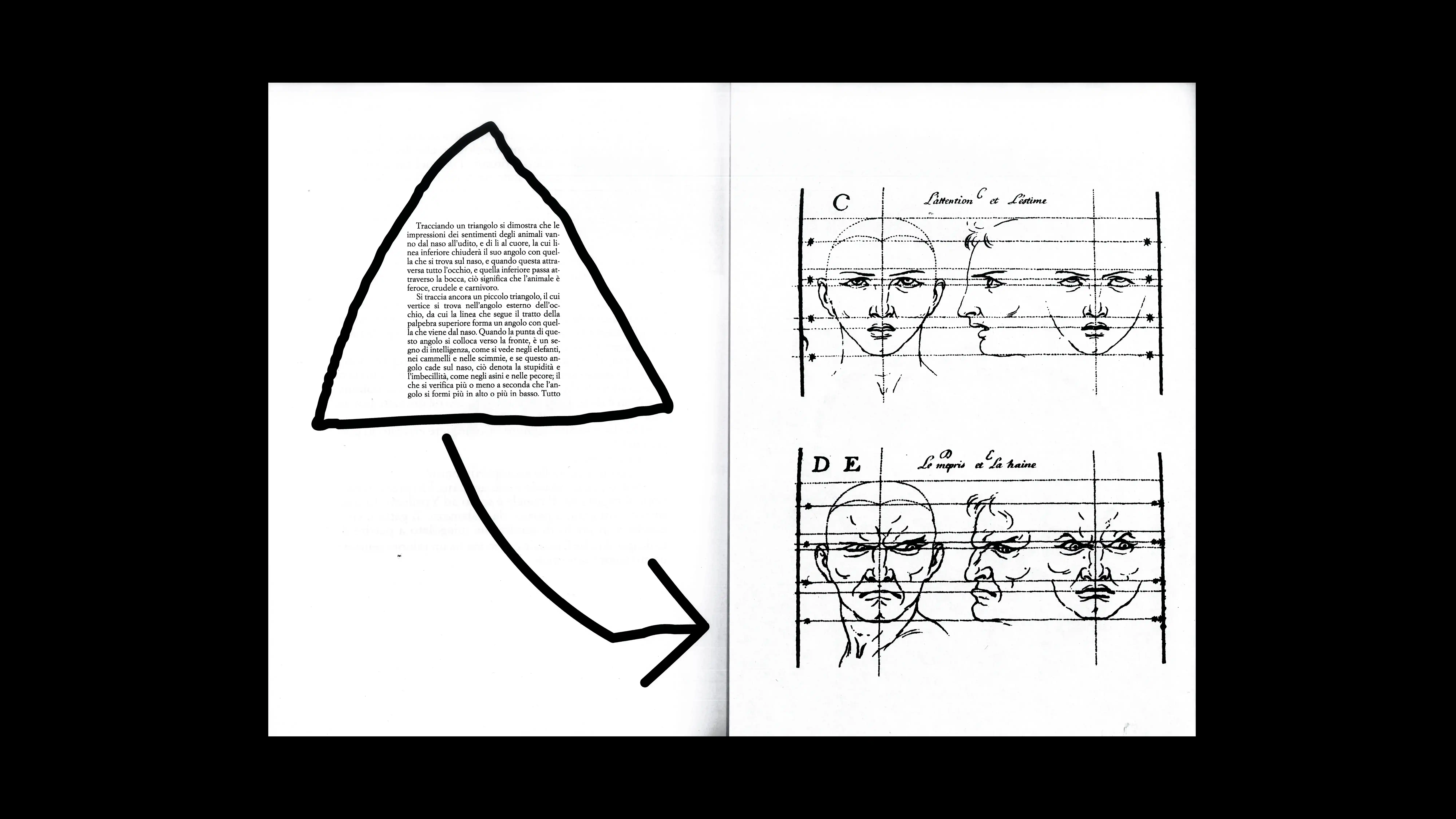
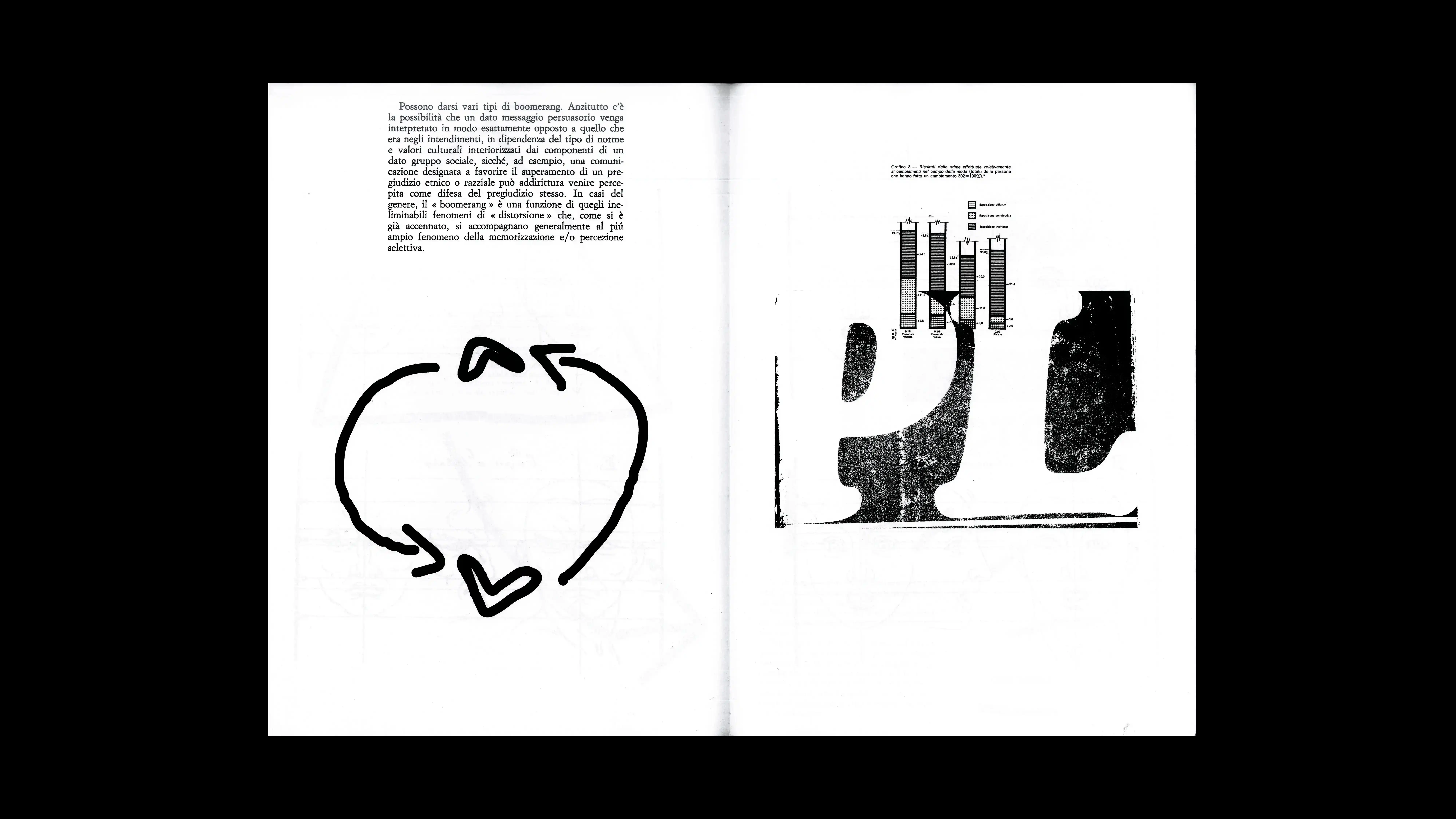
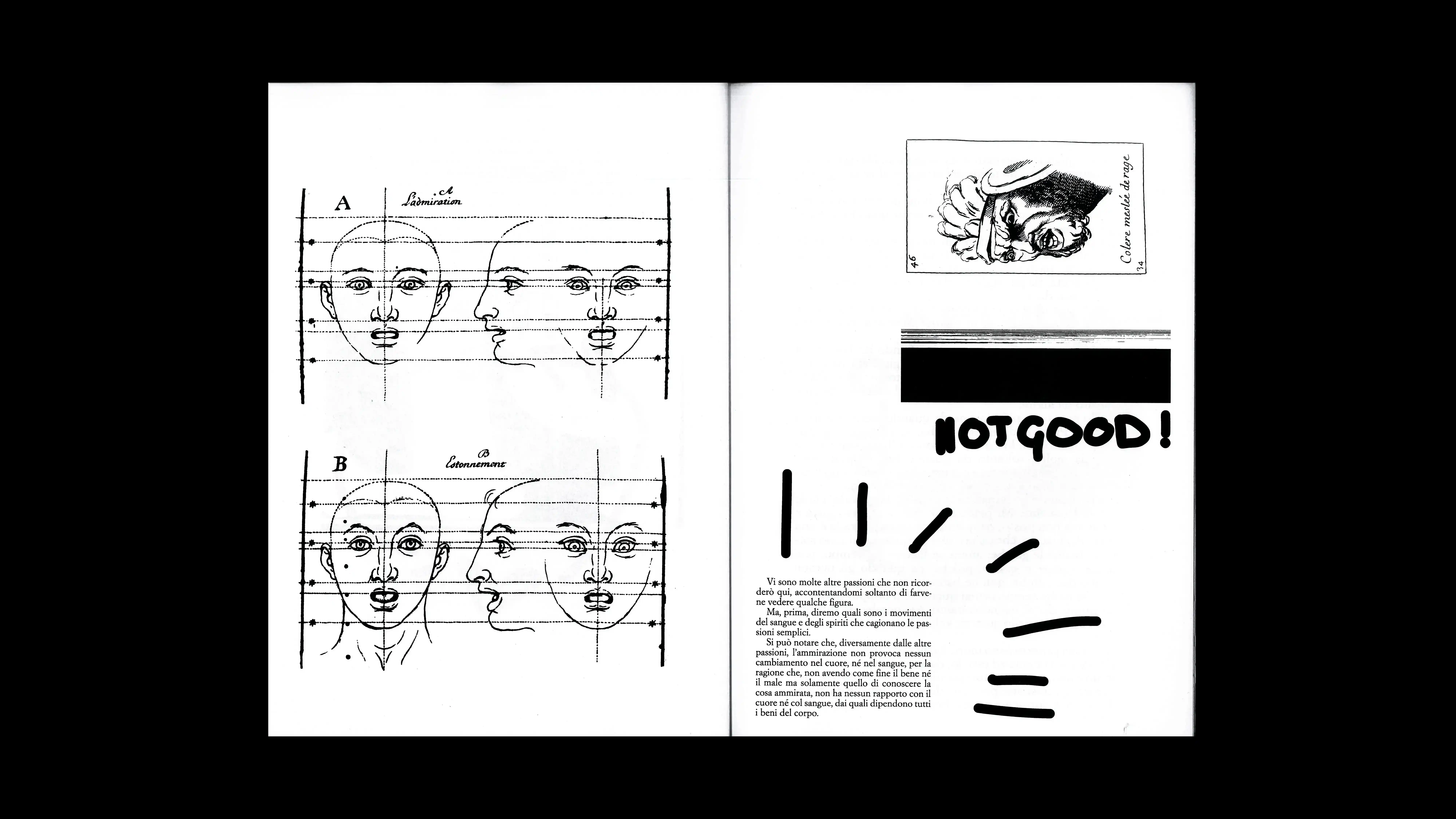
26
QUERELA PACIS
2026
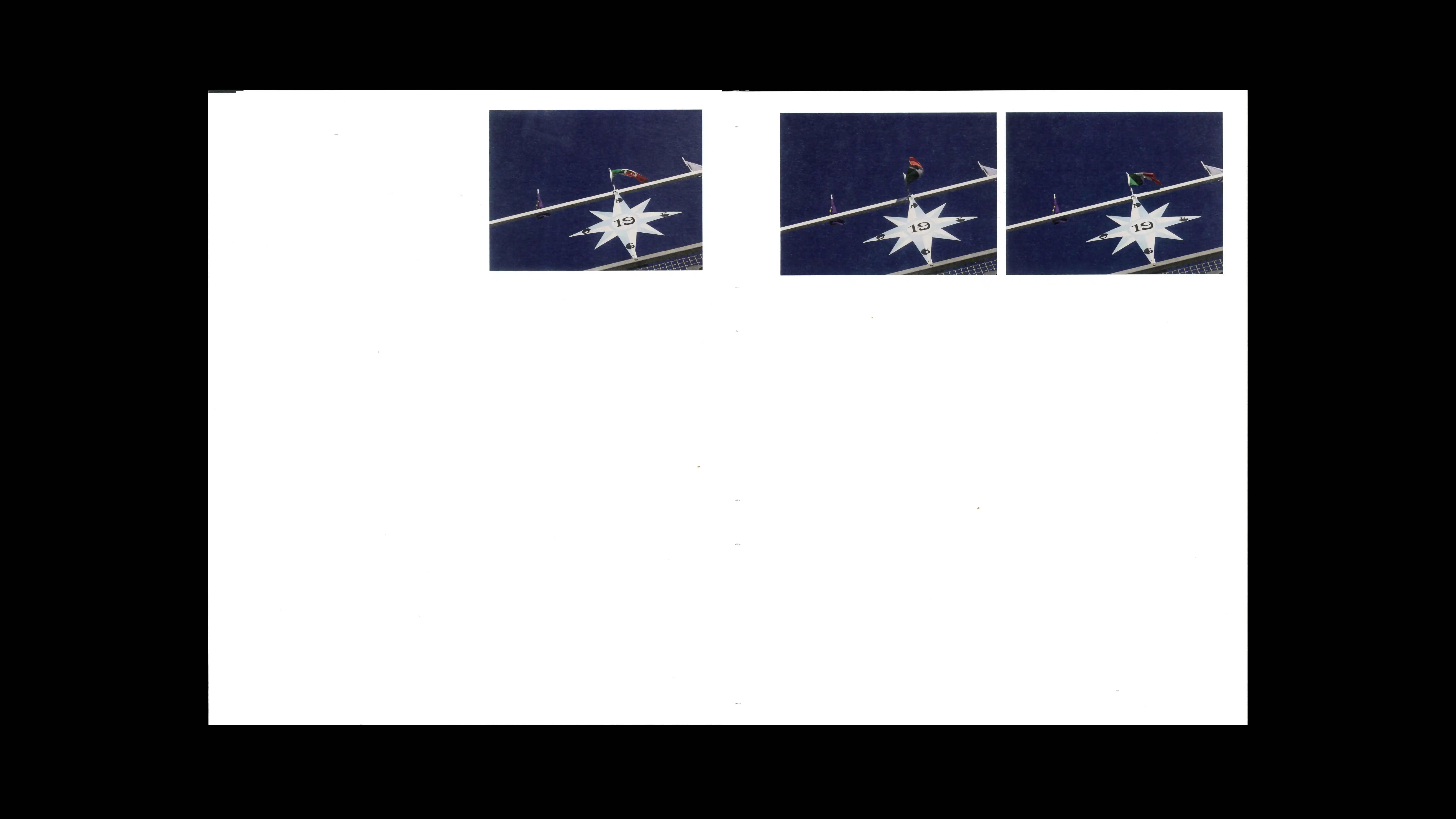
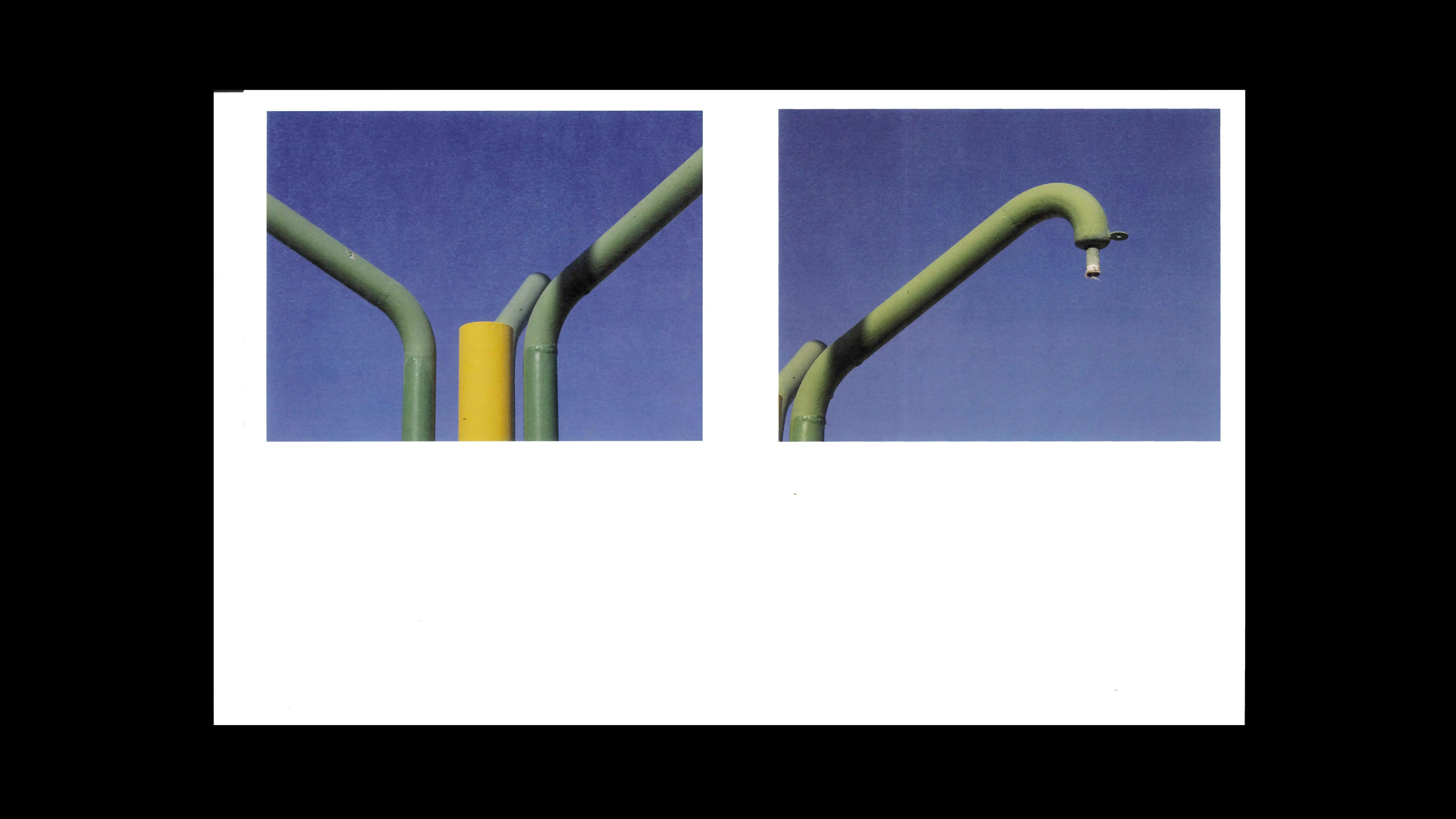
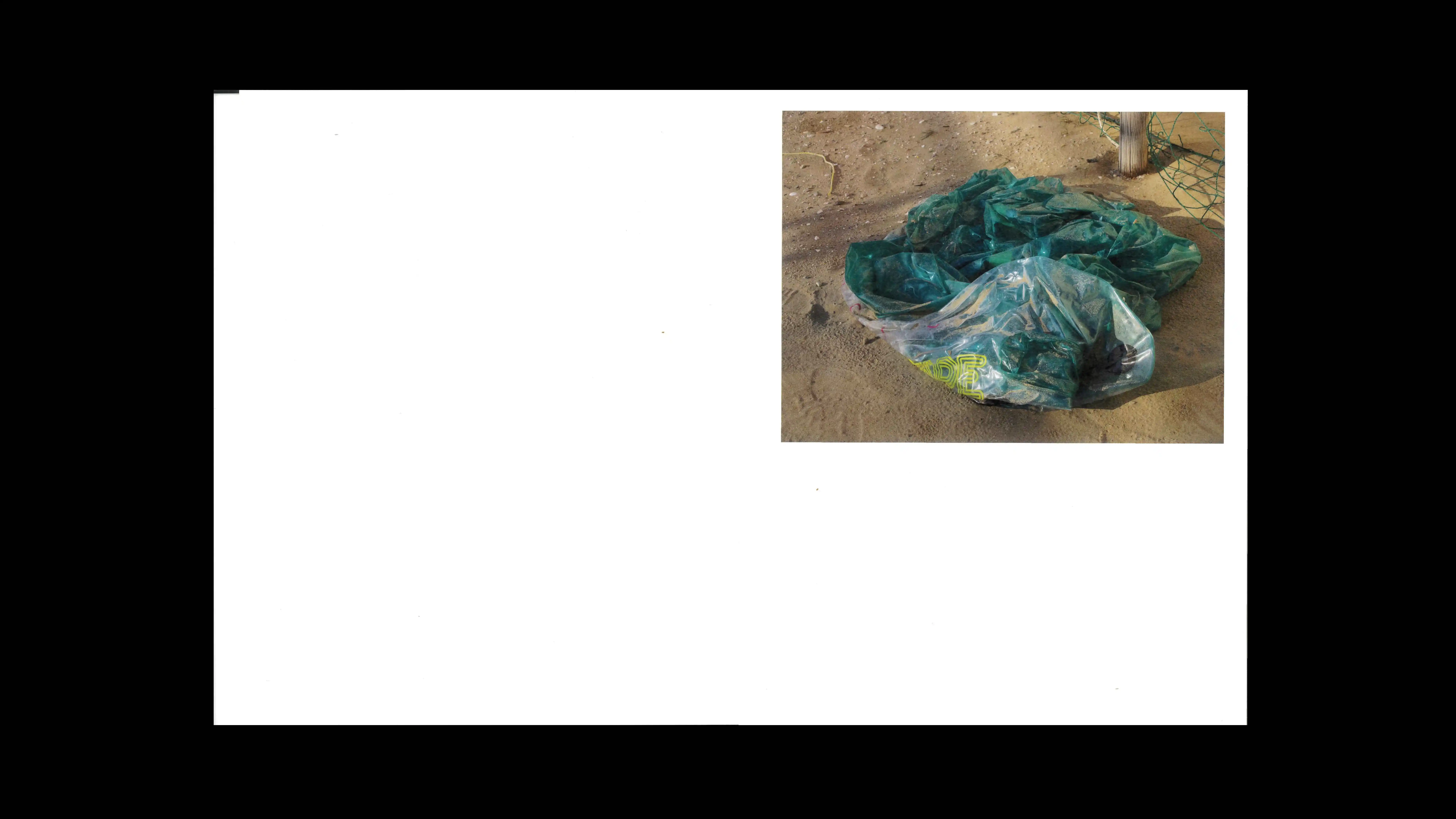
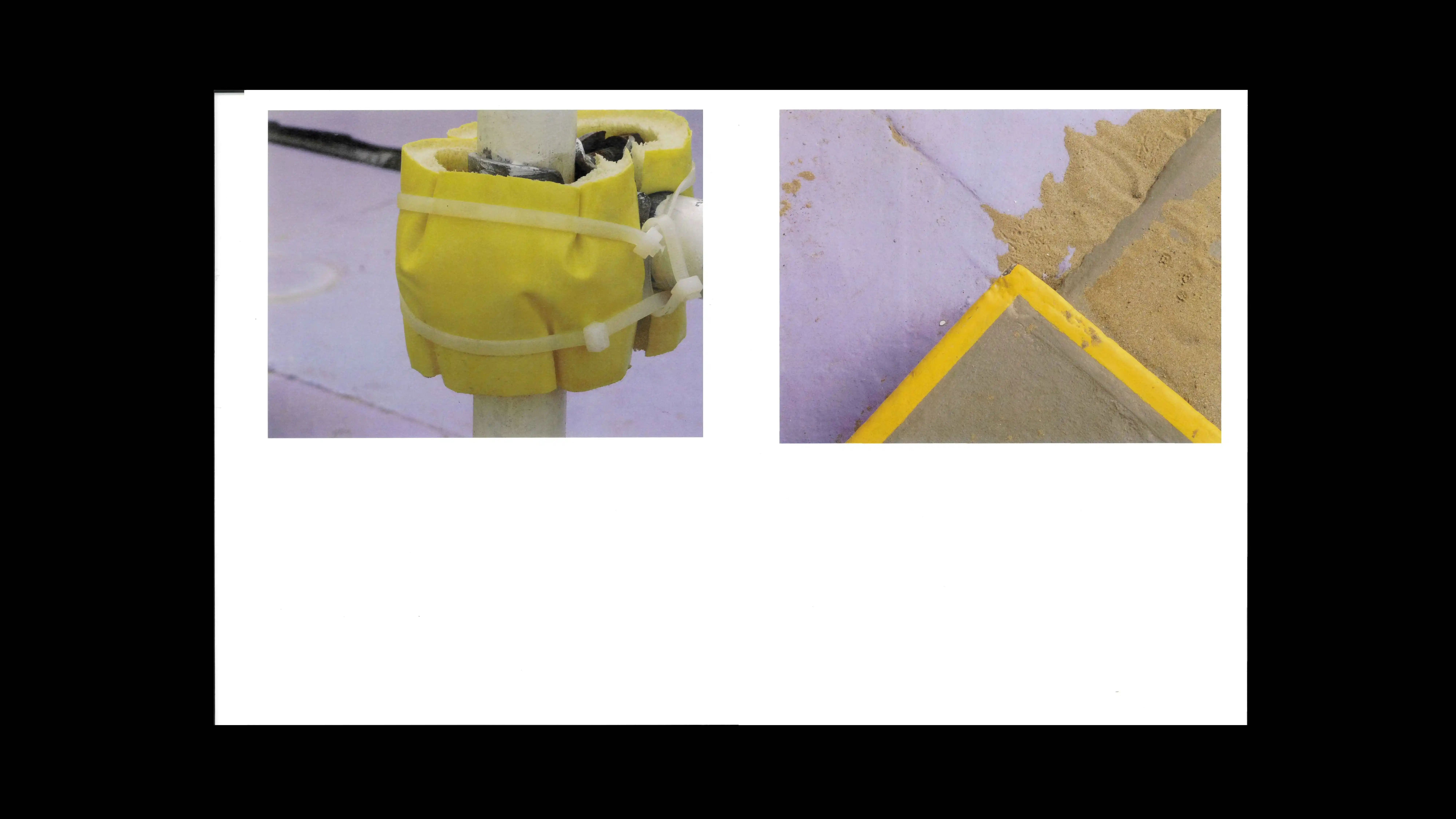
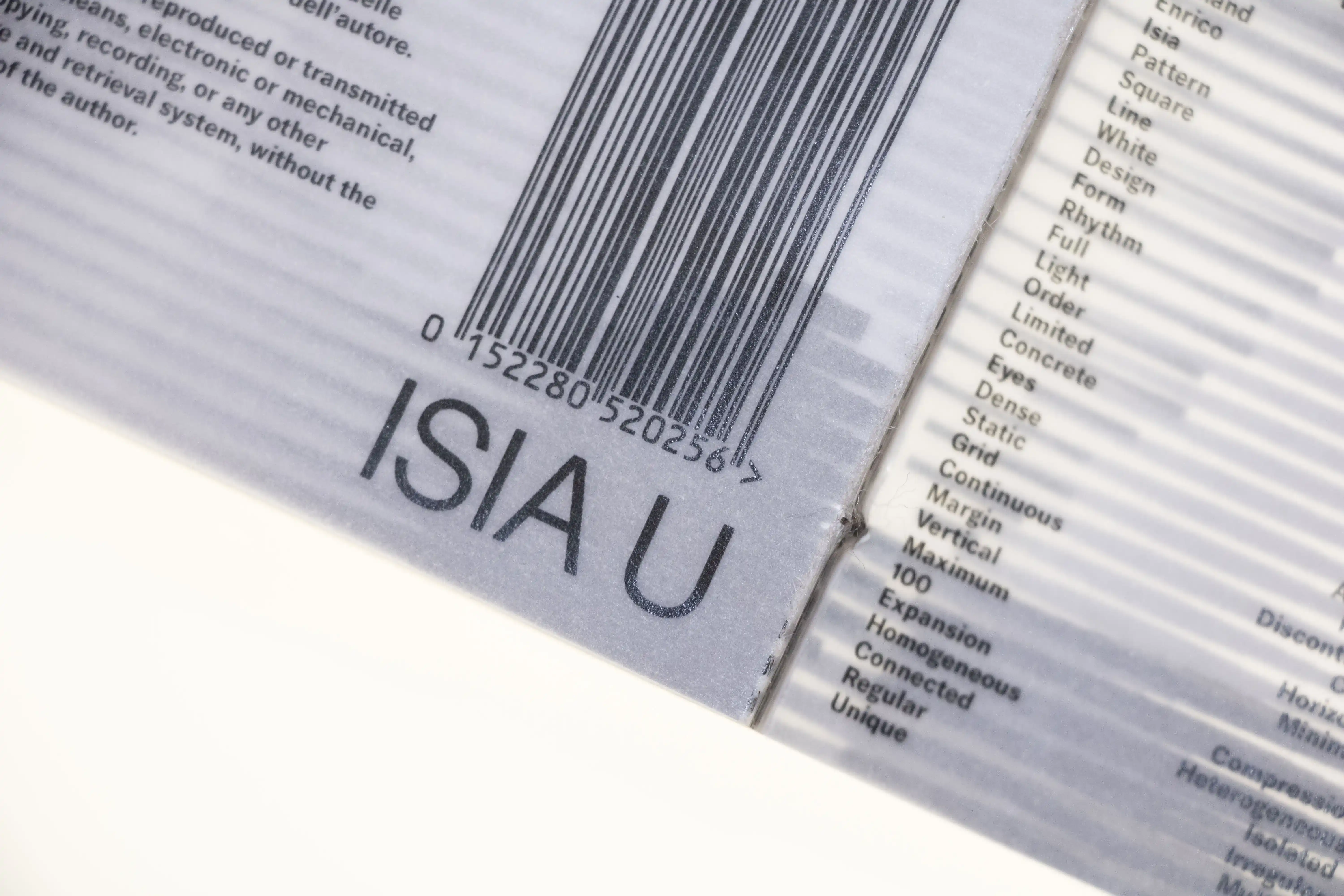
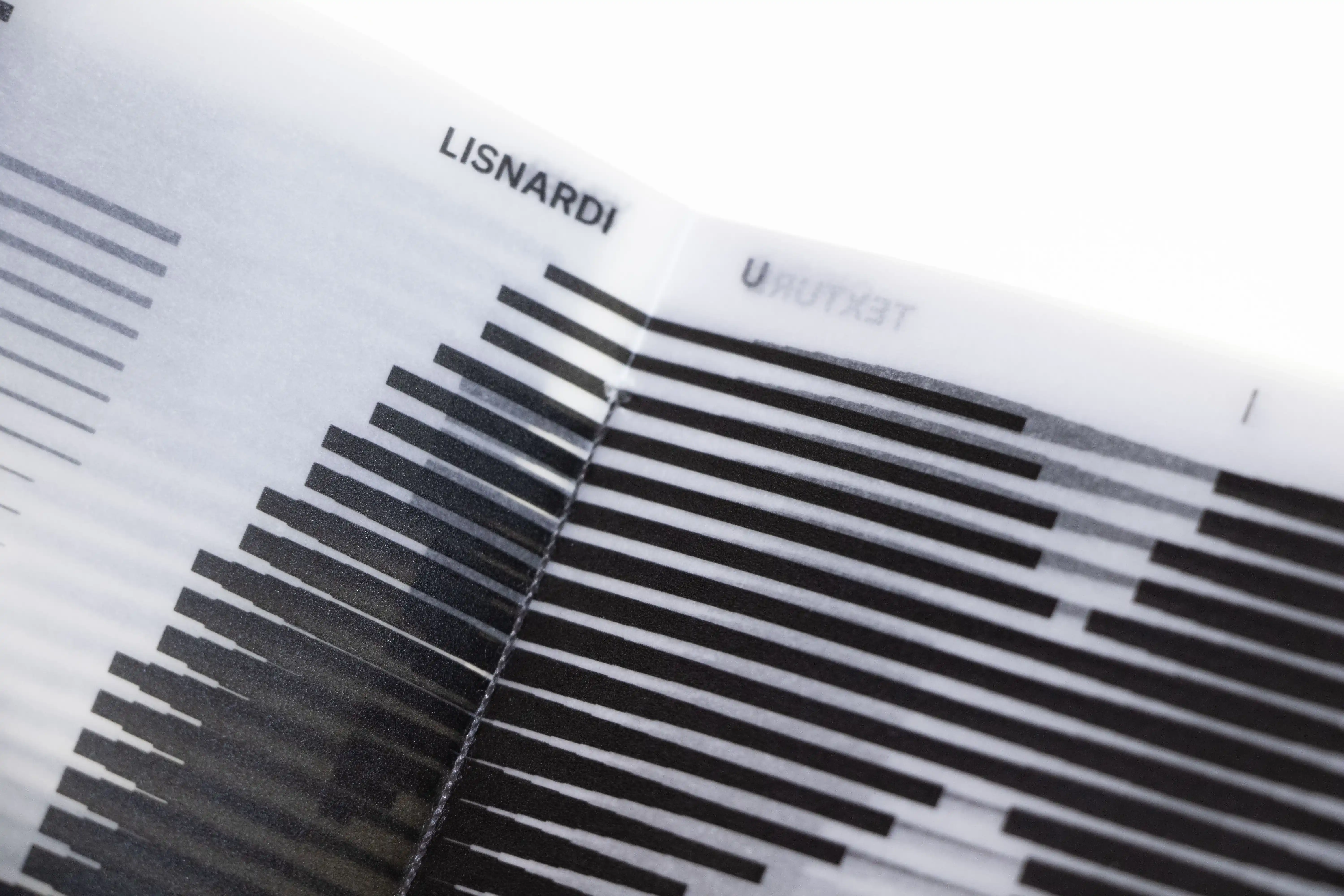
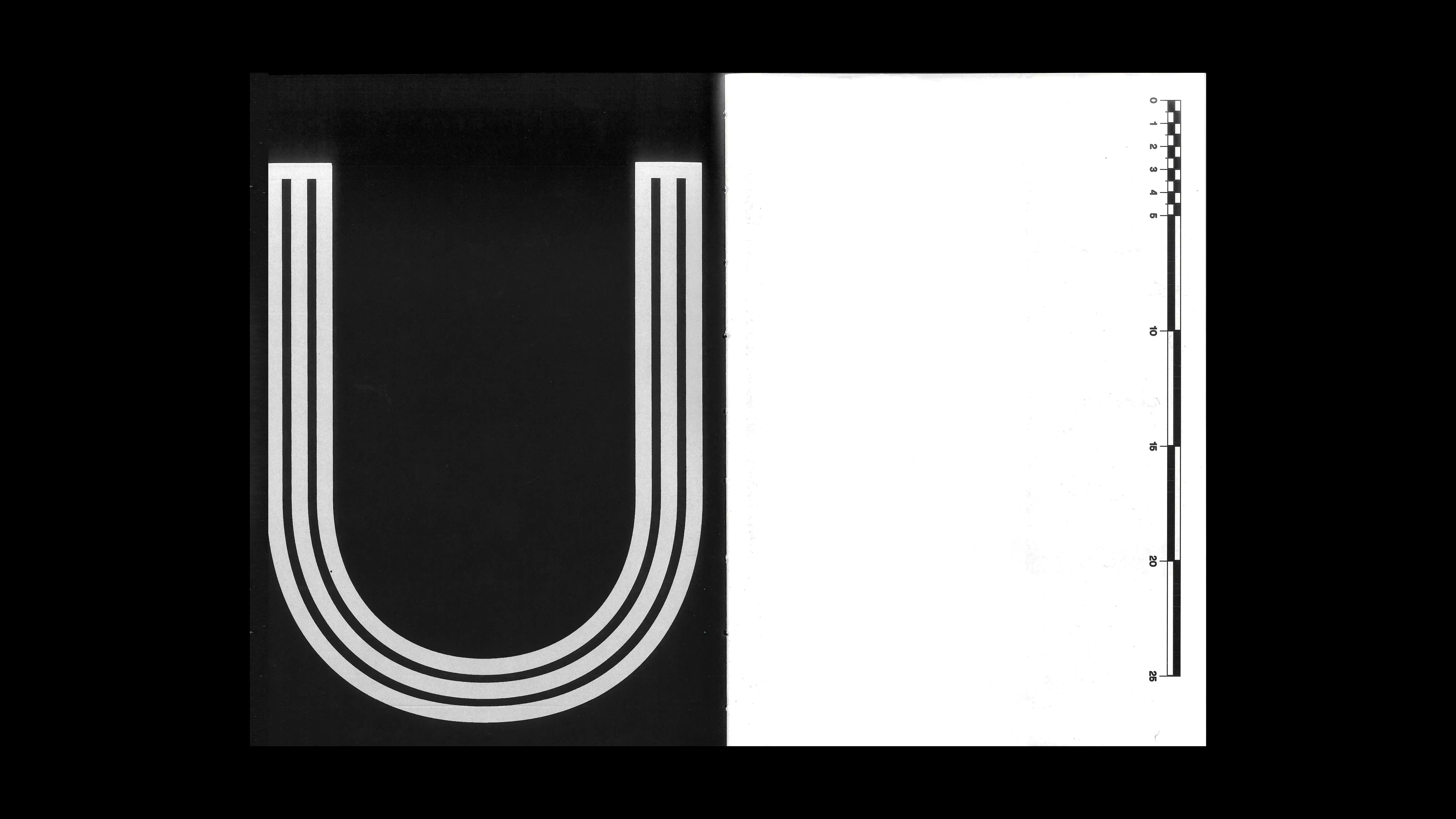
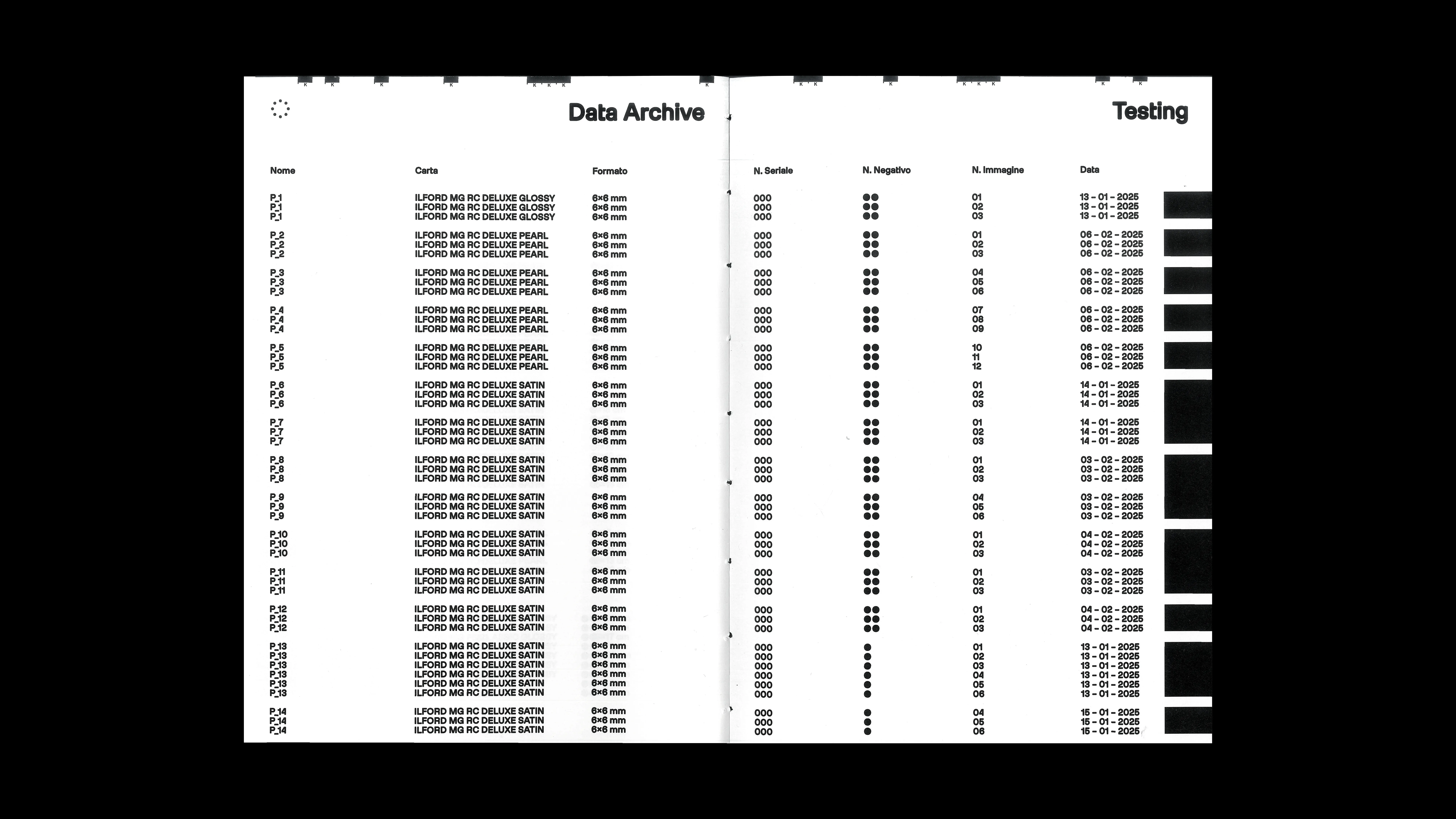
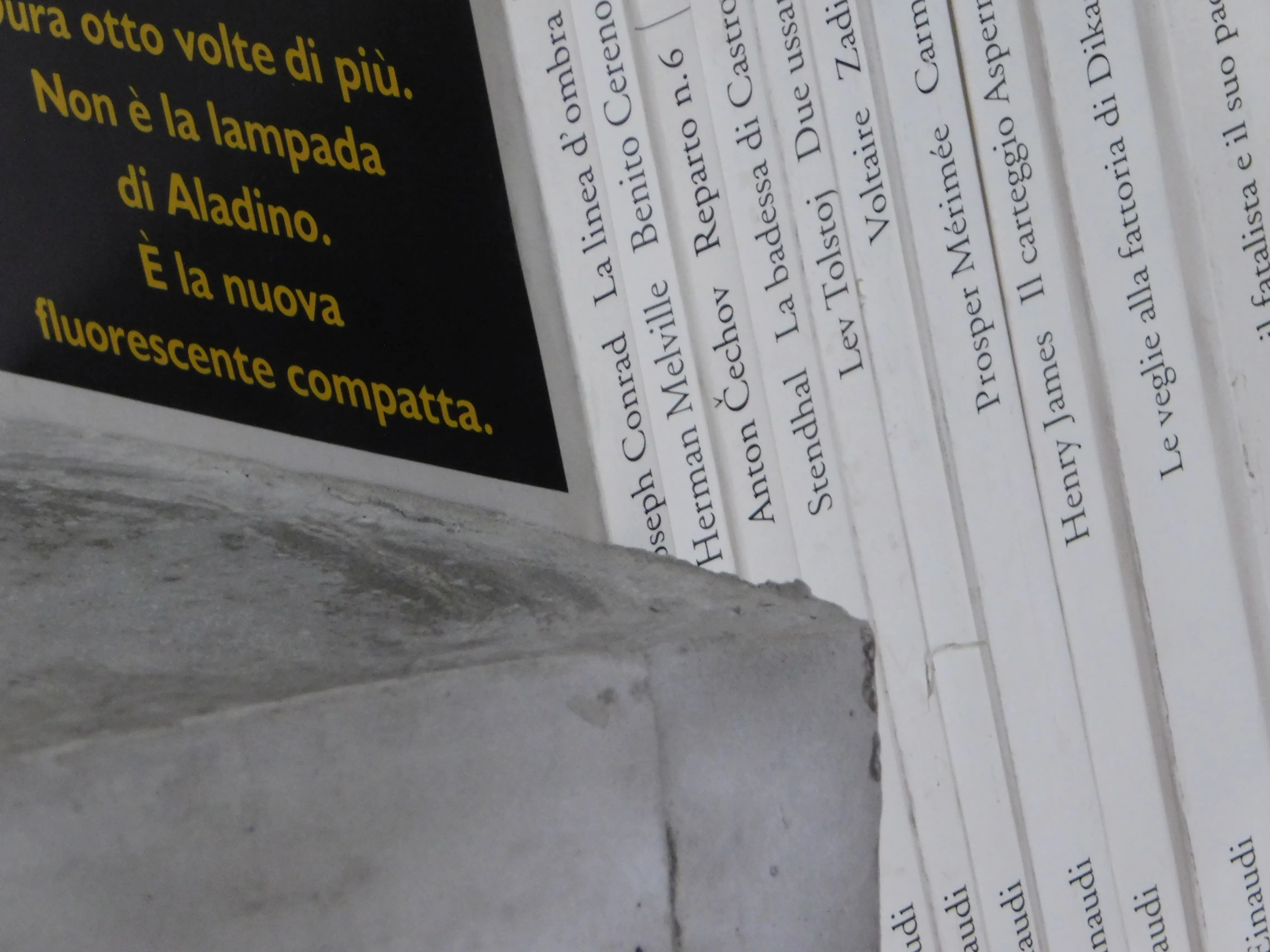
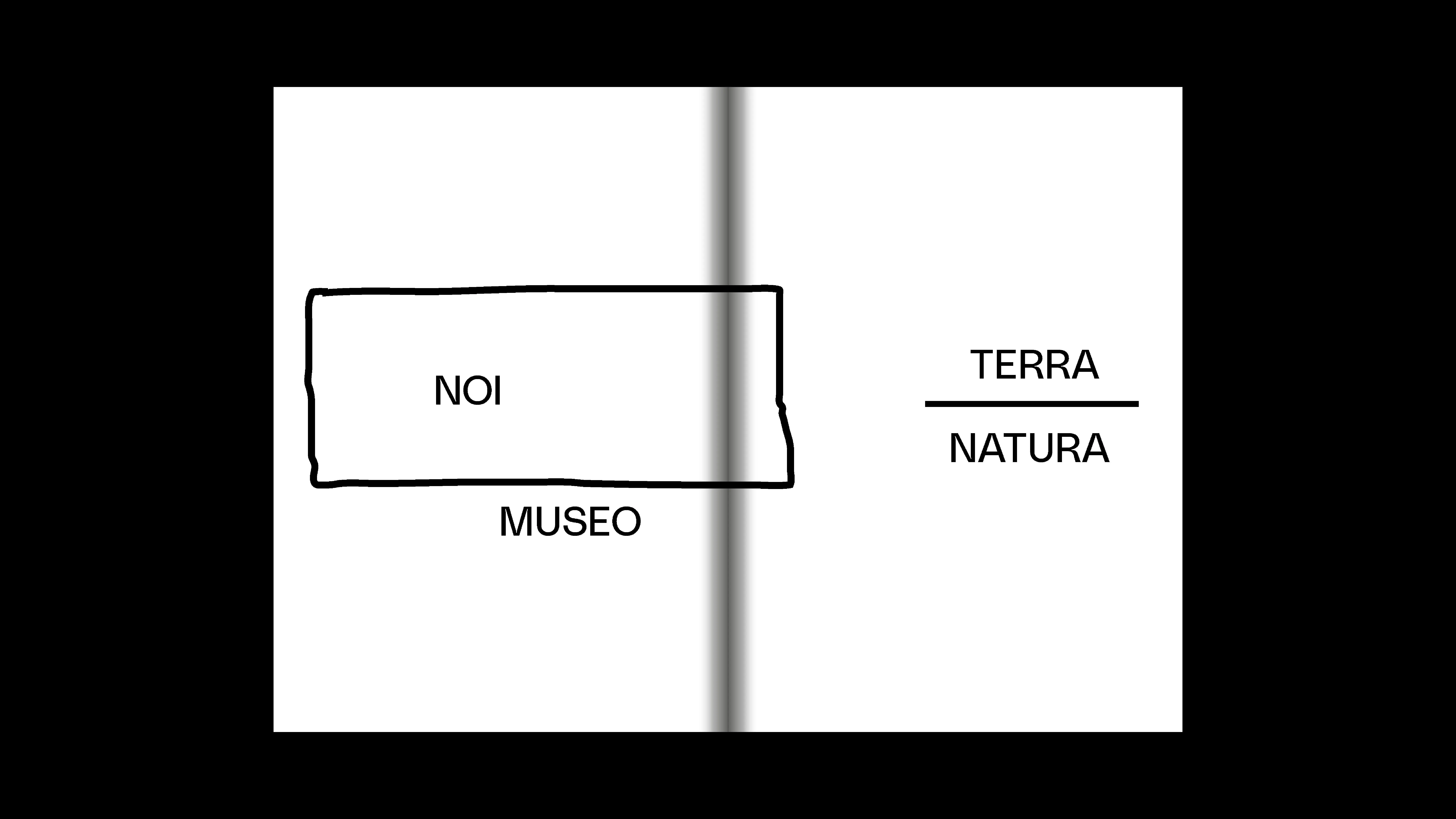
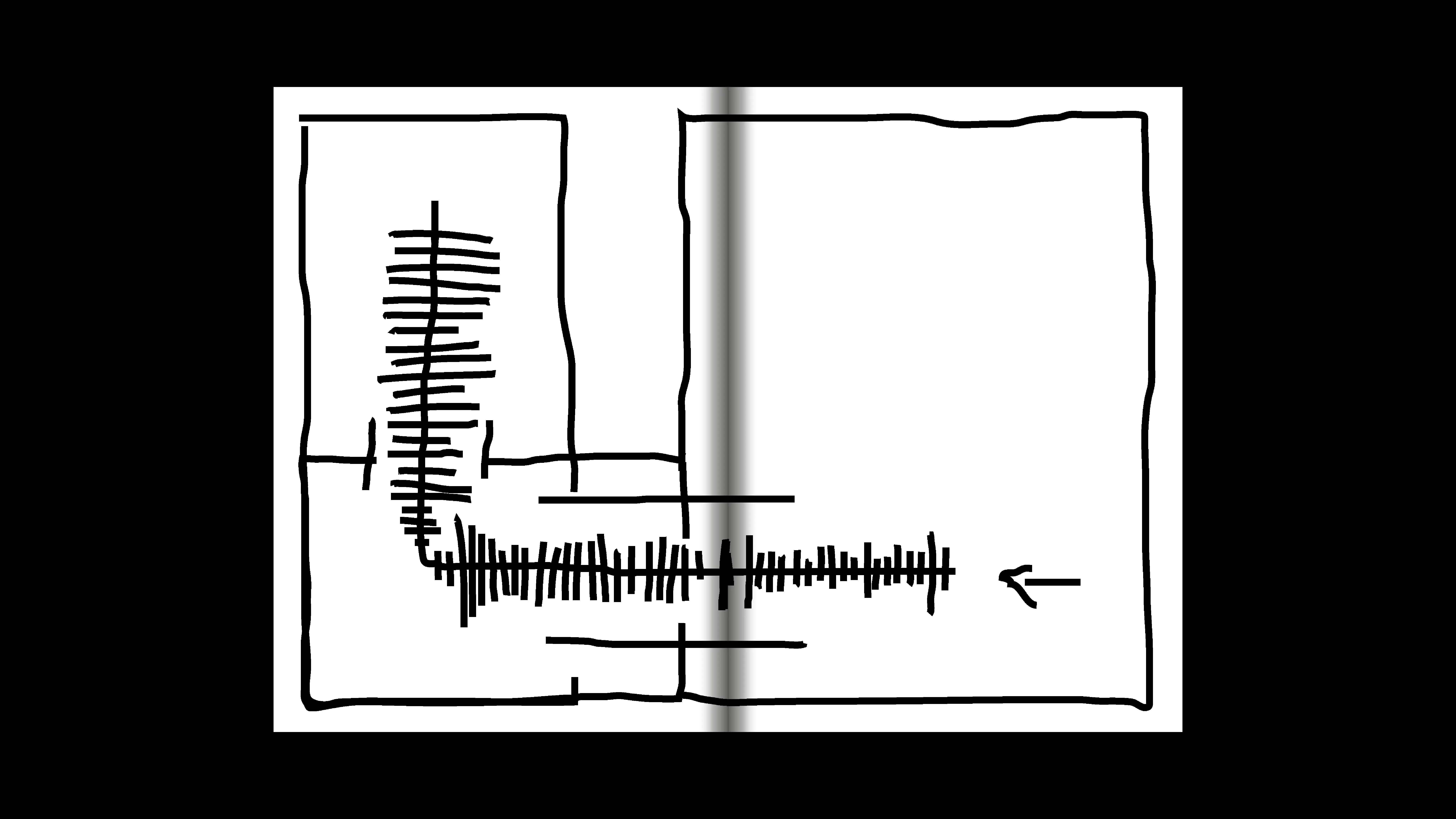
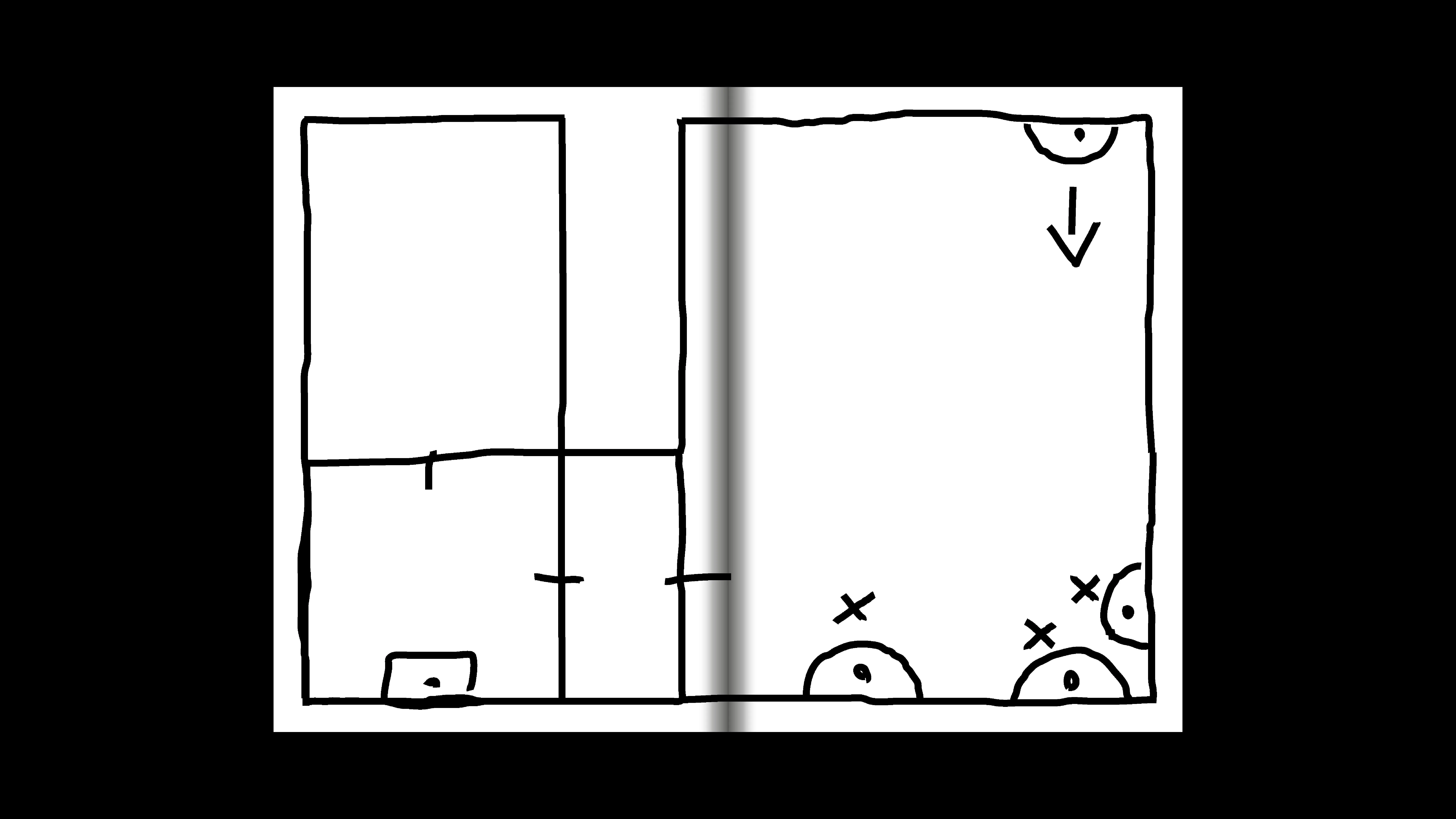
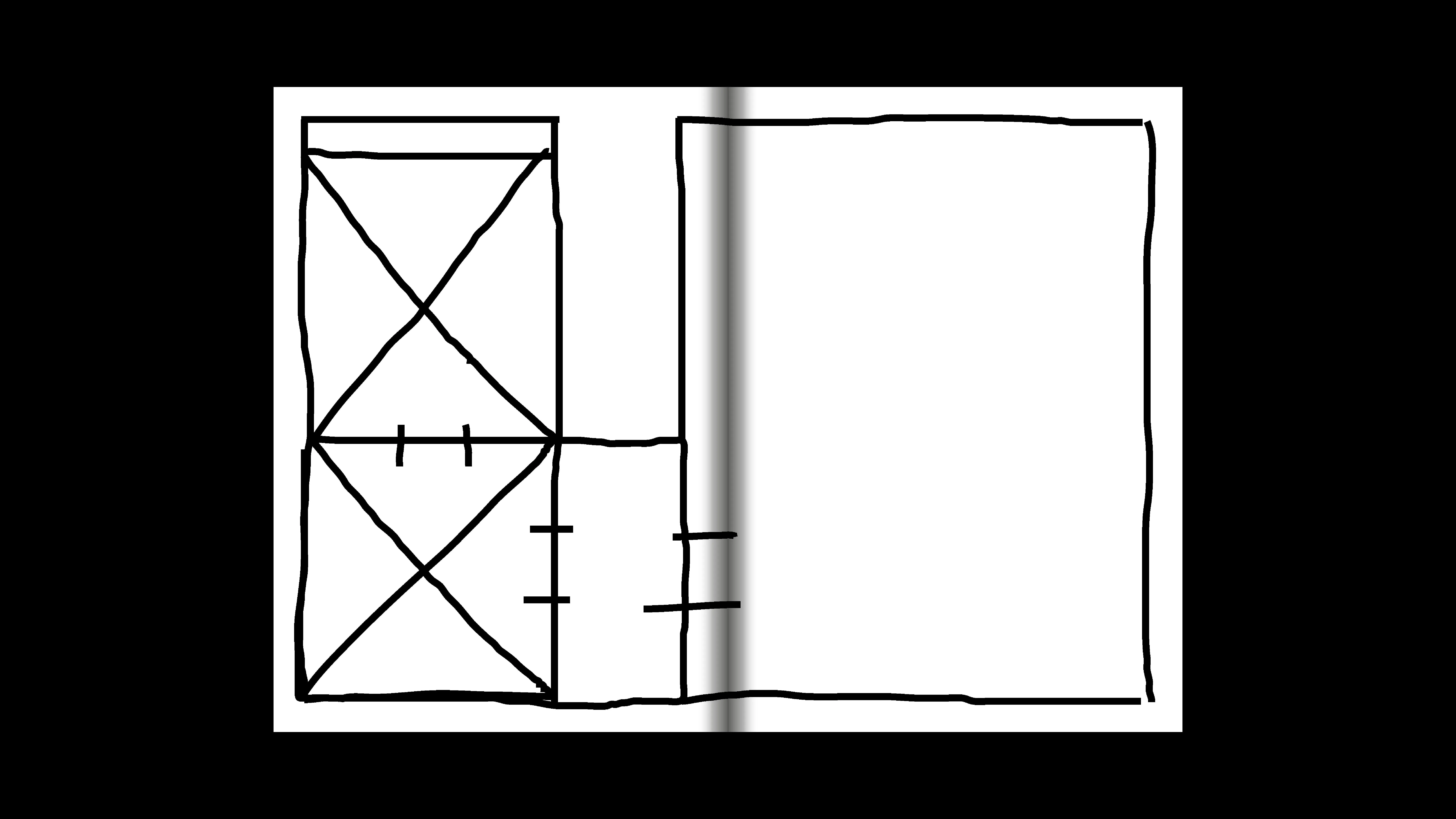
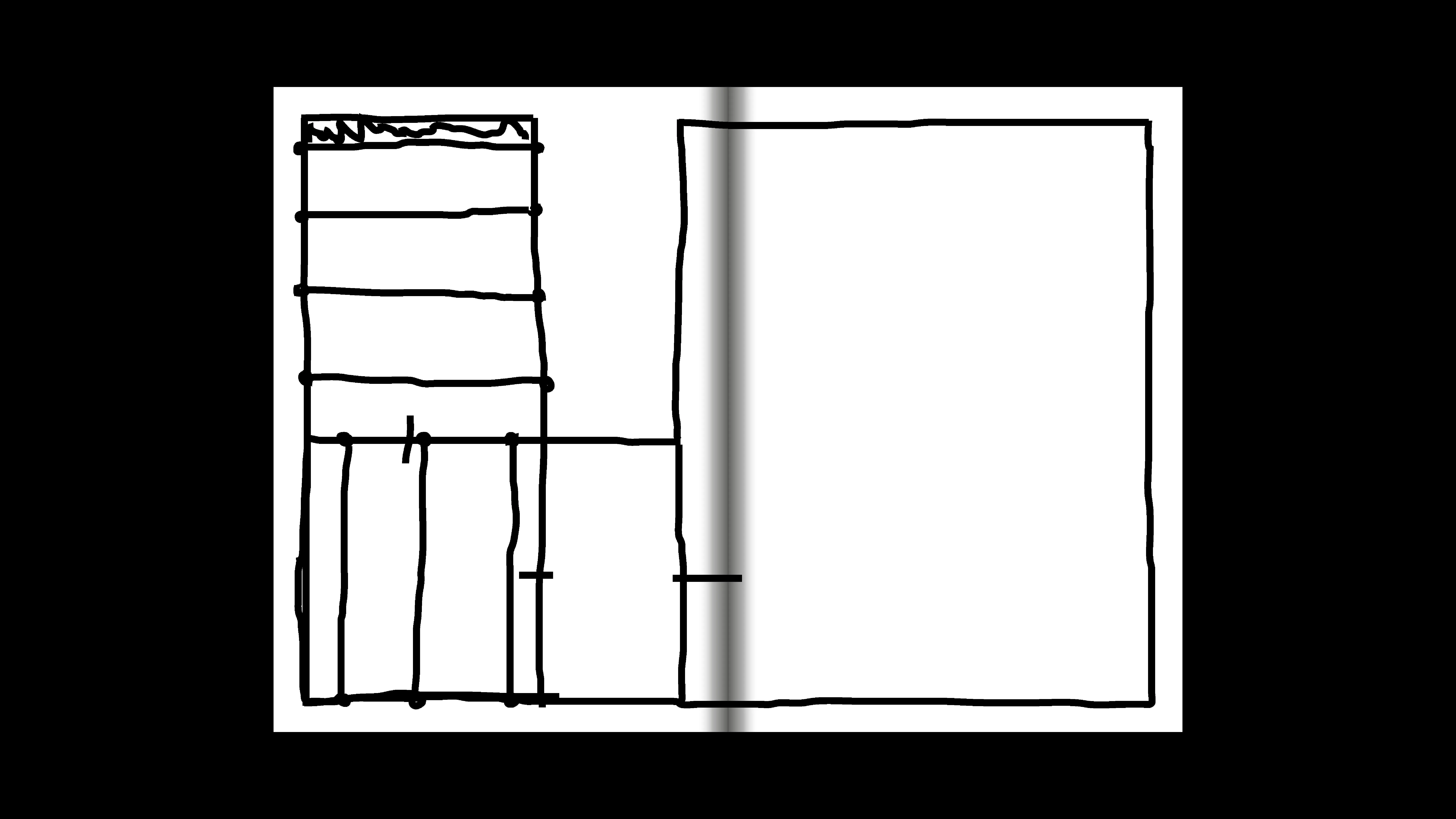
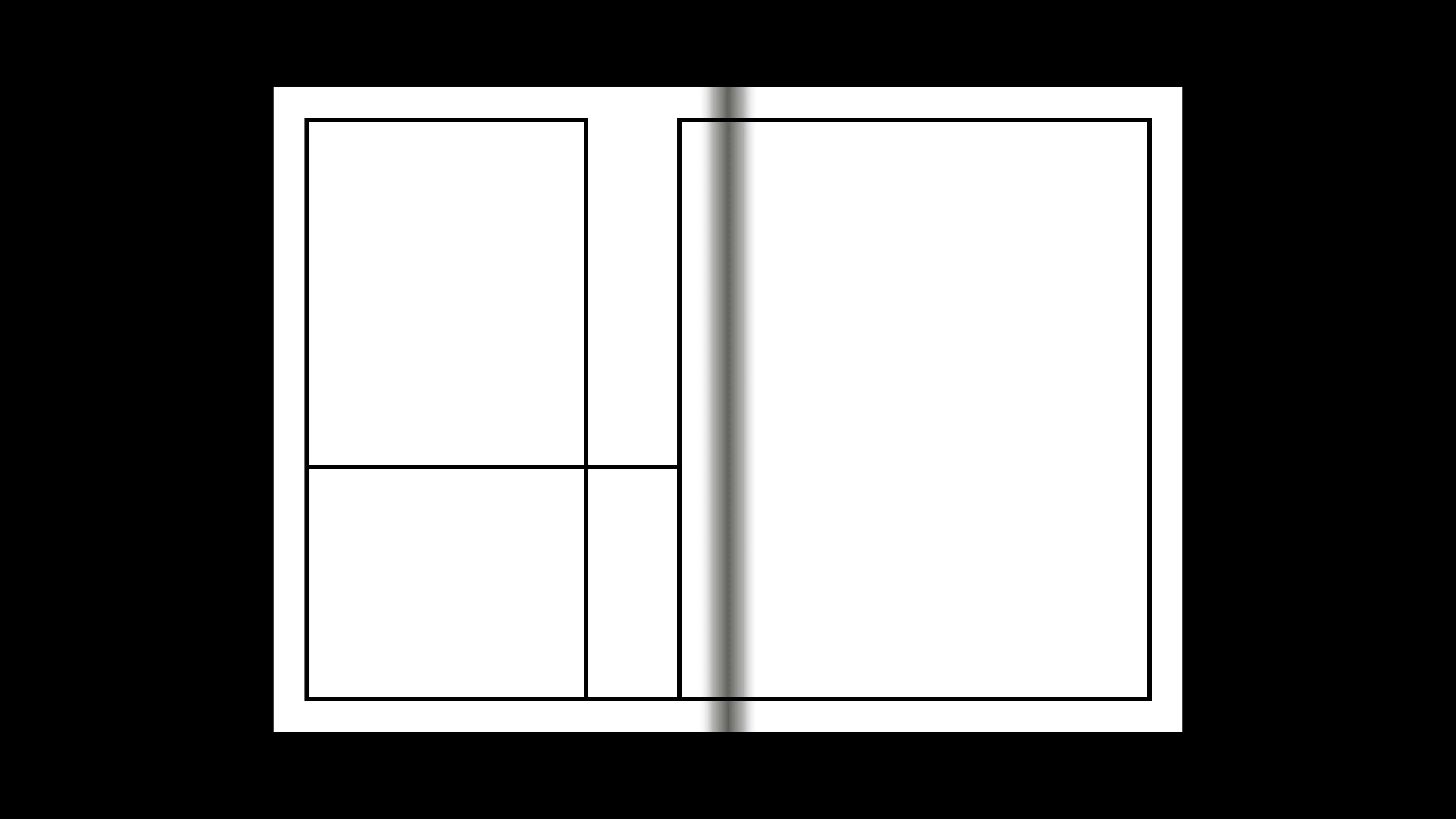
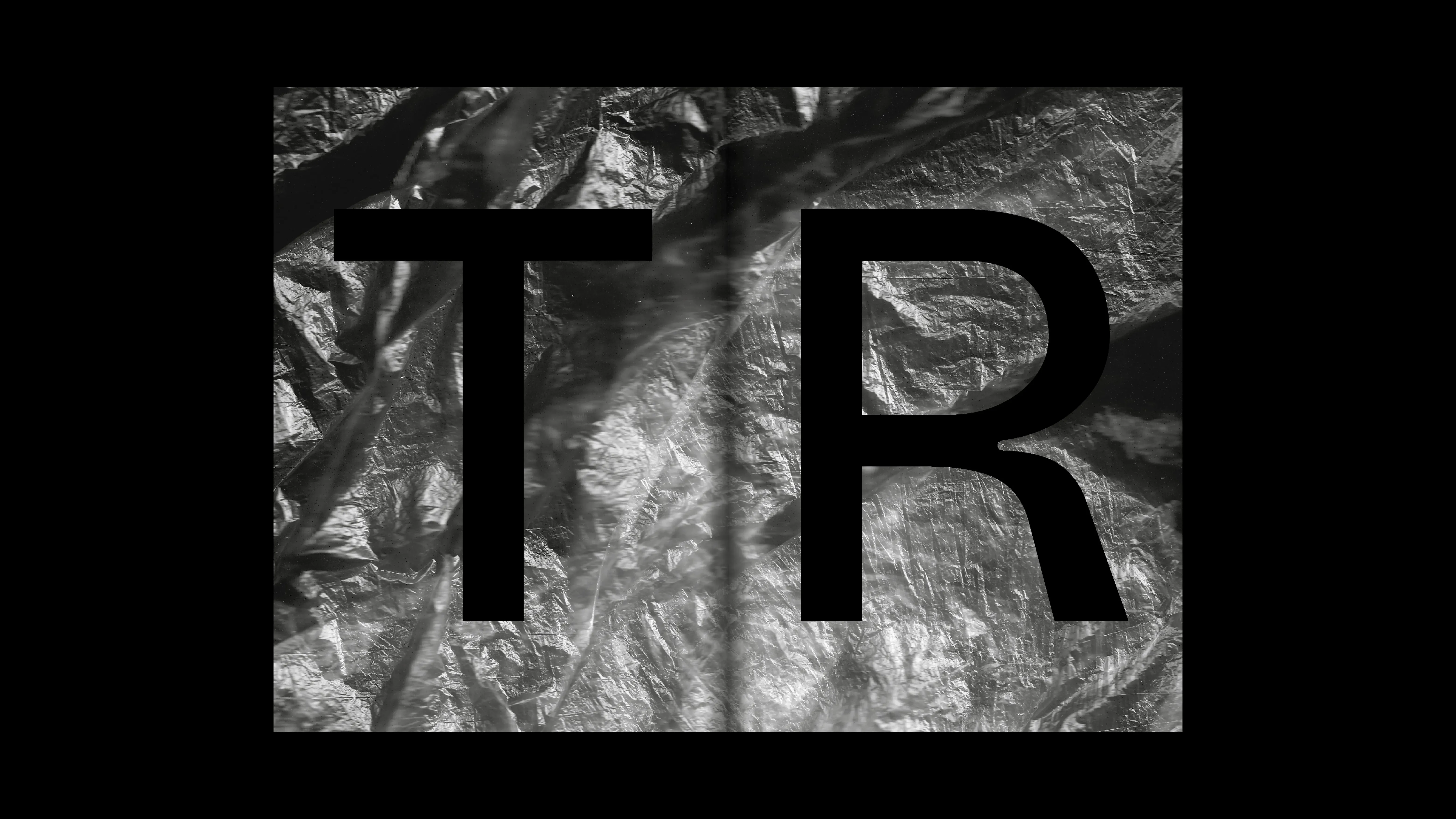
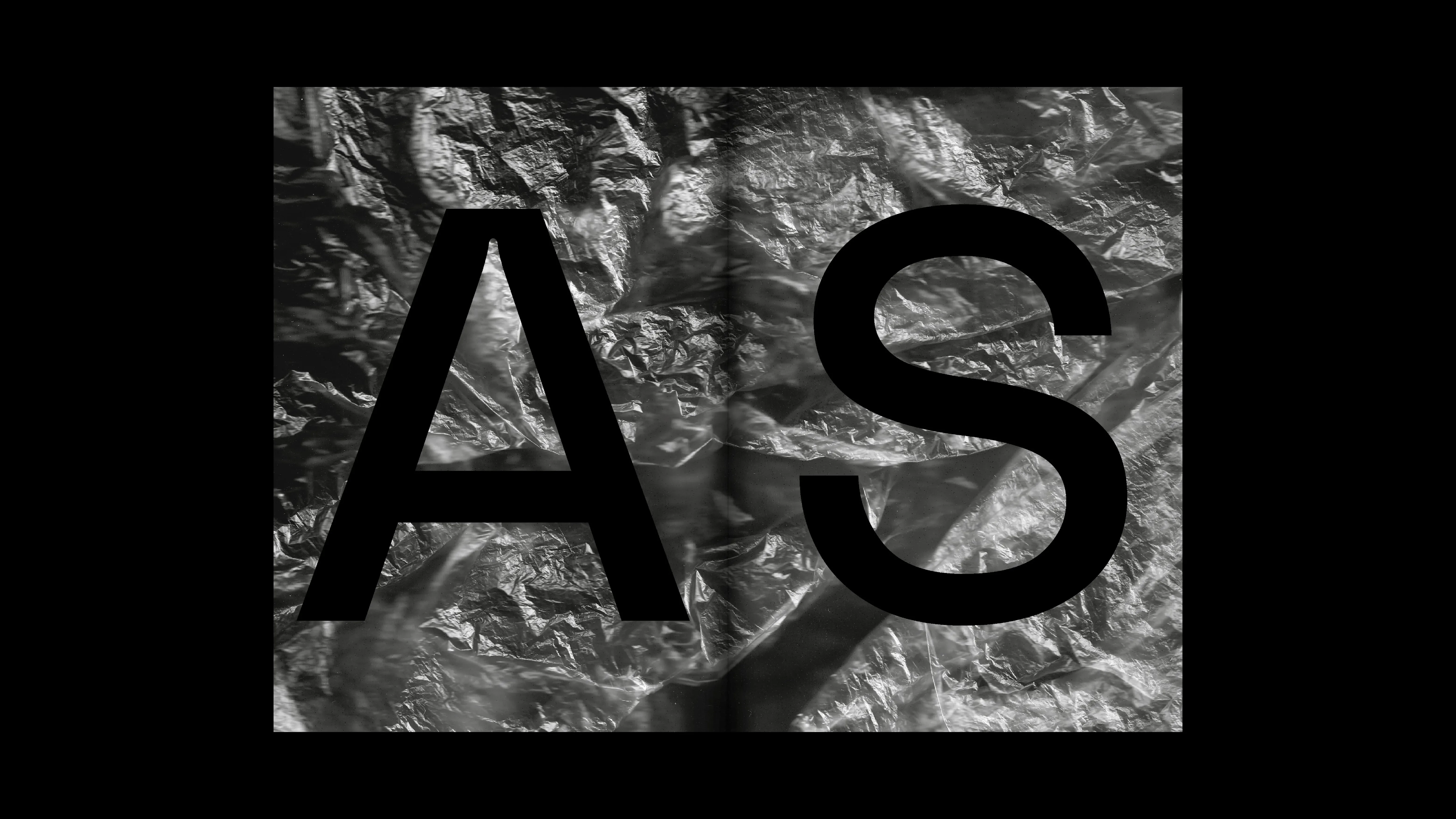
PROJECT Art Direction and Book Design CONTEXT ISIA_U DESCRIPTION The project explores the concept of "Peace" as a mechanical process of constant maintenance, manifesting as a 4×4×4 meter cubic installation located at Le Cesane. Inside, an automated system moves a terminal brush that shifts layers of clay dust to progressively reveal the backlit text of Erasmus of Rotterdam’s Querela Pacis. The core of the work is the 304-page technical catalogue, designed as a military field manual and defined by a brutalist, functional aesthetic. Bound in a "Half Canadian" spiral format with a kraft cardstock cover and a retroreflective decal, the volume documents the structure's anatomy through detailed plans, metric sections, and material surveys. The editorial narrative features two- and three-panel gatefolds showing technical drawings in metric scales (such as 1:25 and 1:5) to provide a clear reference to reality, alongside an extensive section dedicated to the graphic rendering of 16 movement patterns. These are presented through folded double-page folders containing bound topographical data, drone models employed, and preliminary sketches for each sequence. Accompanying the publication, a 70×100 cm sheet gathers the complete corpus of technical drawings, the full Bill of Materials (BOM), and the installation's exact geolocation. Every graphic element—from typography to symbols—reflects the language of surveillance and mechanical precision, transforming the editorial work into the definitive archive of an uninterrupted kinetic action.
1 (OF) 12
25
L'ALTRA STAGIONE
2026
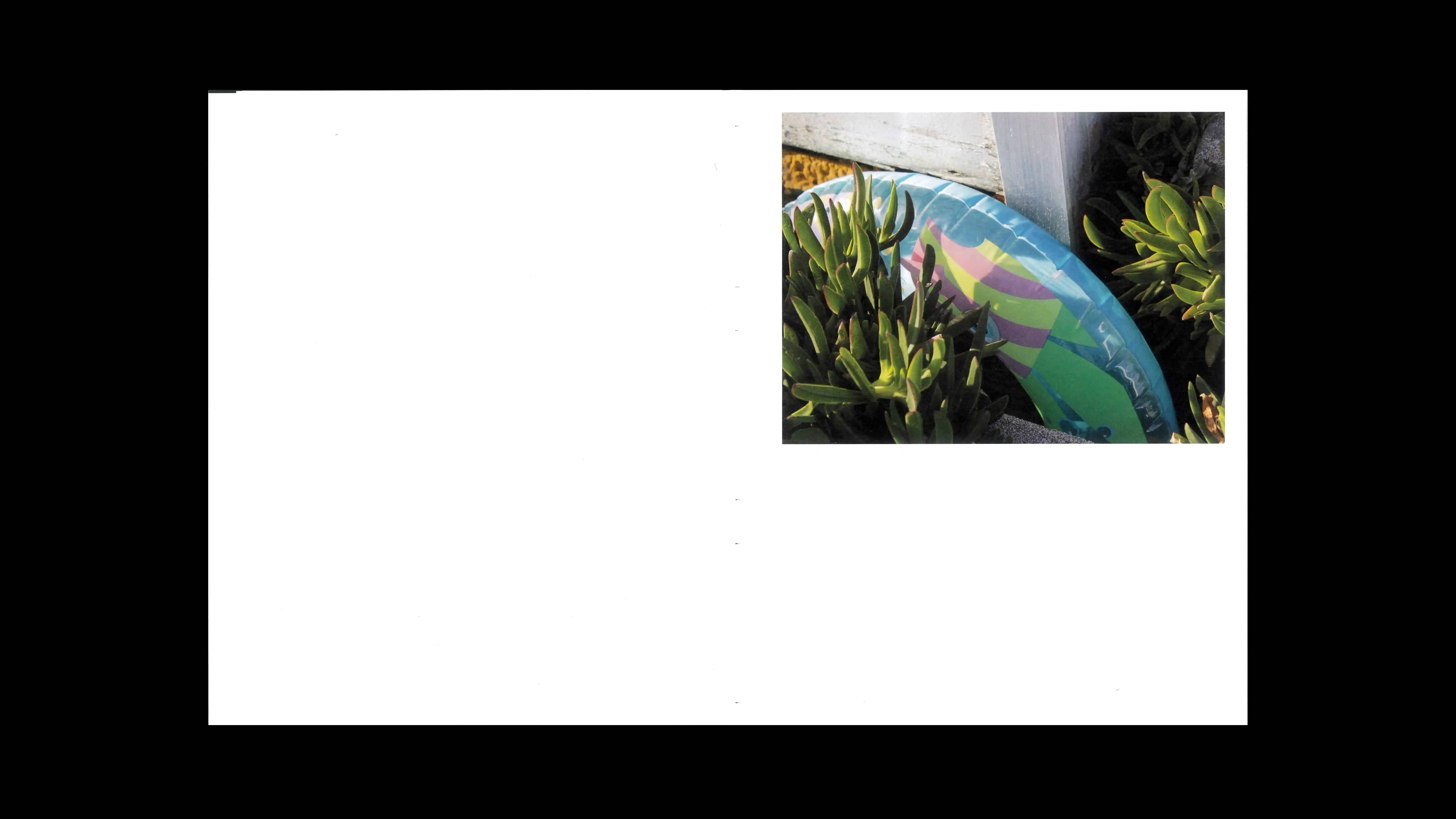
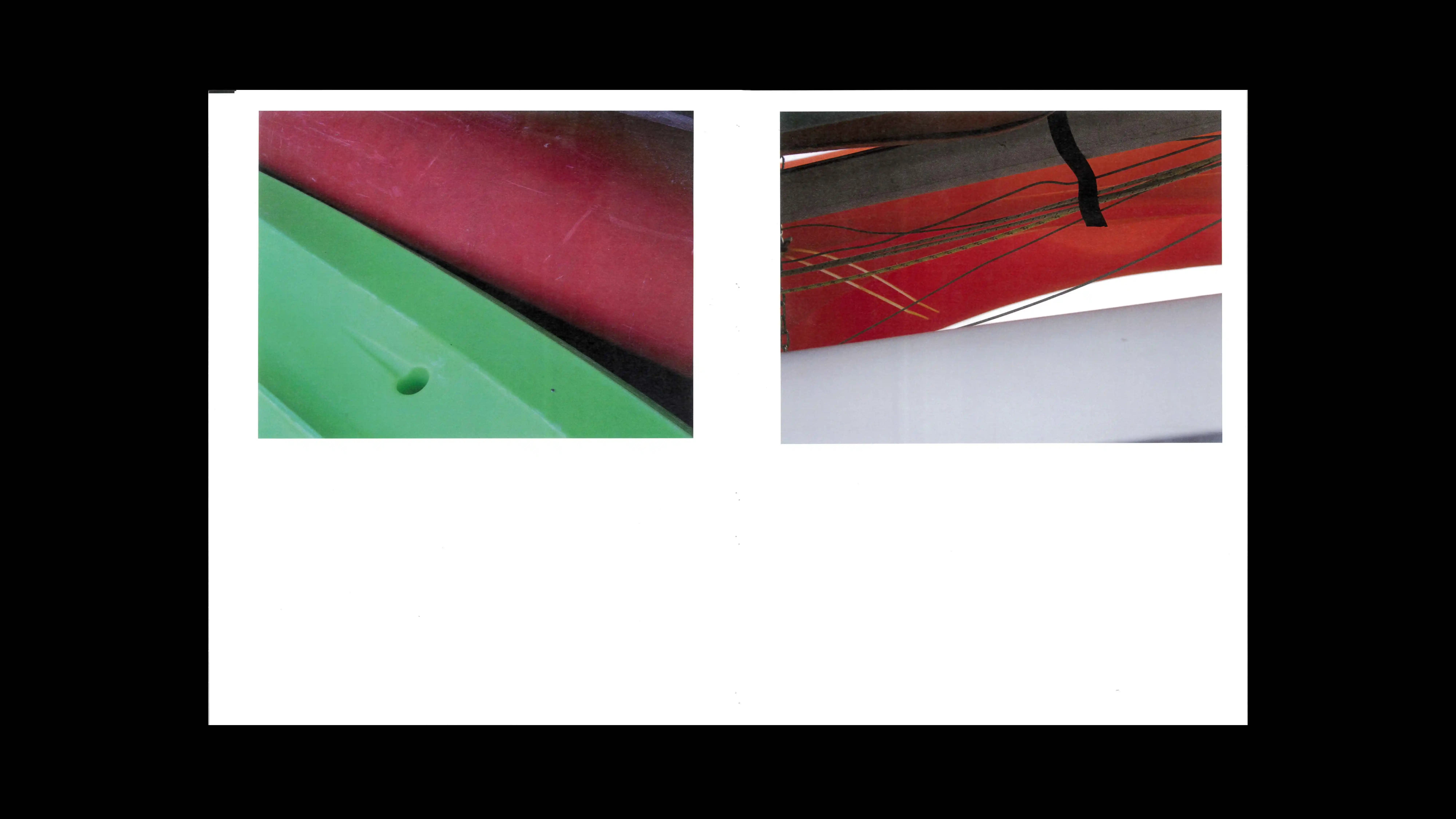
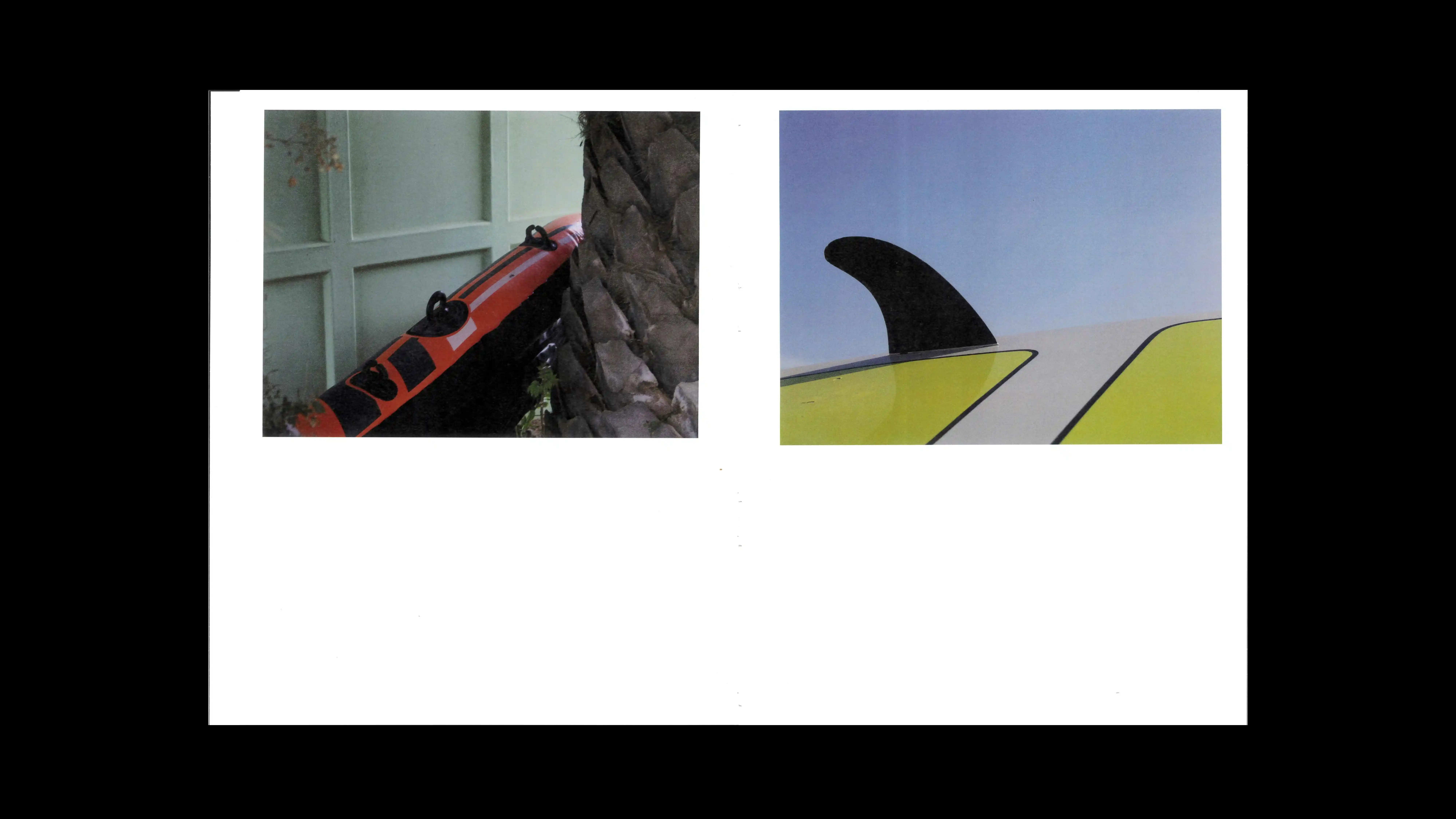
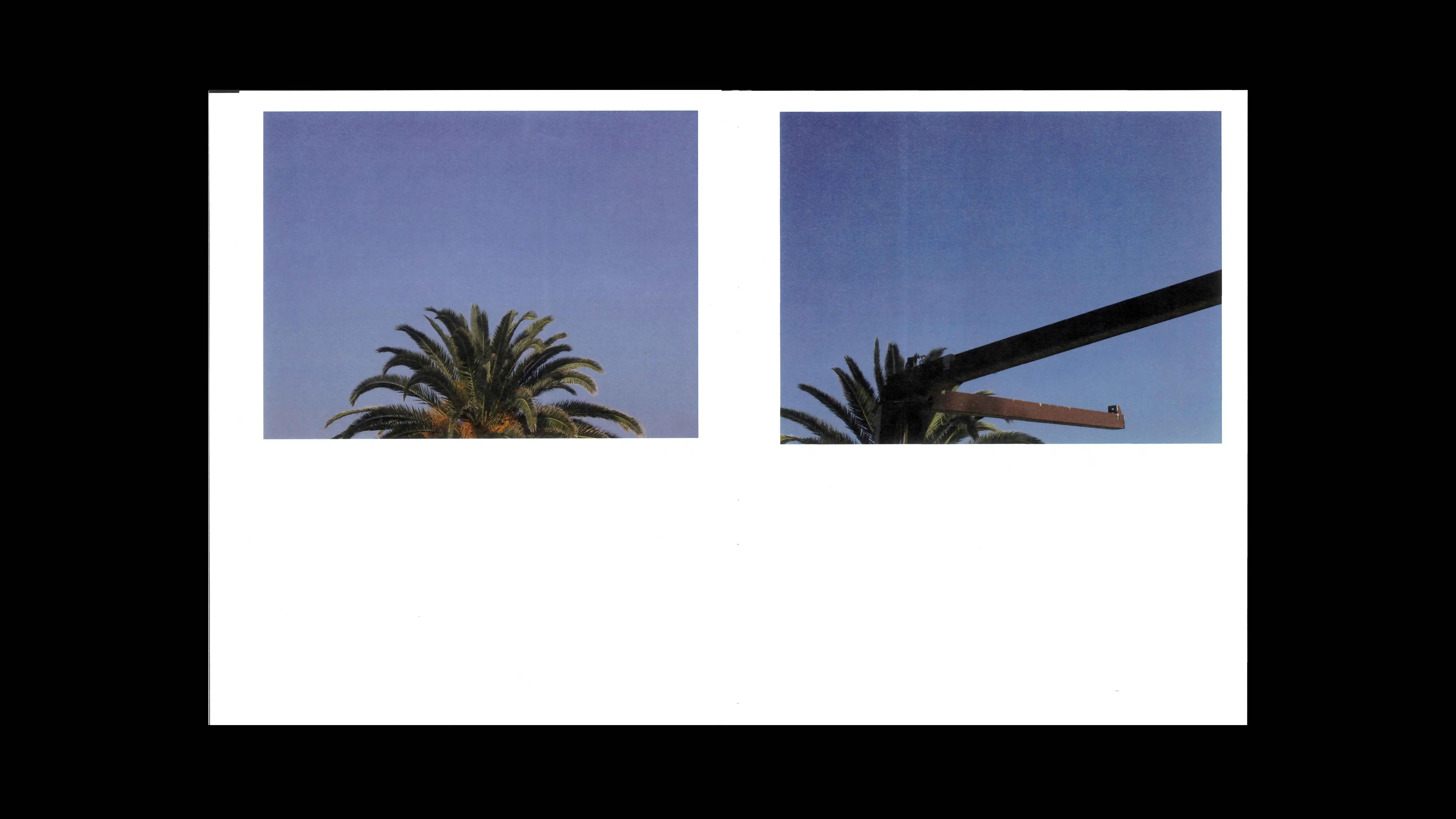
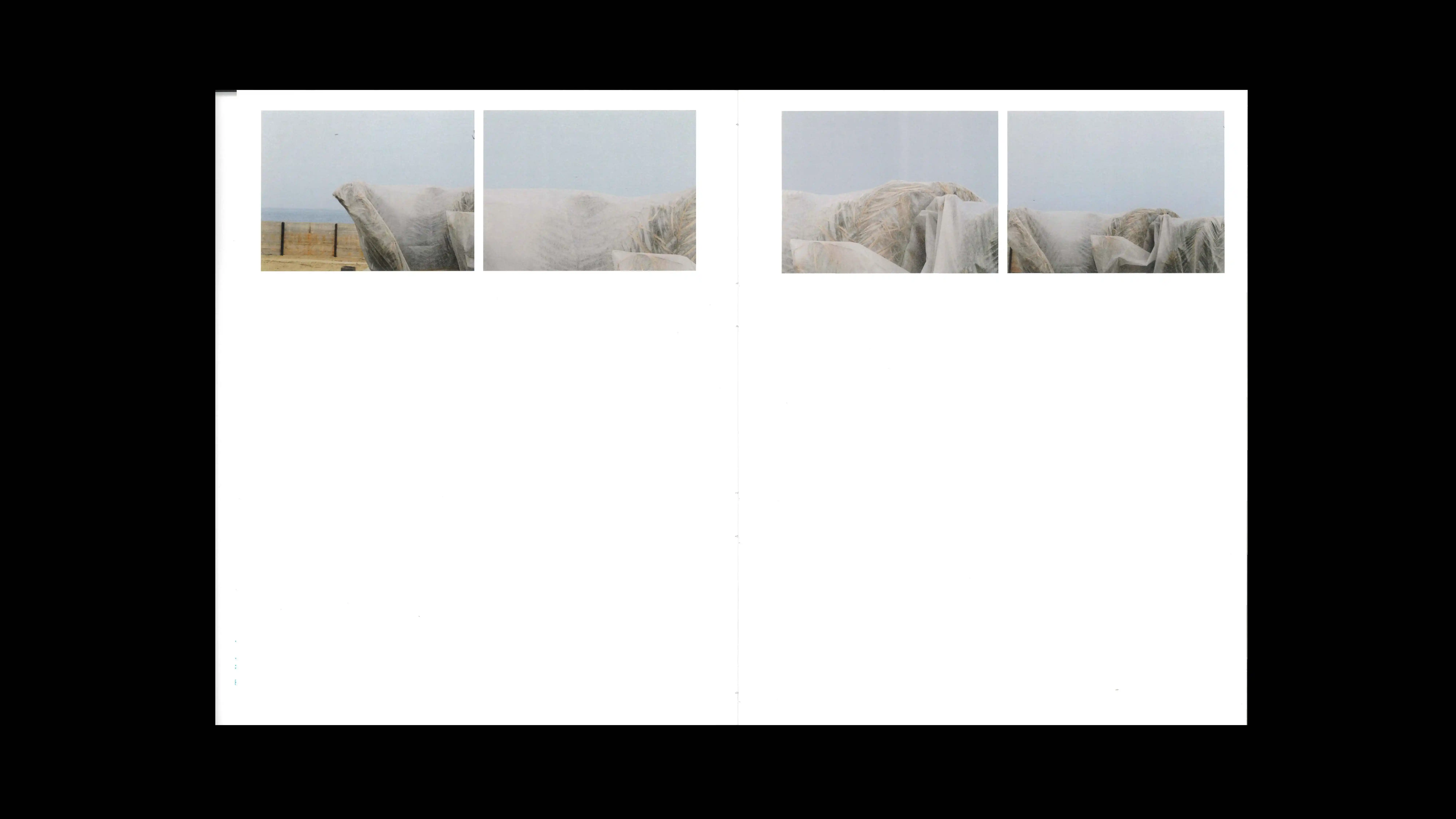
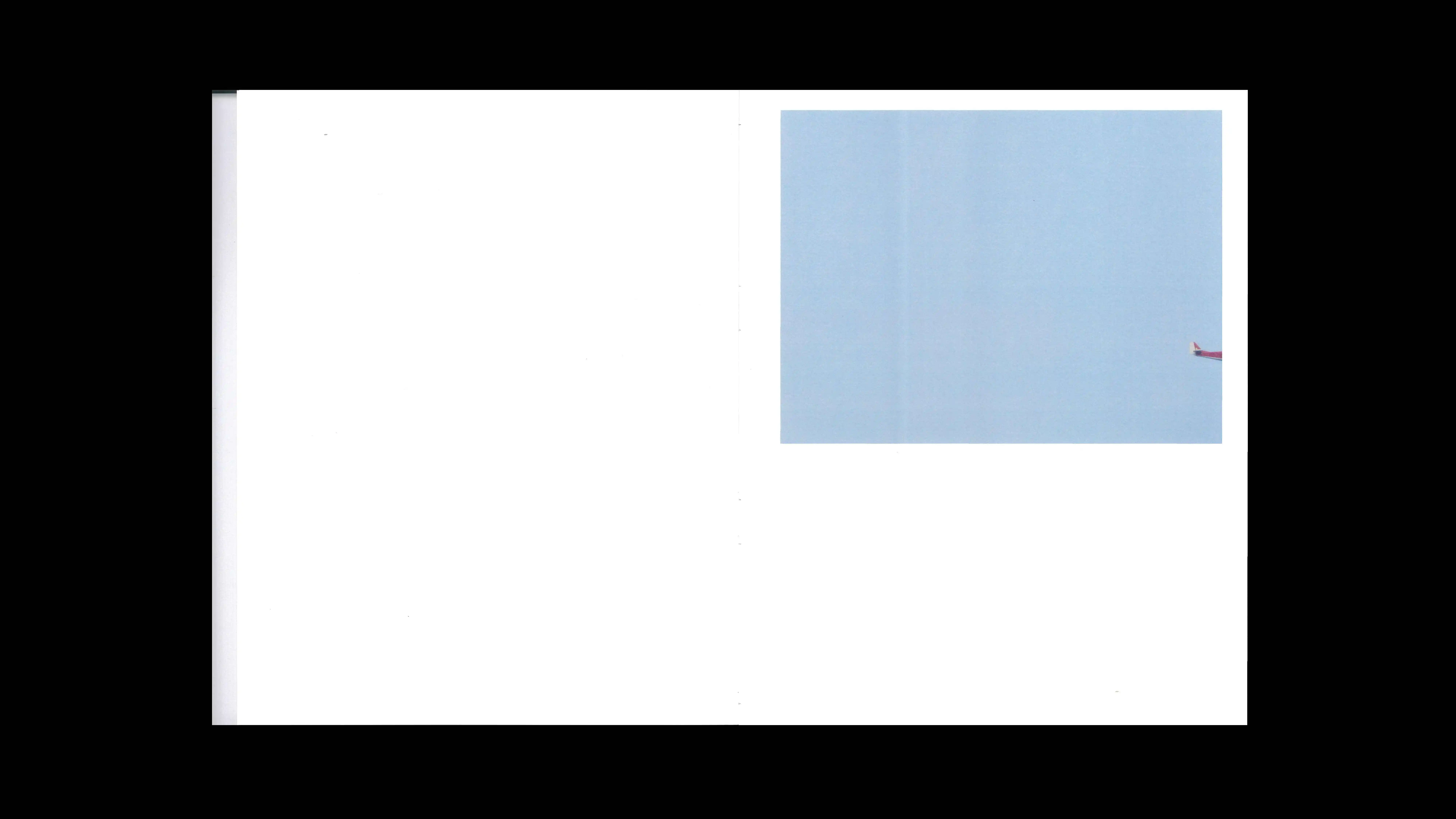
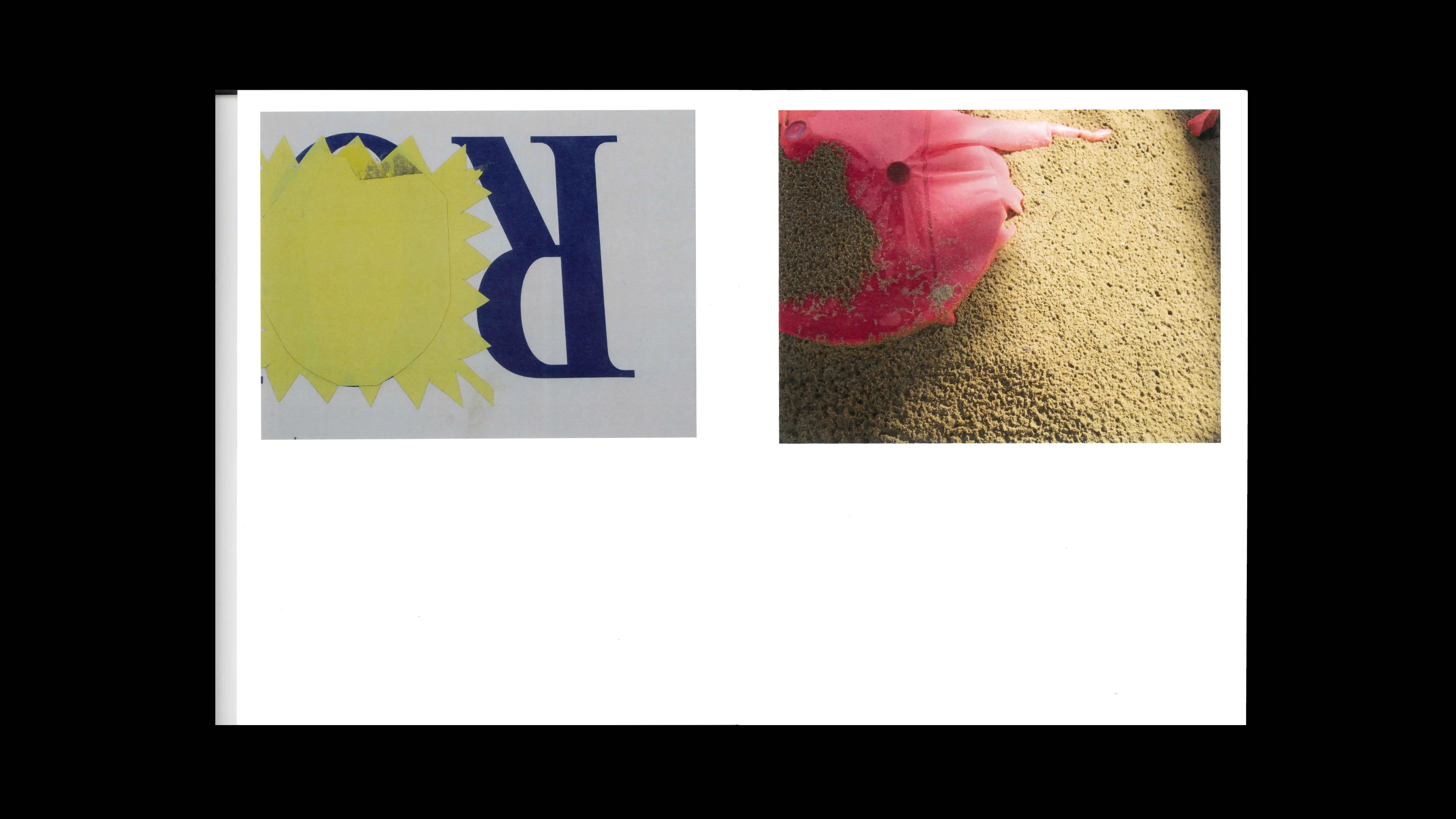
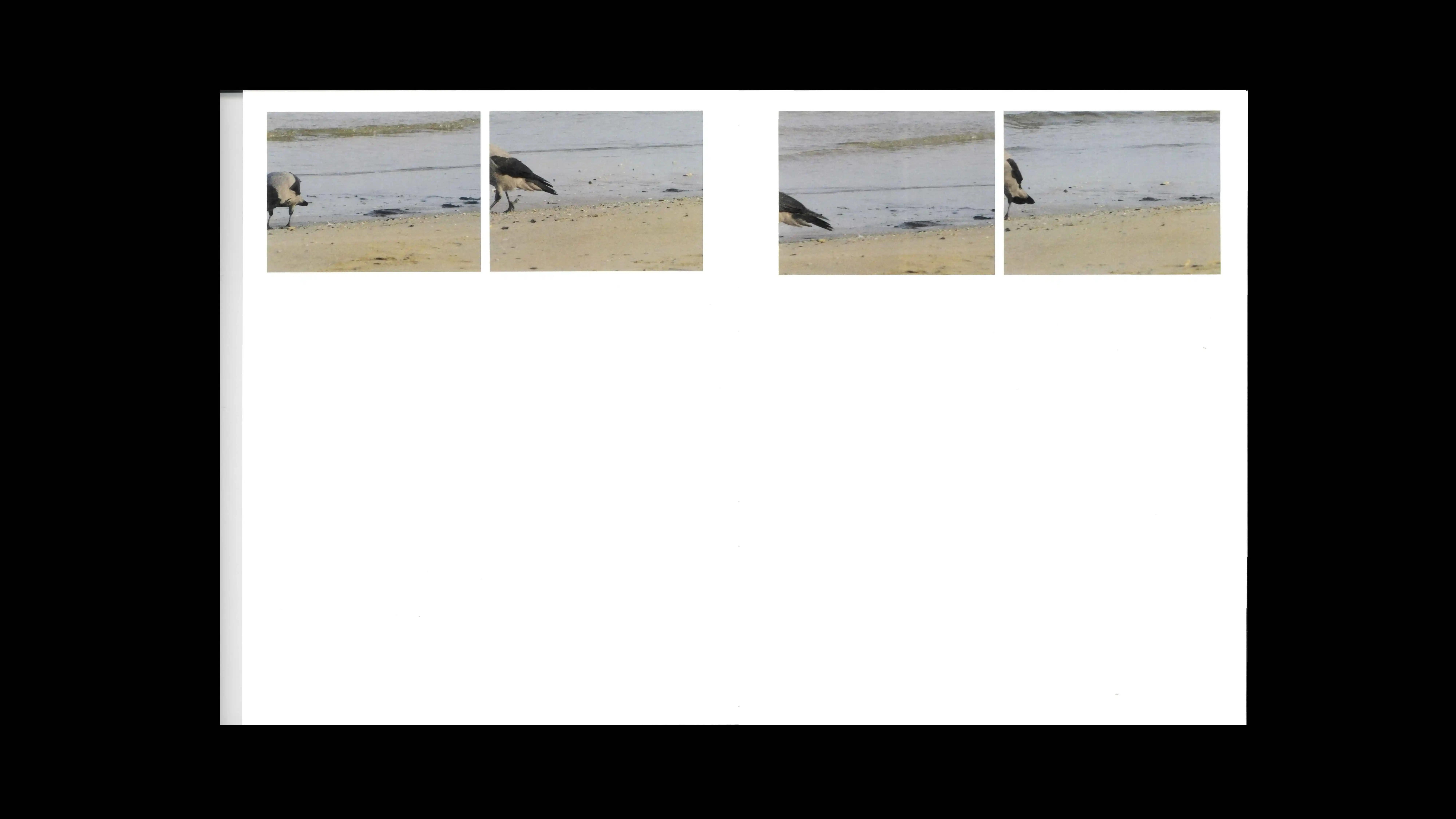
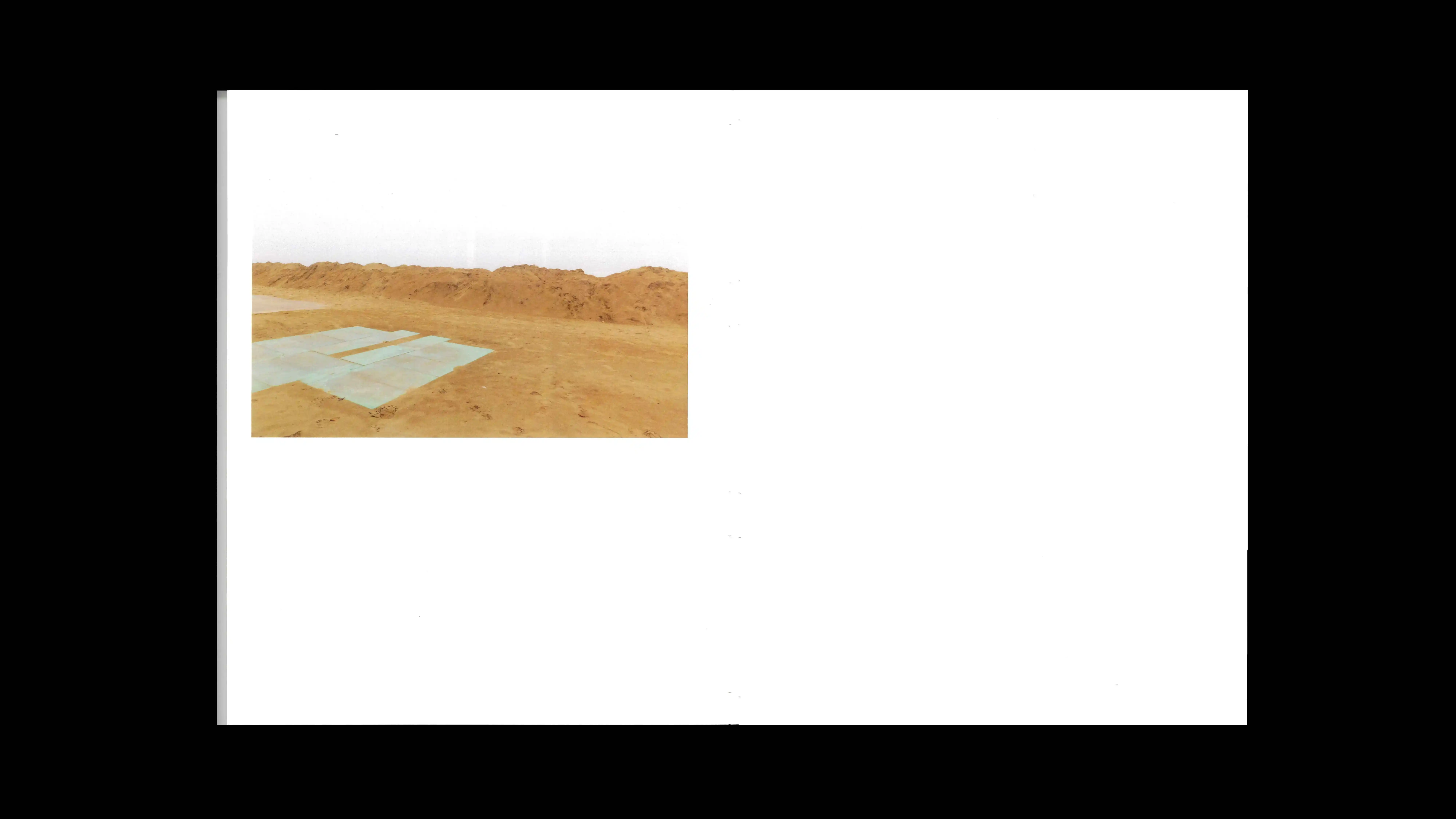
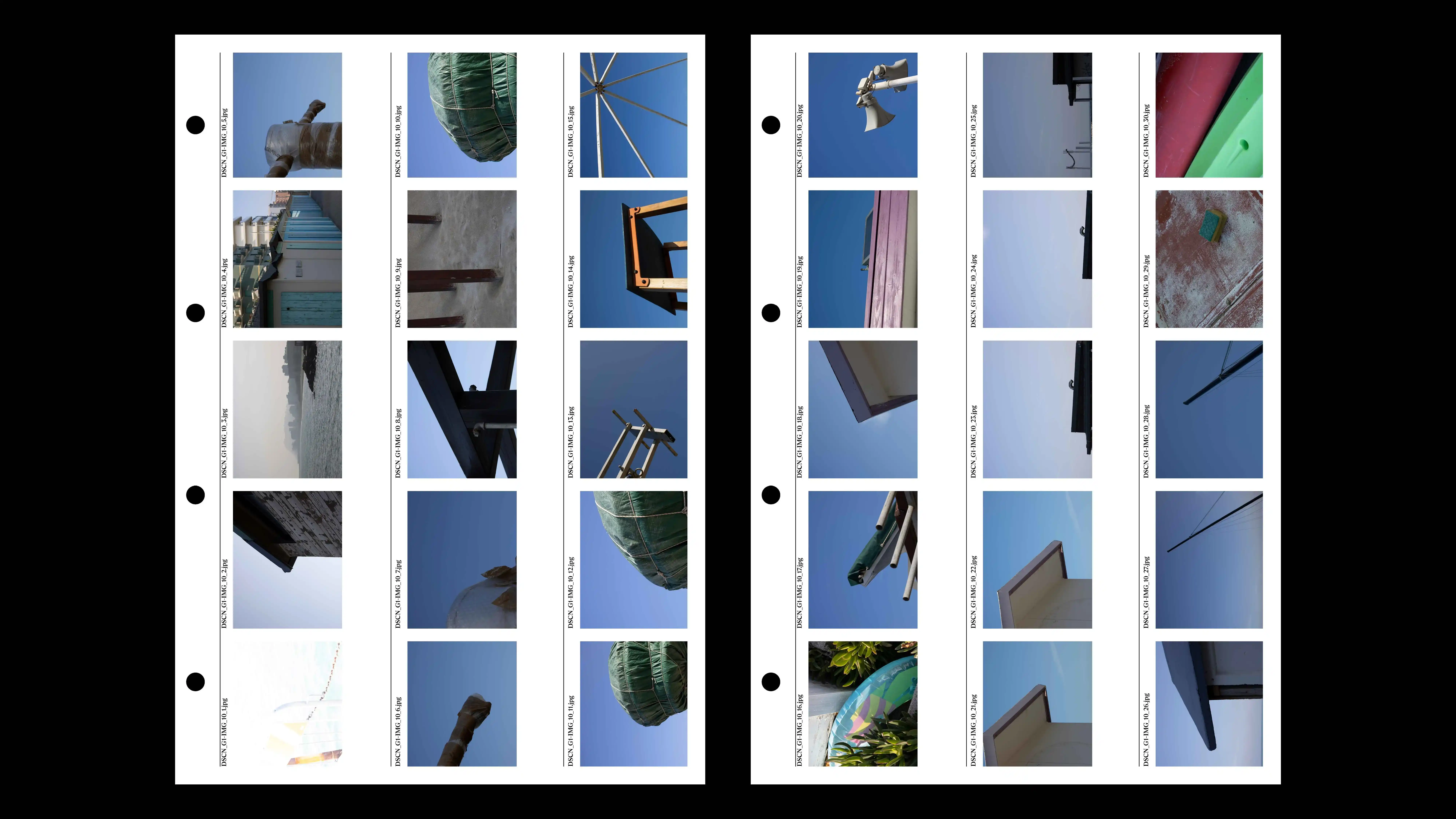
PROJECT Photo and Book Design CONTEXT ISIA_U DESCRIPTION Traditionally associated with the summer stereotype of warmth and crowds, the winter beach reveals, by contrast, a complex condition of waiting and standstill, transforming frenzy into an almost absolute absence. This project arises as a rigorous analysis and deconstruction of these seaside archetypes: cabins, signs, and structures are transformed into silent "superstructures," undergoing a temporary museumification that interrupts their conventional narrative. Through a conceptual gesture of "amputating" the subject via the frame's edges, the detail is decontextualized to bring forth pure form, paused geometry, and residual color. This exploration of structural authenticity finds its physical extension in an artist's book conceived as a Swiss-bound brochure with a screen-printed cover. The choice of exposed binding and the cover's independence from the book block visually reflect the stripping bare of the coastline’s architectural structure, now void of its seasonal function. The images, isolated from a continuous visual flow within a layout composed of the totality of contact sheets, invite the observer into a deeper, more conscious connection with the object. By subtracting noise and crowds, the winter shoreline bestows a new meaning upon that which, in its suspension, appears as much estranged as it is intrinsically familiar.
1 (OF) 12
24
MACHINE VS HUMANS
2026
PROJECT Art Direction, Book Design and Machine Development CONTEXT ISIA_U DESCRIPTION Machine VS Human stems from a challenge that is both technical and philosophical: how can an artificial intelligence watch, interpret, and narrate a video without simply imitating the human eye? The project translates this question into a unique editorial product, born from the analysis of the Grey Area exhibition. We chose to entrust the "direction" of the book to a machine, imposing only one human constraint: the number twelve. The volume unfolds through twelve chapters dedicated to twelve videos, each of which was decomposed by the AI into twelve sequences of twelve seconds each. This is not a random chronological division, but a precise selection based on what the machine deems "interesting." Through a scoring system, the AI scanned every moment to identify the most significant scenes, evaluating them based on their abstract visual structure, sound wave dynamics, or color synthesis. This binary and analytical logic comes to life in a Swiss brochure with a signature sewn into the flap, a design choice that allows for a constant comparison between two different reading speeds. On one hand, the main body of the book offers a "slow flow," where each chapter celebrates the winning scene by graphically displaying the criterion that achieved the highest score; on the other hand, the index (regesto) bound into the flap serves as a "fast flow"—a technical booklet that gathers the entire memory of analyzed data, allowing the reader to instantly consult the global archive while browsing the individual visual representations. Opening the volume, an introduction guides us through the symbolism of the number twelve and the "thought process" of the machine, explaining how it observes and reacts to images, transforming code into a physical dialogue between artificial vision and editorial sensitivity.
1 (OF) 12
23
KATALOG
2026
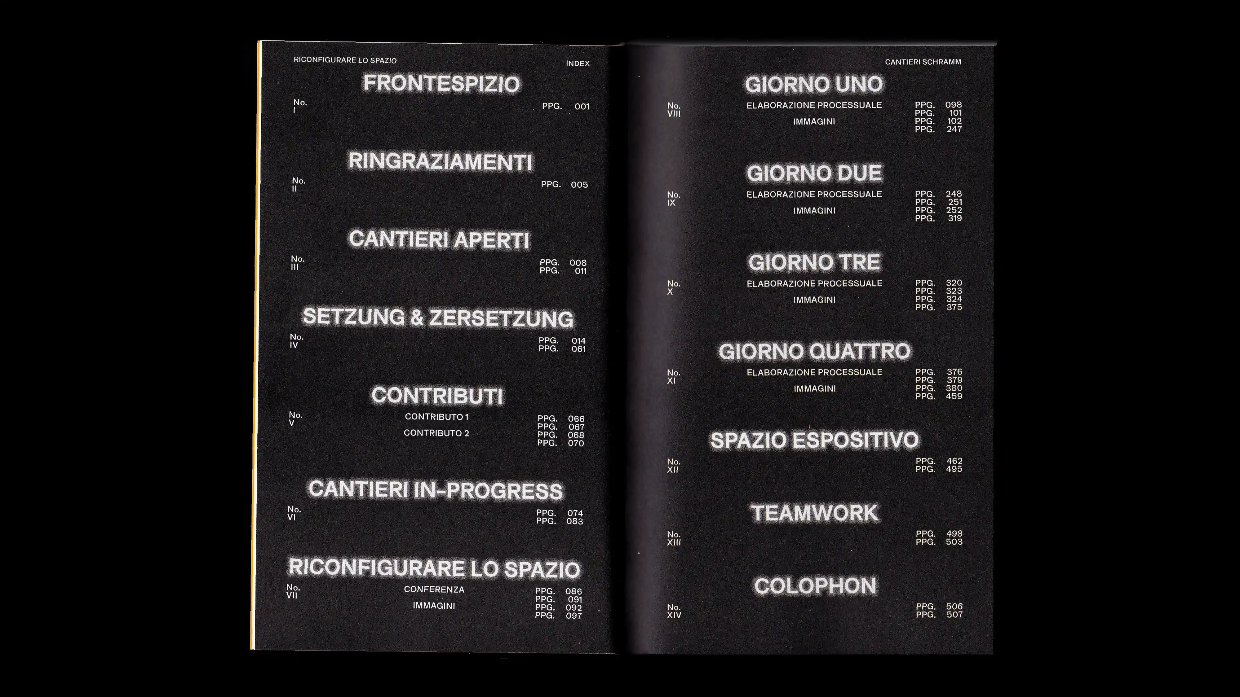
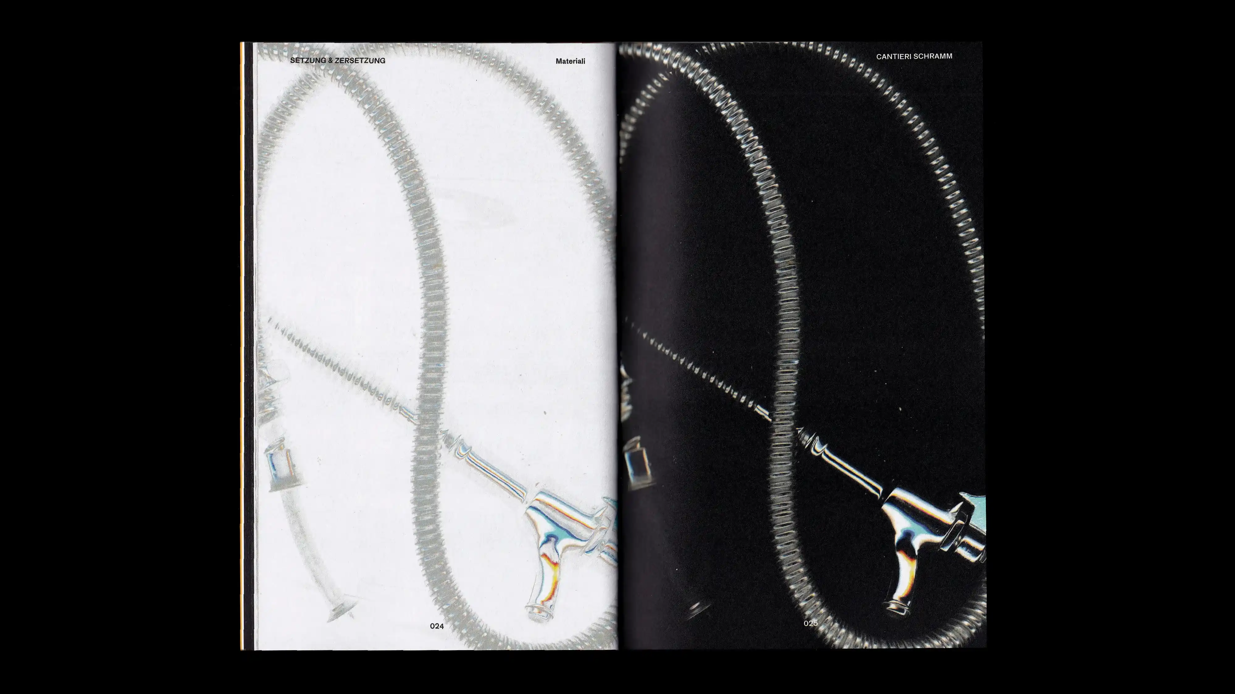
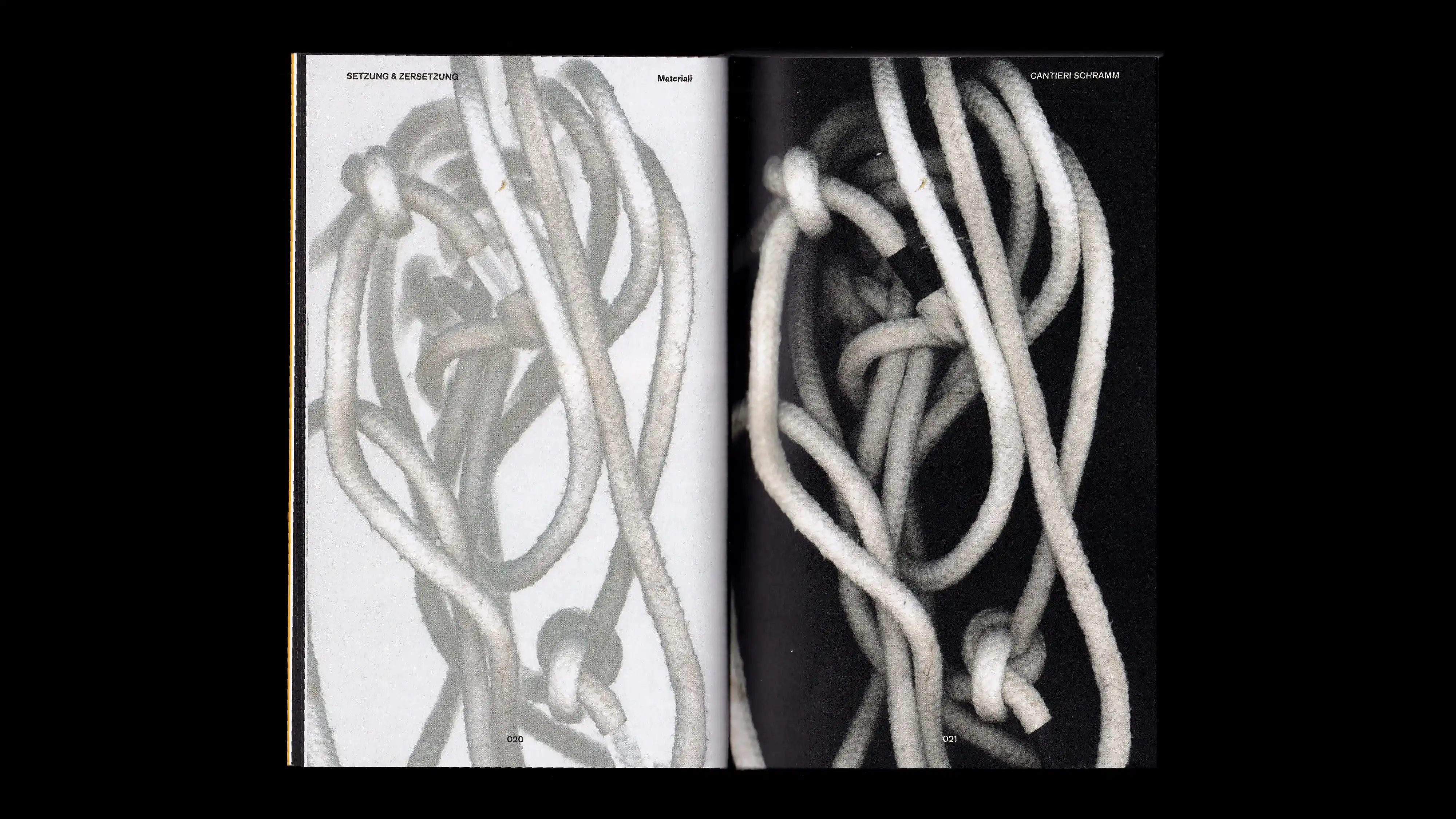
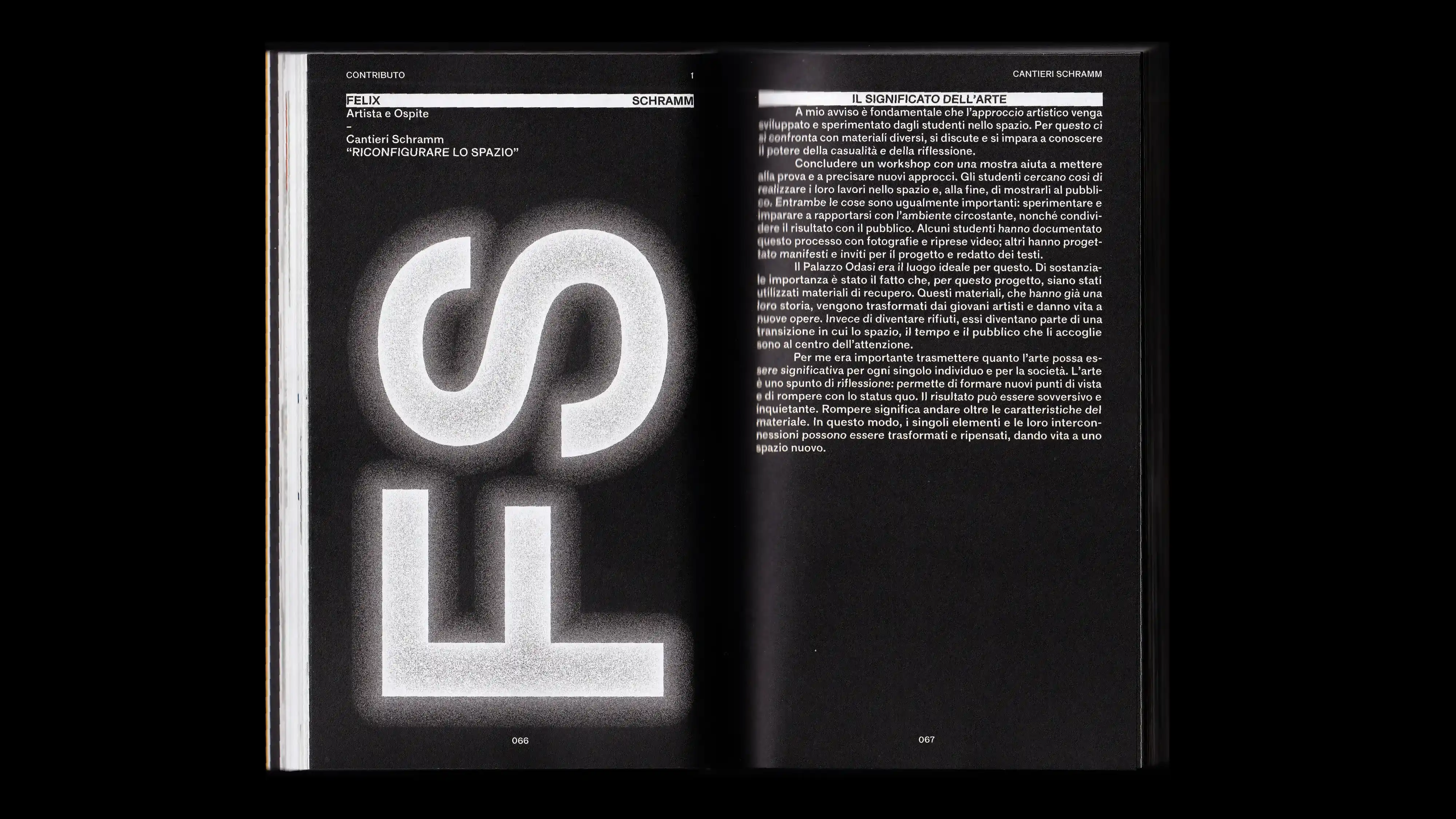
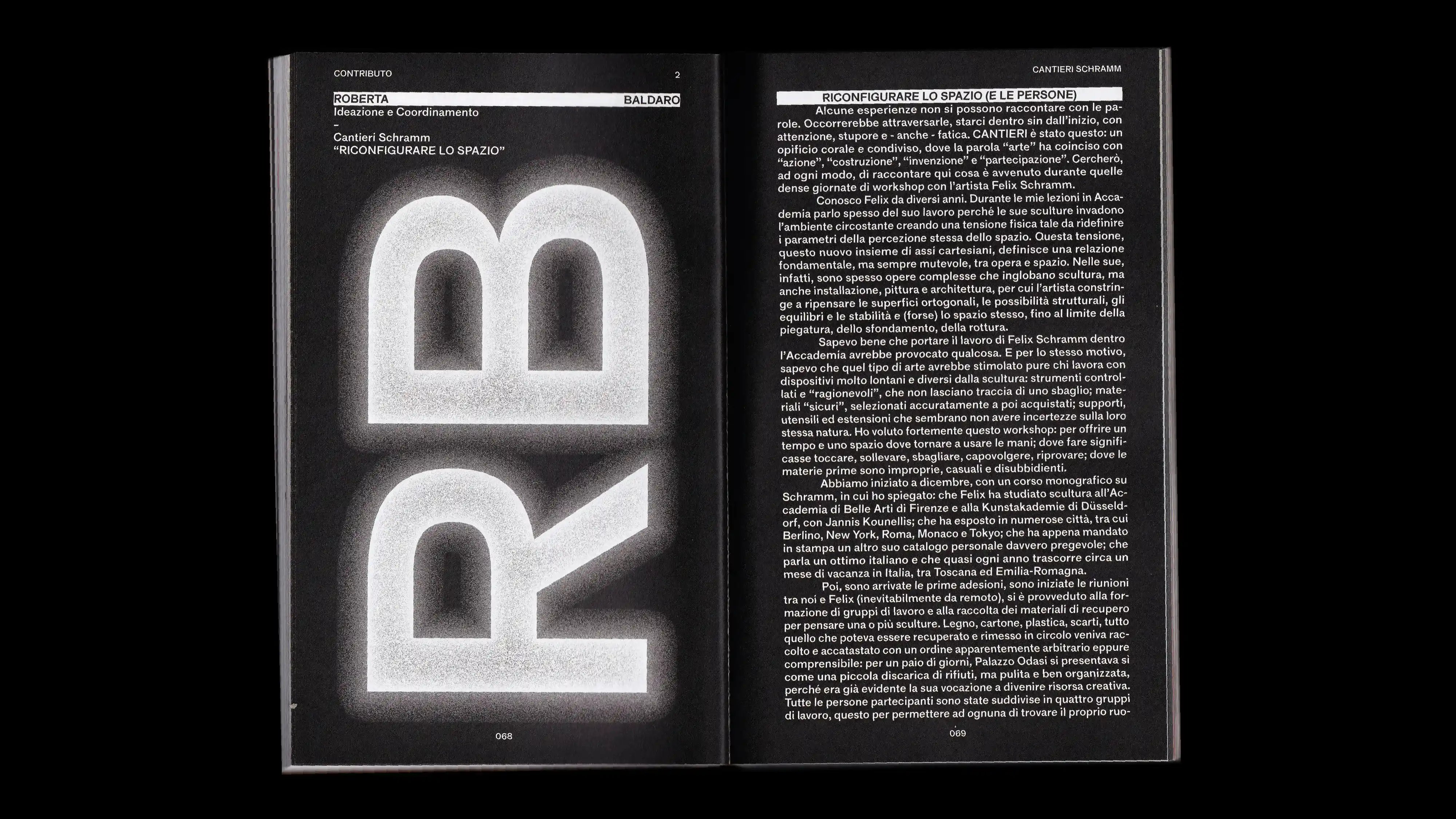
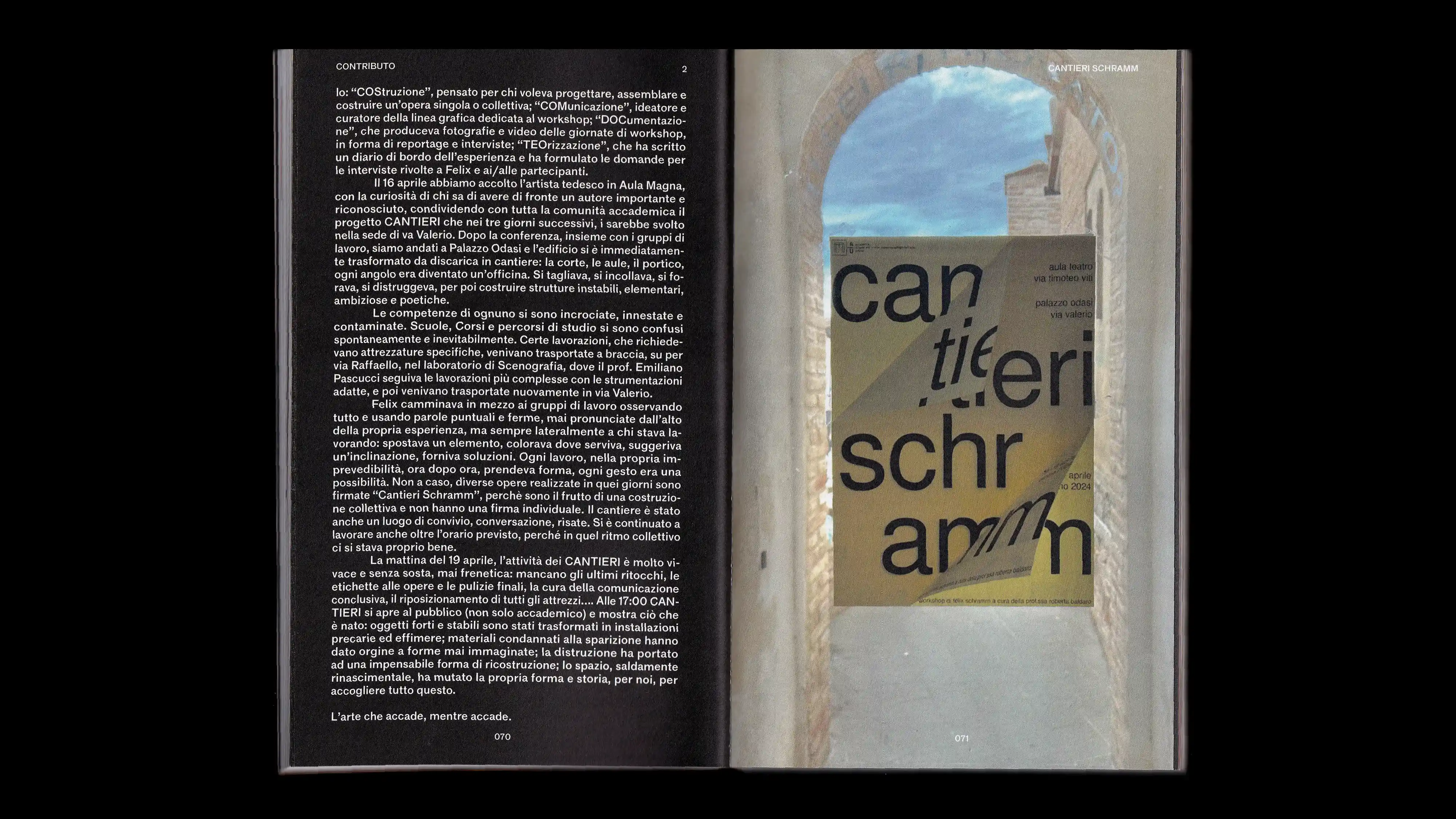
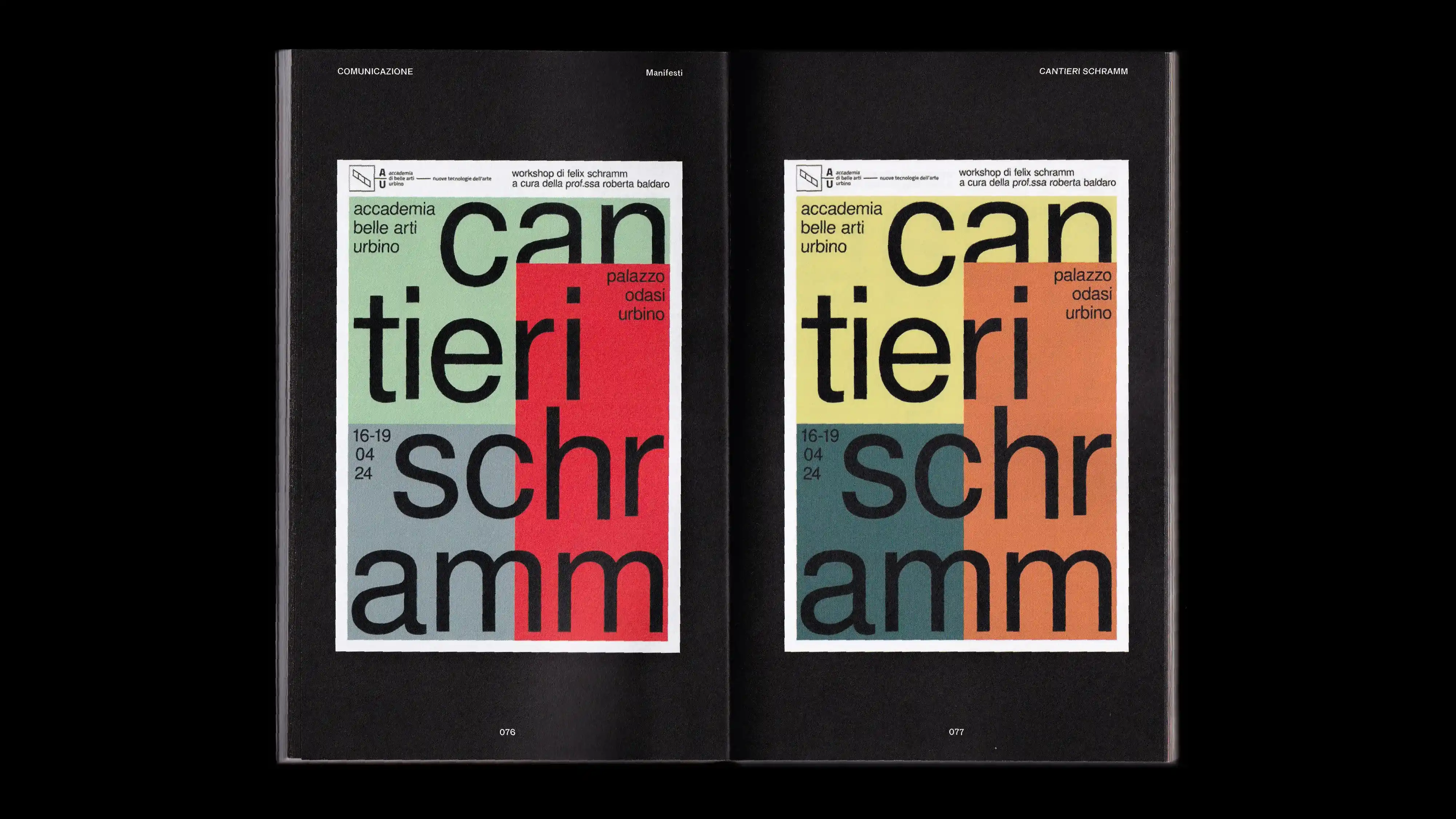
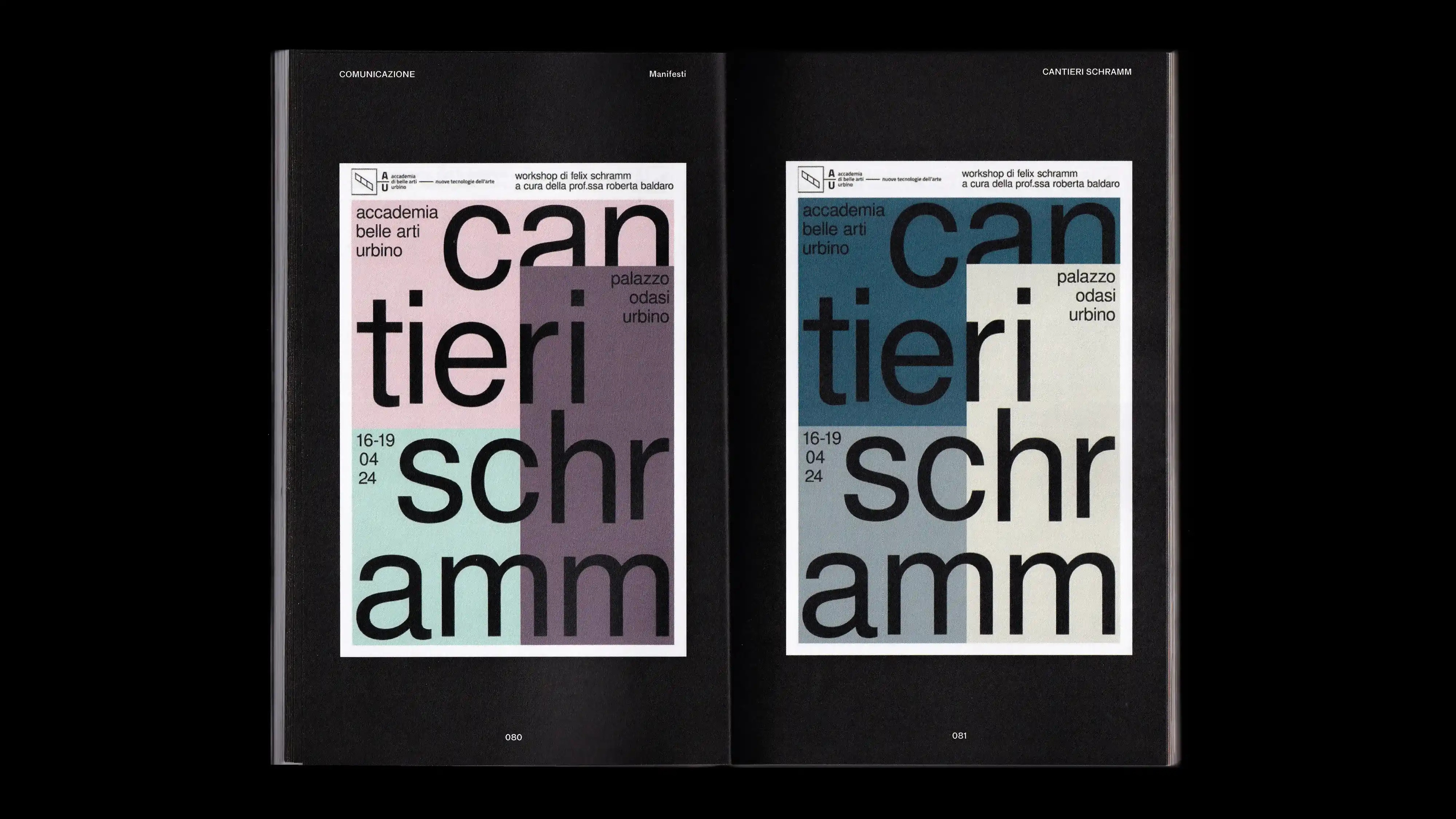
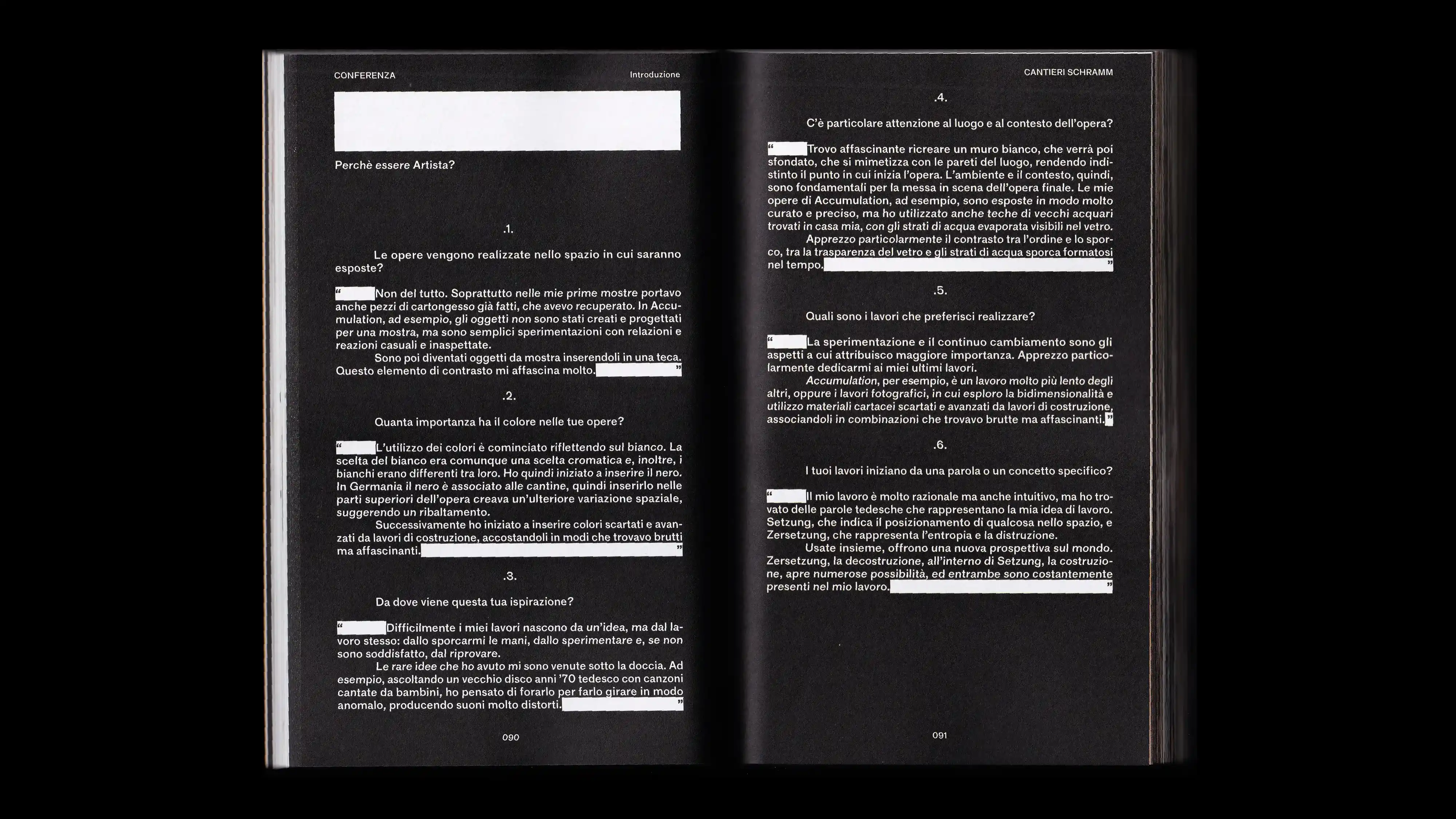
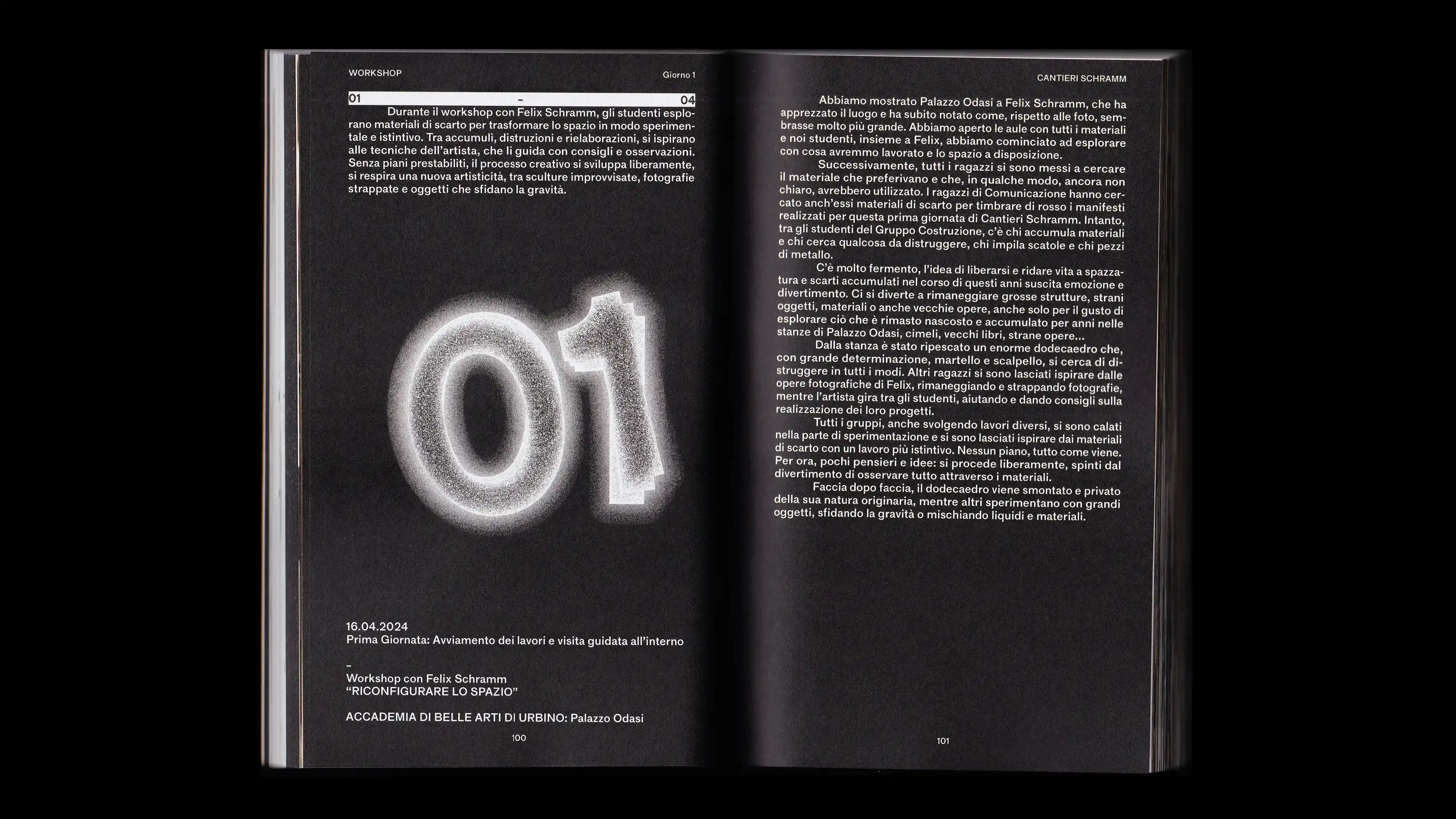
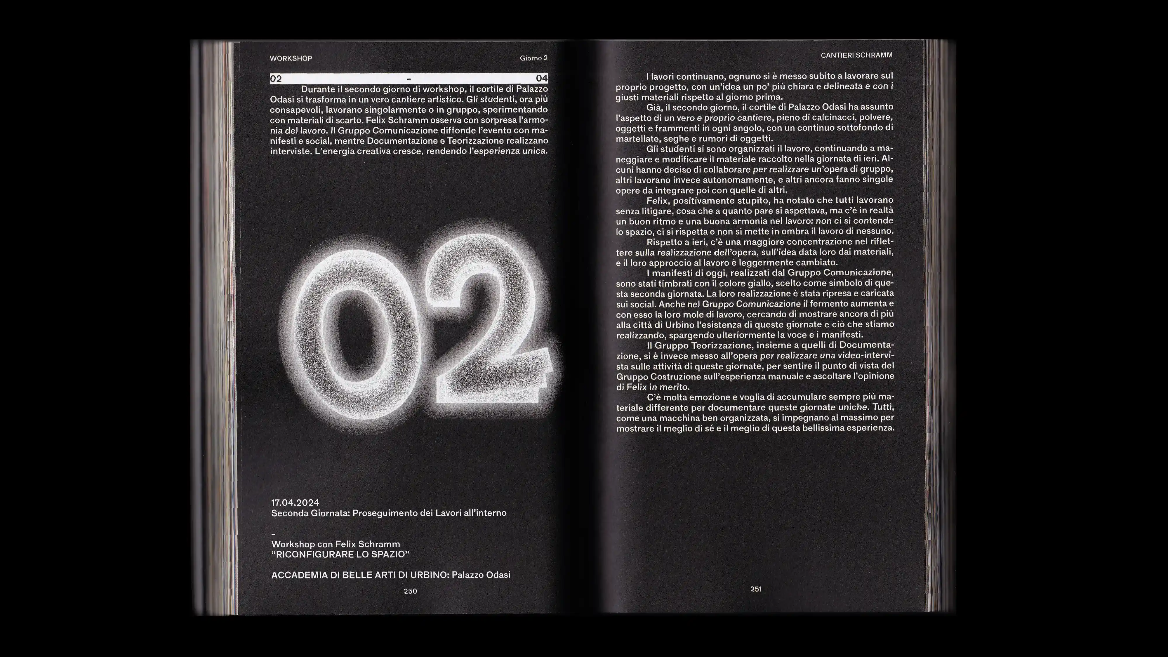
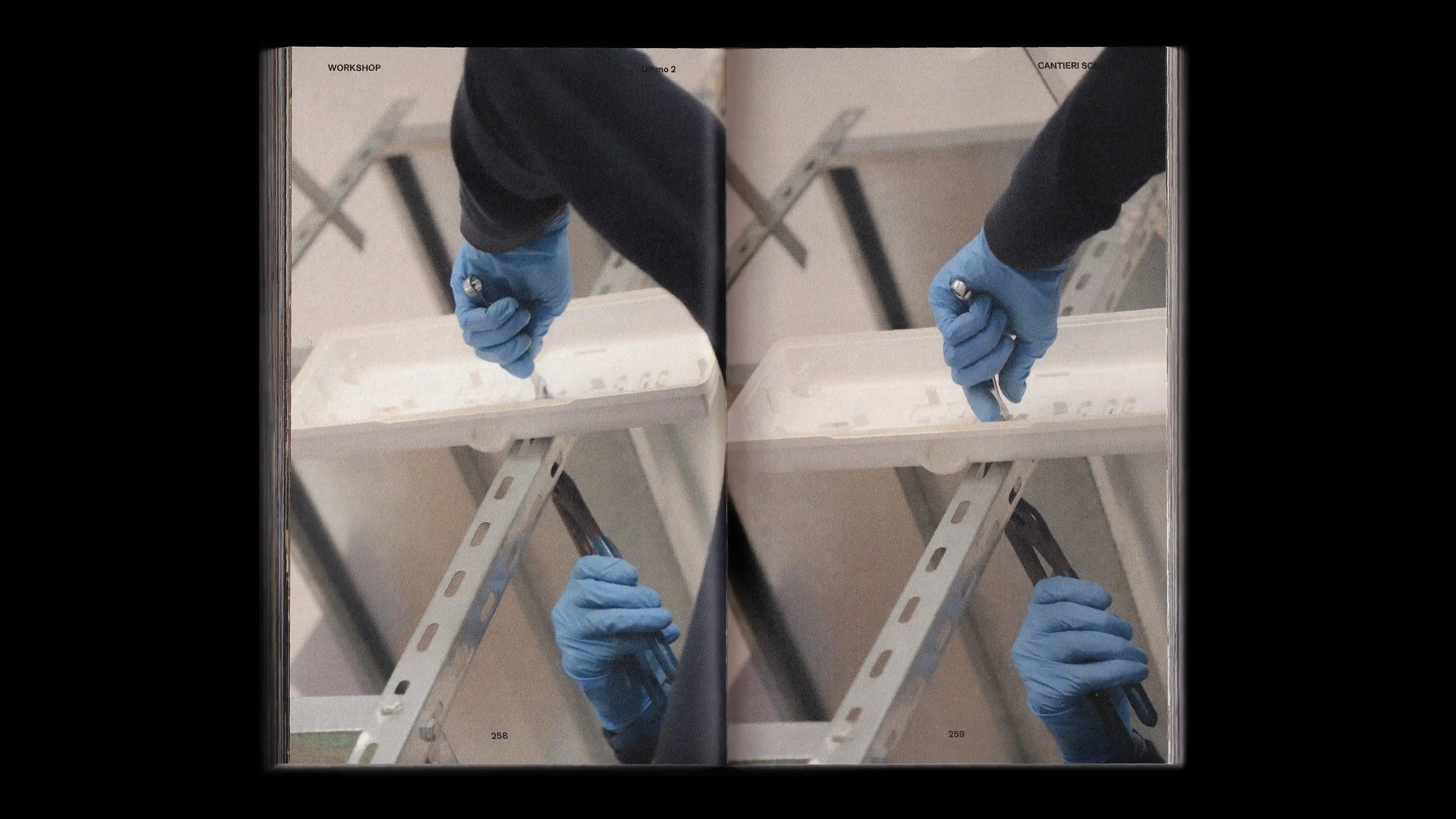
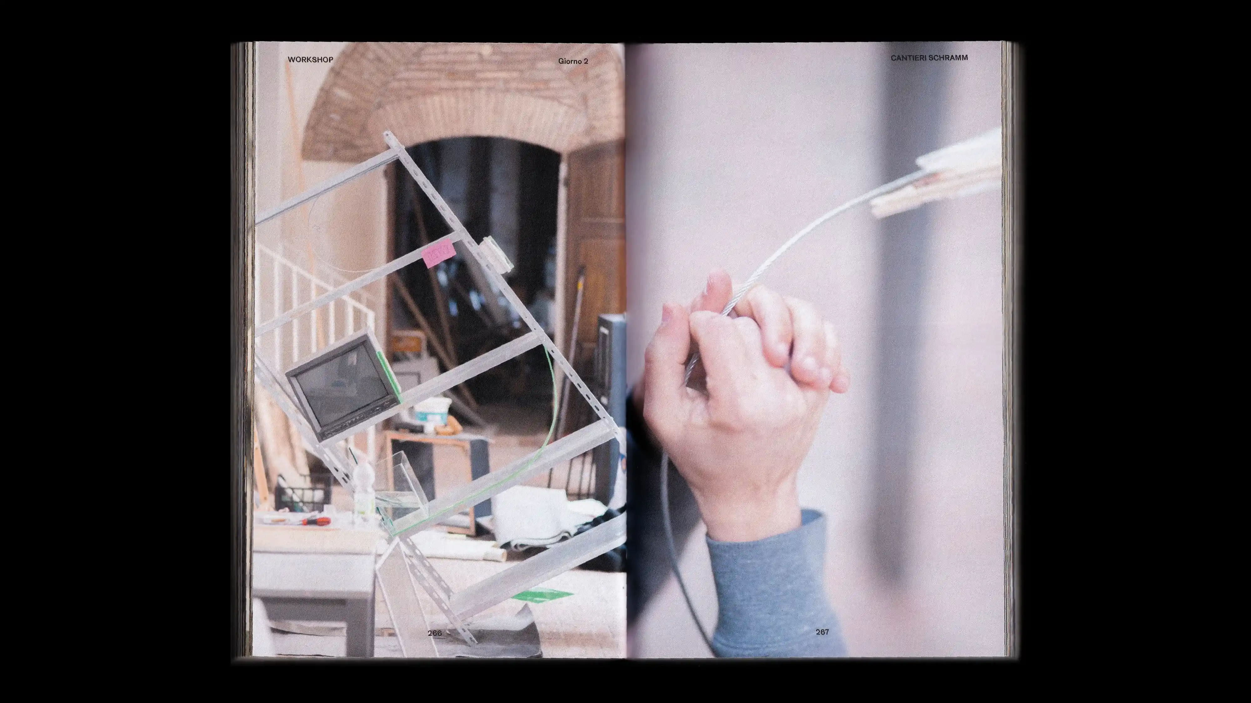
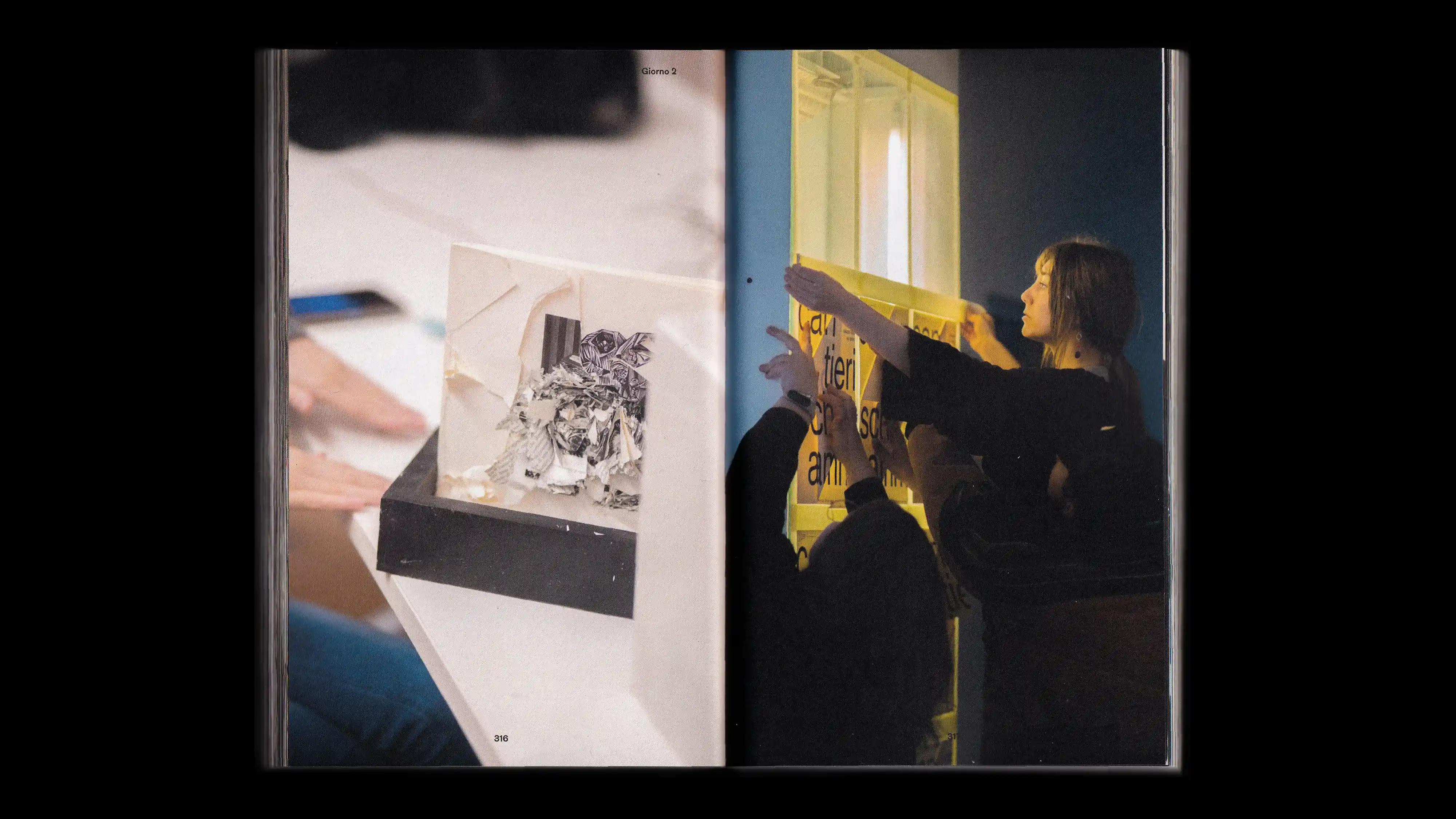
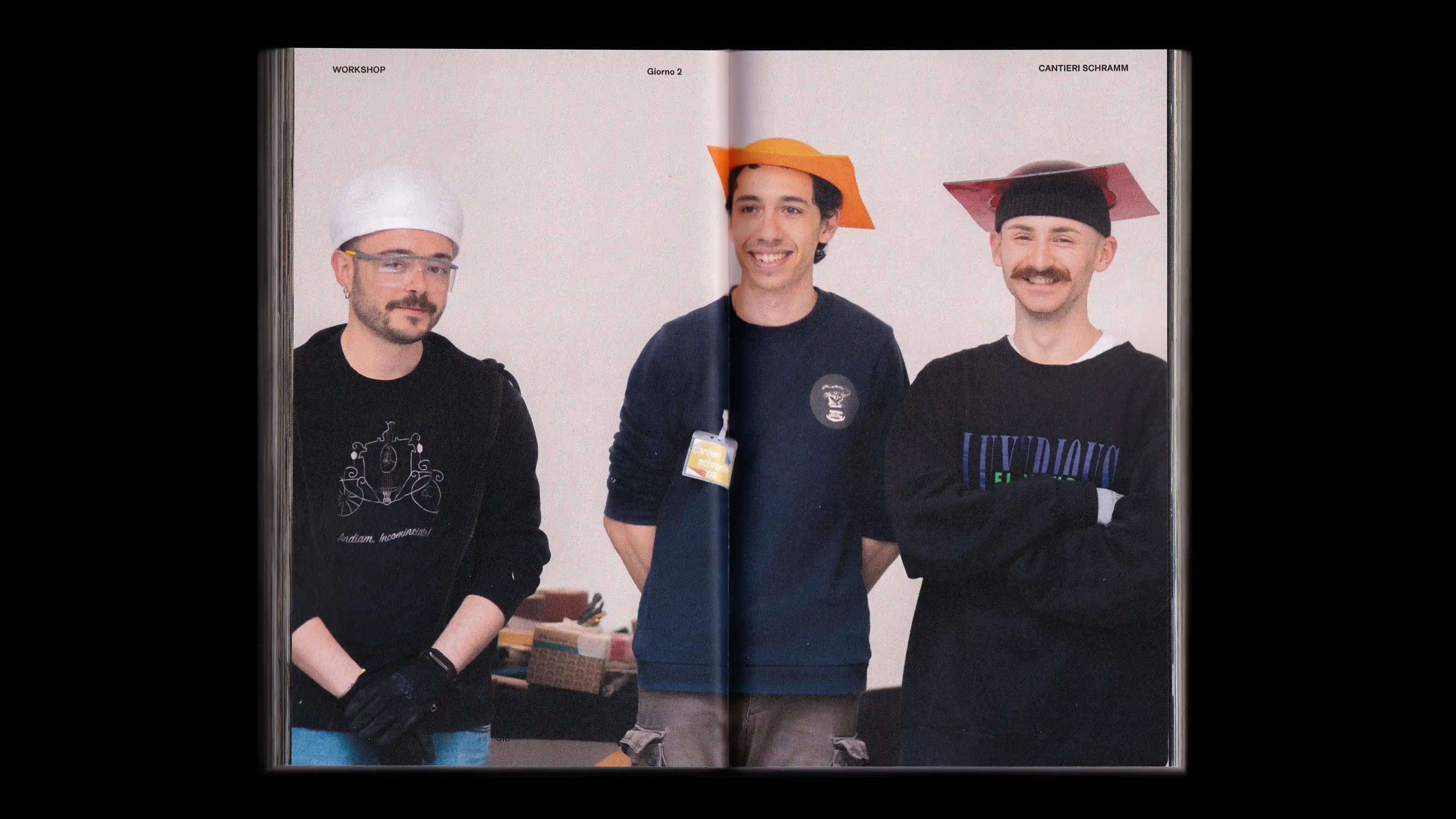
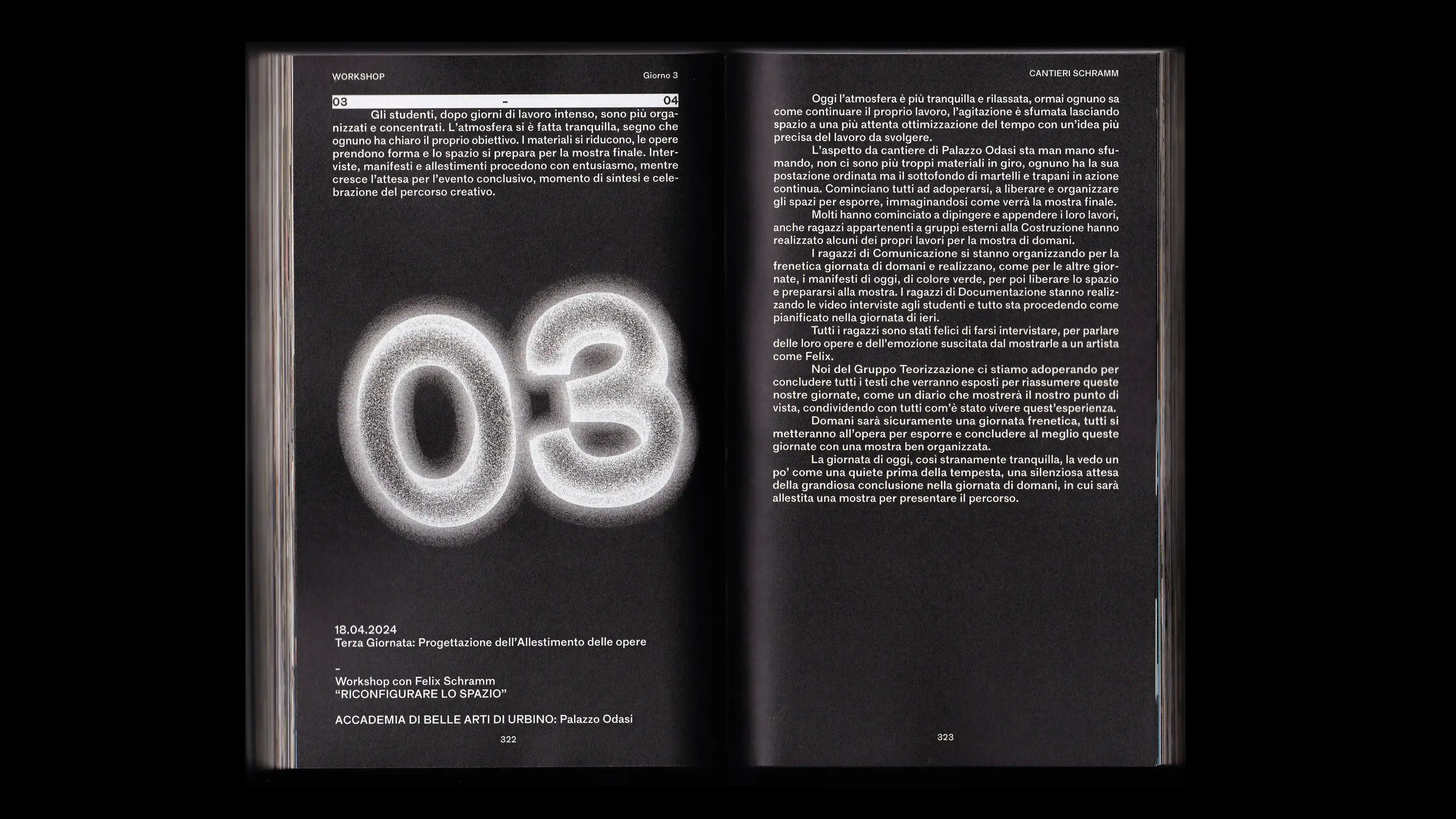
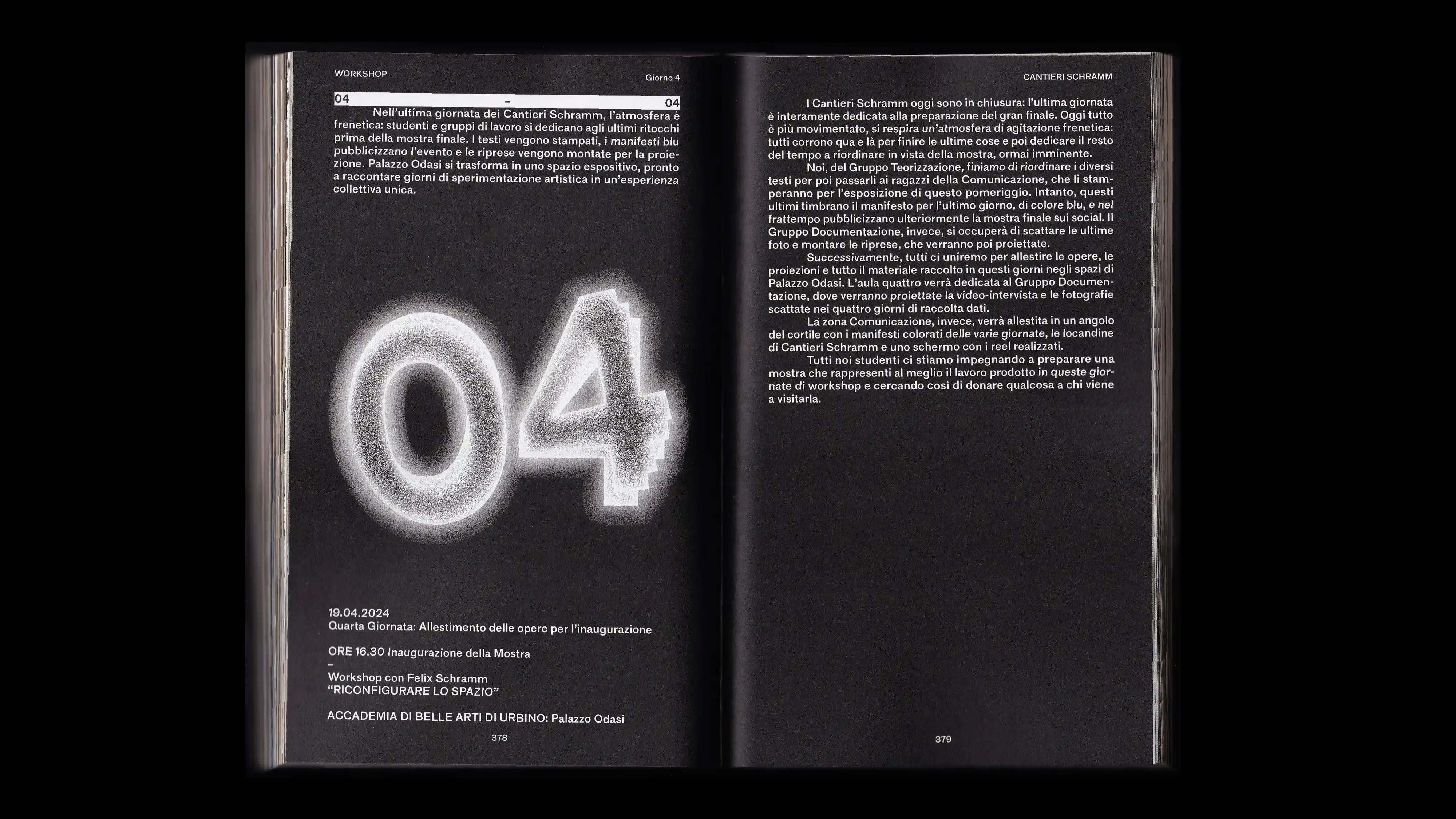
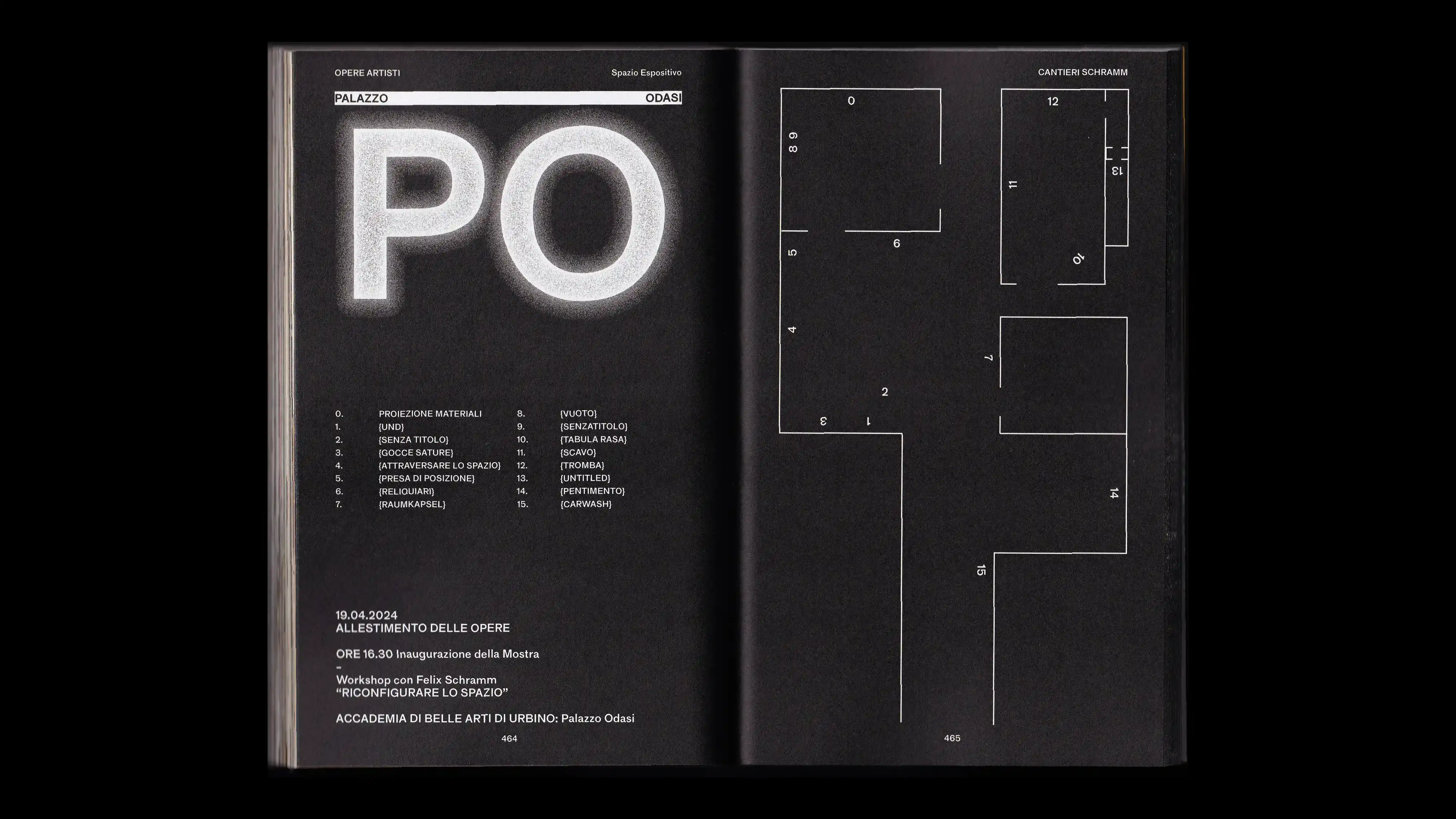
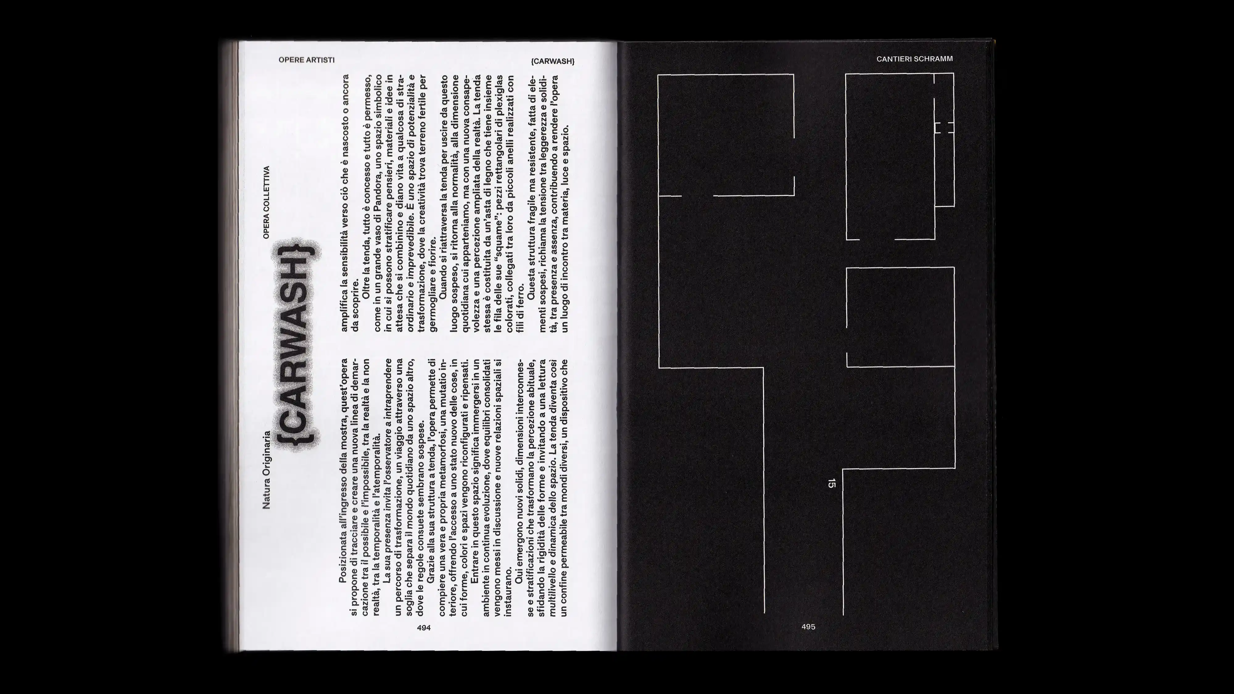
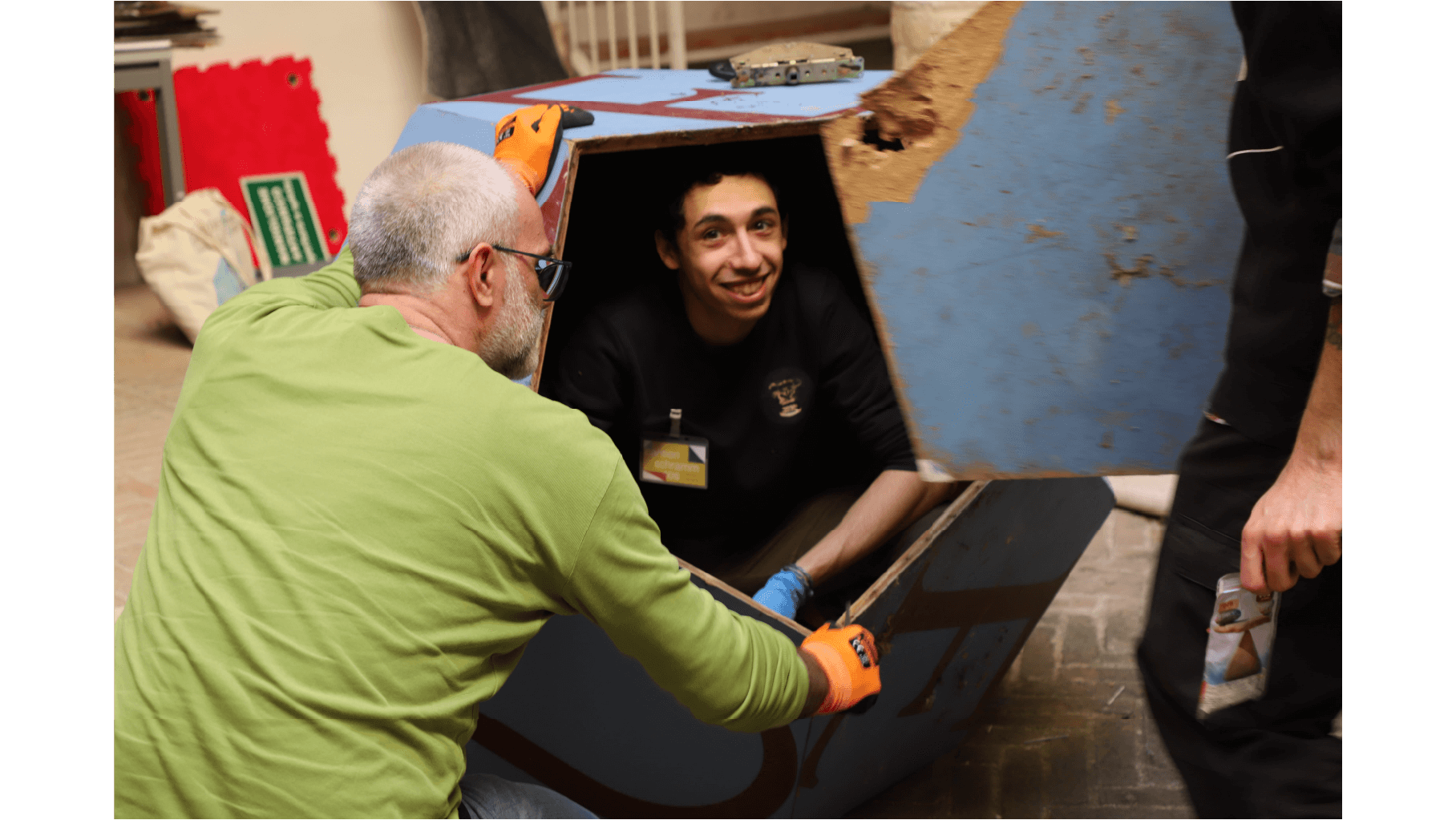
PROJECT Art Direction and Book Design CLIENT Felix Schramm CONTEXT ABA_U DESCRIPTION A catalog created as the result of the Cantieri Schramm workshop, directed by the internationally renowned German artist Felix Schramm. The volume was born from the need to narrate a collective experience that involved nearly 40 participants, including graphic designers, artists, and photographers. Through images, texts, and diagrams, the catalog weaves together works, impressions, and design processes, conveying the intensity of the daily work carried out during the workshop. The editorial project also includes a day-by-day diary that documents and narrates the entire journey, as well as two significant critical contributions, one of which is authored by Felix Schramm himself. Katalog thus becomes not only an experiential document, but also an artifact capable of translating the interaction between space, materials, and visual languages into editorial form.
1 (OF) 12
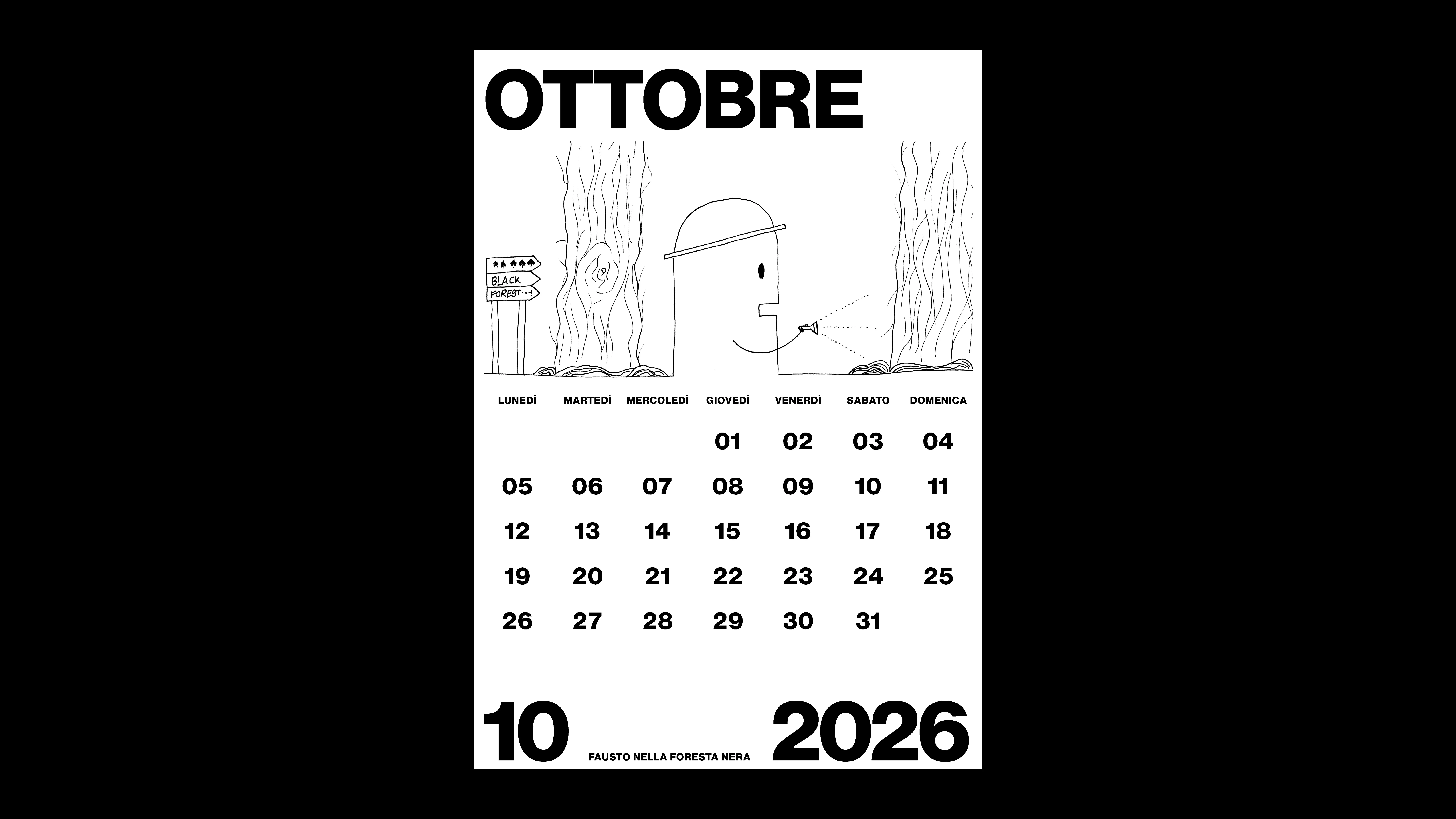
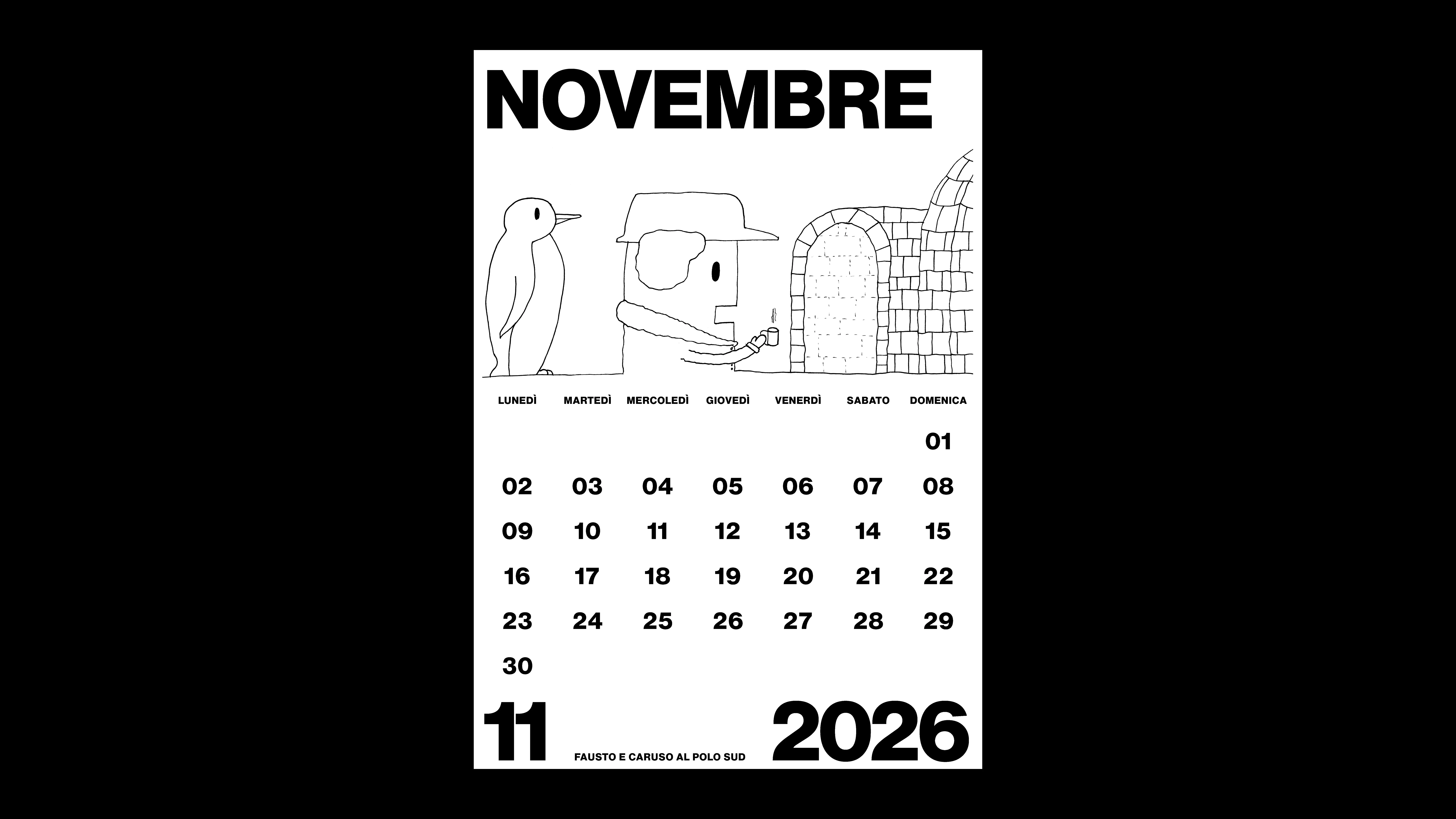
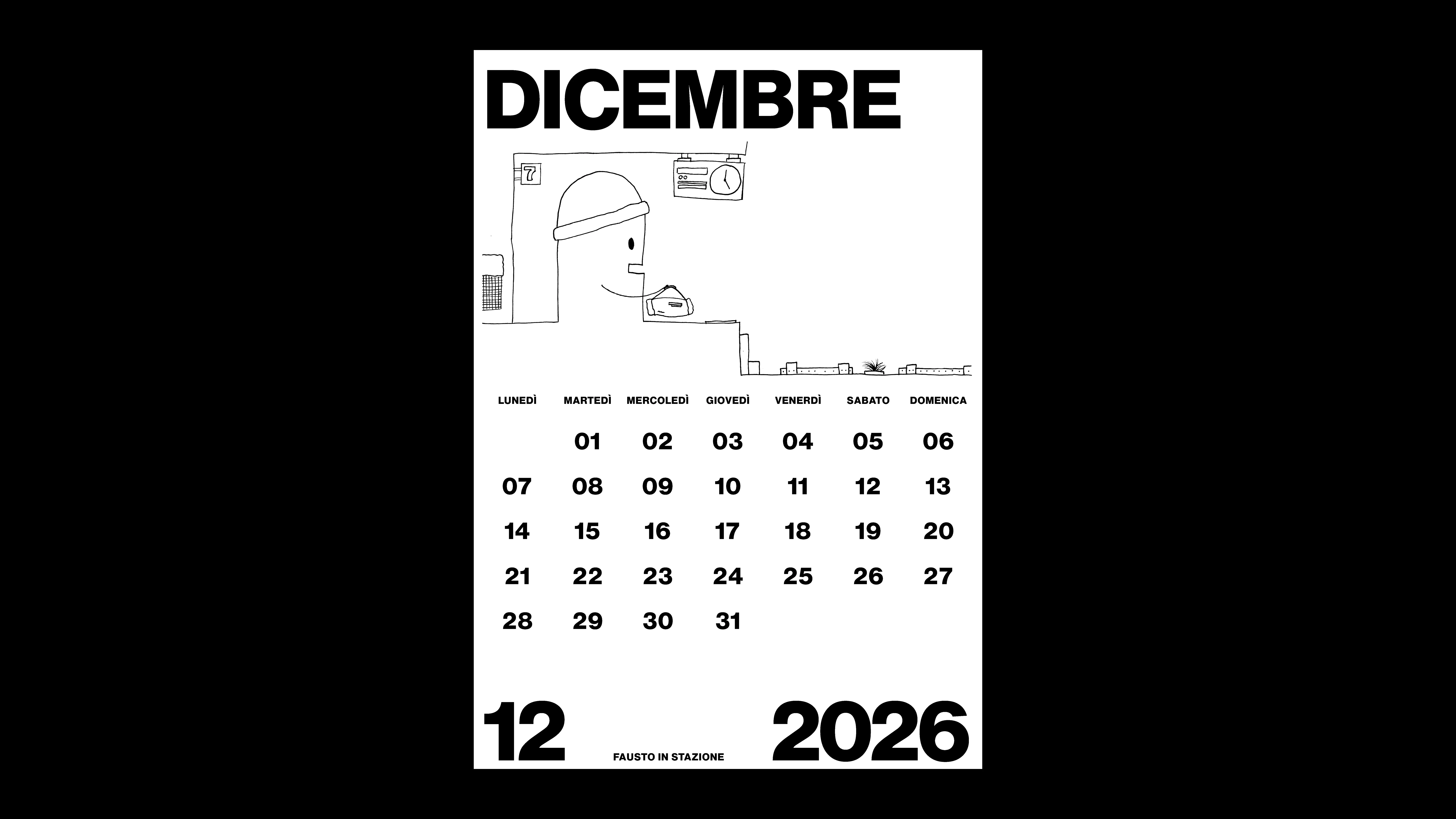
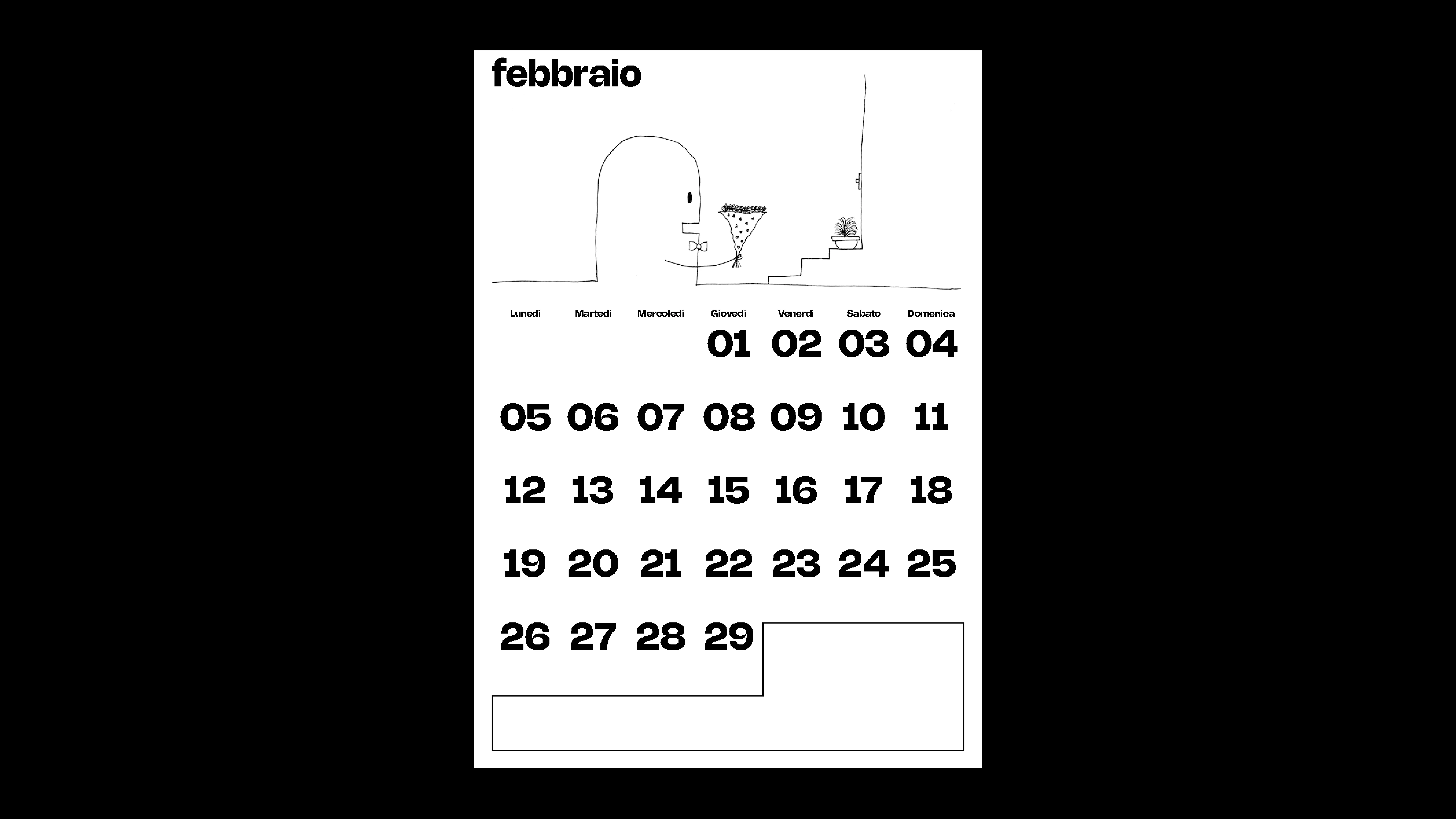
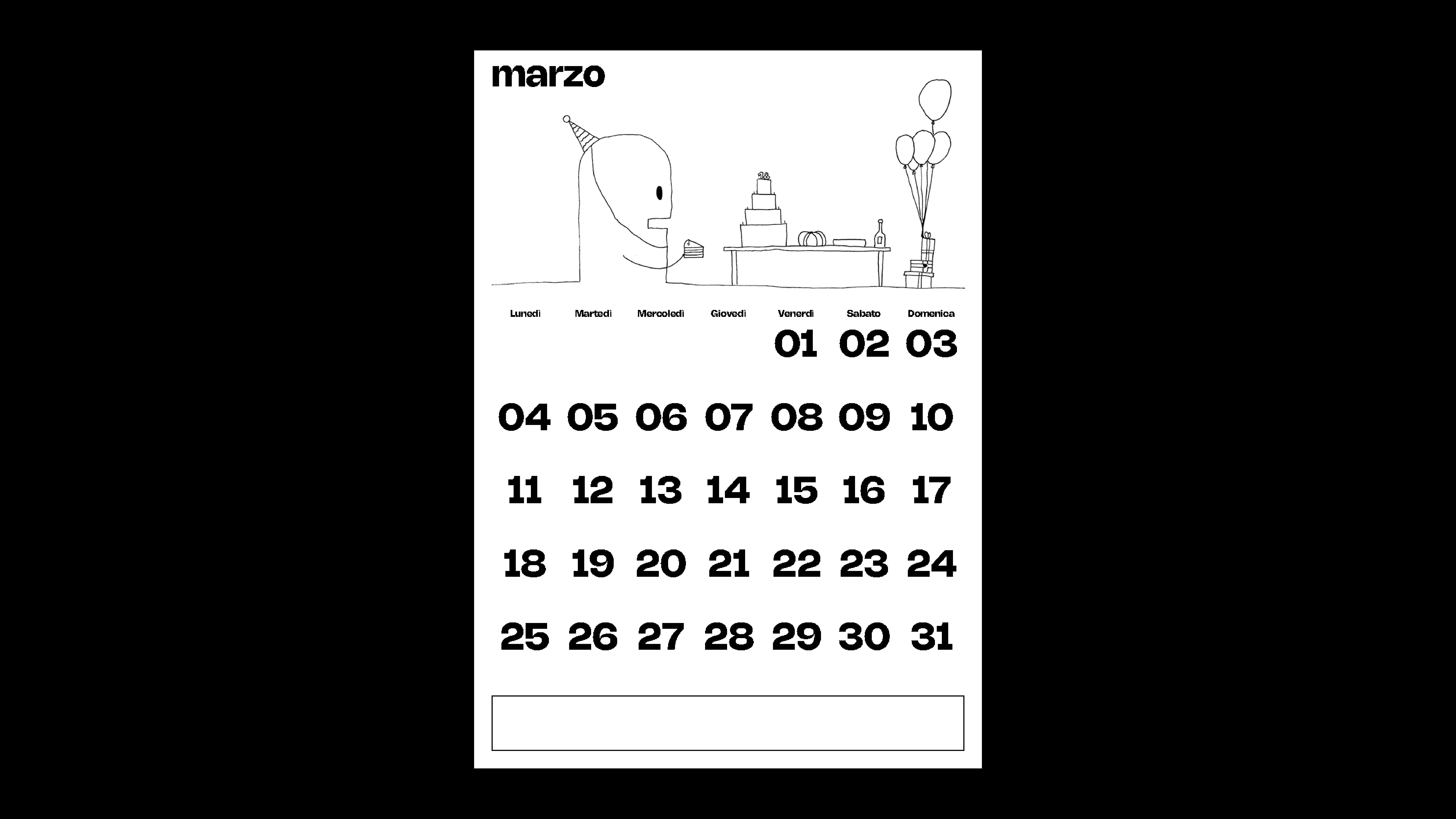
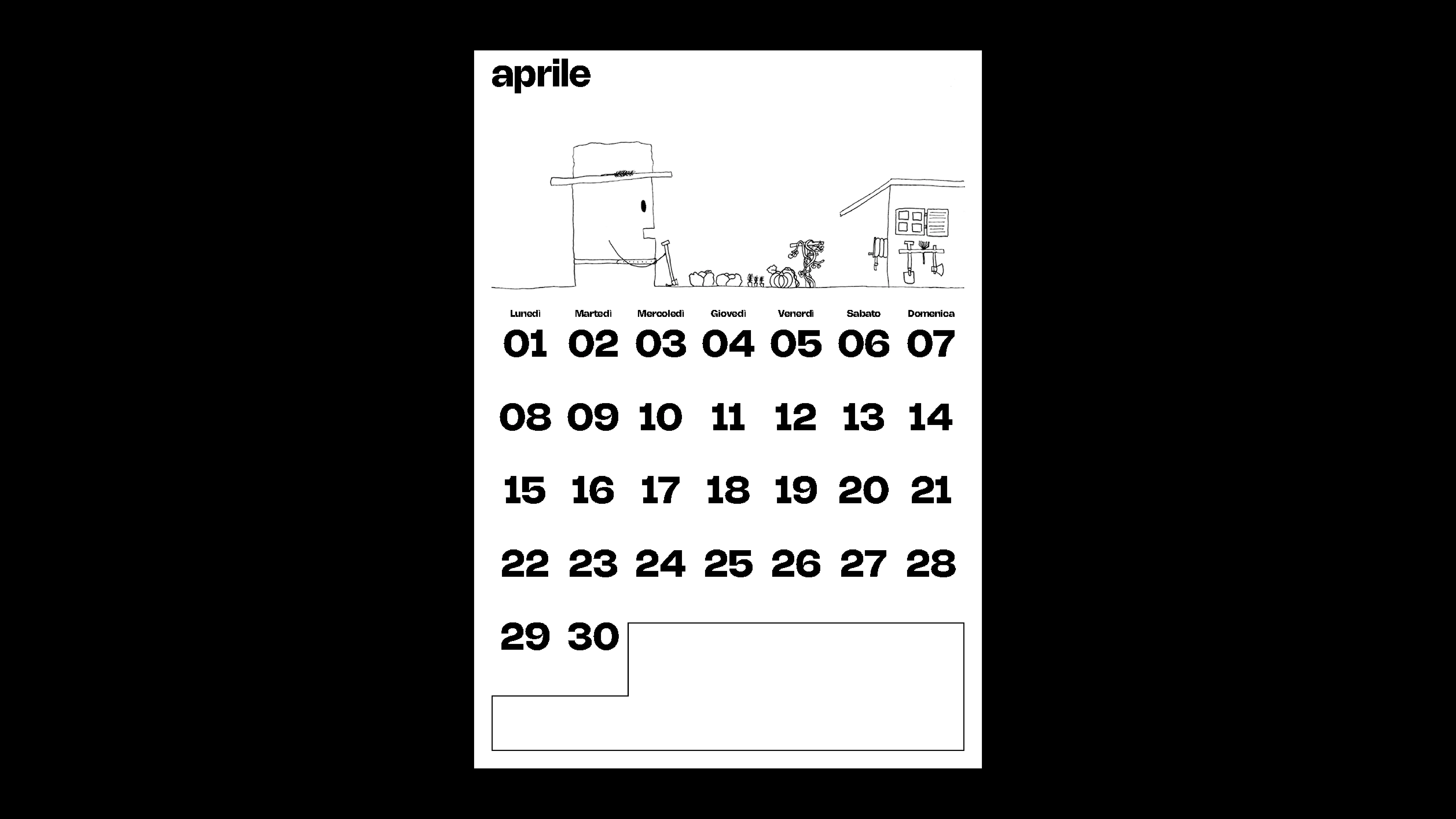
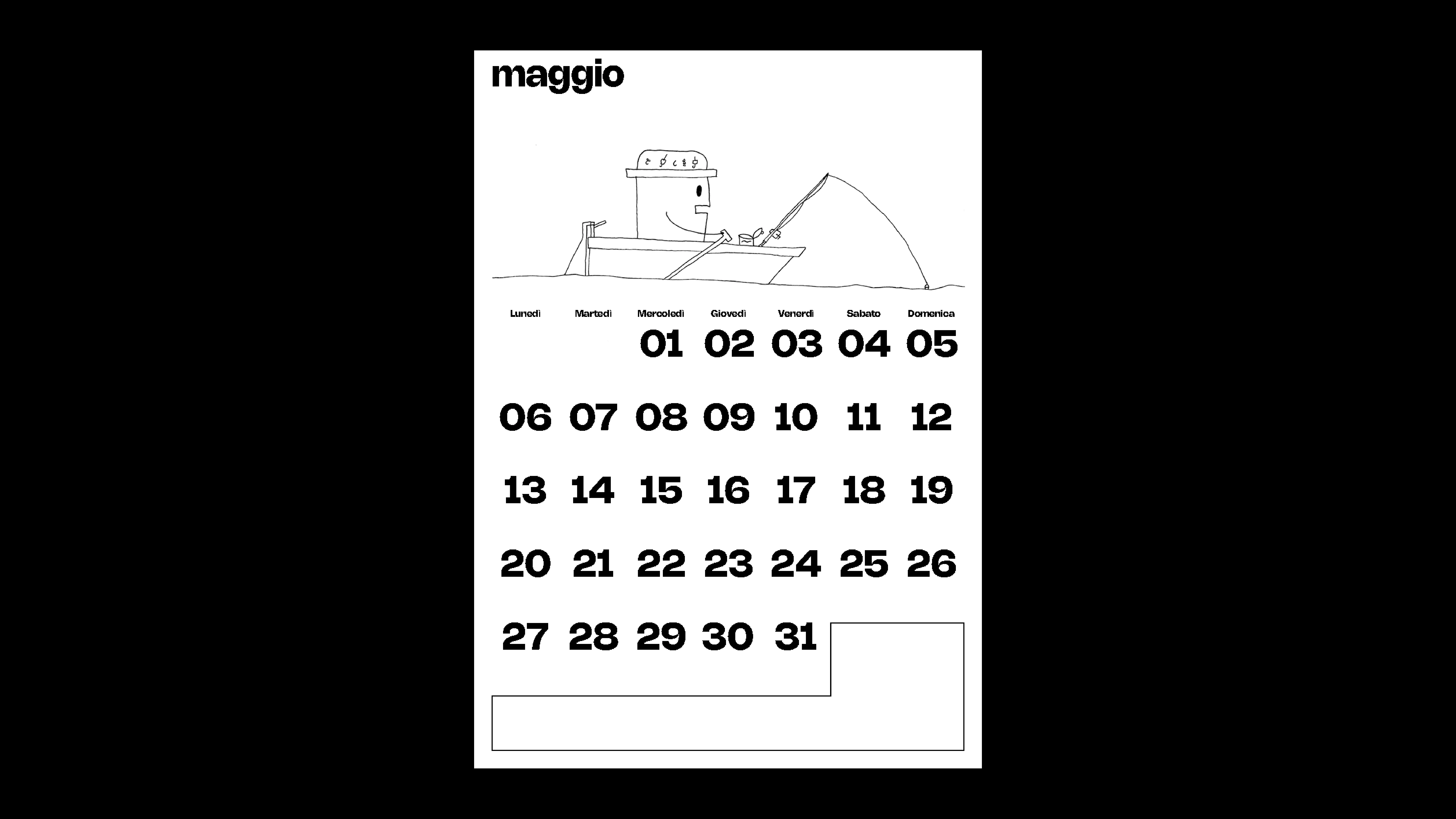
22
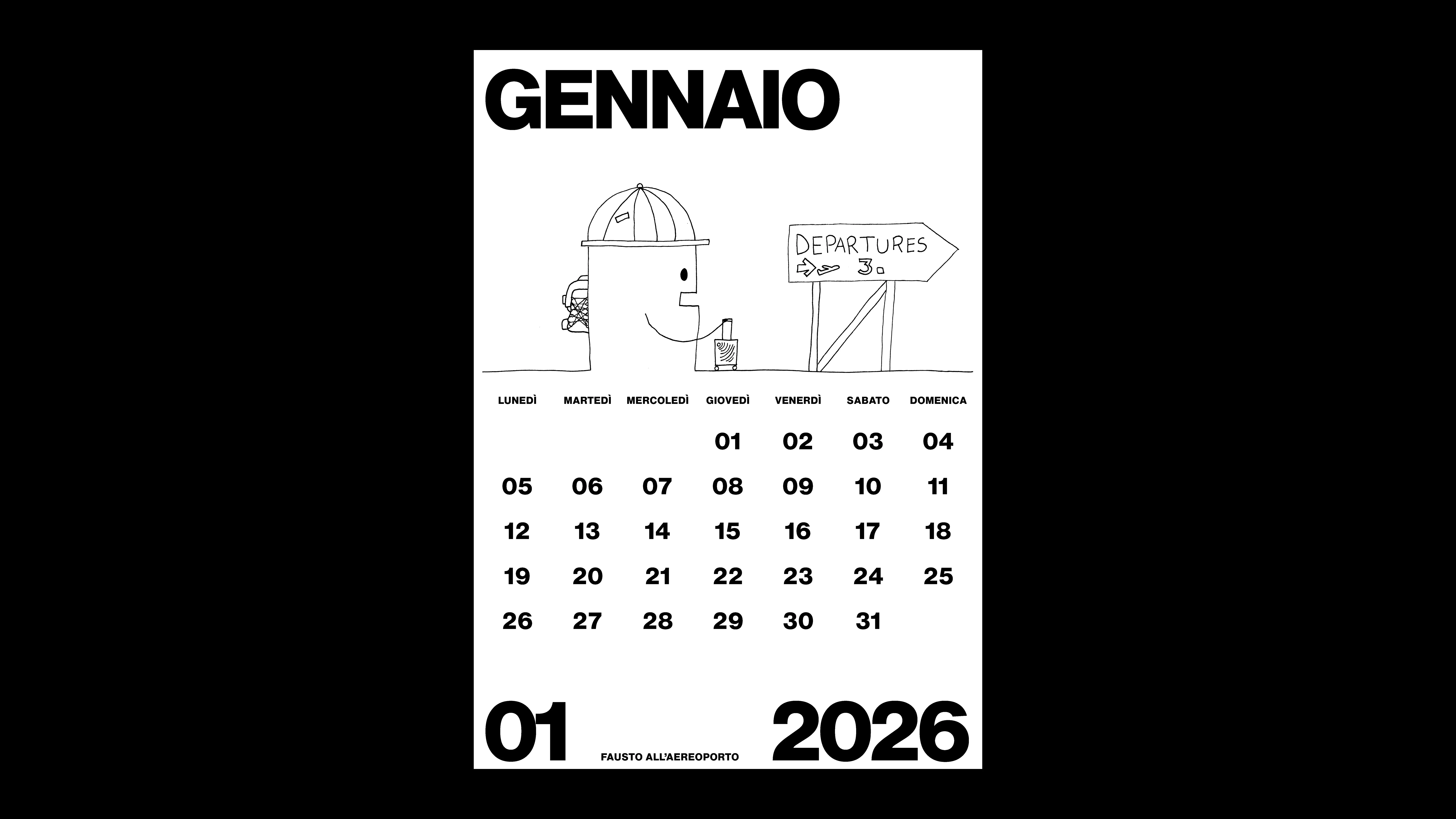
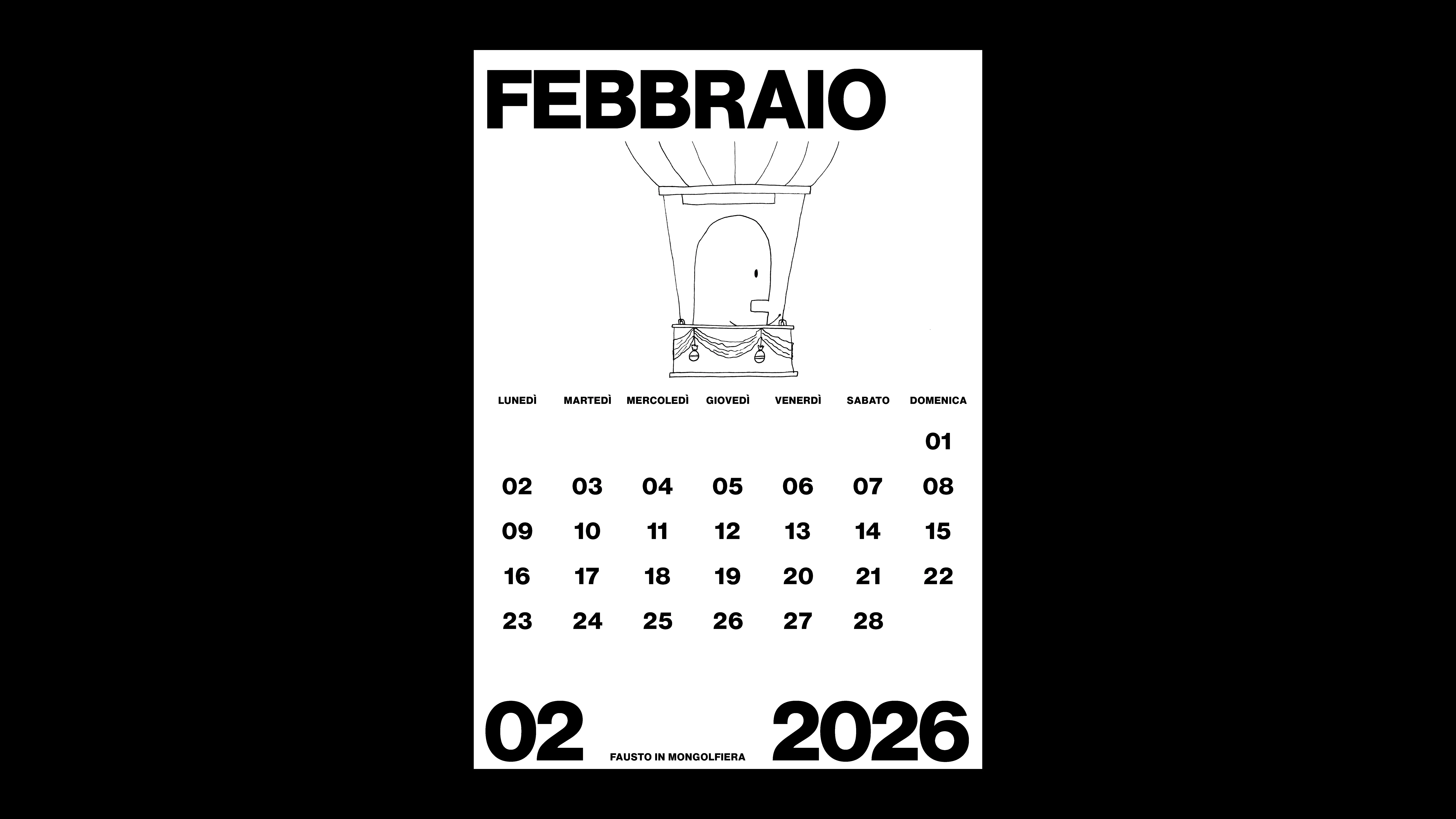
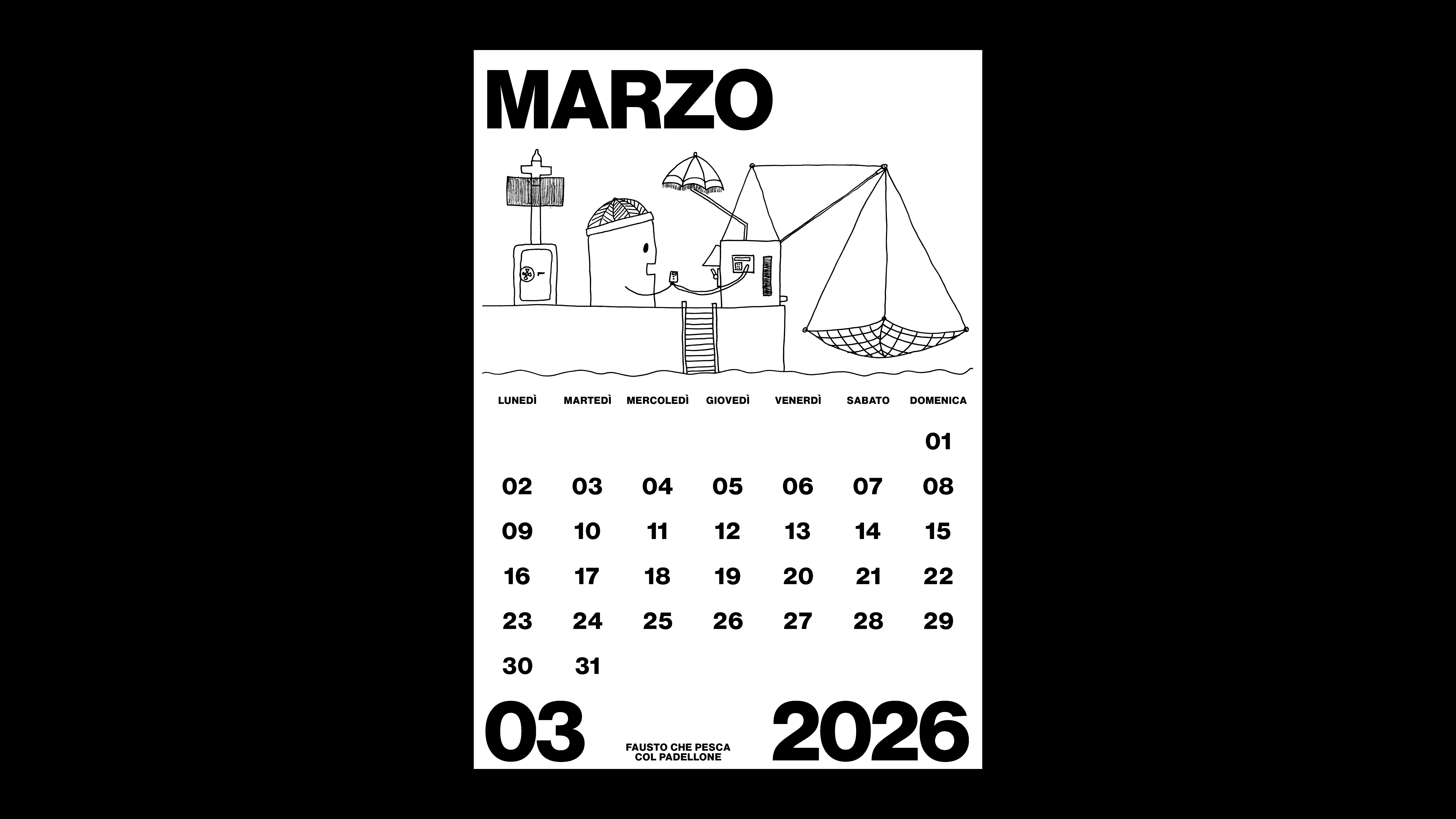
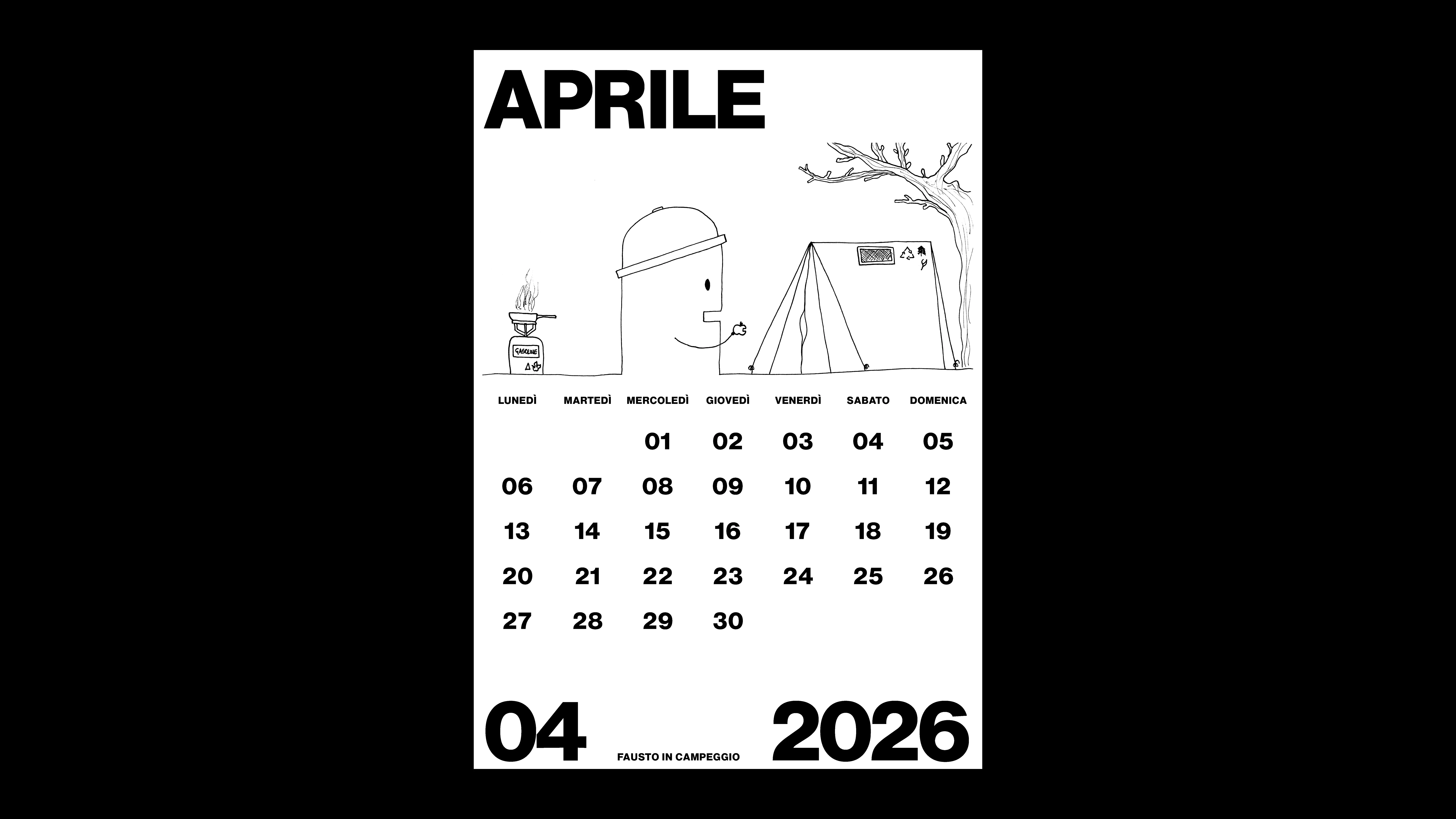
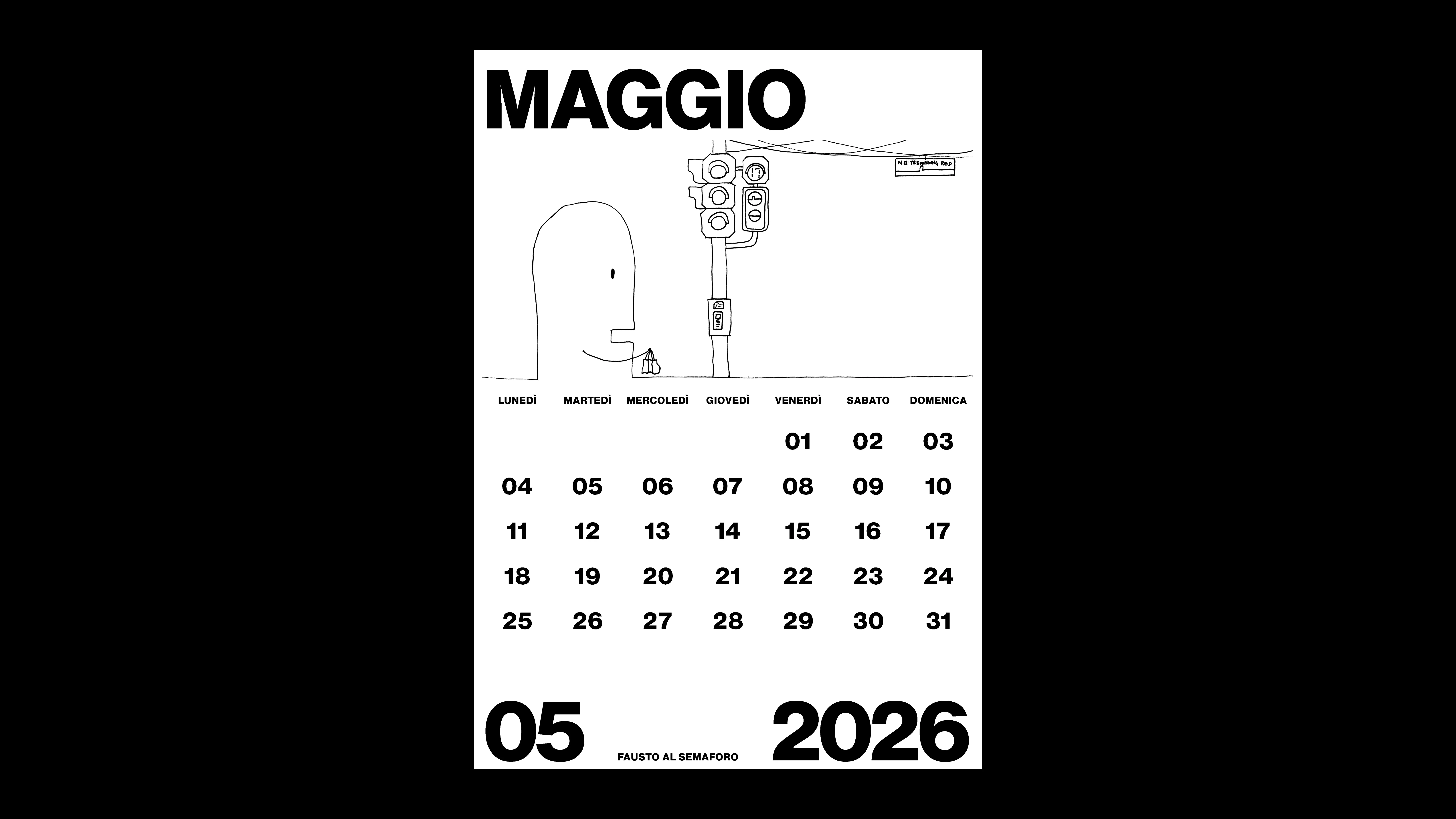
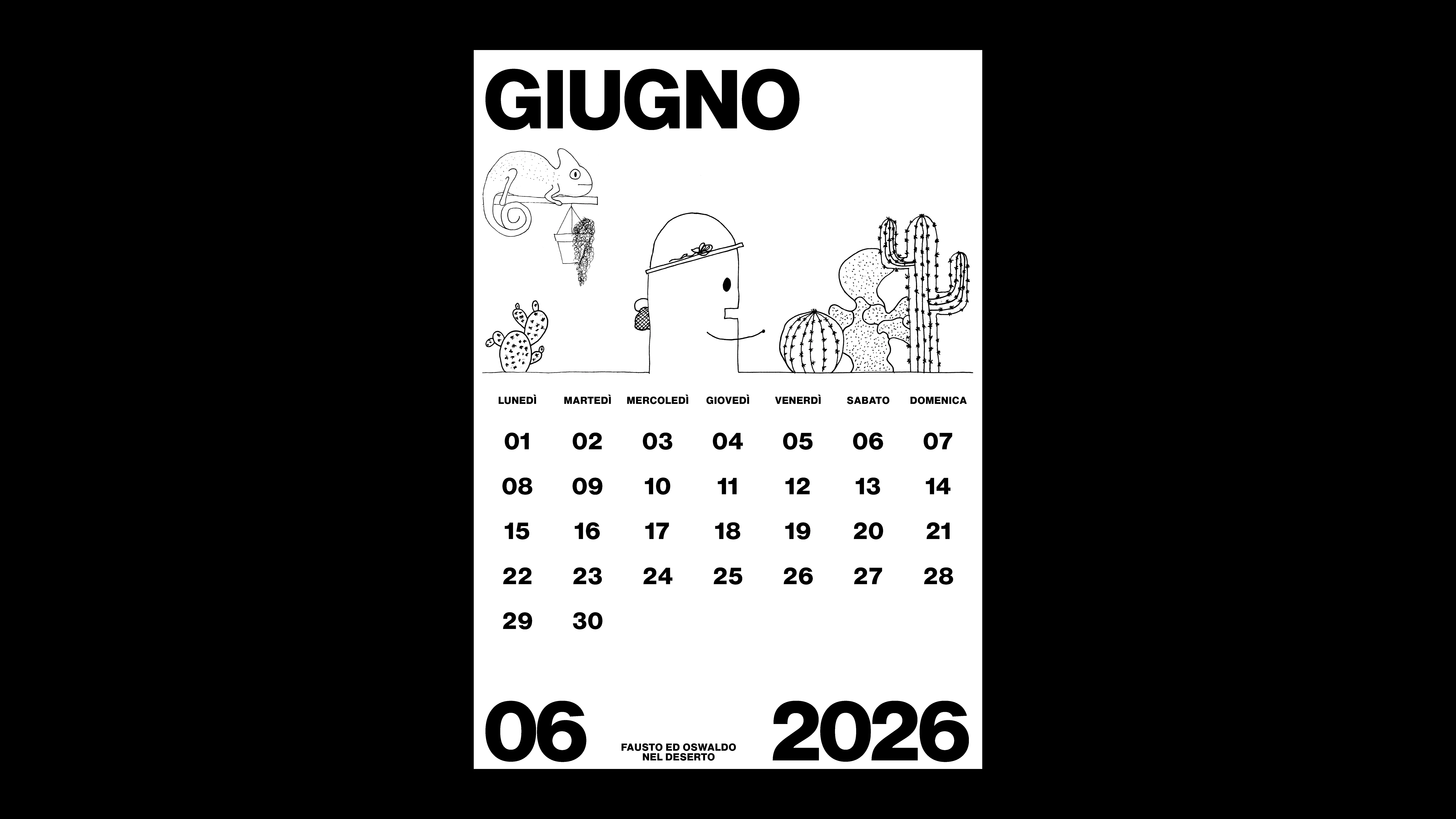
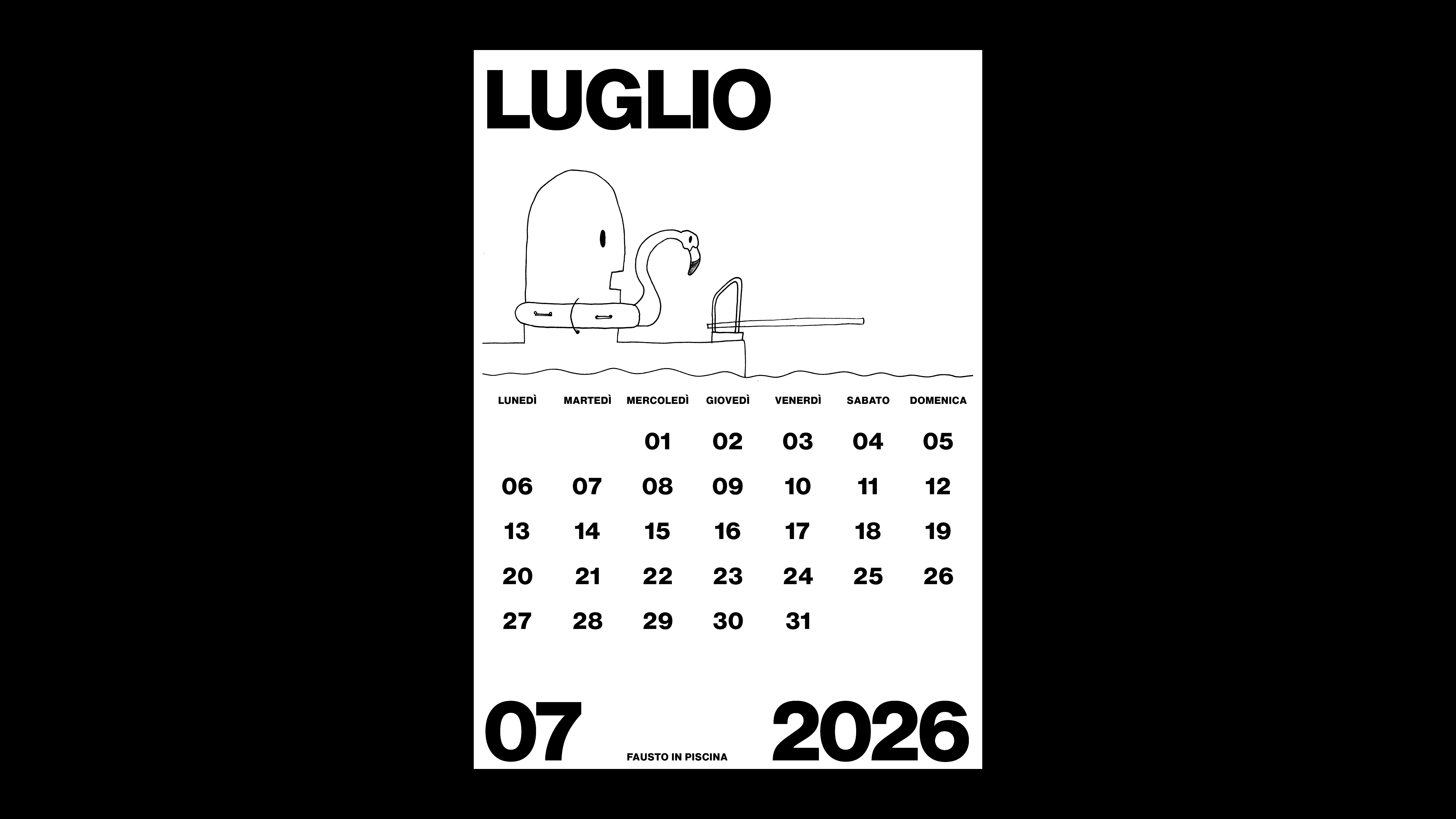
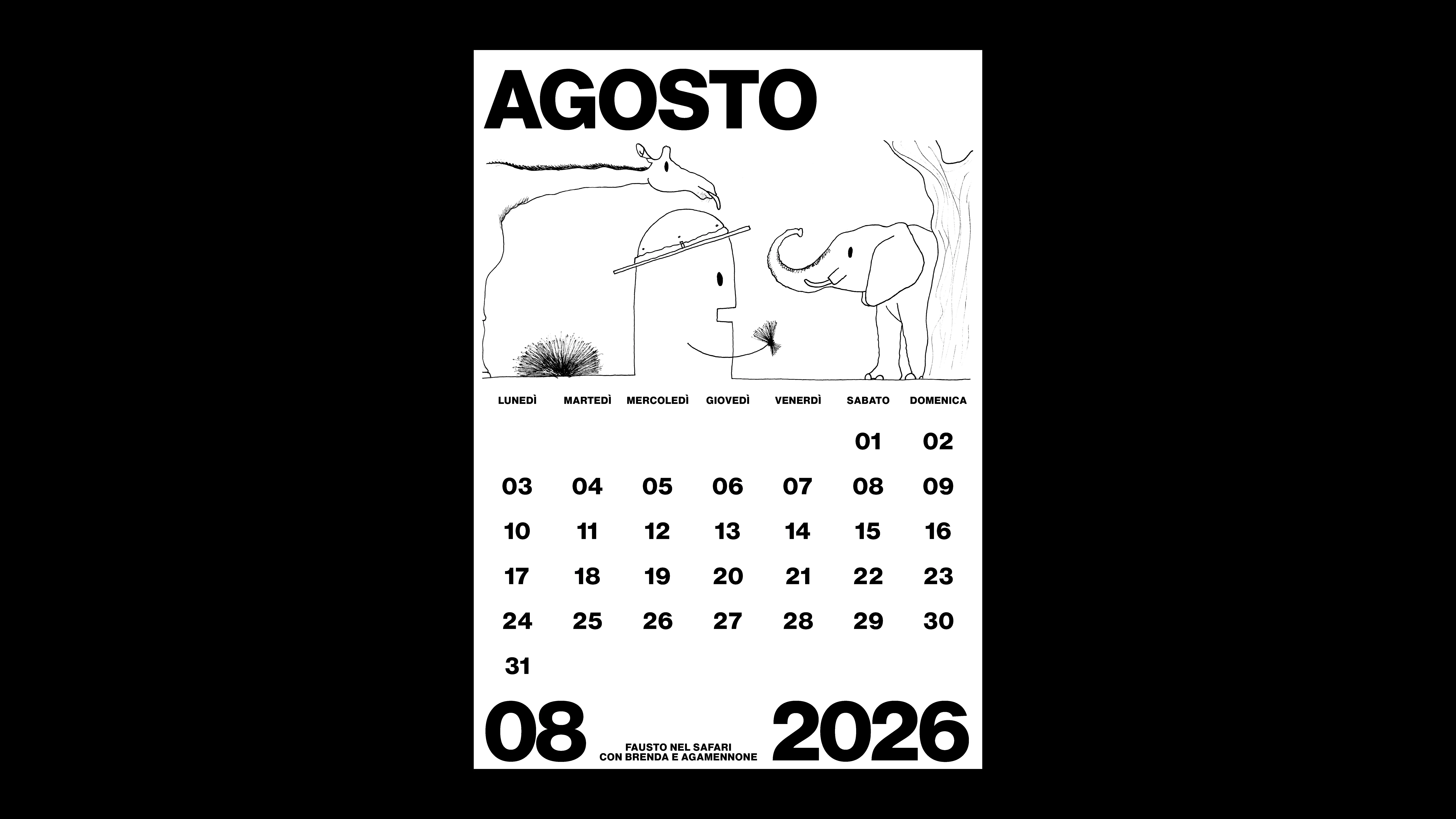
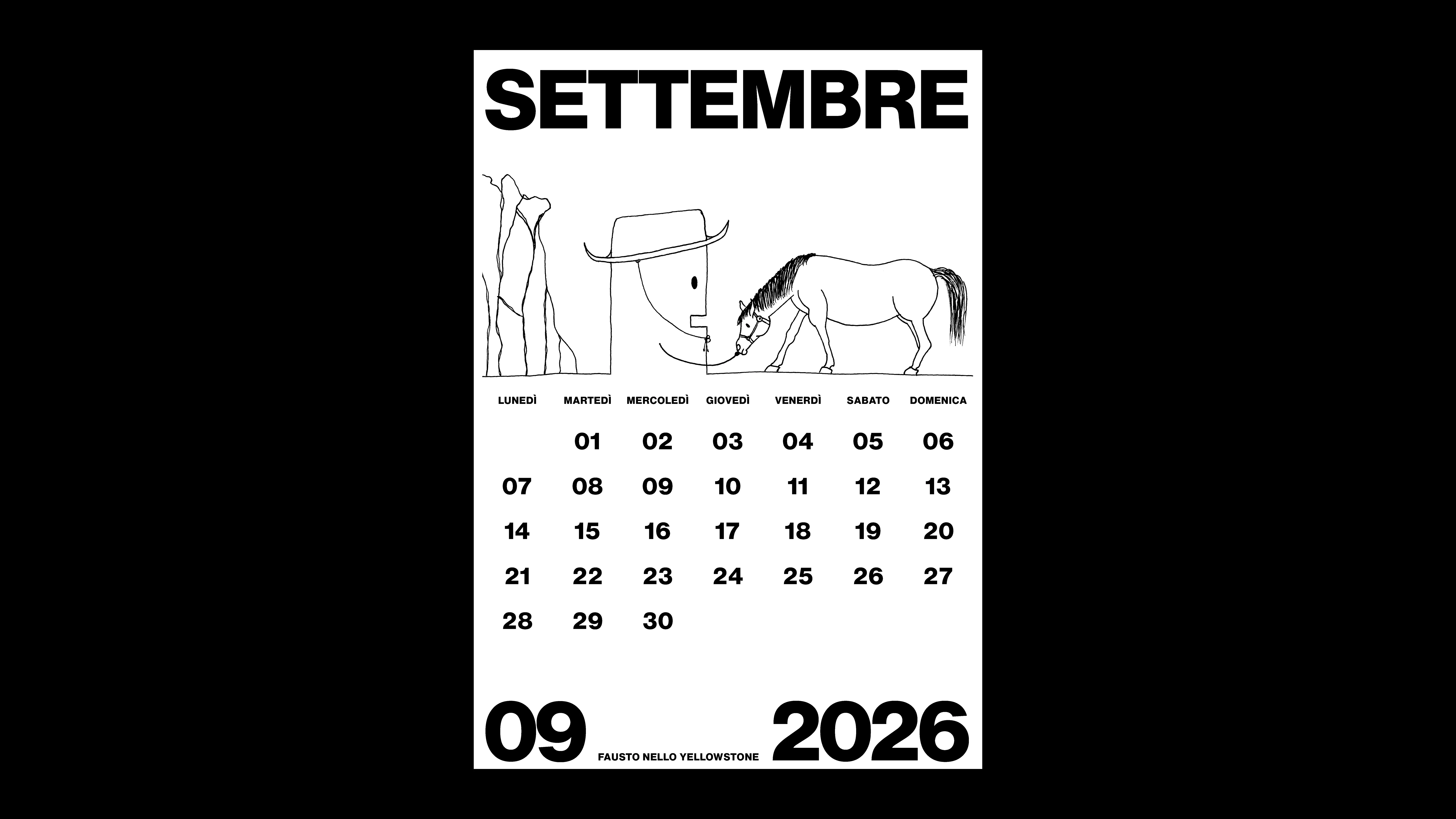
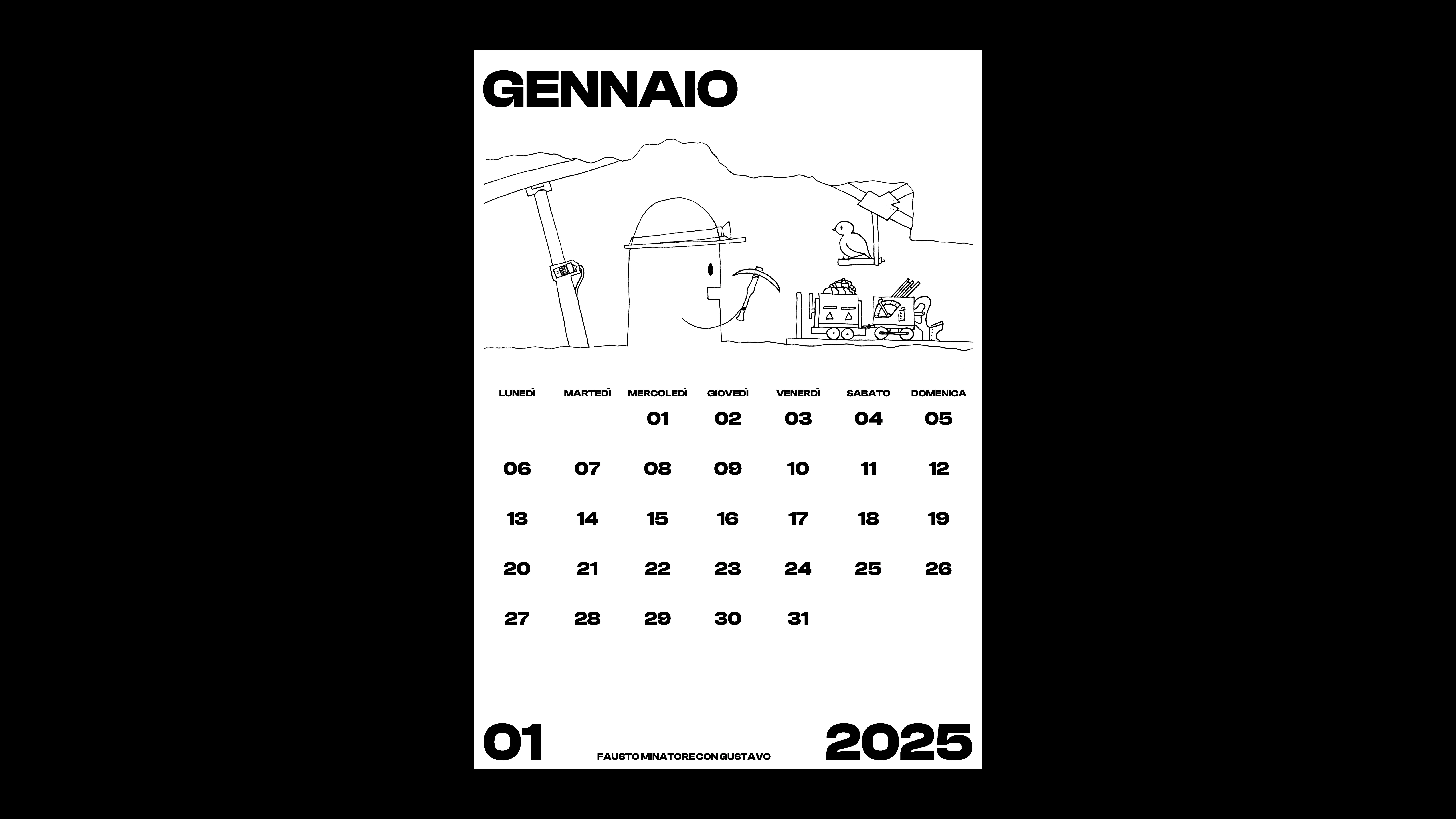
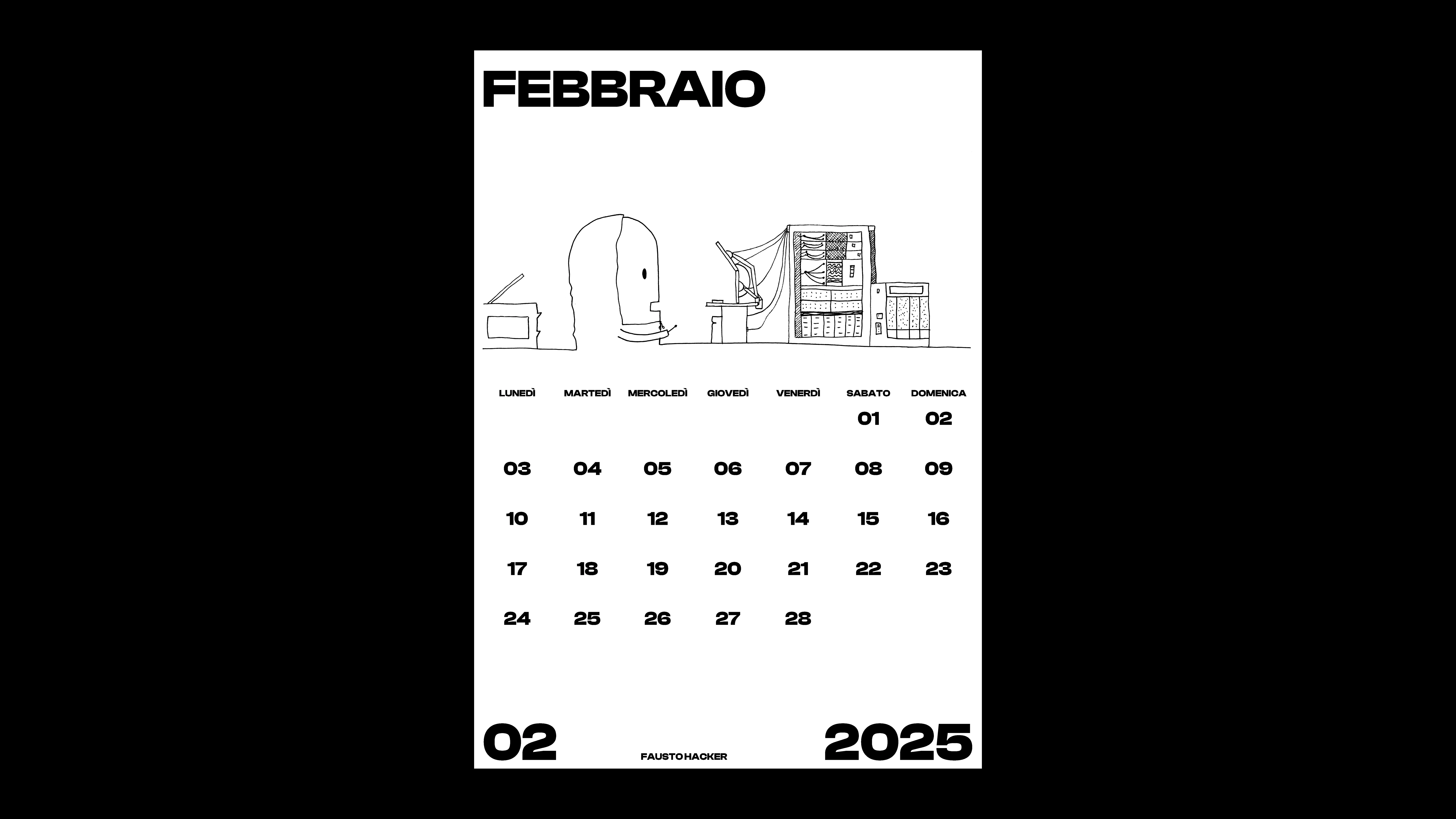
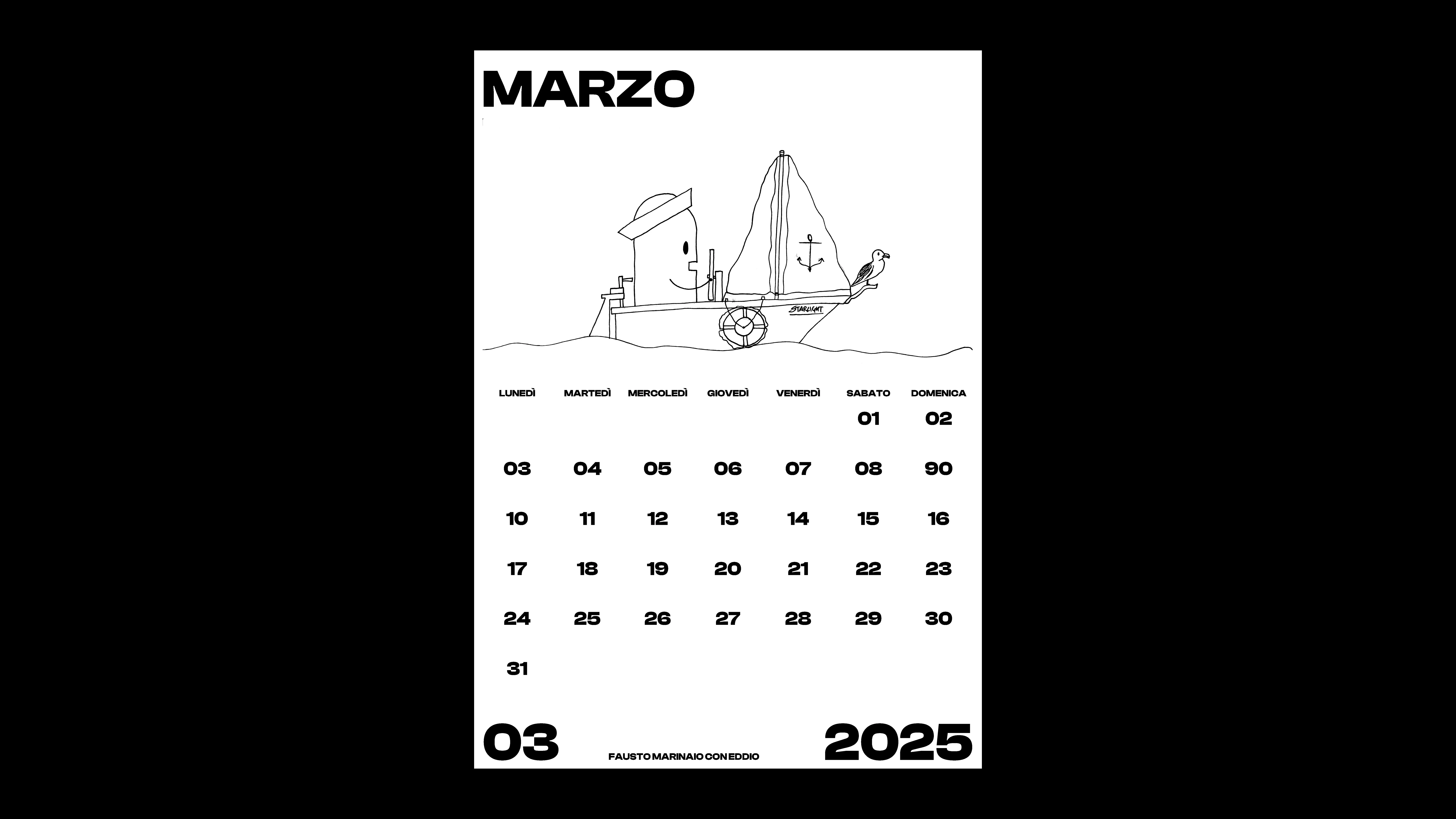
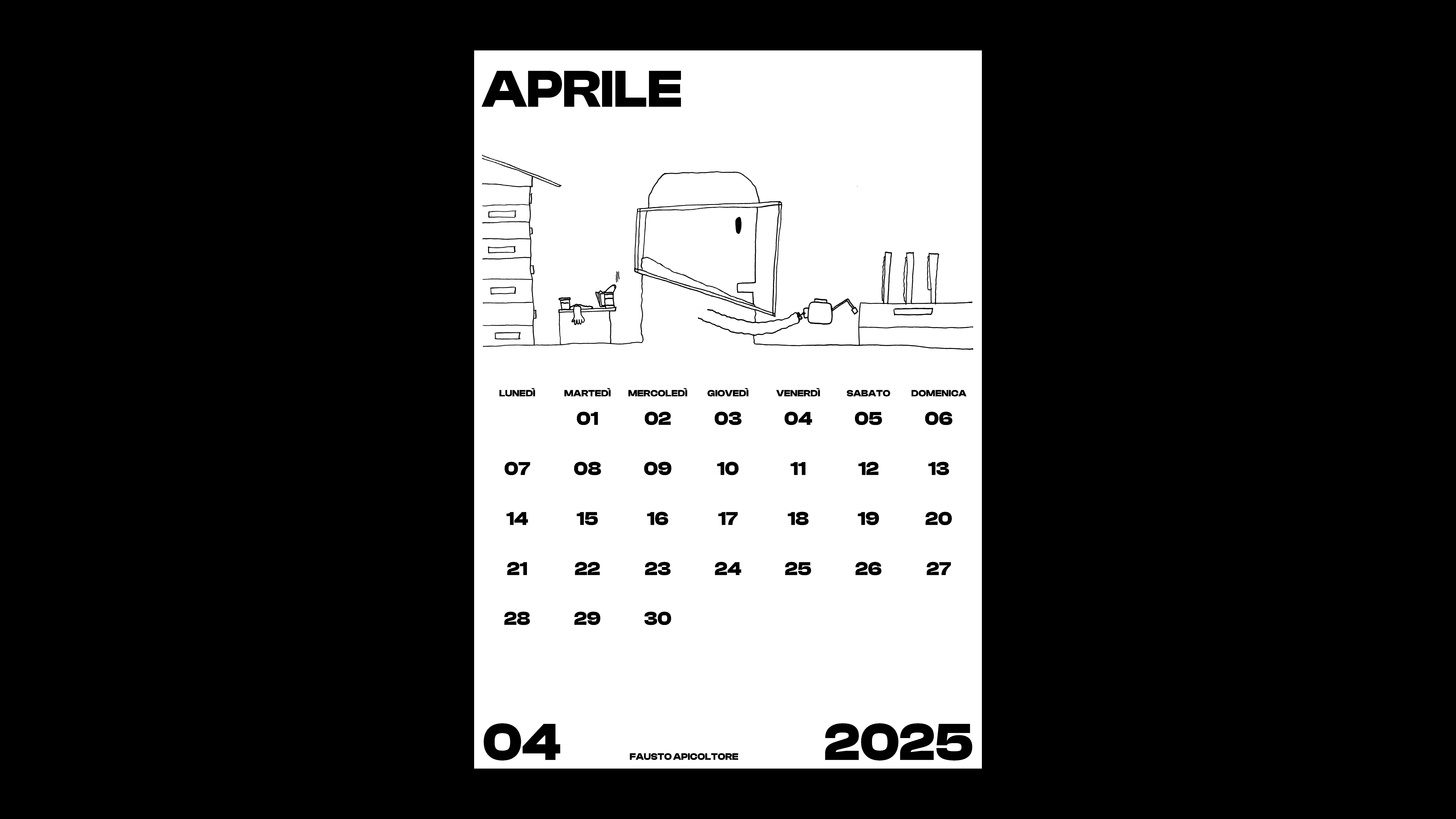
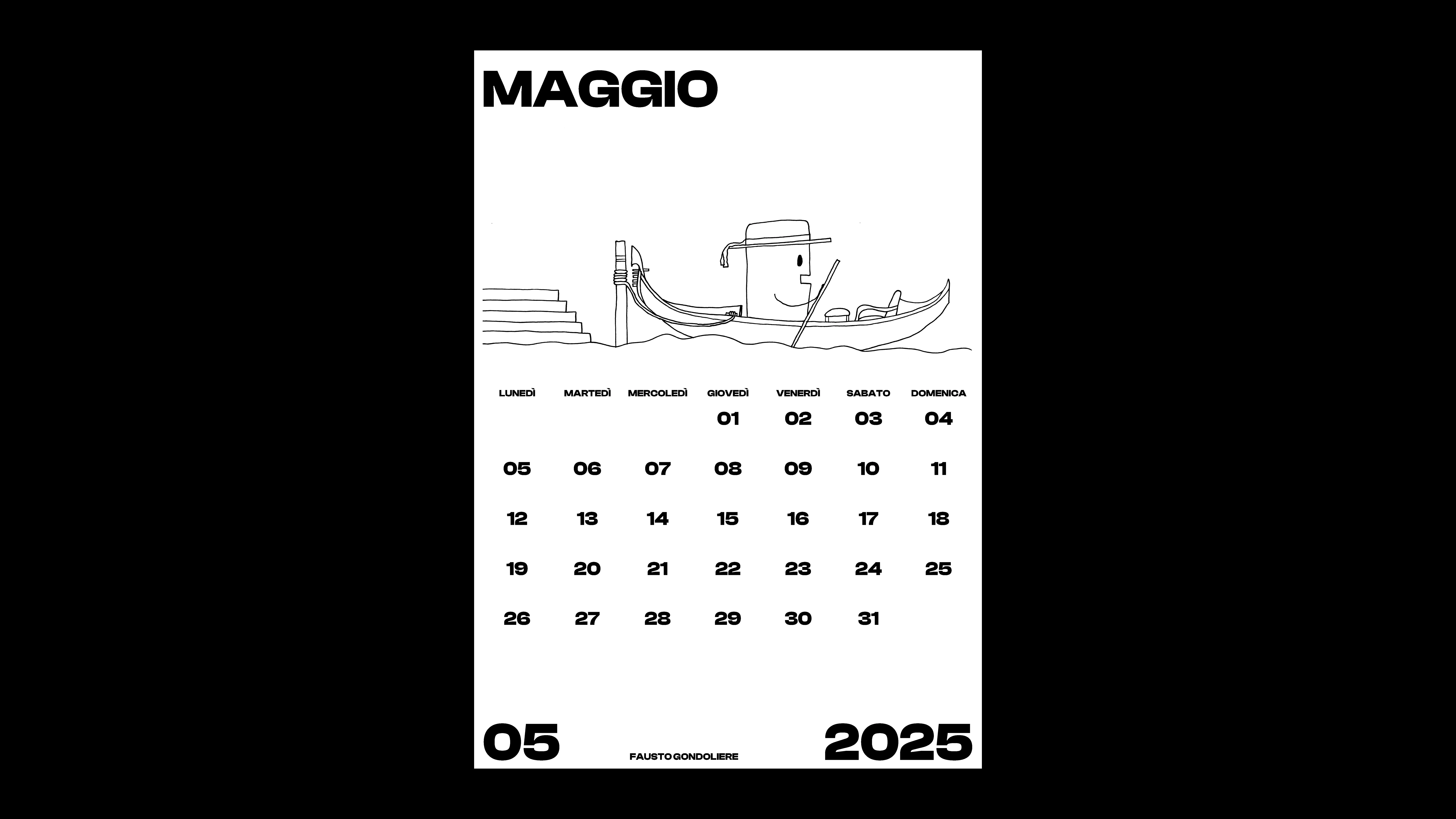
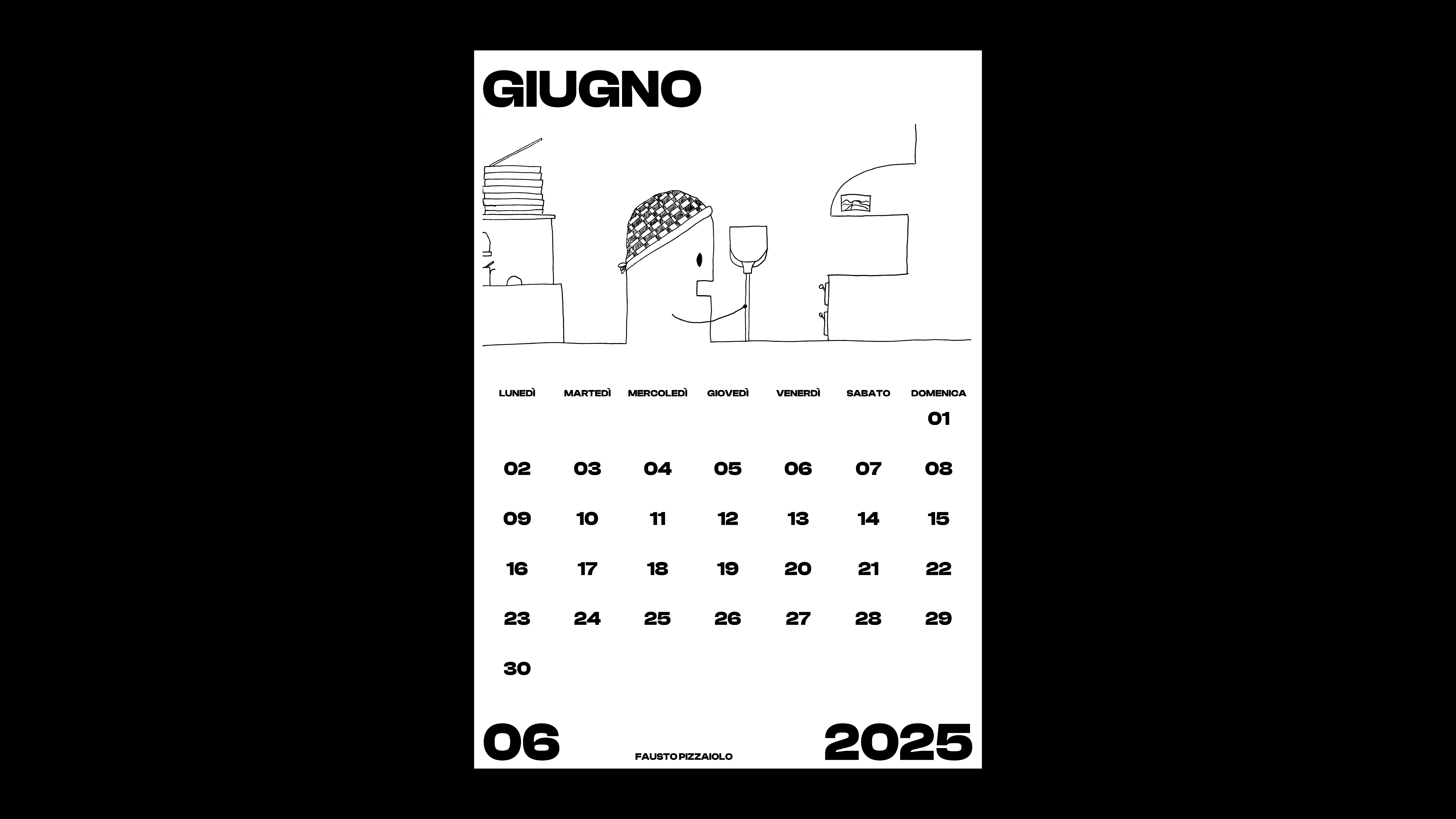
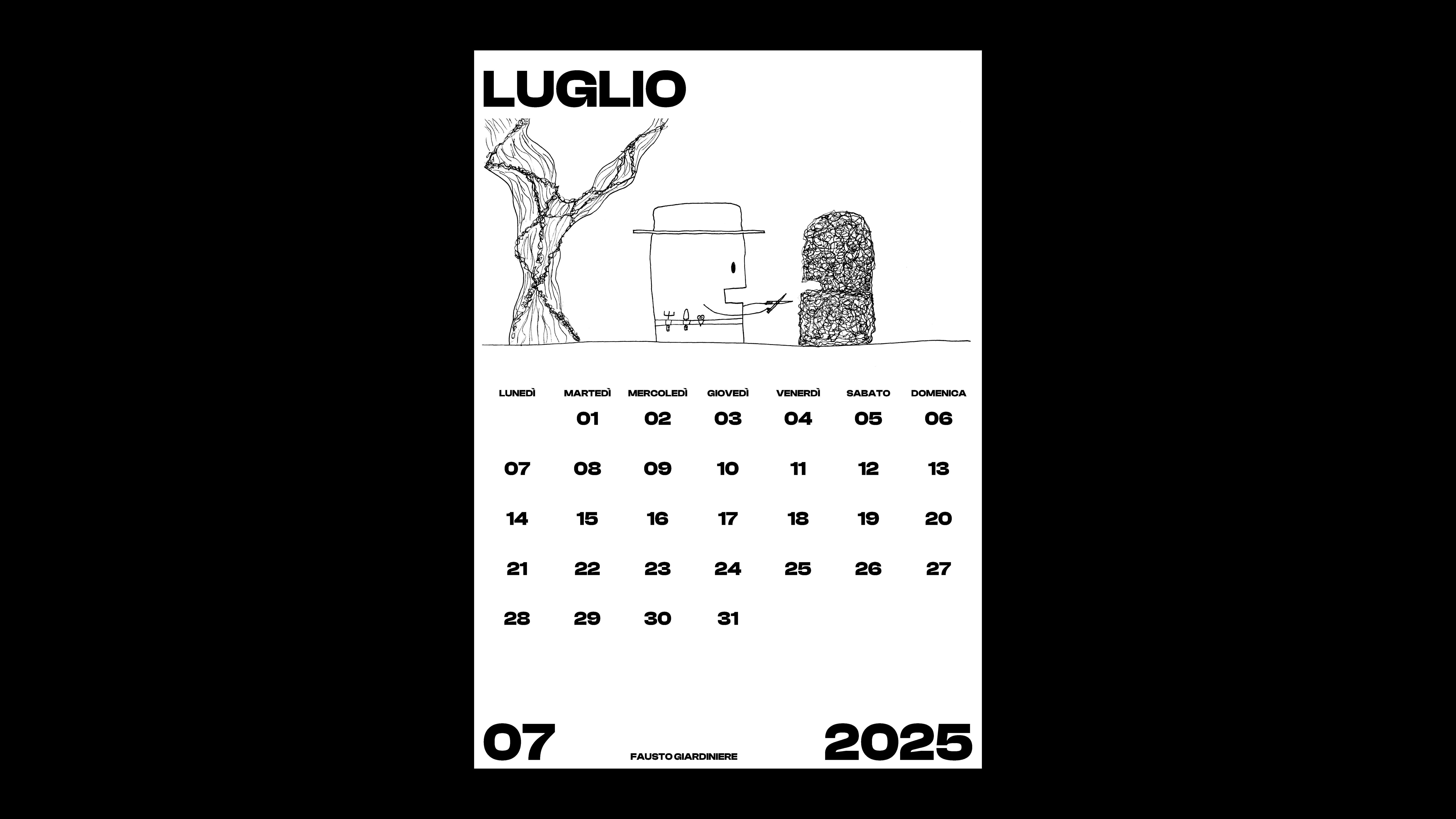
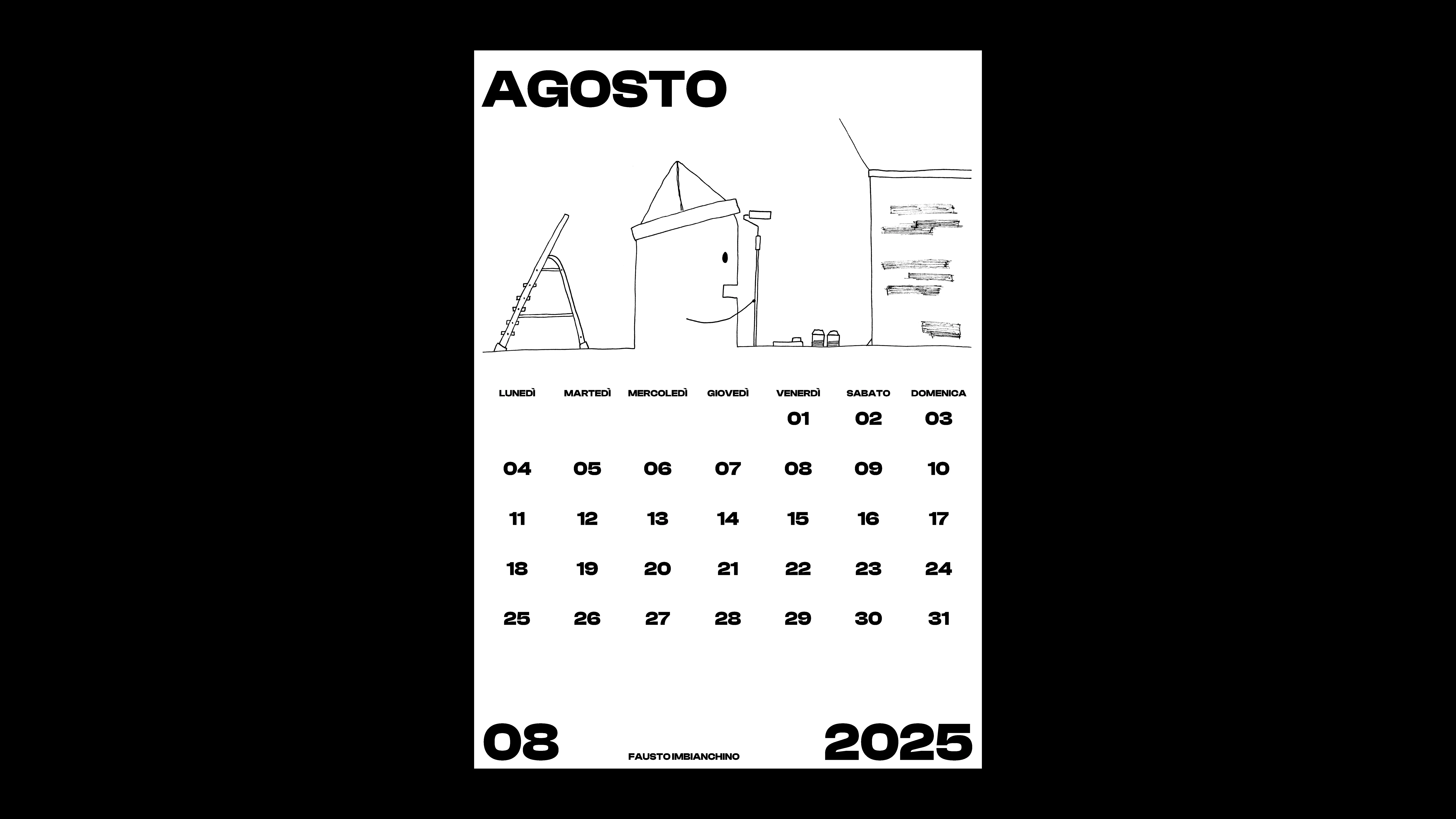
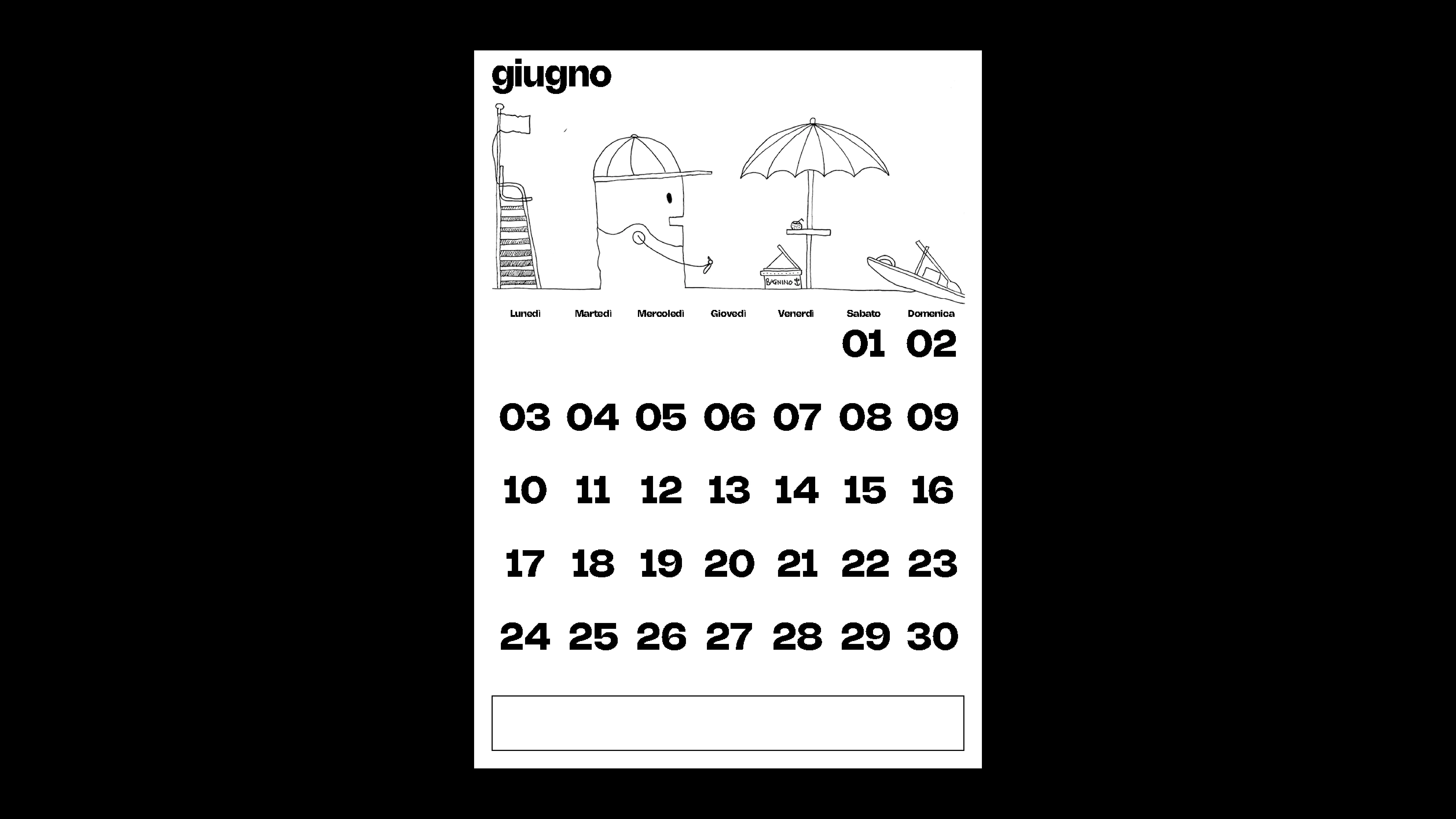
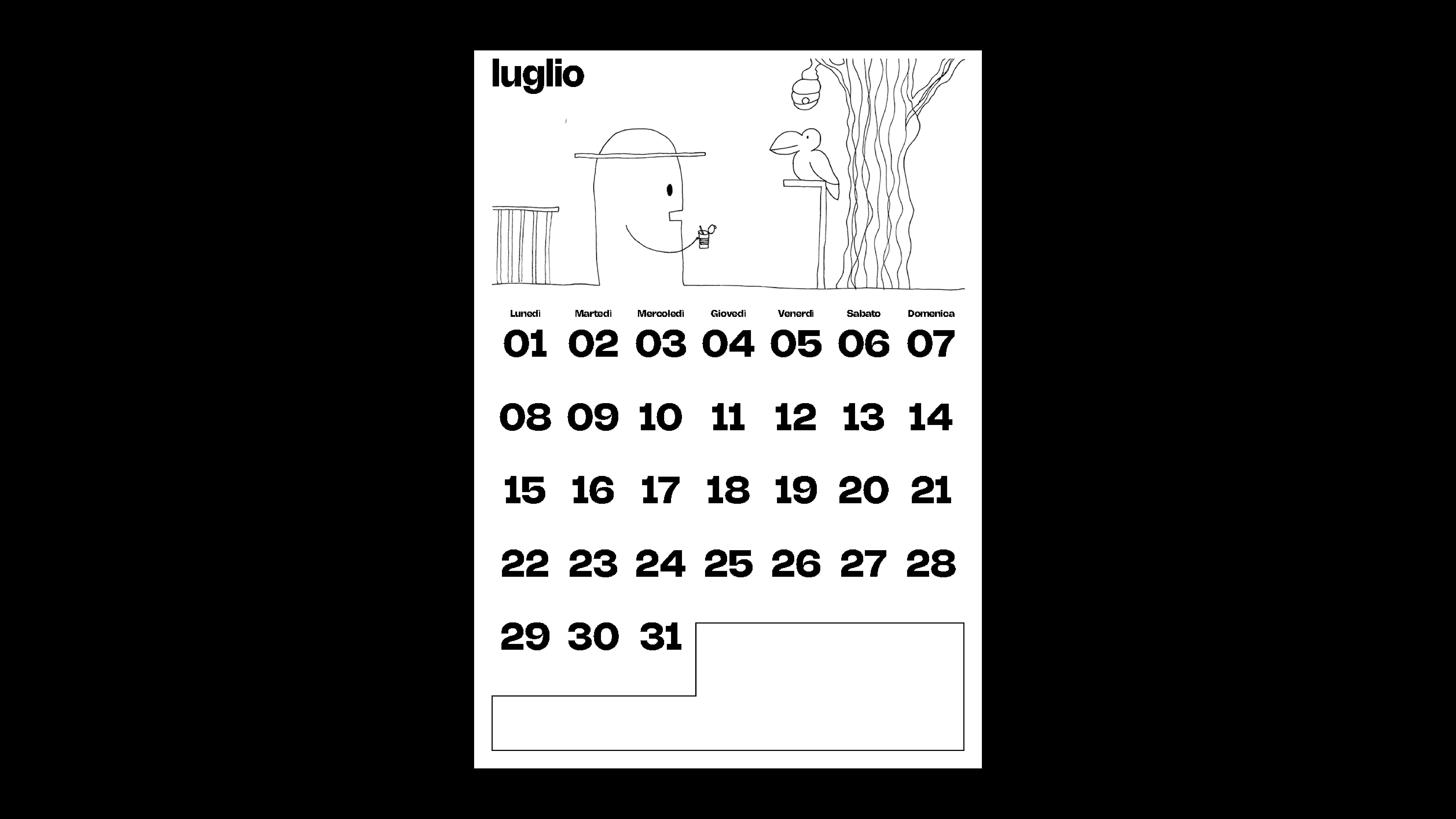
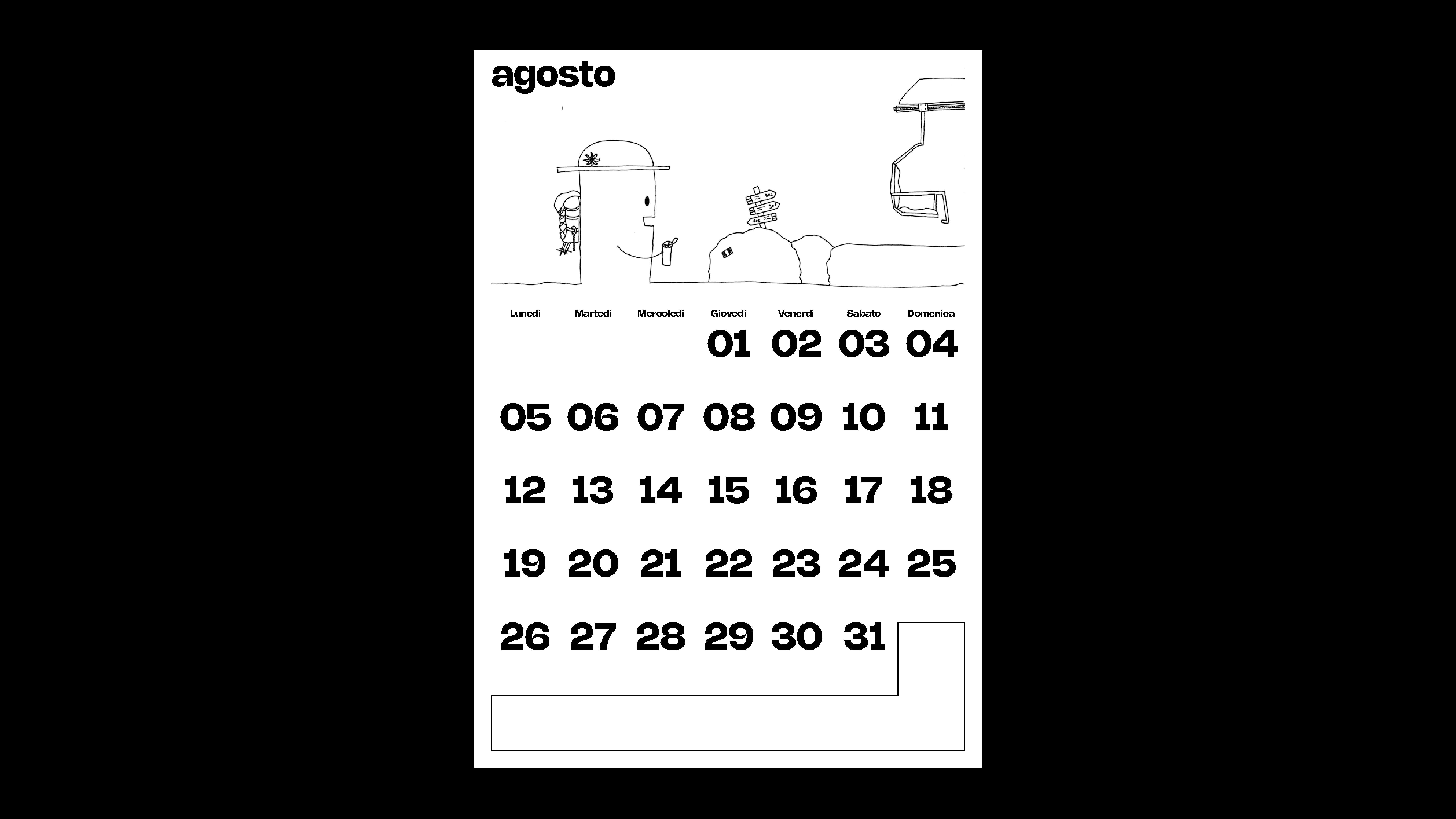
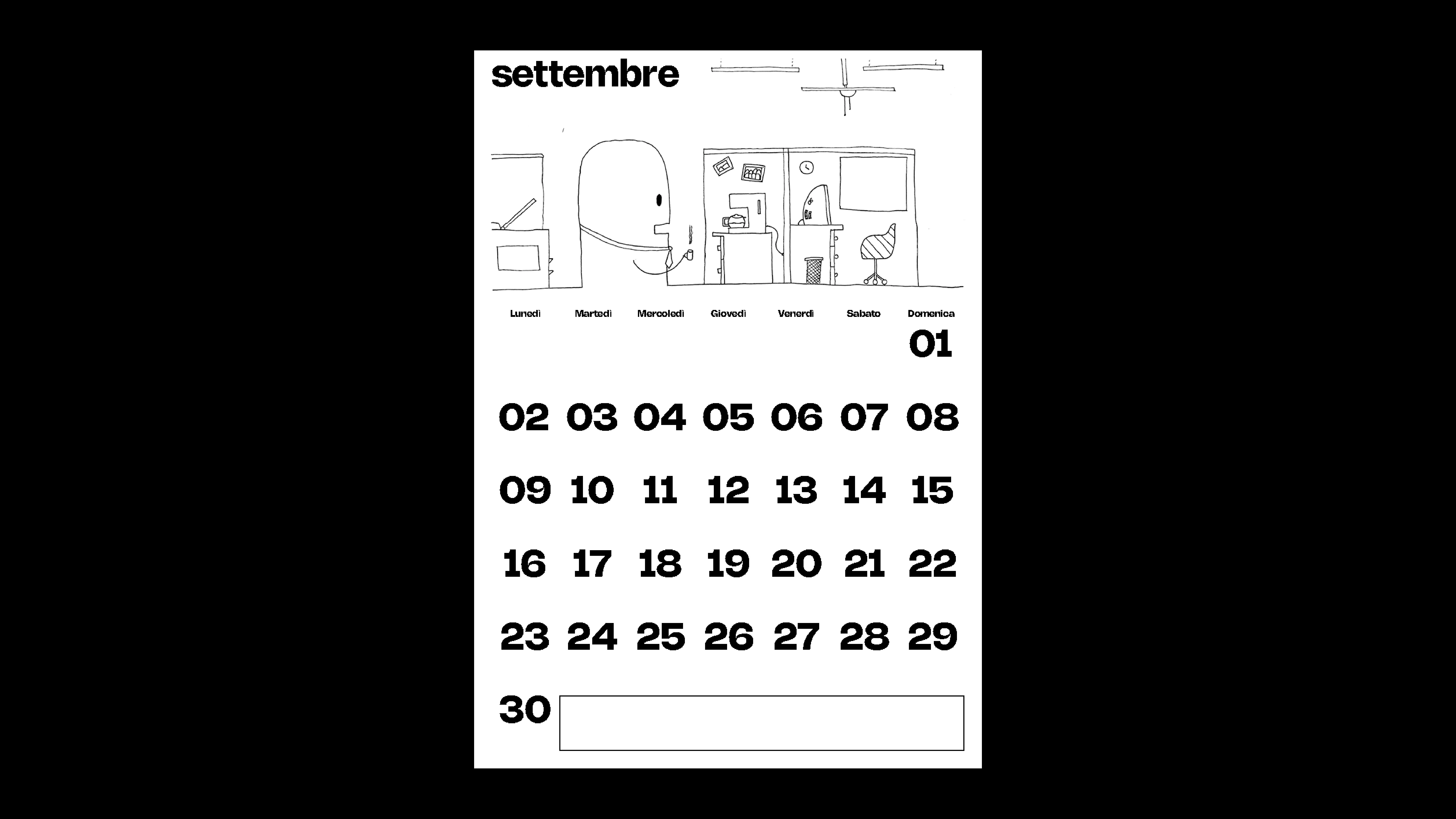
FAUSTO 26
2026
PROJECT Art Direction CONTEXT Personal Project DESCRIPTION The third edition of the A3-format calendar further expands Fausto’s universe, this time through the theme of travel. Each month represents a new stop on his journey around the world: cities, landscapes, and different cultures become the backdrop to his constant and recognizable presence. From bustling metropolises to silent deserts, from ancient temples to contemporary capitals, Fausto moves through places and visual symbols that trace the steps of his itinerary. The calendar becomes an illustrated travel diary, where the character retains his graphic identity while adapting to new contexts, creating a narrative of exploration, movement, and discovery.
1 (OF) 12
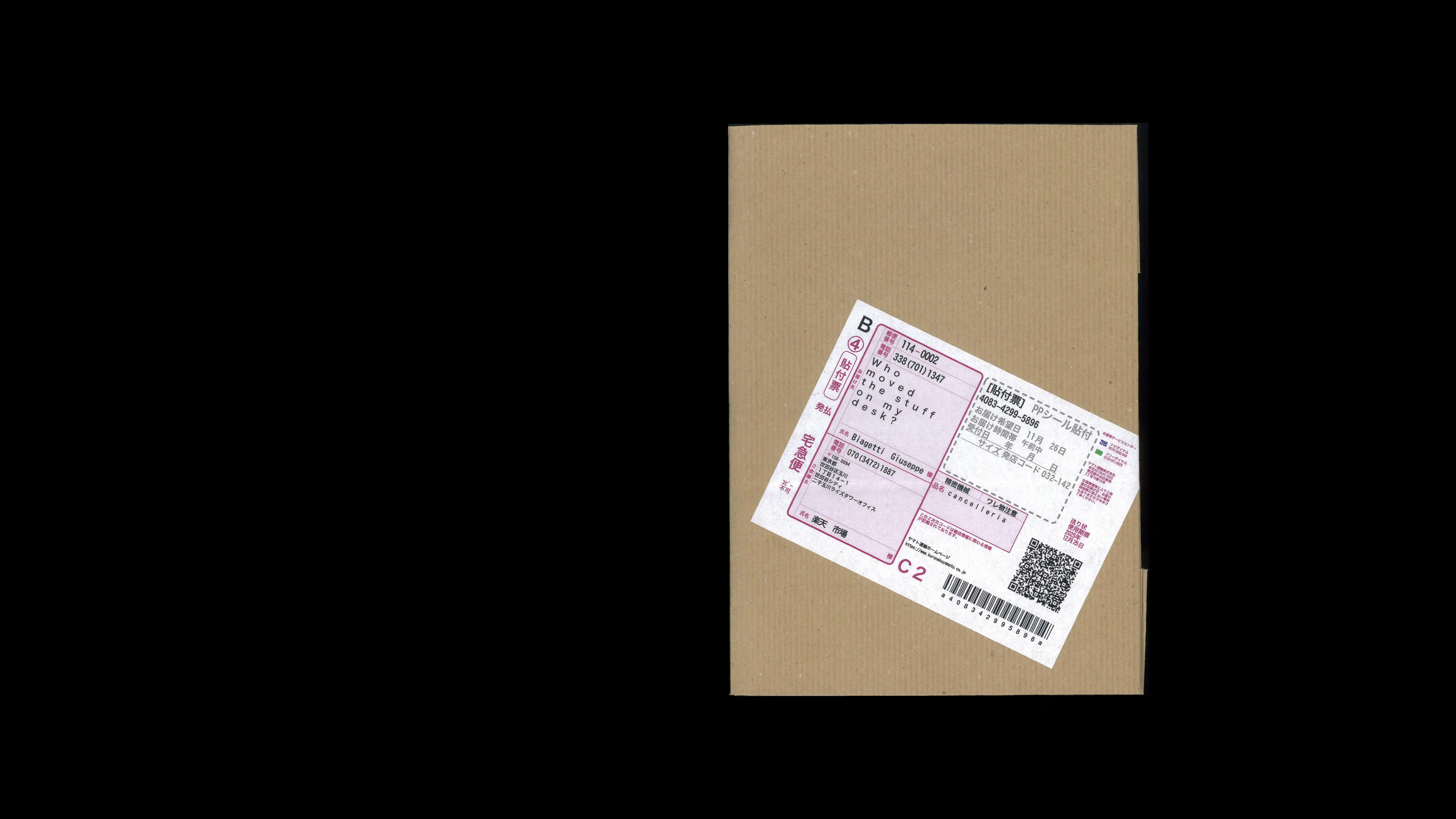
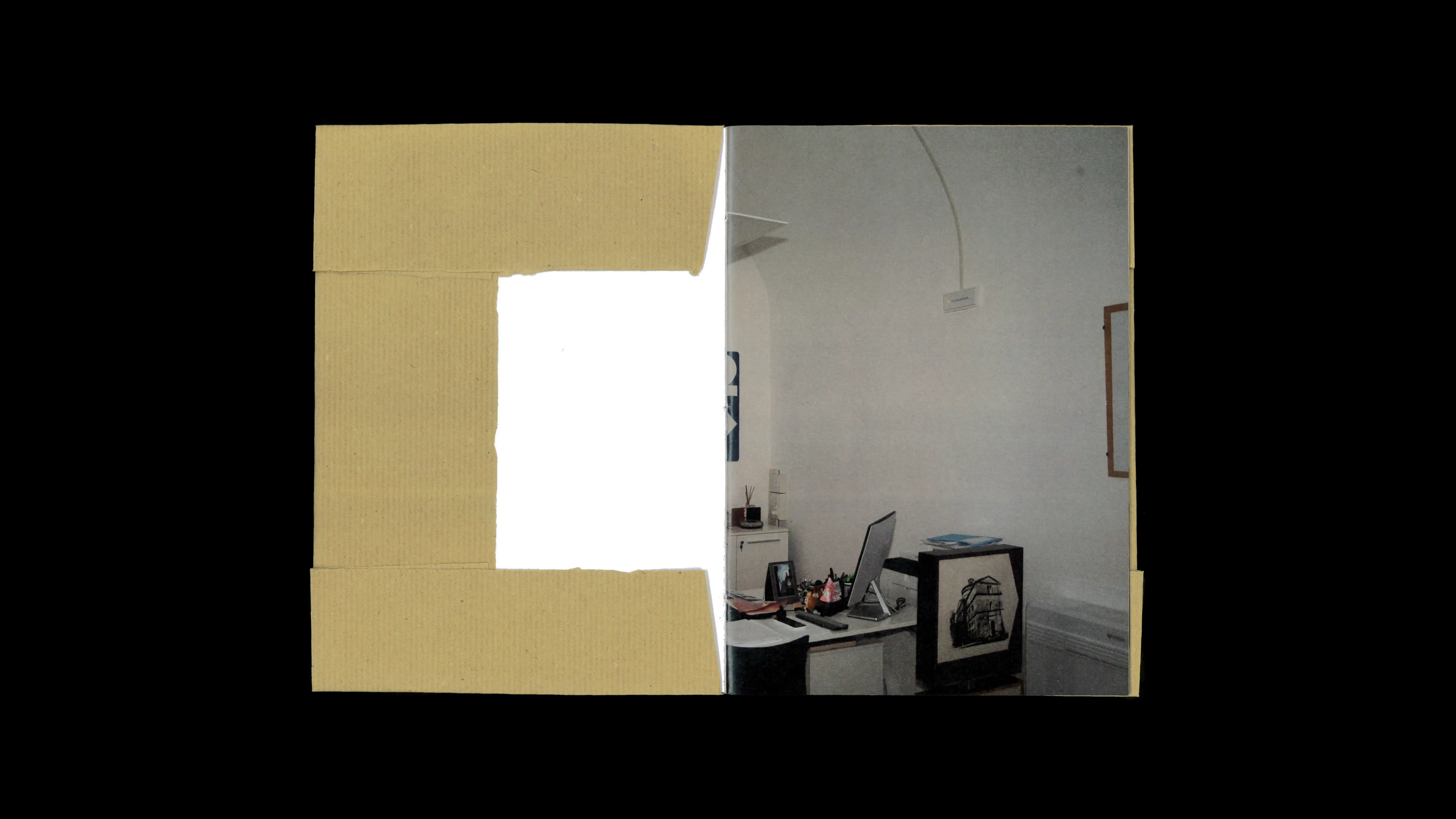
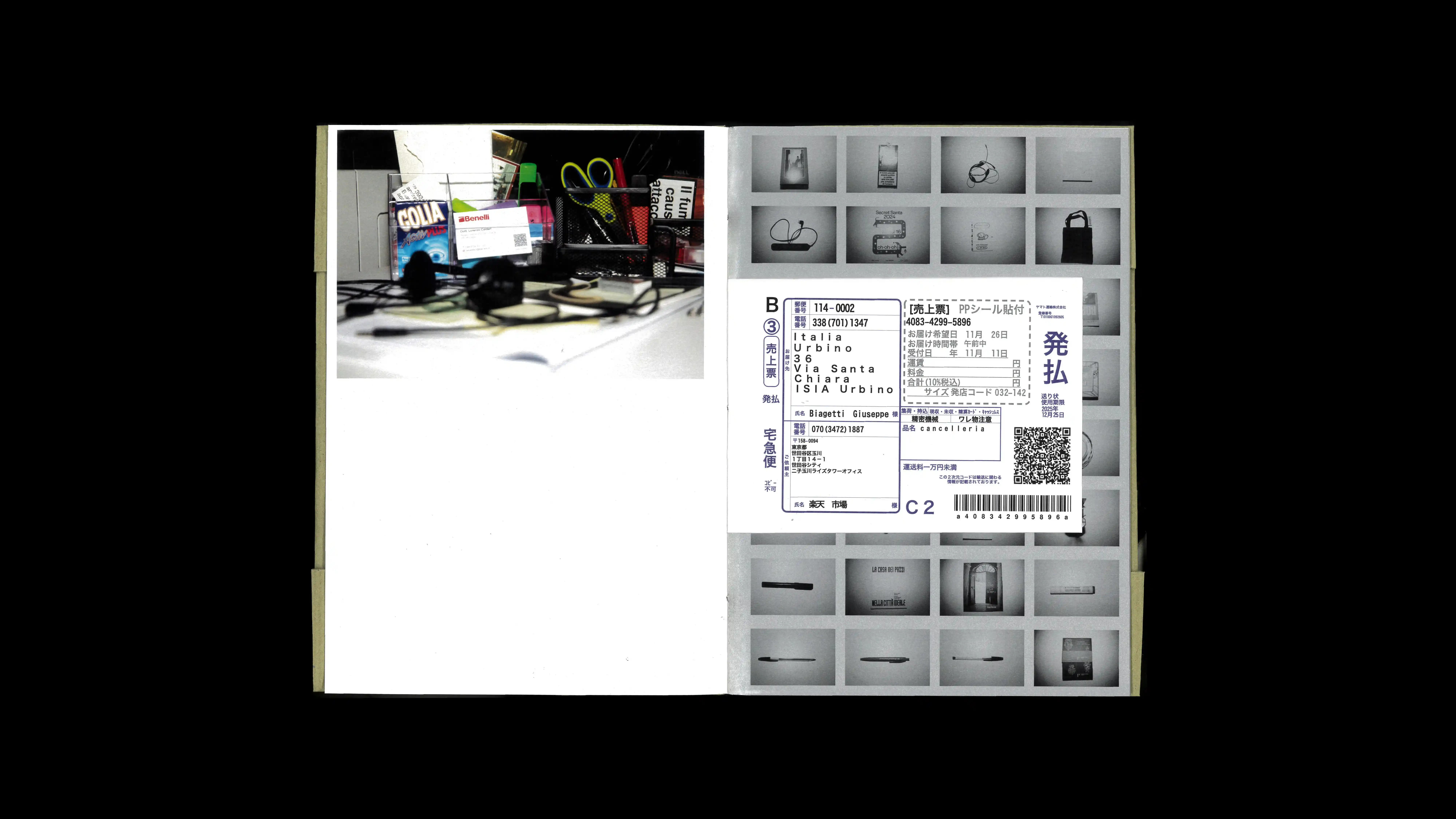
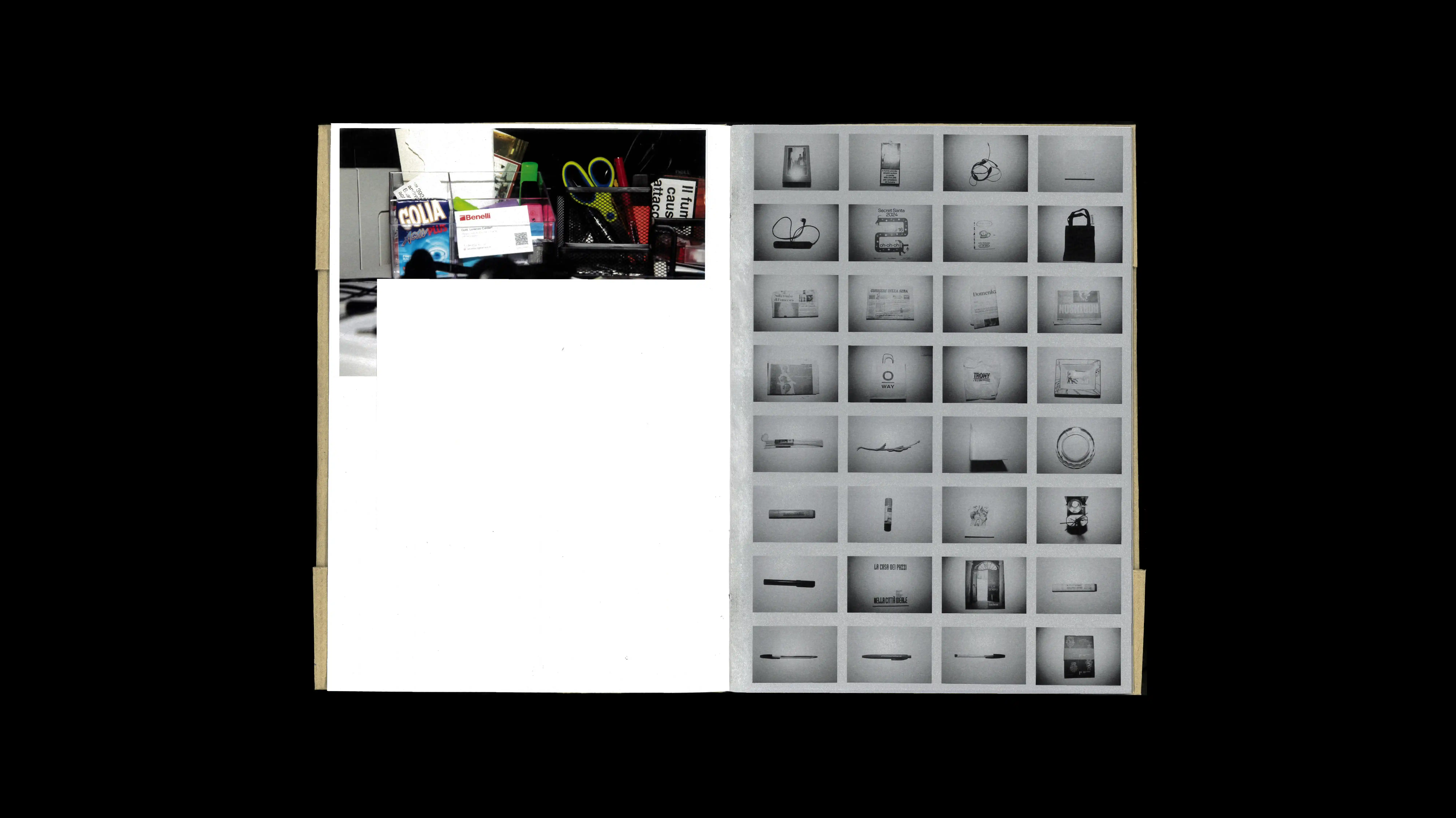
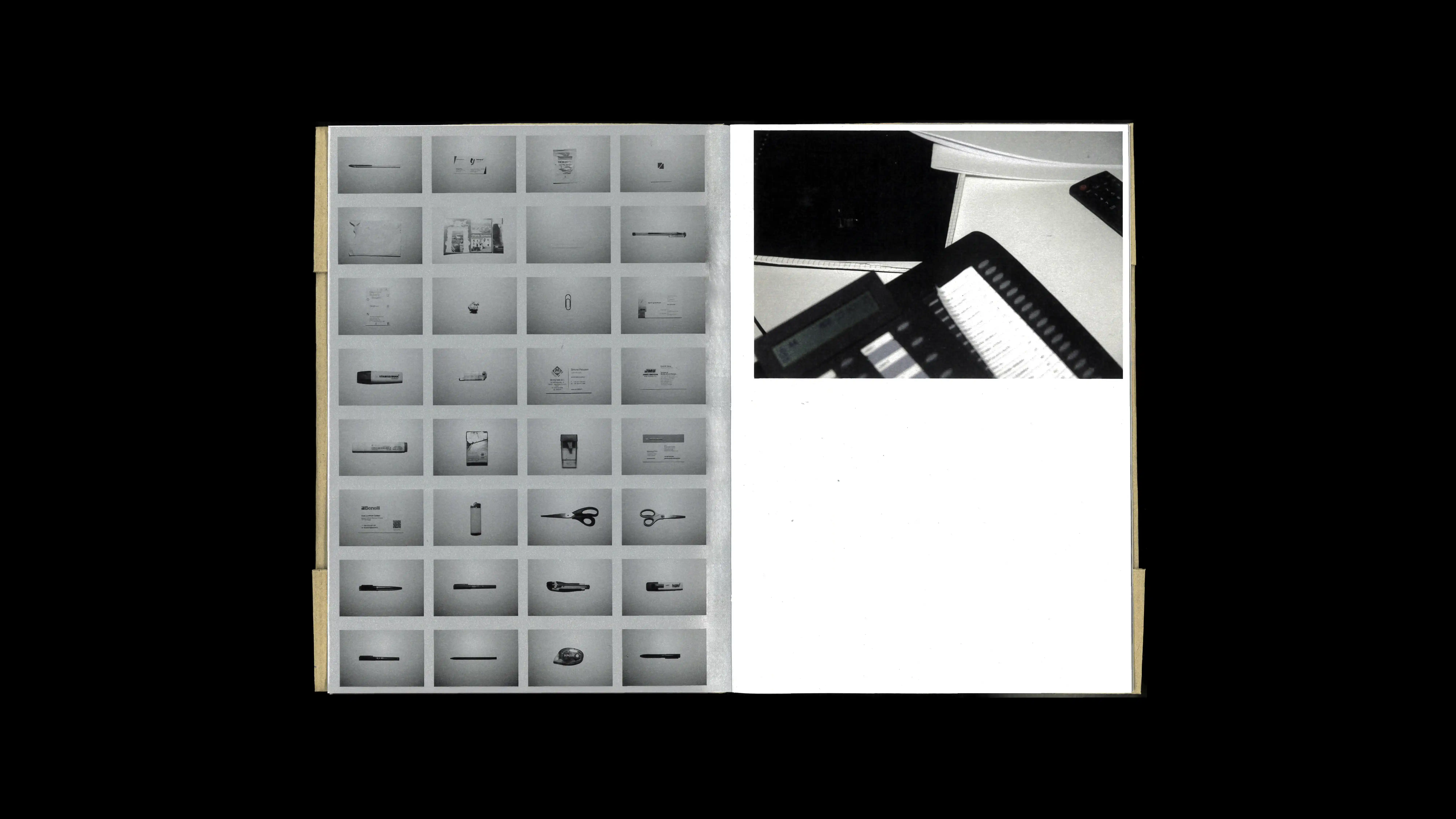
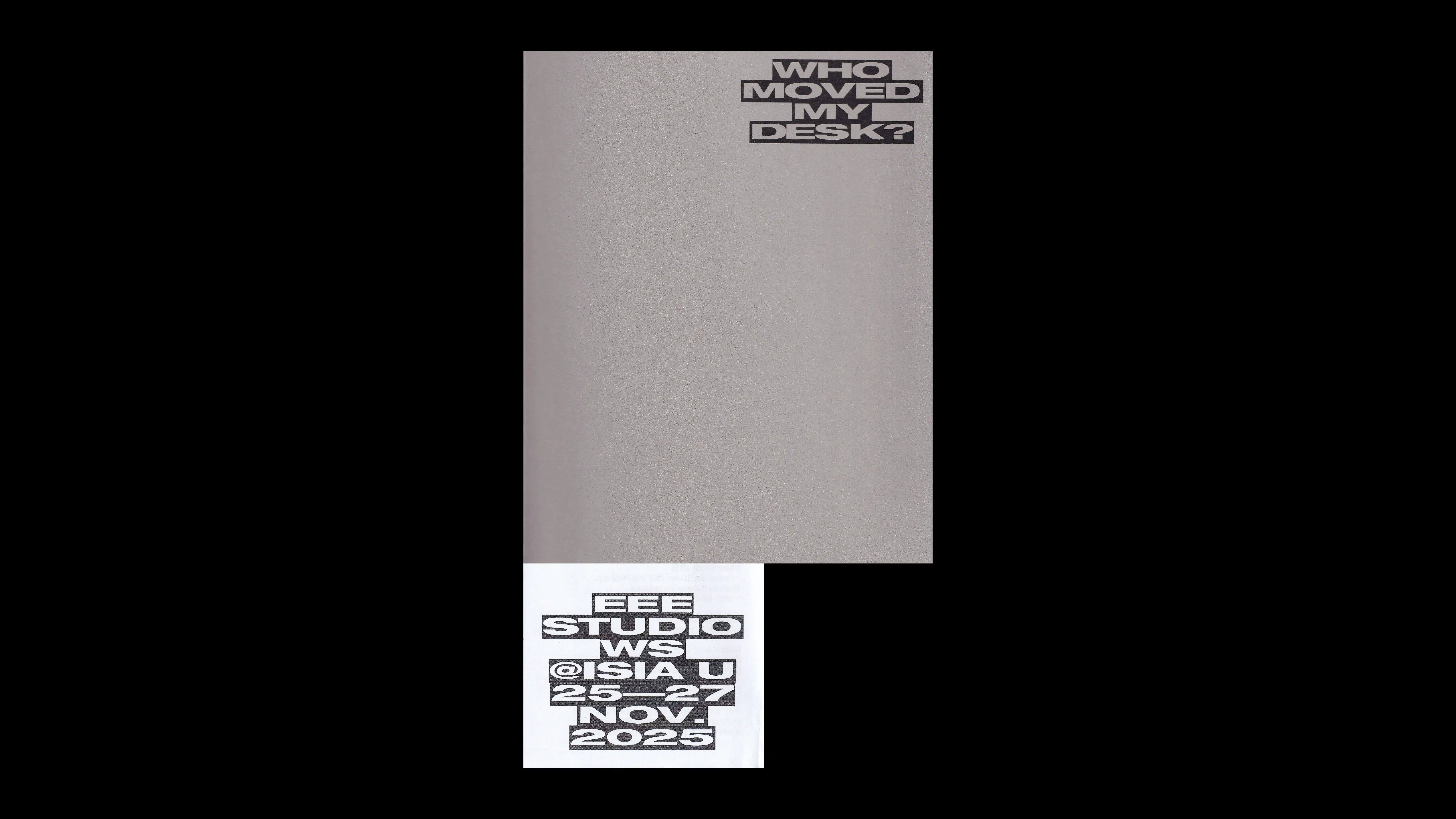
21
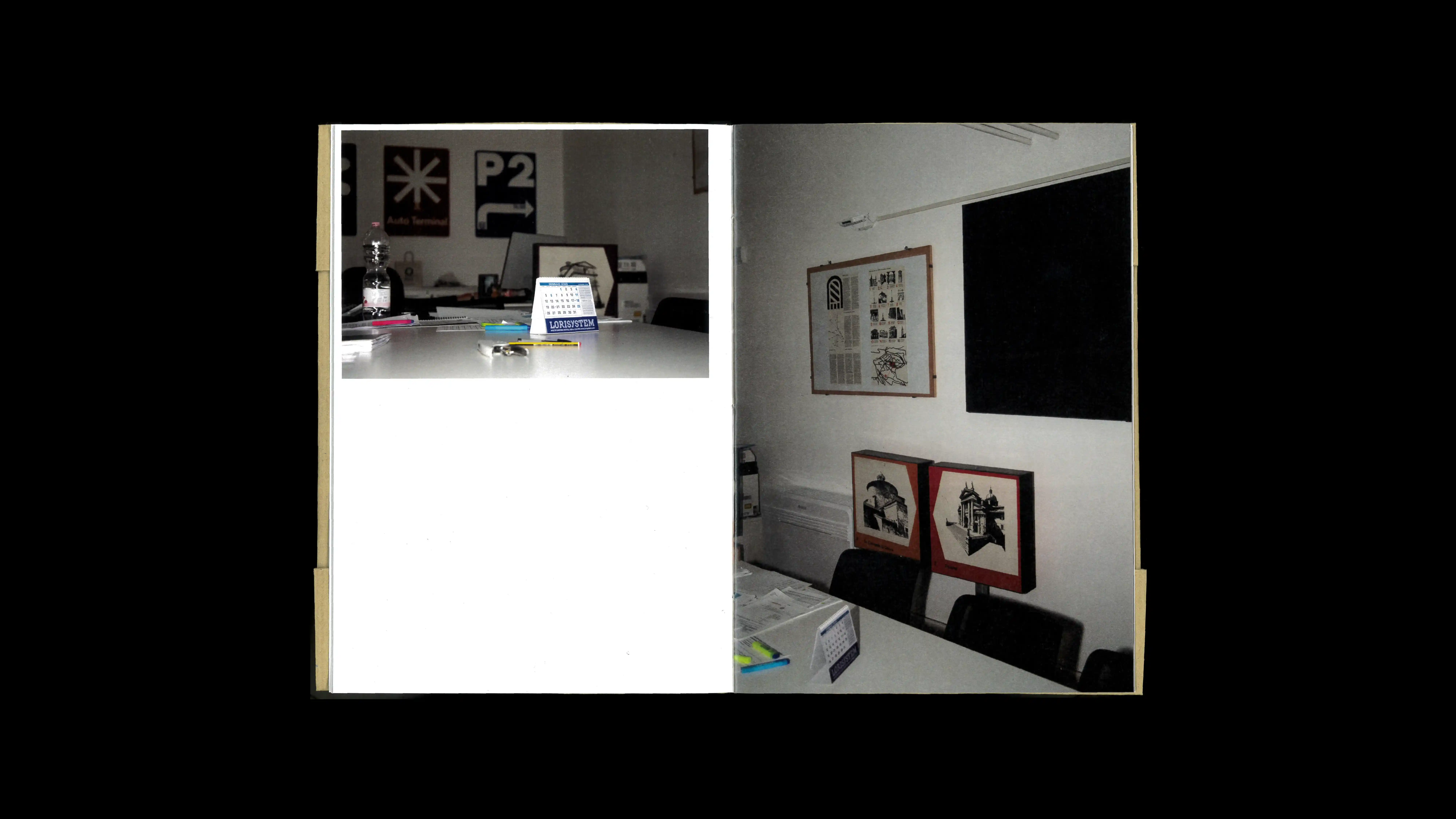
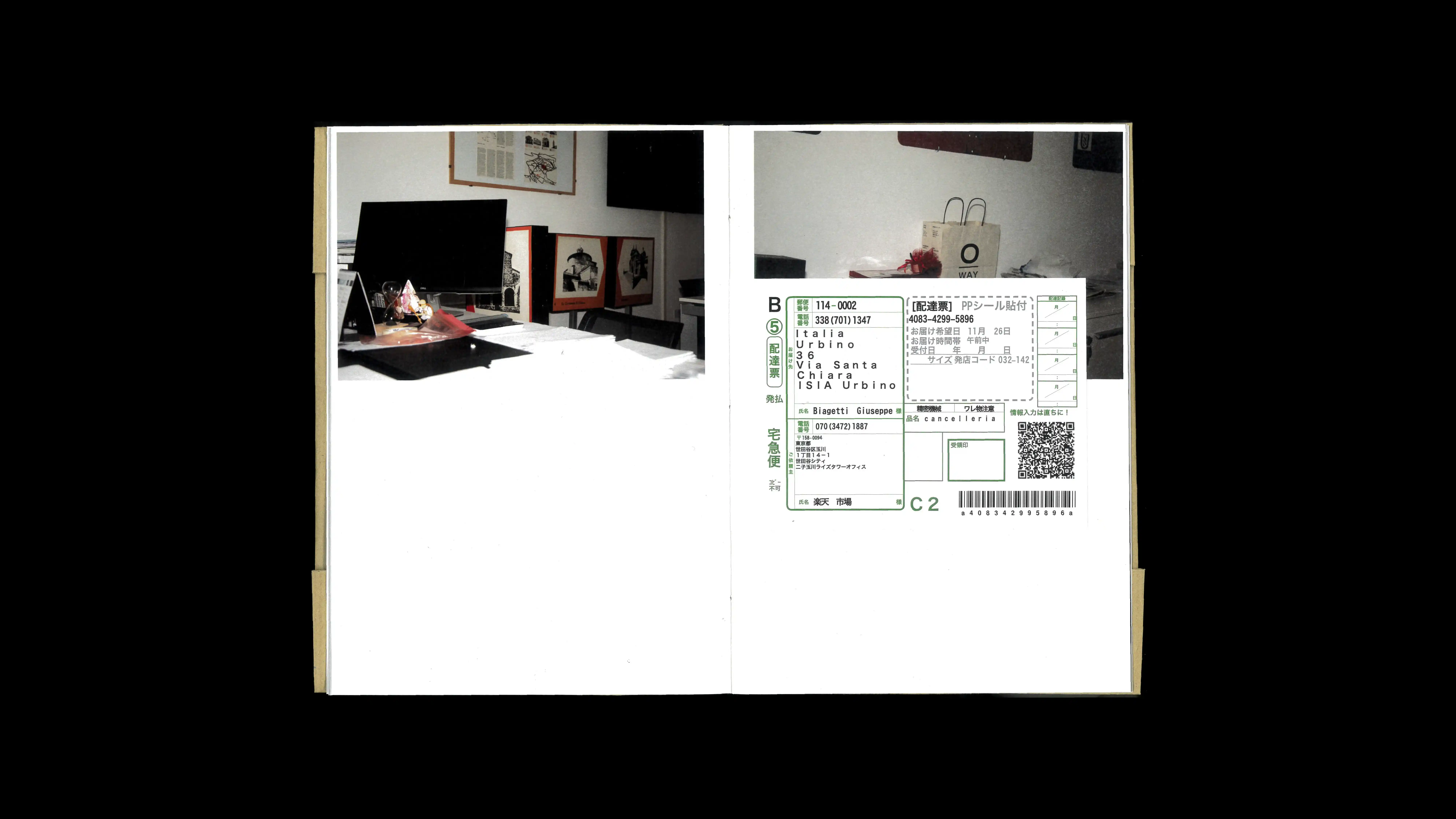
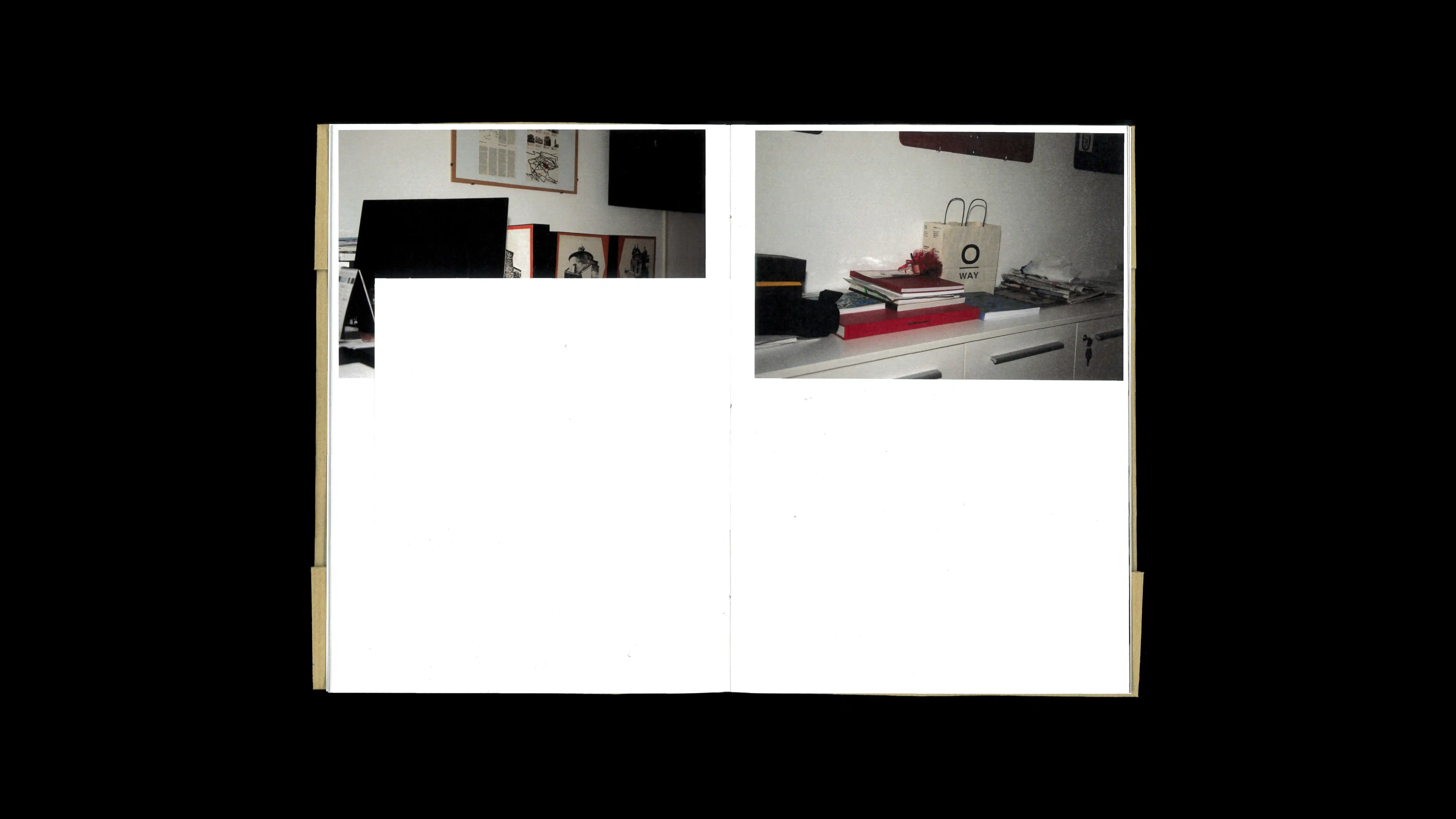
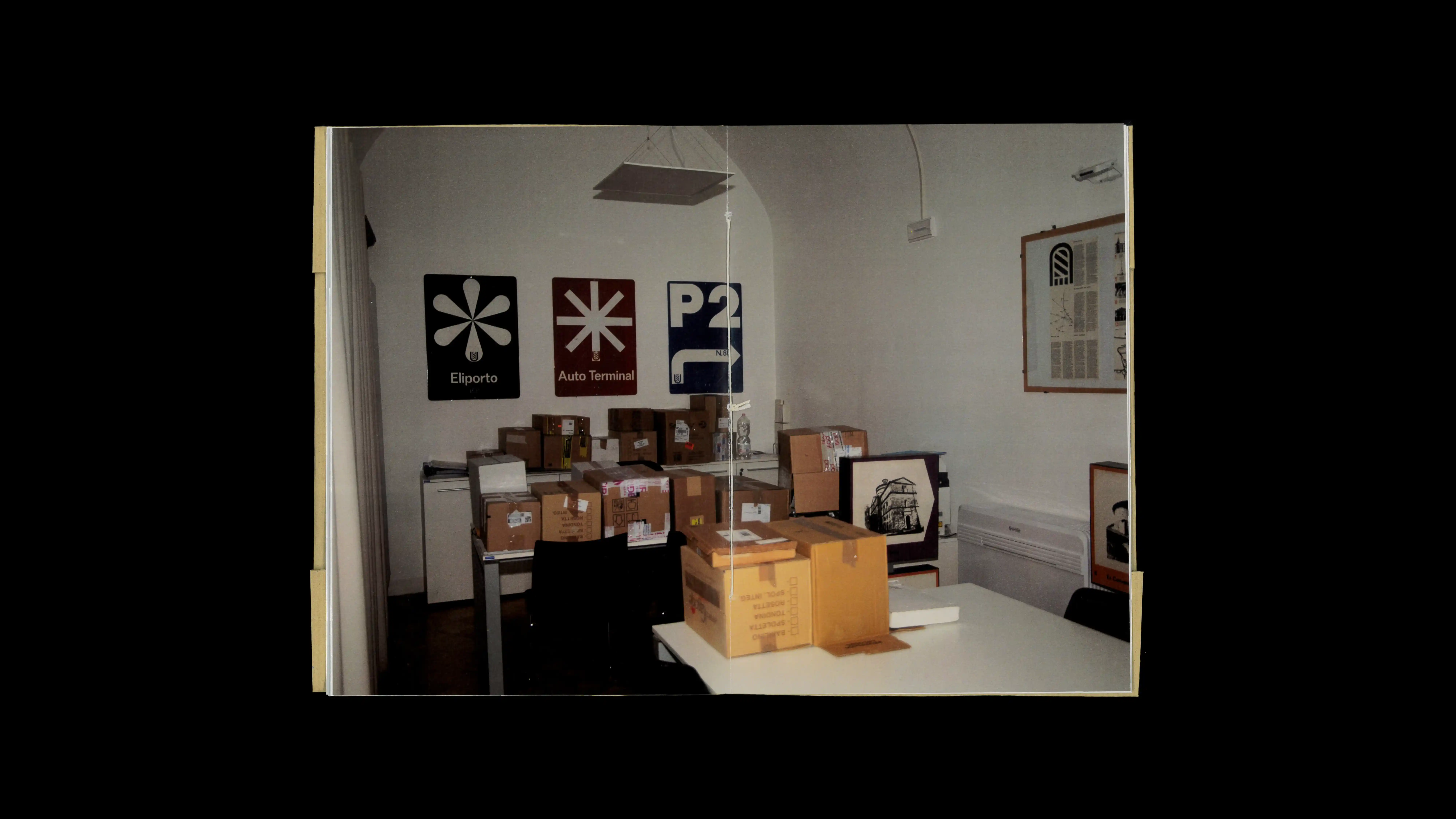
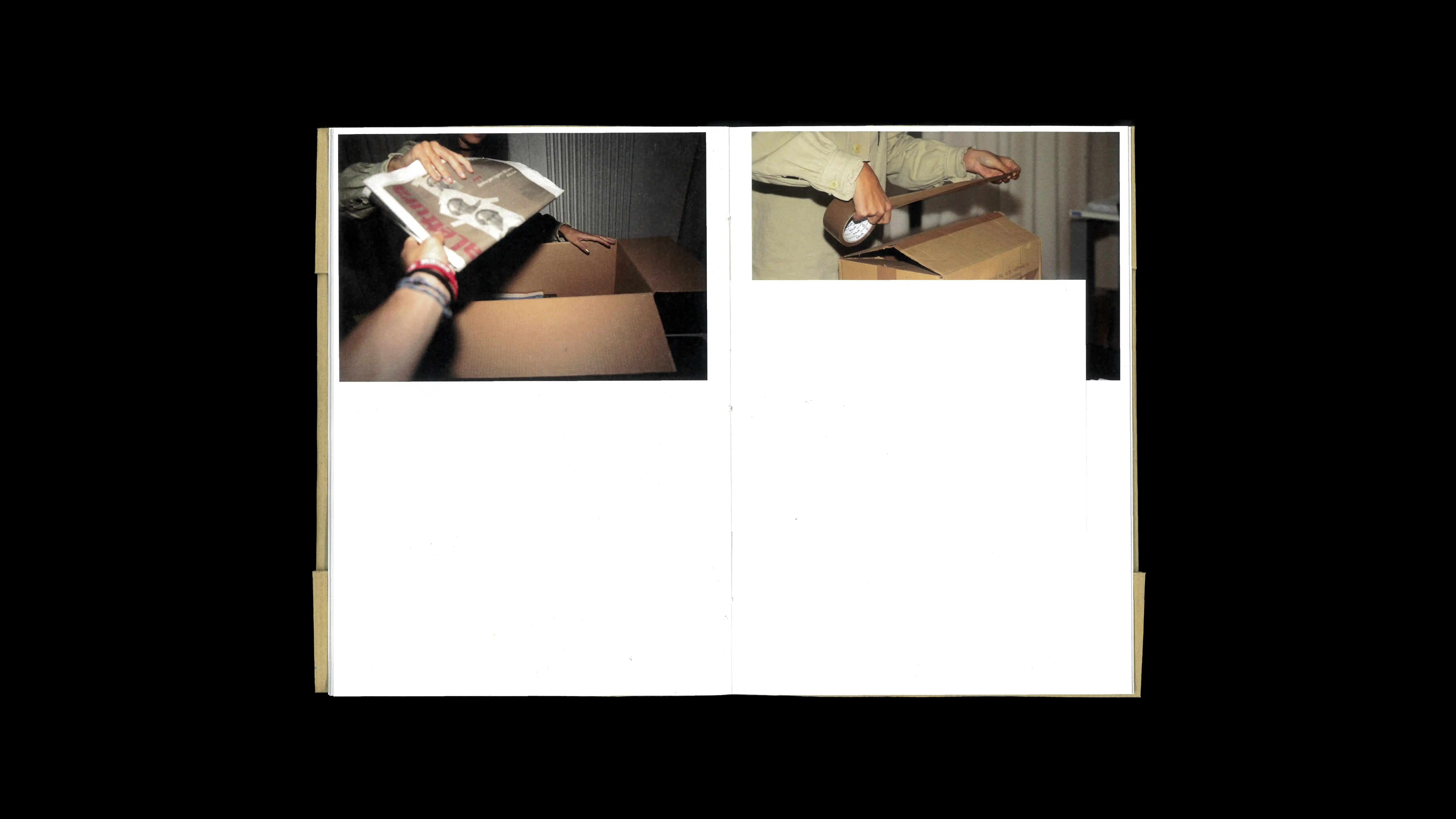
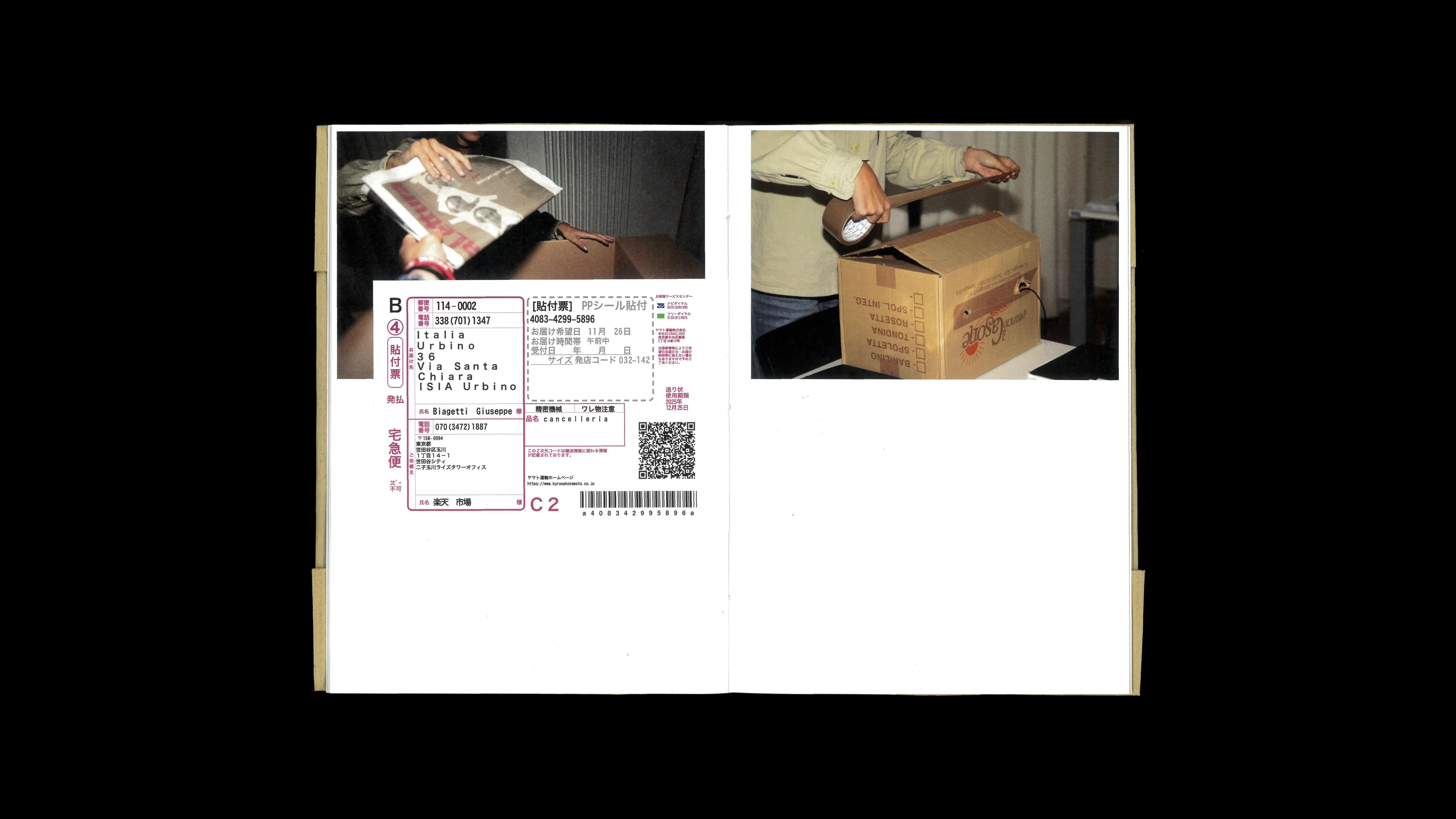
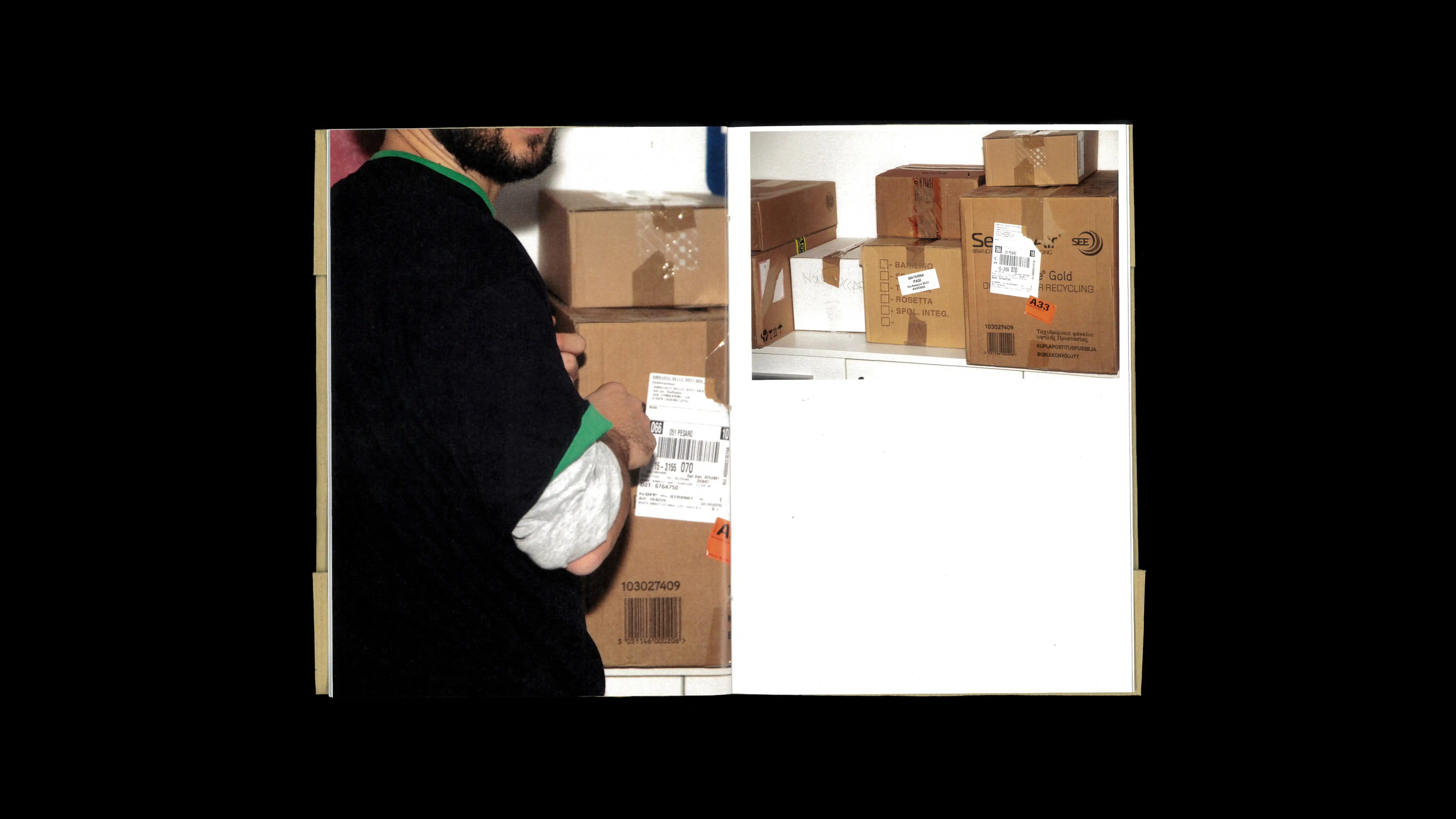
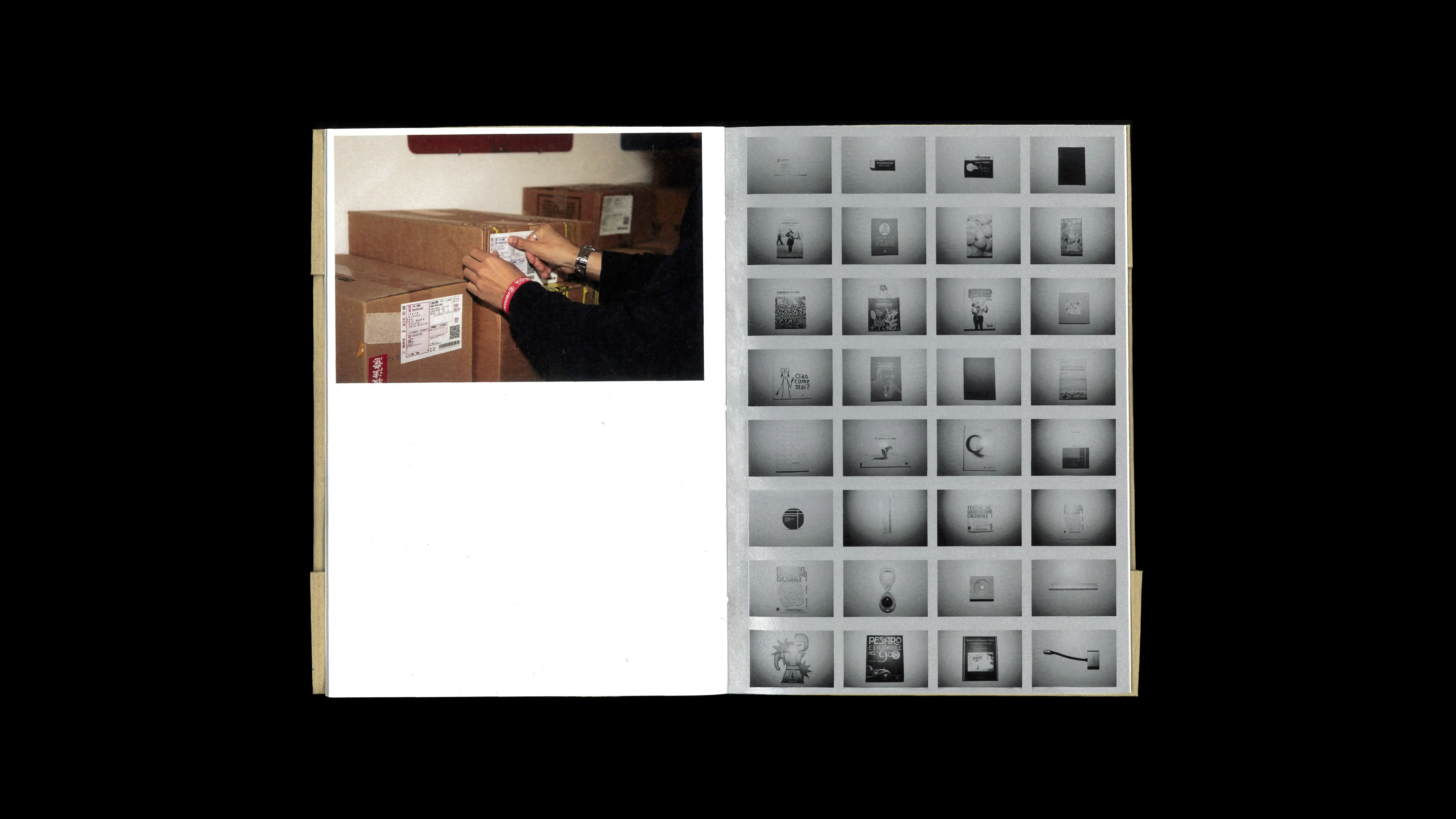
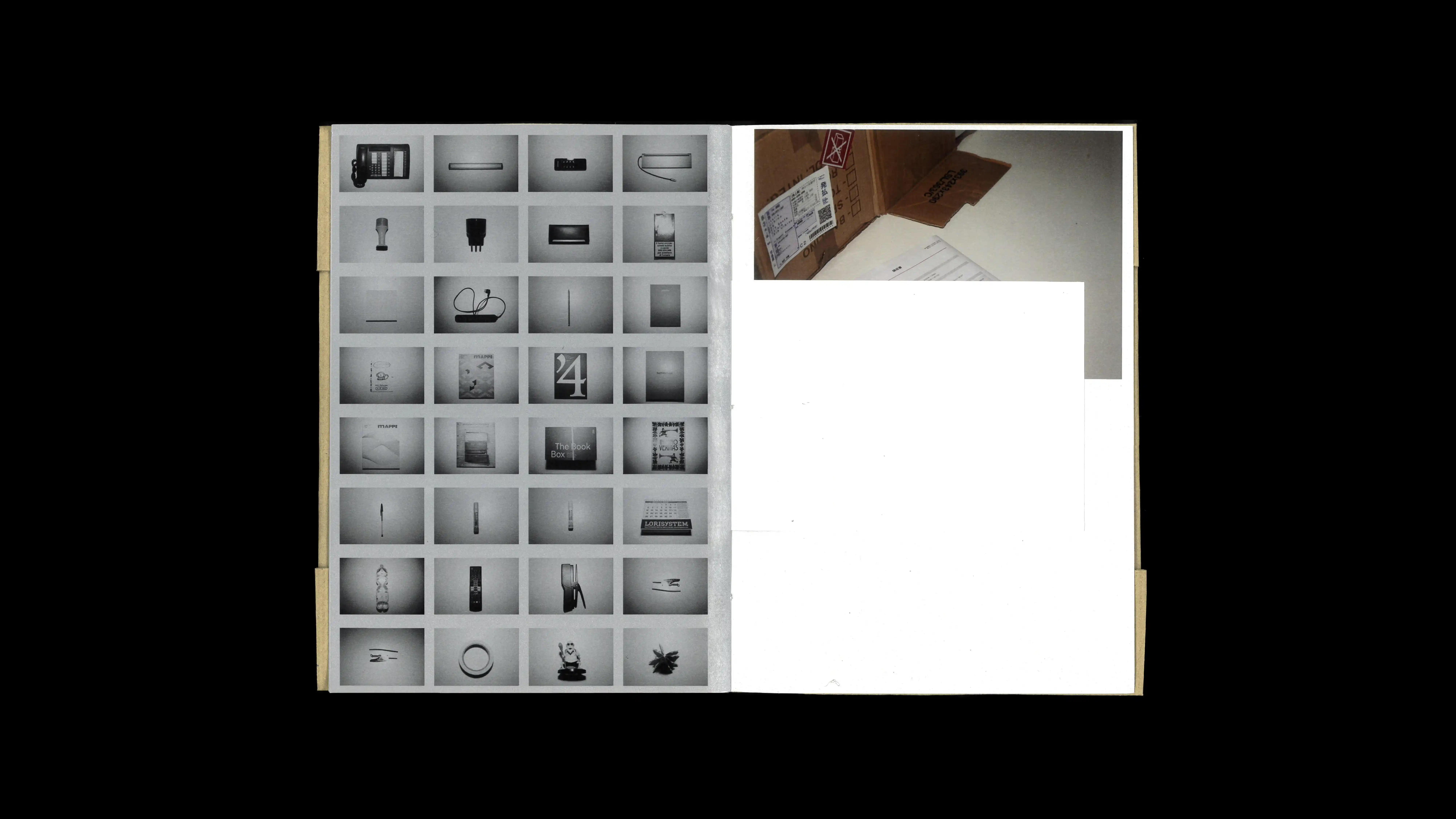
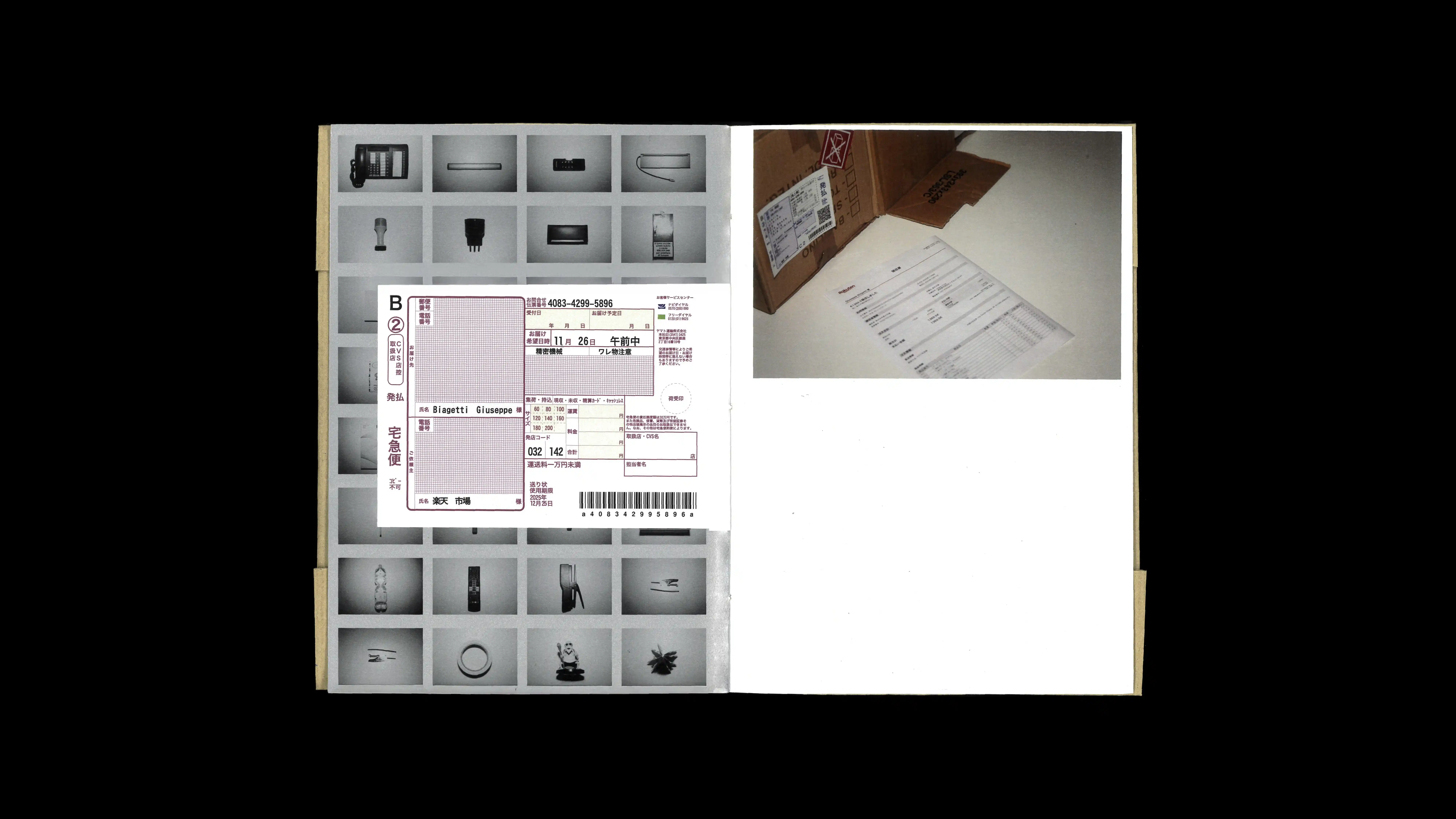
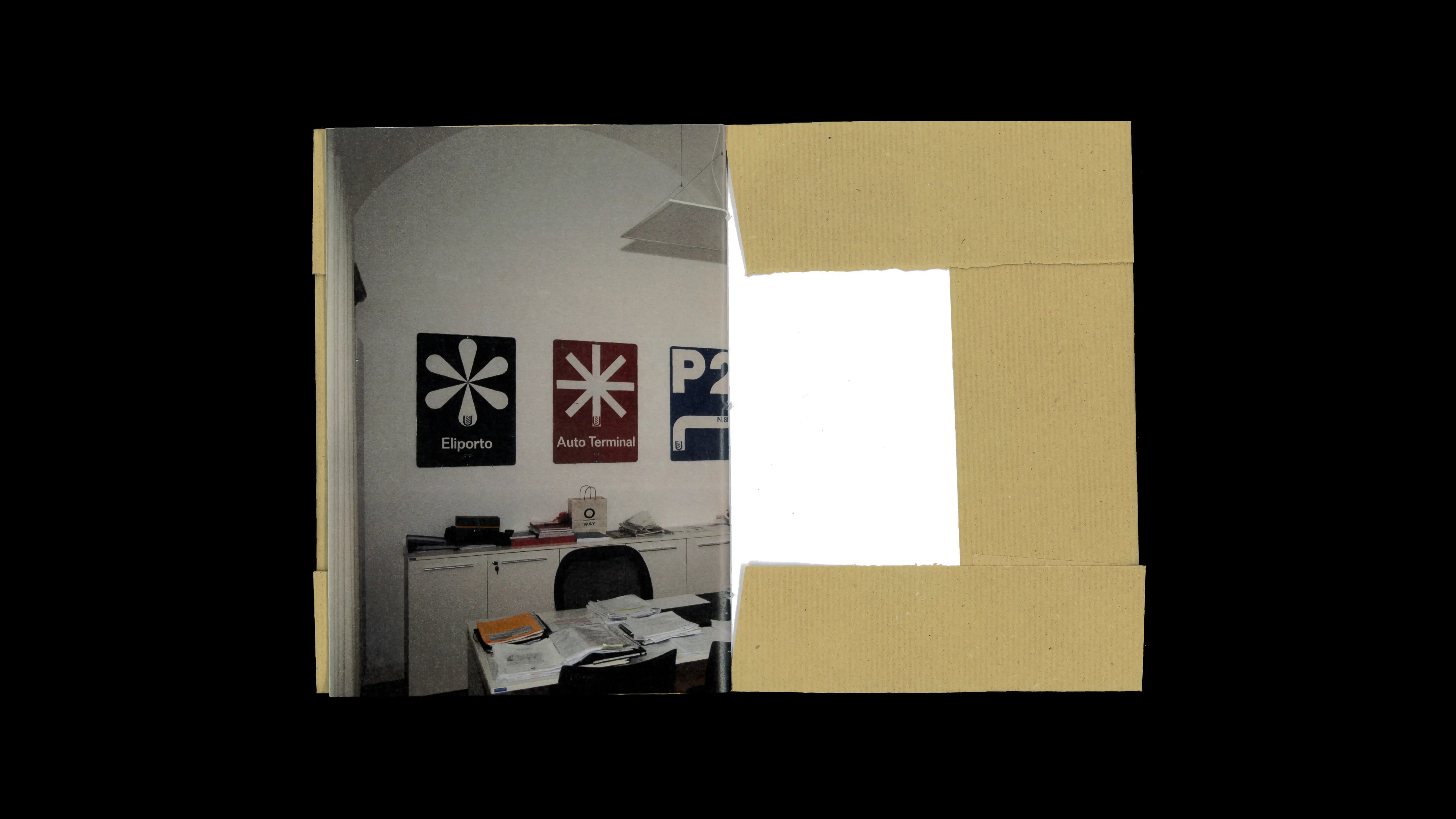
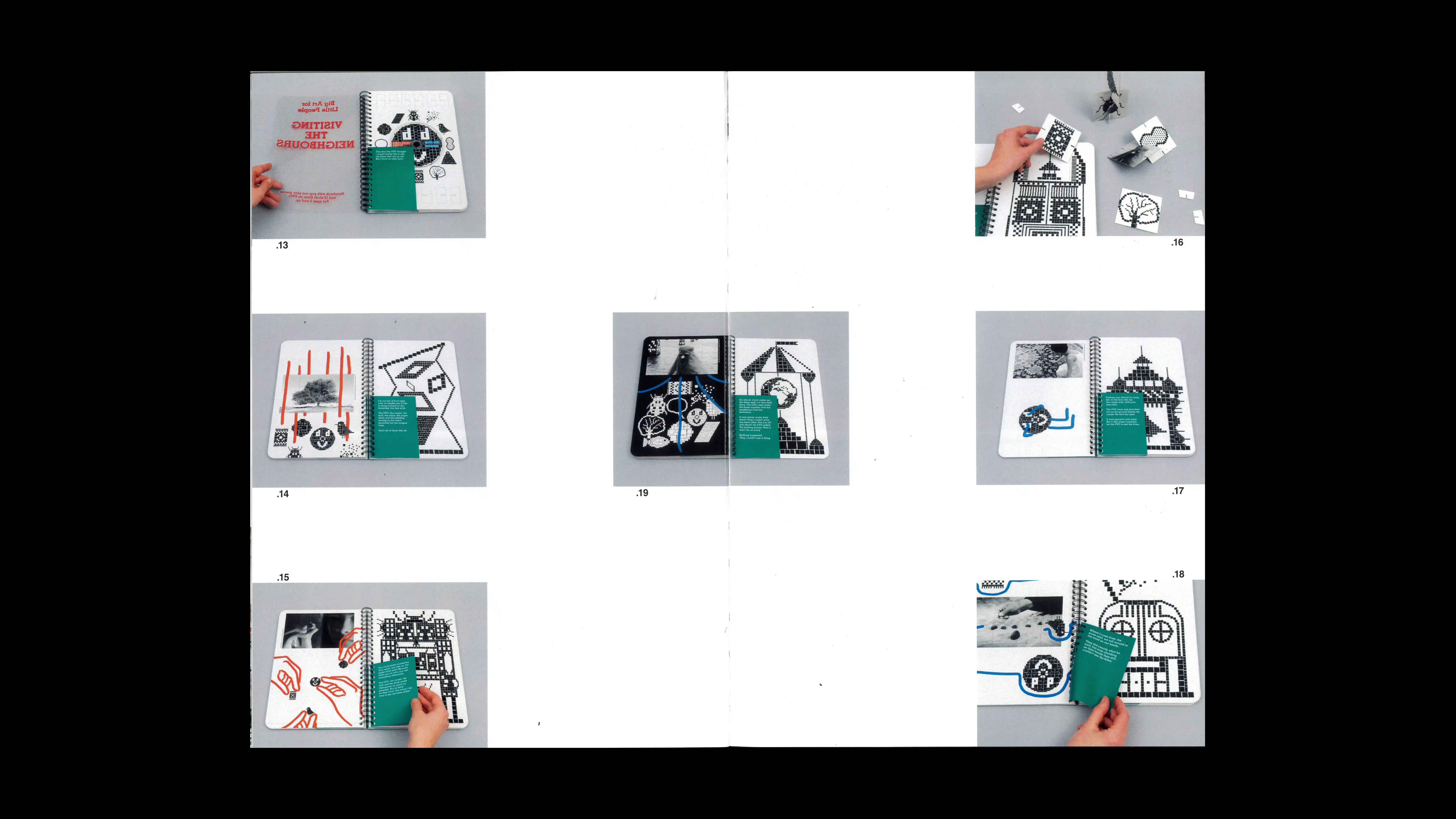
WHO MOVED THE STUDD ON MY DESK?
2025
PROJECT Book Design CONTEXT &&& Studio's Workshop at ISIA_U DESCRIPTION "An approach to graphic design that thrives on the tension between rigor and freedom. While acknowledging the ethical and functional responsibilities of communication, this perspective affirms the power of the unexpected. The goal is not merely to find what works, but to seek what surprises. In this vision, irony, play, and even error become valuable design resources. It is precisely by moving away from academic conventions that the most vivid intuitions emerge. Design, therefore, is not just about solving problems, but about opening new expressive avenues capable of disorienting and fascinating. What happens when graphic design abandons rigor to embrace play? During the ISIA director's absence, his office was transformed into a surreal international shipment. By using perfectly counterfeited Japanese labels and documents to wrap the entire environment, the project demonstrated that design can be a tool to disorient, surprise, and entertain."
"Special thanks to EEE studio, Emilio Macchia, and Erica Preli for realizing this special workshop, in which we experimented with a new playful dimension of 'being graphic designers.'
"Special thanks to EEE studio, Emilio Macchia, and Erica Preli for realizing this special workshop, in which we experimented with a new playful dimension of 'being graphic designers.'
1 (OF) 12
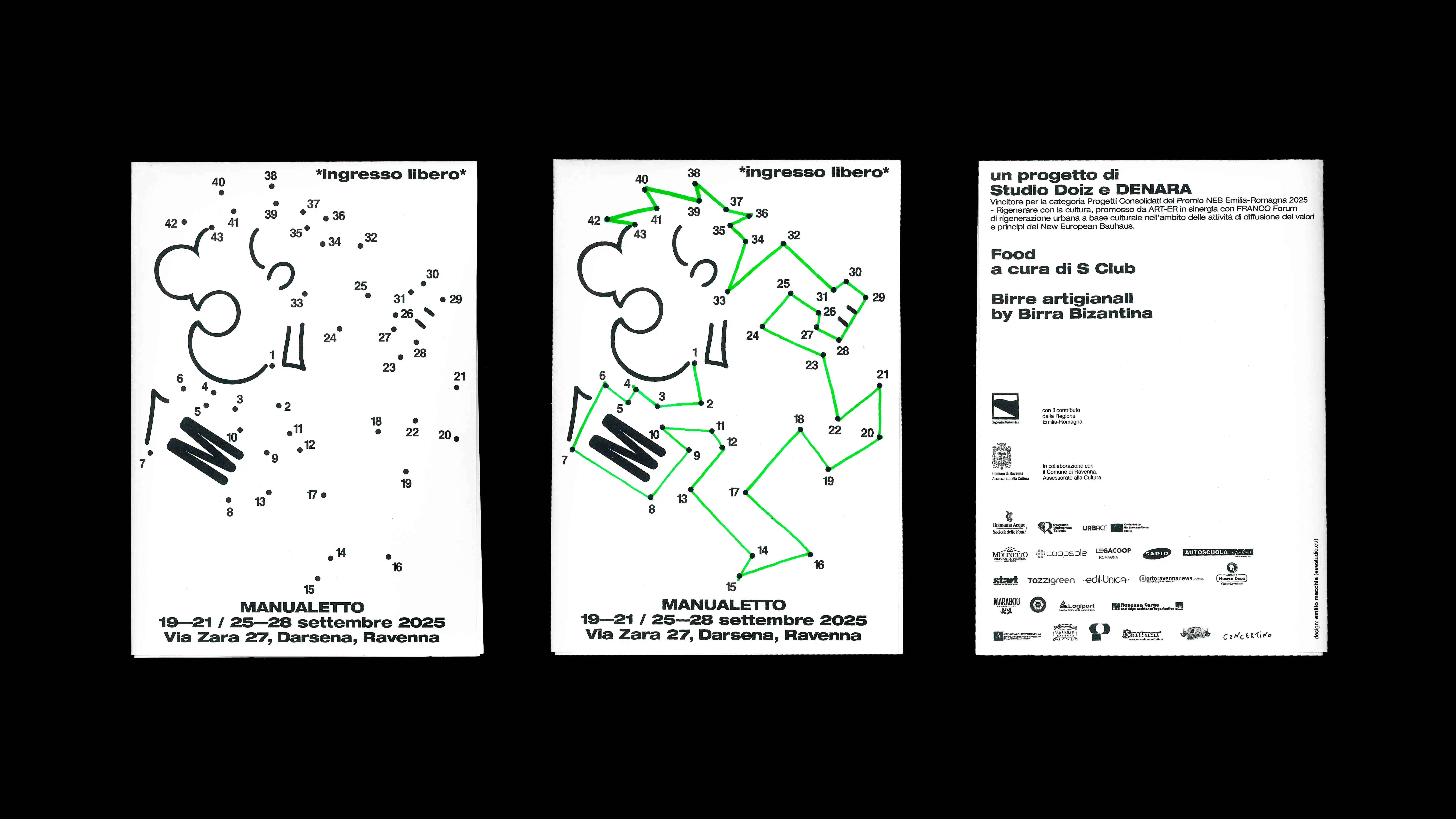
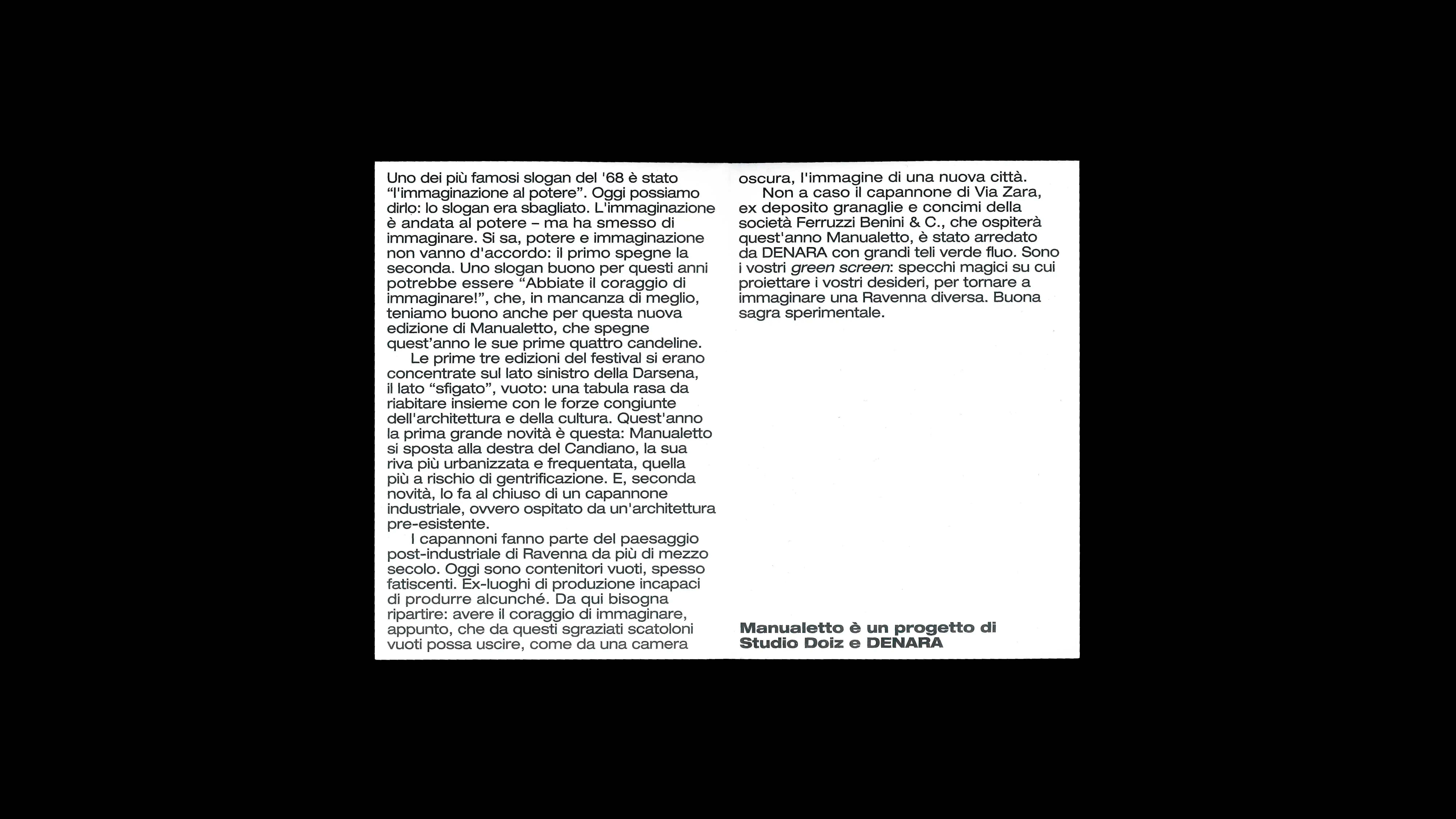
20
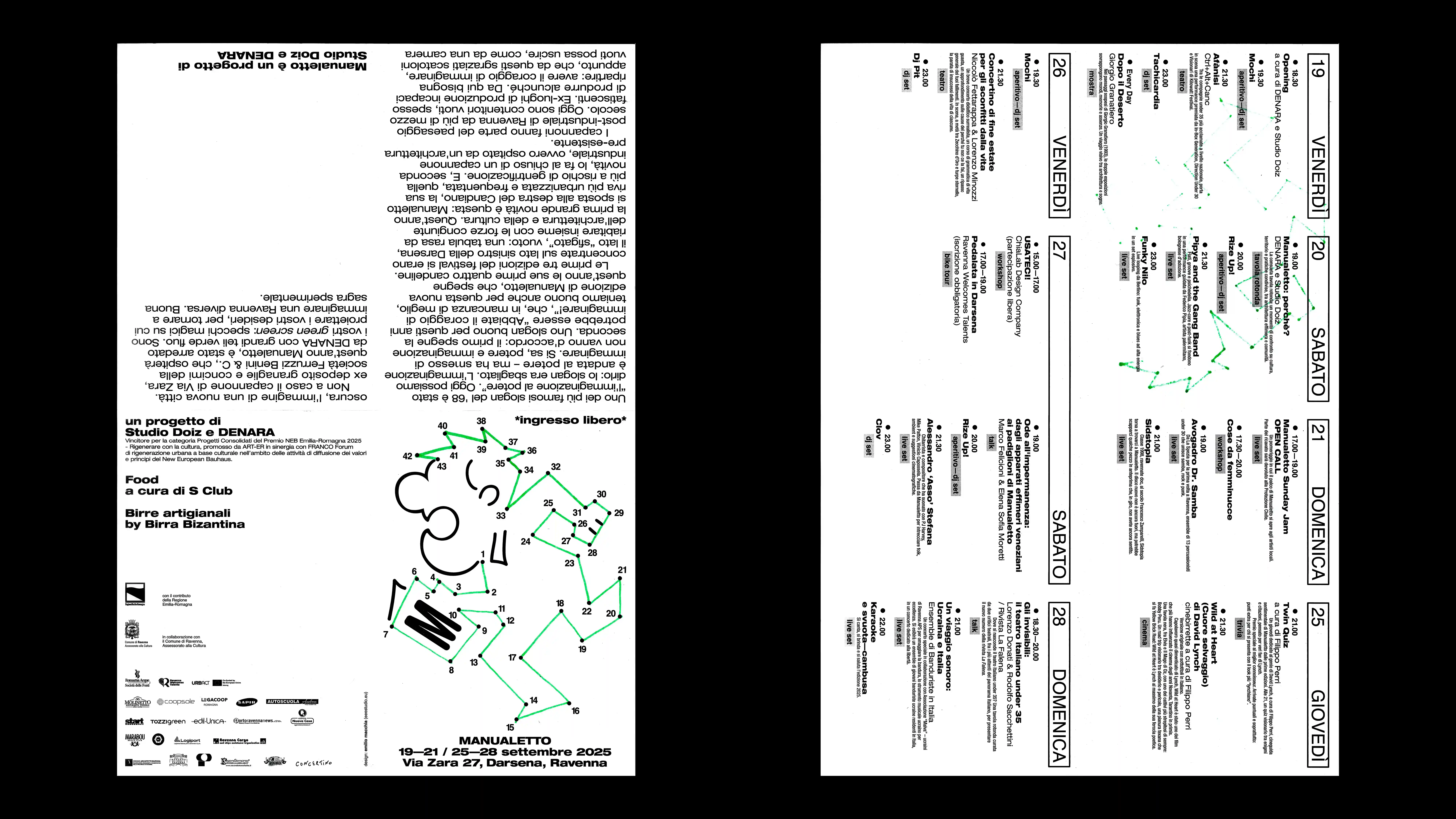
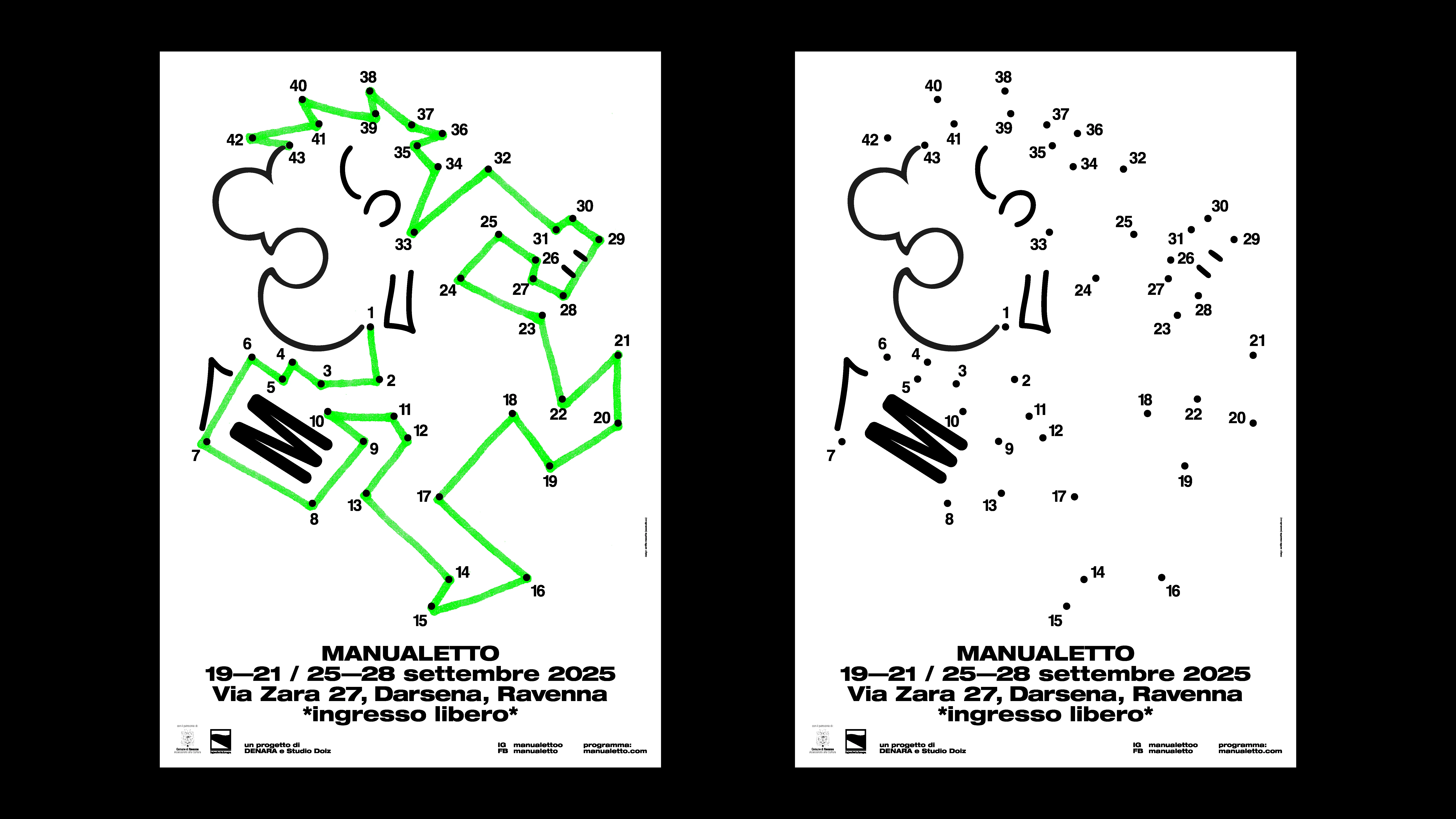
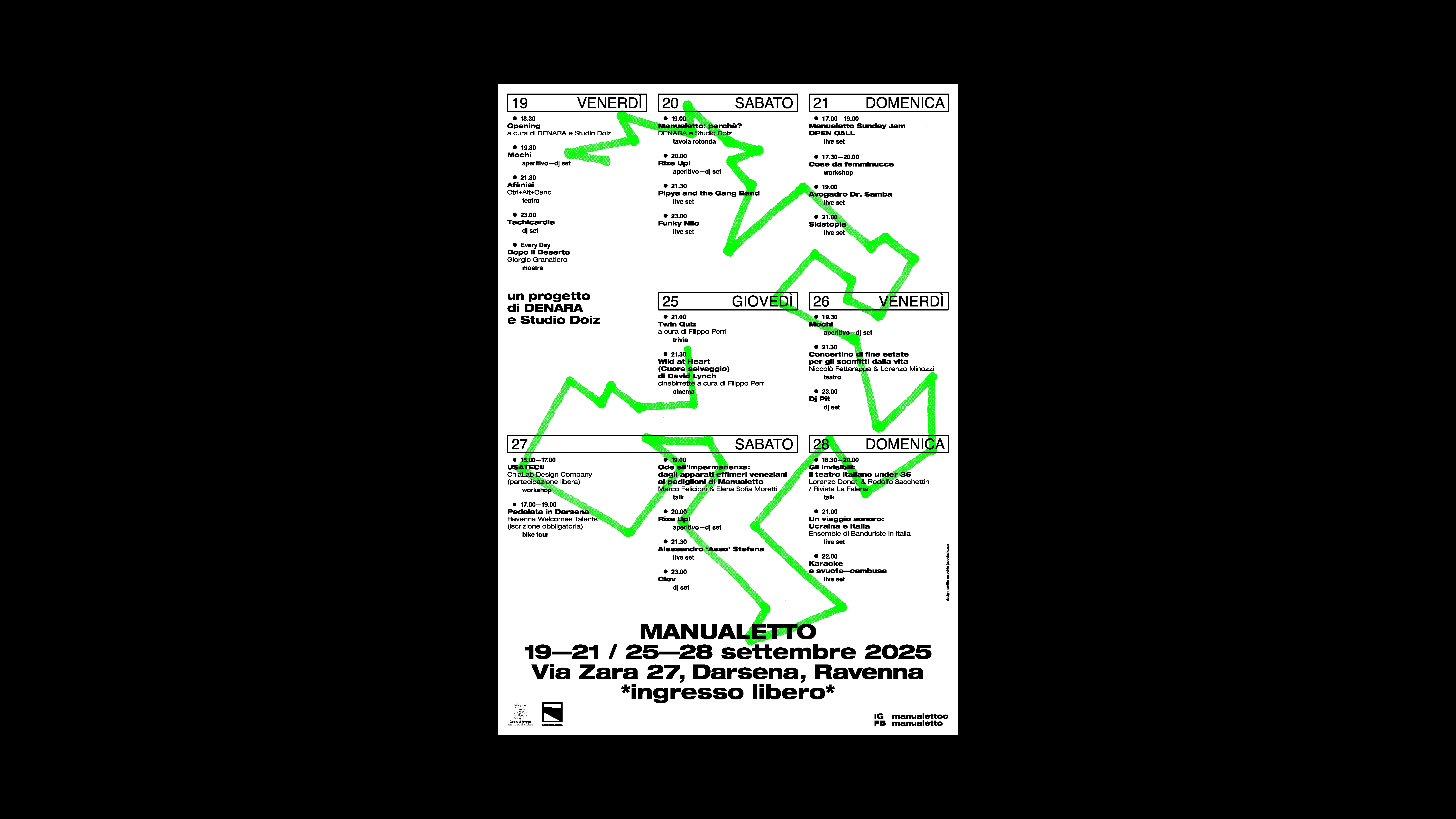
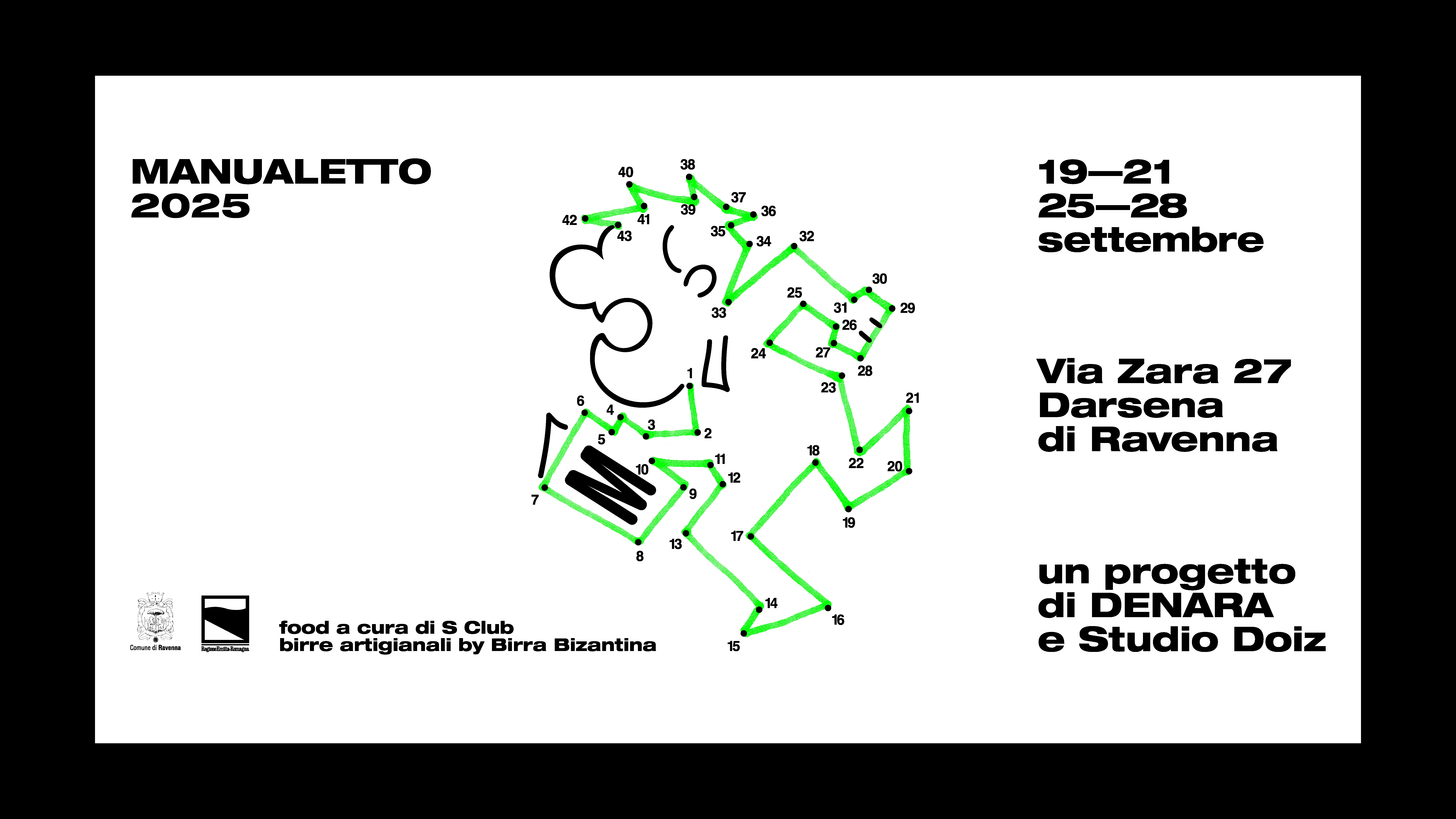
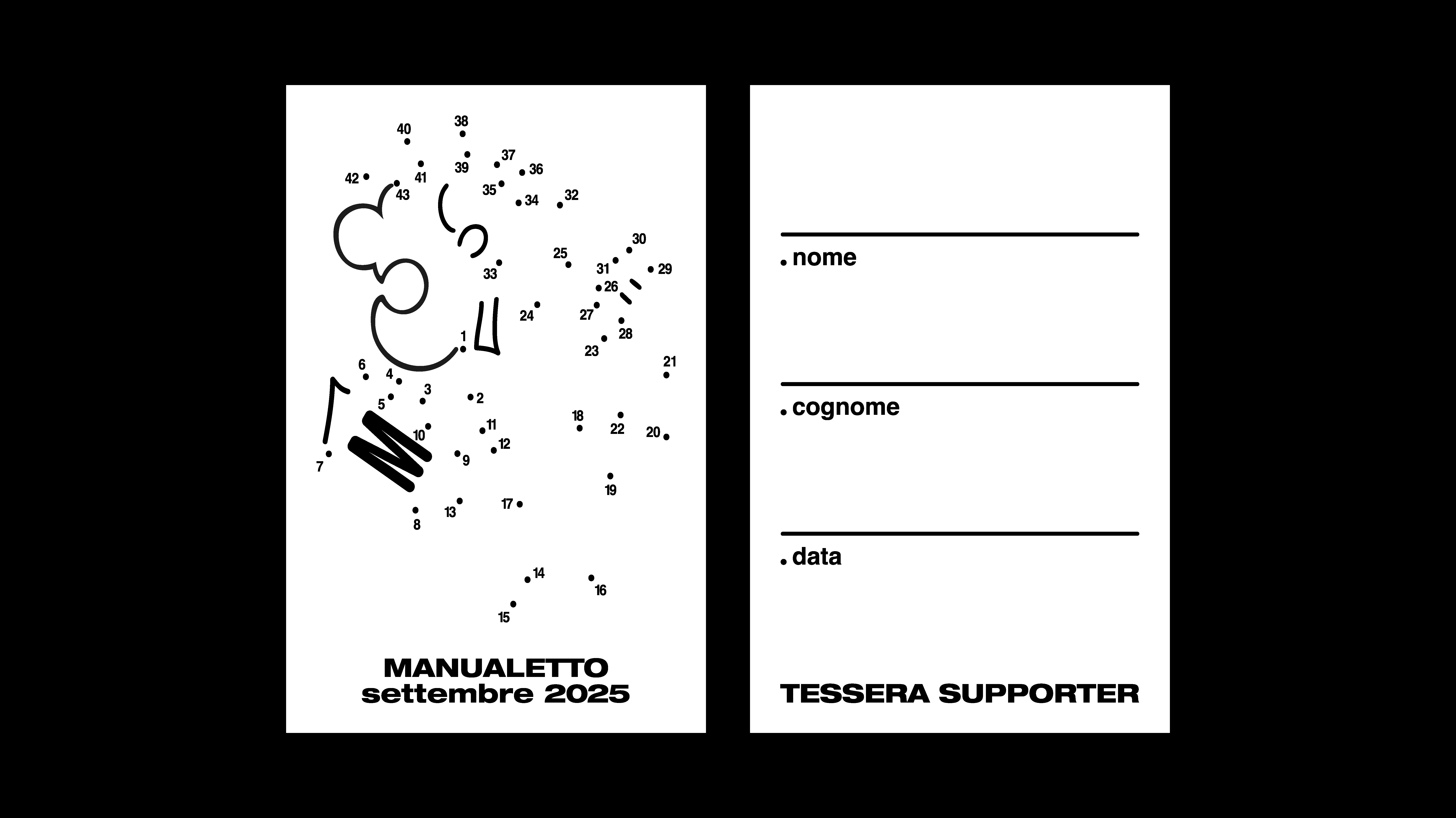
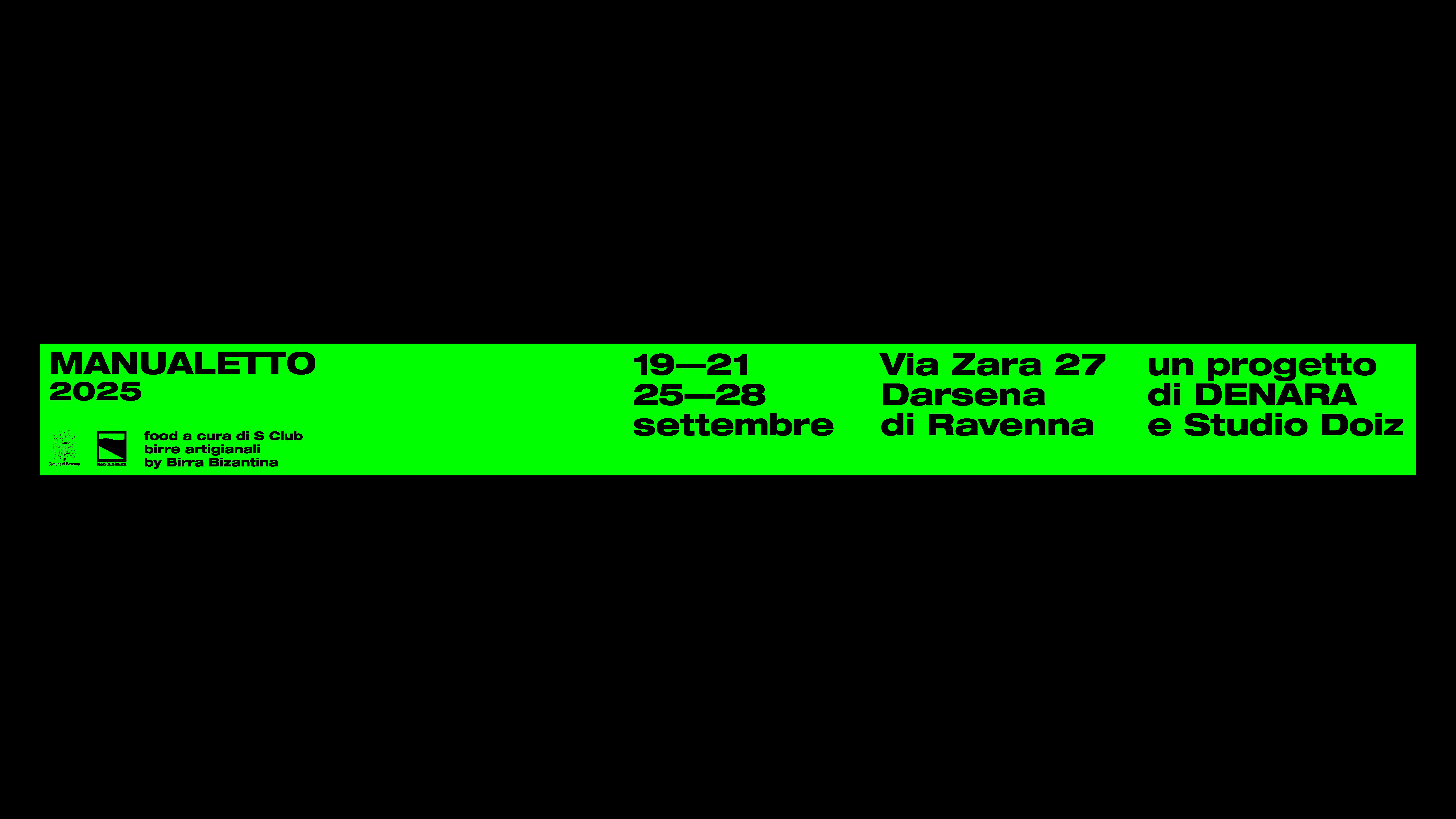
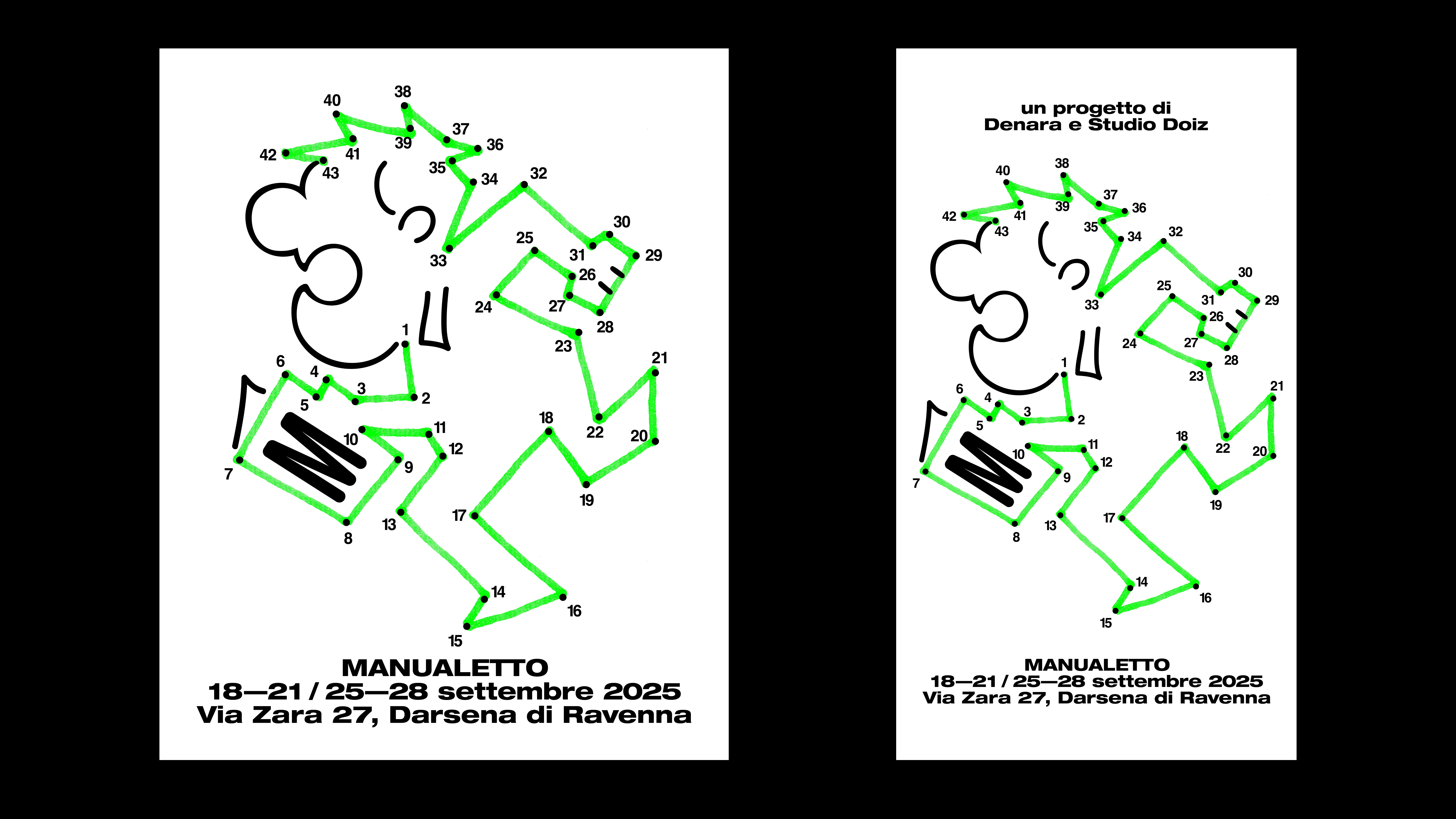
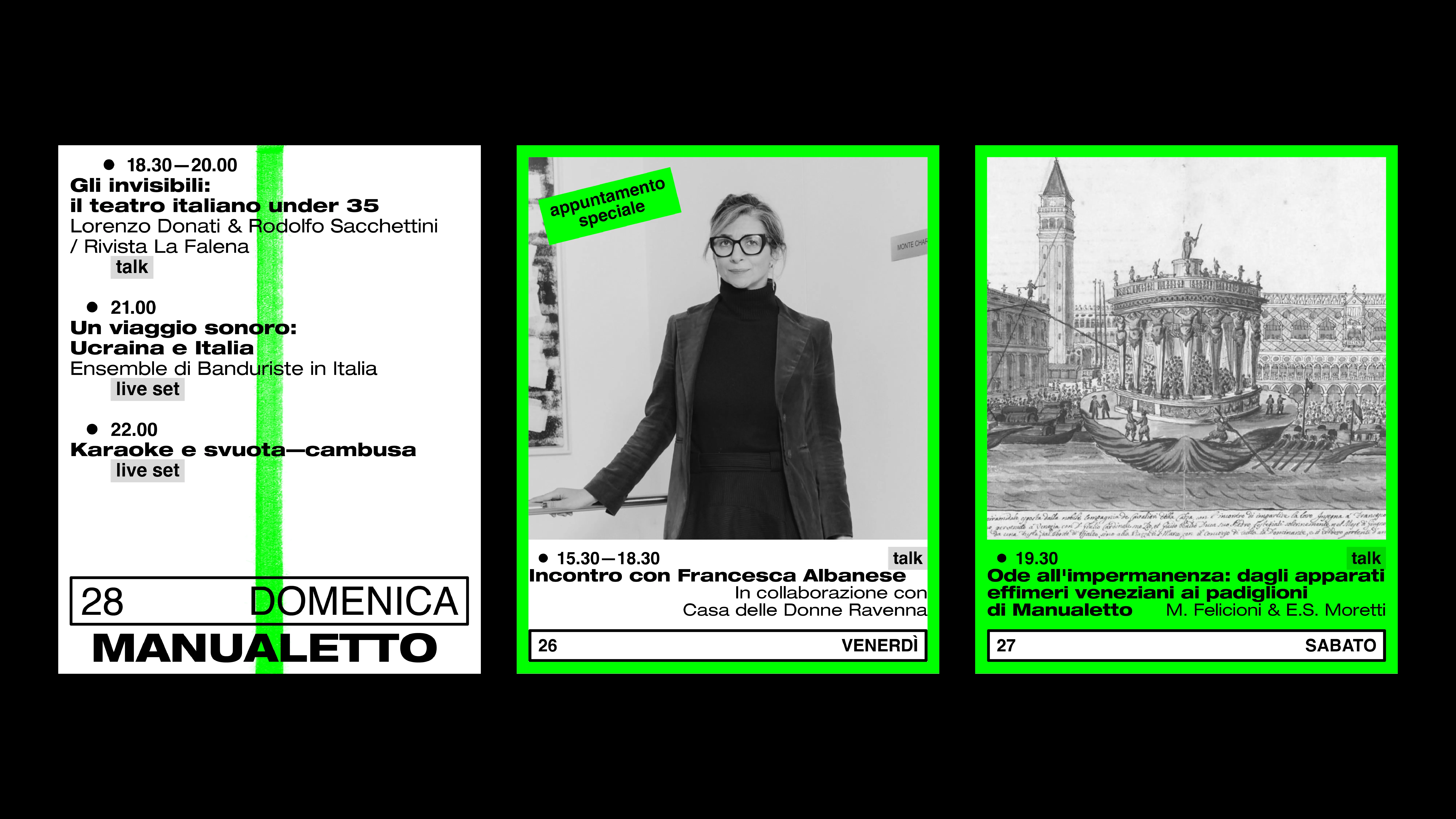
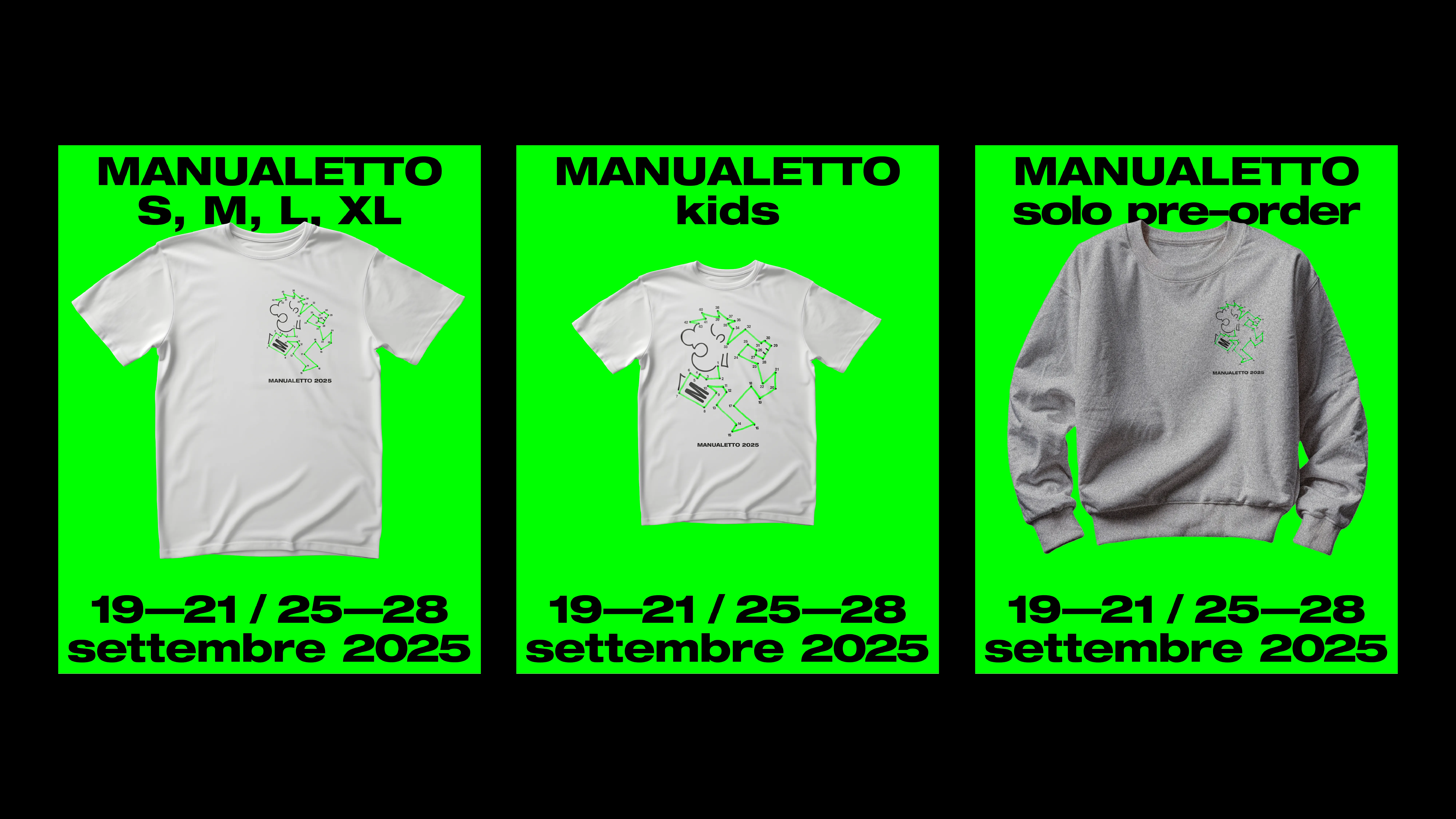
MANUALETTO 2025
2025
PROJECT Art Direction by Emilio Macchia (eeestudio) CLIENT Manualetto festival CONTEXT the City’s Waterfront, September 2025 DESCRIPTION Inspired by the Radical Design of Ugo La Pietra and Ettore Sottsass, the visual identity for Manualetto 2025 is an open, participatory system. The public is invited to complete the graphic materials, transforming the design into a collective gesture of playful reappropriation of the city.
(collaborative project: internship)
(collaborative project: internship)
1 (OF) 12

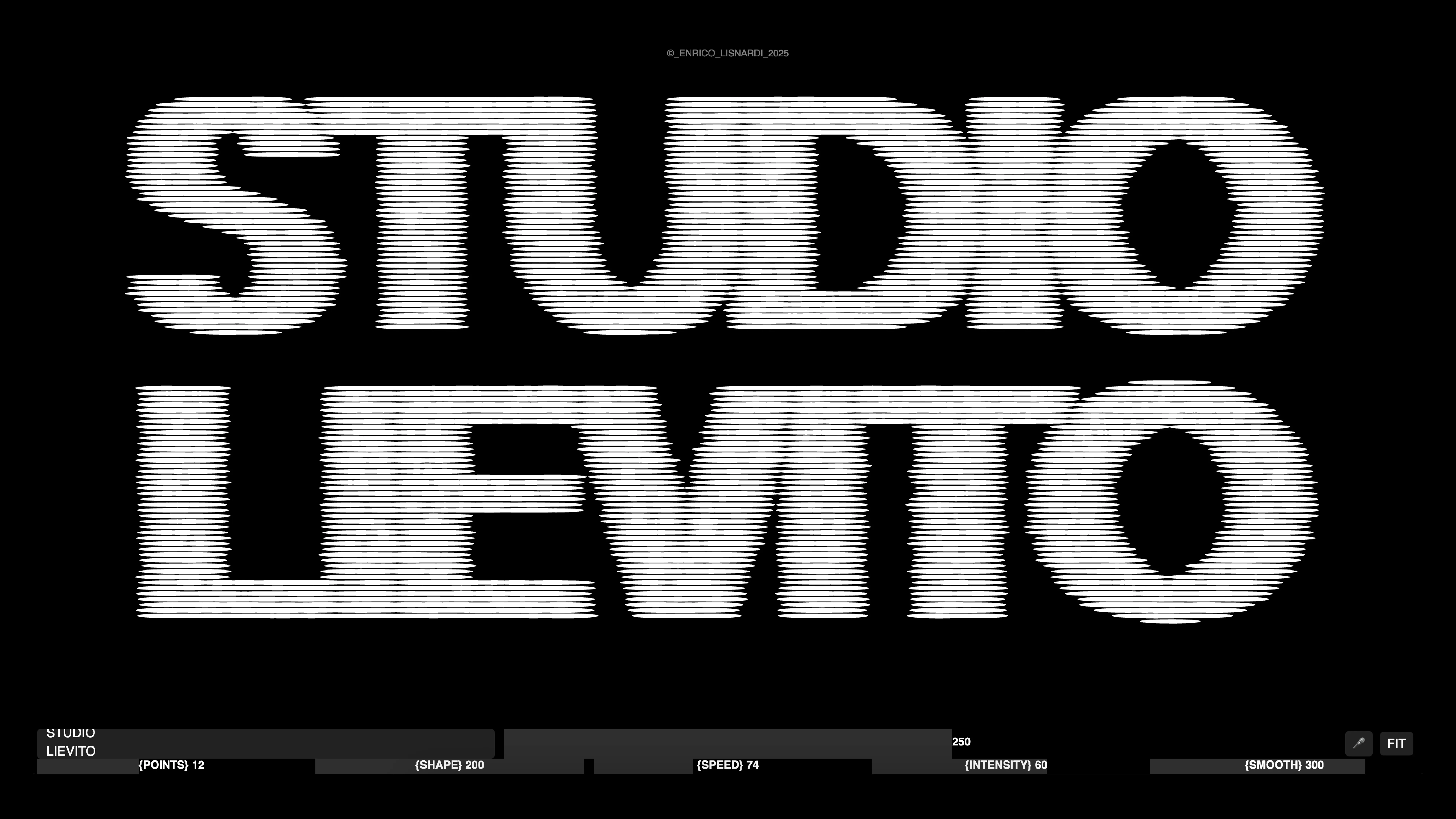
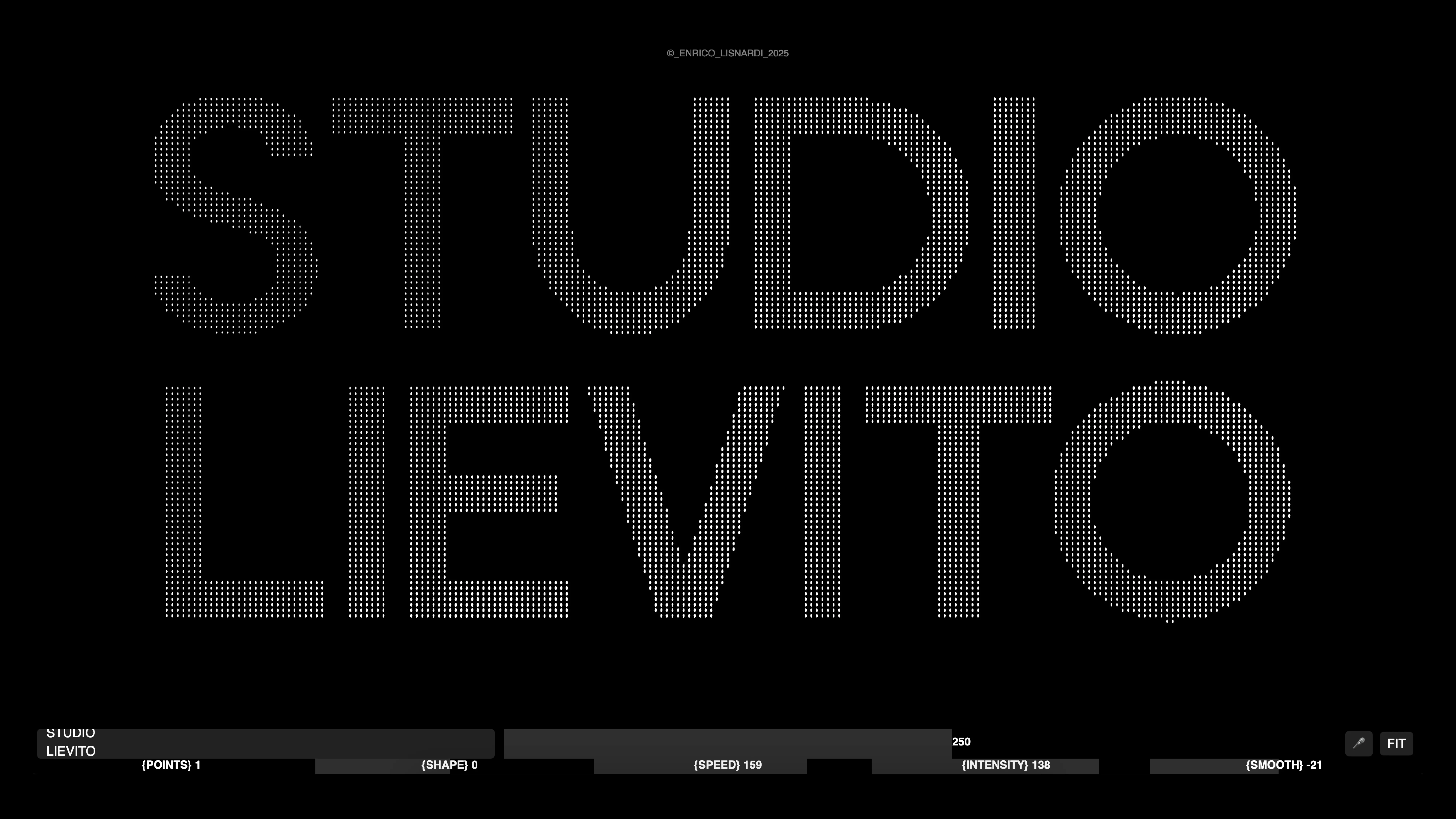
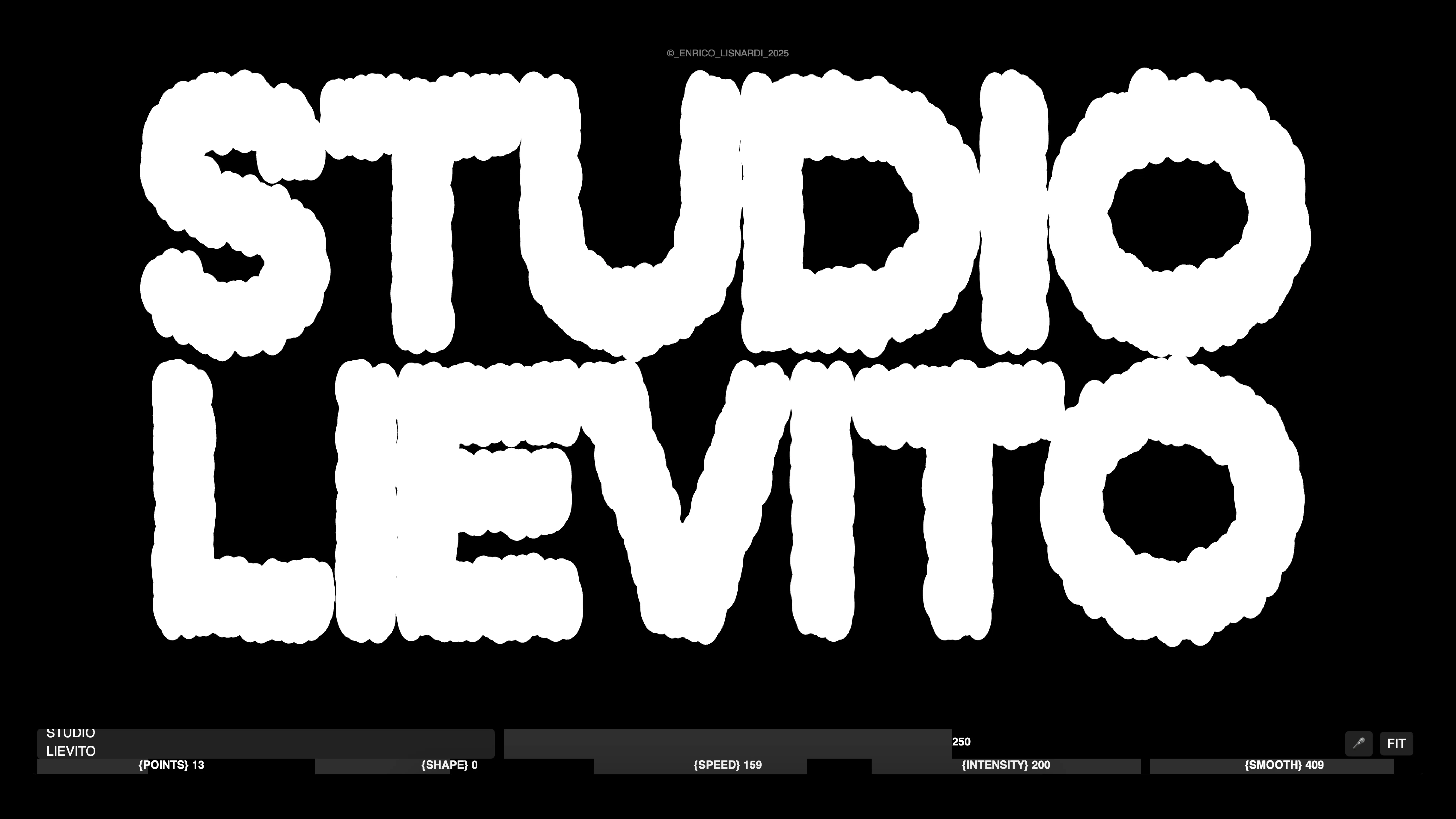
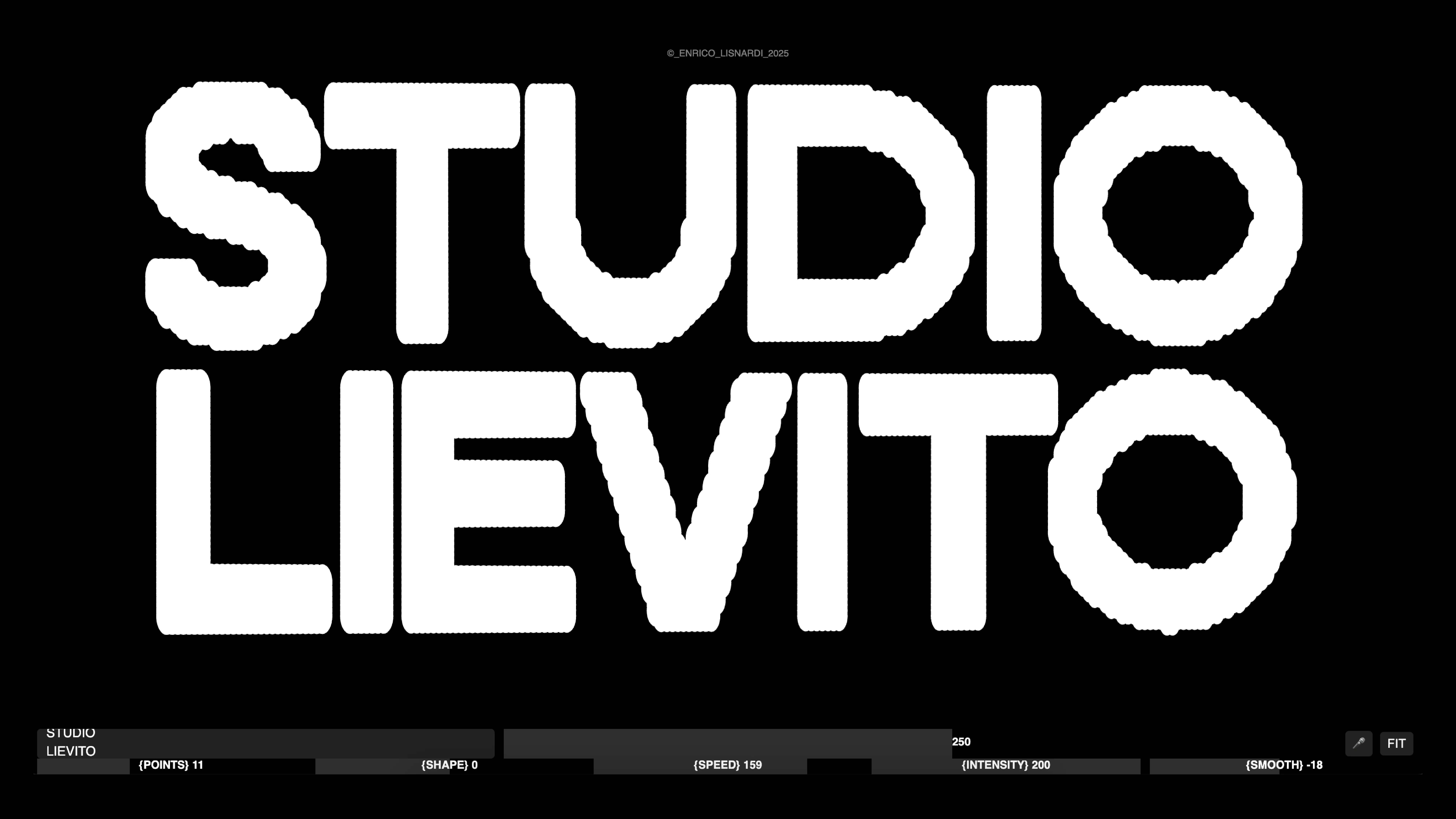
19
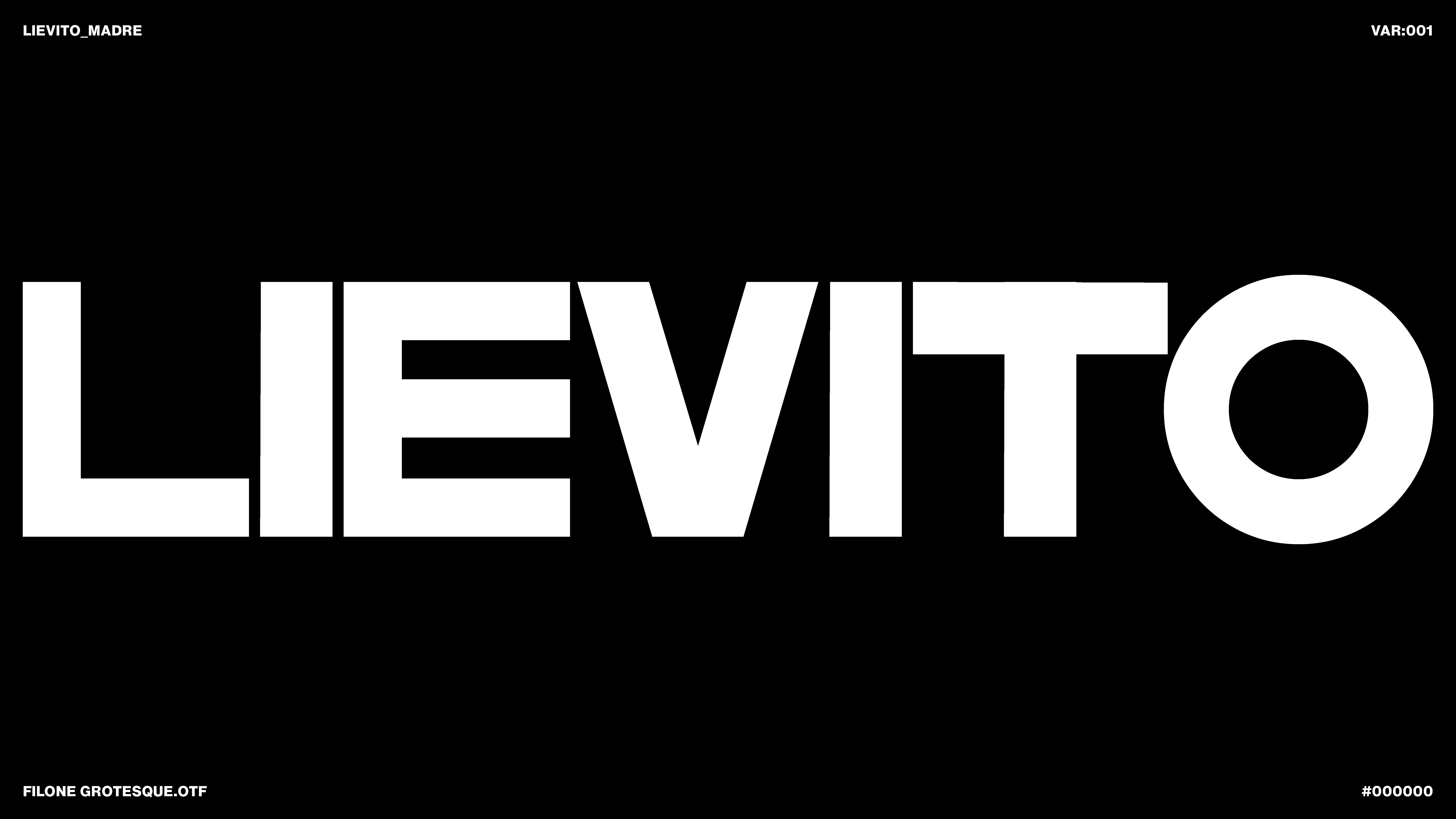
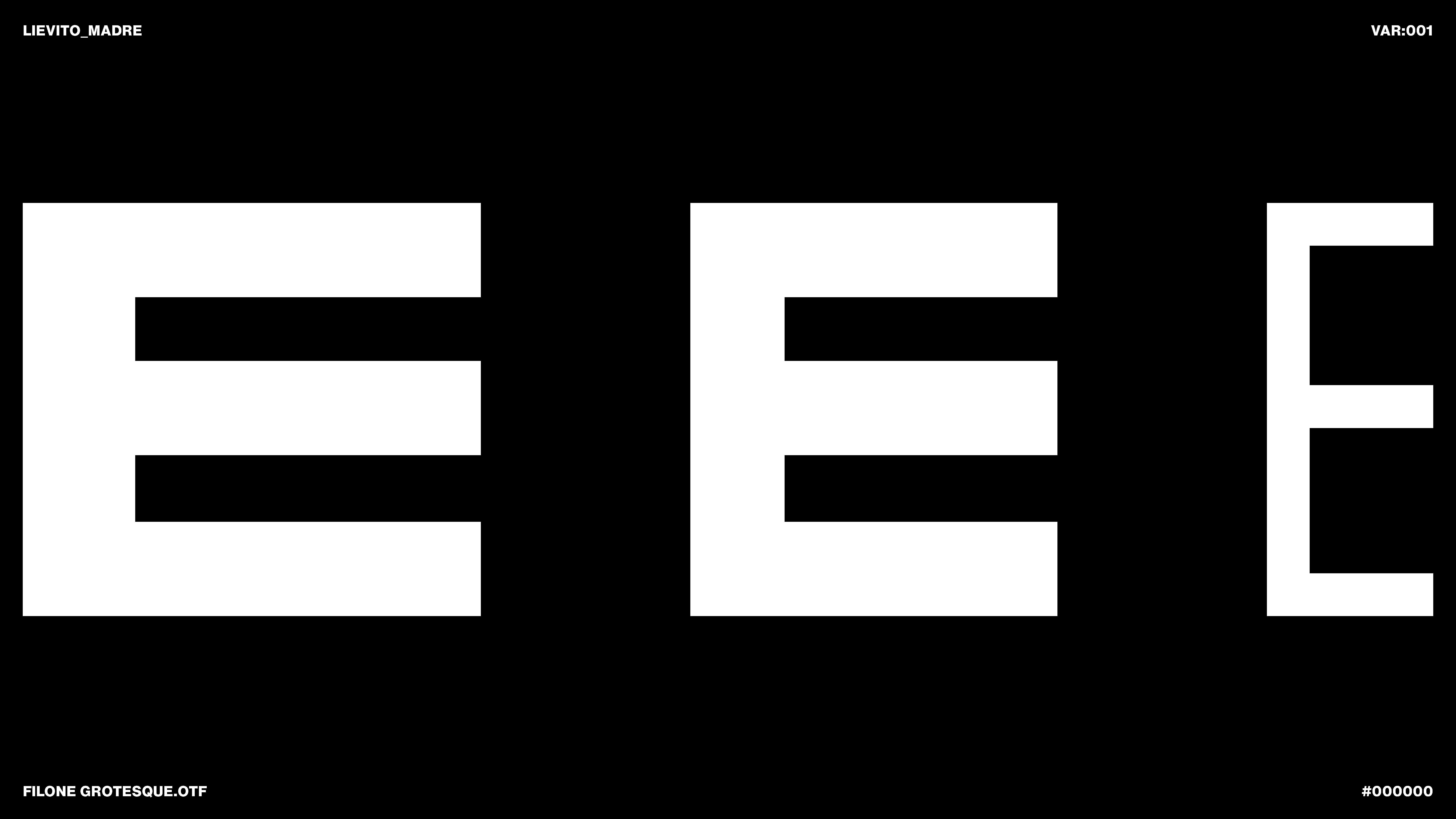
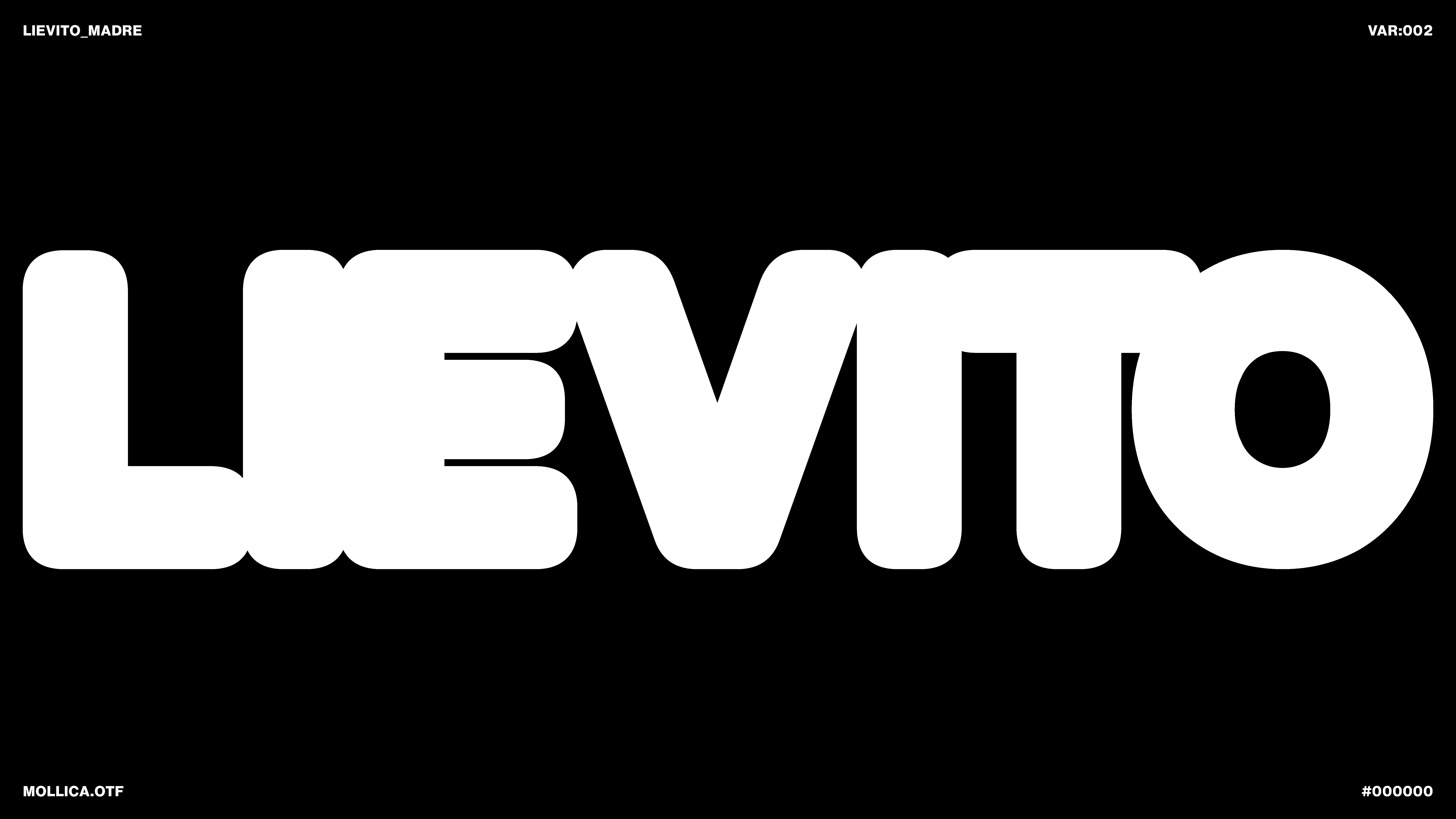
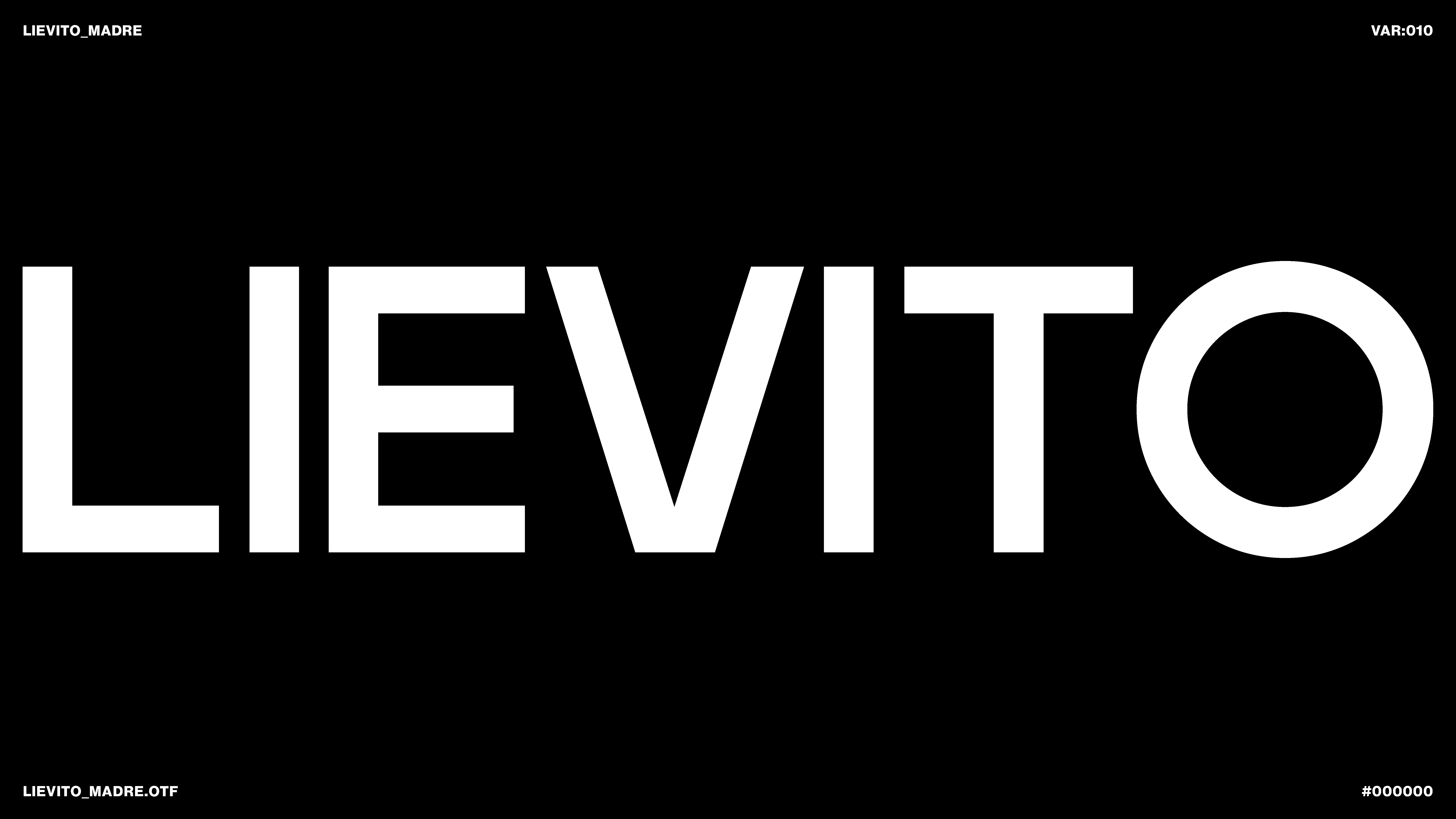
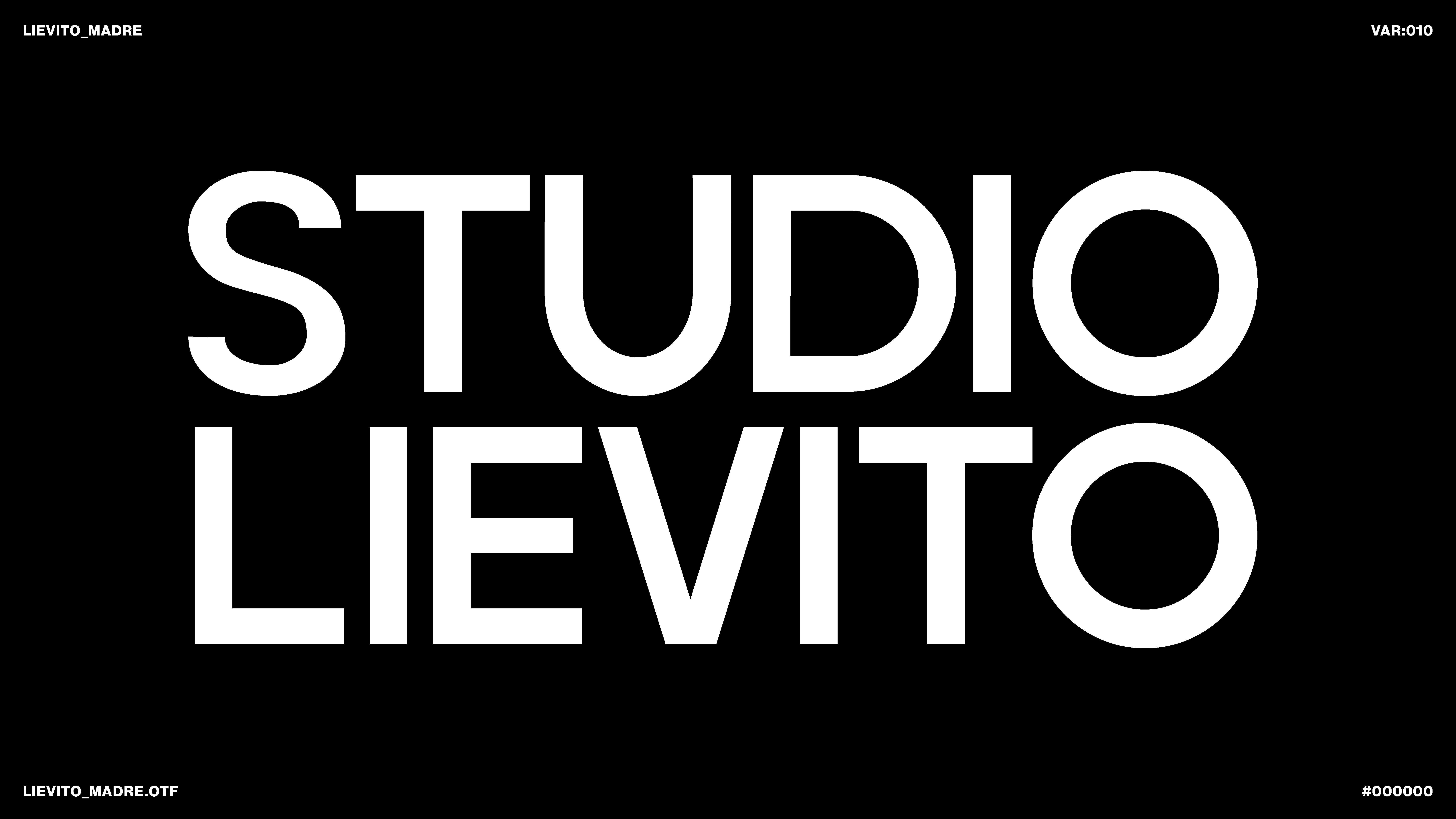
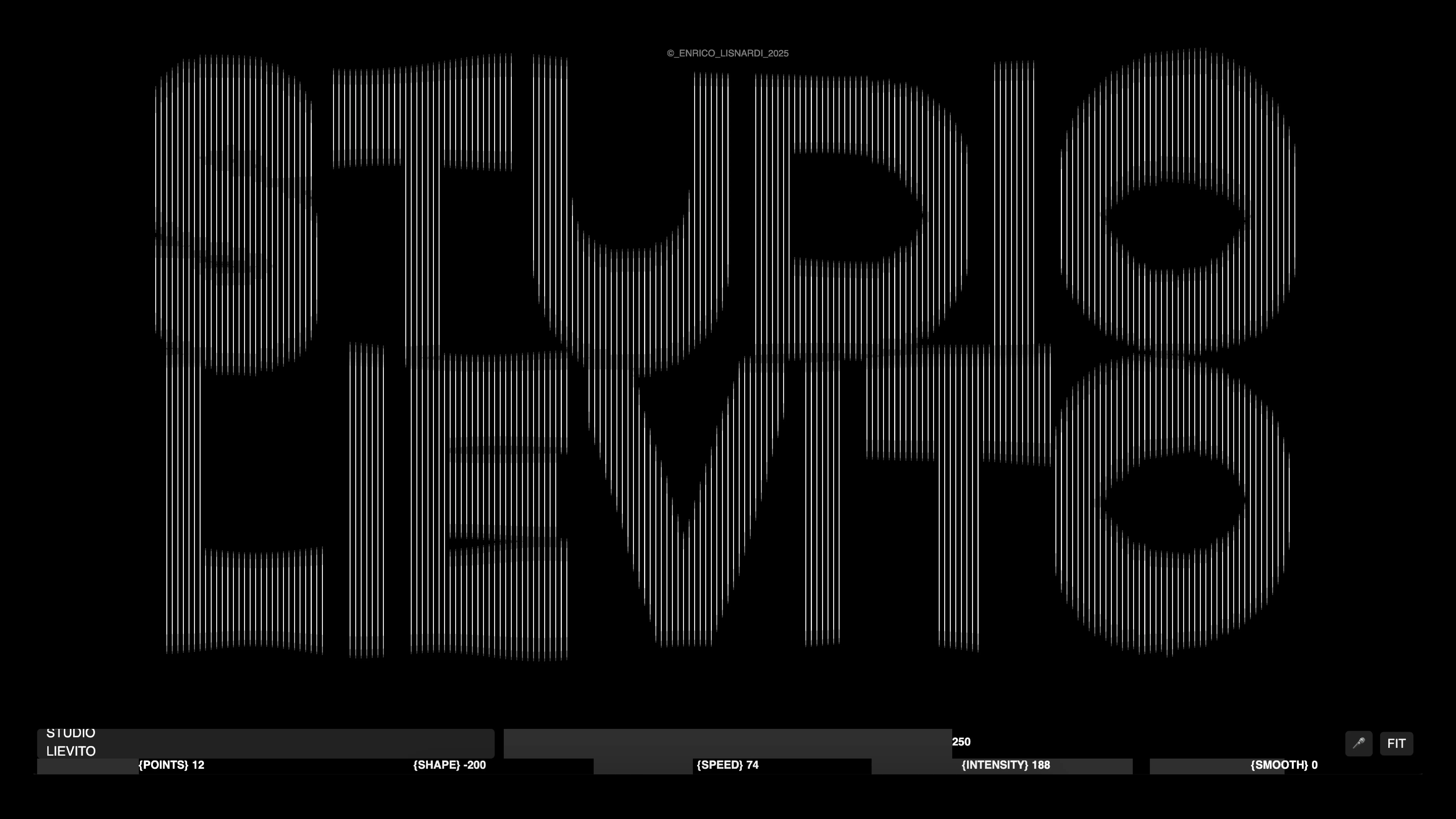
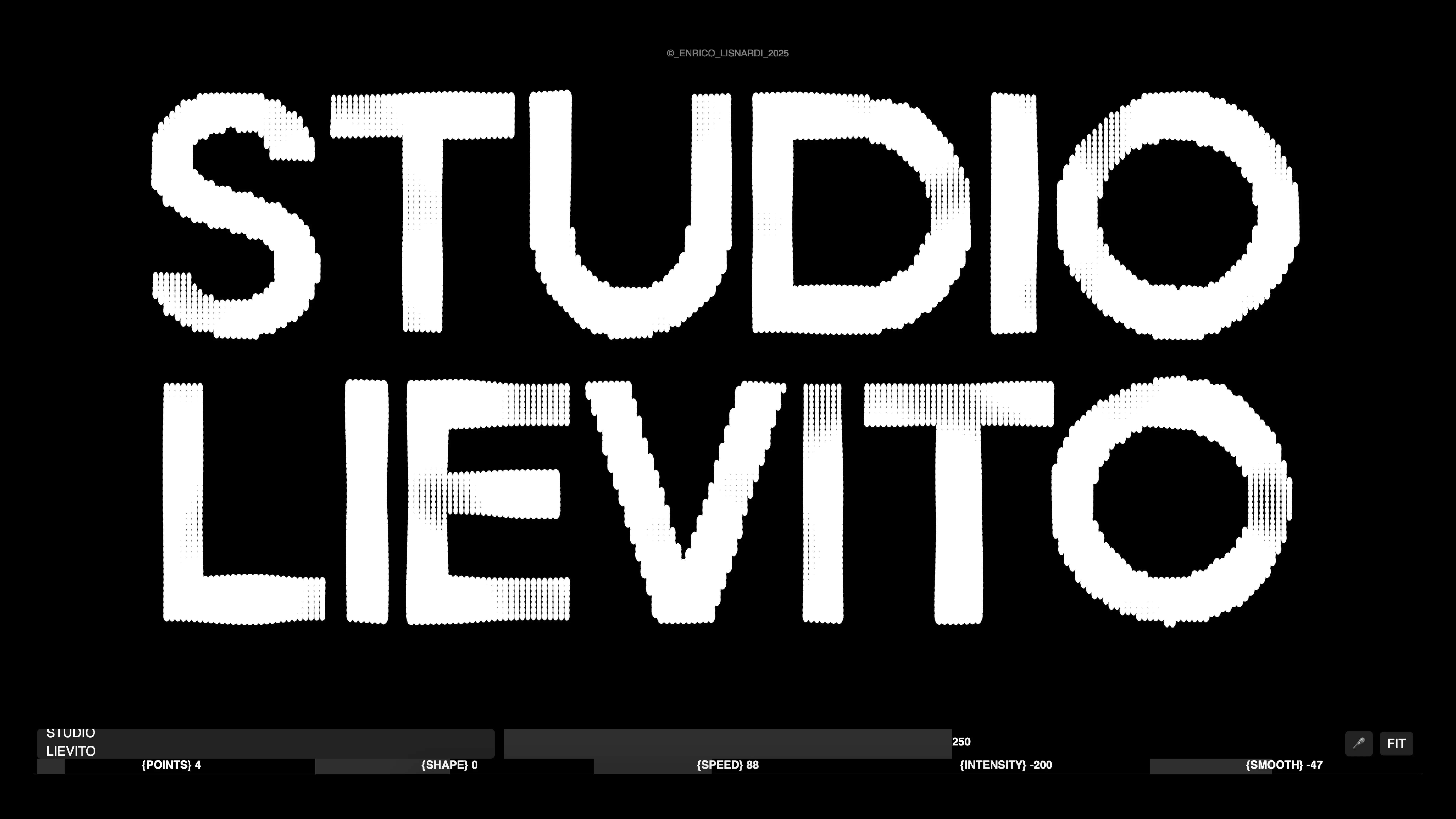
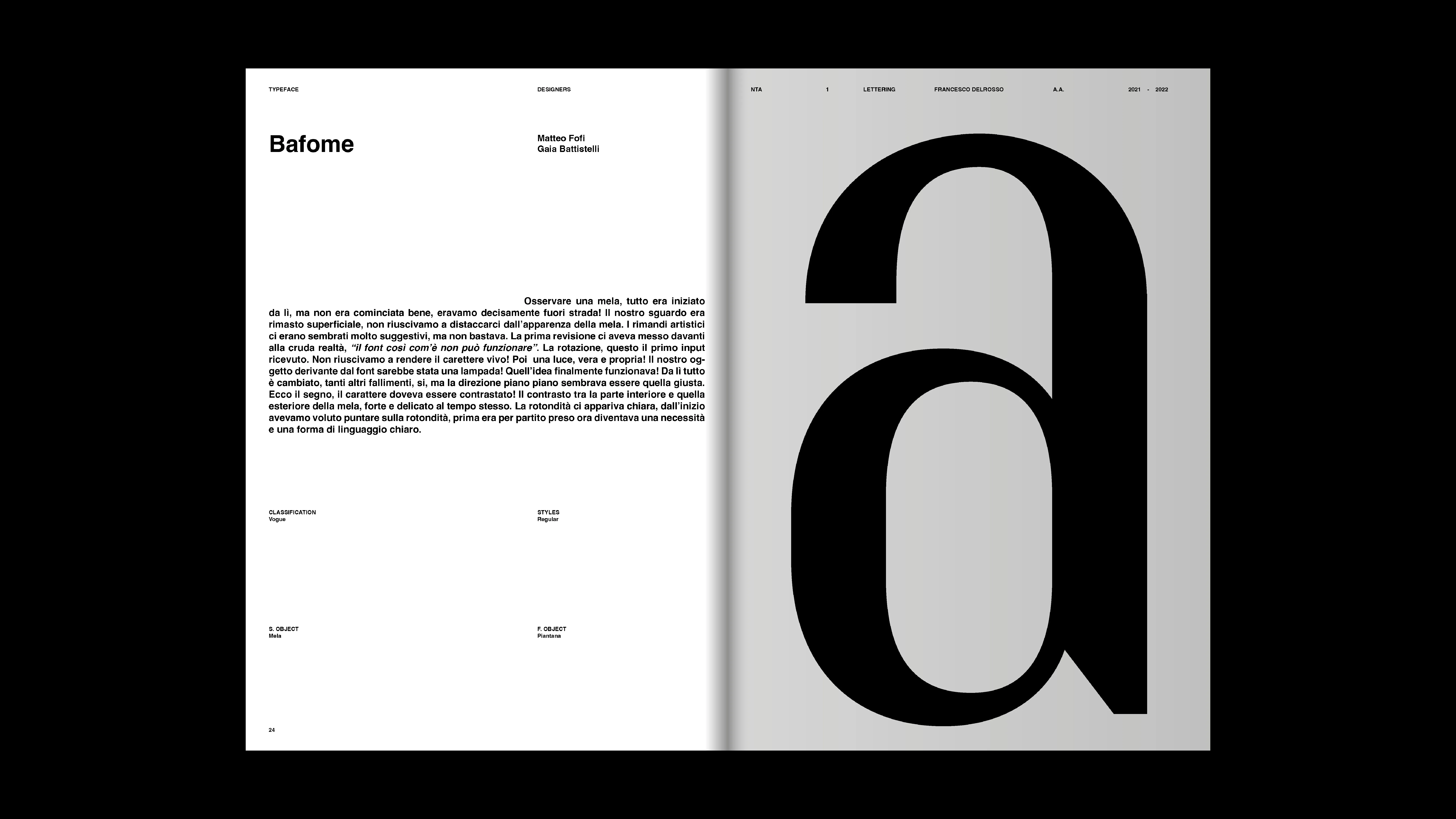
LIEVITO TYPEFACE
2025
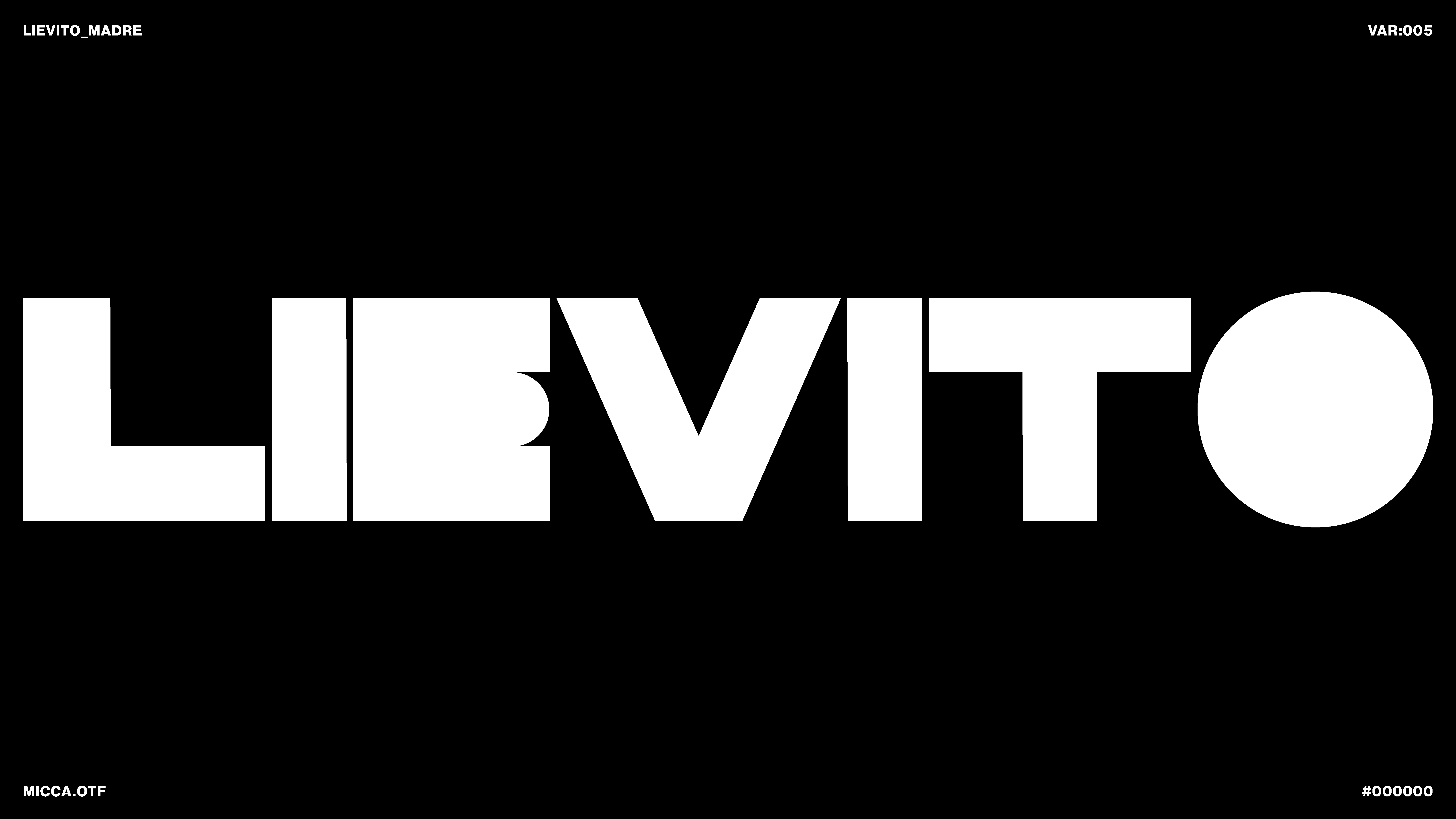
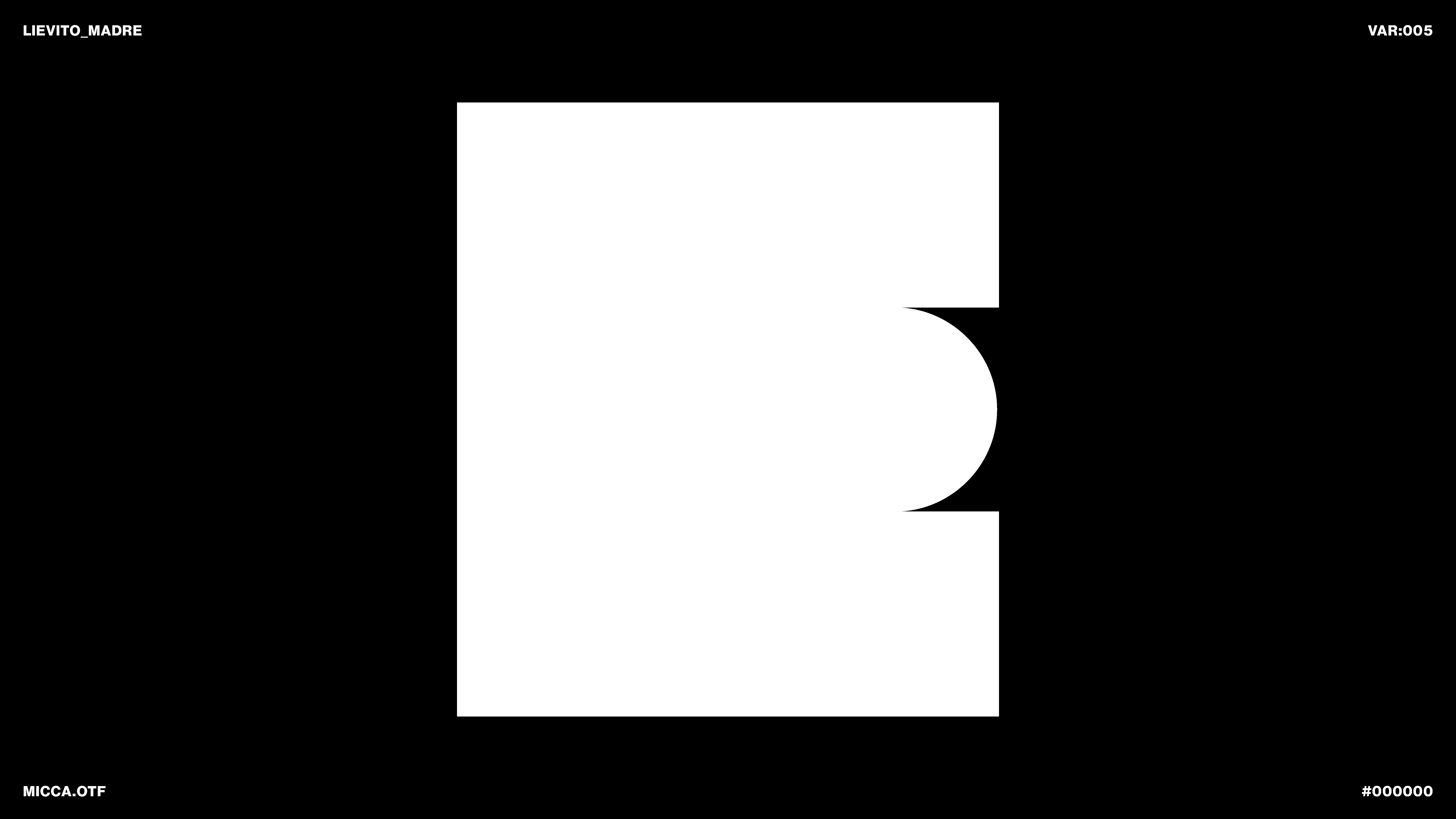
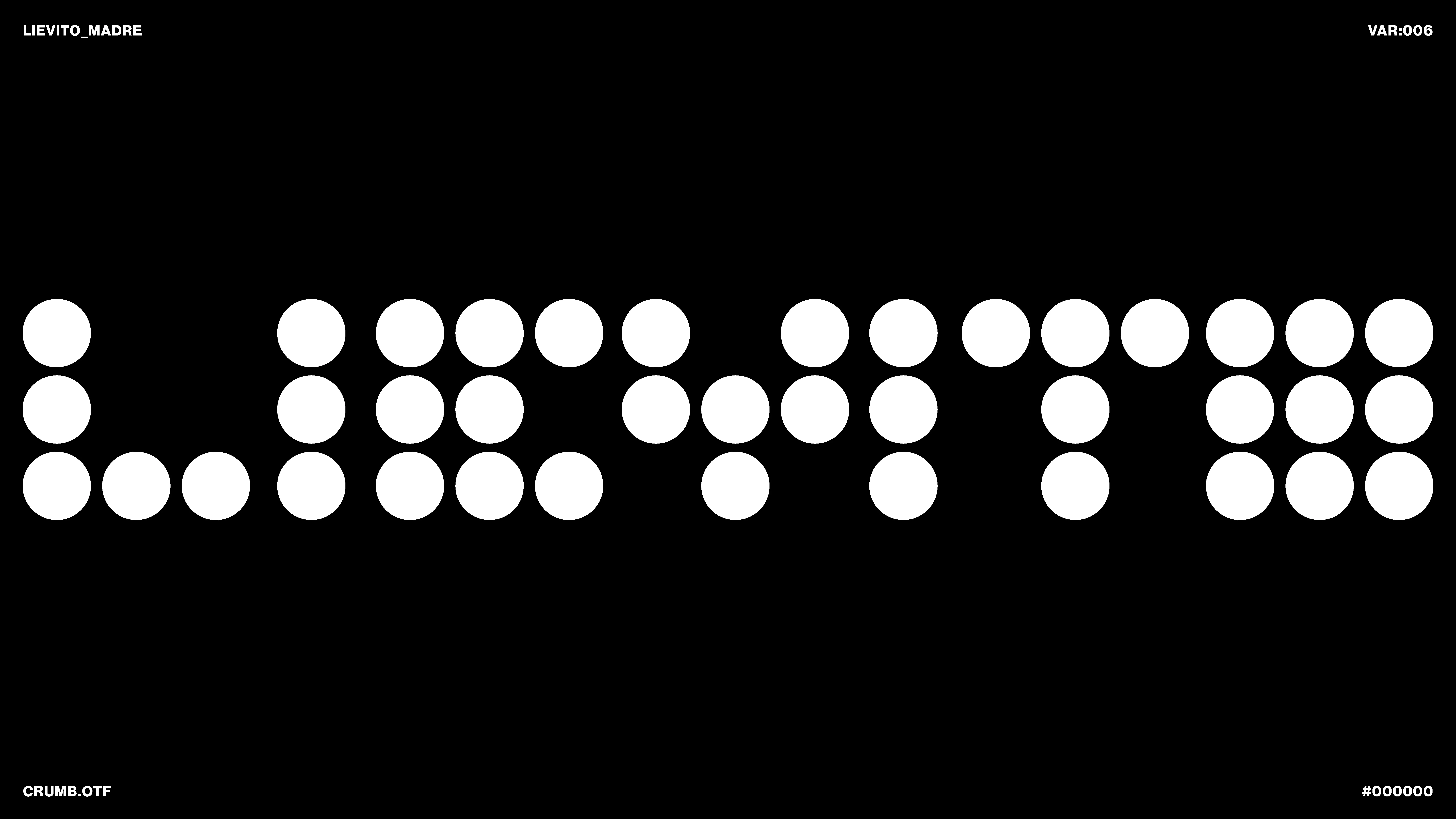
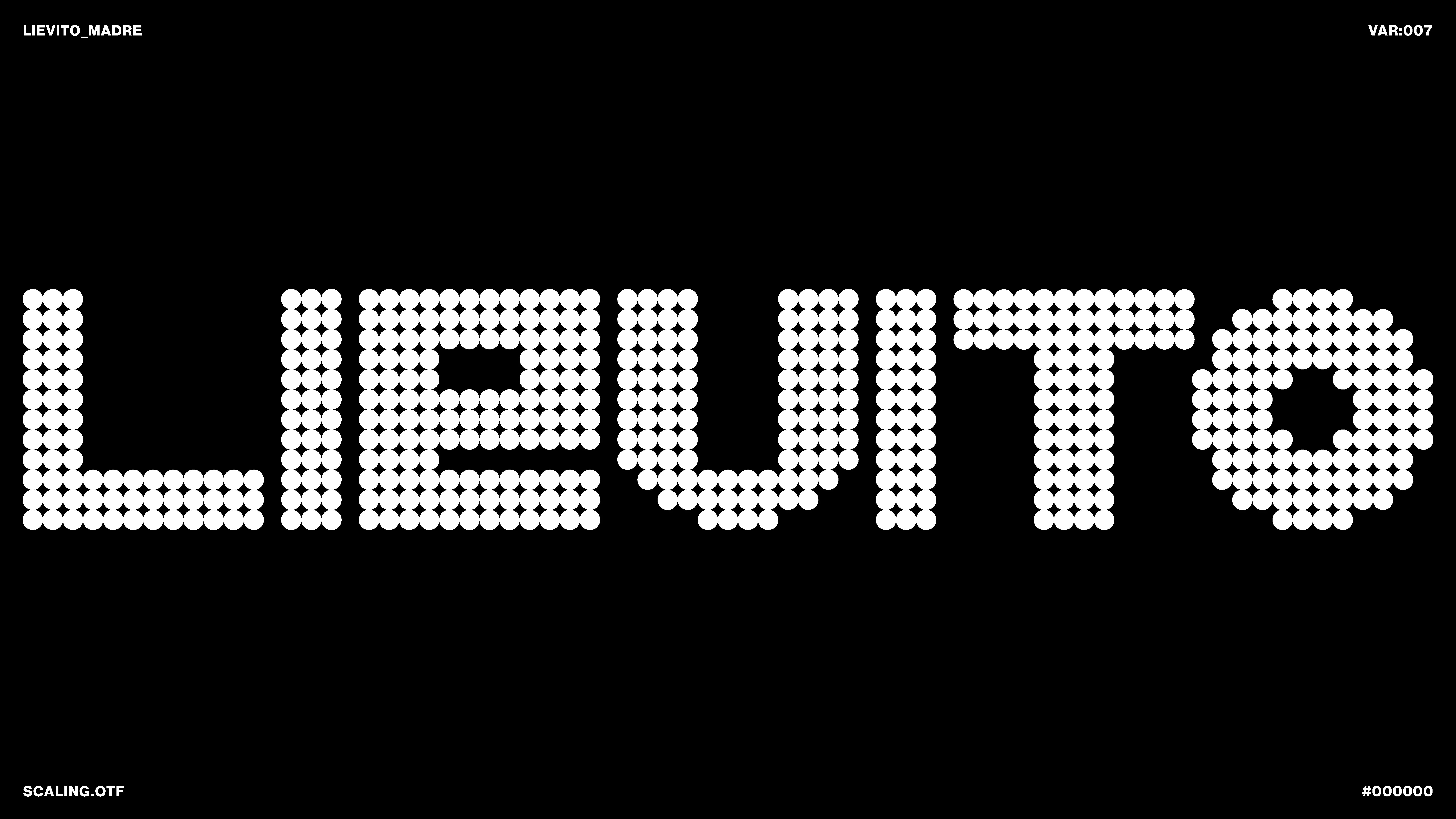
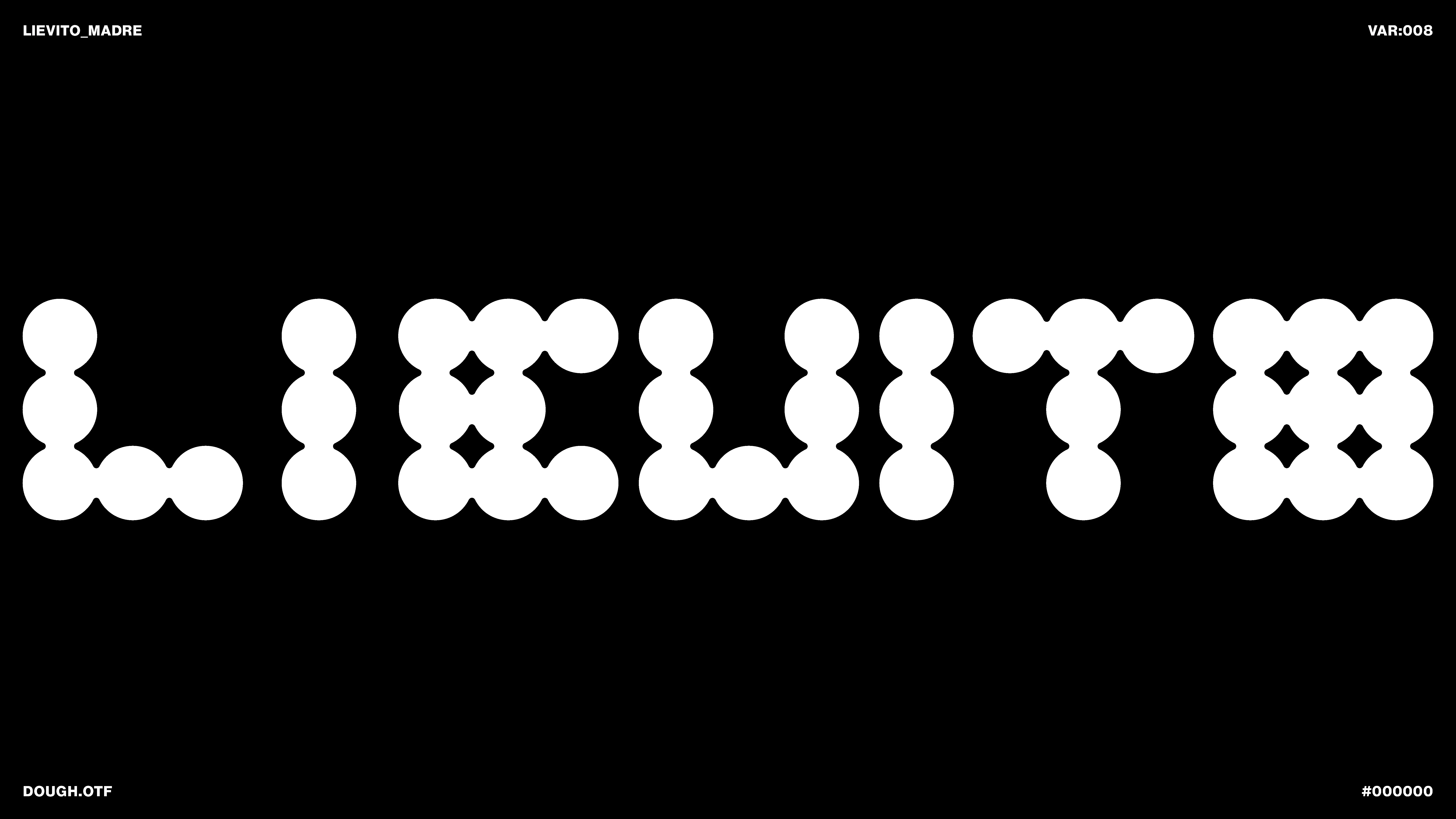
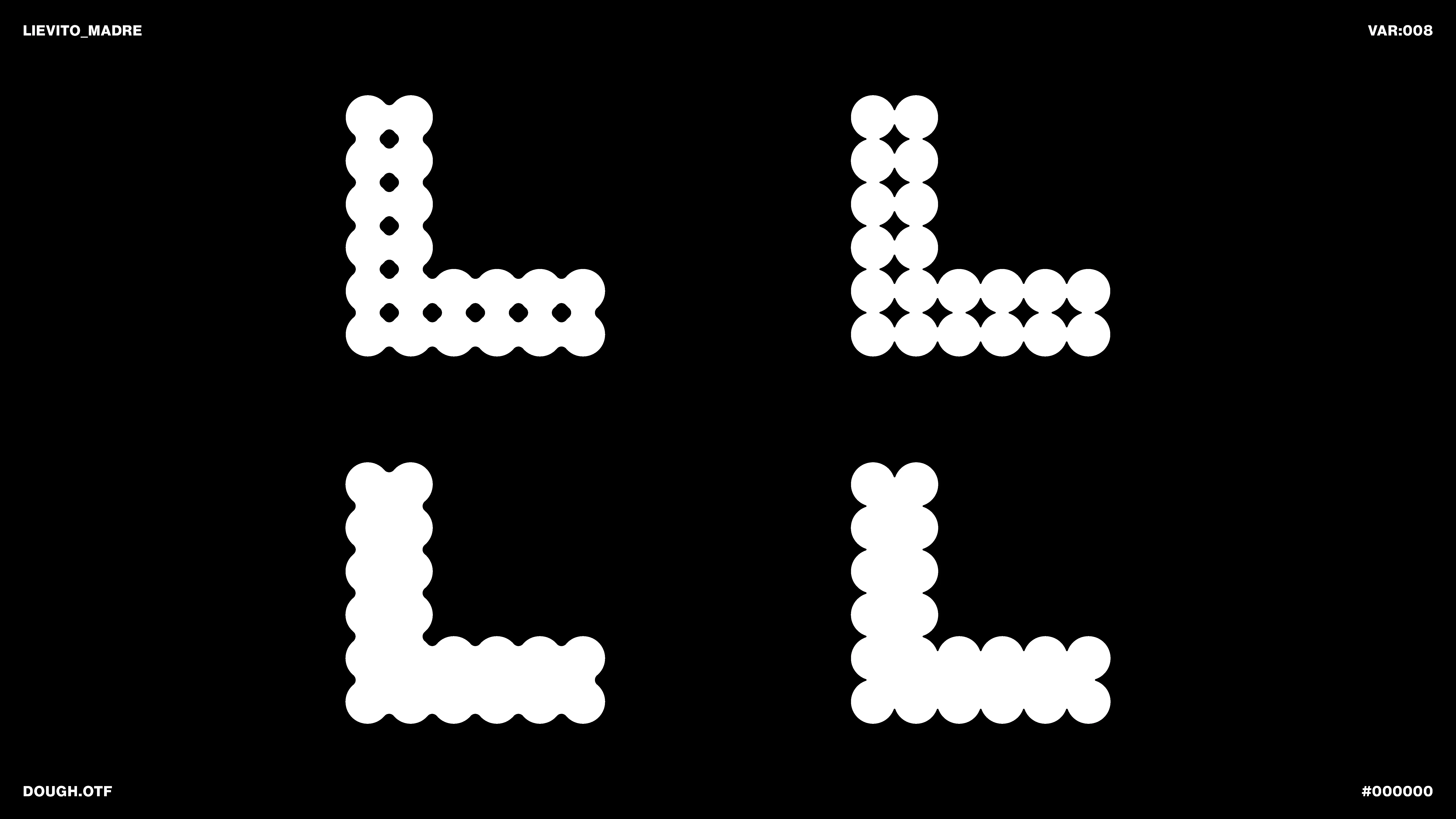
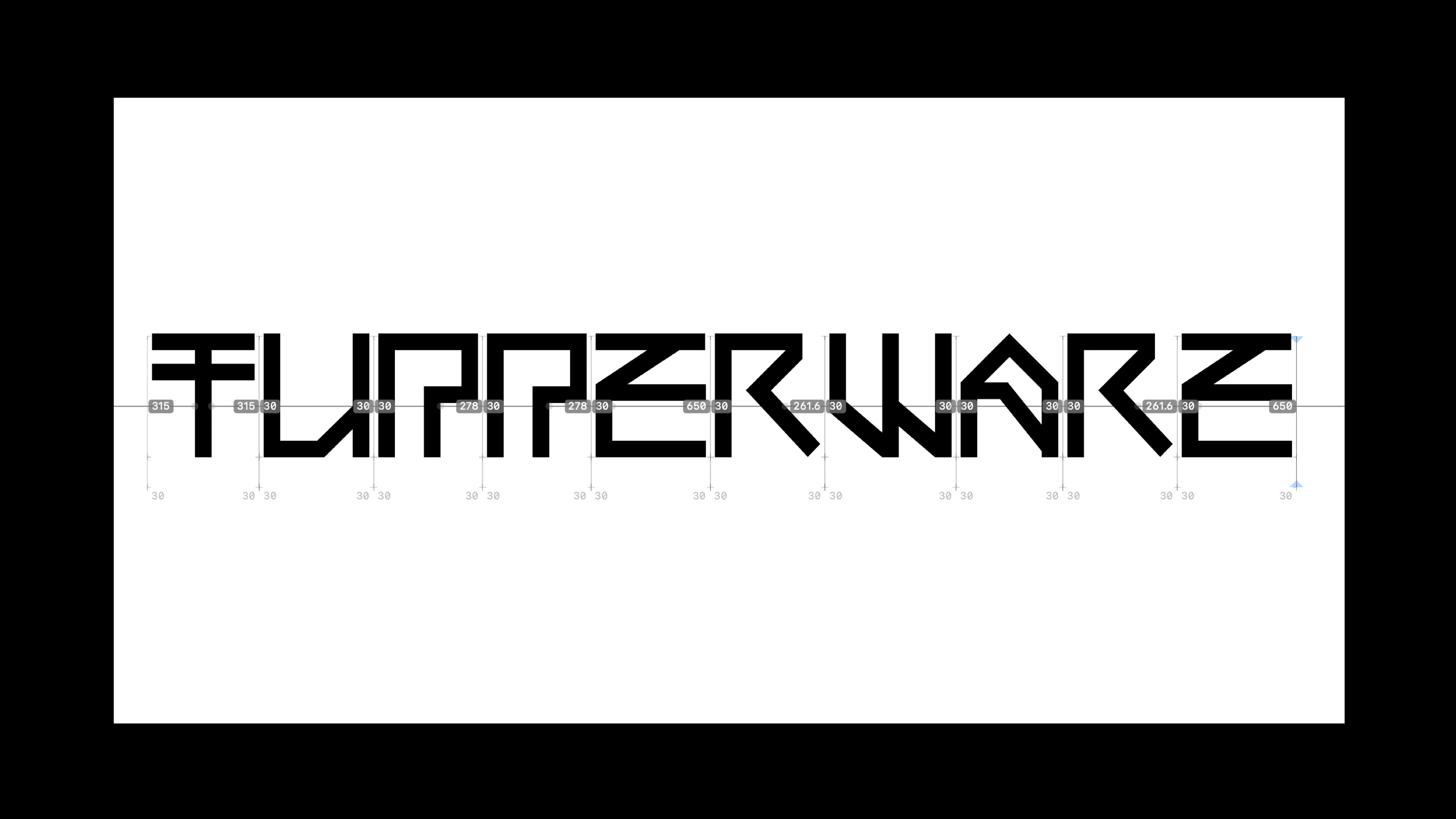
PROJECT Art Direction and Type Design CONTEXT ISIA_U DESCRIPTION The concept behind Lievito (Yeast) stems from the idea of “yeast” as a metaphor for the ability to connect content and form, just as the studio connects with its clients. The project explores how a typeface can expand, adapt, and develop its visual identity while maintaining clarity and readability. Through typographic experimentation, the lettering grows and evolves dynamically, generating flexible stylistic sets that allow the character’s appearance to be modulated according to context and desired communication. The goal is to create a coherent and recognizable visual identity, capable of translating the studio’s philosophy into graphic form and adapting to various media, from digital to print publishing. MACHINE GAIA MACHINE
1 (OF) 12
18
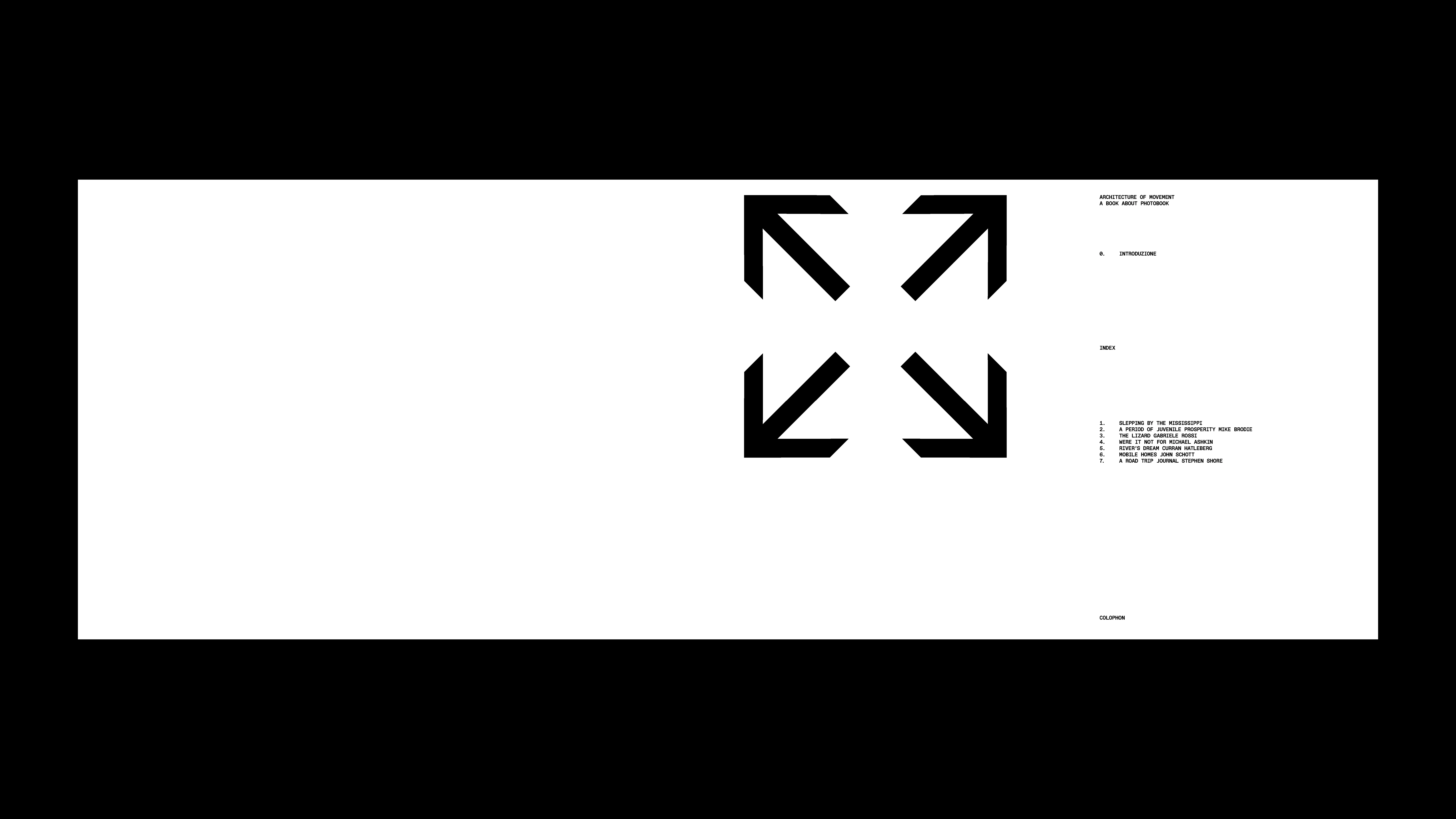
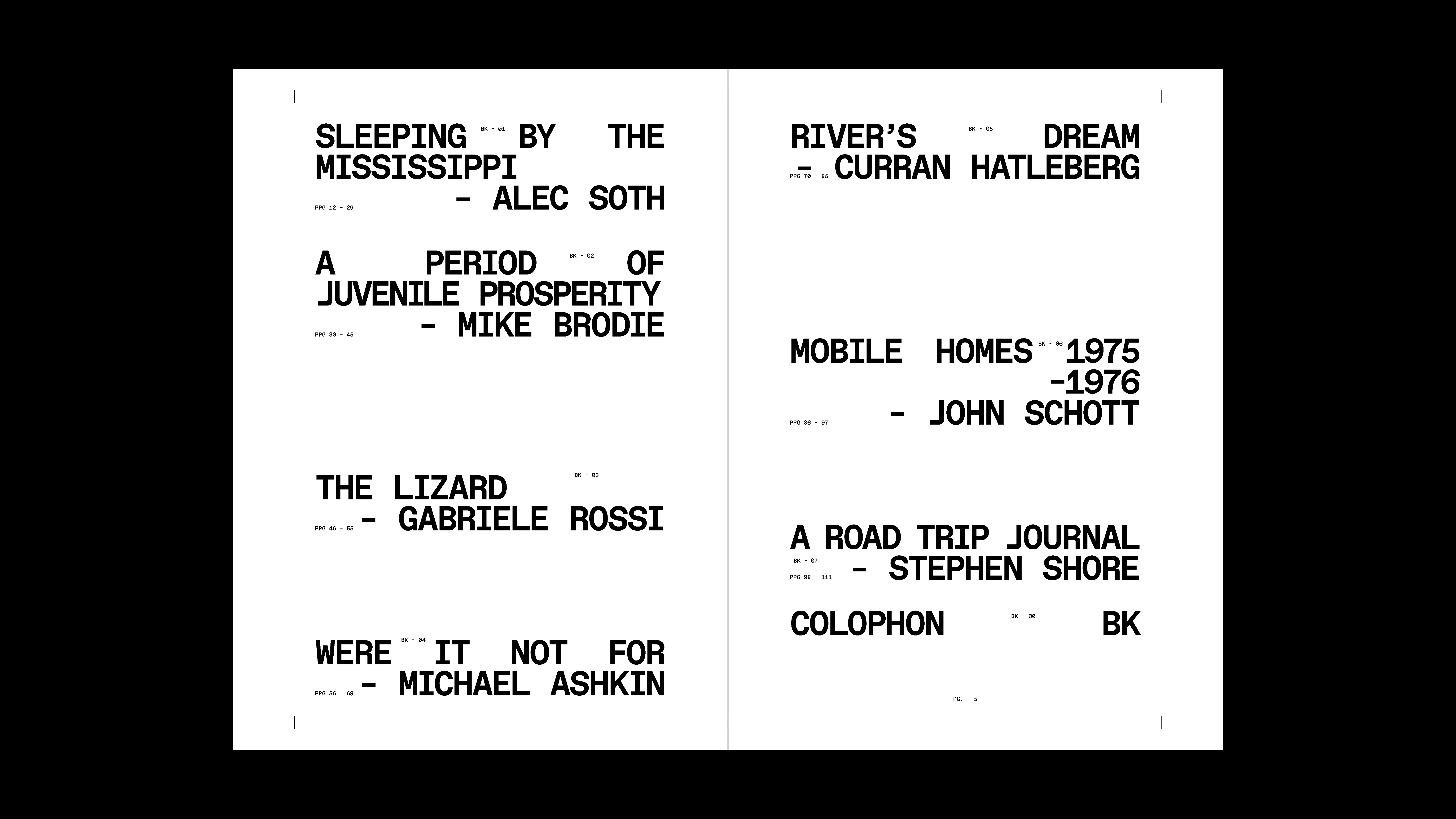
ARCHITECTURE OF MOVEMENT
2025
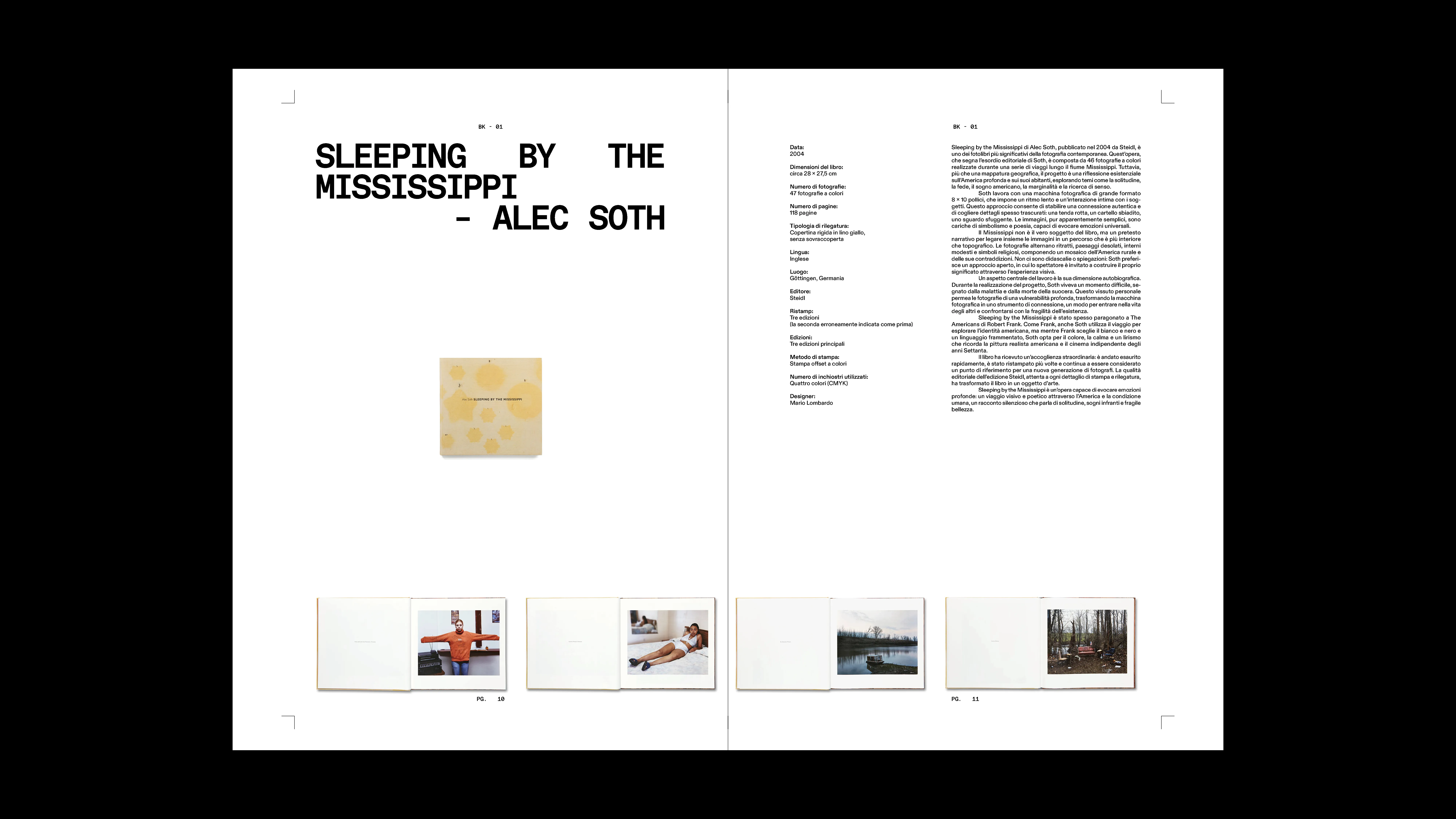
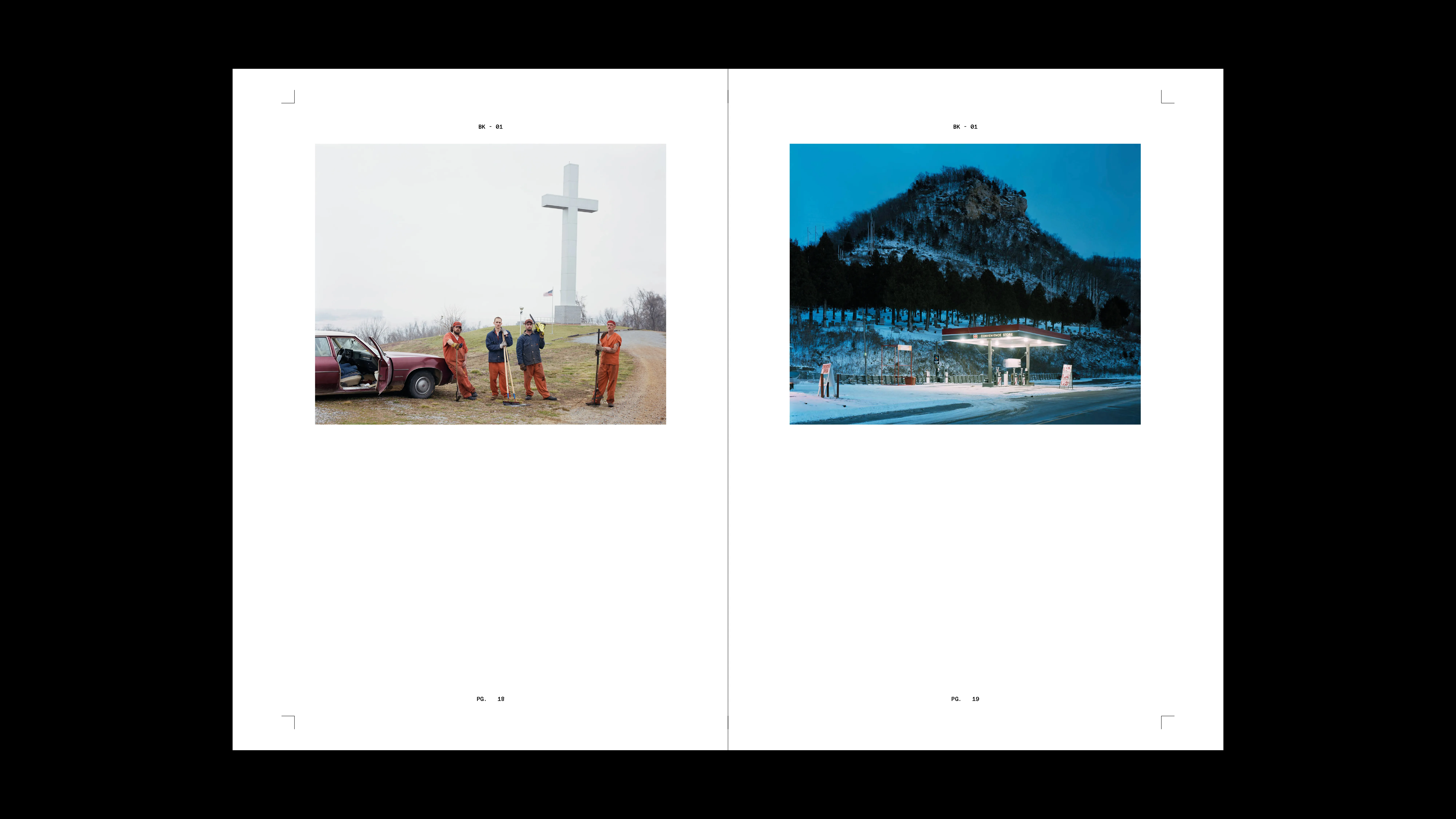
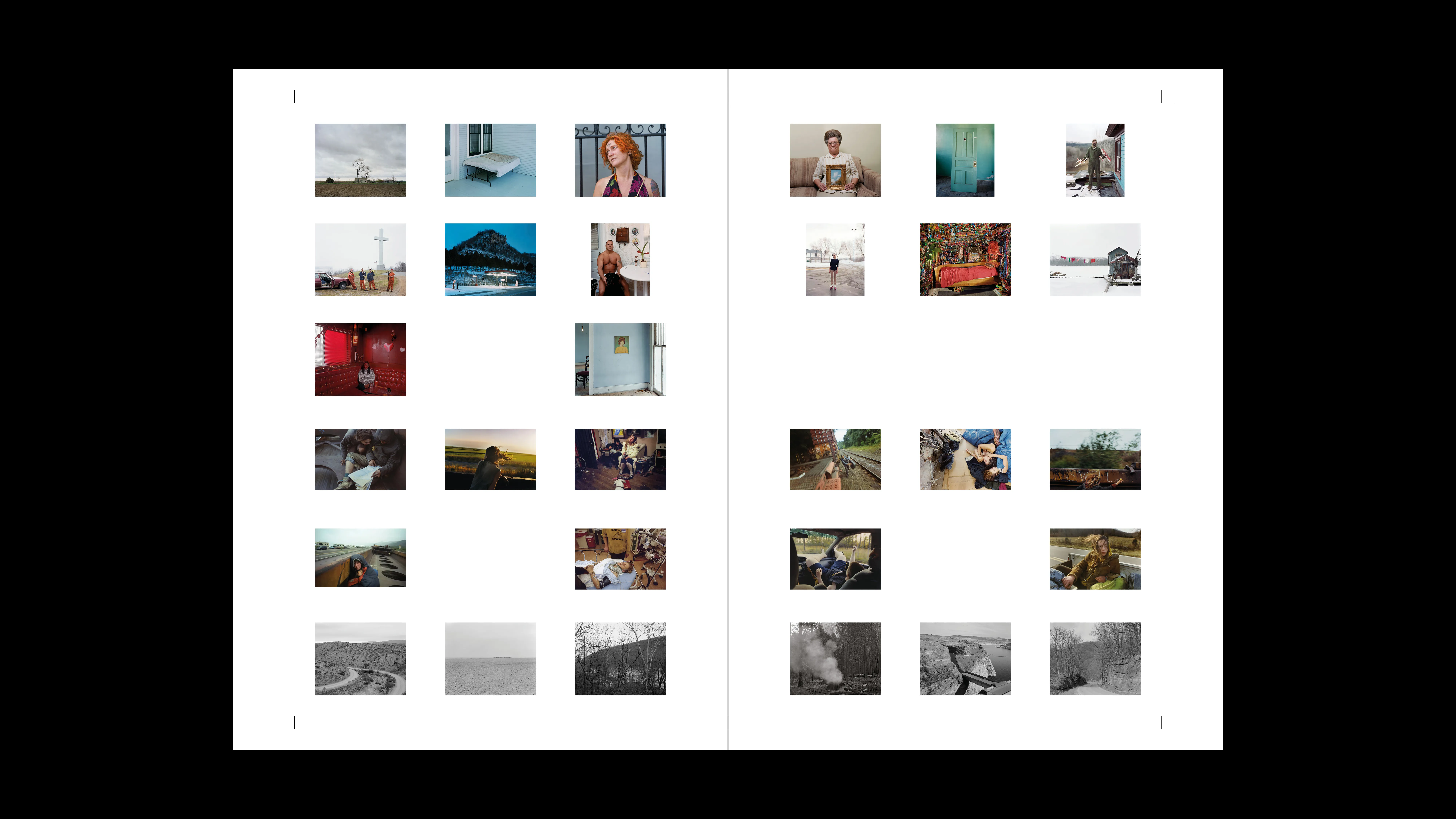
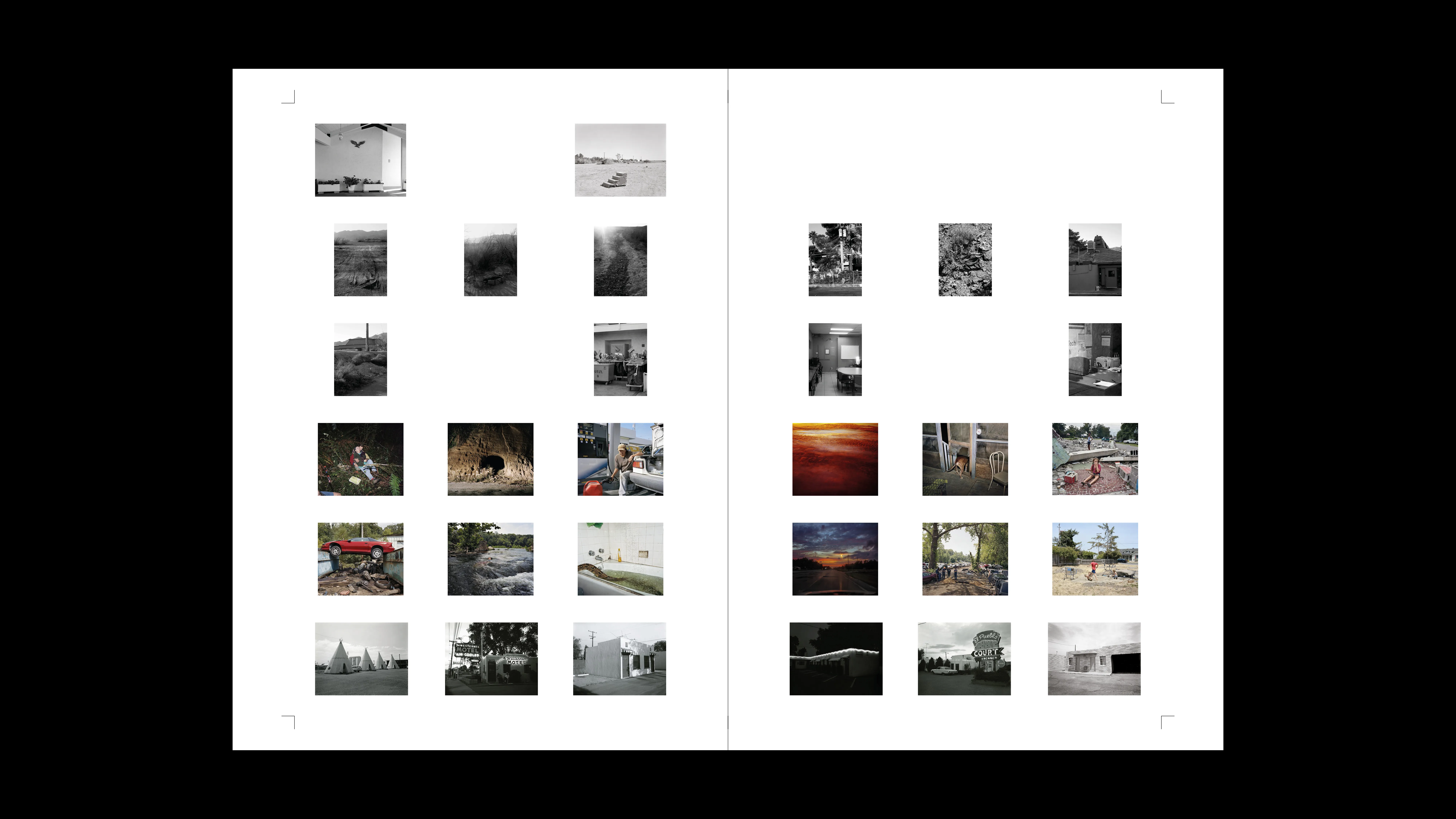
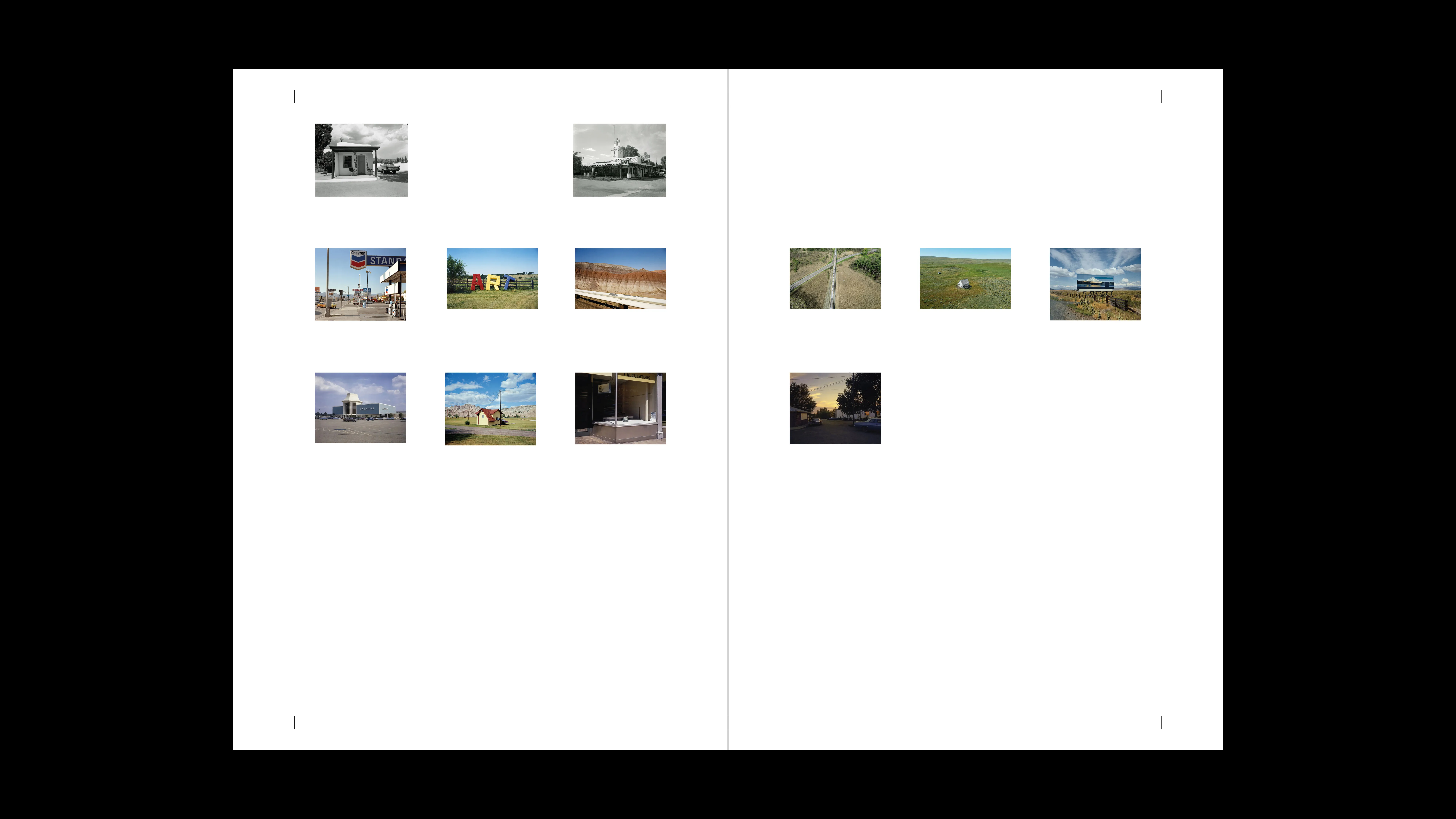
PROJECT Book Design CONTEXT ISIA_U DESCRIPTION This project is a critical exploration of the photobook as a narrative and theoretical tool capable of conveying a complex vision of contemporary America. Far from using images as mere illustration or spectacle, it investigates how photographic sequencing, editorial structure, and the interplay between text and image can generate layered meaning. The work unfolds as a journey—geographical, sociological, and interior—in which the photobook becomes an active medium: a space where patient observation, attention to detail, and the construction of visual rhythm transform representation into experience.Rather than simply documenting, this research reflects on the limits and possibilities of photographic language, placing visual forms and archival materials, aesthetics and critical thinking in dialogue. The result is a slow, mindful way of seeing that resists the speed of digital imagery, inviting the reader to an act of presence and participation.
1 (OF) 12
17
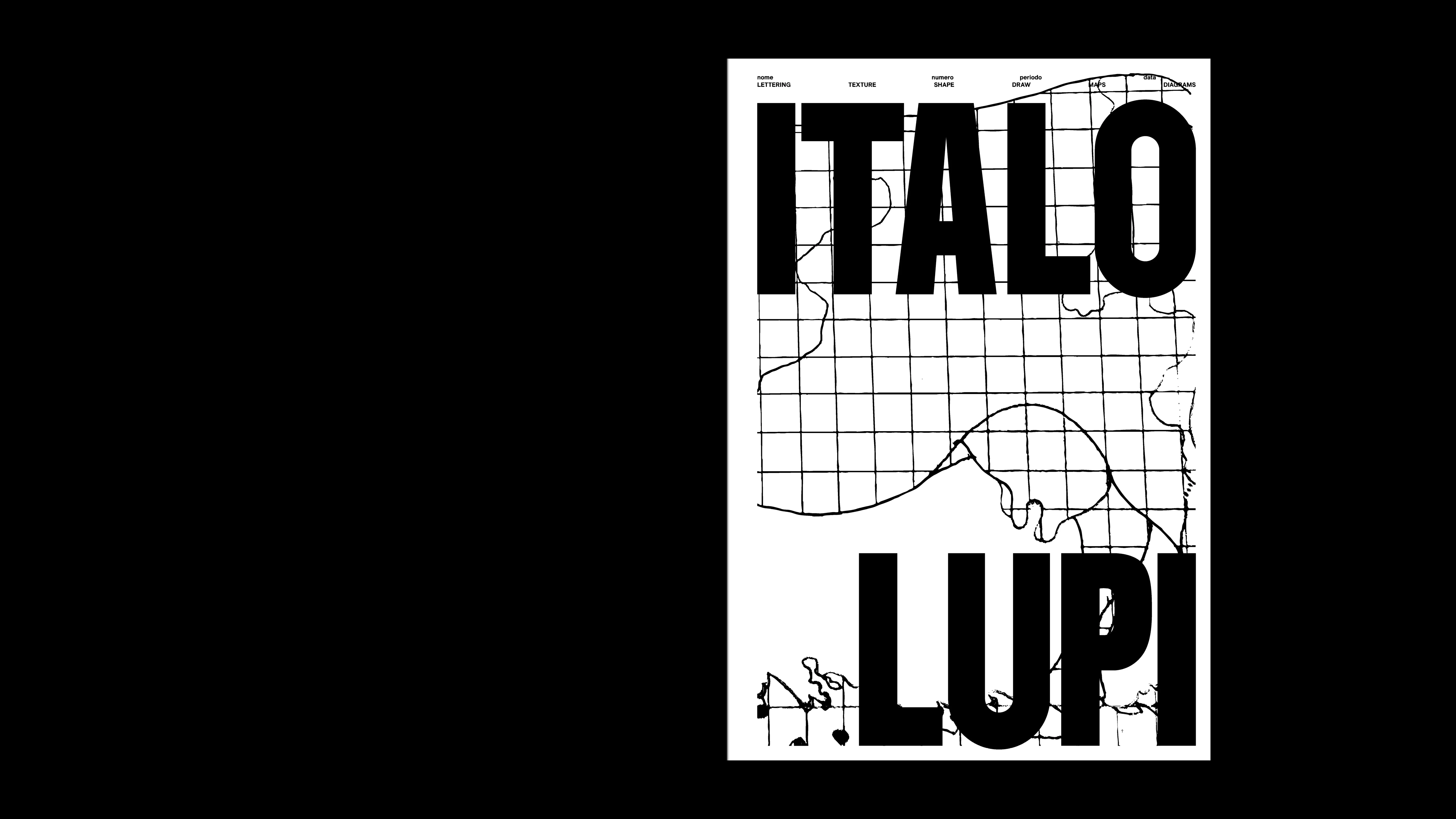
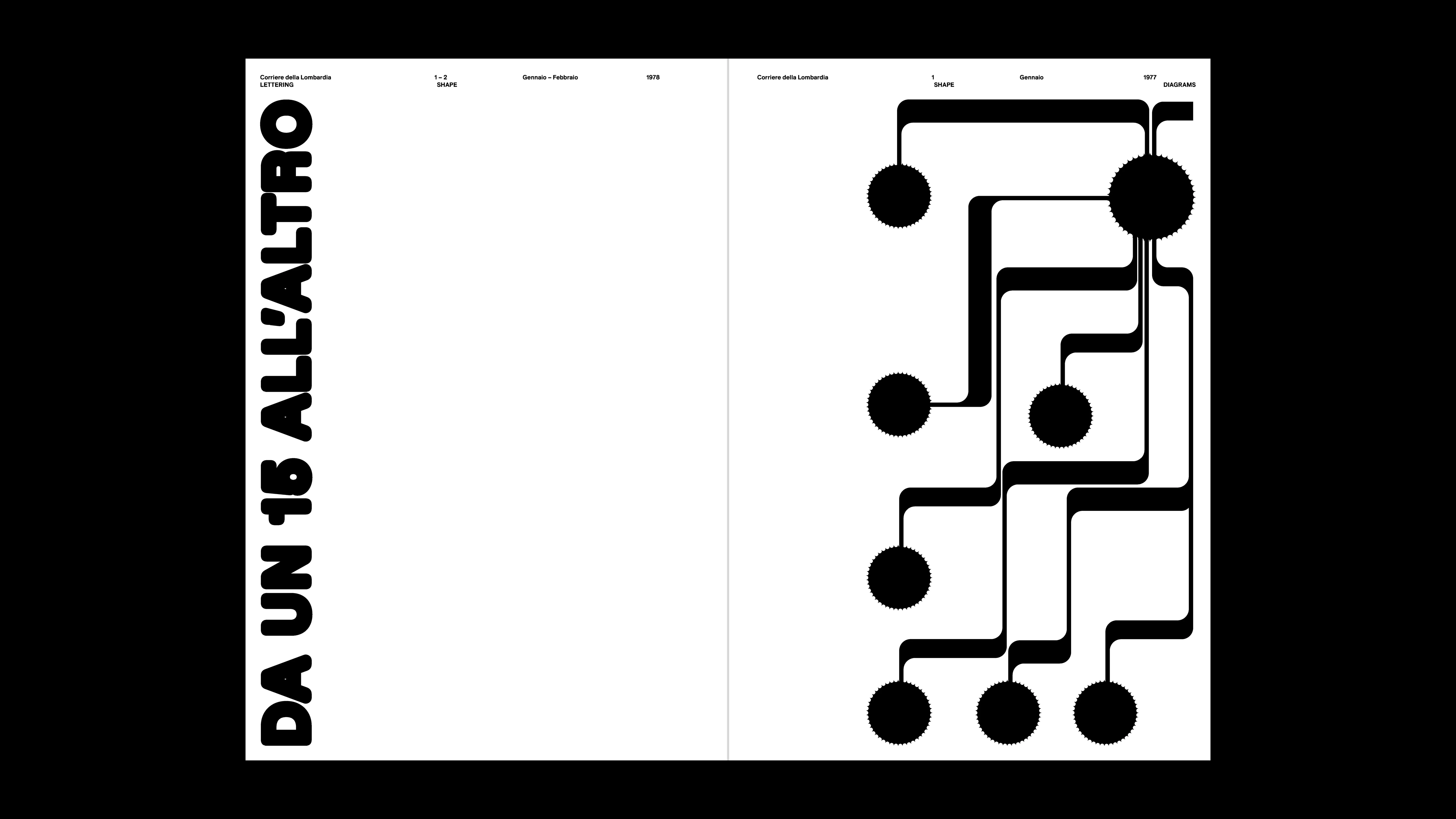
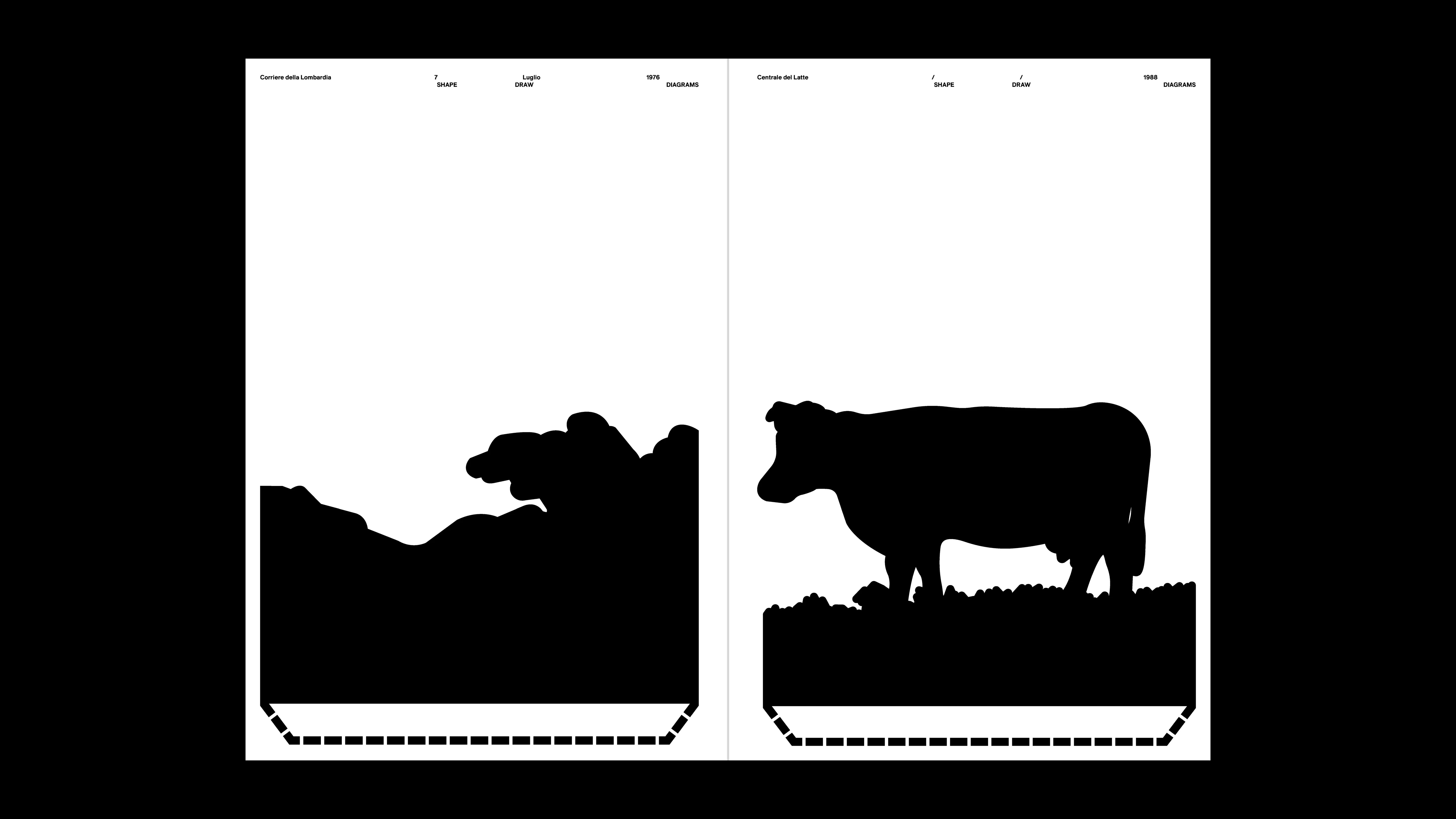
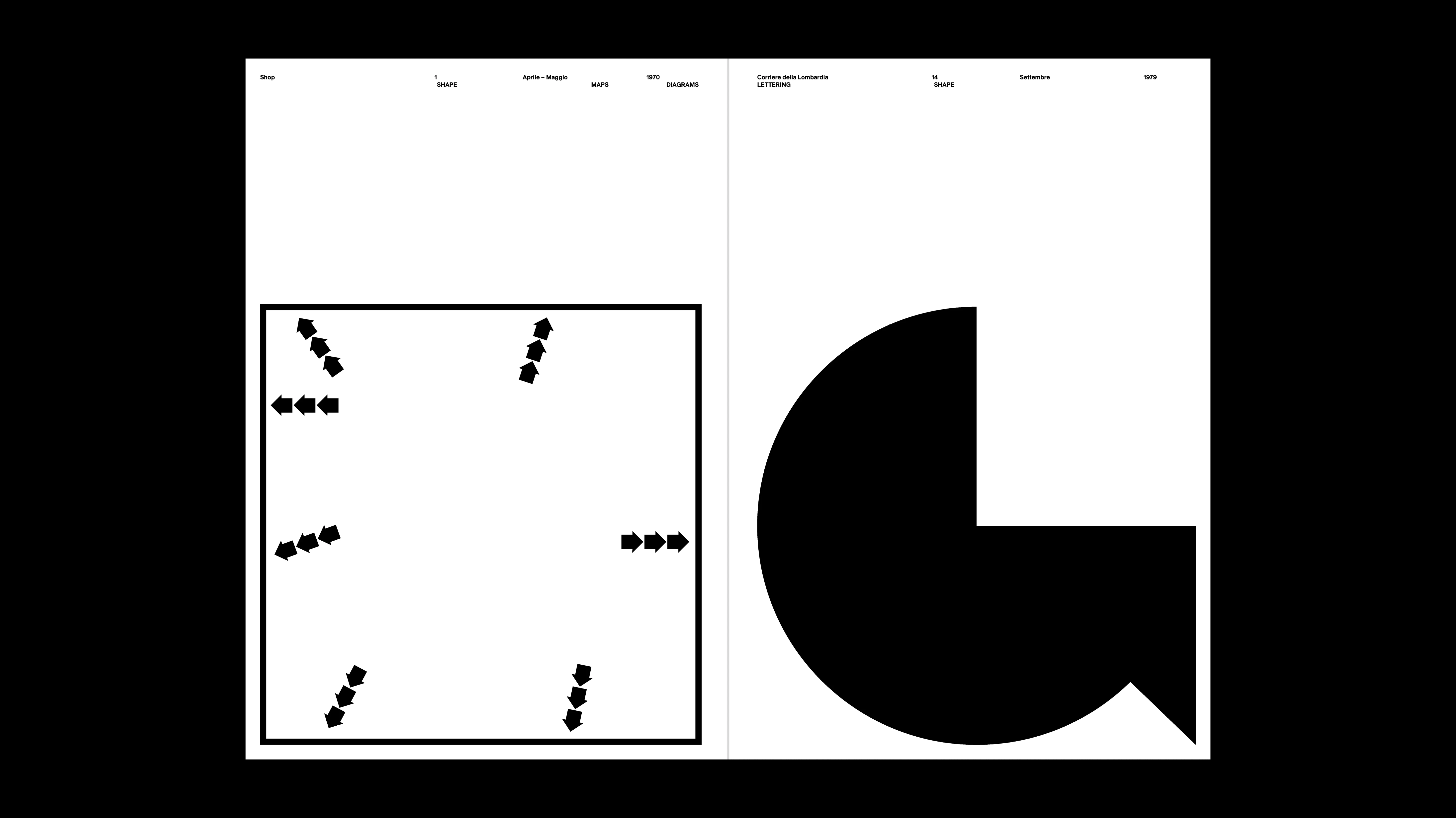
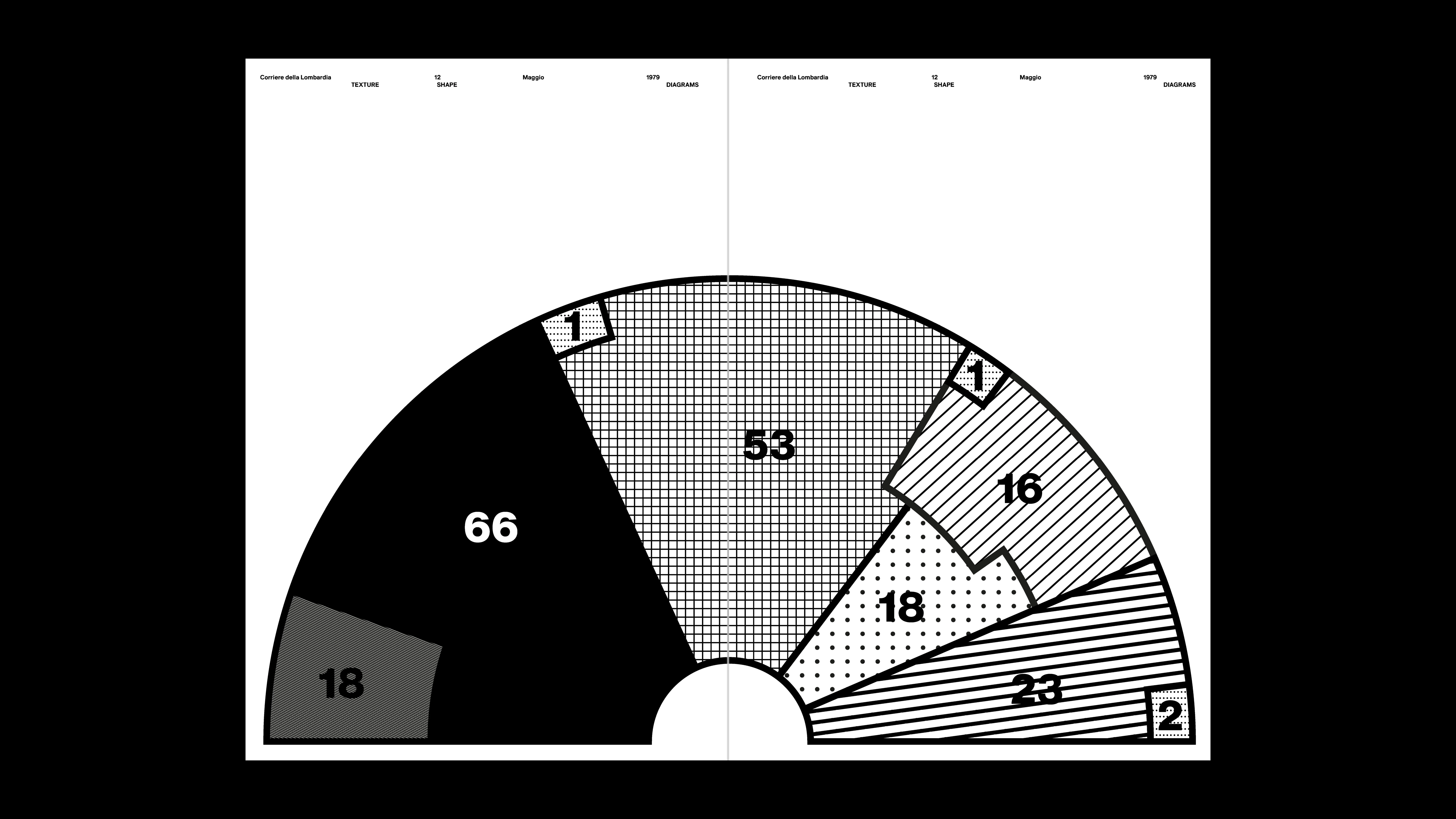
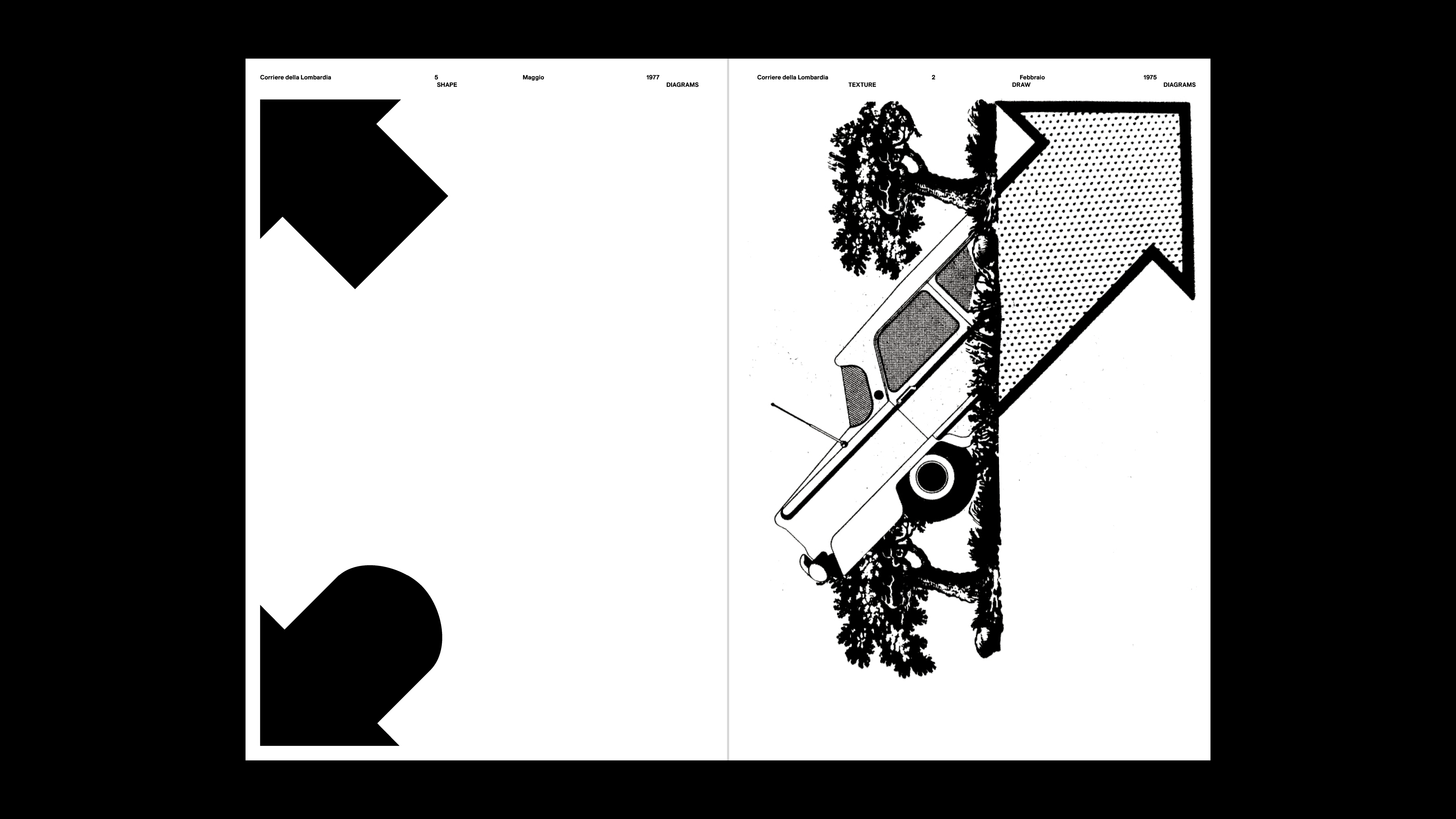
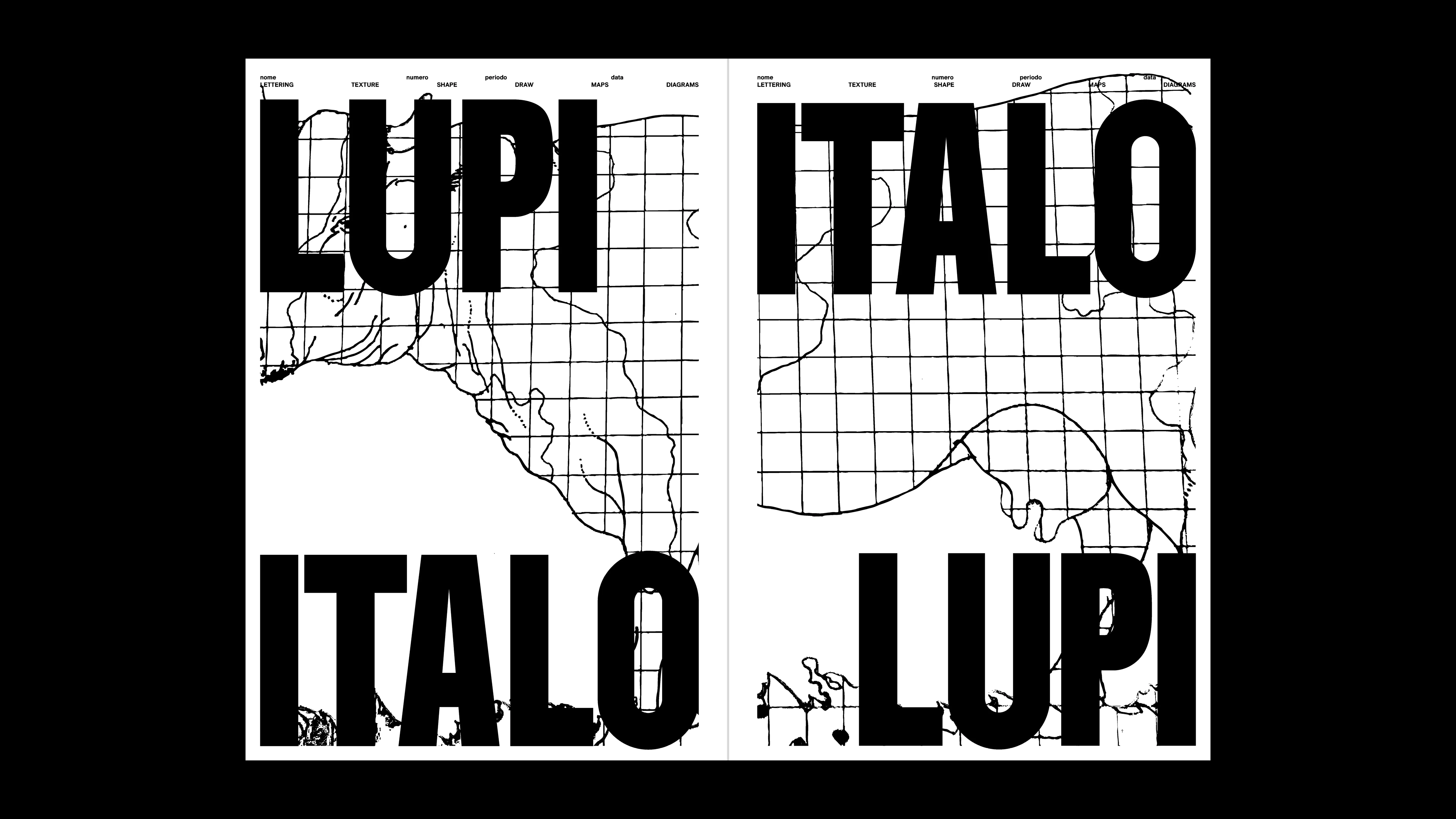
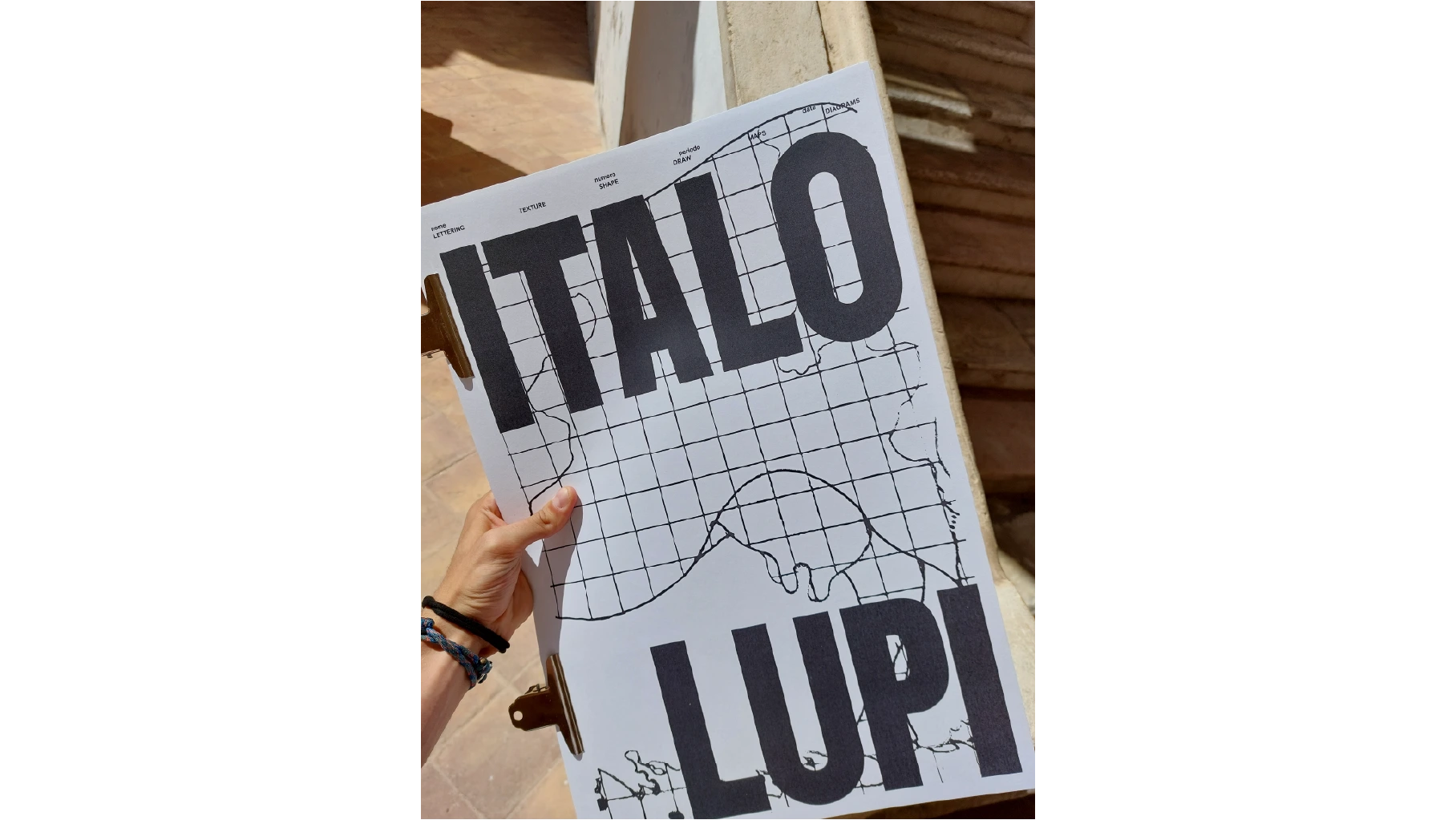
THE ITALO LUPI
2025
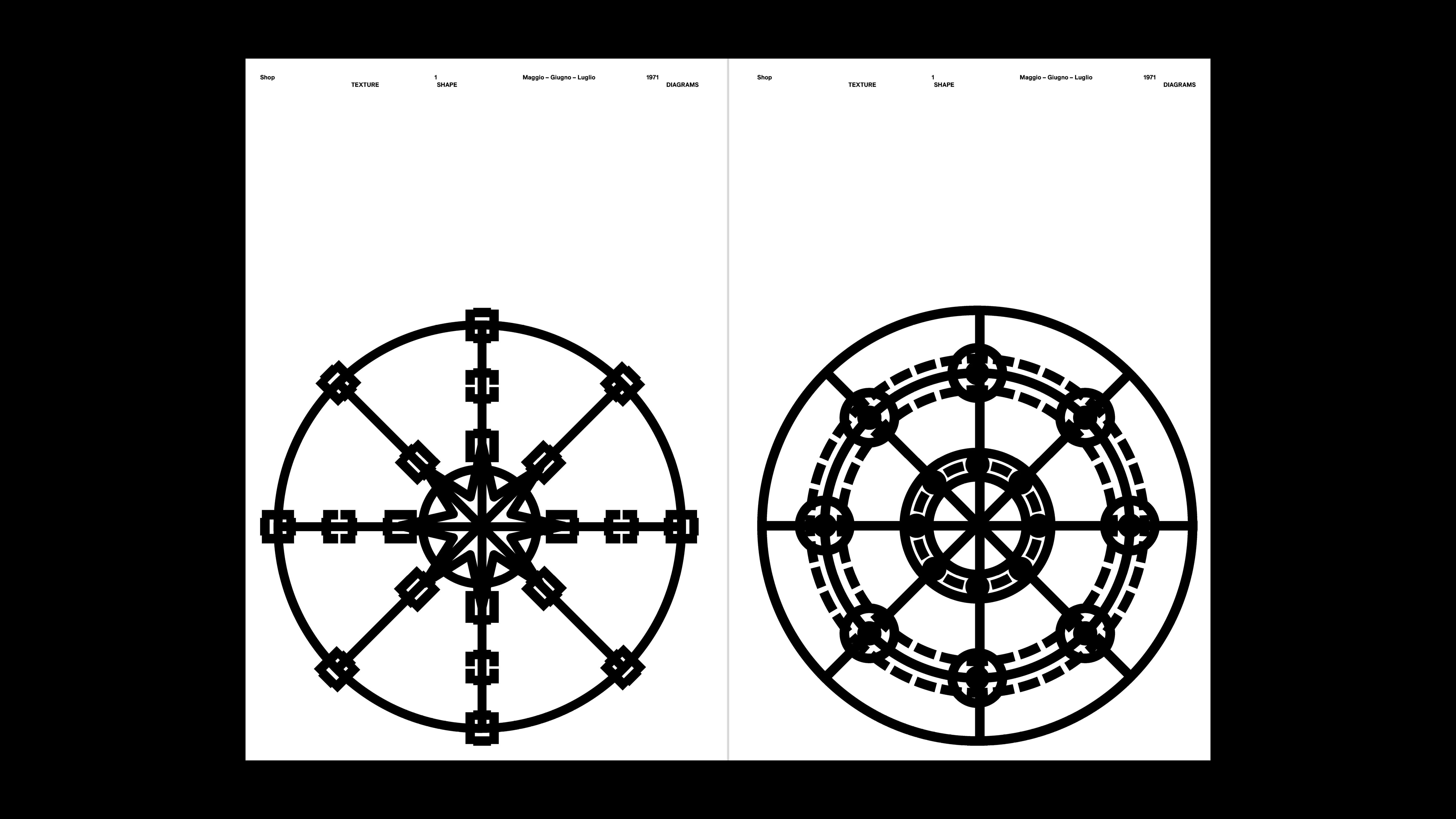
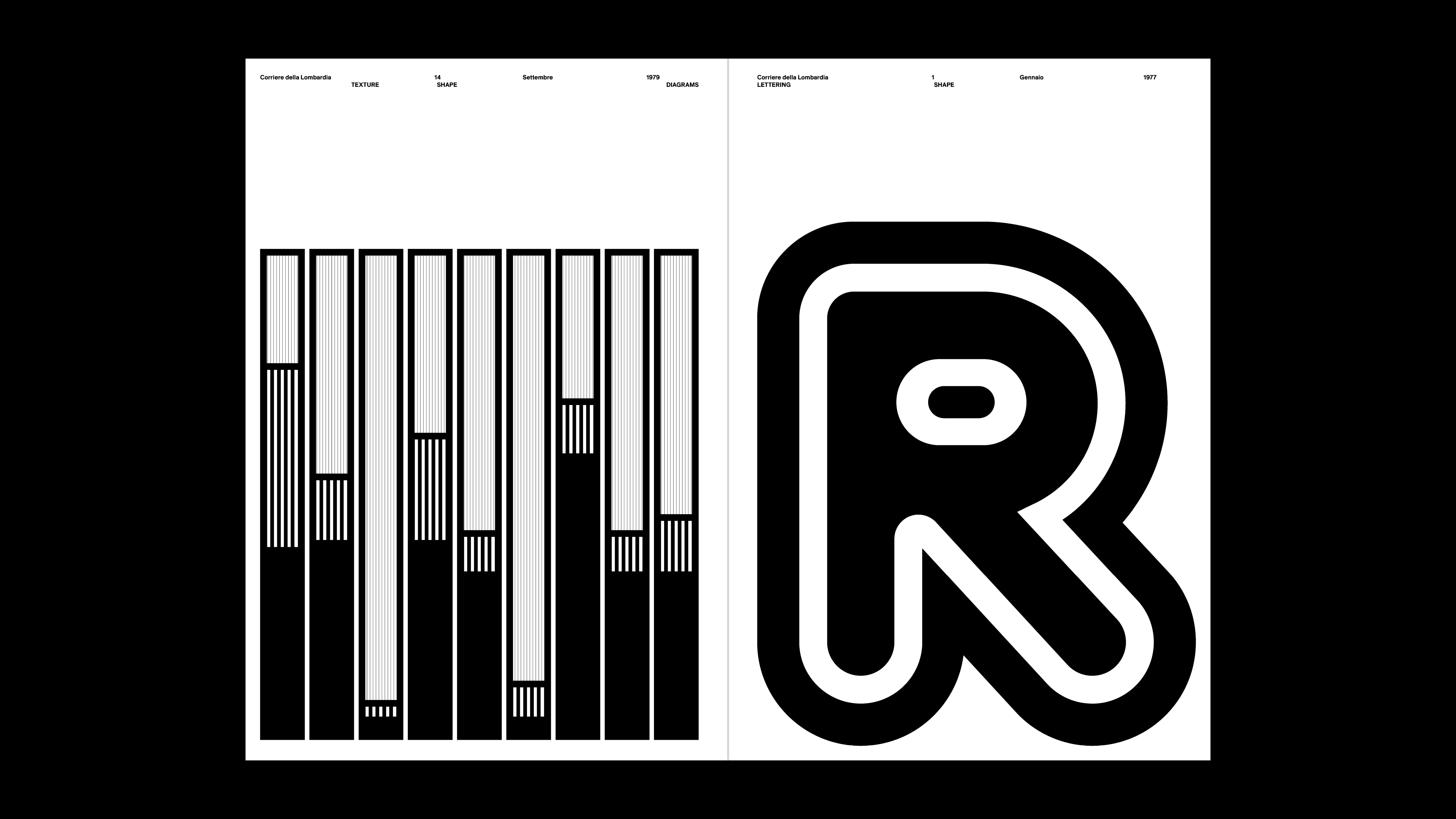
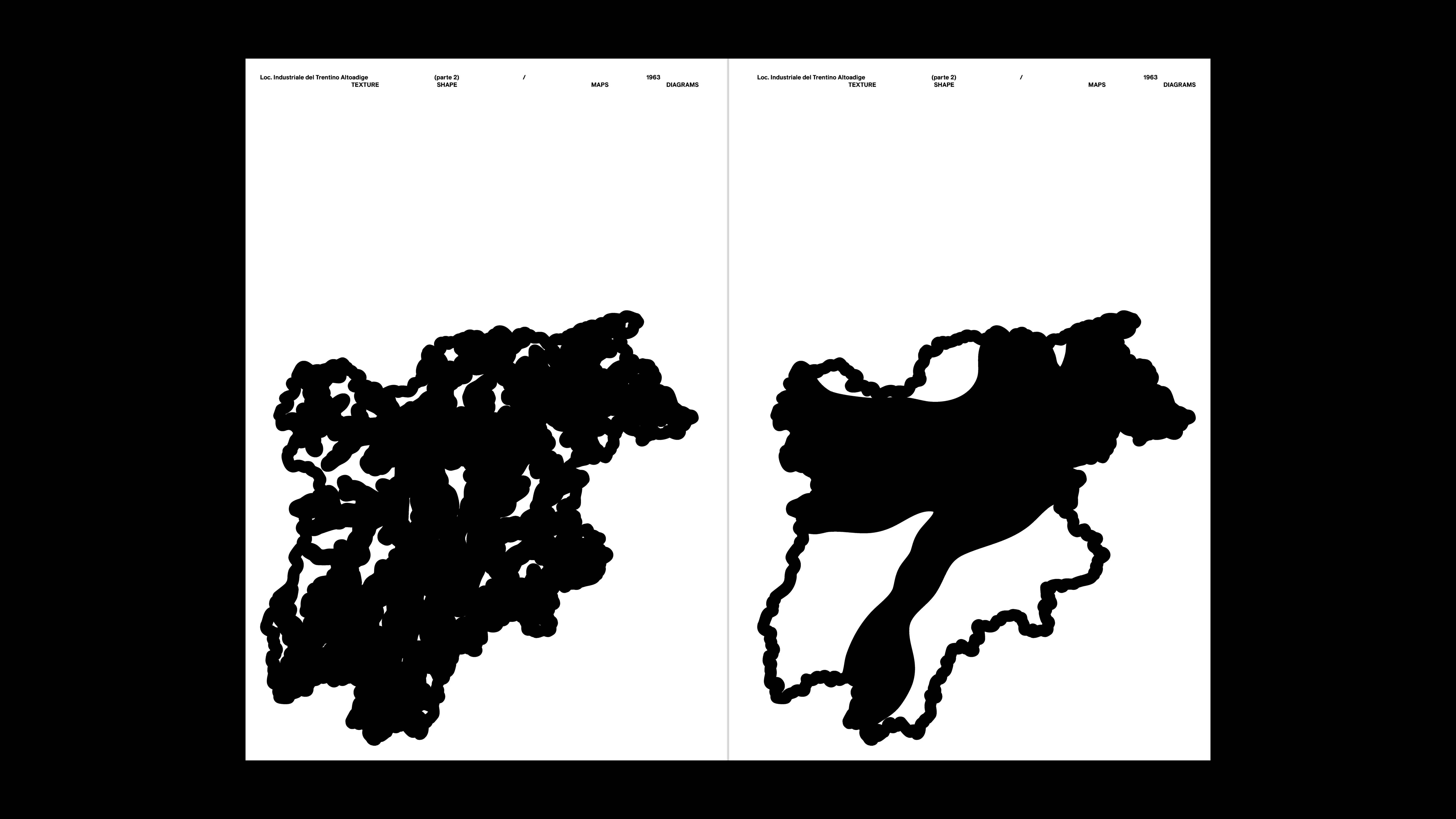
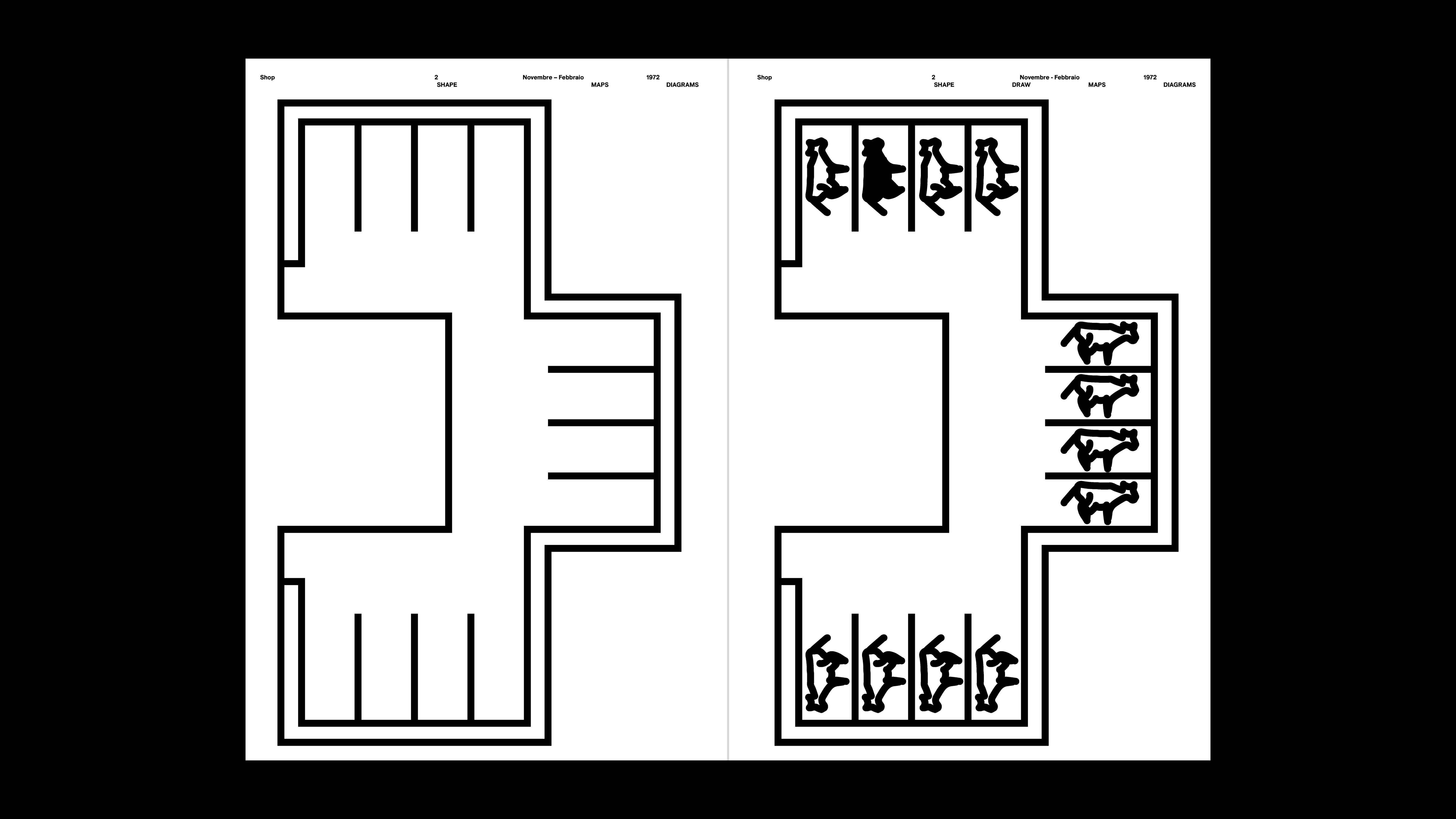
PROJECT Book Design CONTEXT ISIA_U DESCRIPTION This book is a tribute to the extraordinary originality of Italo Lupi’s infographics, where each diagram transforms into a symbol rich in details, shapes, and cultural references that amplify its communicative value. I carefully curated the page layouts, thoughtfully selecting the pairings and arranging multiple illustrations side by side to create a constant visual dialogue between the right and left pages. This comparison enhances the perception of coherence and harmony within Lupi’s work. His infographics go beyond simple data representation: they are true graphic masterpieces capable of conveying complexity with a fresh, personal, and never trivial language. By removing color, I aimed to highlight how the communicative power of his forms remains intact, even strengthened, revealing clear and striking diagrams that stand out as recognizable visual icons, directly engaging the viewer. This project tells not only of Lupi’s genius but also of the graphic sign’s ability to become a universal language—clear and at the same time deeply expressive.
1 (OF) 12
16
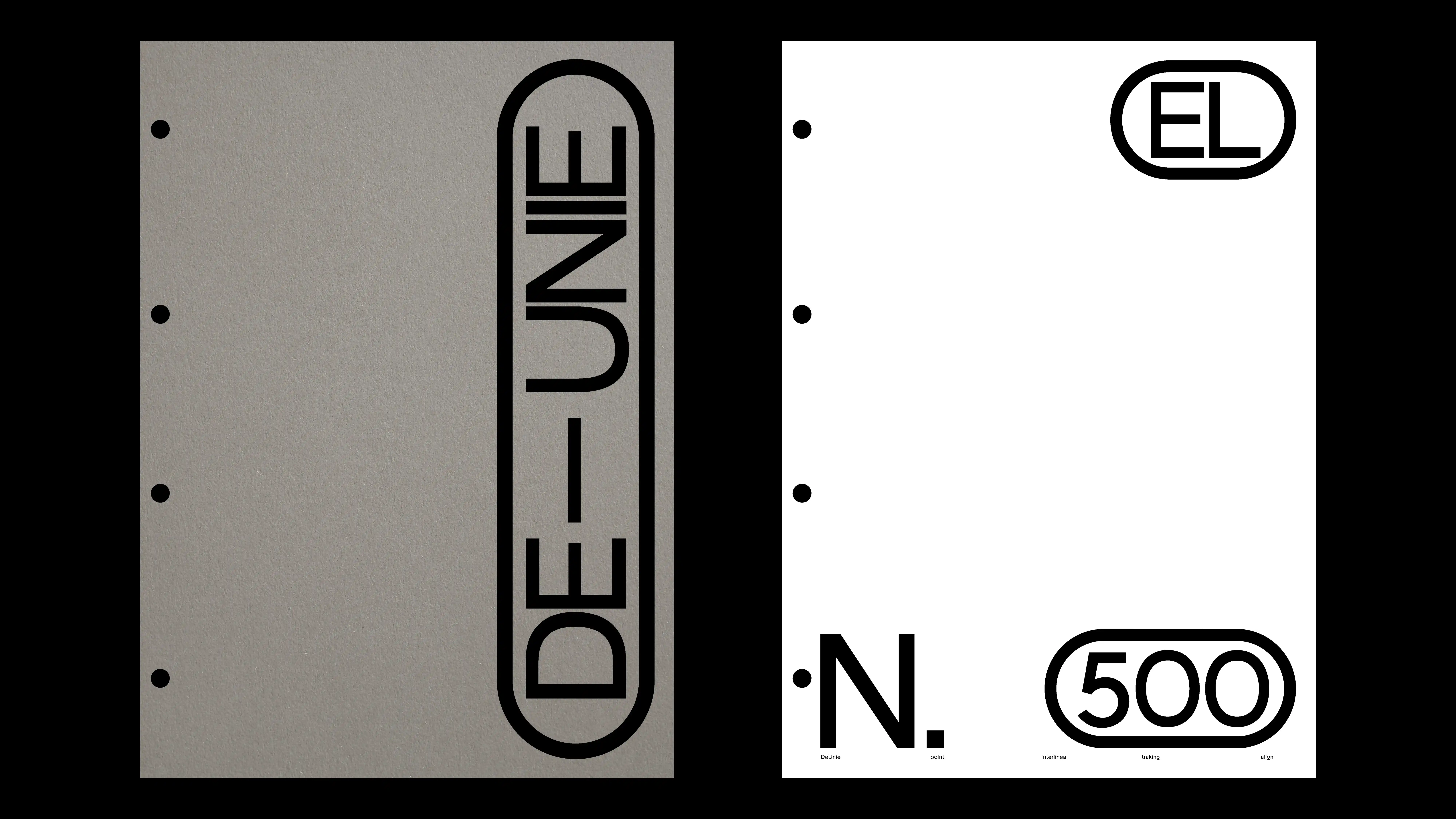
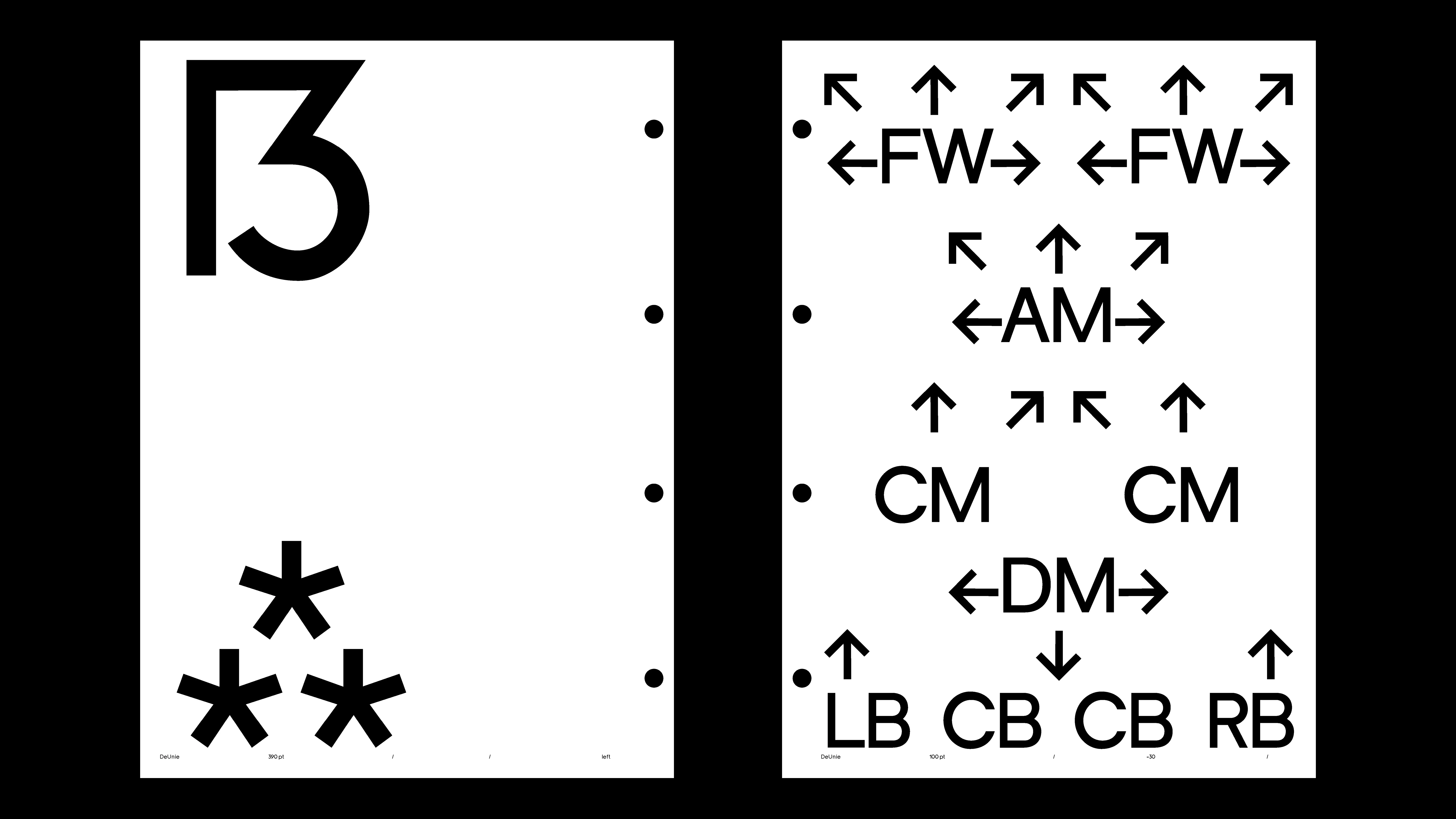
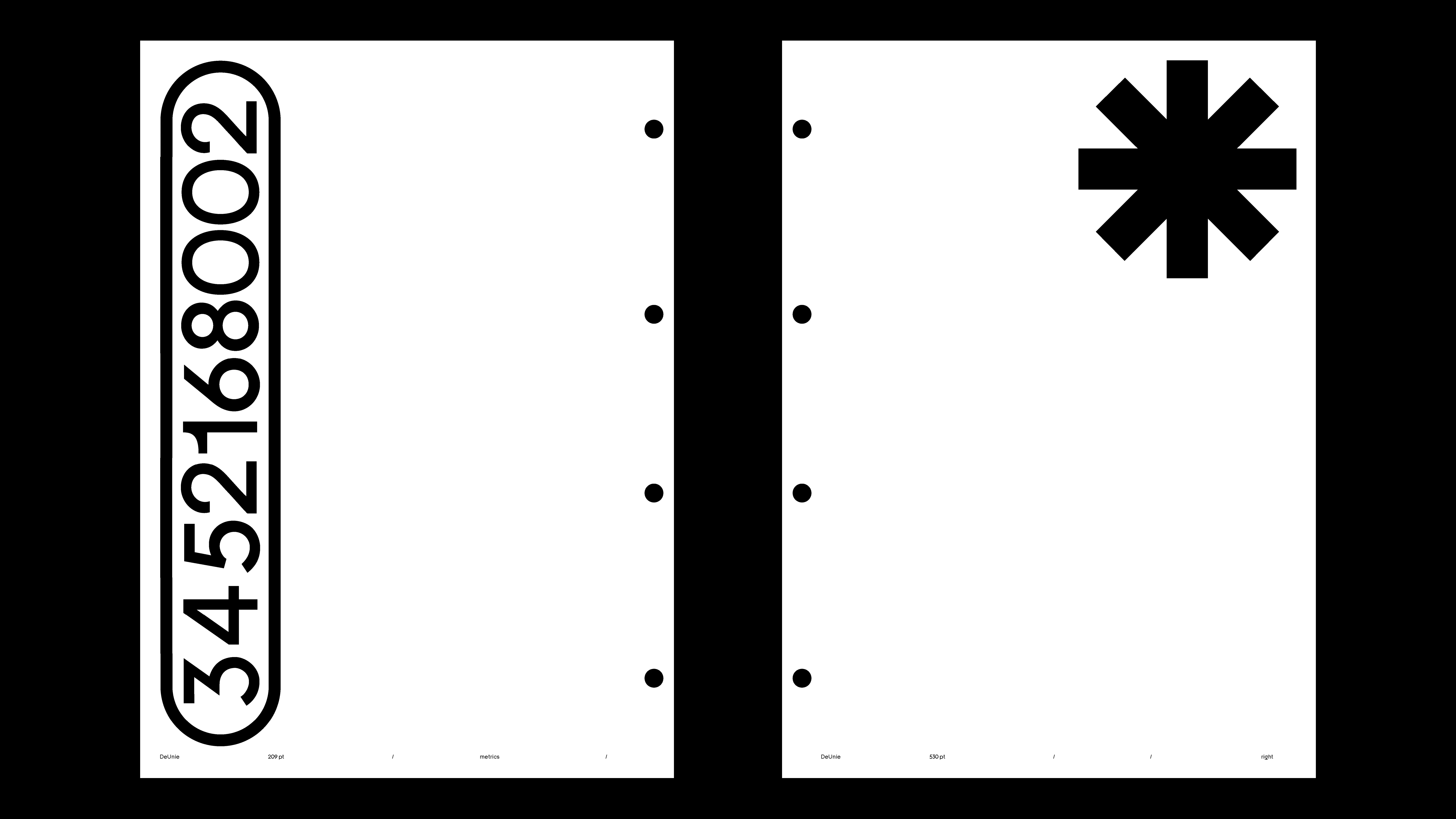
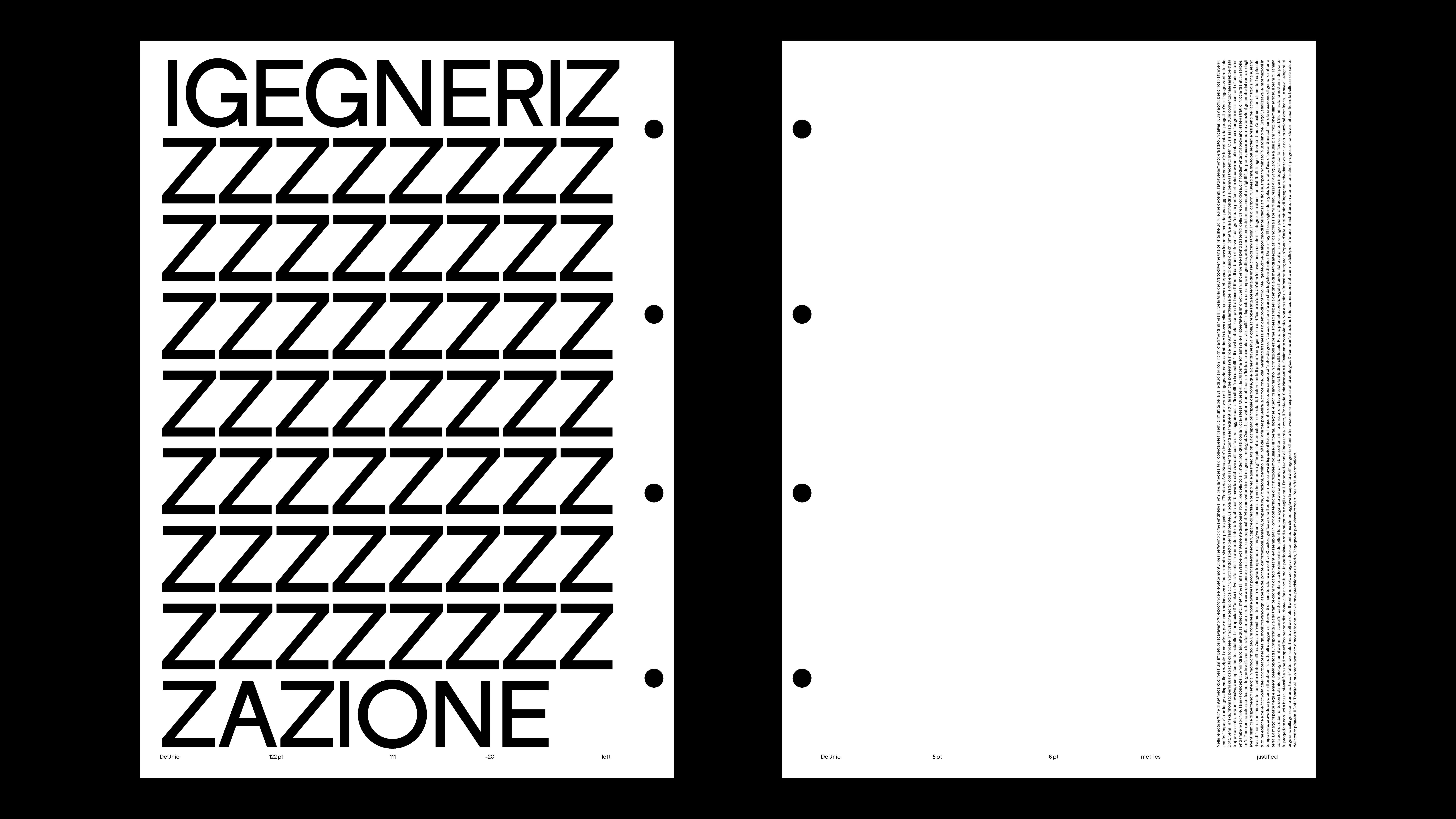
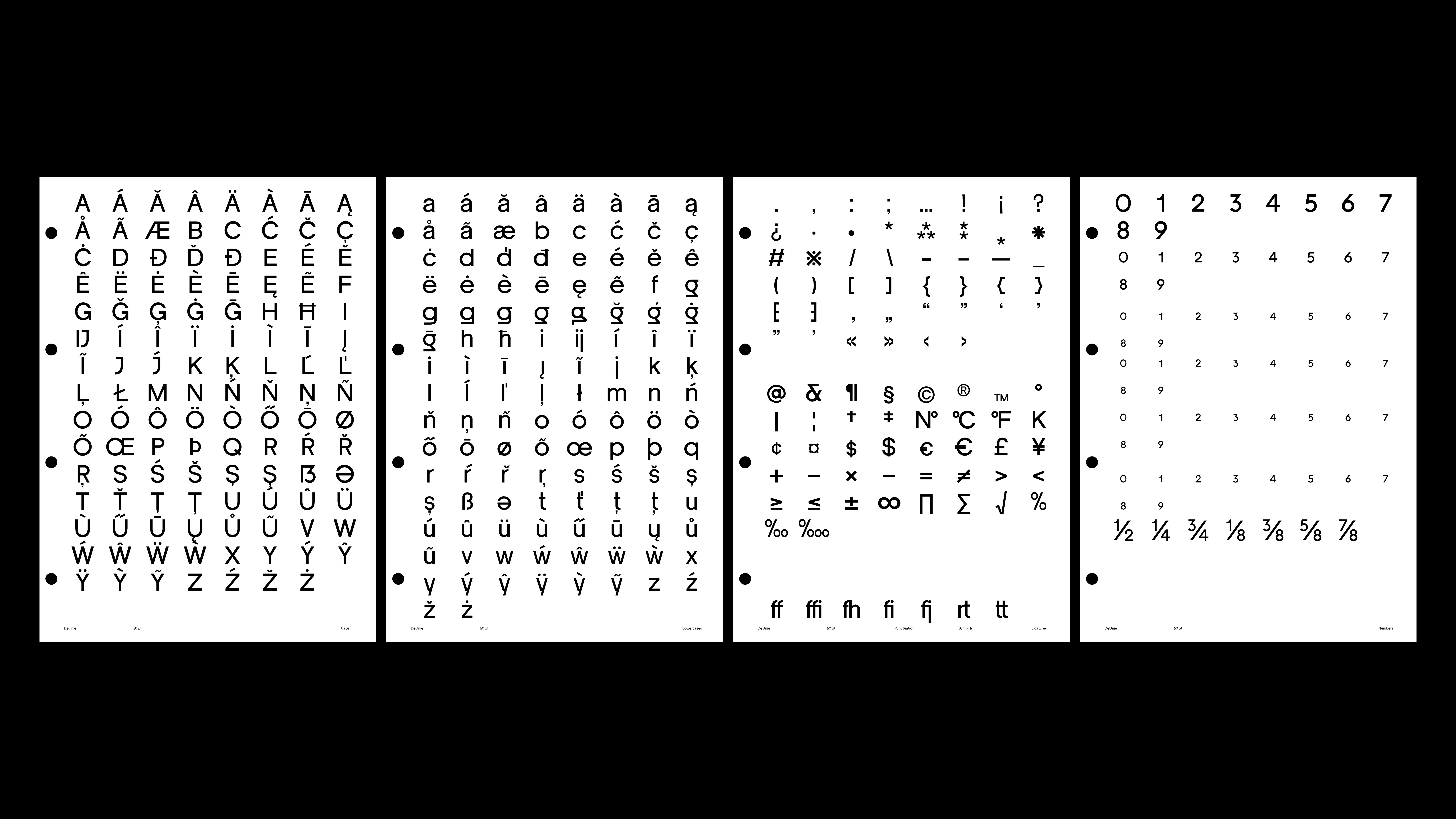
SPECIMEN 02
2025
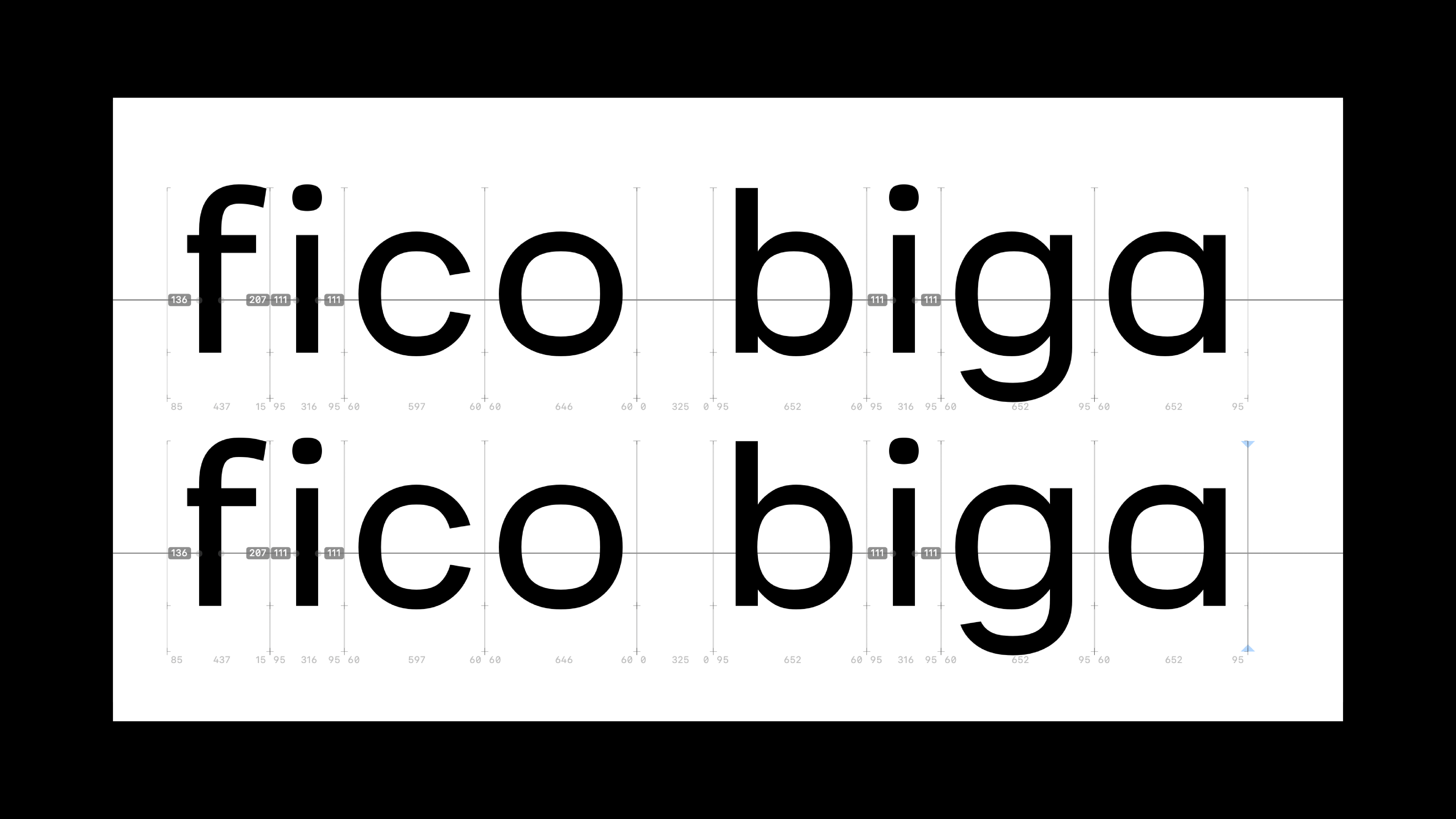
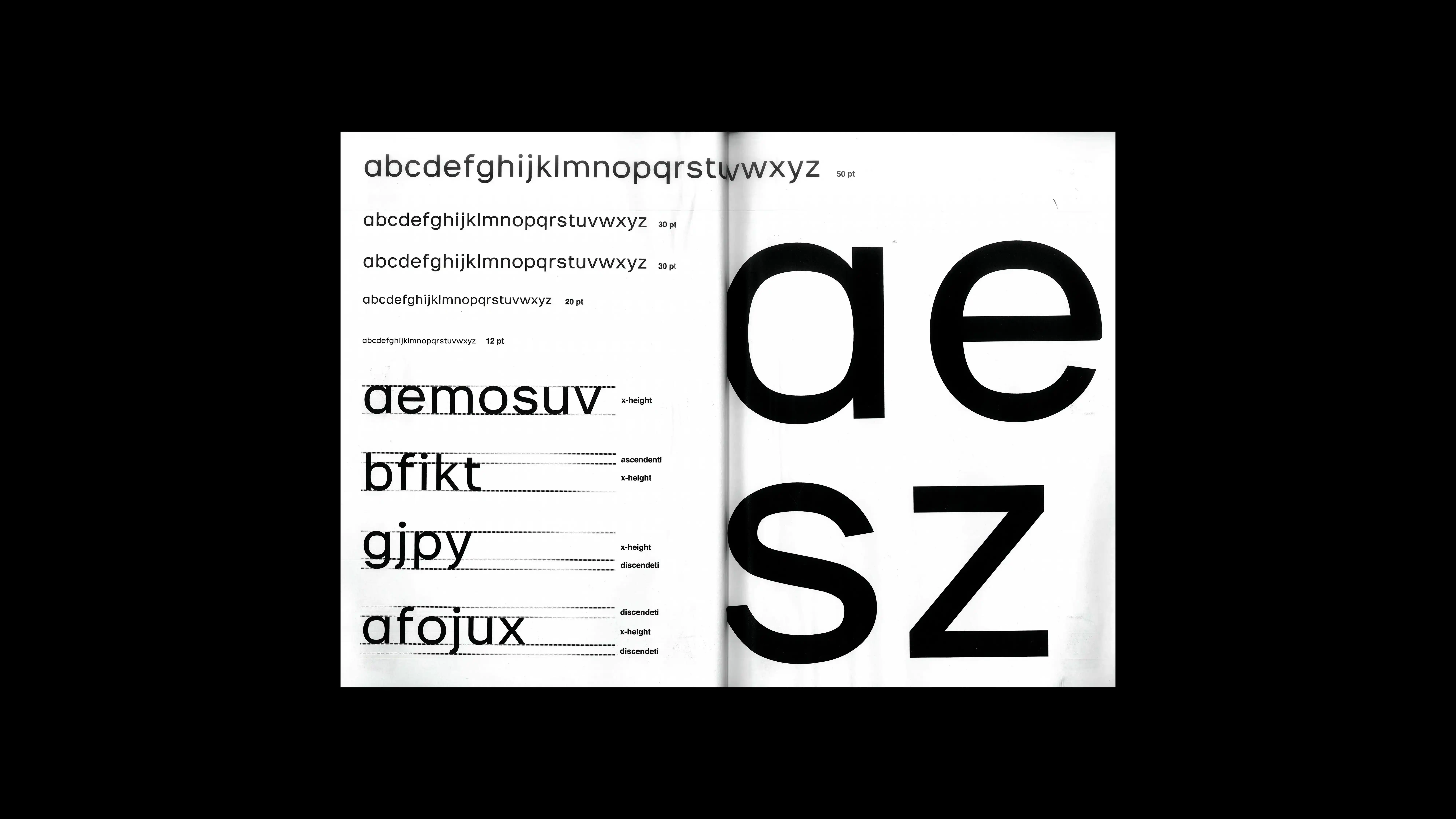
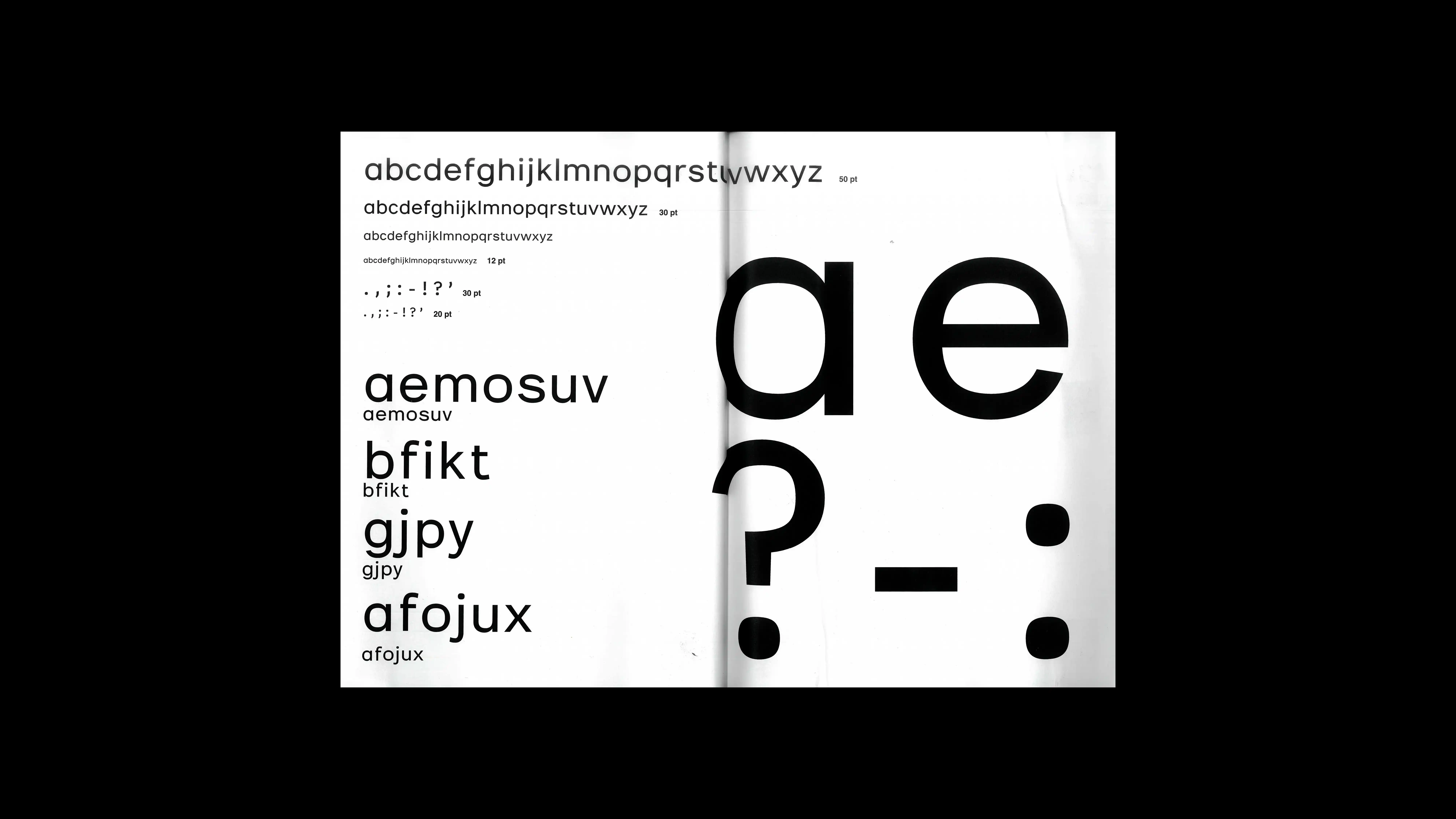
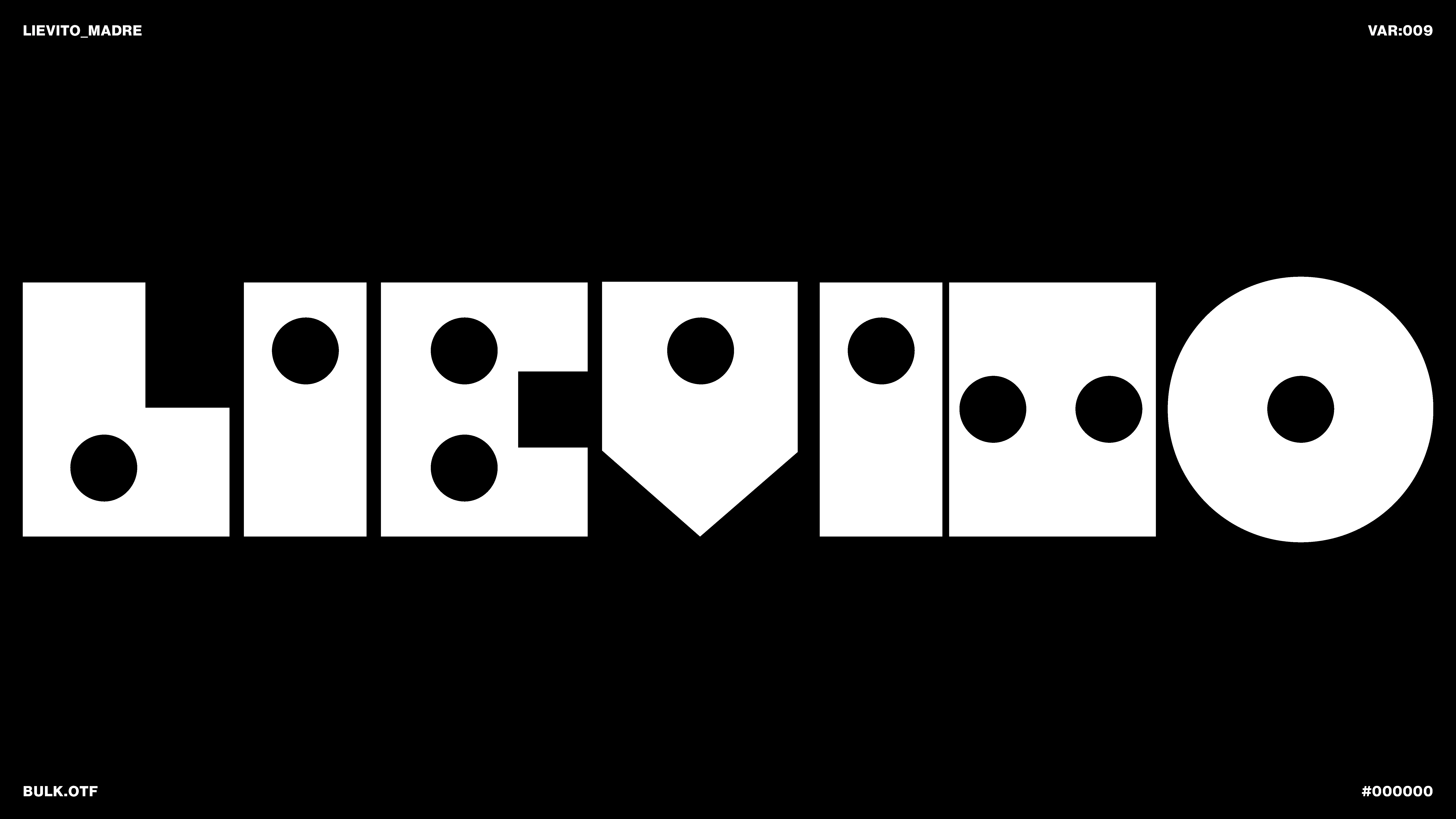
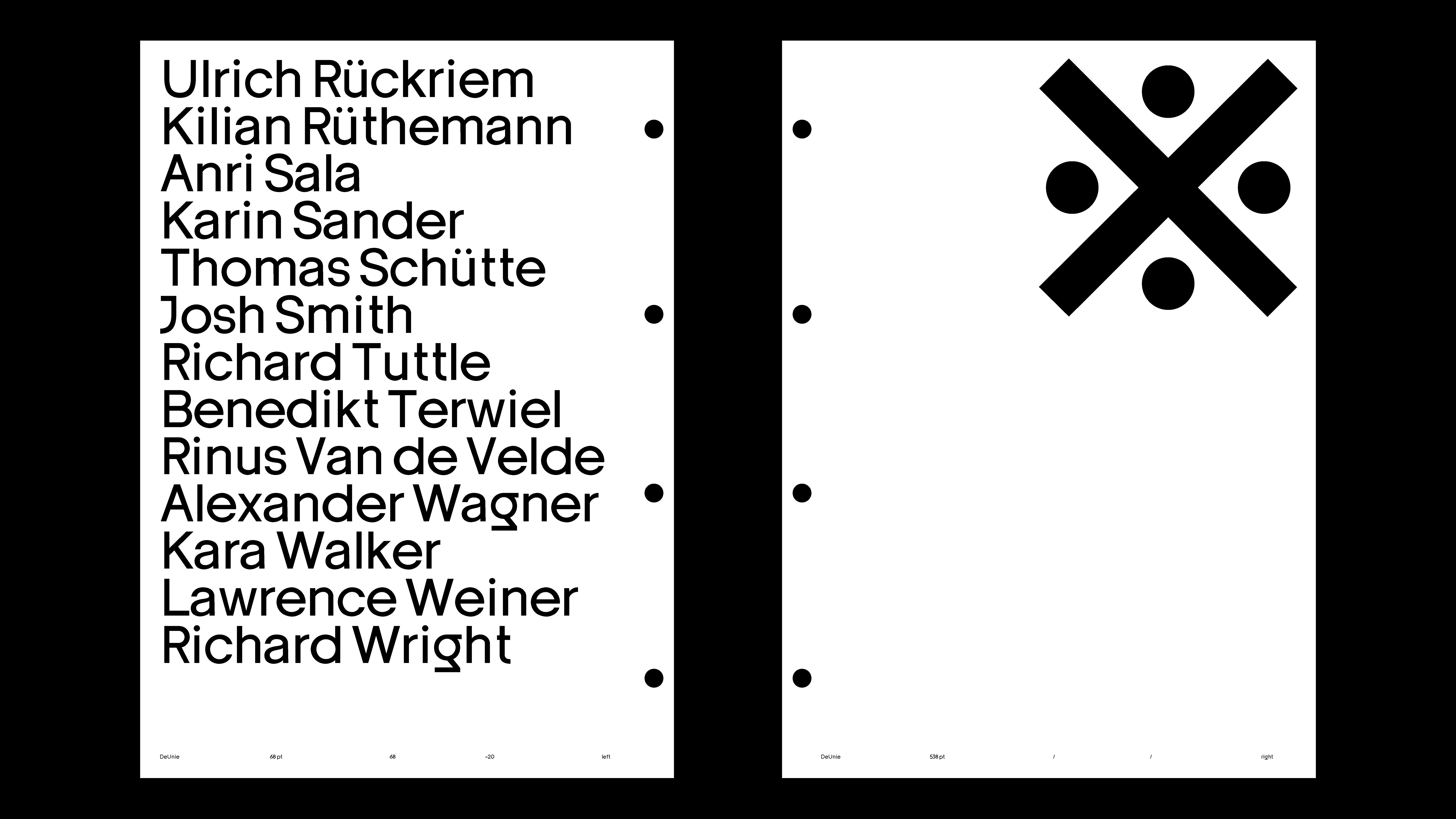
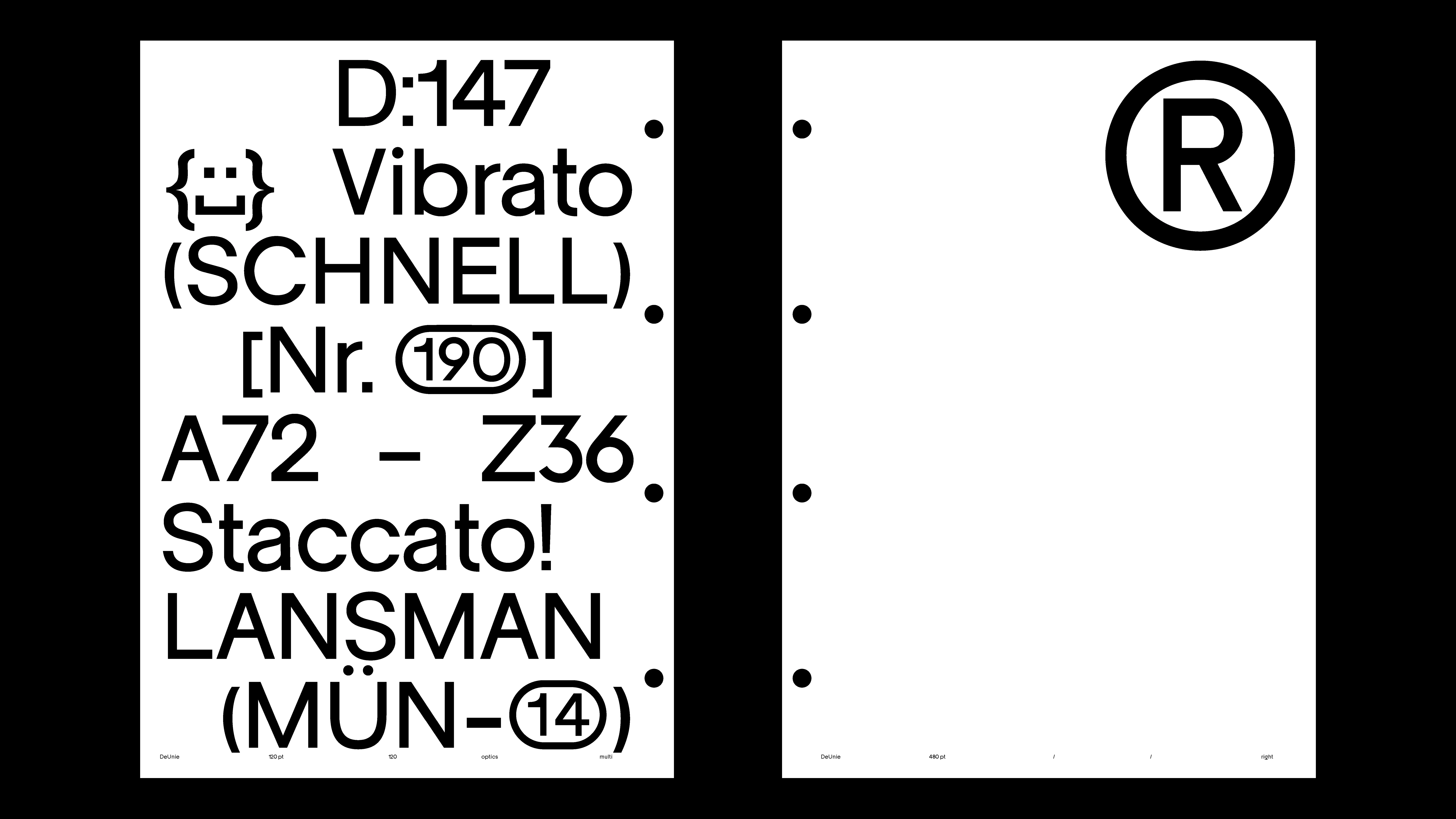
PROJECT Book & Poster Design CONTEXT ISIA_U DESCRIPTION The DEUNIE type specimen, in 33×48 cm format and bound with fasteners, was designed to reflect the poetic and design principles underlying the typeface. The binding and format allow practical use, while the content highlights the internal structure of the glyphs with exploded letter drawings and demonstrates their applicability even at very small sizes. Inside the specimen, there are inserts showcasing all approximately 600 glyphs of the typeface, including letters, accents, punctuation, and stylistic alternates. This provides a complete and systematic reading of the typographic project, turning the specimen into a tool that visually translates DEUNIE’s modularity and architectural logic. To complement the presentation, I also designed a poster that utilizes the typeface’s stylistic sets, emphasizing DEUNIE’s stylistic possibilities and versatility. The poster serves as an independent visual support, effectively communicating the modularity, legibility, and unique character of the font in a broader graphic context.
1 (OF) 12
15
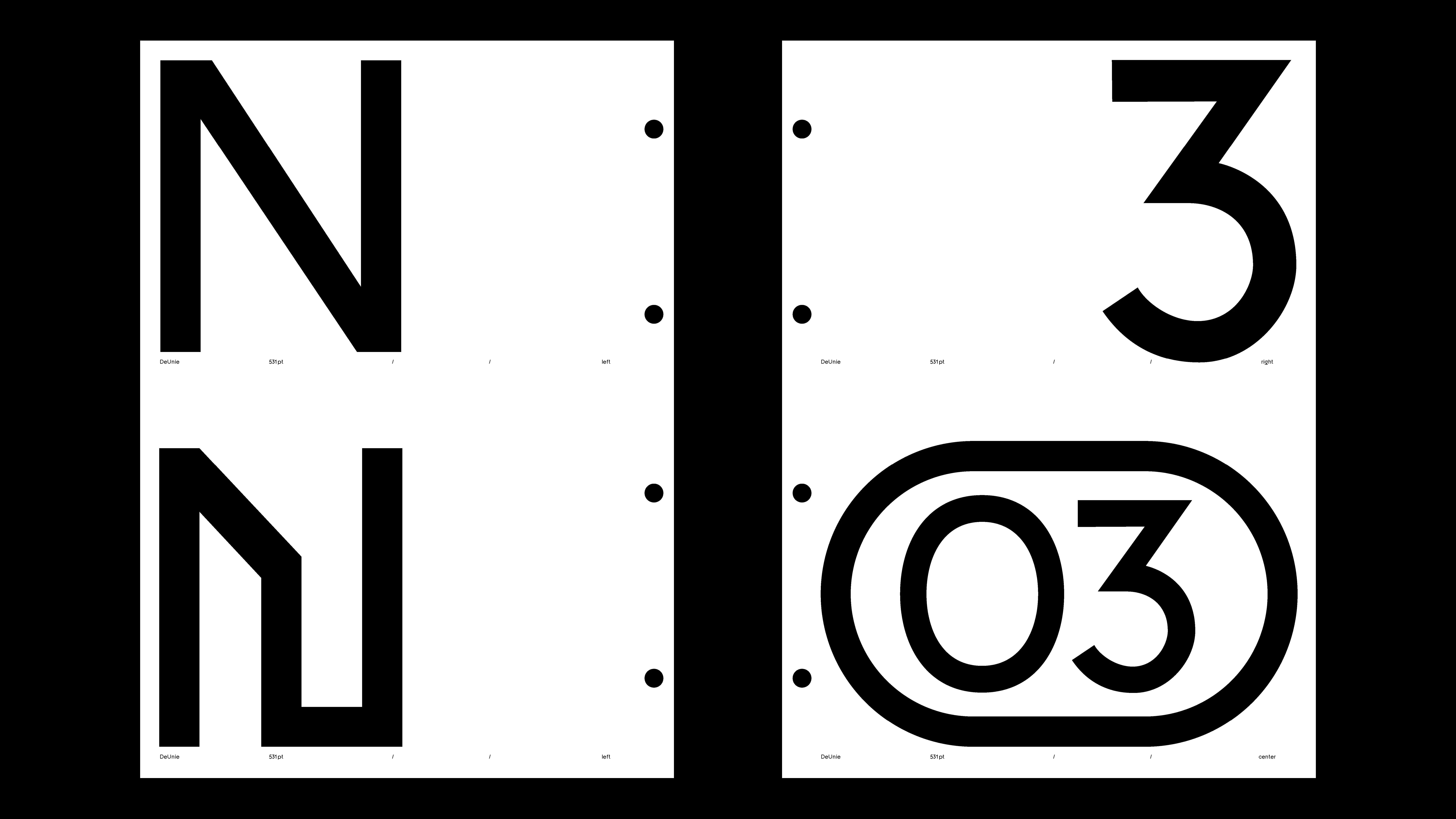
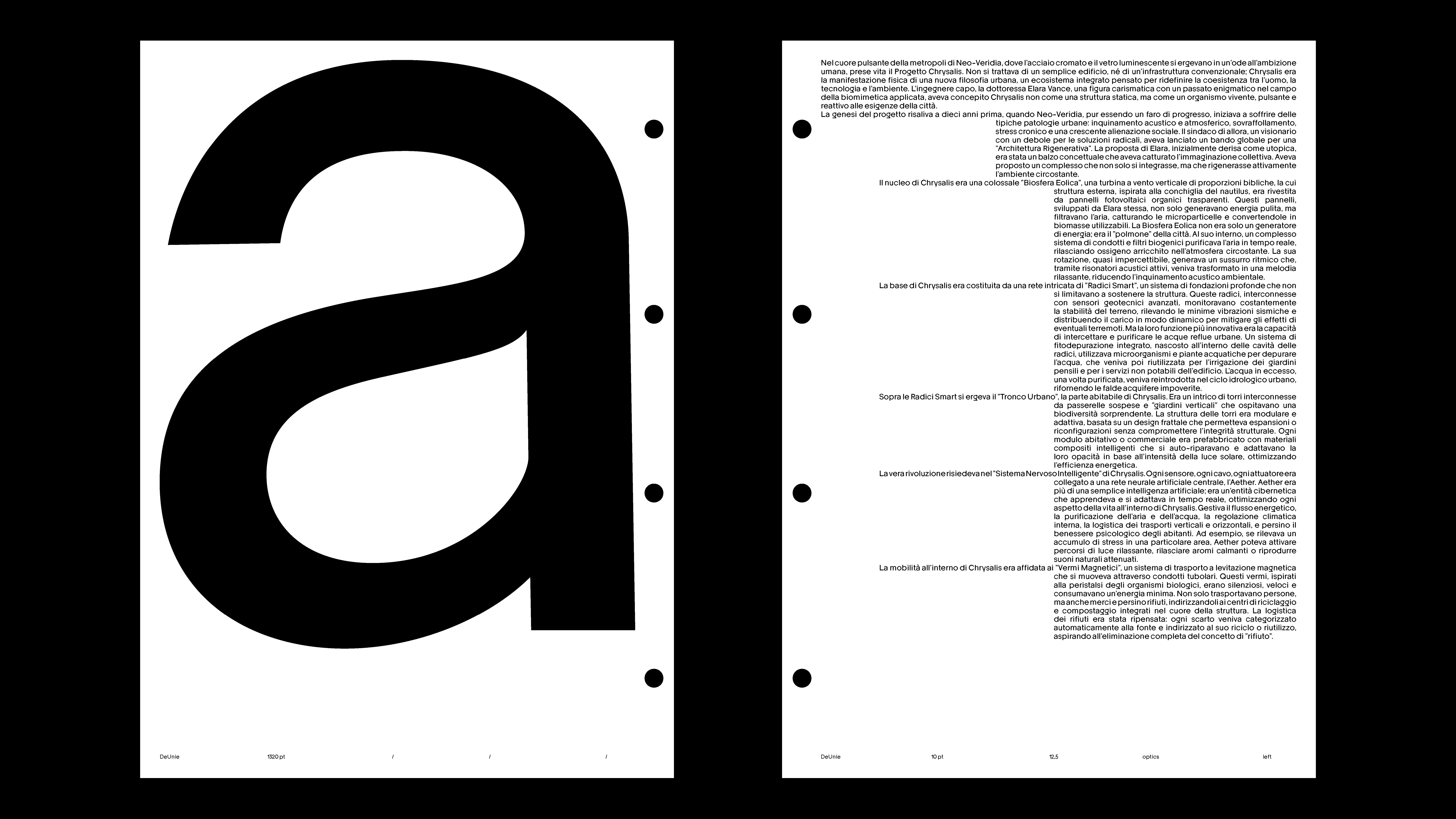
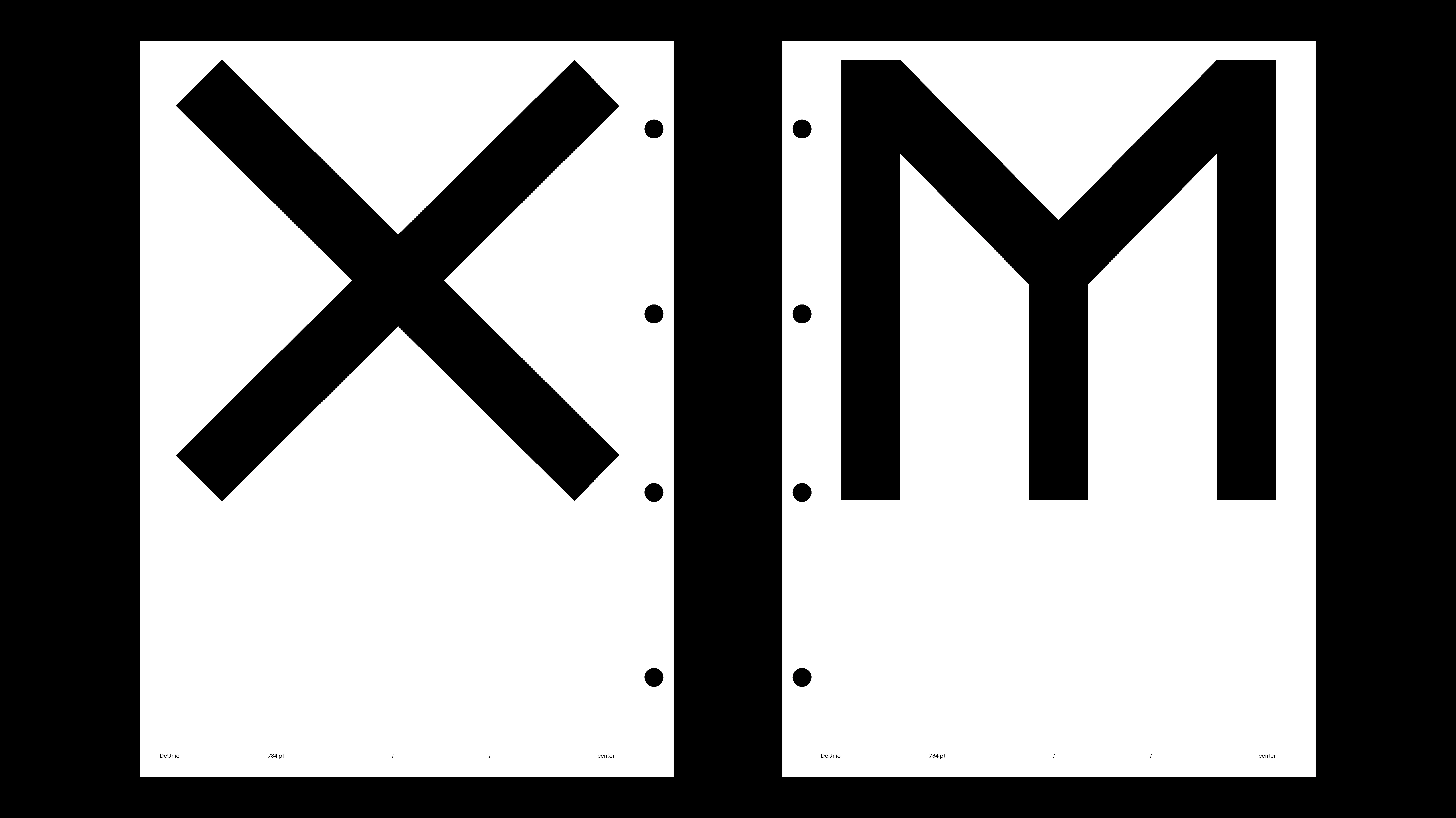
DEUNIE
2025
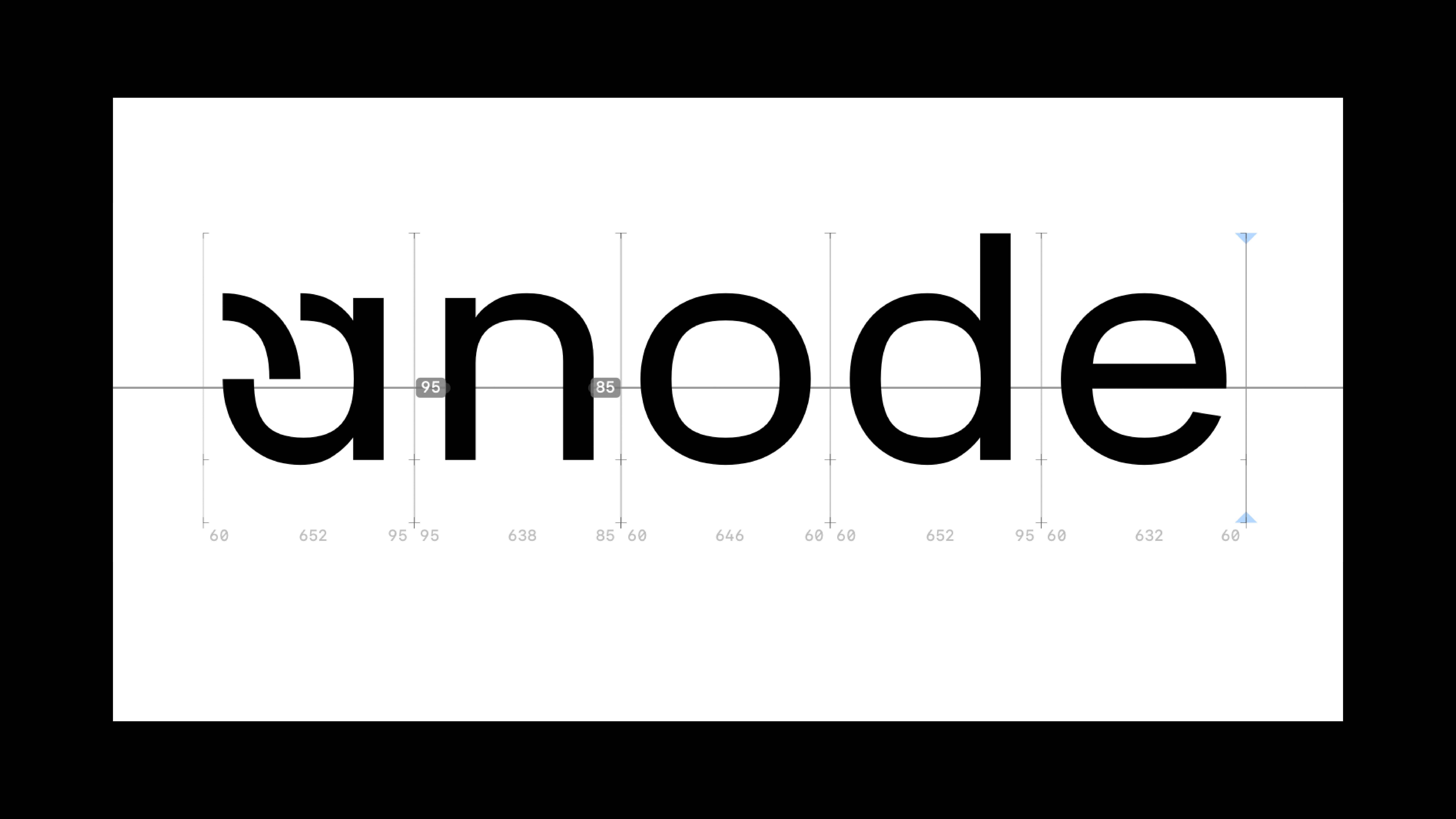
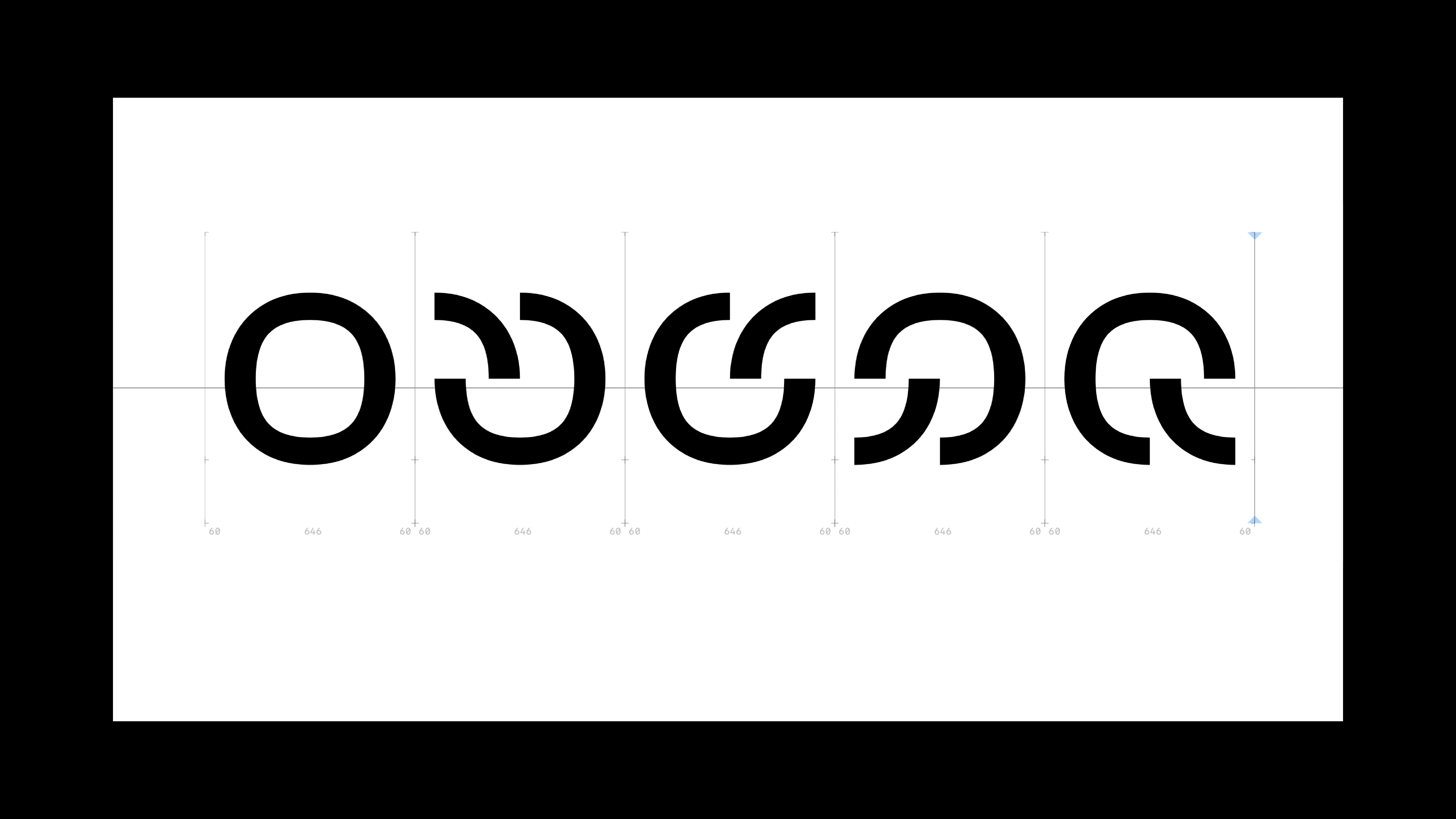
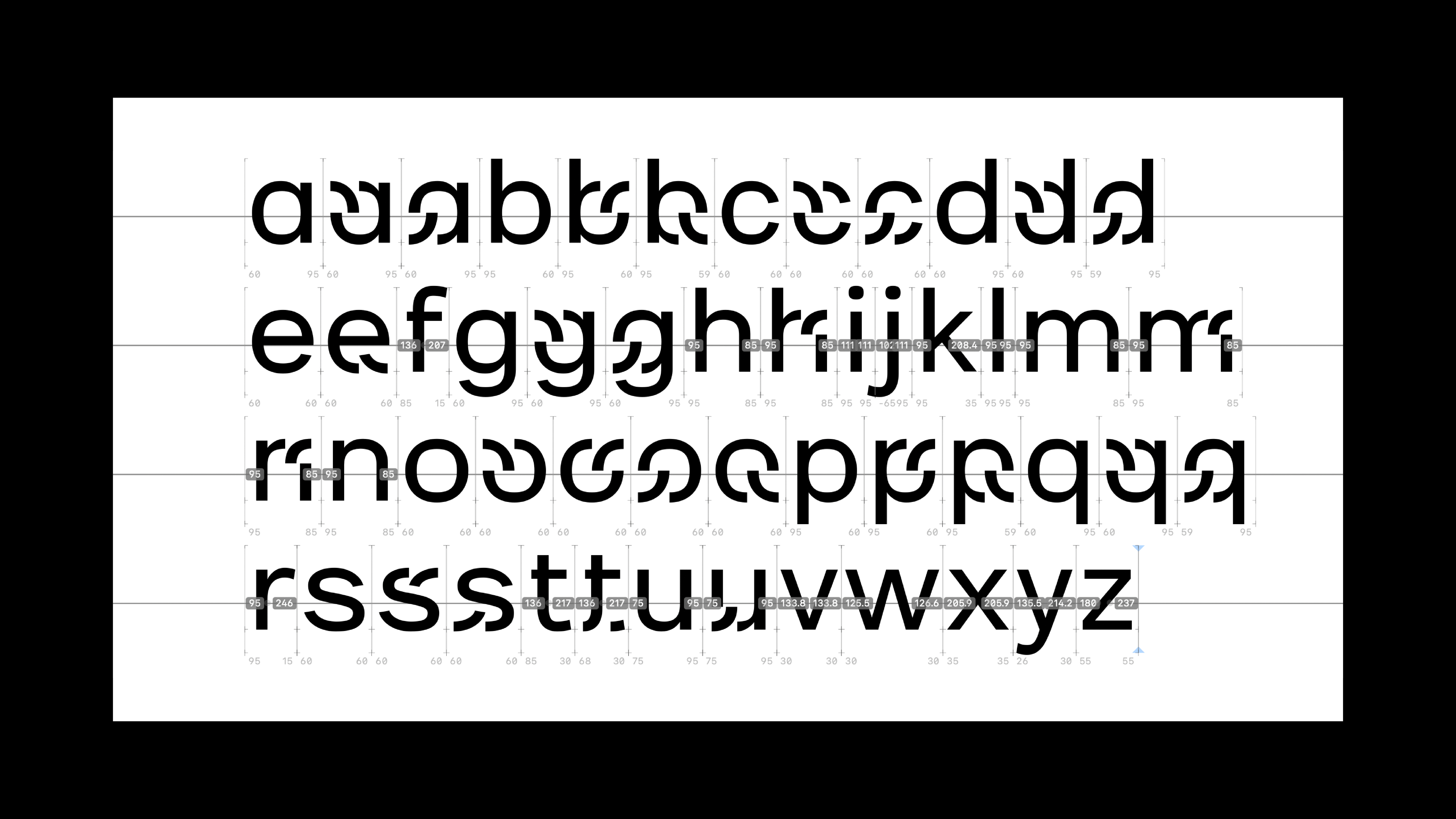
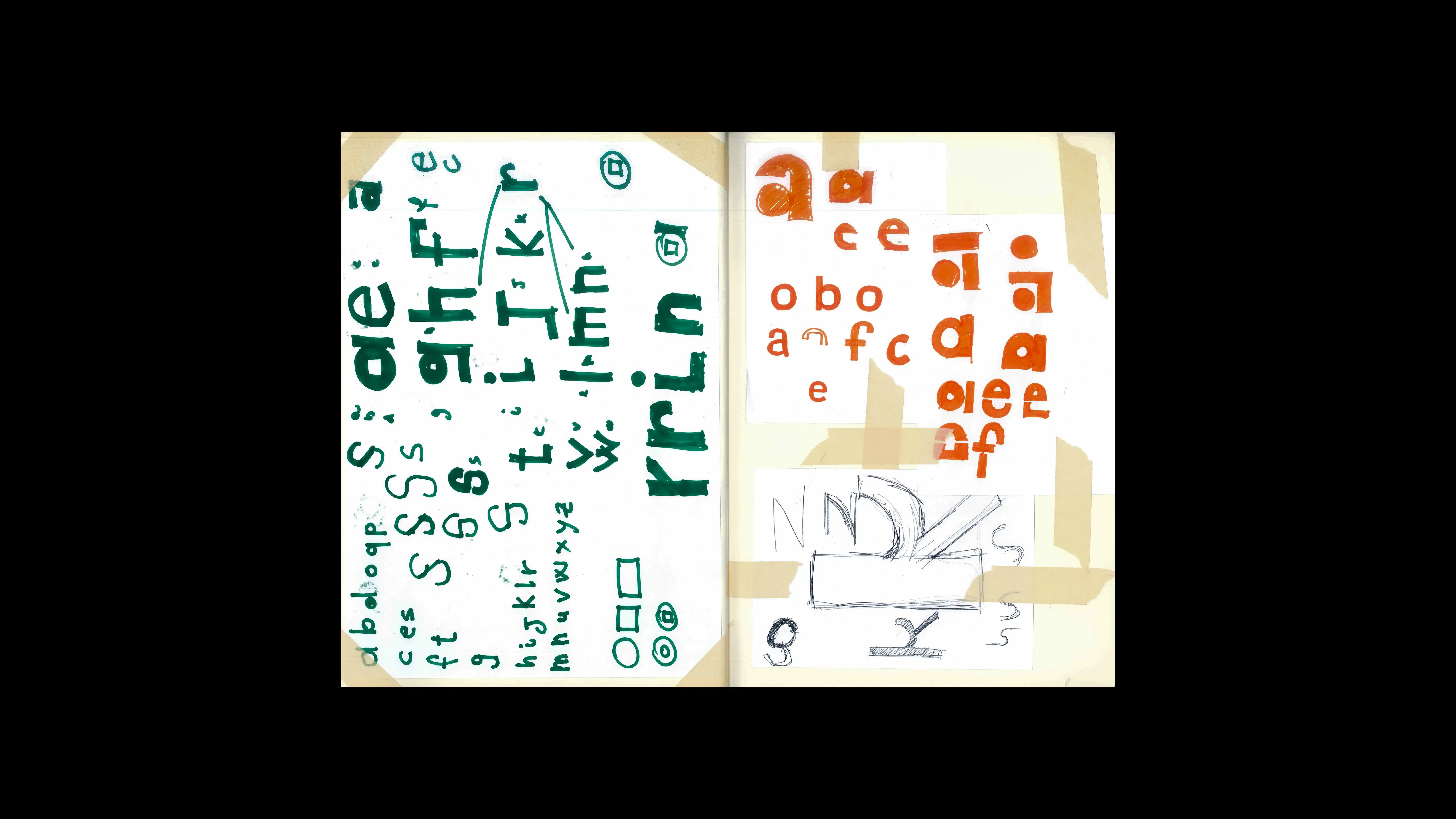
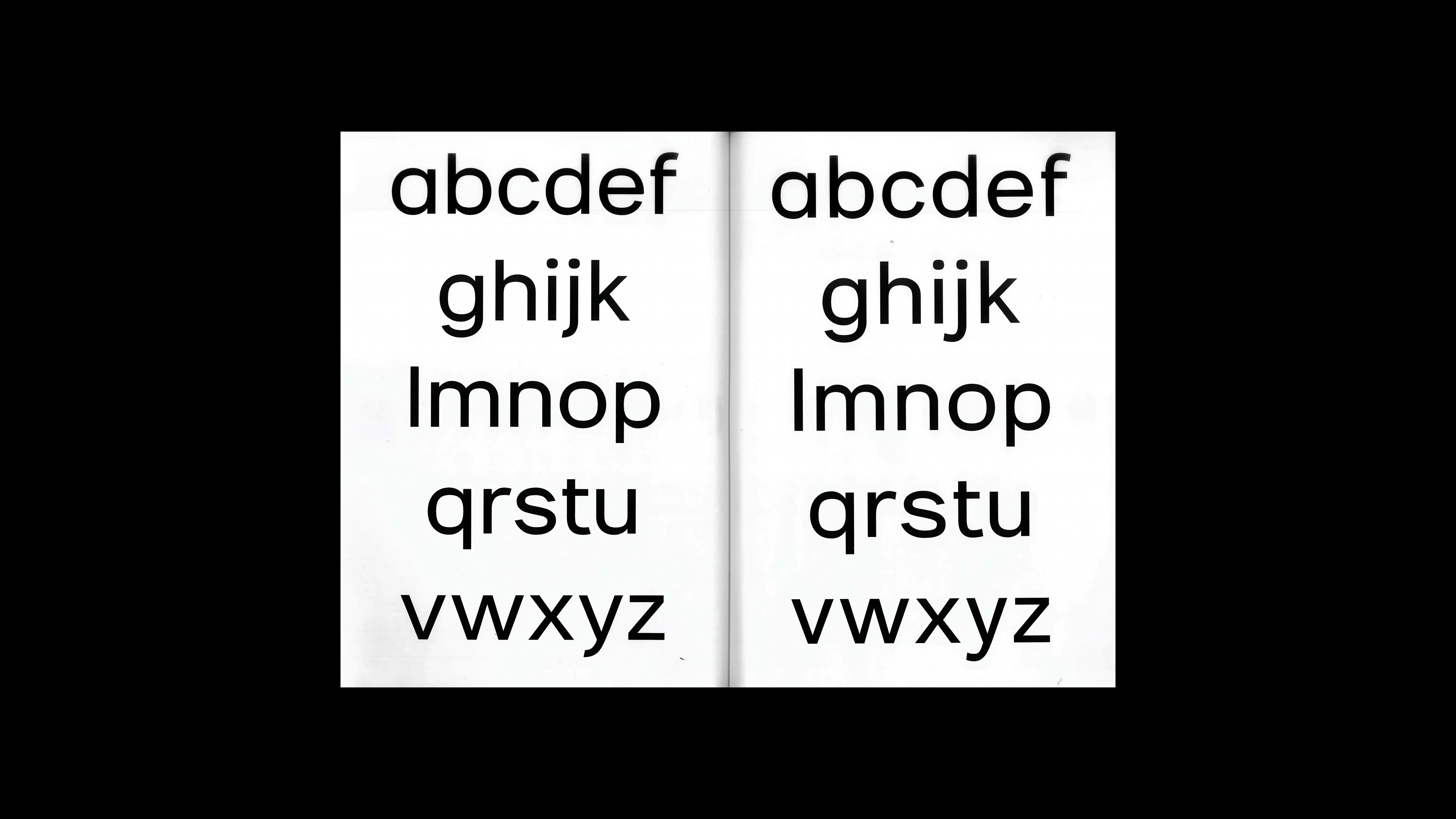
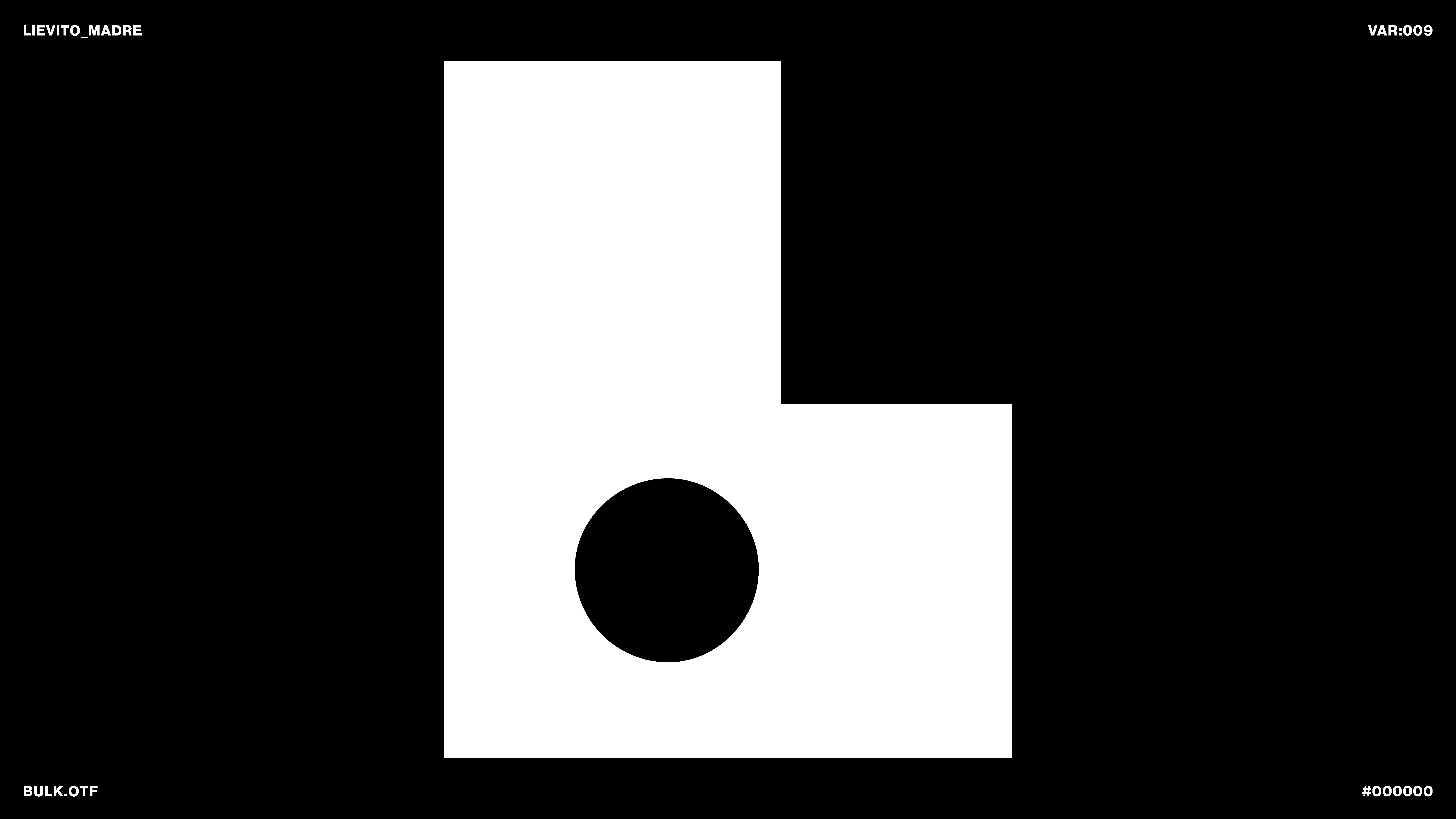
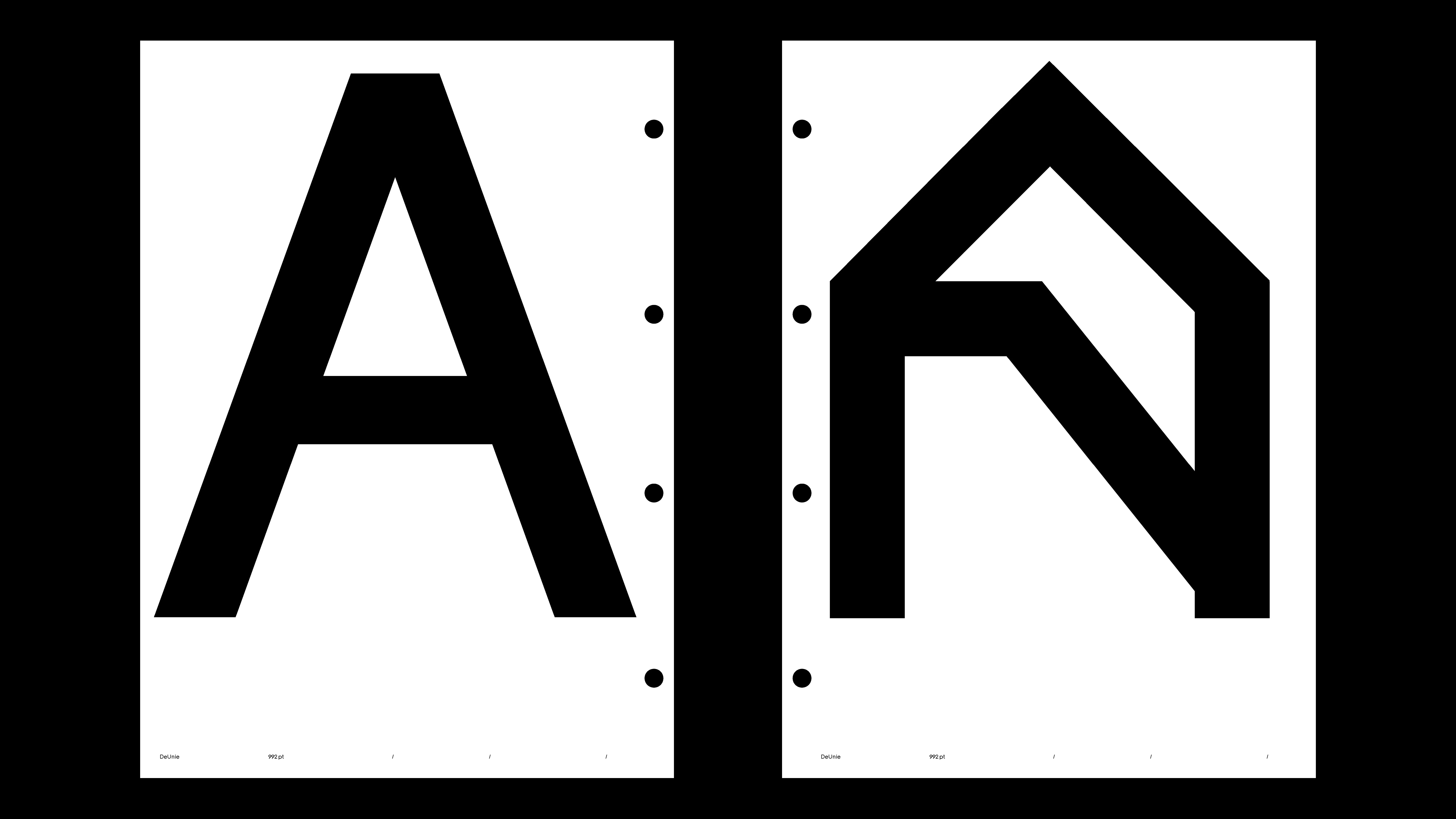
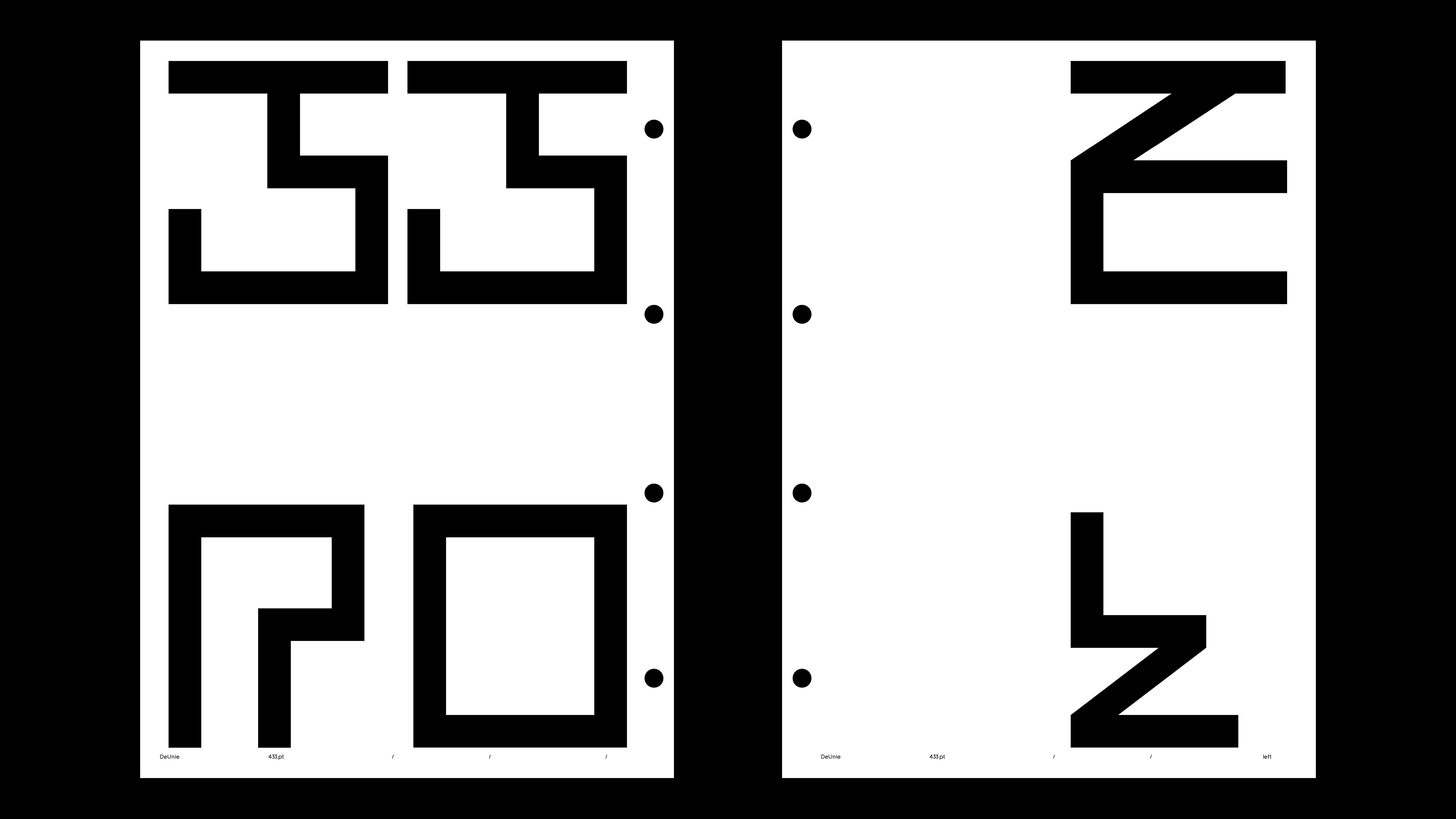
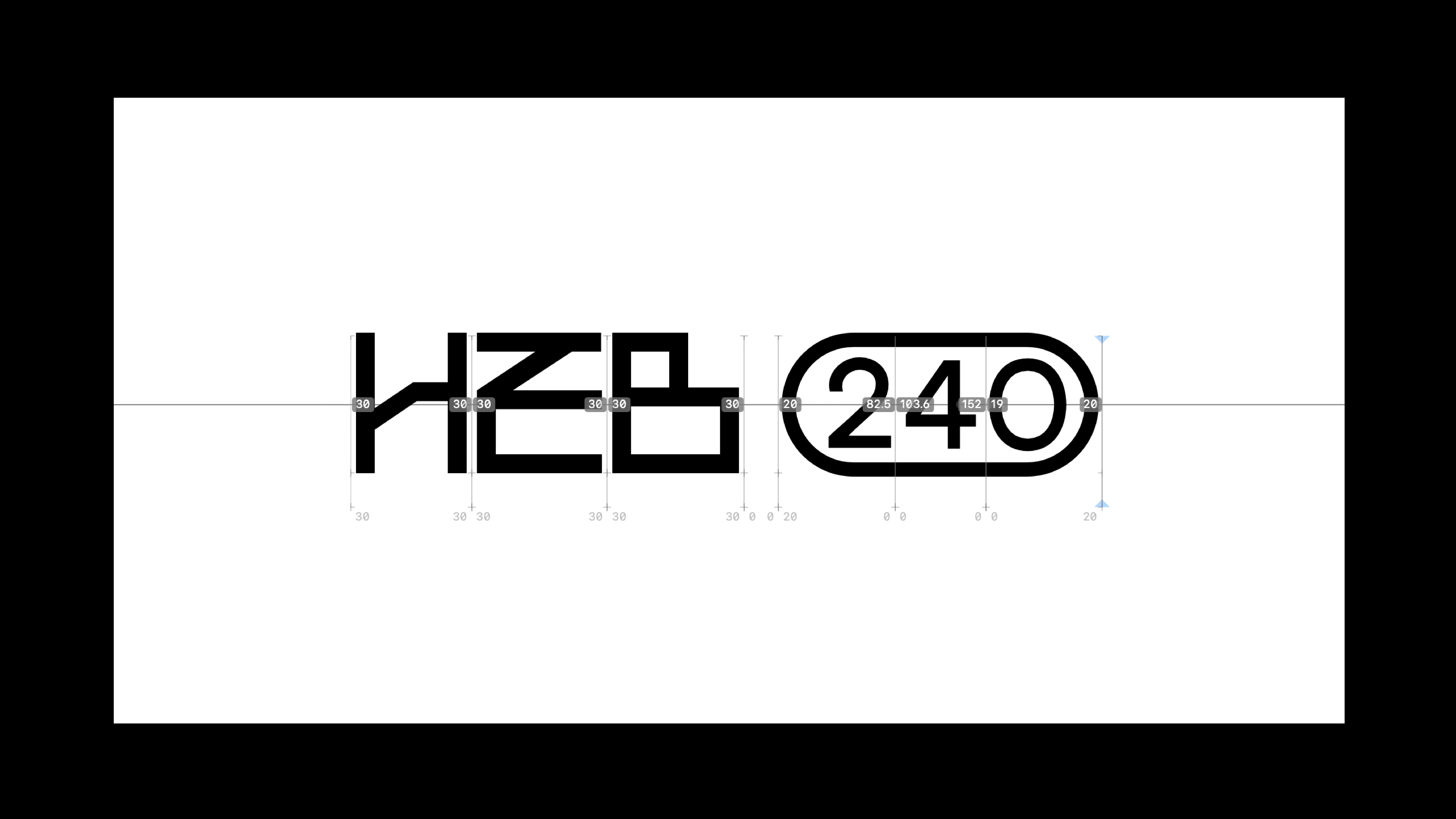
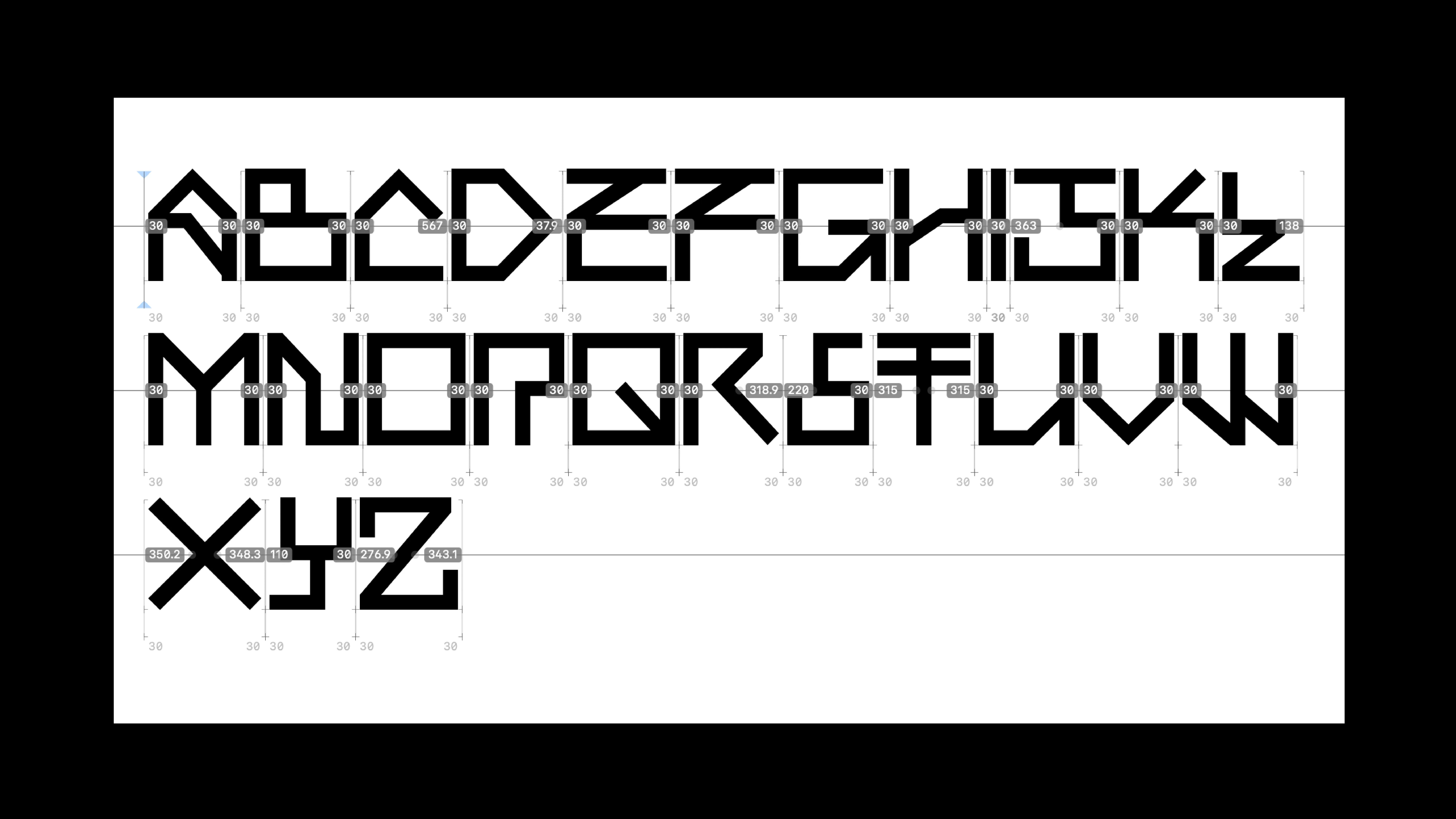
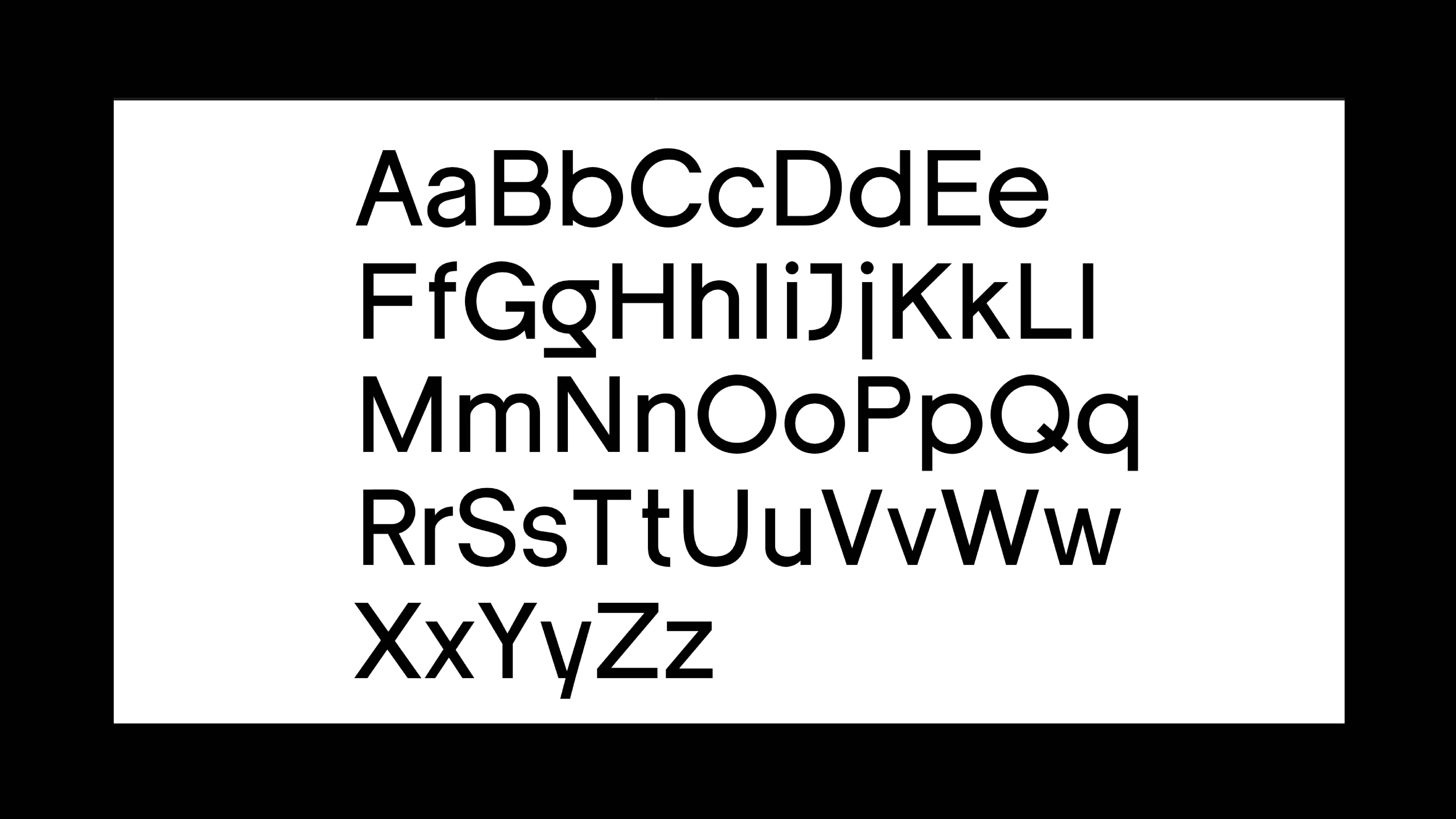
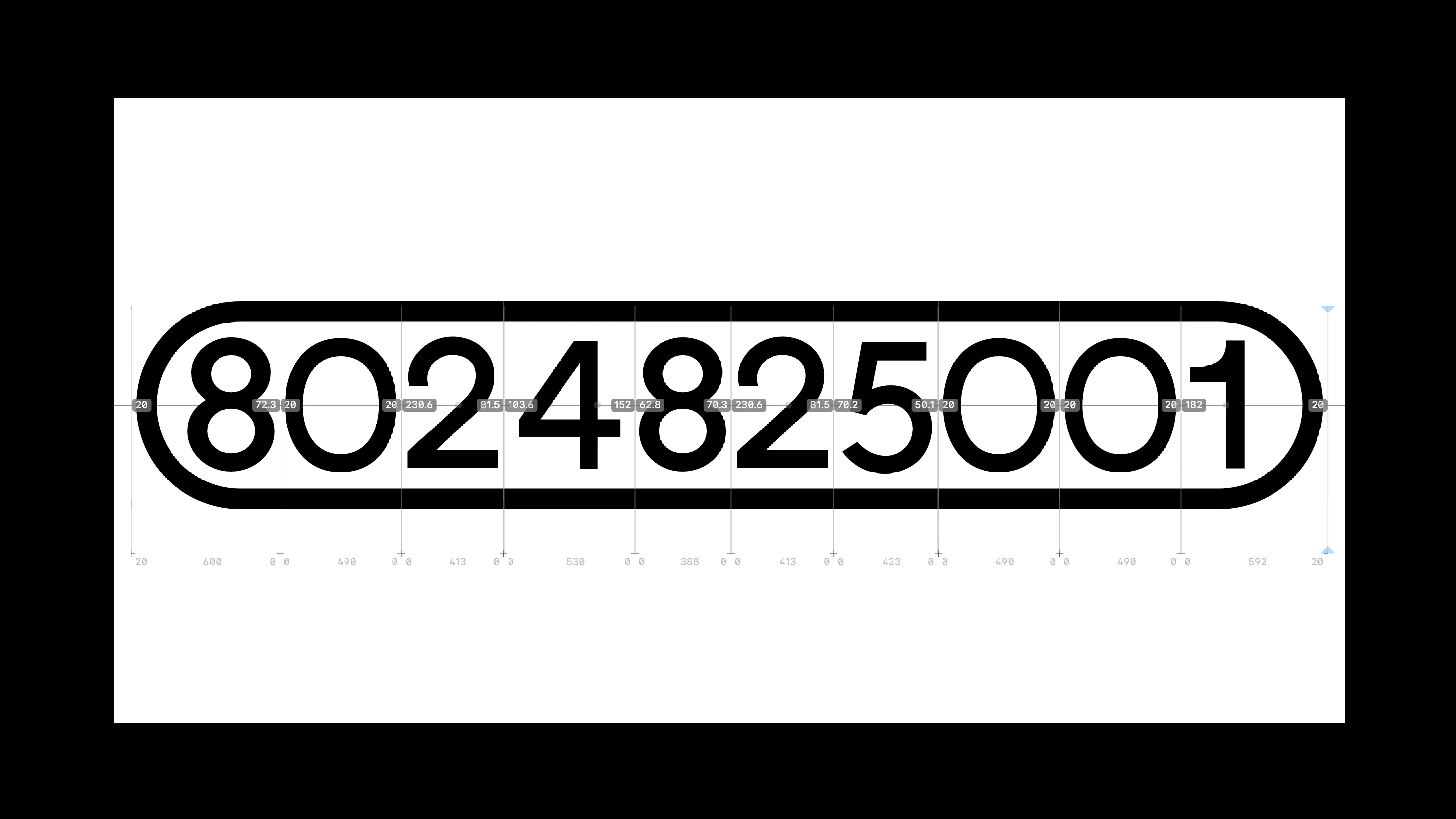
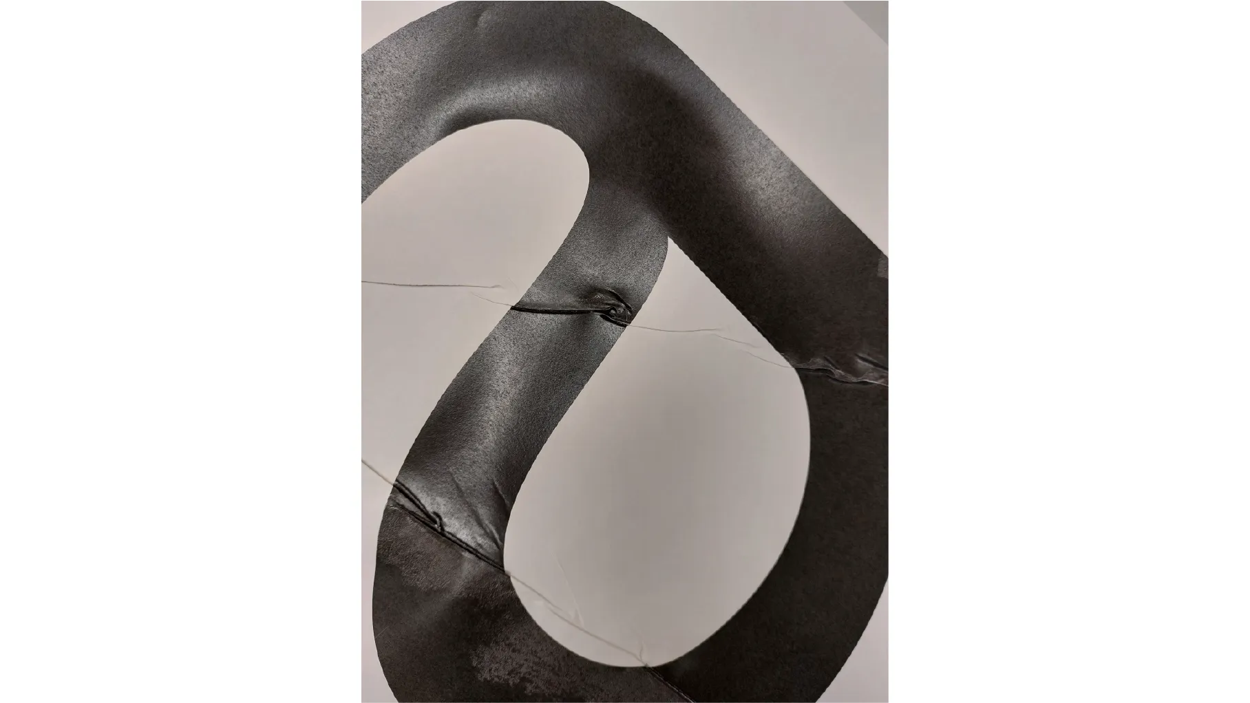
PROJECT Type Design CONTEXT ISIA_U DESCRIPTION This typeface is named after a famous Dutch bar designed in 1925 by Jacobus Johannes Pieter Oud, a key figure of the De Stijl movement and modern architecture. Though the original building was destroyed during World War II in 1940, its innovative spirit lives on in this font. The design merges the clean functionality of a grotesque sans serif with the elegant curves and geometric principles characteristic of Oud’s era. Its bold black forms and compact shapes directly reference JJP Oud’s architectural floor plans, giving the typeface a unique structural identity beyond typical sans serifs. A distinctive feature is the “circled” glyph set, which transforms letters into iconic graphic elements reminiscent of Oud’s technical drawings, creating a powerful visual link between typography and architecture. With nearly 600 glyphs—including letters, accents, punctuation, and an alternative uppercase set inspired faithfully by Oud’s building plans—this font offers exceptional versatility. Modular numbers and stylistic alternates make it perfect for editorial design and strong visual identities. More than just a typeface, it’s a bridge between modernist architecture and typography, capturing the radical vision of J.J.P. Oud in every character.
1 (OF) 12
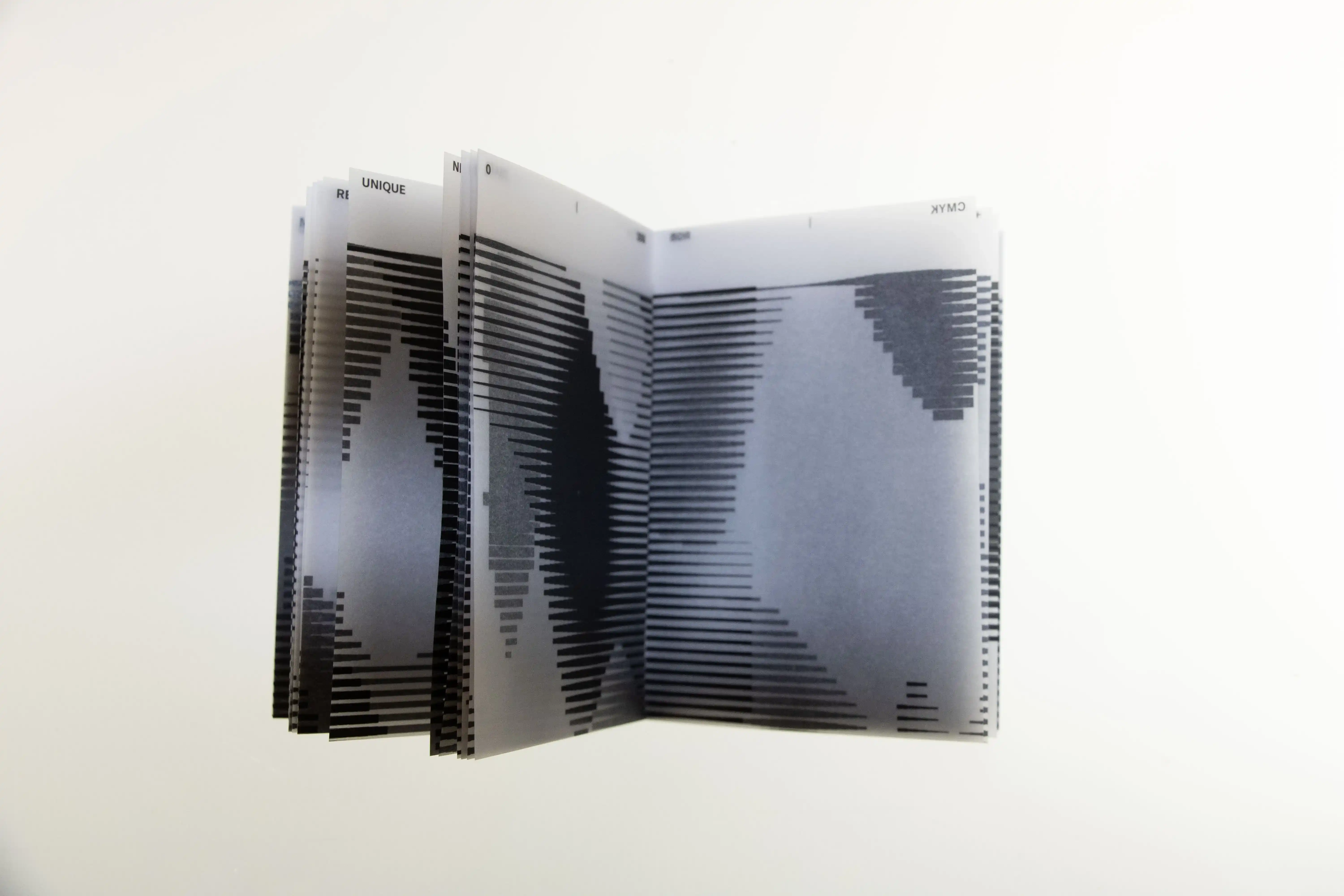
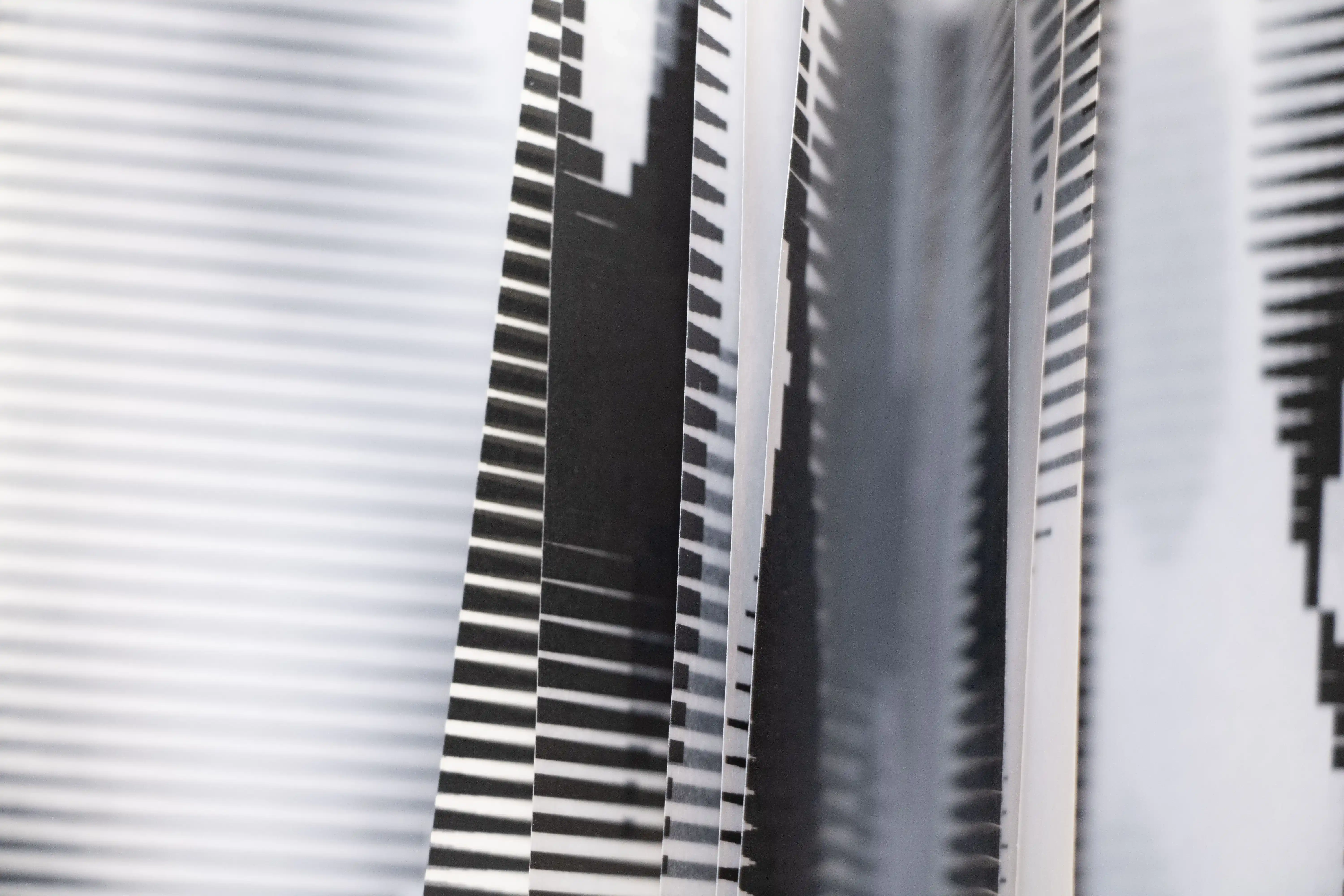
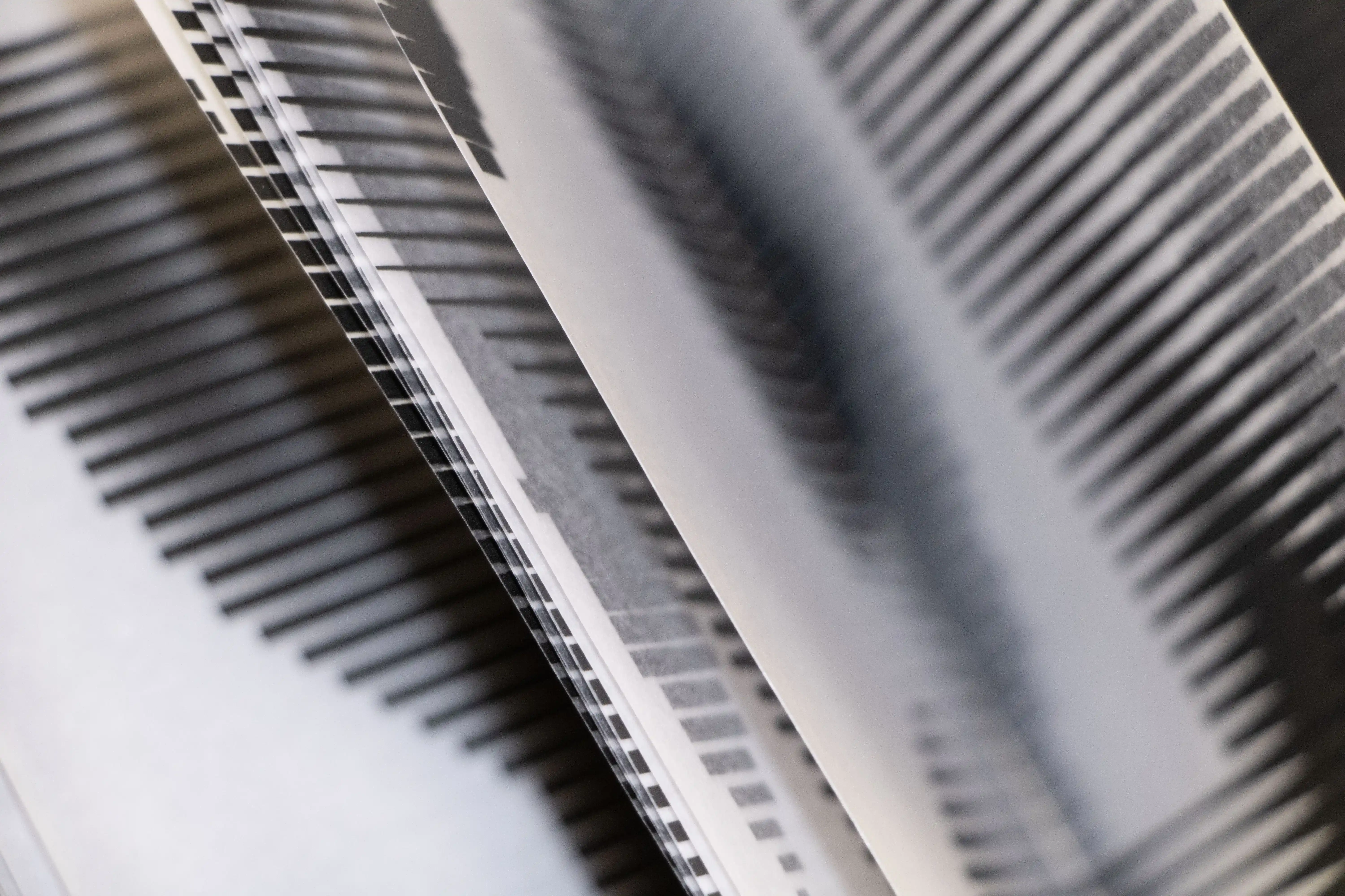
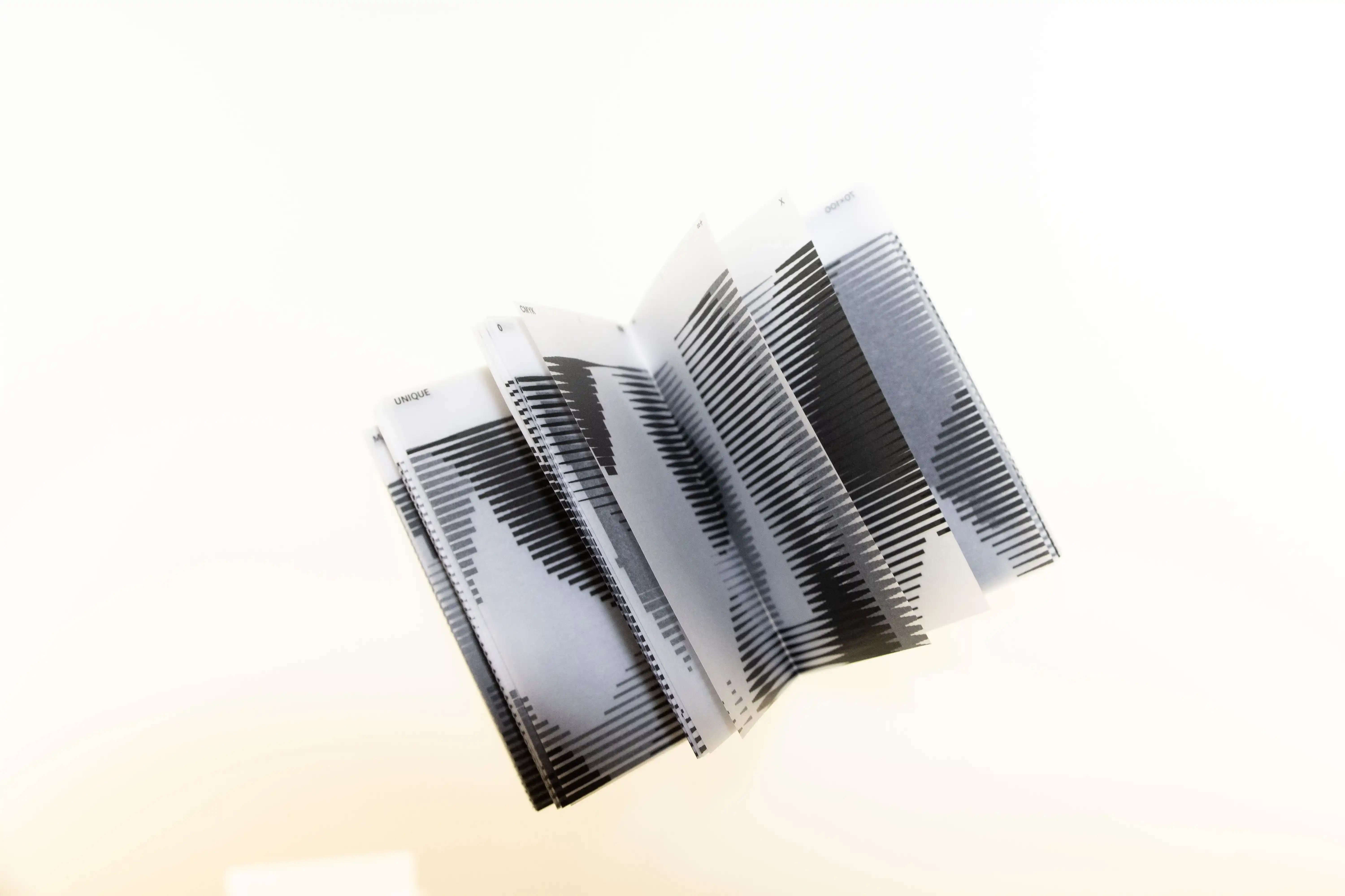
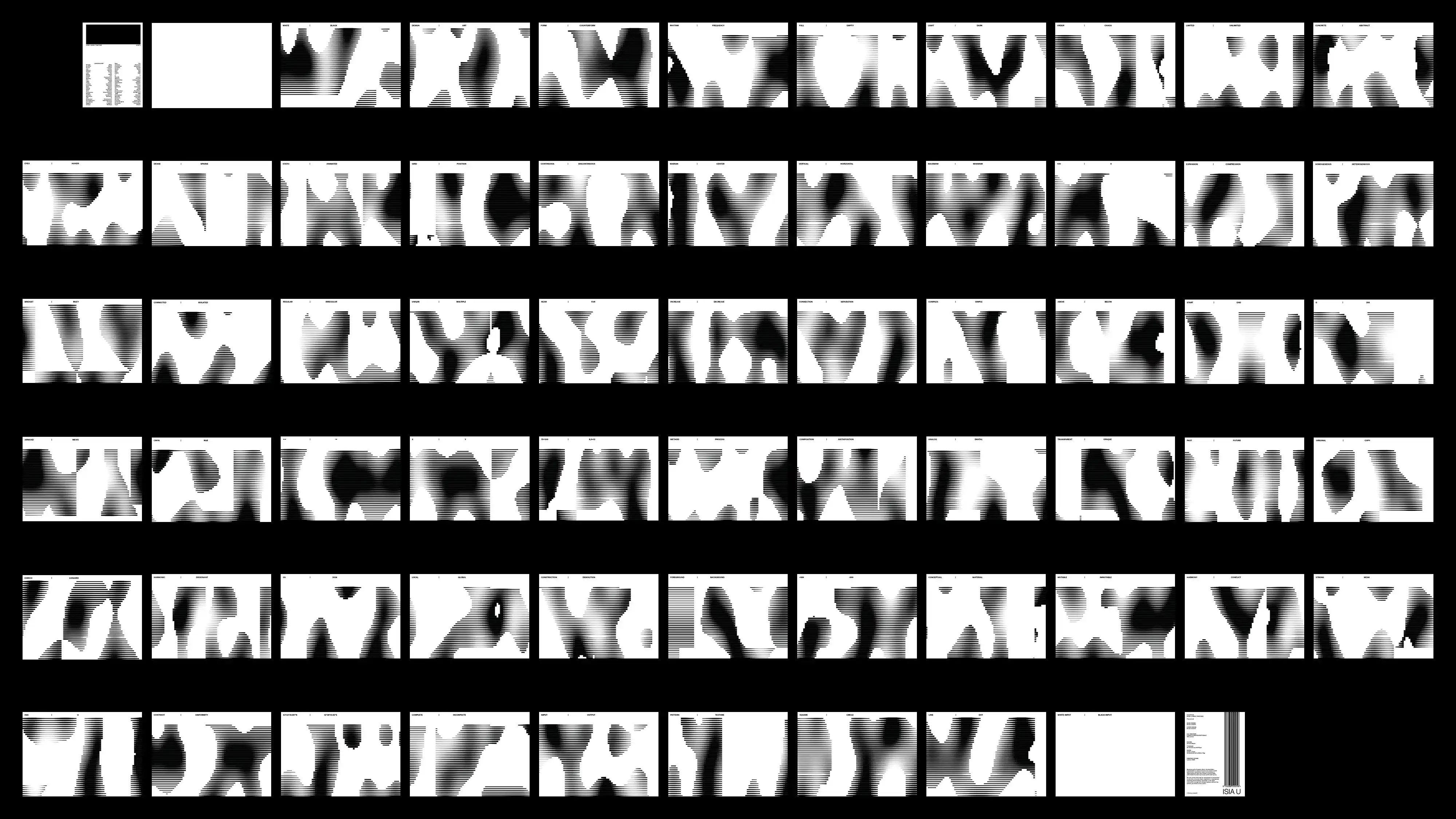
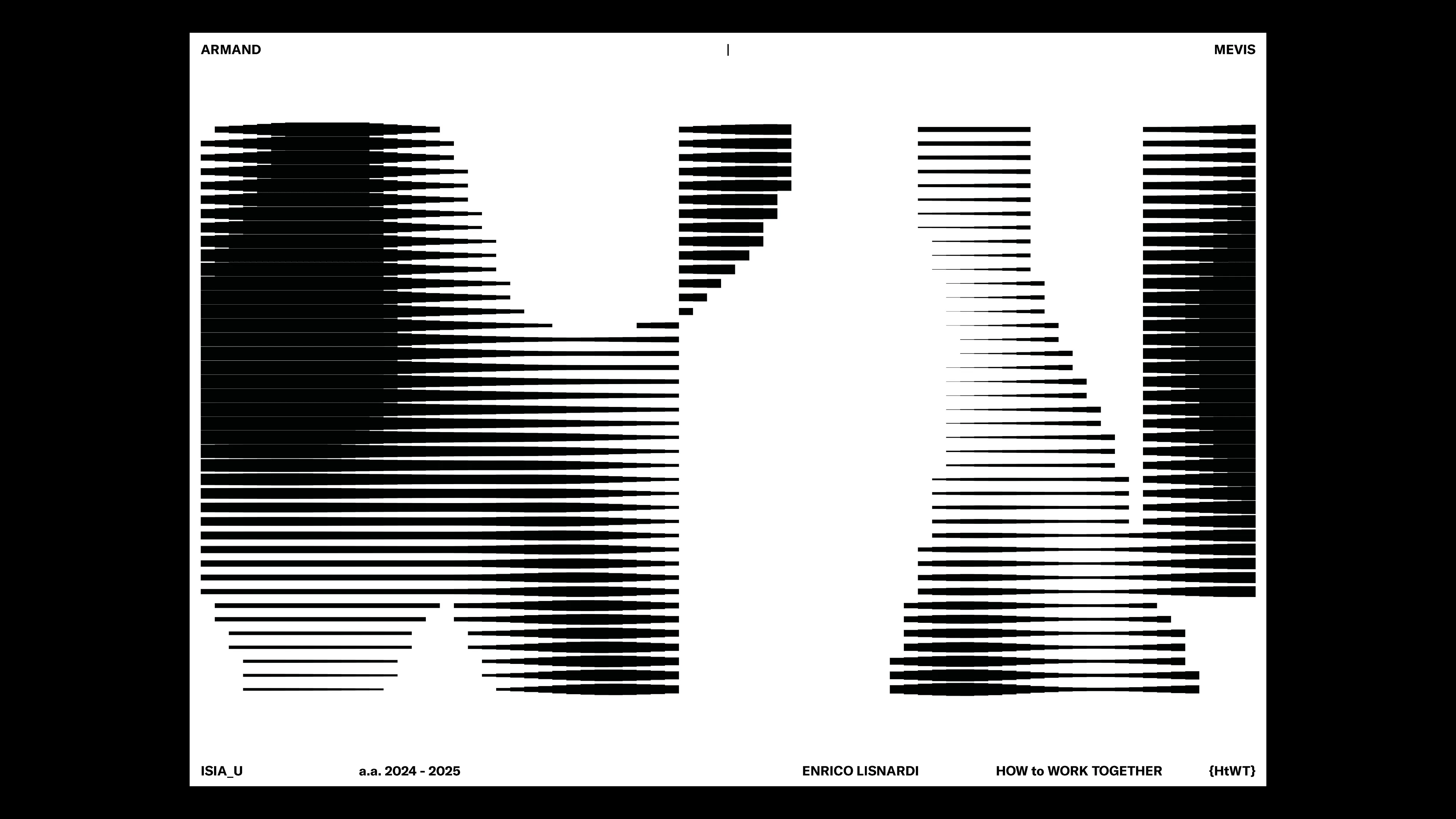
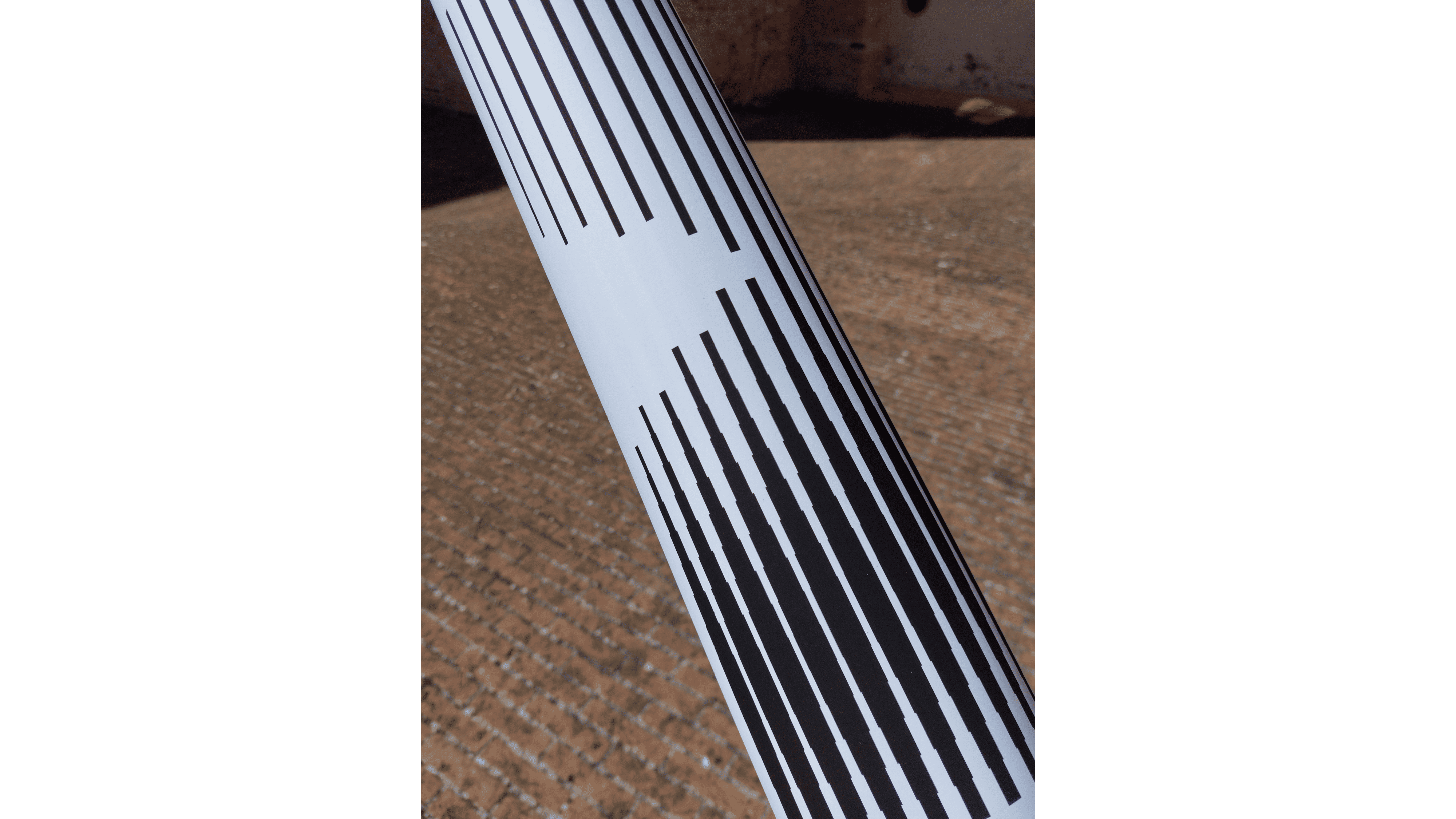
14
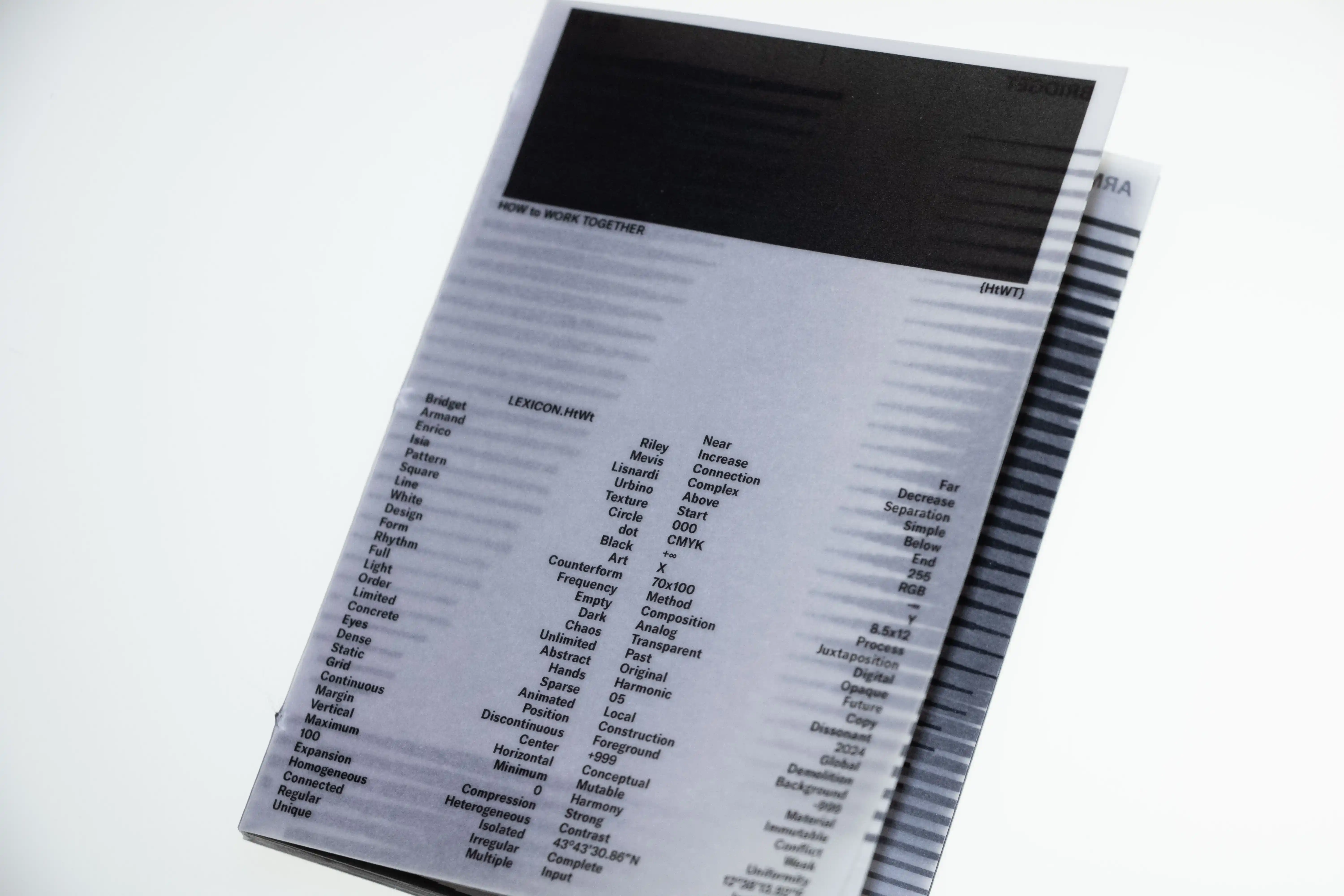
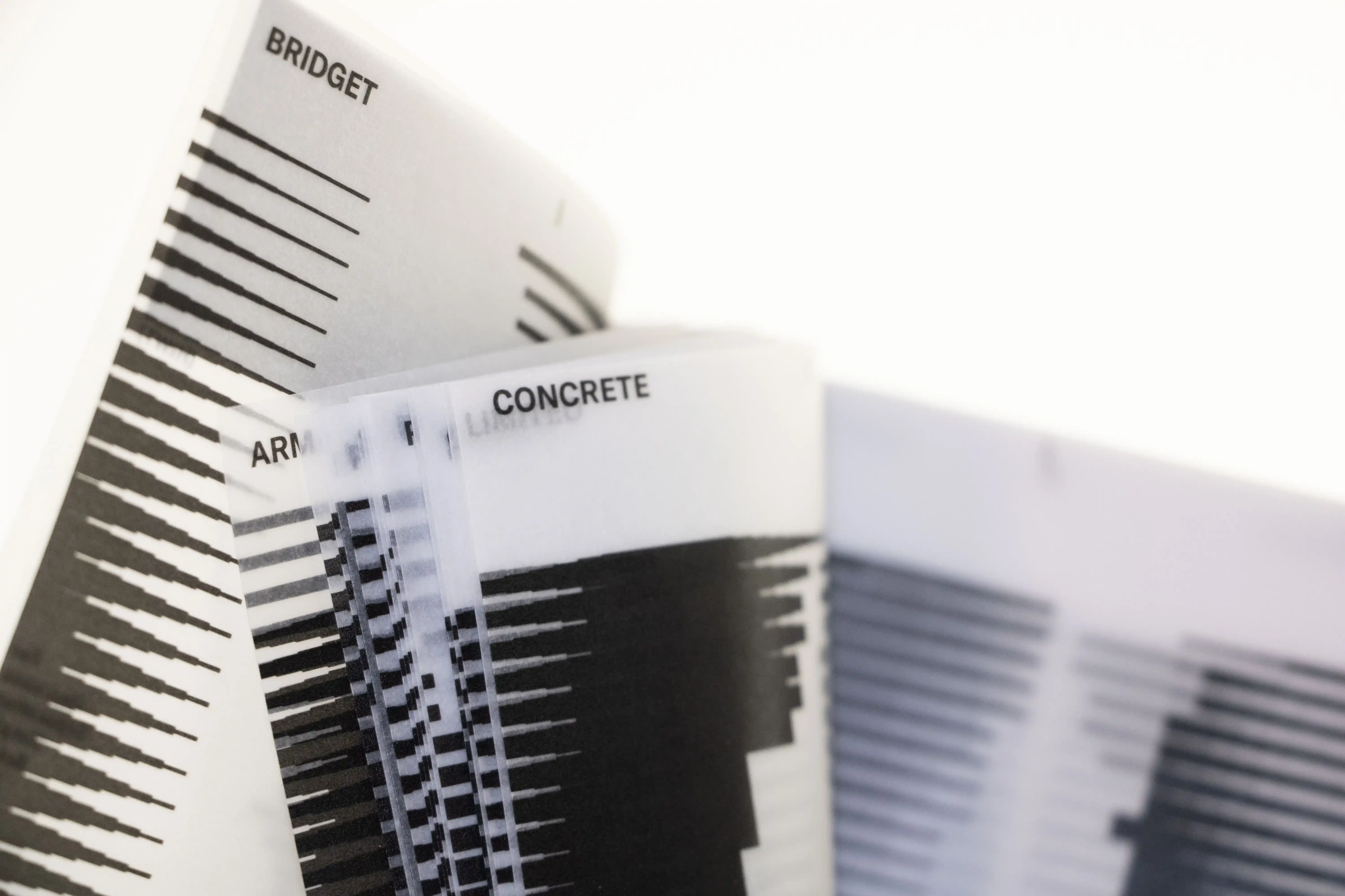
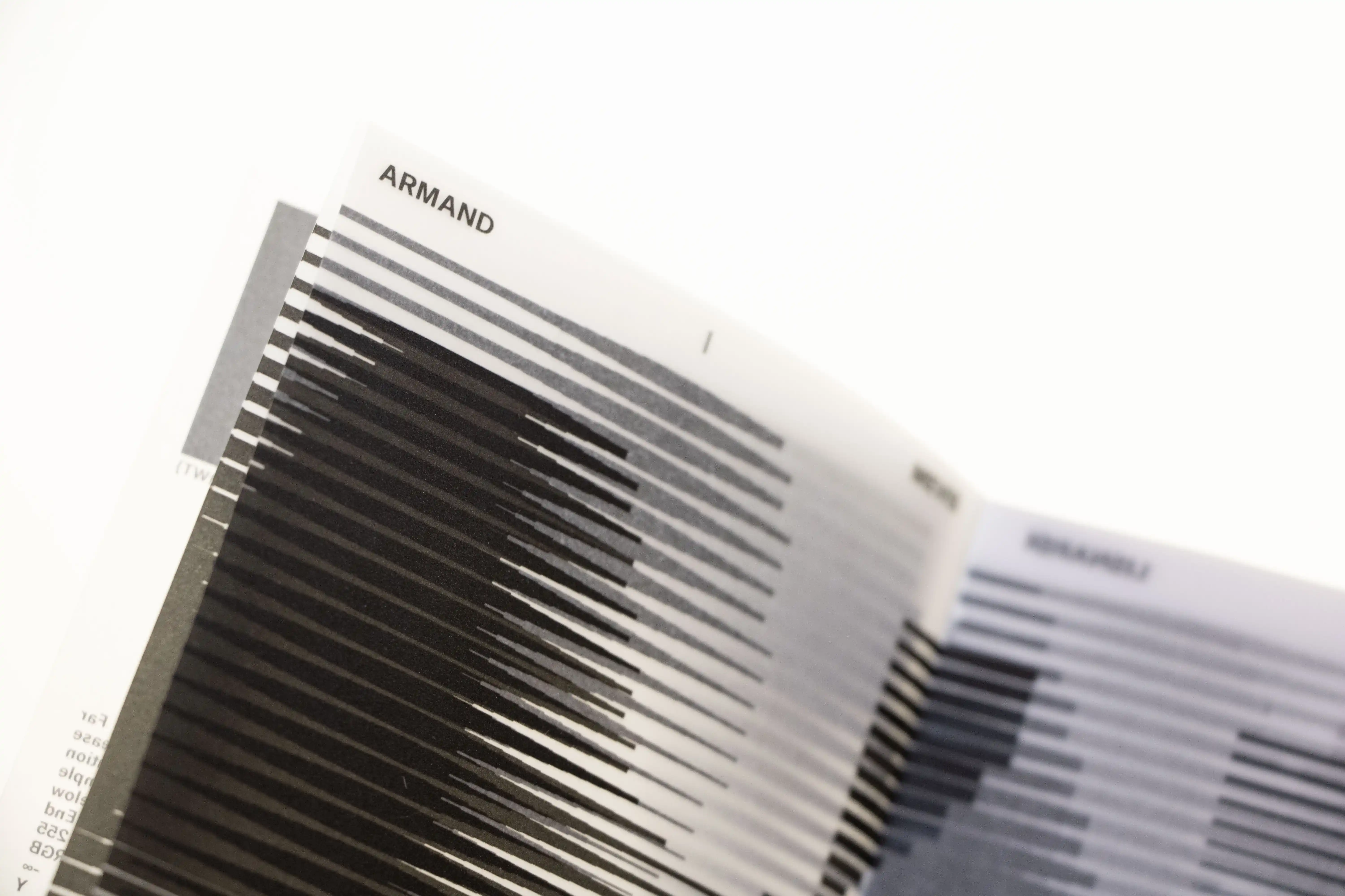
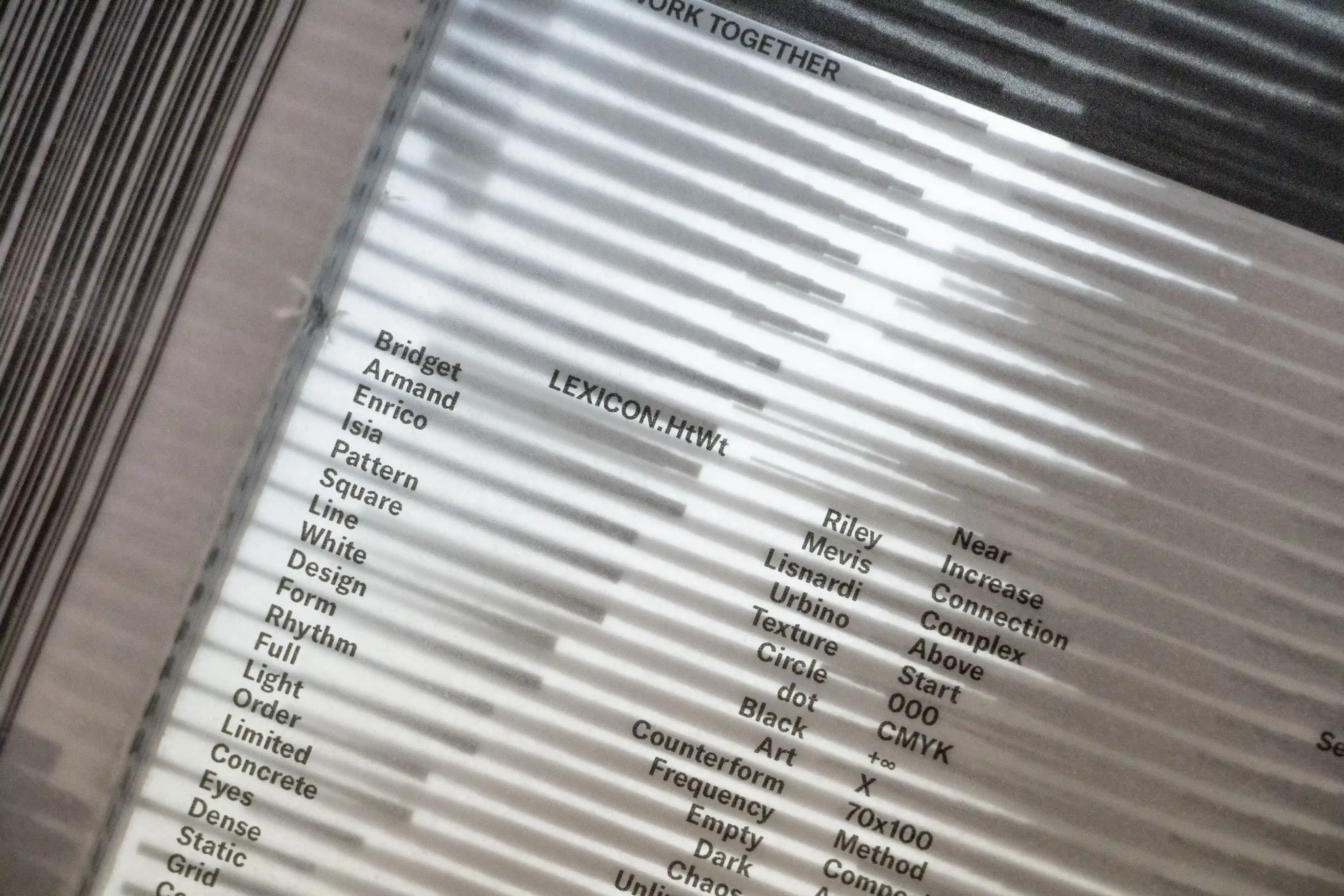
HOW TO WORK TOGETHER
2025
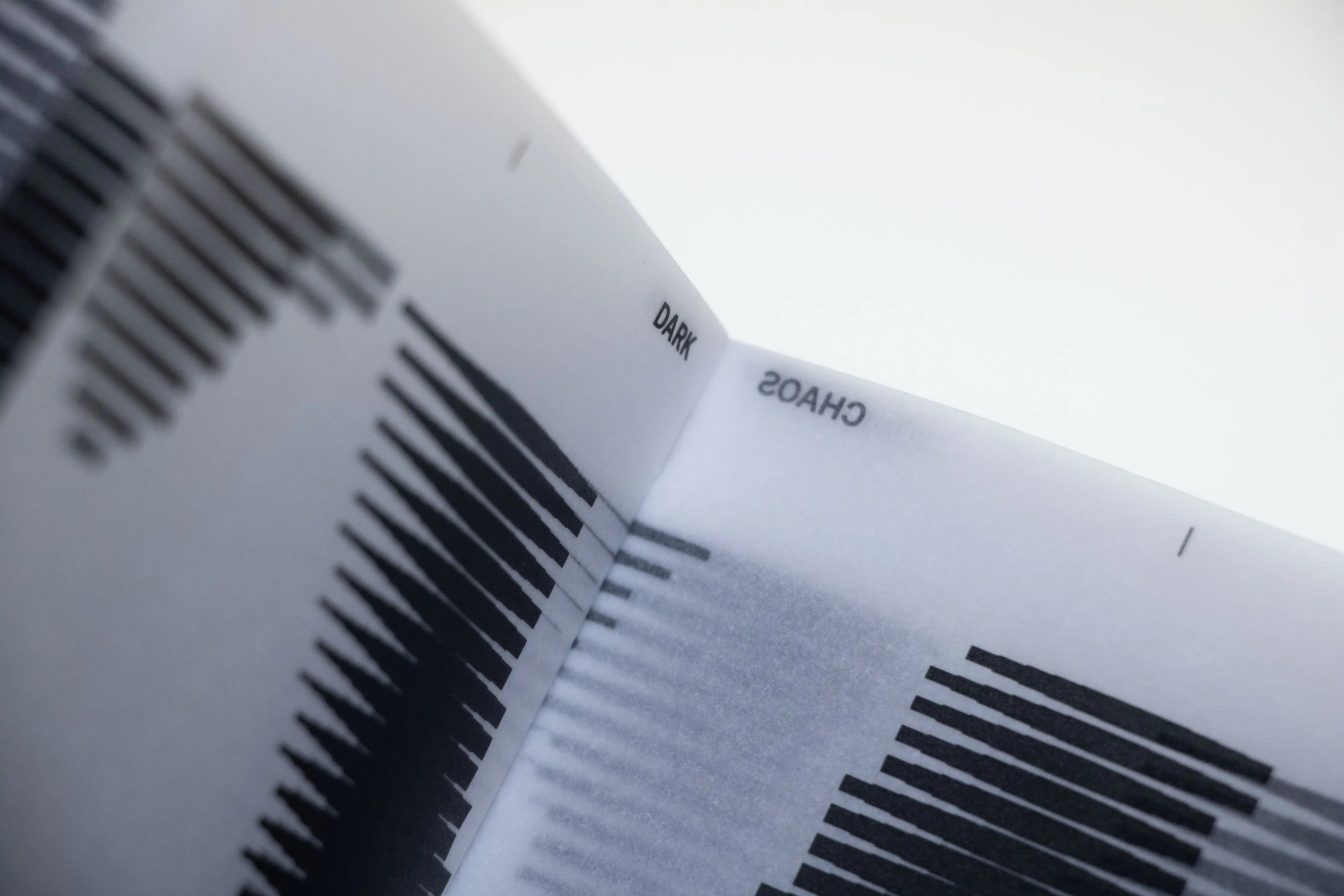
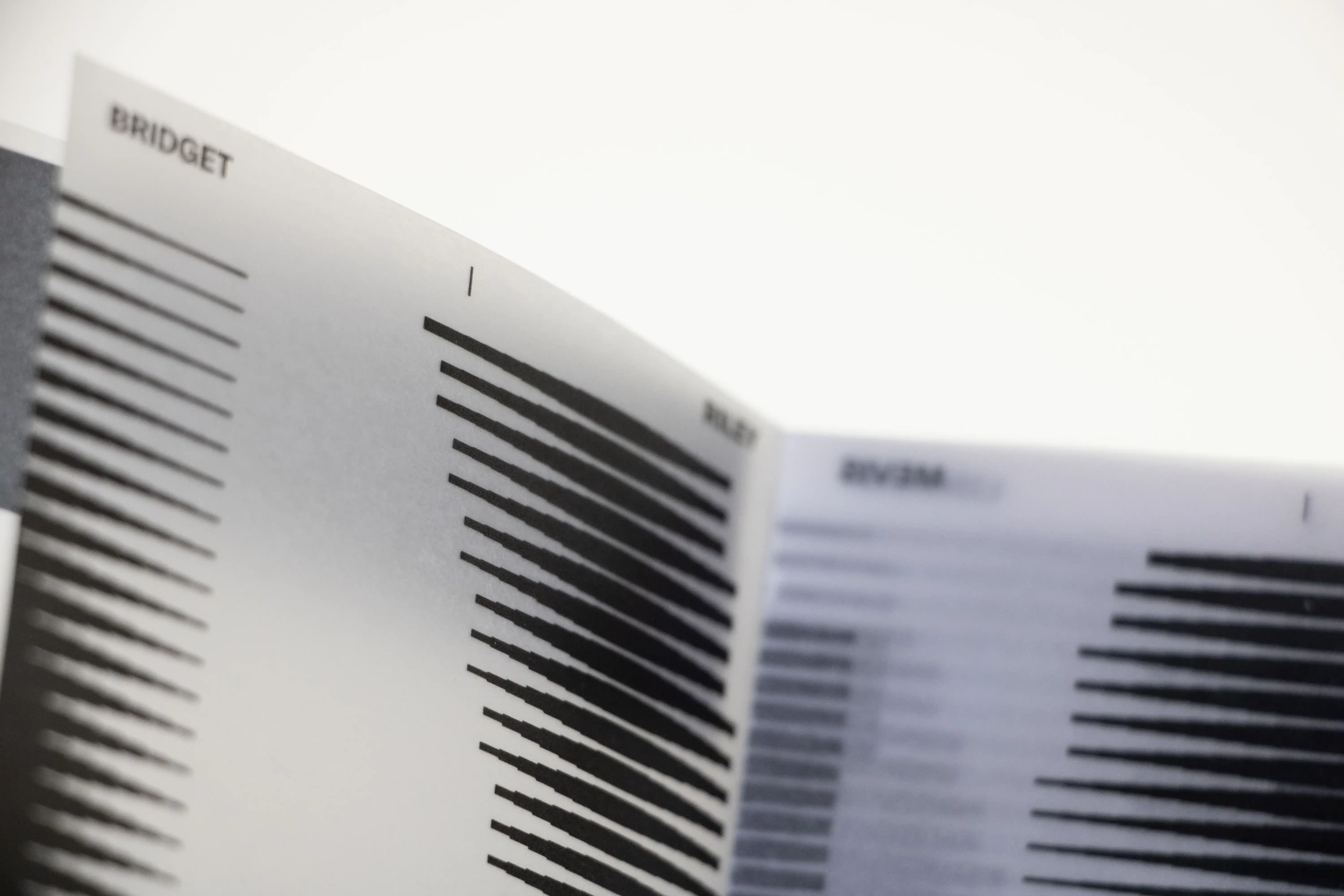
PROJECT Web Development and Book Design CONTEXT ISIA_U DESCRIPTION The project develops a code capable of generating graphic patterns based on the input of two words, dividing the screen into black and white surfaces. The inspiration comes from the work of Bridget Riley, known for her dynamic and engaging visual effects. However, this book is not a mere translation of her visual language but a reinterpretation of her poetic approach, enriched with added value that creates something new. The effects are never automatic or repetitive; each shape varies, producing an “effect within the effect,” enhancing visual complexity. Like Riley, a limited color palette—usually three or four colors per project—is used to maintain coherence and expressive strength. The work follows rules inspired by compositional principles: “Establishment of the Unit” to define parts in relation to the whole, “Intensification of Contrast” to introduce variation, “Climax” to emphasize, “Split or Dislocation” to redistribute space, and “Return to the Basic Process” to grasp the essence of the composition. The distinction between pattern and composition is clear: the pattern is mechanical and repetitive, while the composition is analog and unique, with each shape differing from the others. The book presents visual experiments based on pairs of words exploring composition, pattern, and publishing, printed on an innovative semi-transparent material called GSK, which allows patterns to be overlapped, creating new compositions in continuous evolution. In this way, the project renews Bridget Riley’s vision with a contemporary and experimental approach, going beyond translation to become an original and innovative contribution. MACHINE HTWT://LEXICON_MACHINE
1 (OF) 12
13
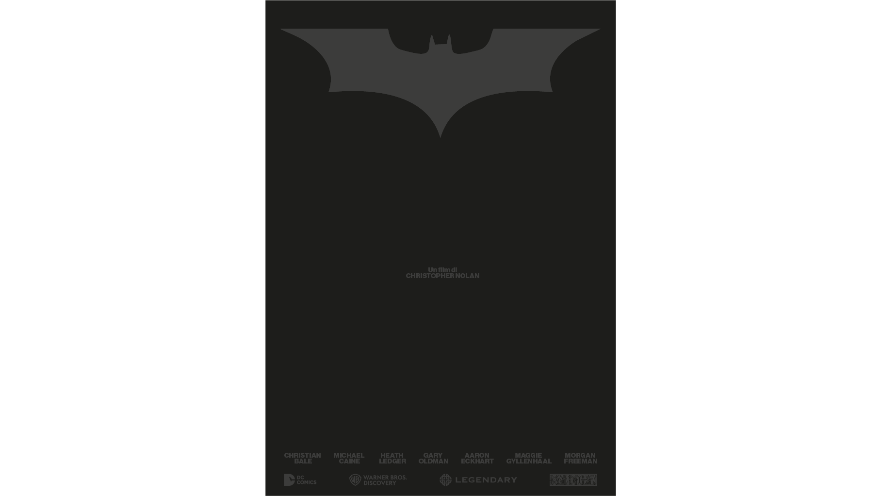
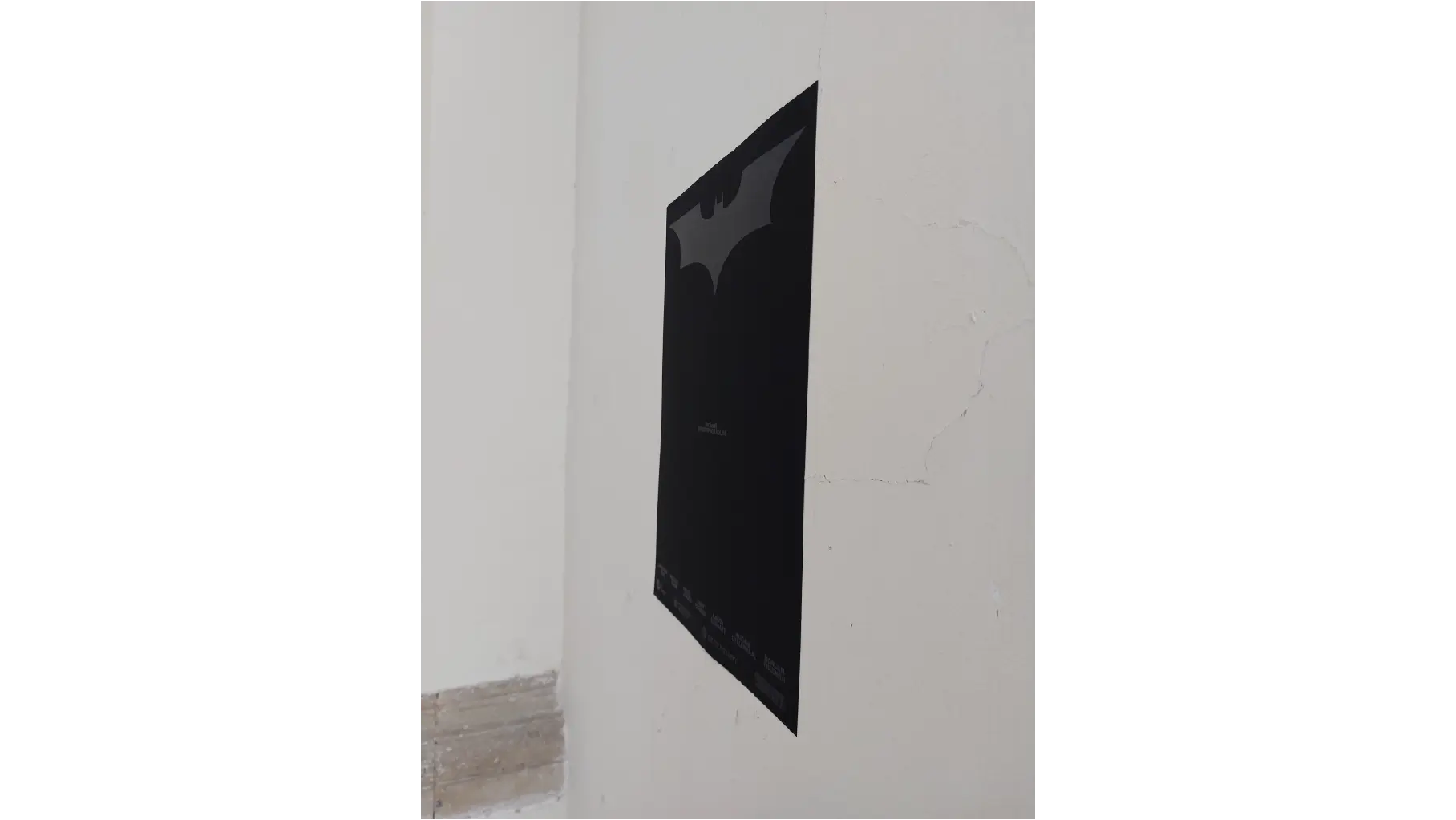
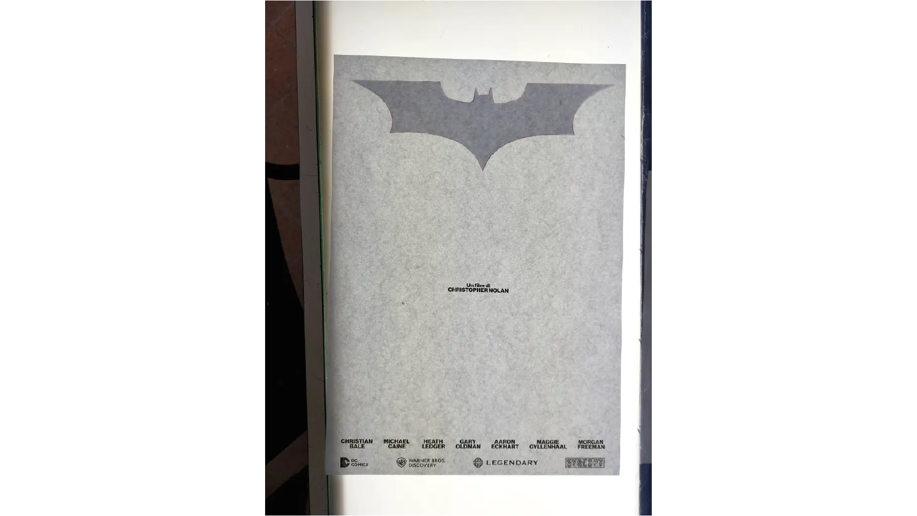
THE DARK KNIGHT
2025
PROJECT Motion Design and Manifesto CONTEXT ISIA_U DESCRIPTION The video draws inspiration from the behavior of the bat, using it as a metaphor to portray the protagonist, who constantly moves between darkness and light. Shot entirely in black and white, the film turns typography into a living, shifting element: the text is repeatedly invaded by the movement of bats, which alternately reveal and conceal the characters’ names, creating a hypnotic visual rhythm. The choice of a sans serif typeface is deliberate, echoing the purity and formal strength of Brutalist architecture, in stark contrast with the protagonist’s narrative setting — an elegant, lavish castle. This architectural tension mirrors the character’s dual nature, as he retreats to a minimalist, functional refuge far from the opulence of his public life. Black and white, the work’s defining element, becomes the visual language to express the oppositions that shape the protagonist: child and adult, light and darkness, good and evil. Opposites that exist only through each other, reflected in his split identity. The project’s poster focuses entirely on this duality, revealing Bruce Wayne’s two sides: the billionaire philanthropist and the superhero. Printed on black paper, it uses a digital black made from all colors, creating a striking visual depth that underlines the mystery and complexity of his double life.
1 (OF) 12
12
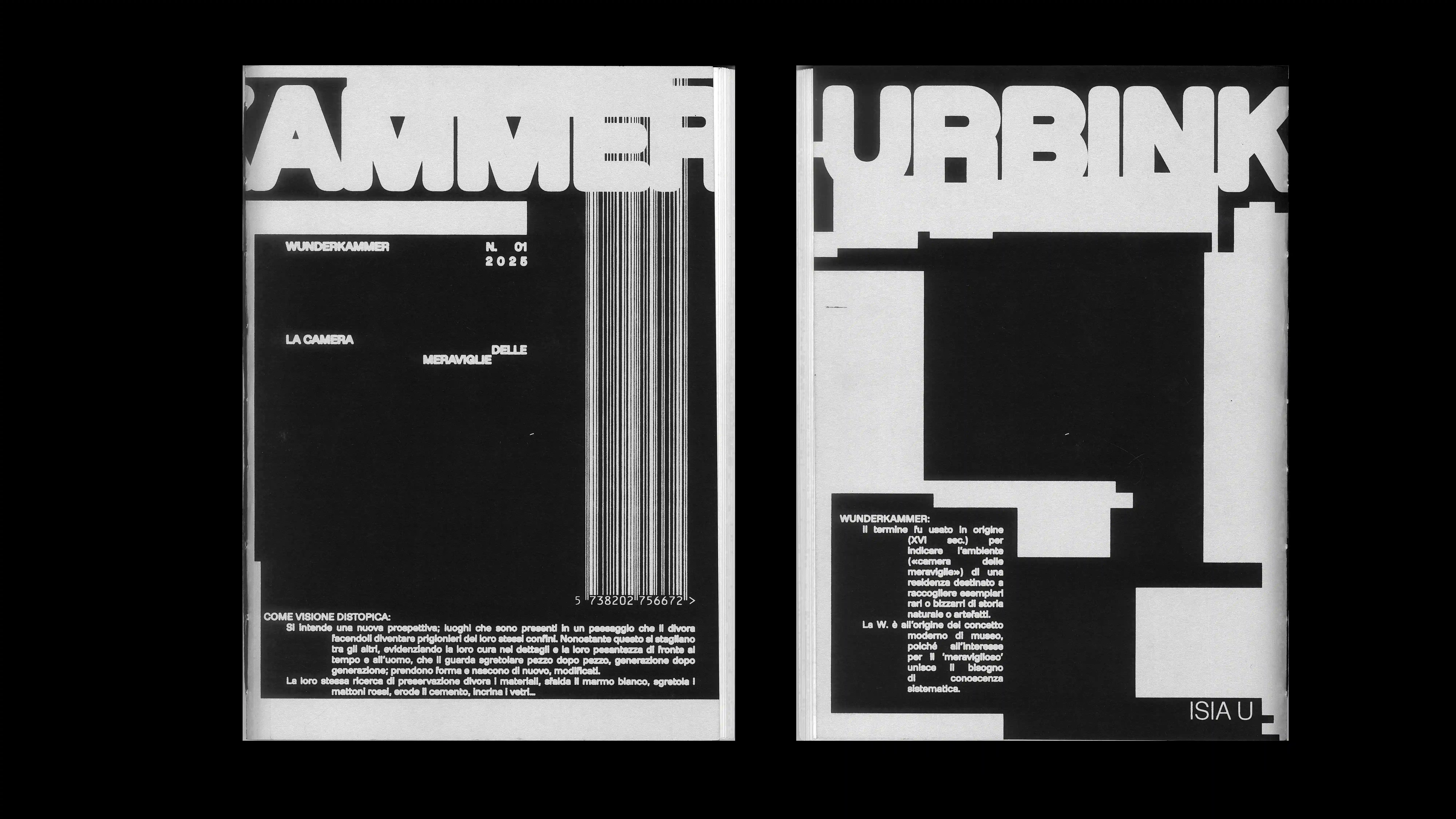
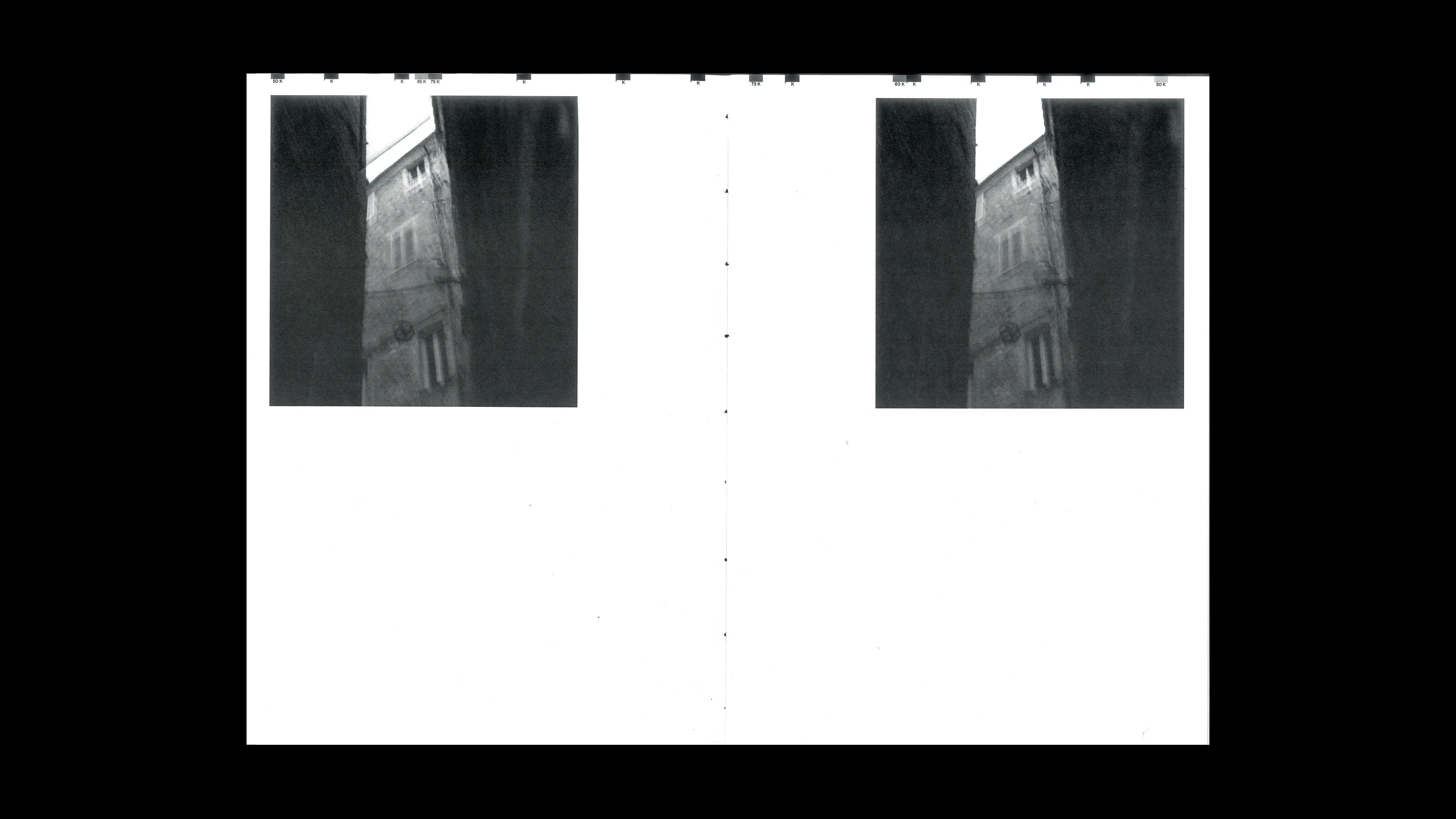
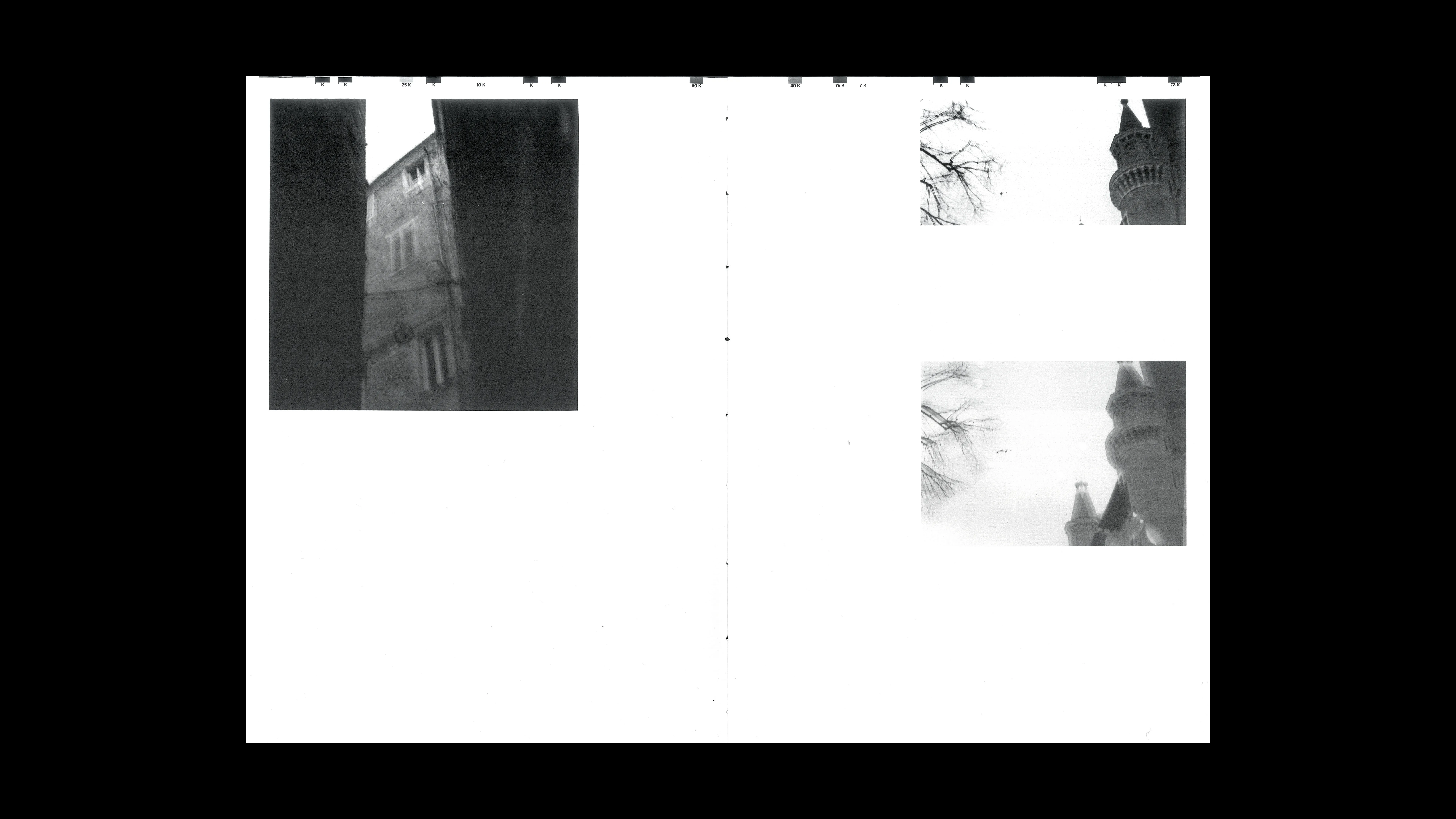
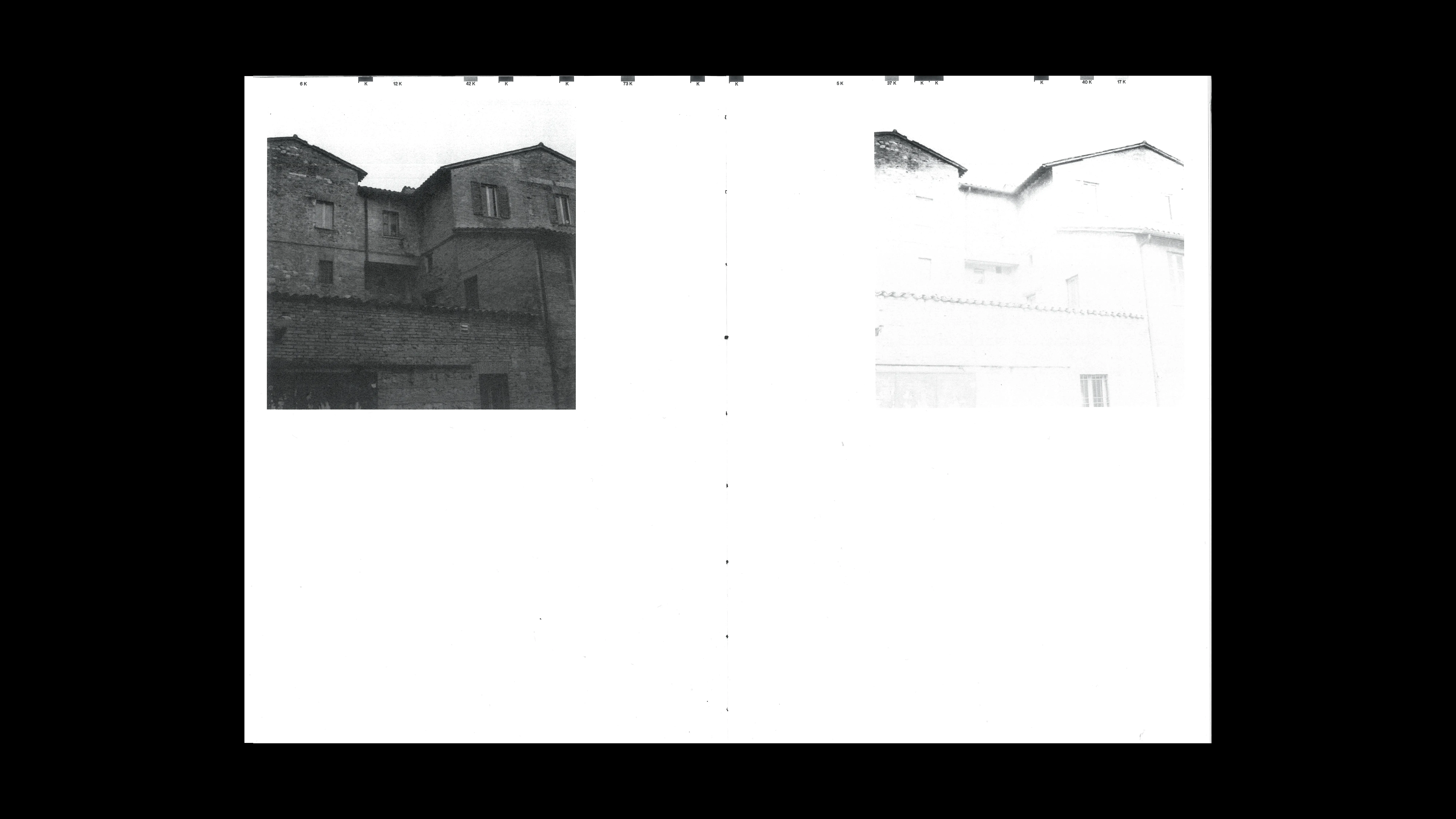
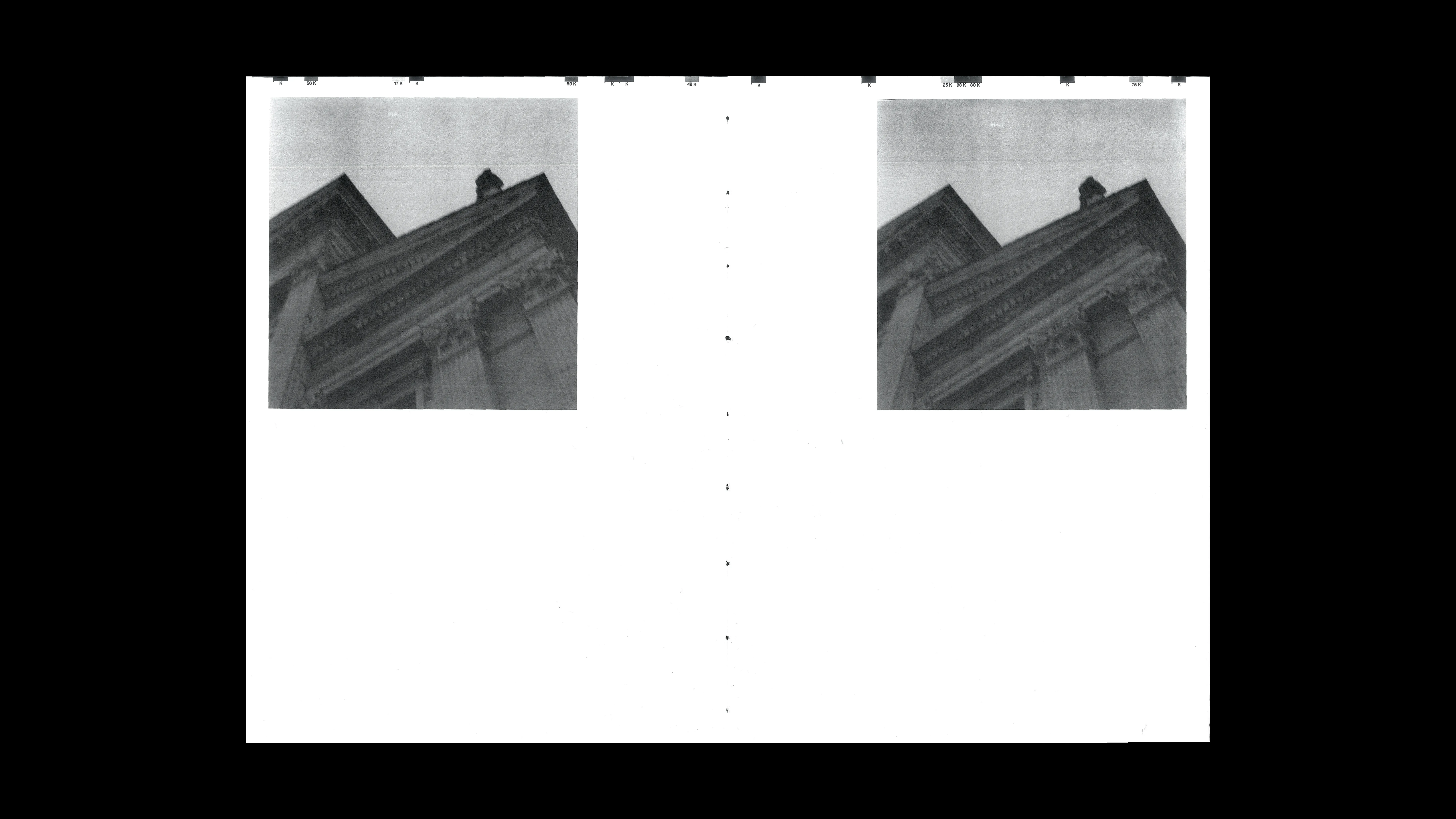
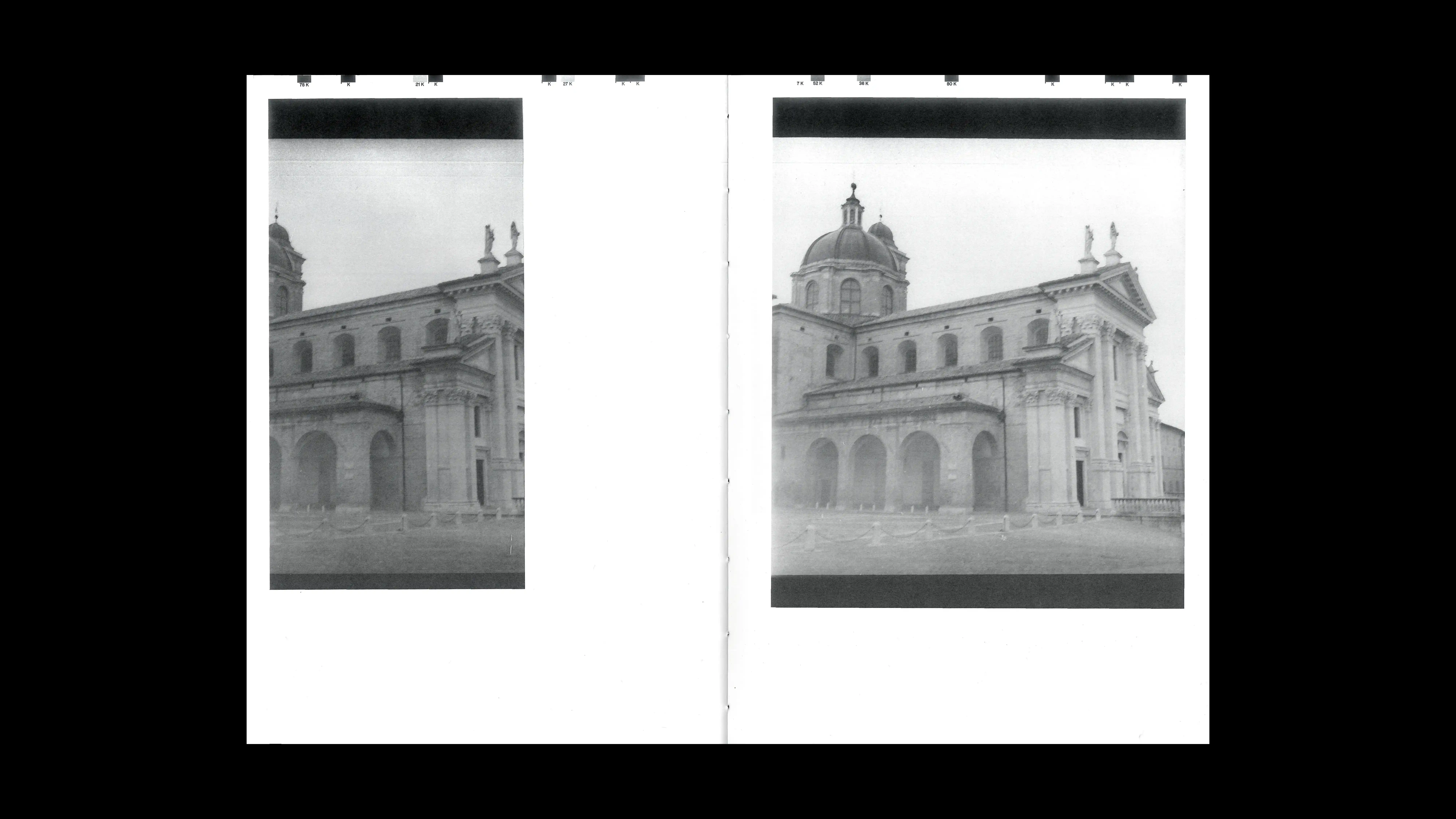
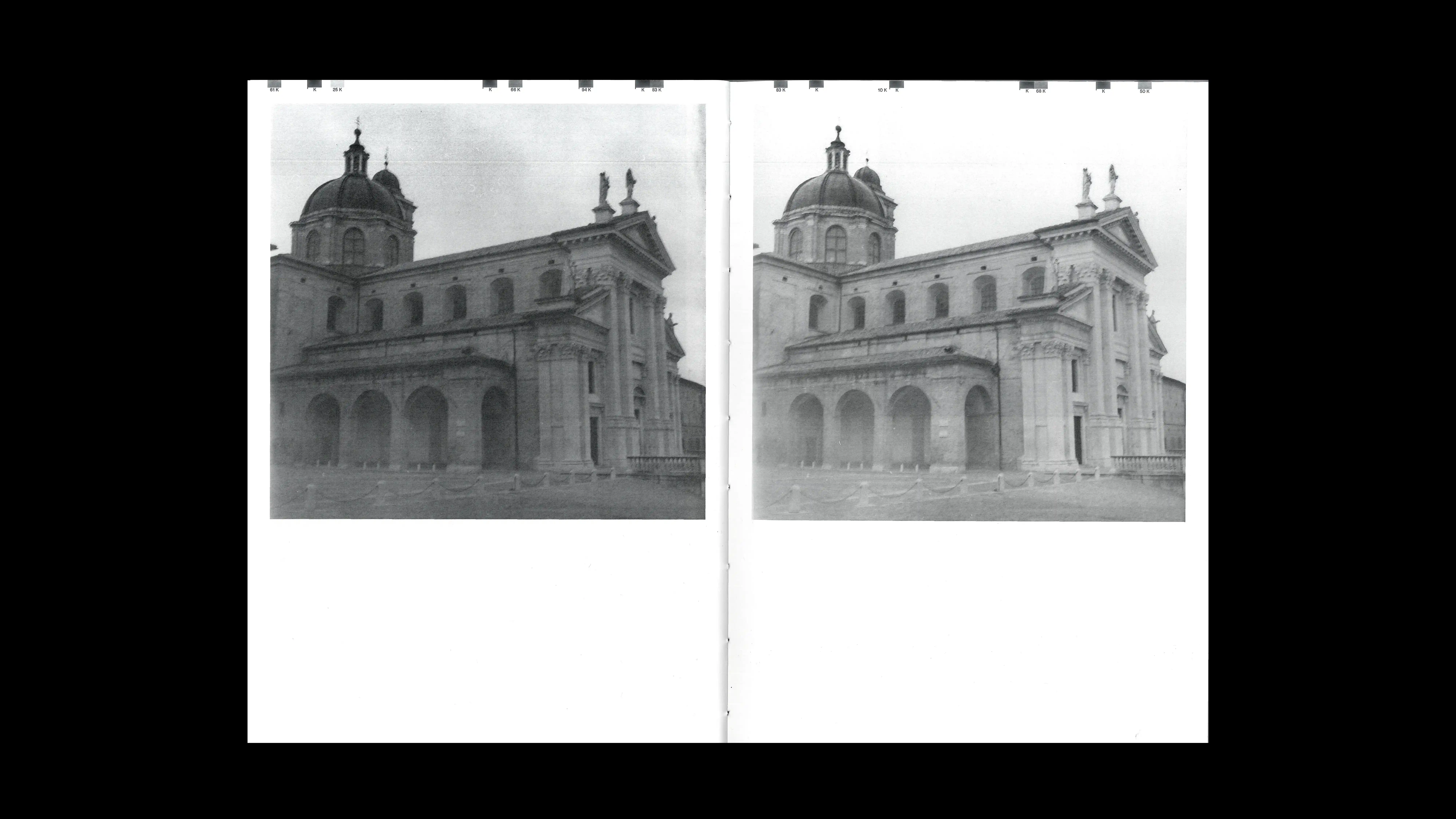
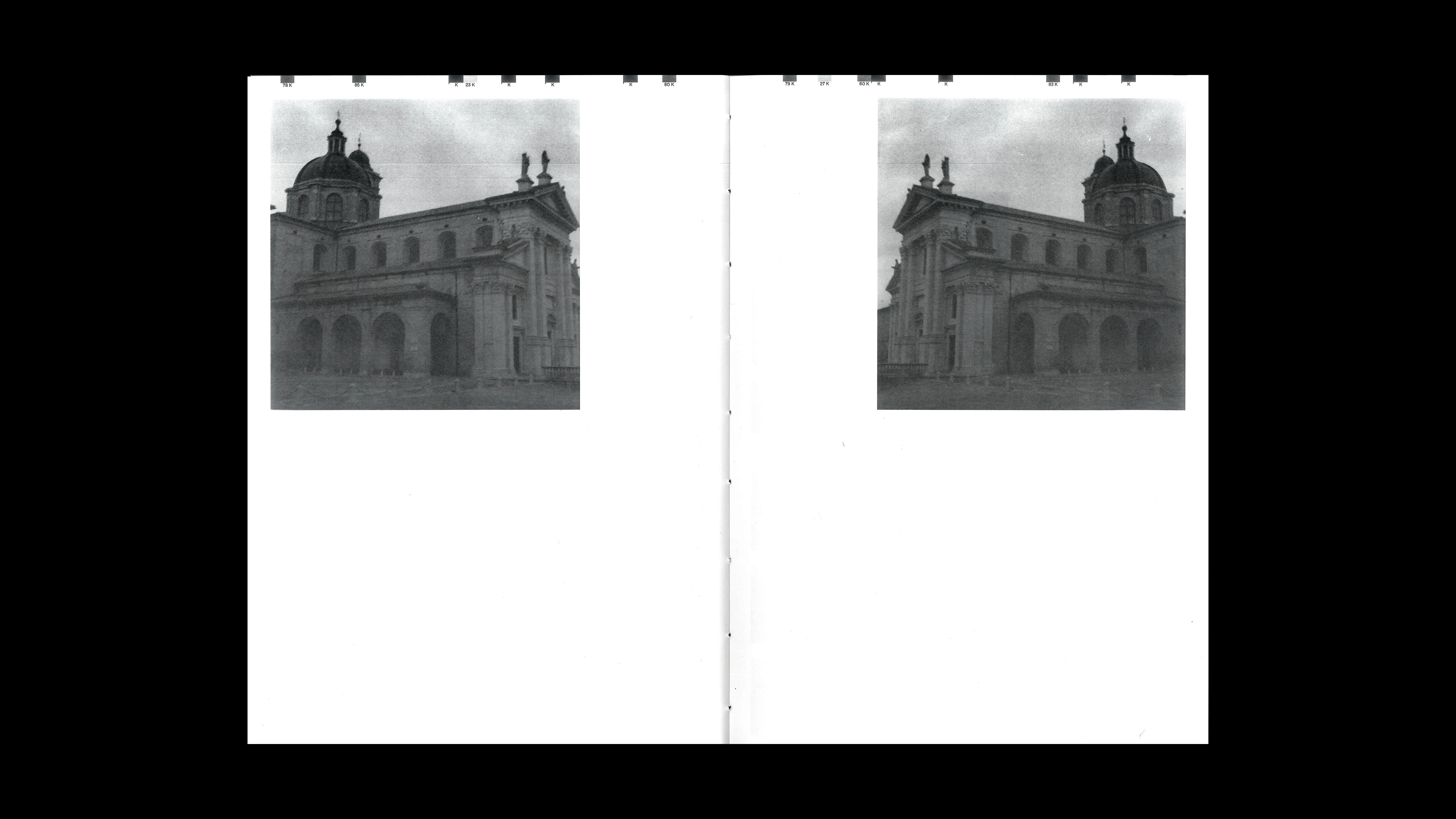
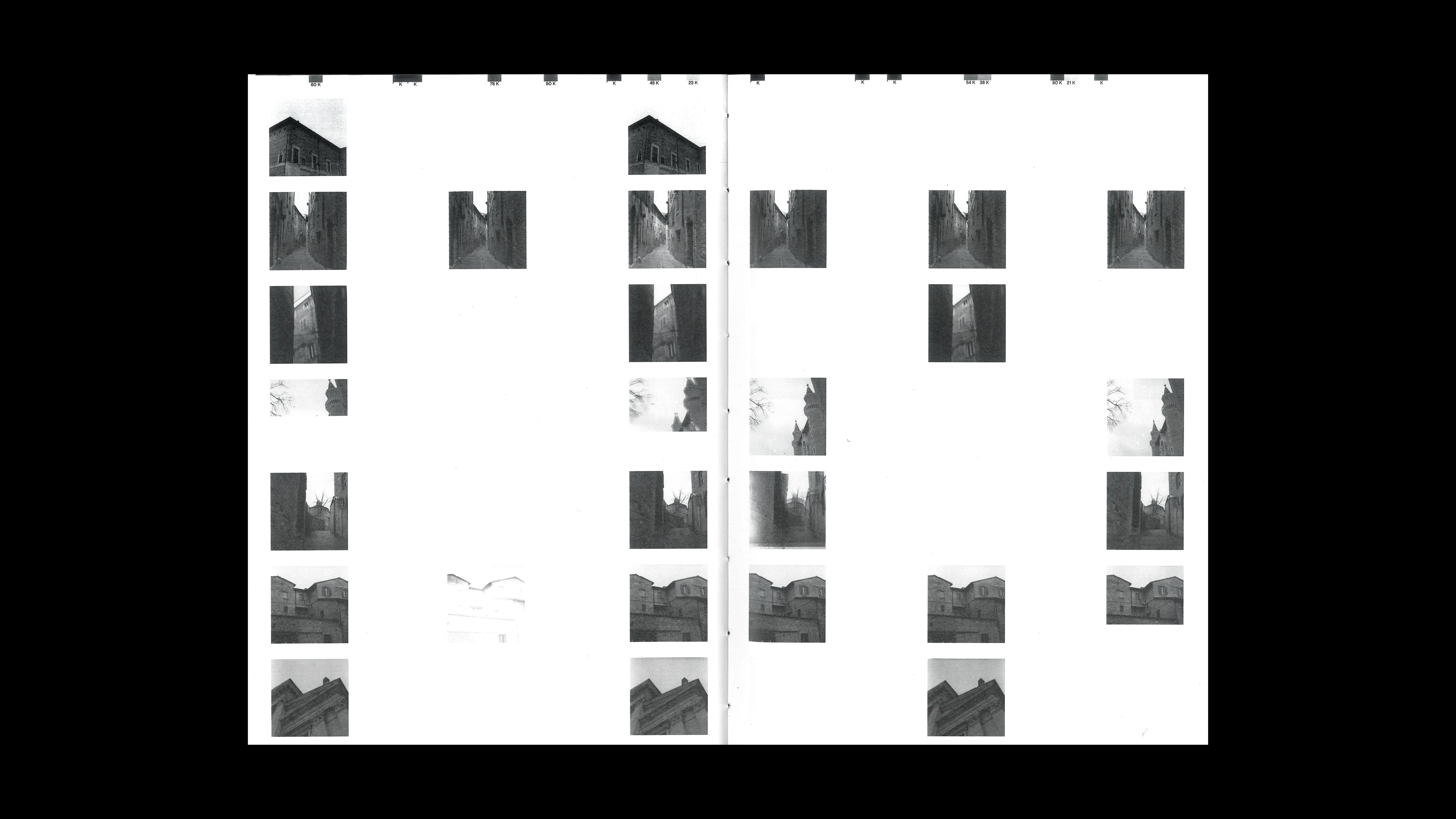
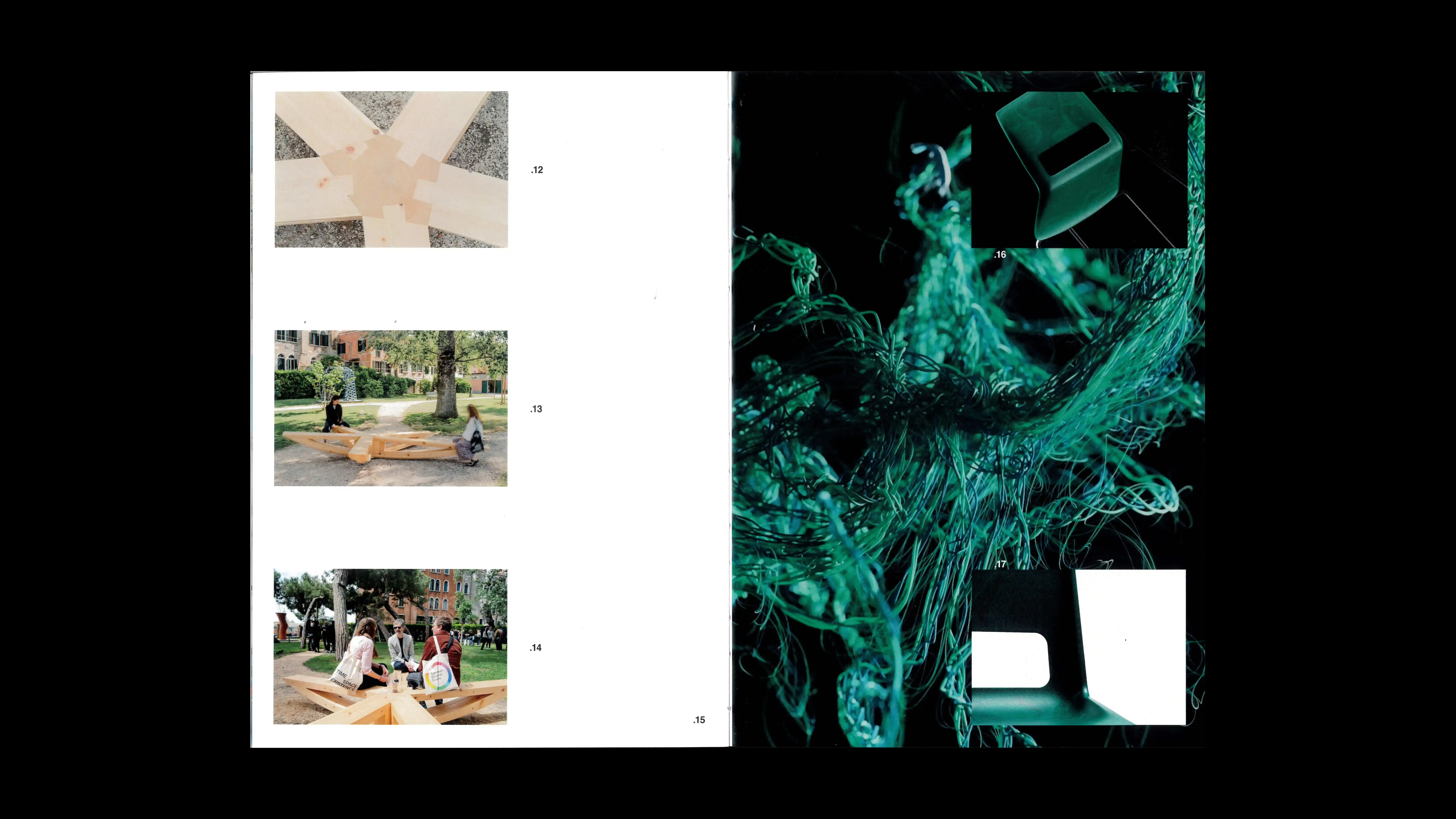
URBINKAMMER
2025
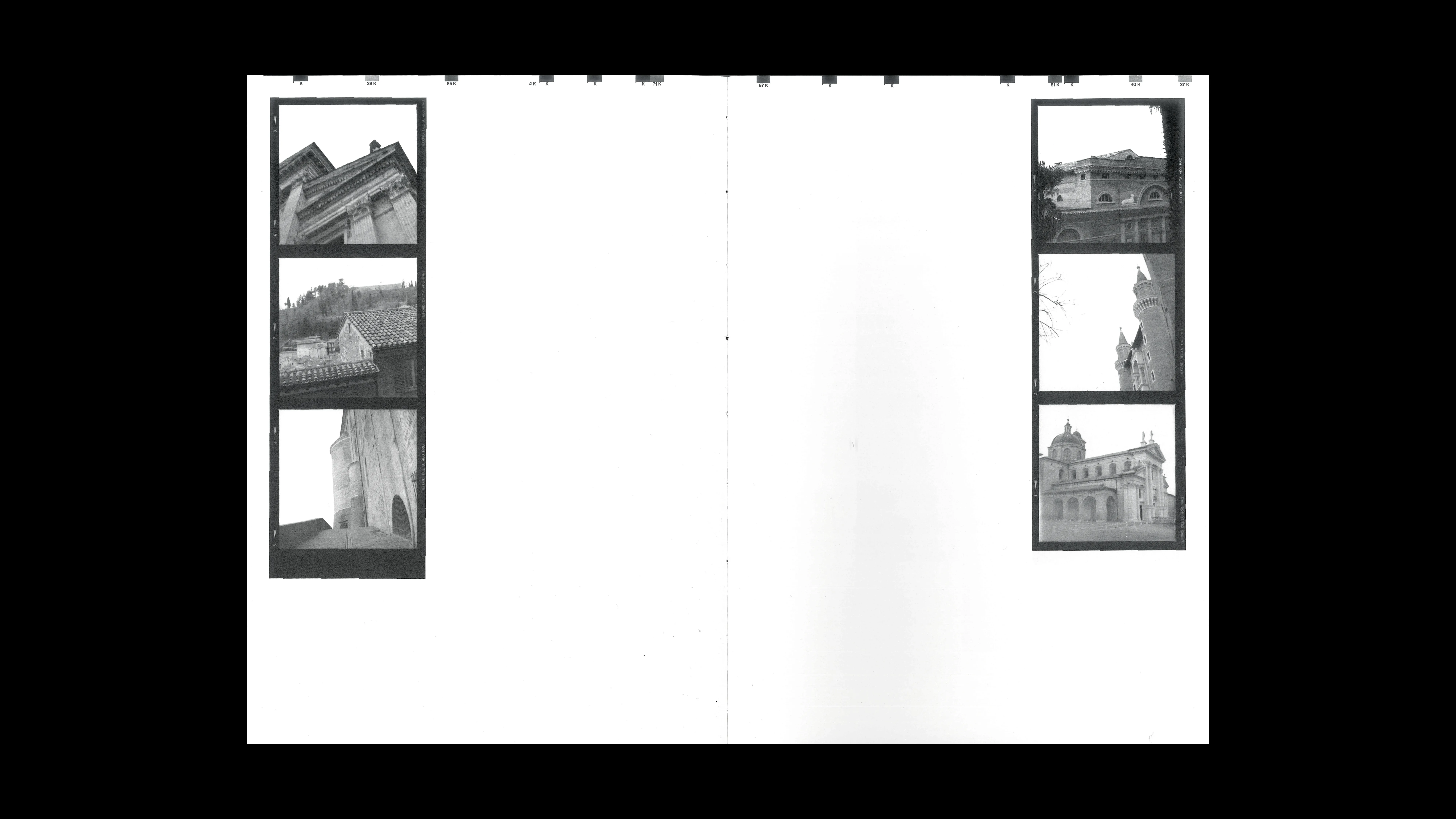
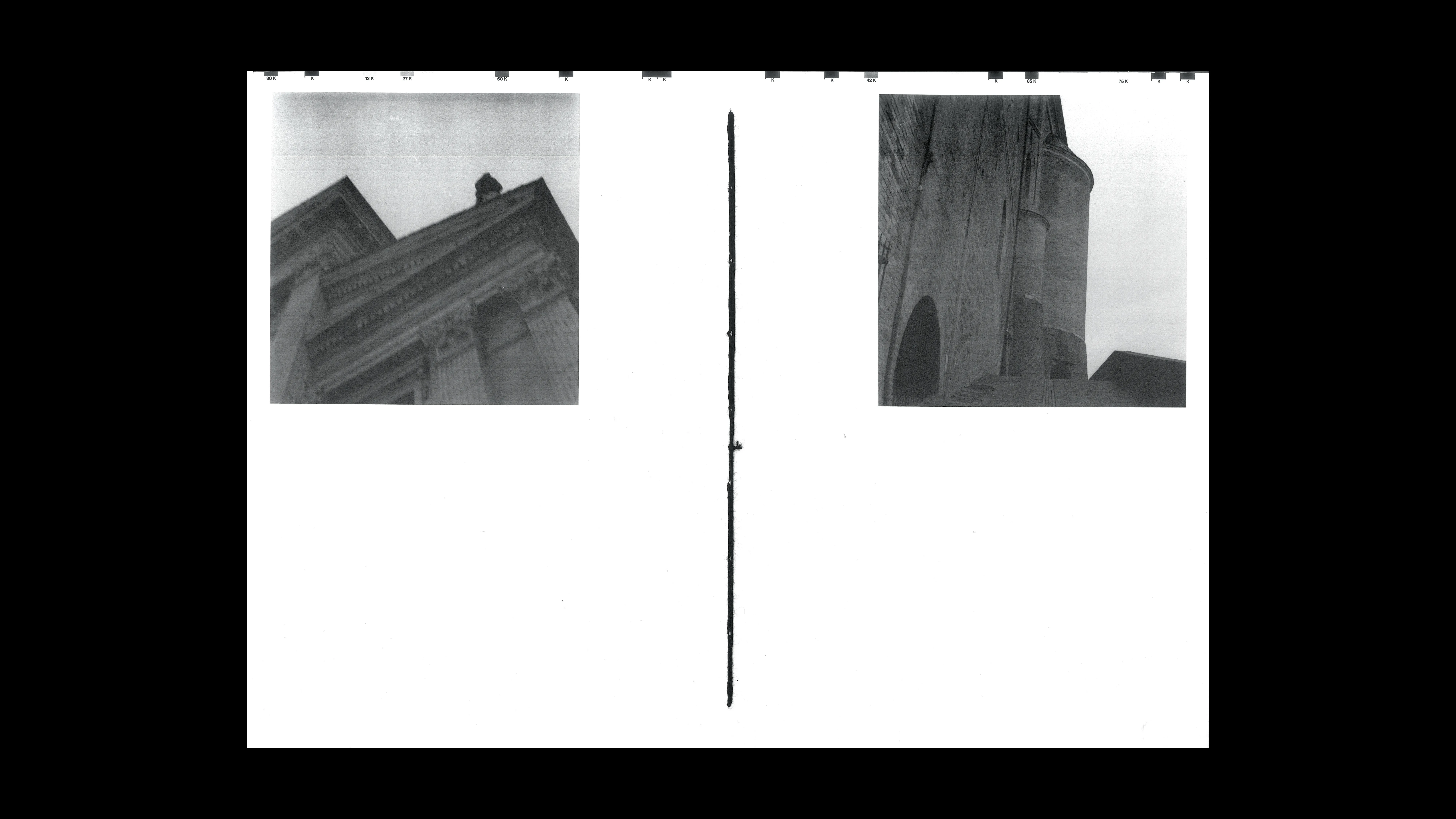
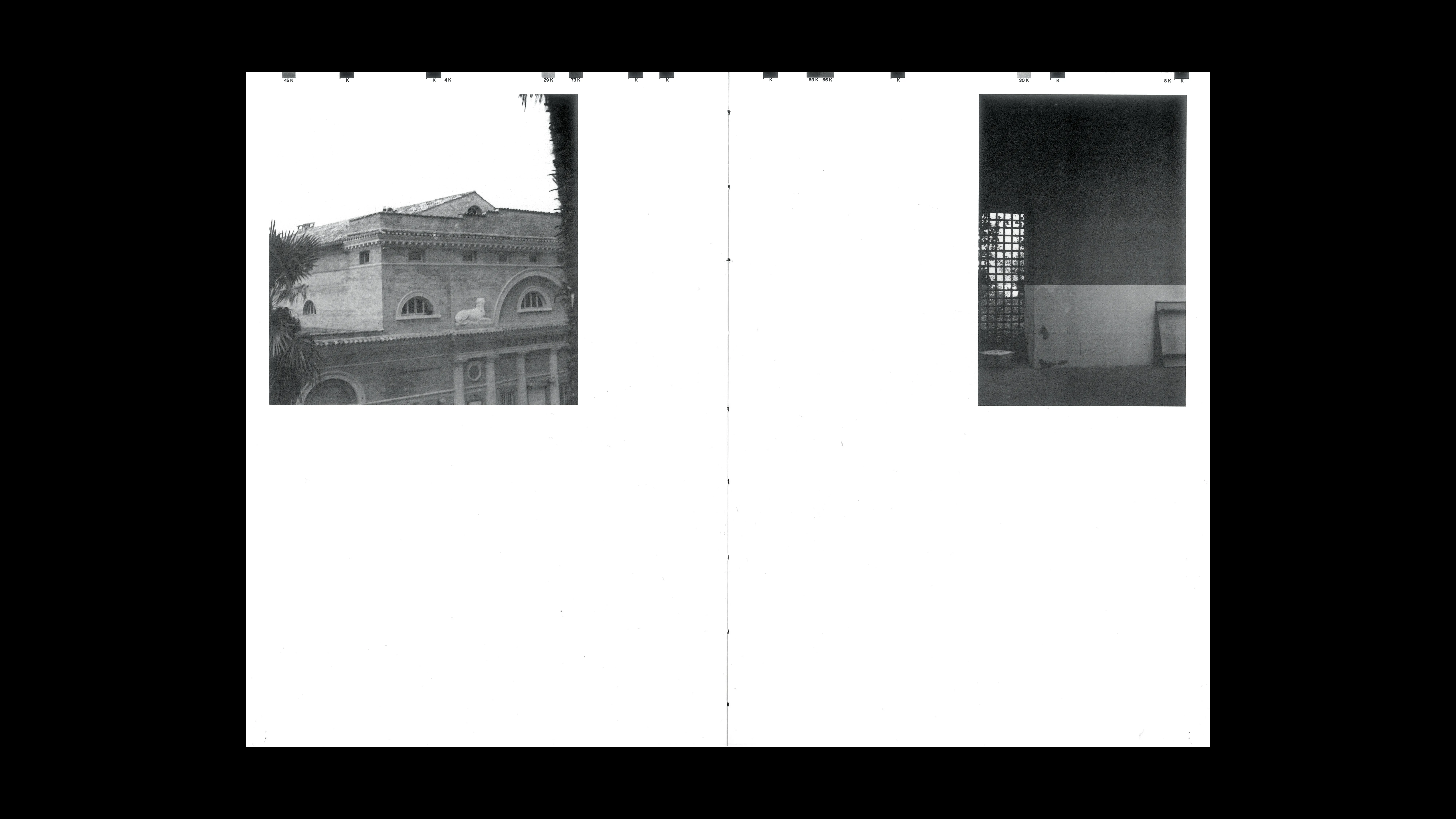
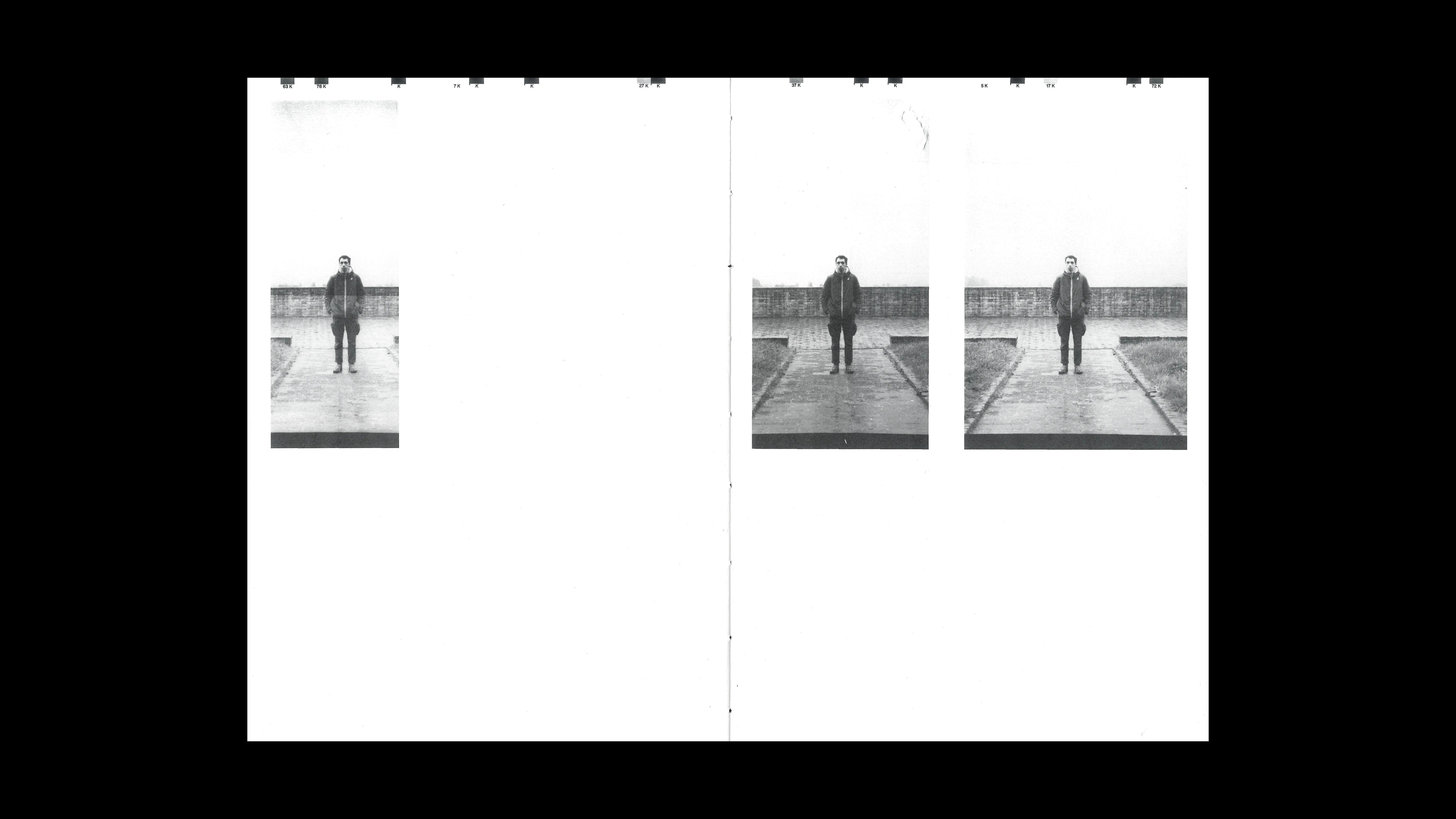
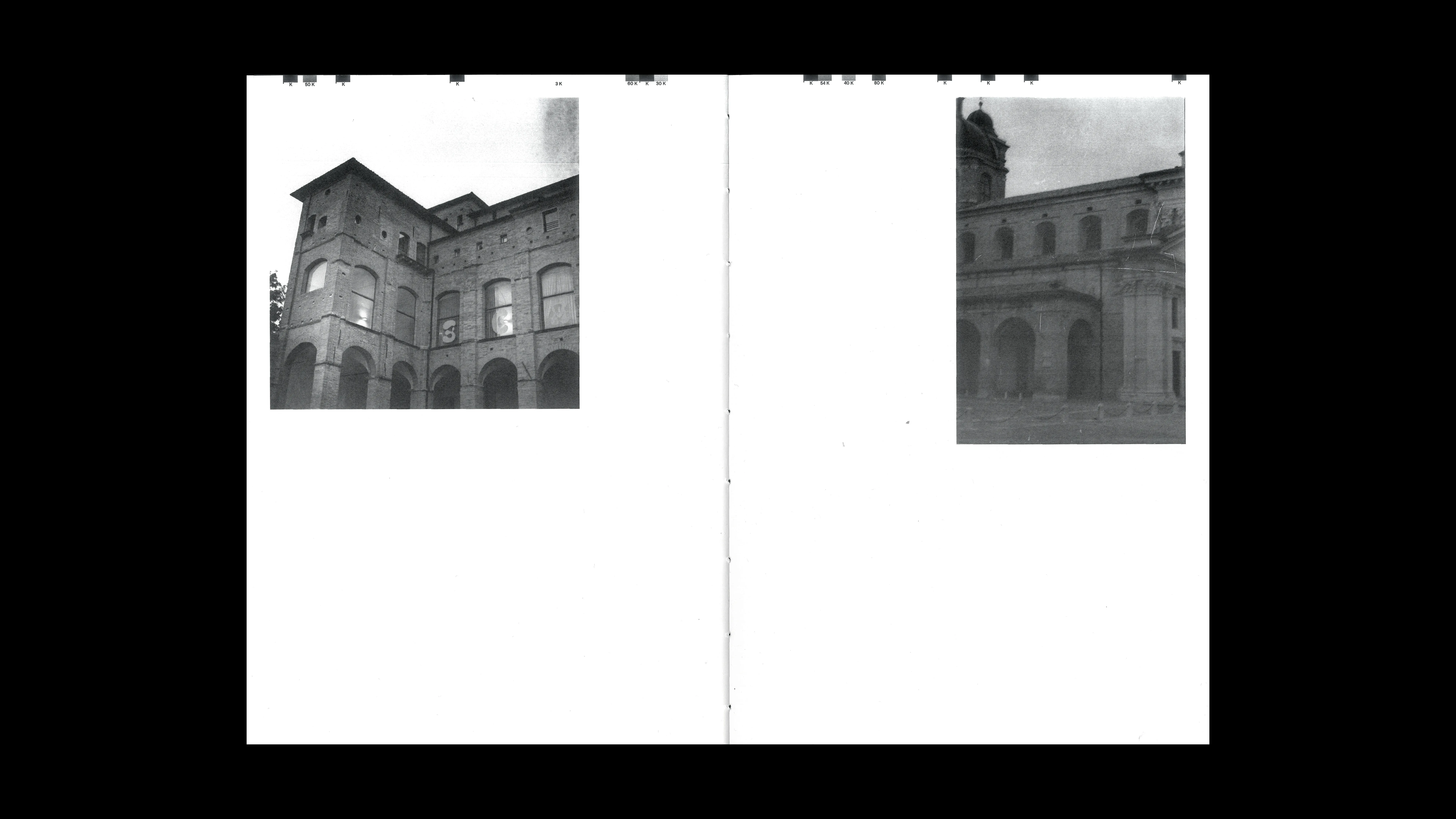
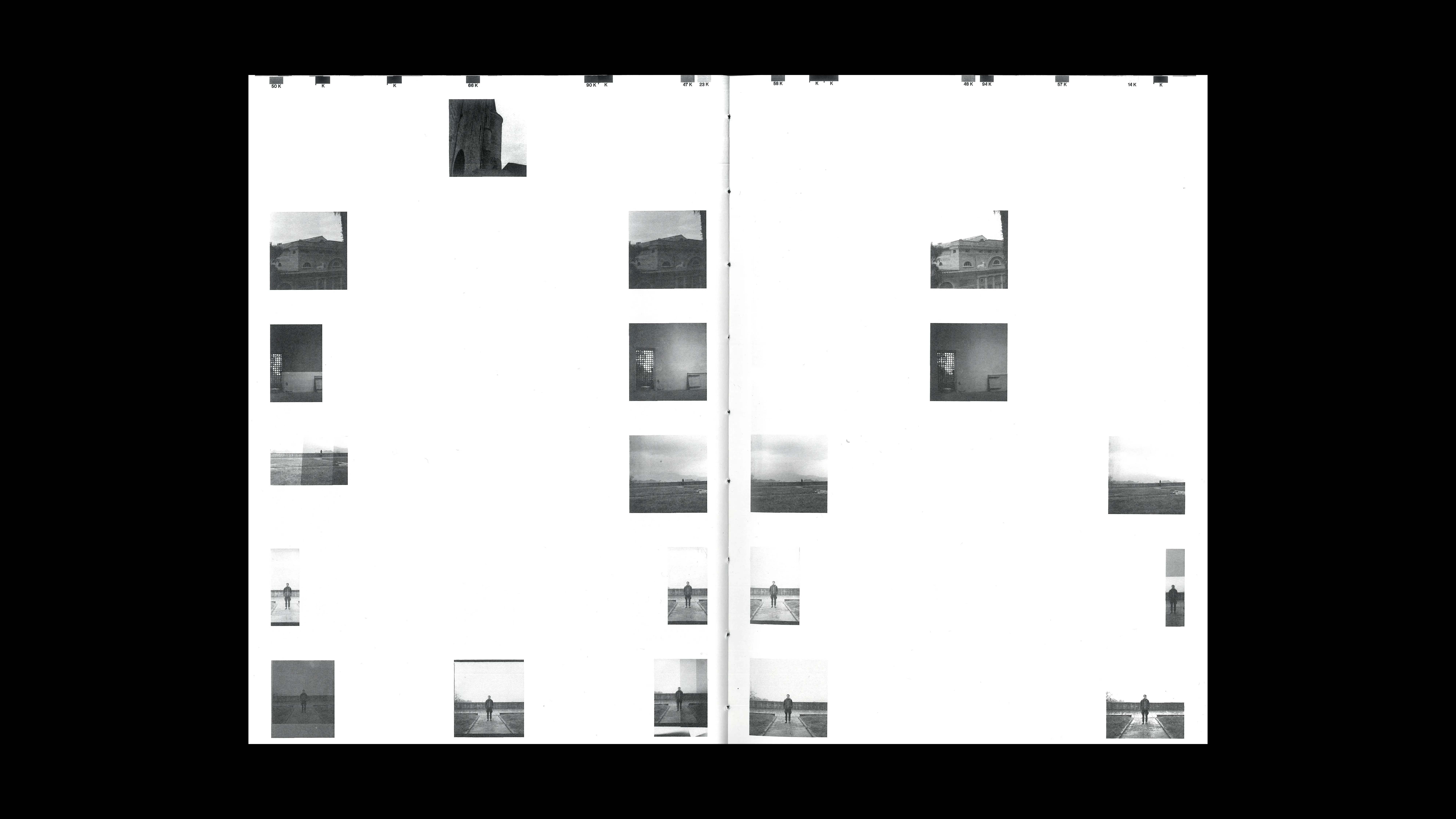
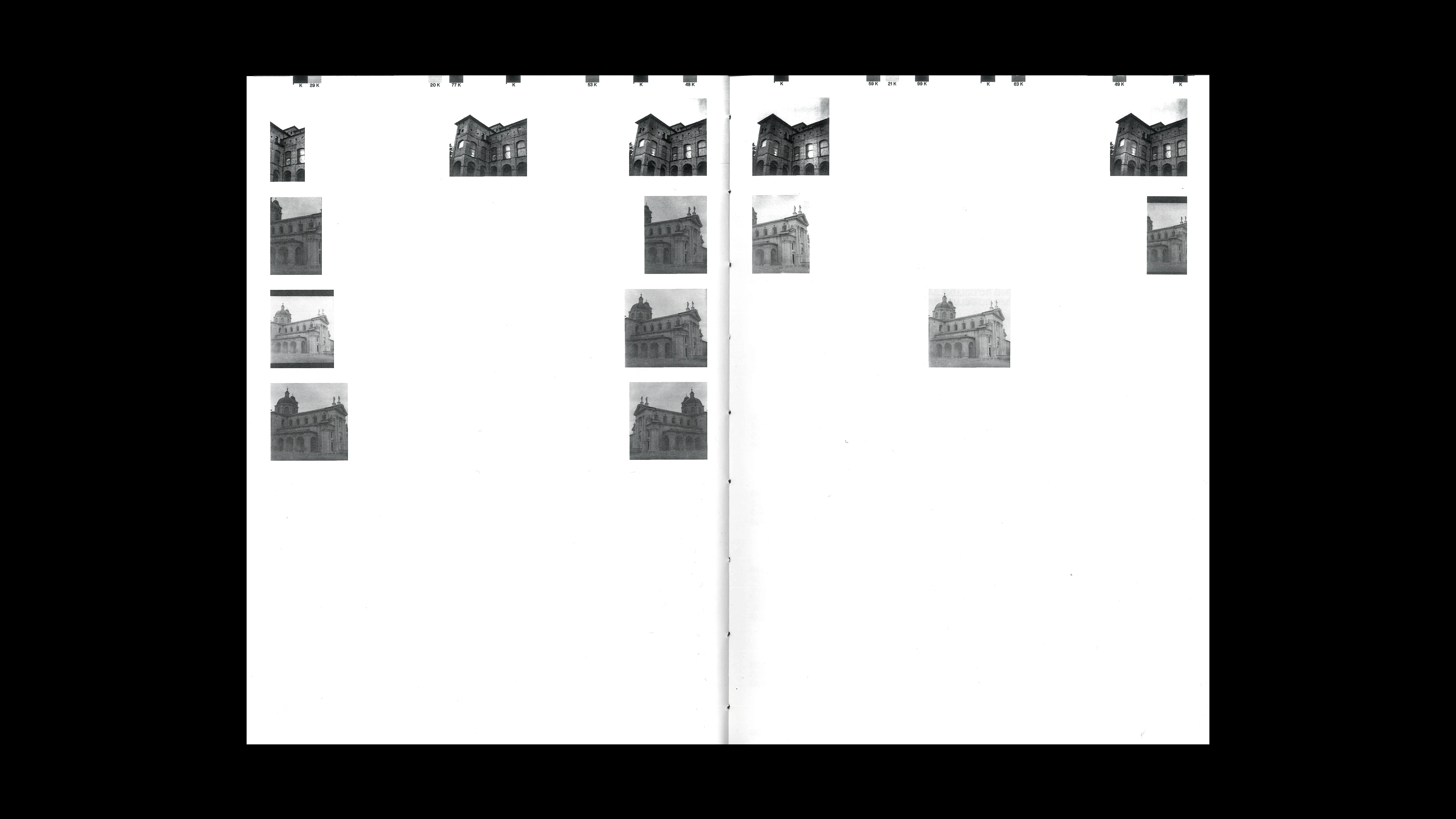
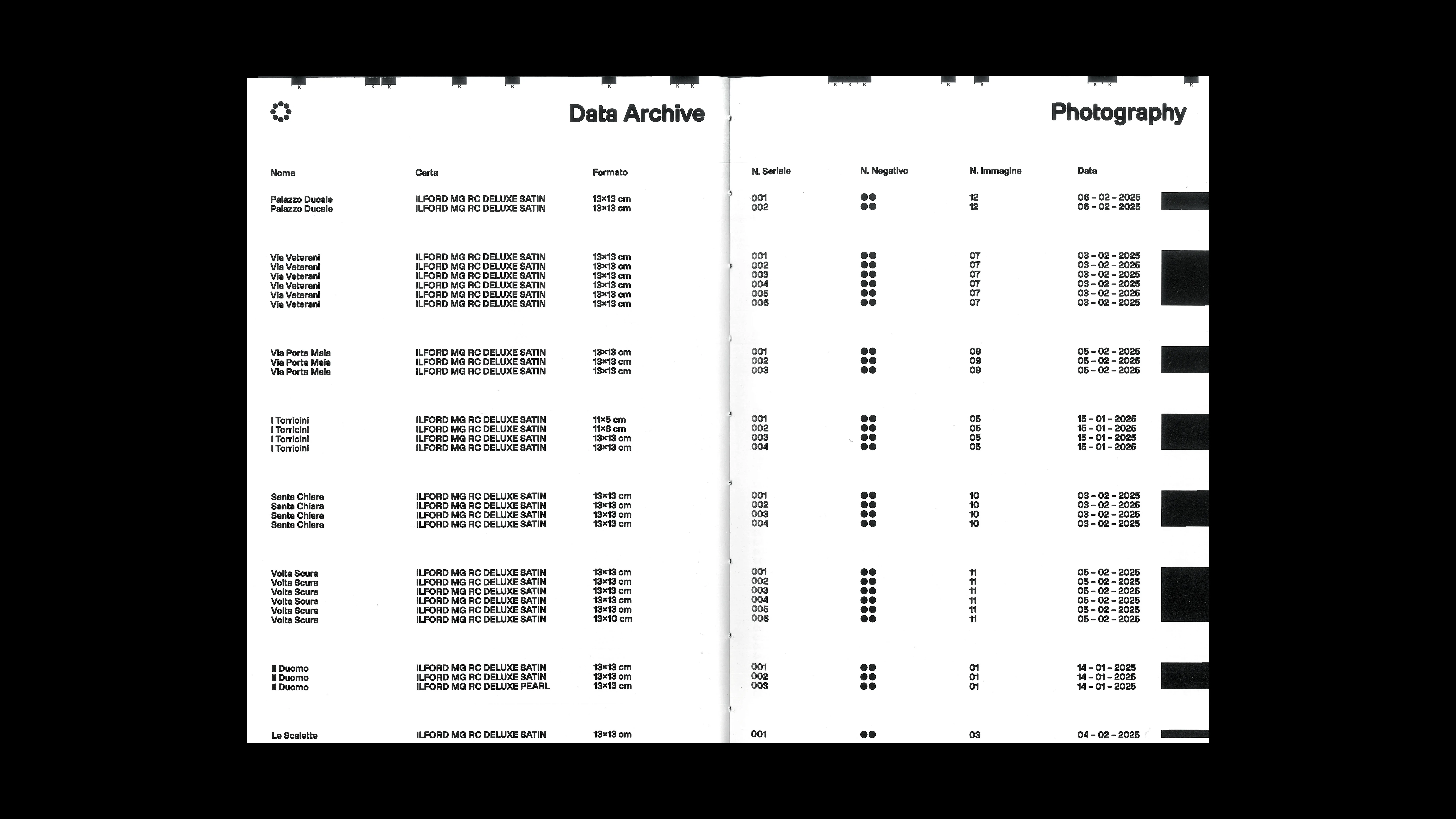
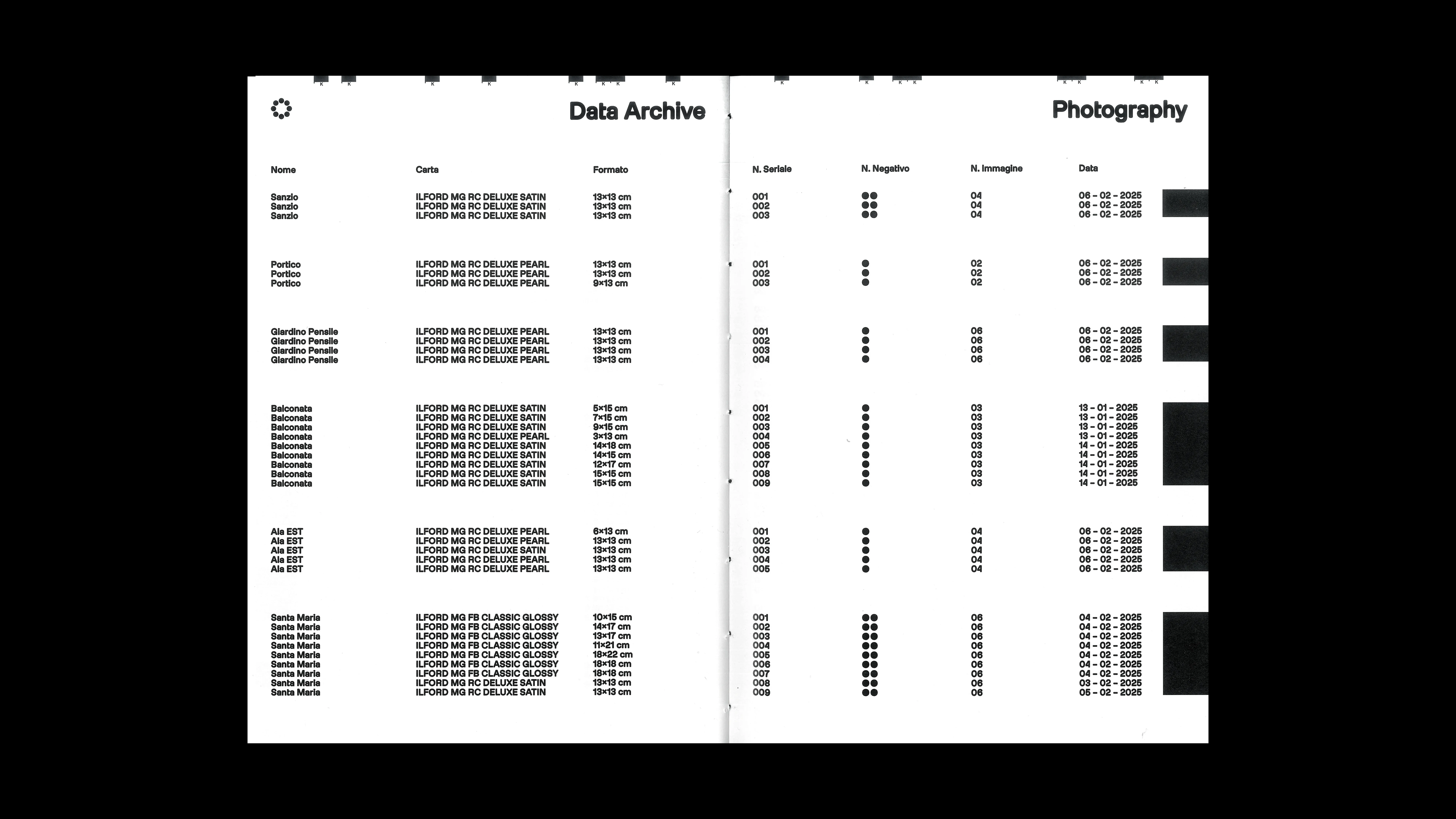
PROJECT Photo and Book Design CONTEXT ISIA_U DESCRIPTION I designed this book starting from the full development of a roll of film, focused on architectural photography of the city of Urbino. The project stands out for its use of unconventional angles, rarely employed in traditional architectural documentation, aiming to offer a fresh perspective on the city and its spaces. Each photograph is a “proof” created in the darkroom, where I experimented with exposure times and apertures to produce multiple variations of the same shot. This analog process generated a unique series of images, each slightly different, reflecting the dynamic and ever-changing nature of architectural perception. The title, Wunderkammer (the “cabinet of wonders”), emphasizes that the book is not merely a documentation but proposes an artistic and architectural interpretation of Urbino—like a collection of wonders to be discovered through a creative and personal lens. Physically, the book is entirely handmade. It features a single-chain binding with one signature, a choice that highlights the project’s originality and artisanal care. The cover is screen-printed with silver ink, adding elegance and a unique tactile effect that further enhances the volume’s exclusive character.
1 (OF) 12
11
FAUSTO 25
2024
PROJECT Art Direction CONTEXT Personal Project DESCRIPTION The second edition of the A3-format calendar expands Fausto’s universe, this time focusing on the theme of professions. Each month portrays him engaged in a different job, from the most common to the most unusual, highlighting his personality through ever-changing roles yet always drawn with the same clean and recognizable style. This series transforms the calendar into a repertoire of possible identities, continuing to play with repetition and variation of the character.
1 (OF) 12
10
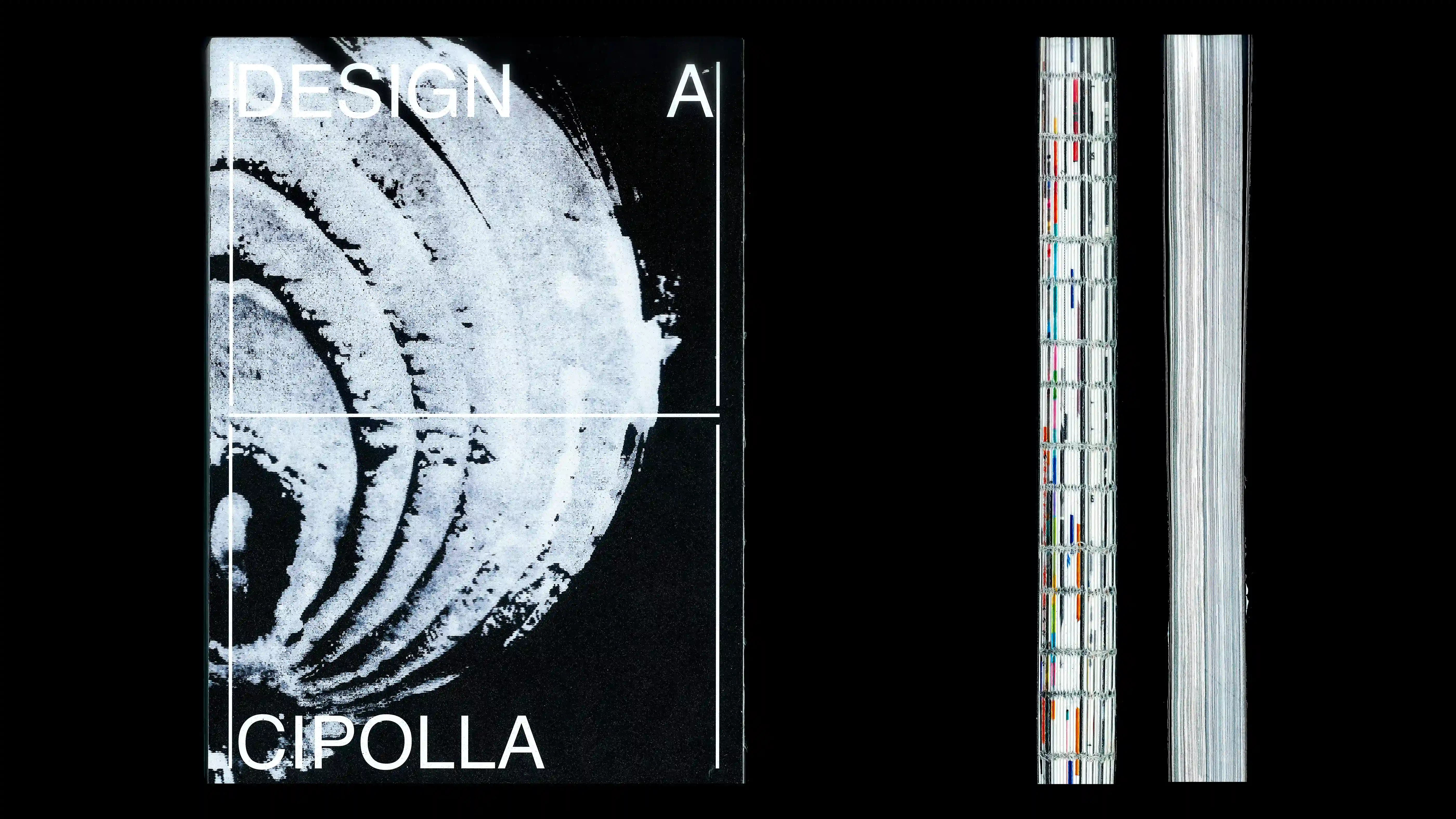
DESIGN A CIPOLLA
2024
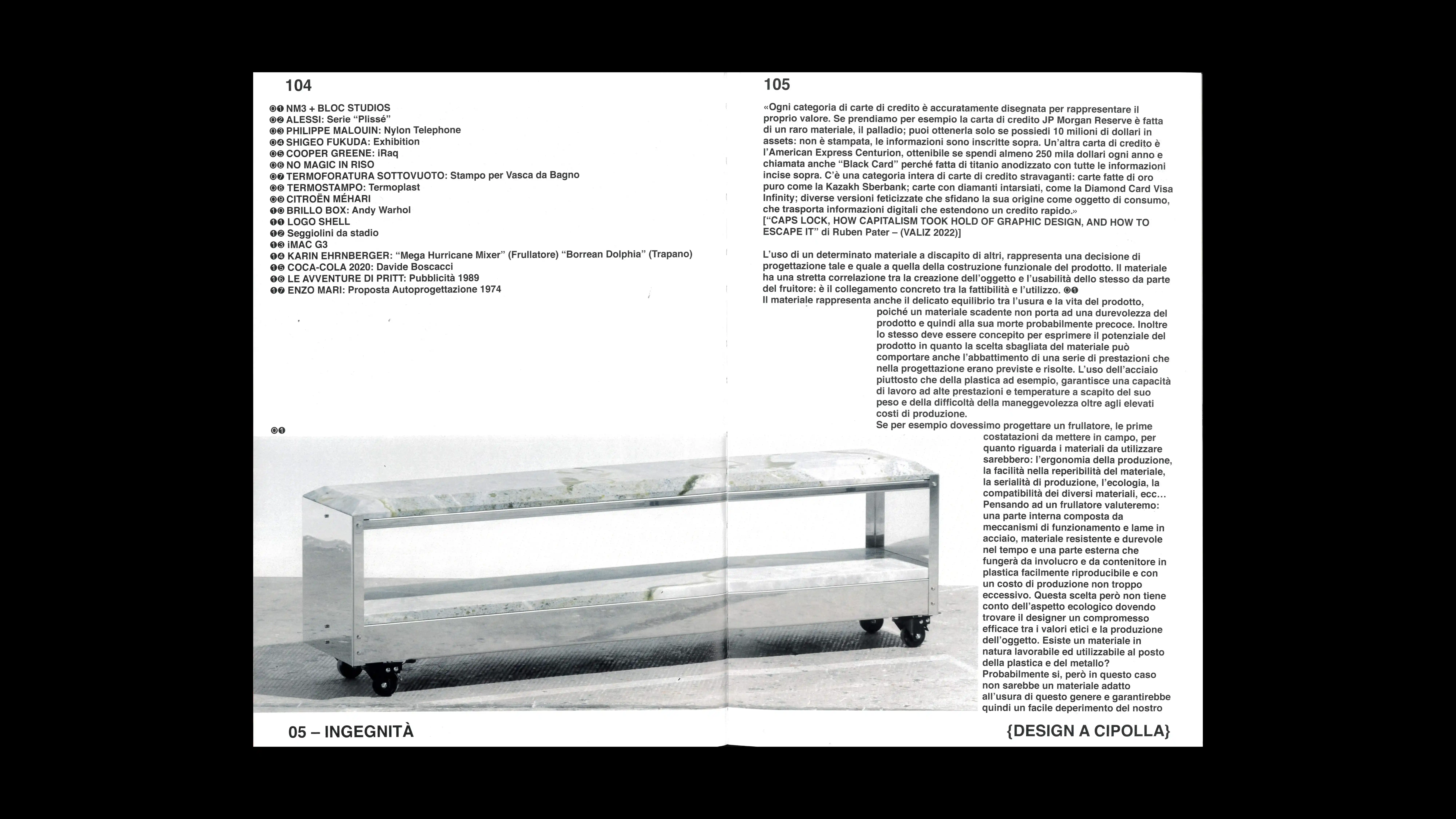
PROJECT Book Design CONTEXT ABA_U ADVISOR Emilio Macchia & Roberta Baldaro DESCRIPTION "Onion Design" ("Design a cipolla") is my thesis project, an exploration that rejects defining design through singular, definitive answers. The thesis is based on the idea that design, much like art, lacks clear-cut boundaries, and that its true essence lies in the plurality of questions and the infinite possibility of answers. Design itself is the constant search for solutions to an inexhaustible number of problems; if we found definitive answers, design would cease to exist. The "onion" approach is a metaphor for the design process: a journey through layers, stacked one upon the other. It is a slow, deliberate journey that invites us to savor each individual layer to reach the "heart" of the problem, avoiding getting stuck on the surface. From this perspective, the designer is not a creator of final solutions, but rather a professional who methodically engineers possible pathways to facilitate the user's life. Consistent with this premise, this thesis is not a technical manual for industry insiders. Rather, it is an exploratory journey intended for anyone with an interest in the subject. The goal is not to provide answers, but to guide the reader on a path that sparks new questions, instills fertile doubts, and provokes reflection. It is an invitation to discover new pathways in the process by actively participating in the content and "contaminating" it with one's own perspective.
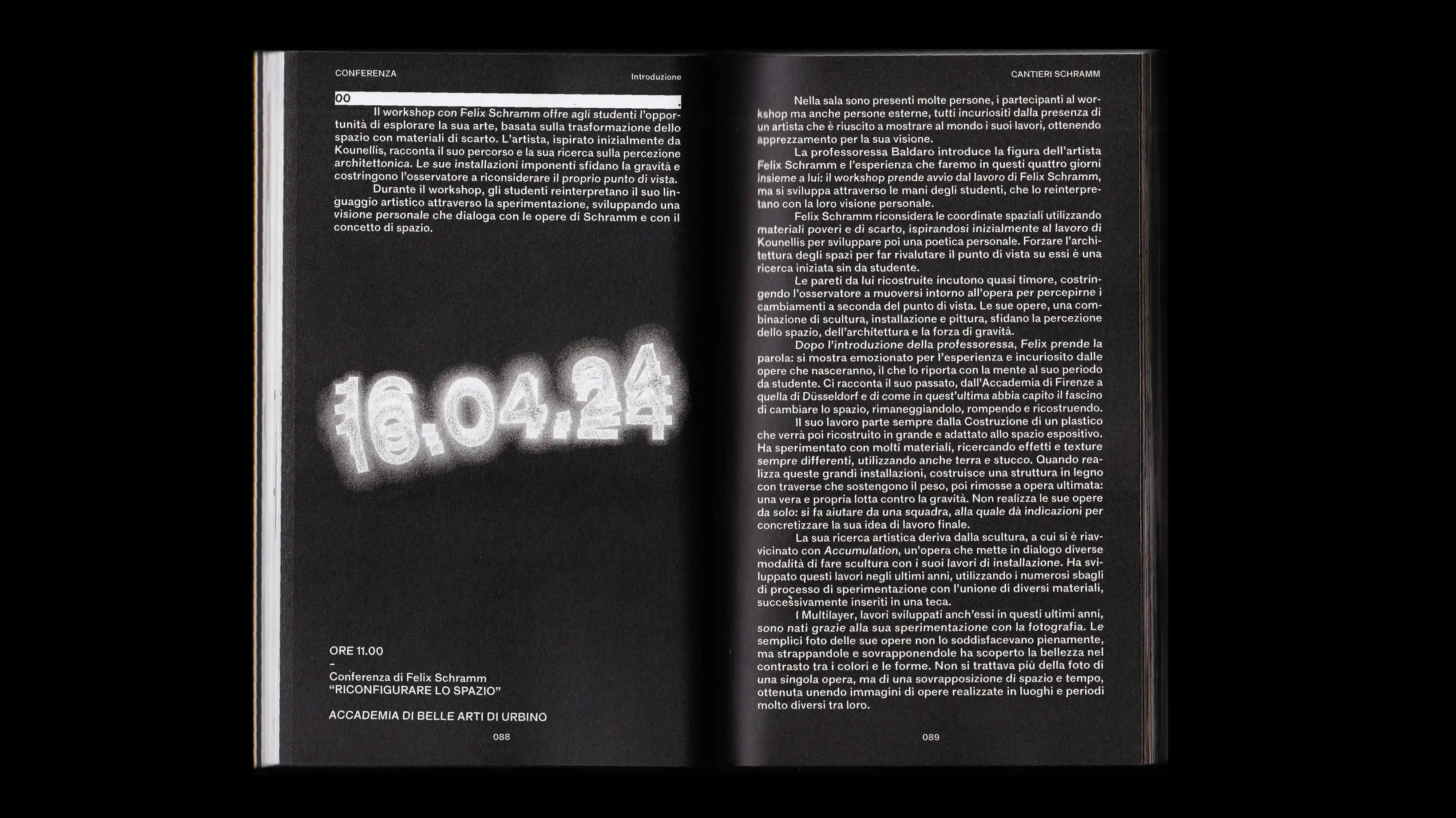
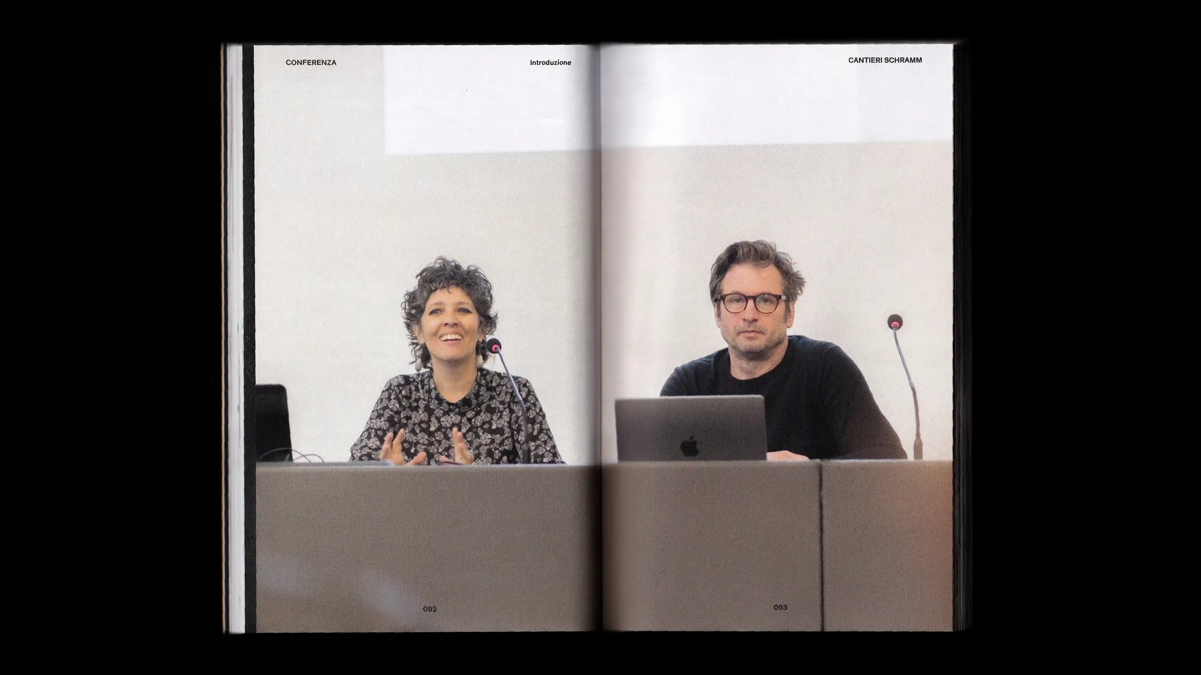
1 (OF) 12
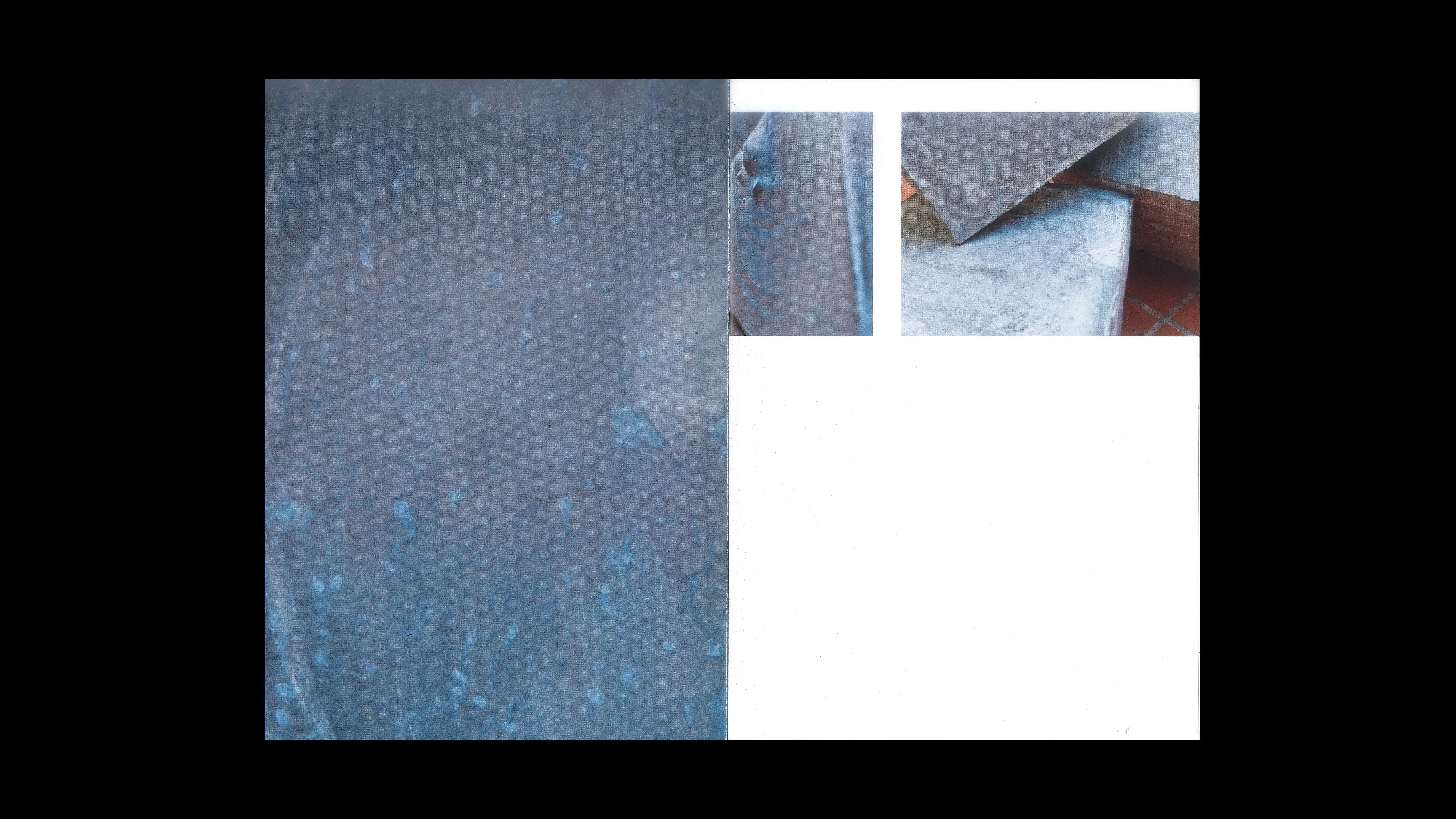
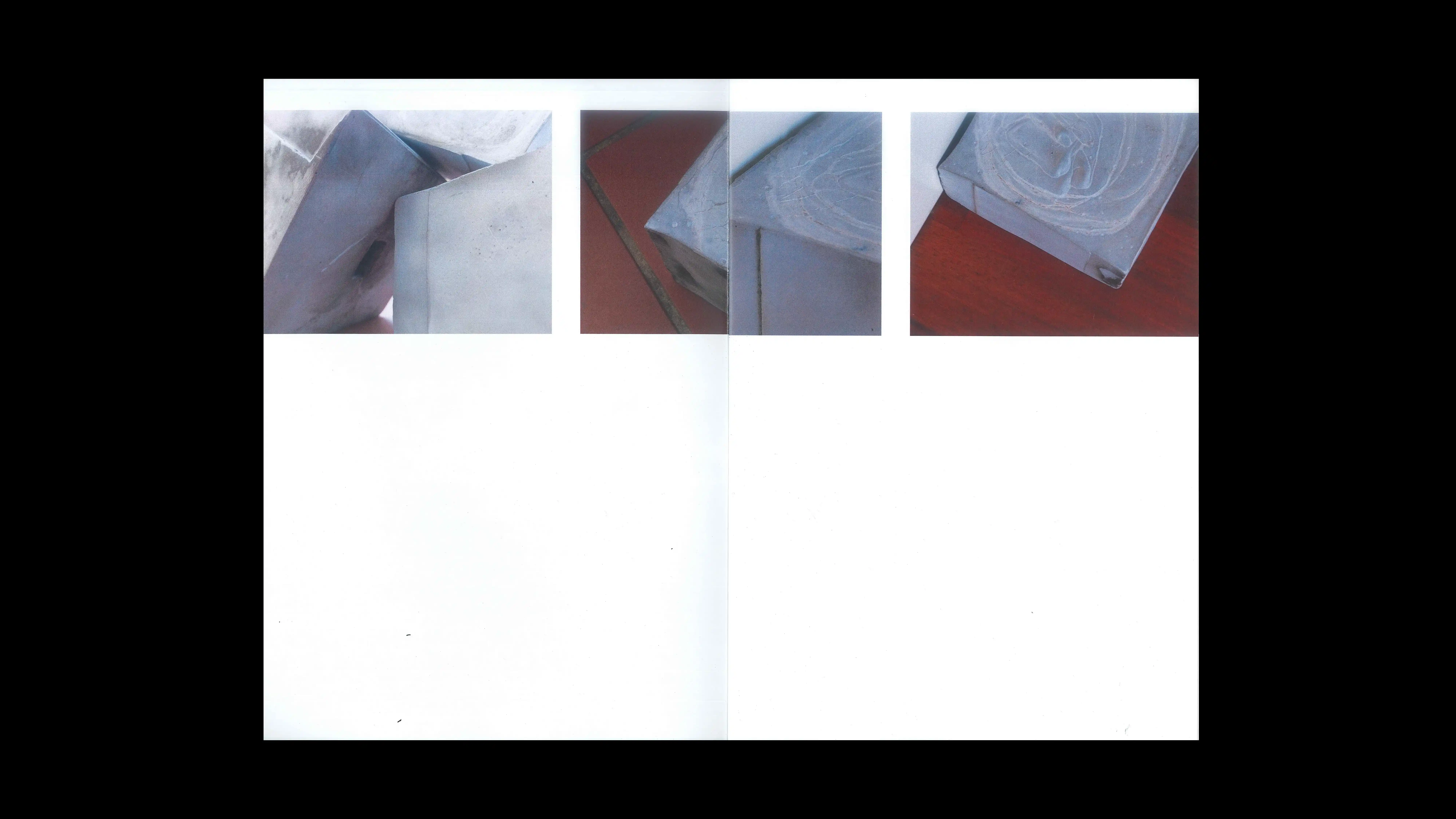
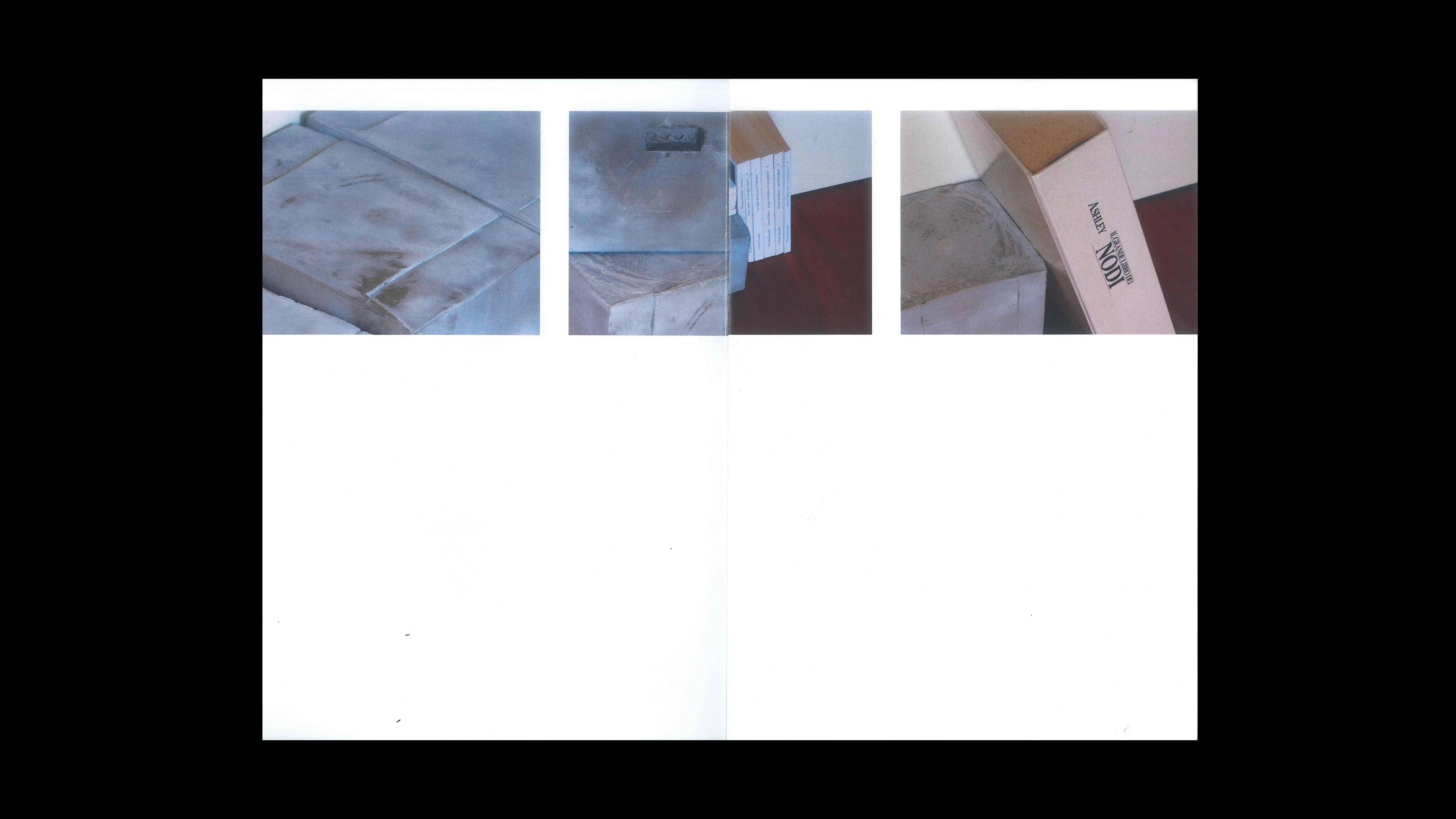
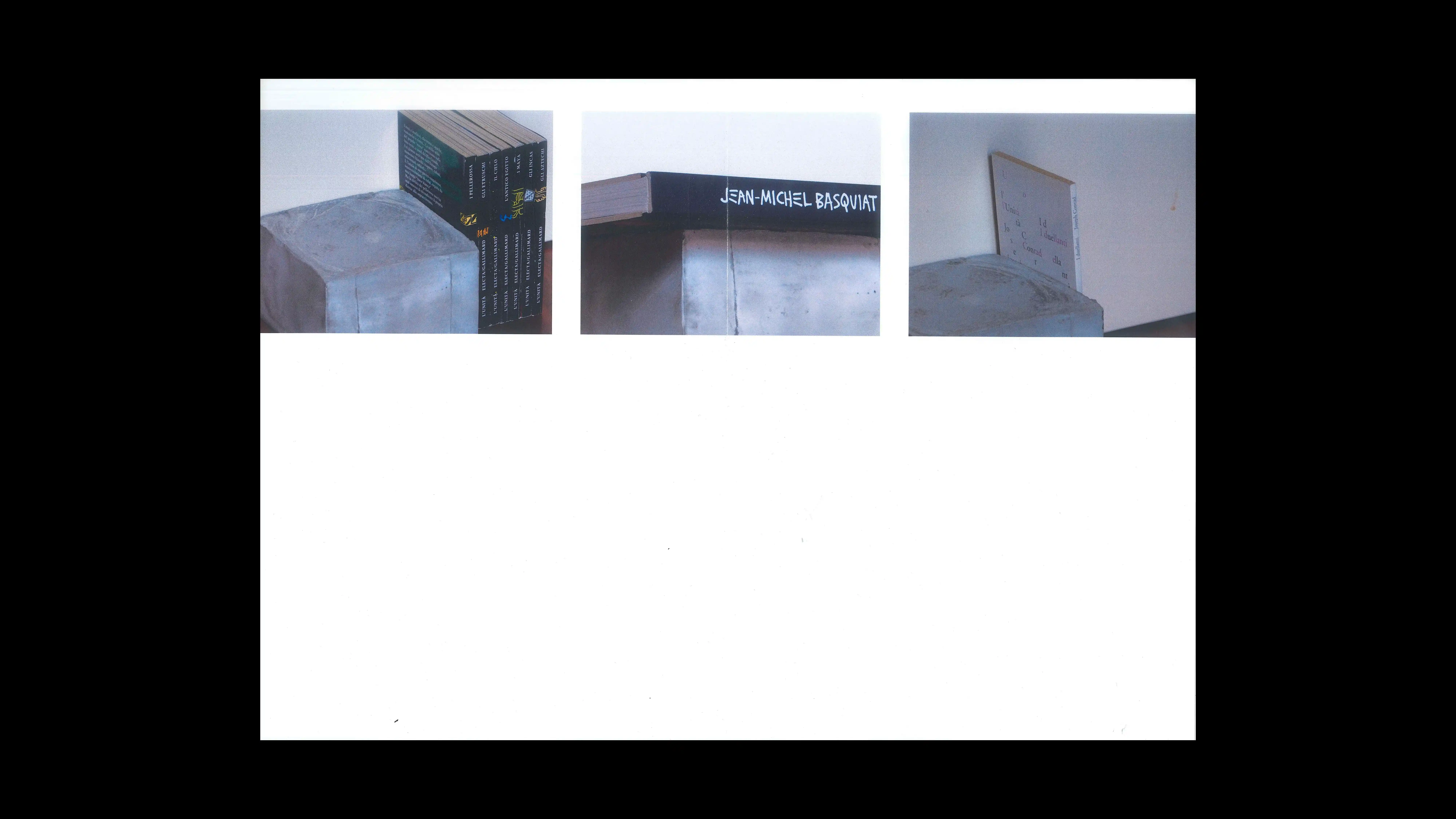
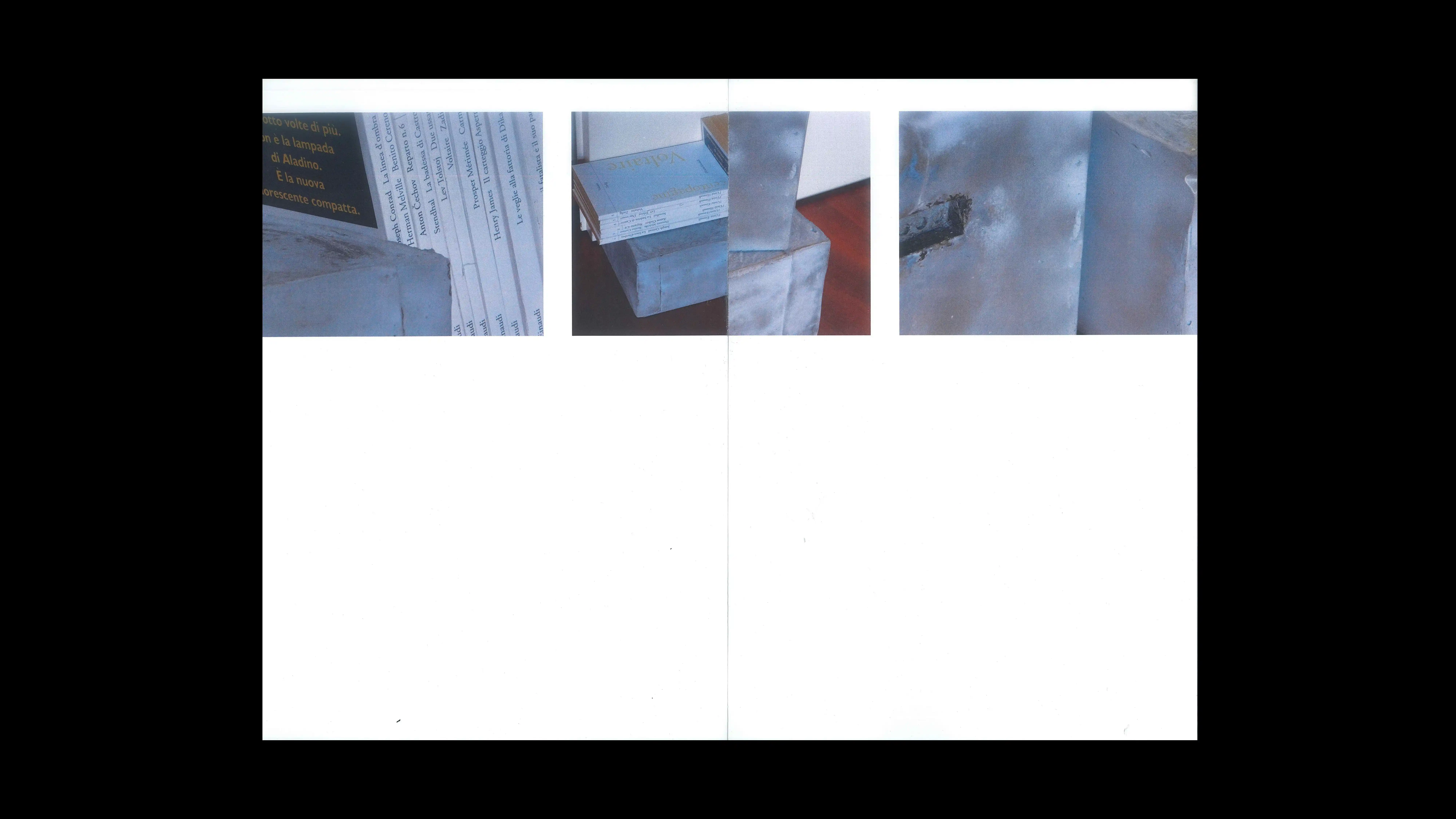
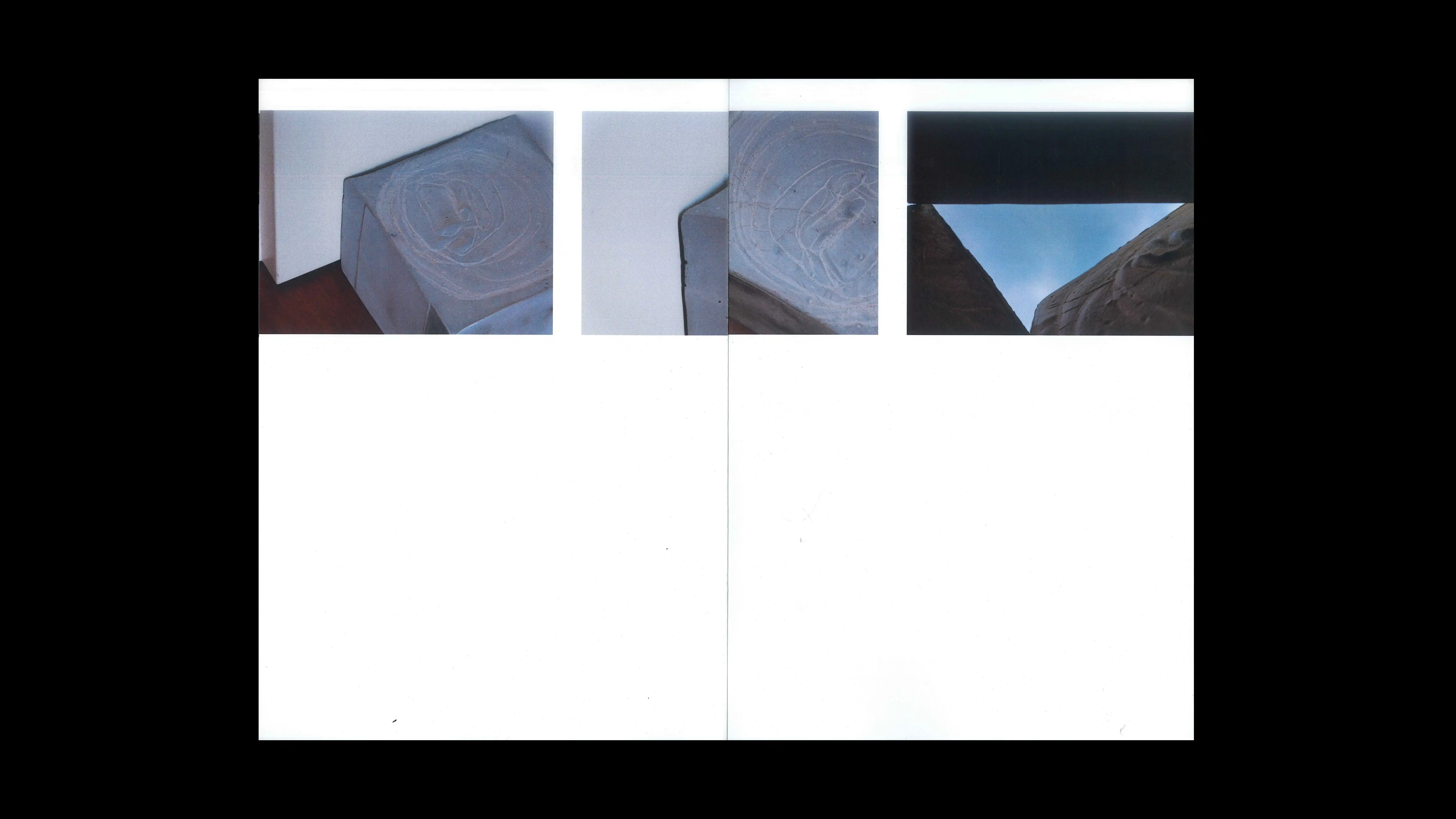
09
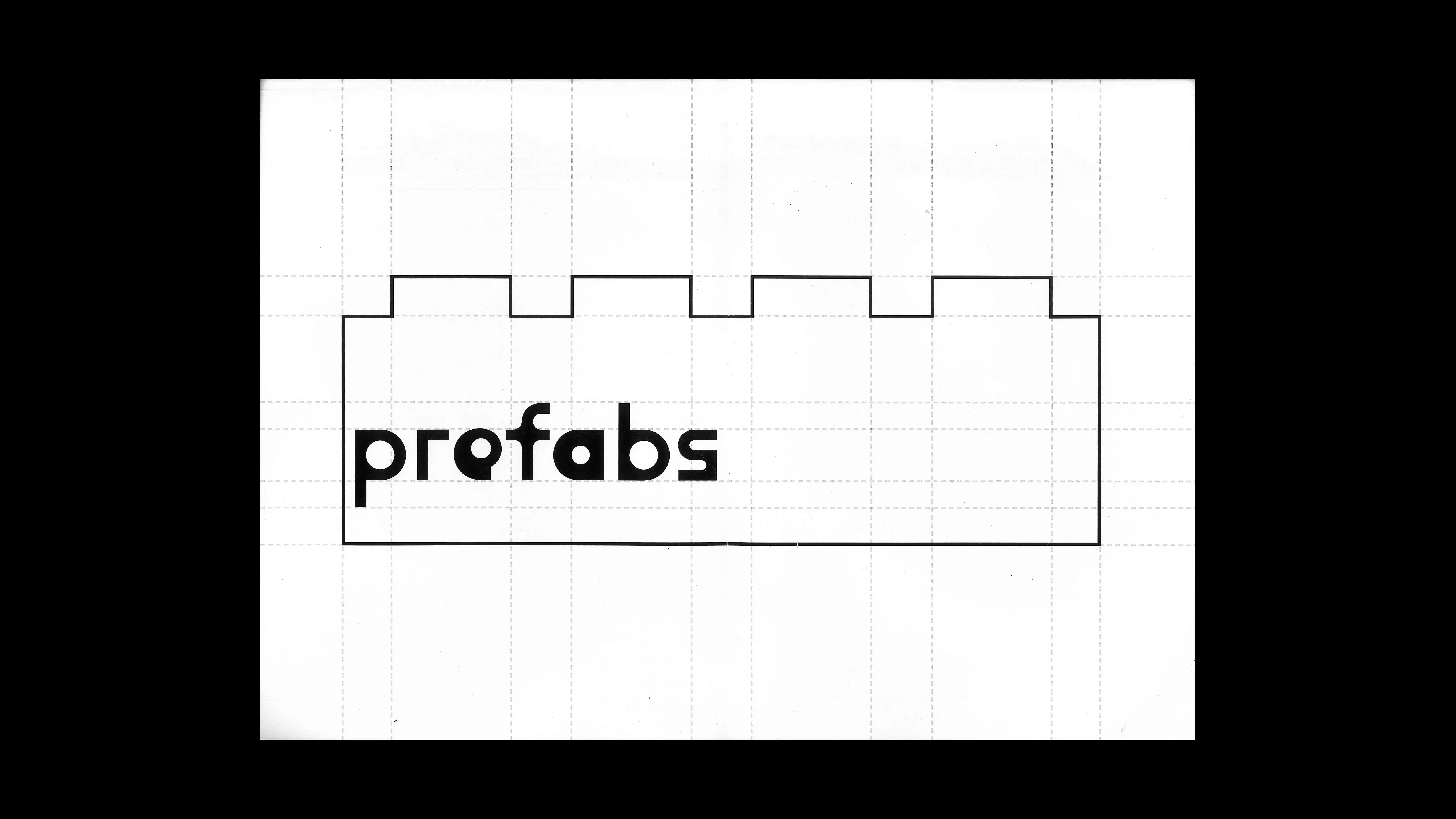
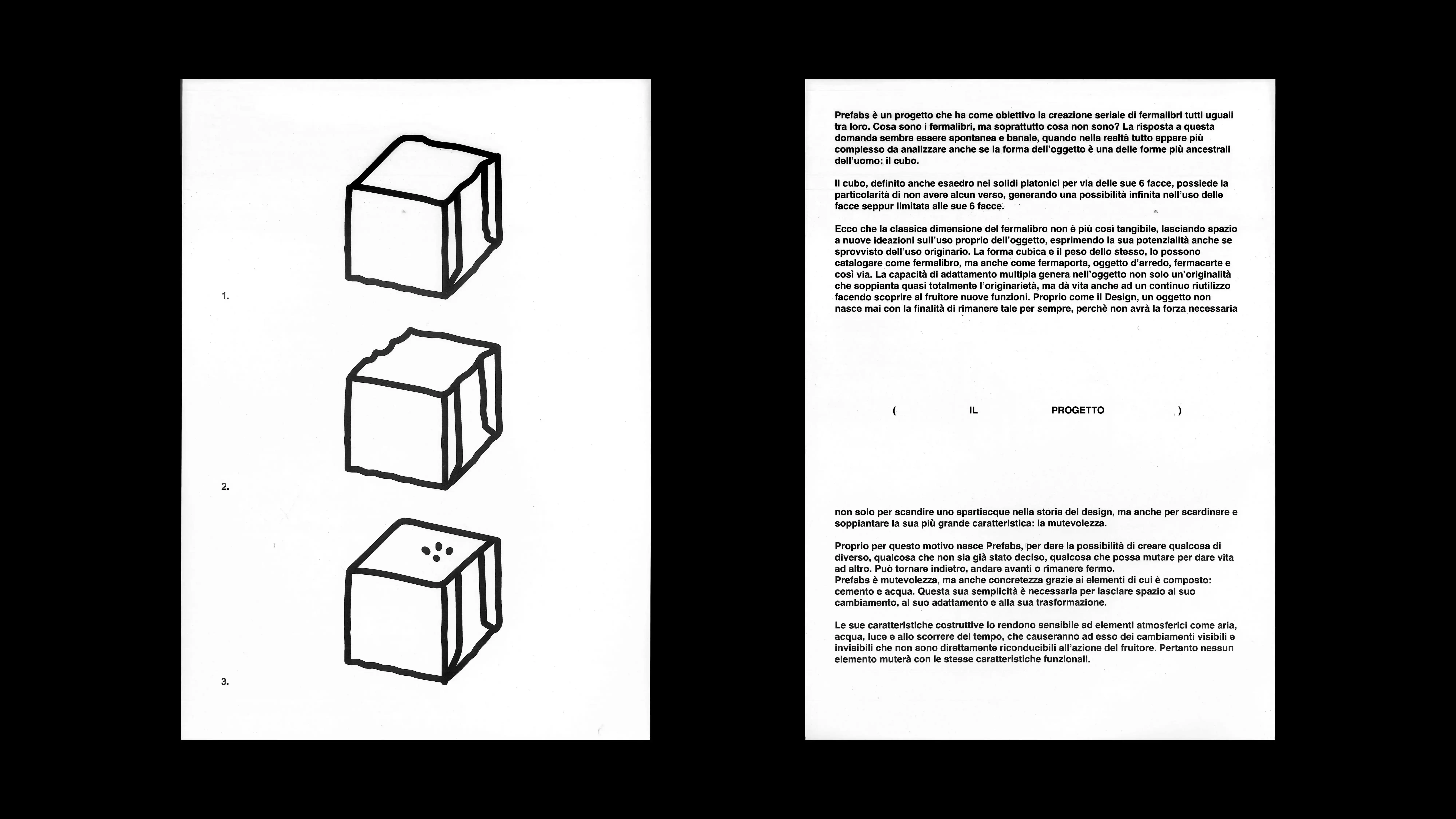
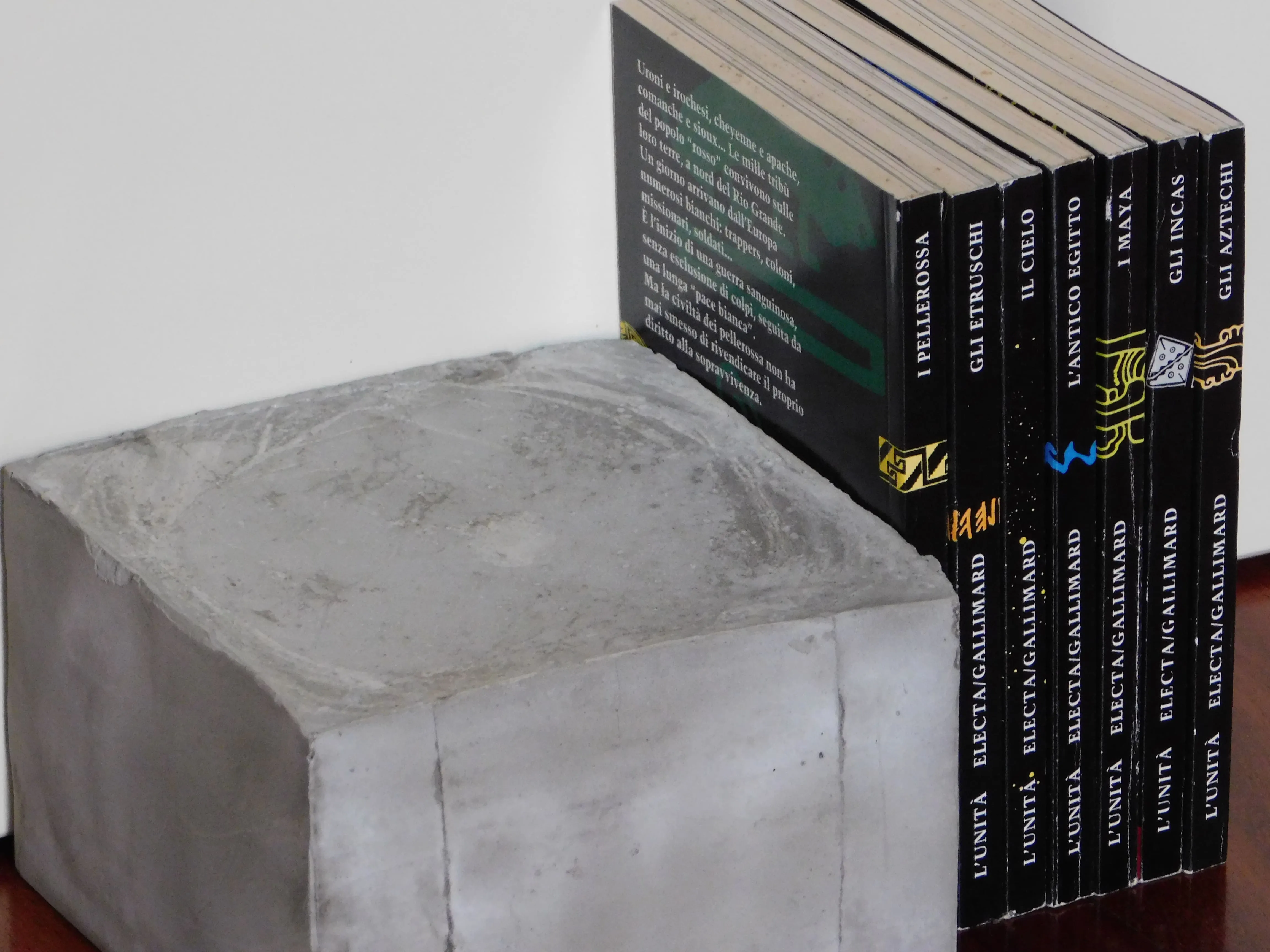
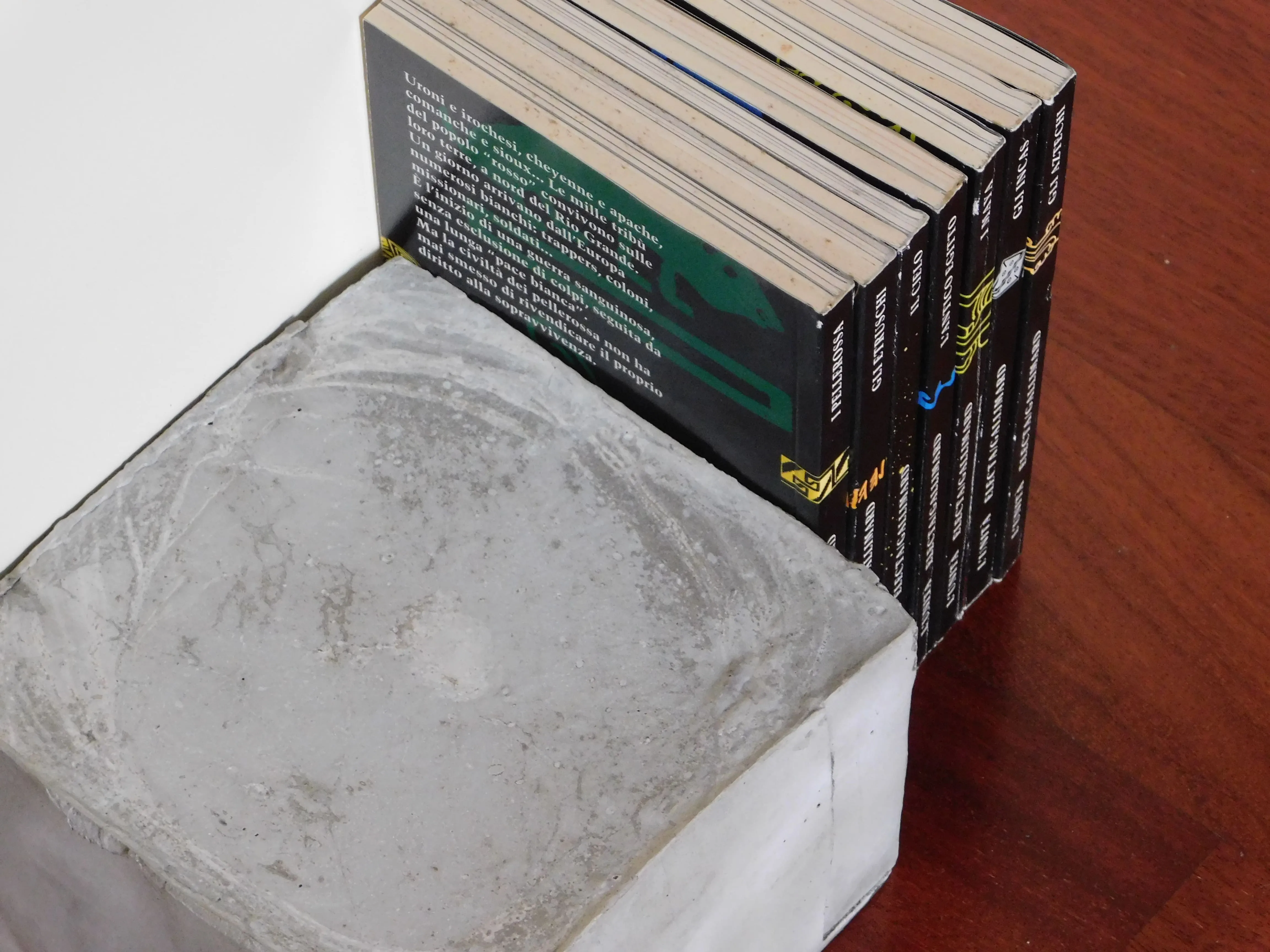
PREFABS
2024
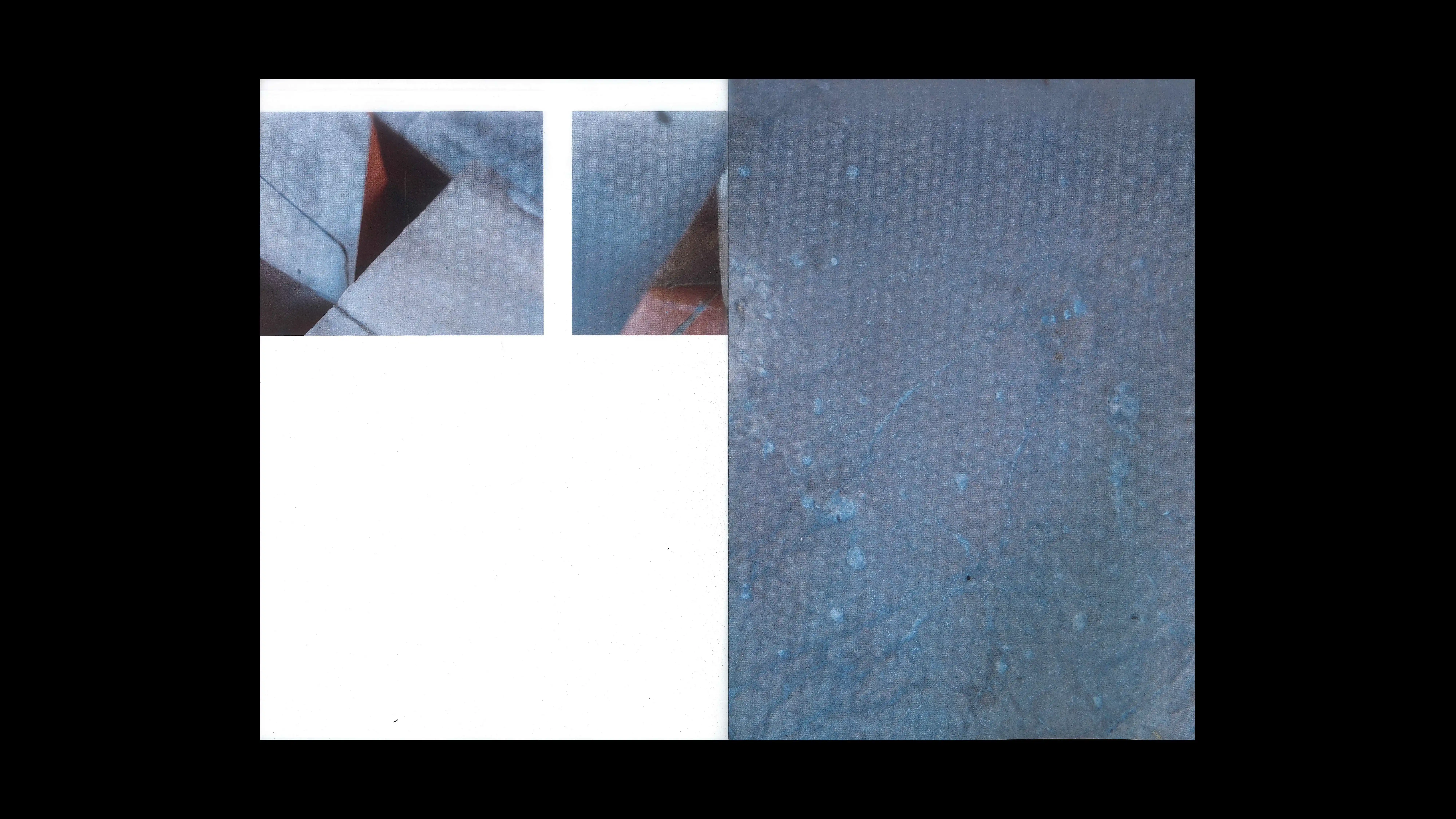
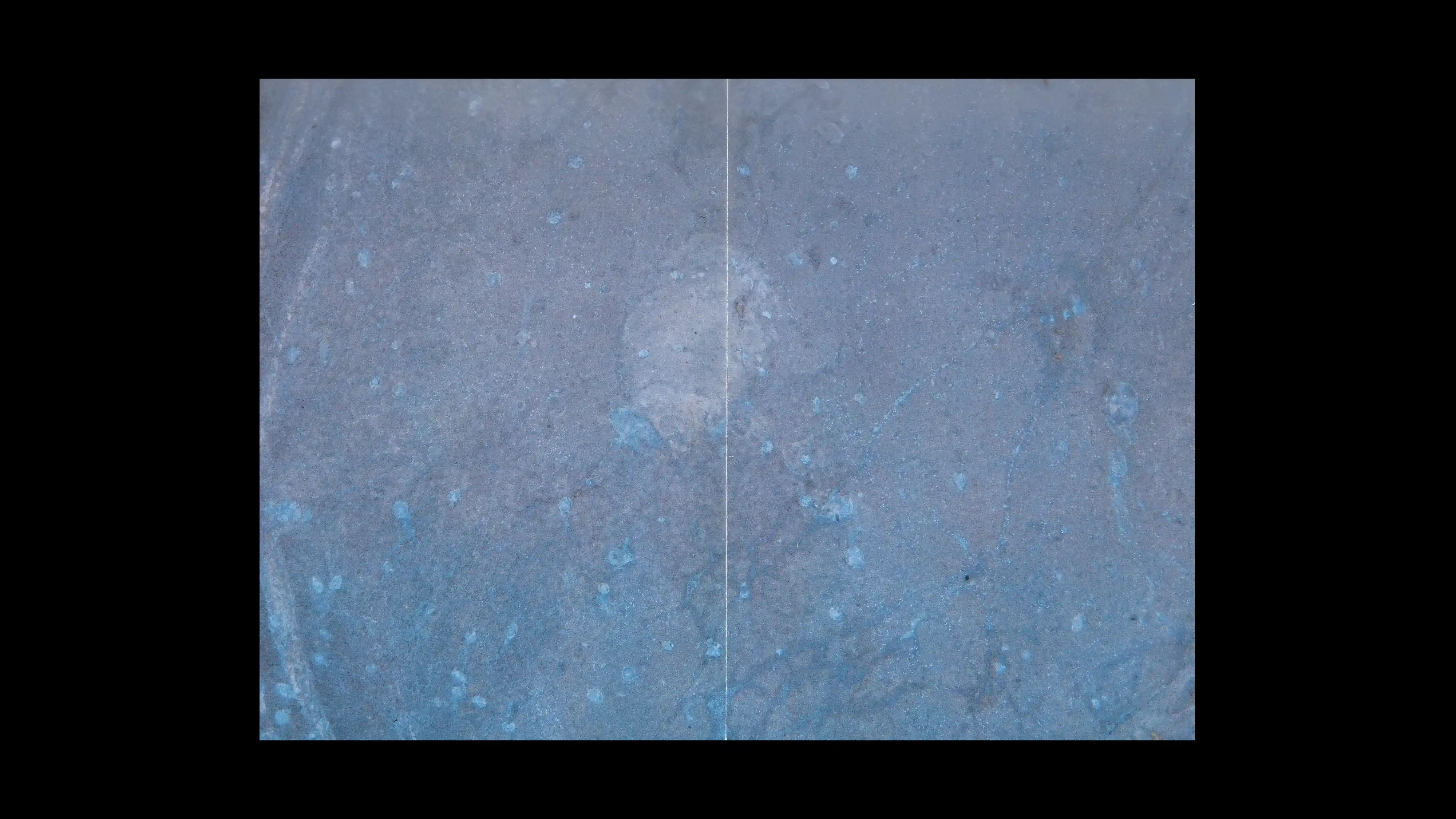
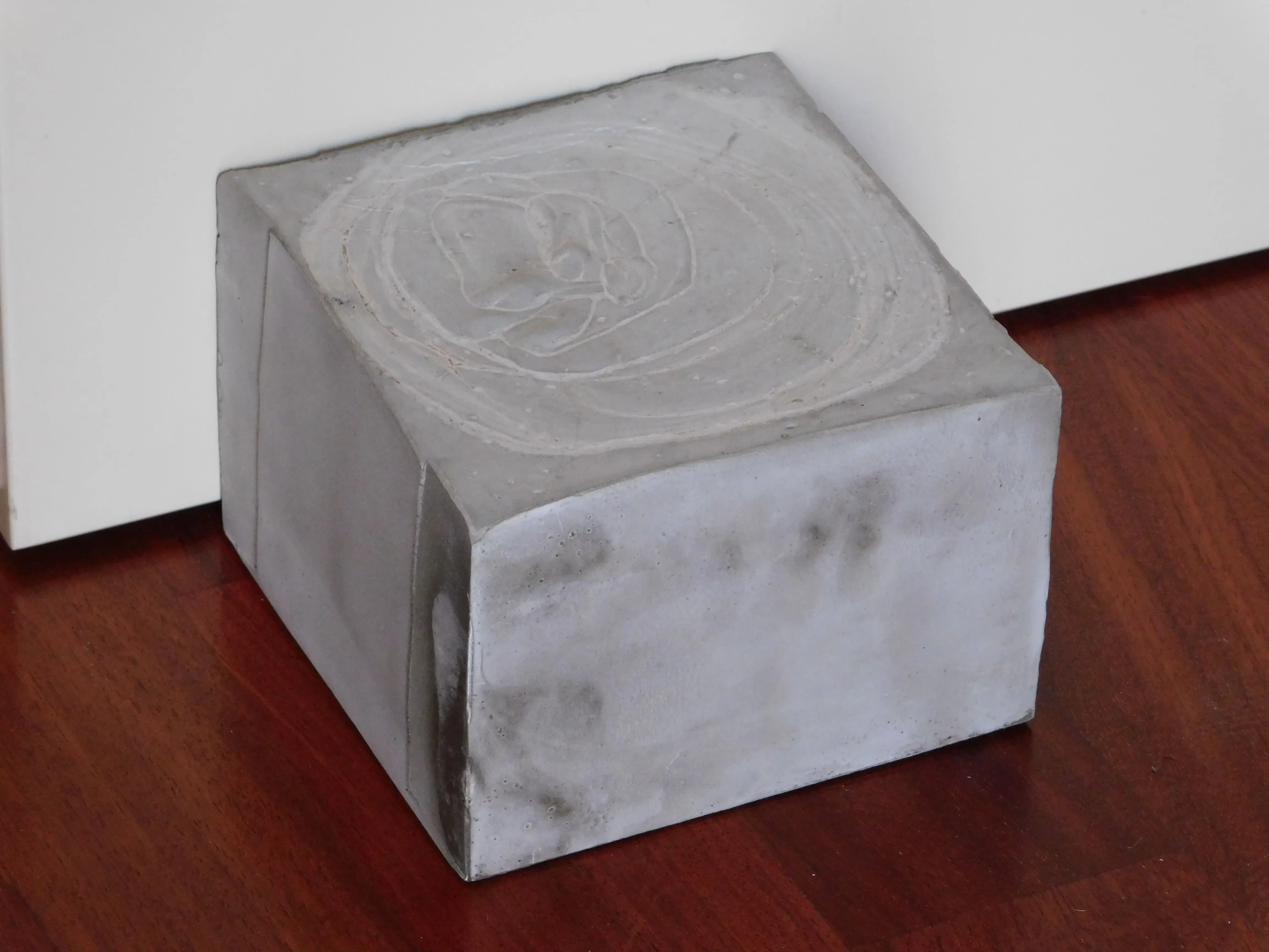
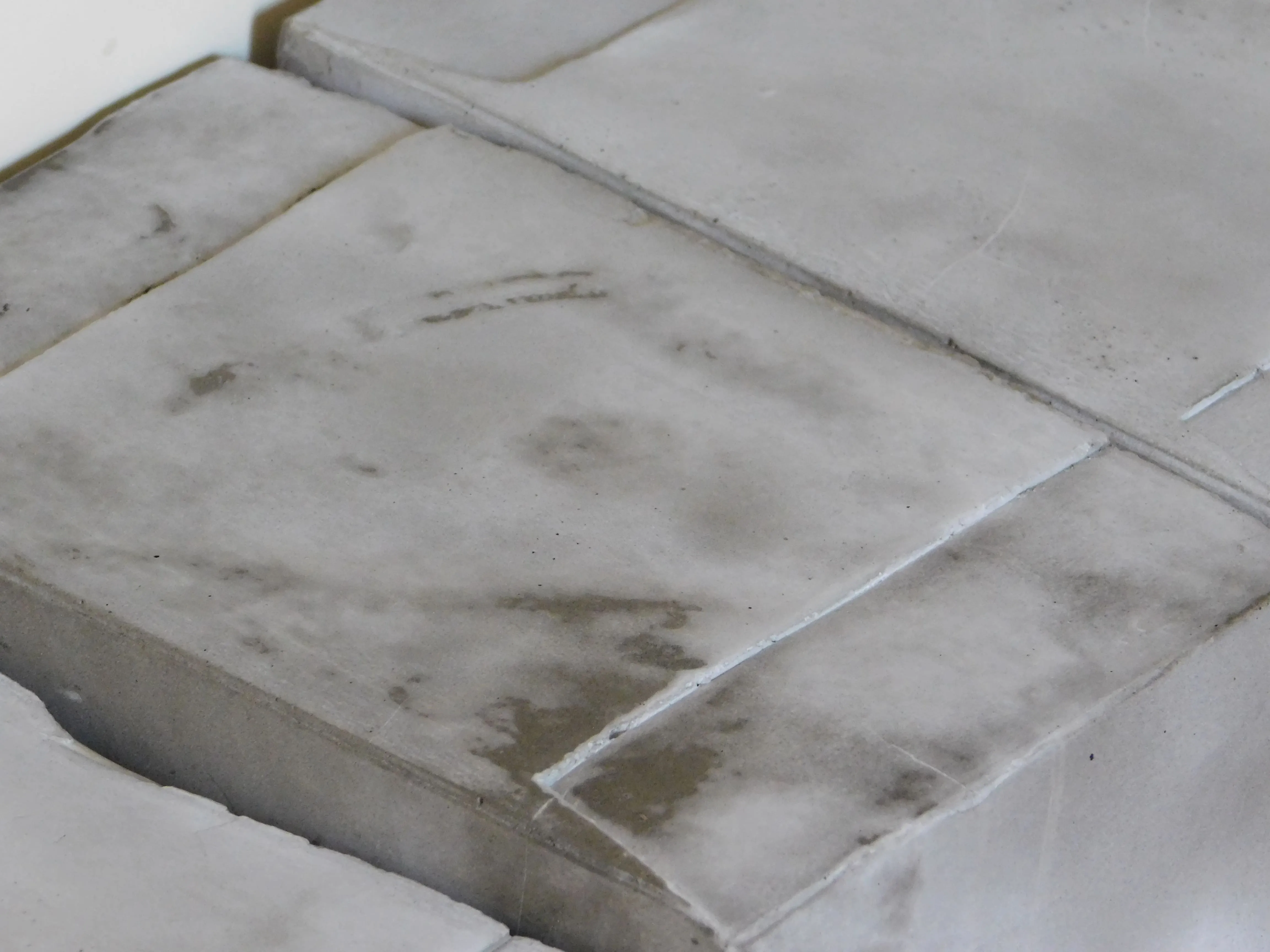
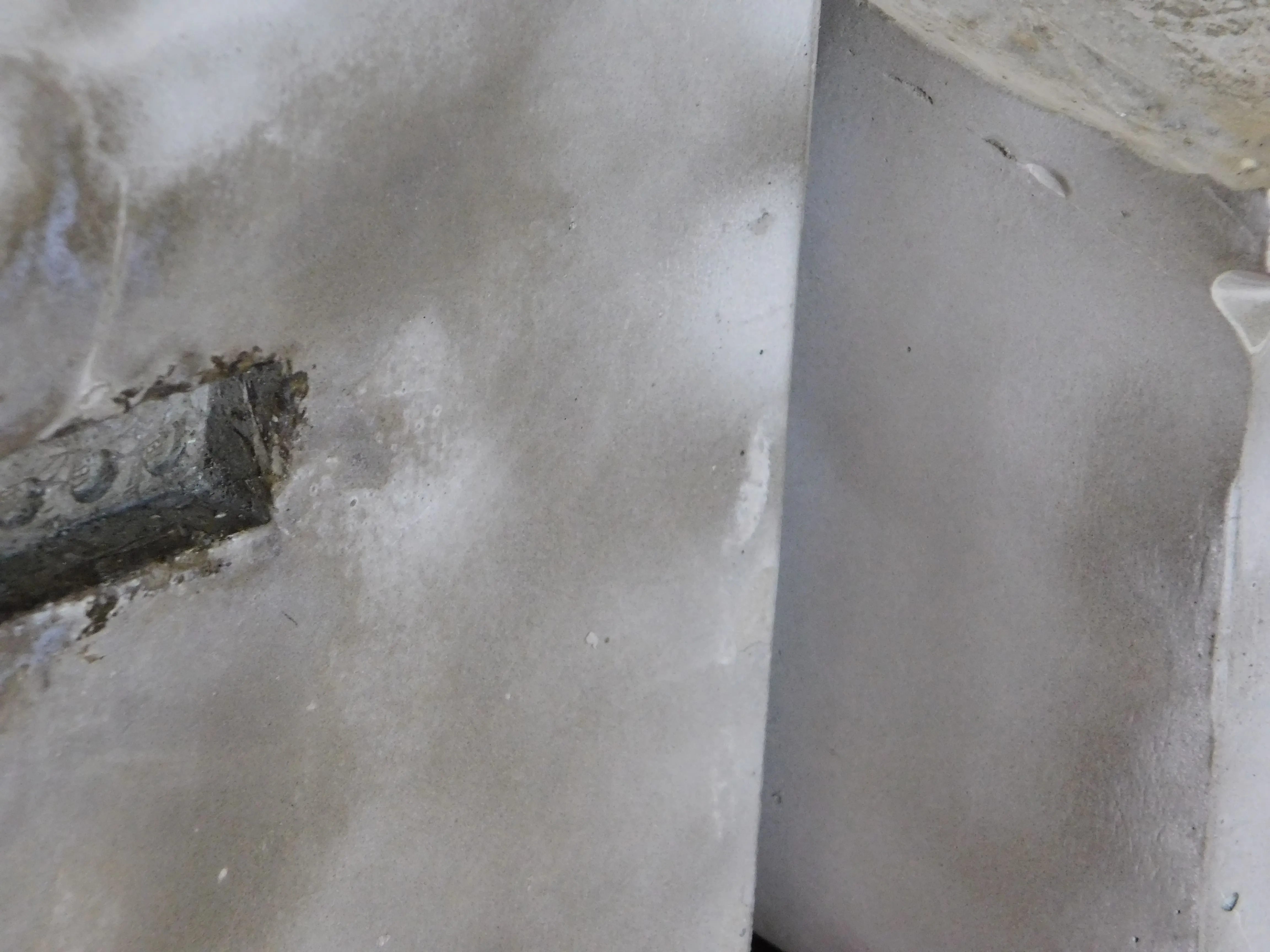
PROJECT Object Design CONTEXT ISIA_U DESCRIPTION Prefabs is the artistic project that accompanies my thesis, taking shape as a series of cubic cement bookends. The cube, an ancestral and universal form, becomes here a reflection on the mutability of design and the ability of objects to generate new functions beyond their original purpose. Although conceived as a bookend, the cube can transform into a doorstop, a paperweight, or a decorative object: its identity is never fixed but constantly redefined by context and by the imagination of the user. The choice of material—cement and water—emphasizes this duality, combining solidity and transformation. Exposure to air, light, water, and time produces visible and invisible changes, making each piece unique. Prefabs is therefore a project about concreteness and transformation, stability and mutability. Every cube is identical in form yet different in its evolution: a paradox that becomes a metaphor for design itself, always balanced between repetition and change.
1 (OF) 12
08
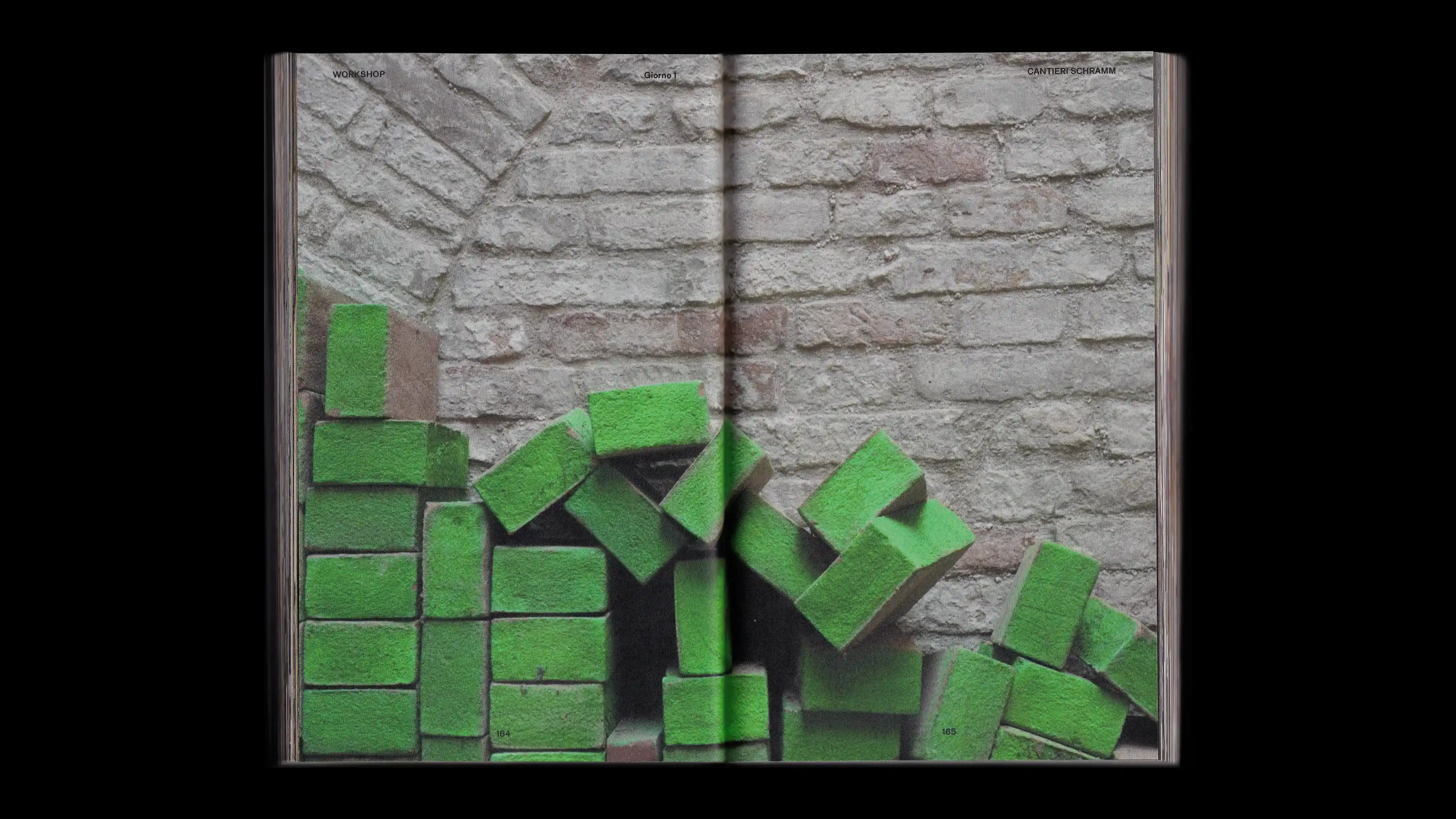
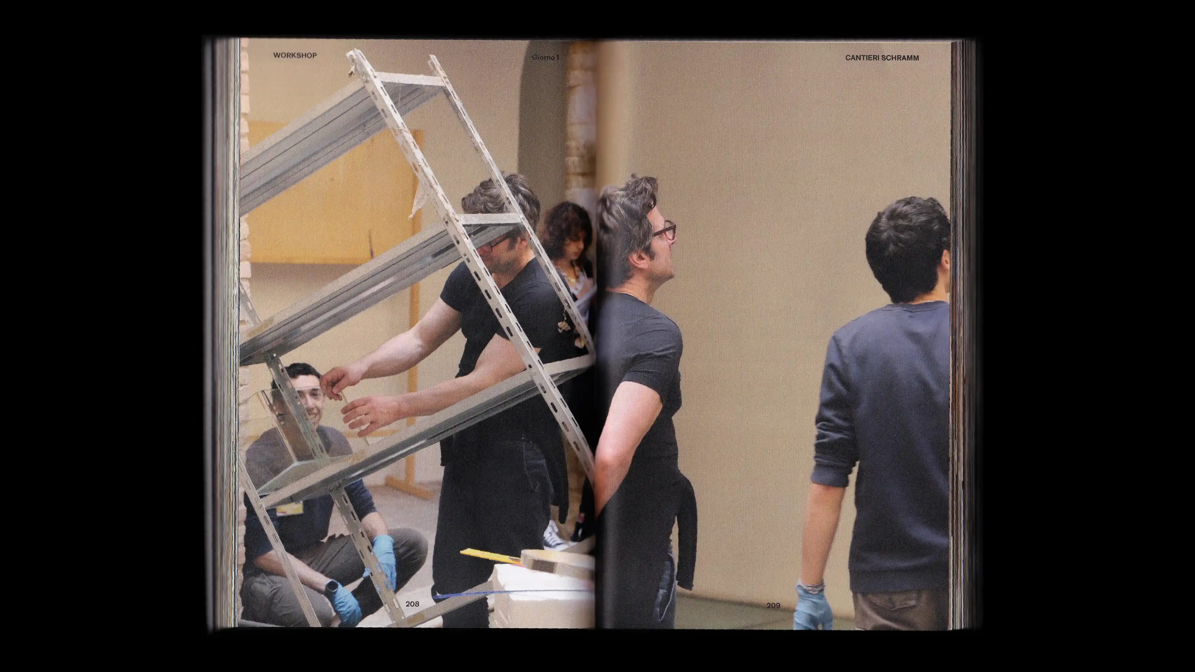
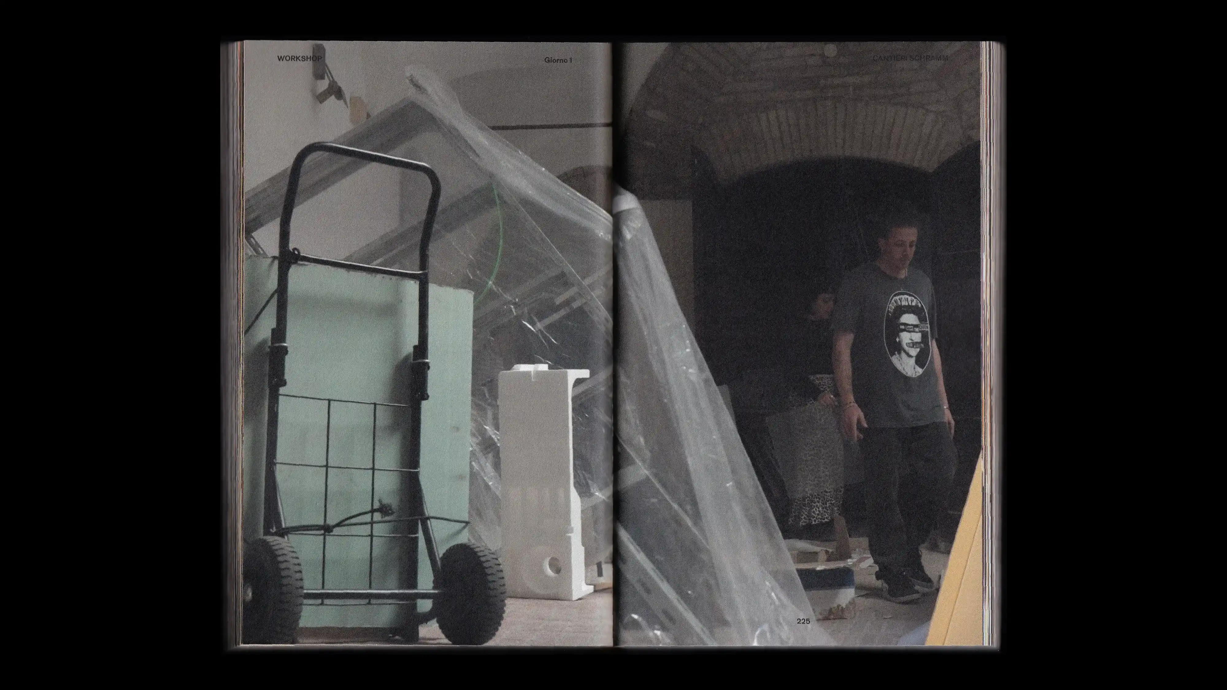
CANTIERI SCHRAMM
2024
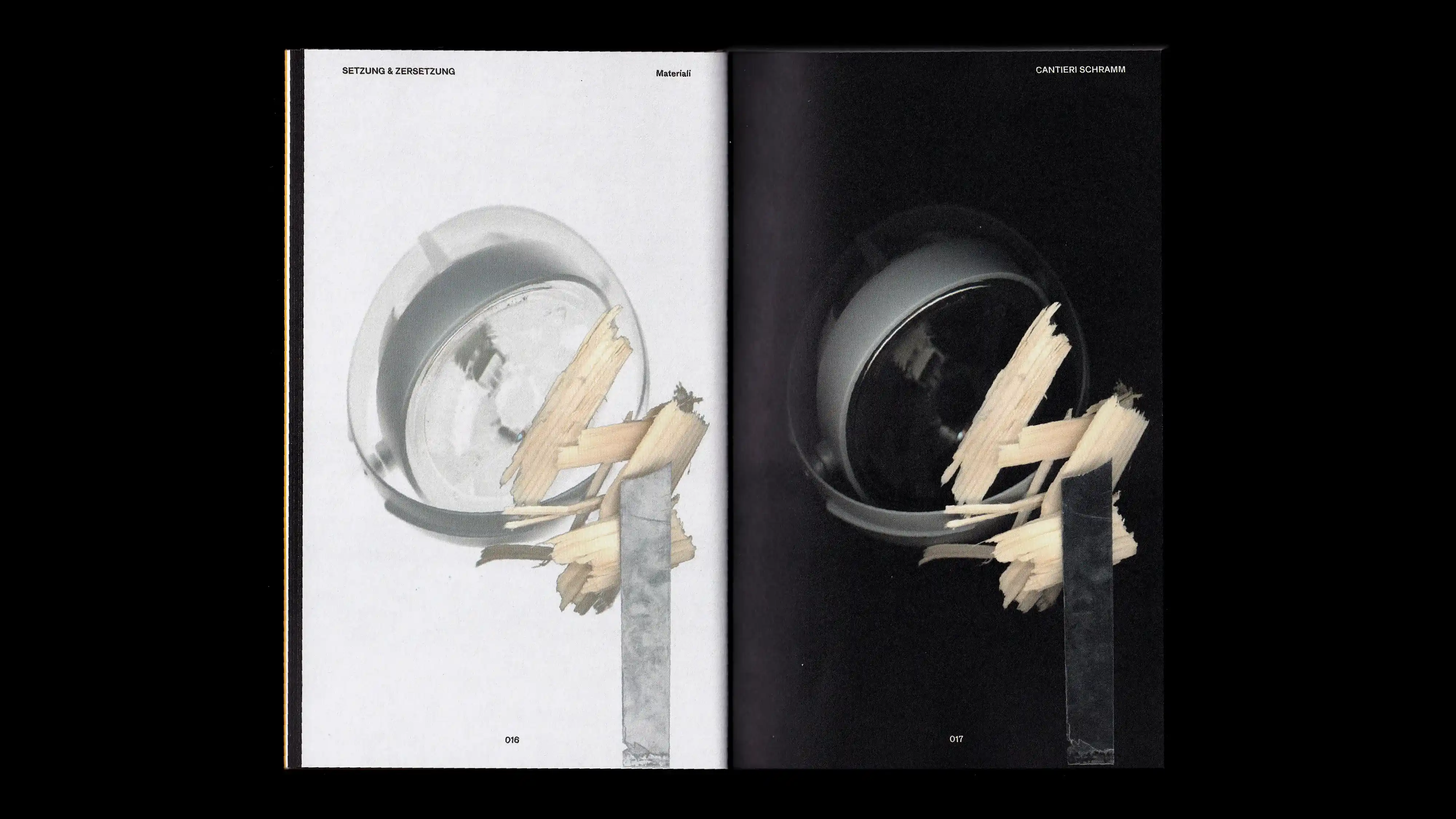
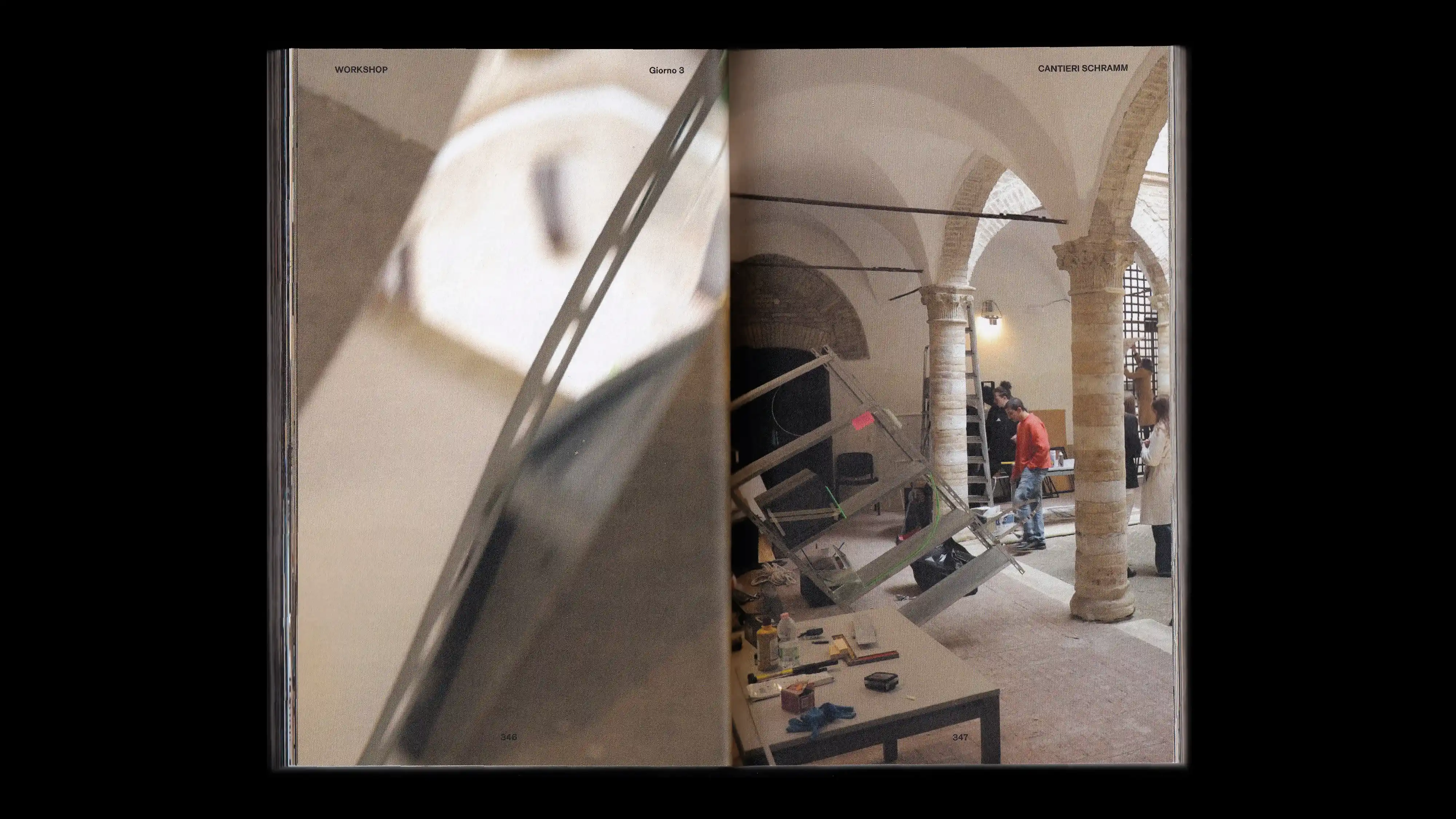
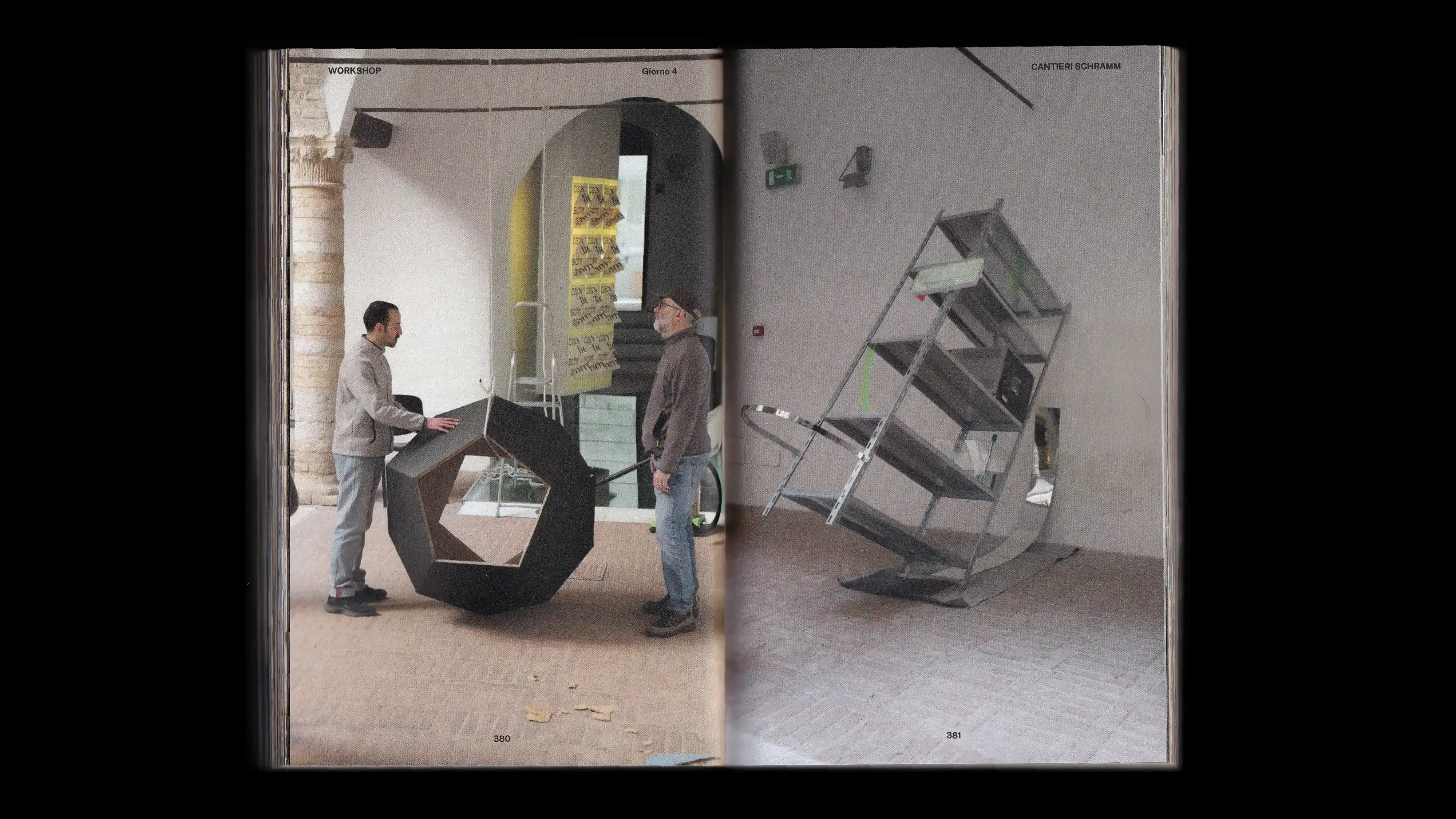
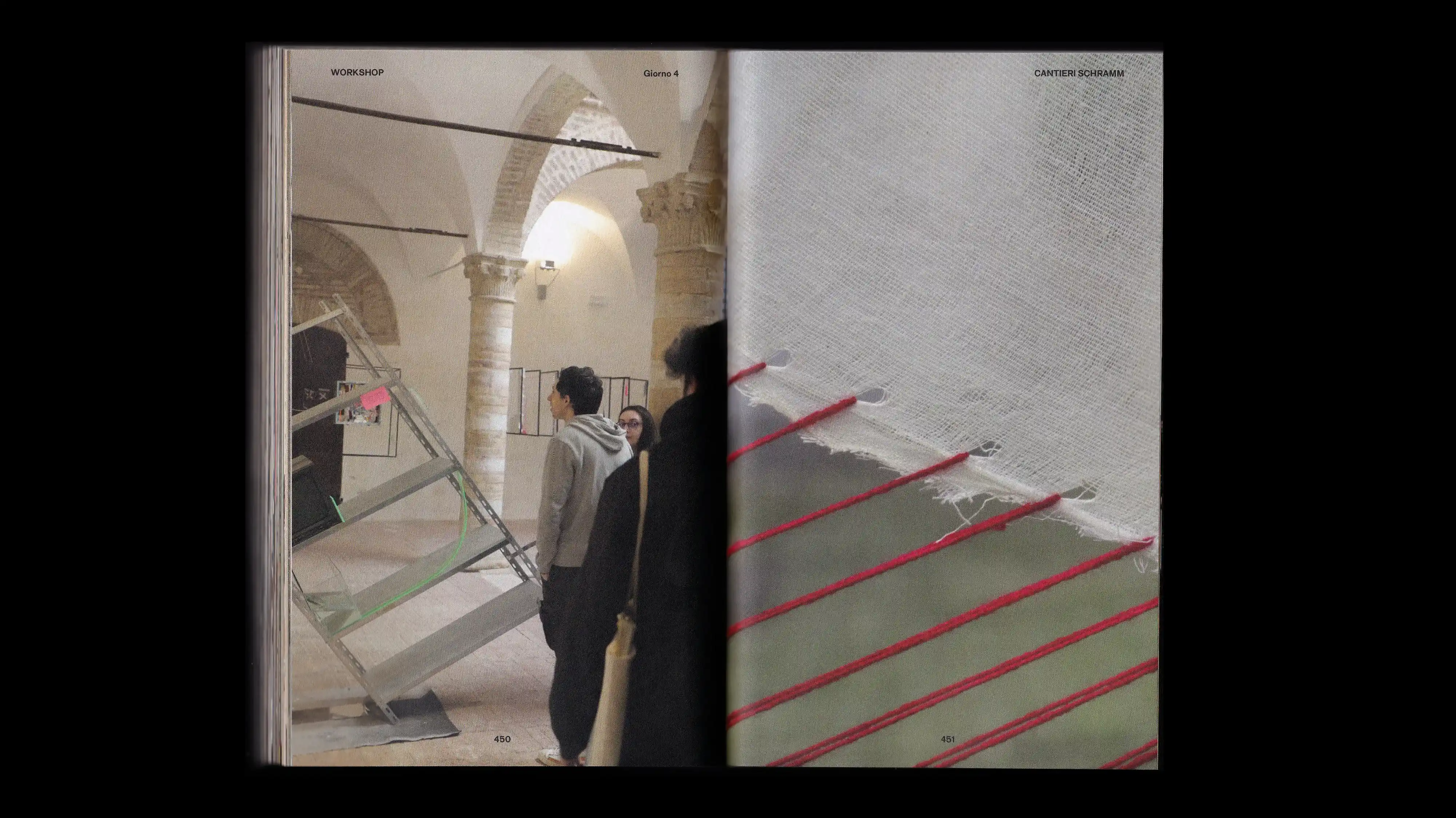
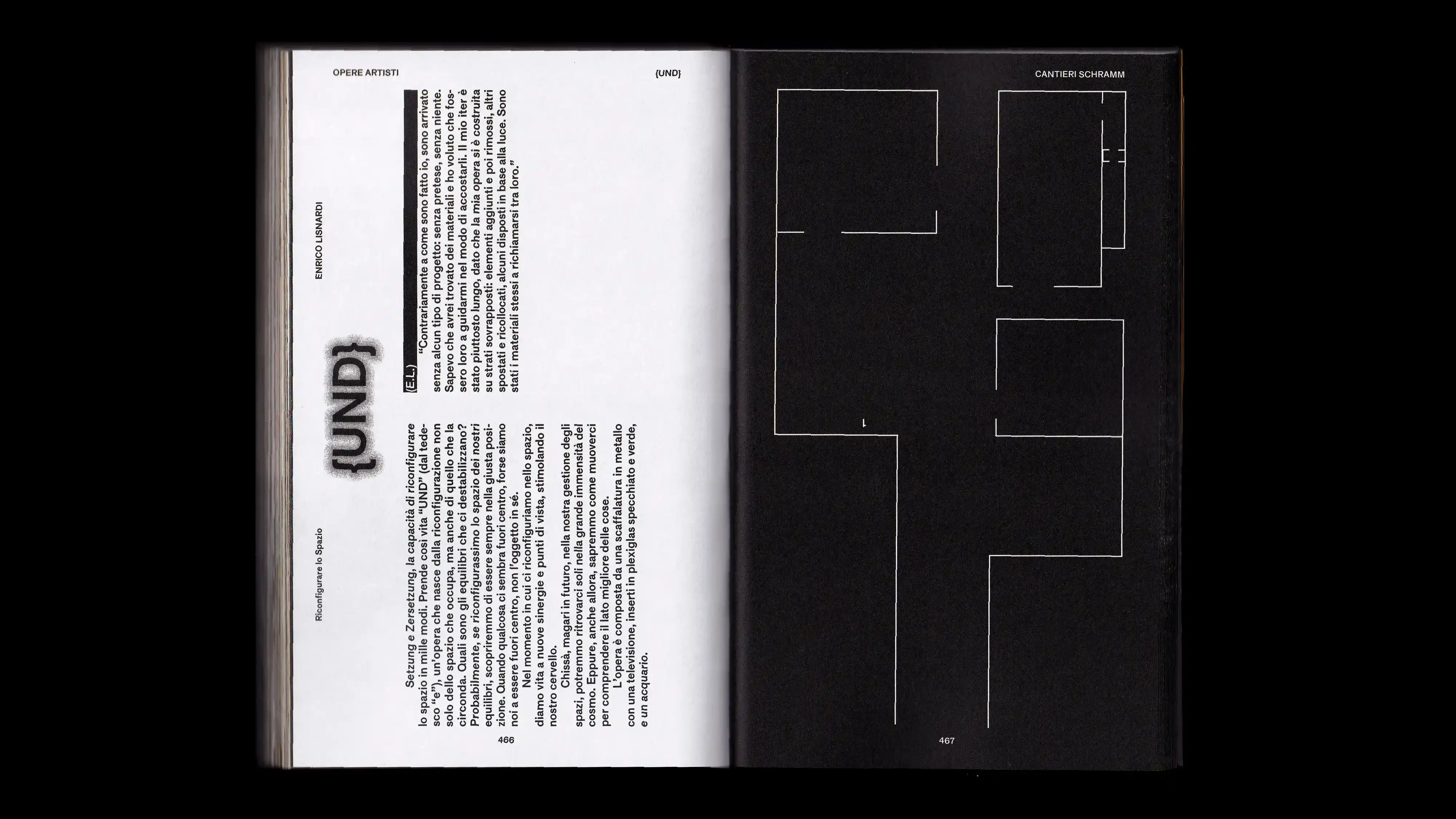
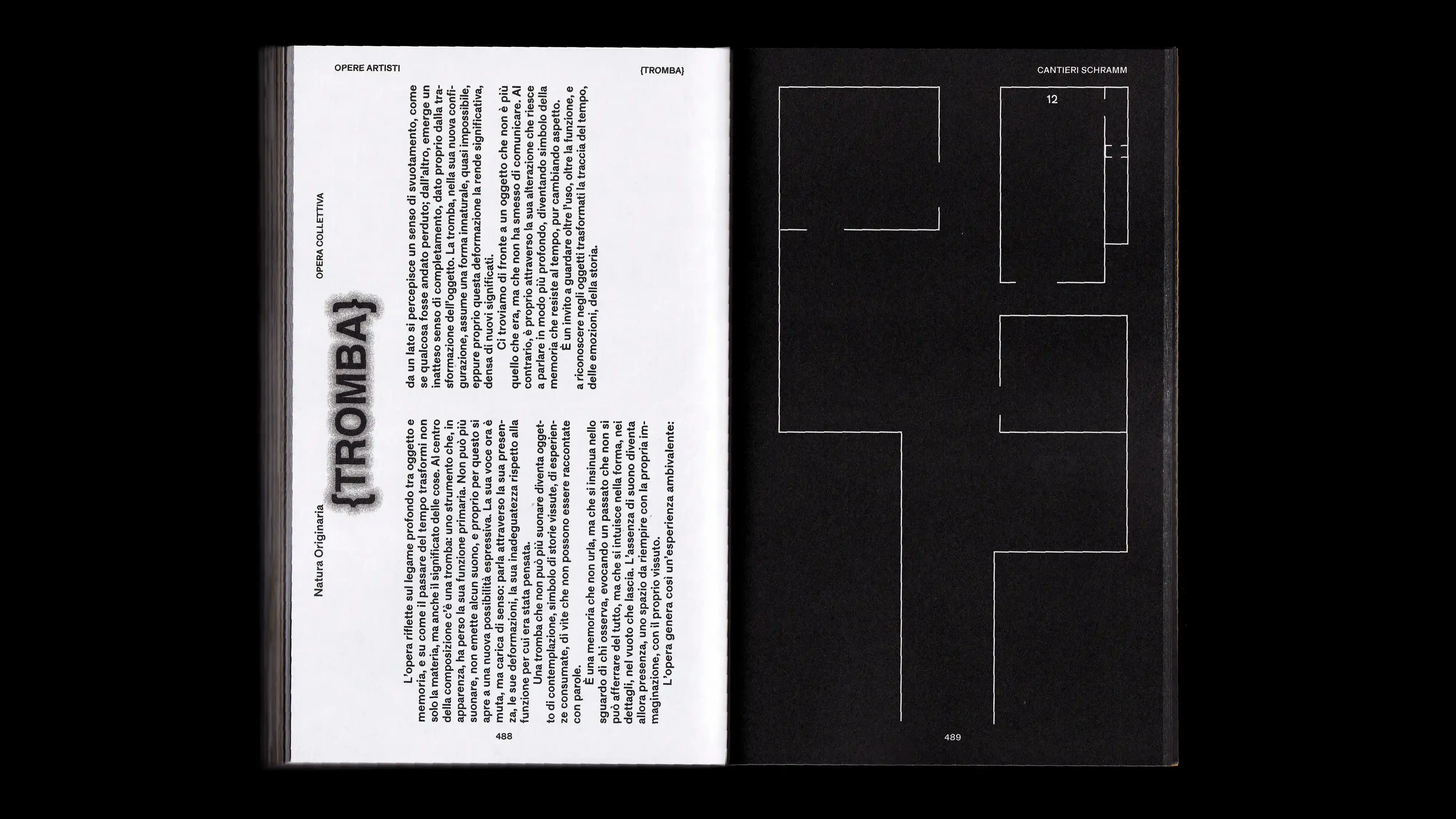
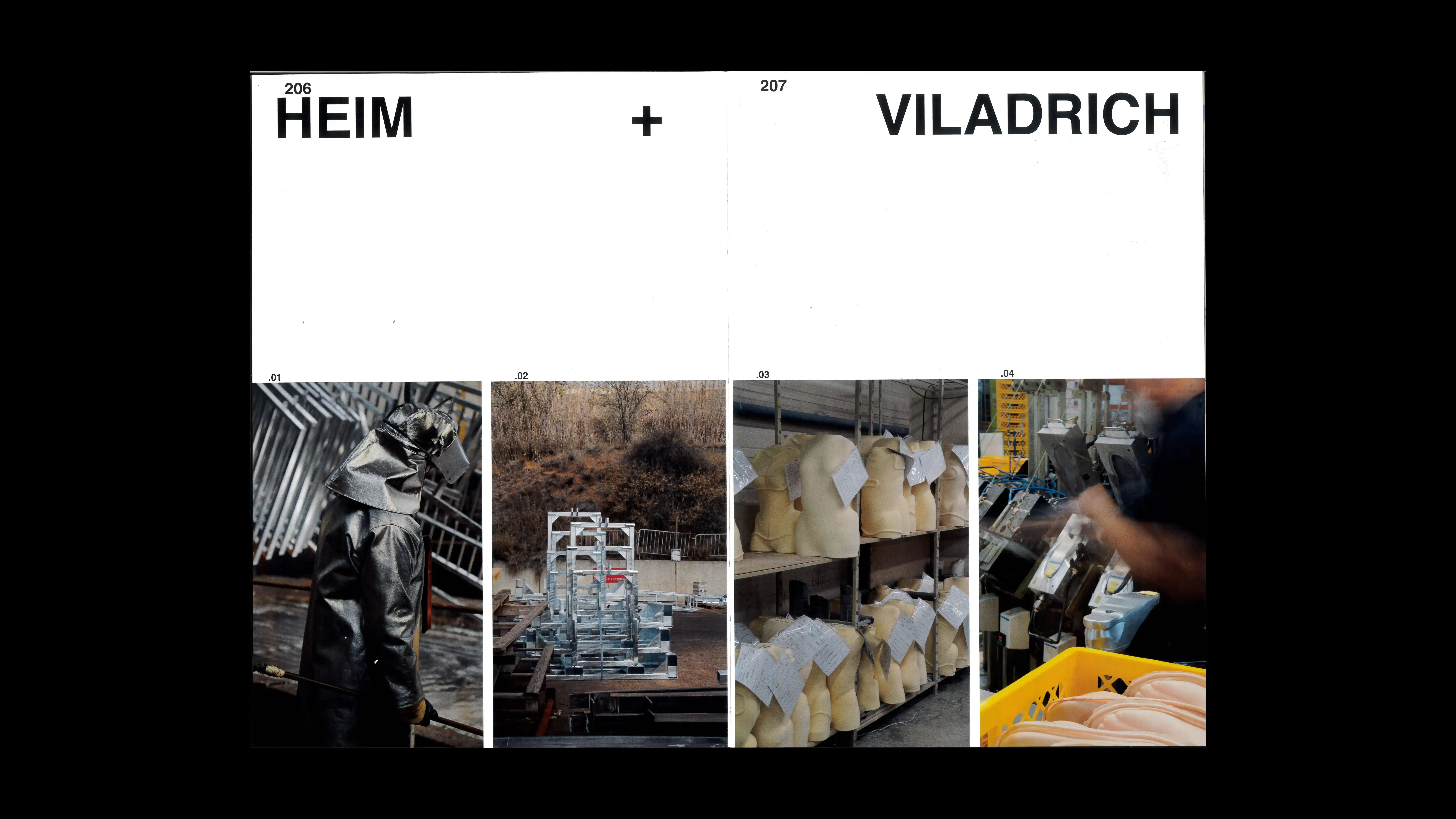
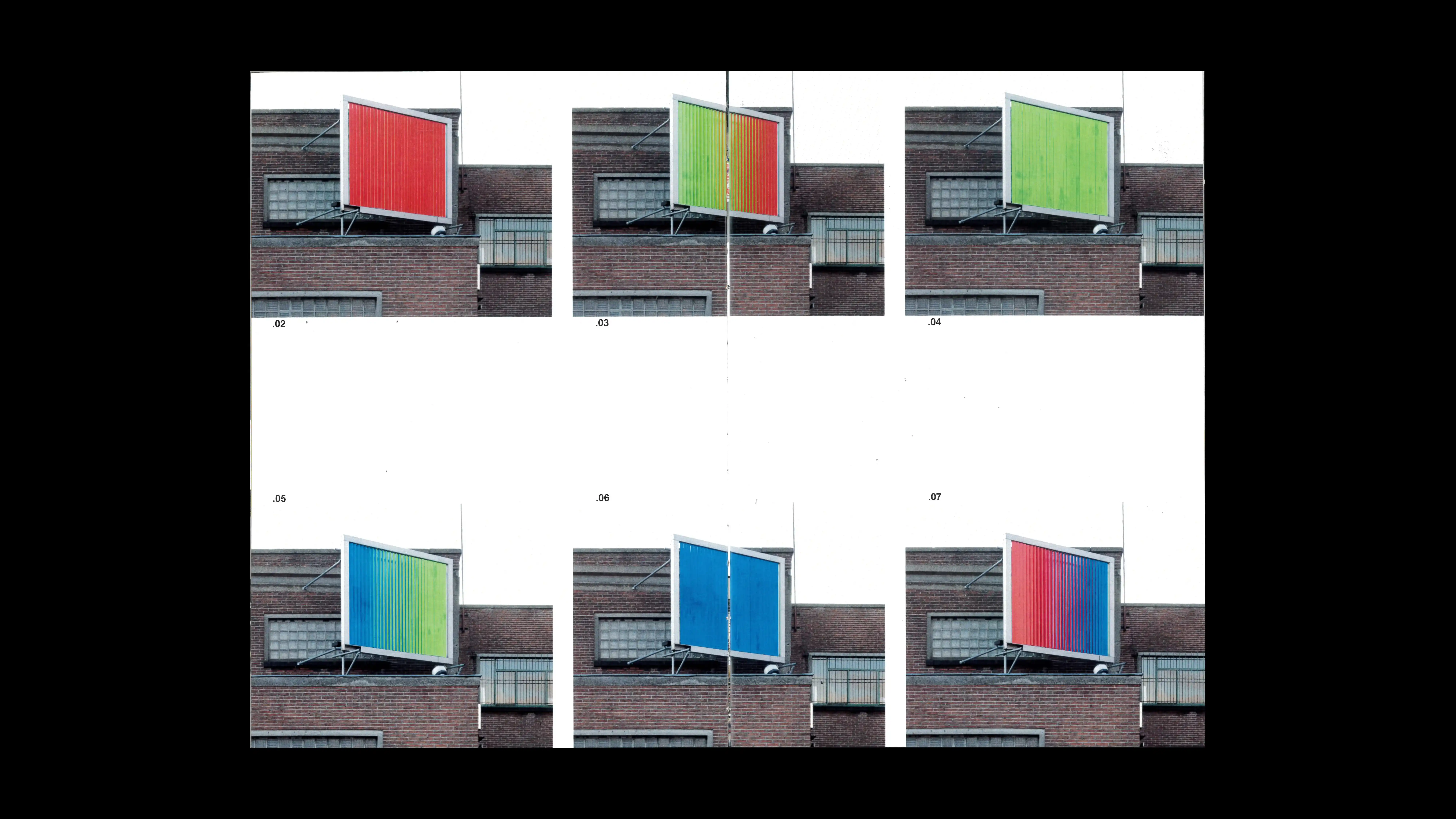
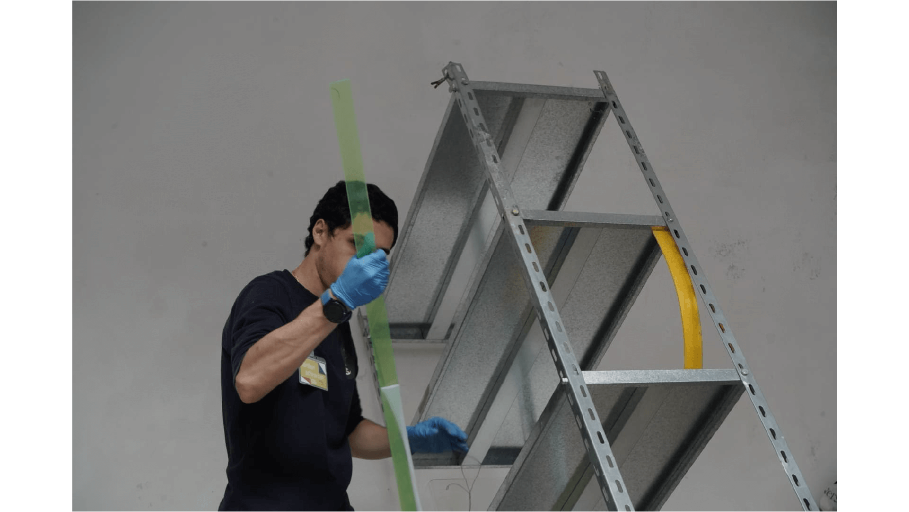
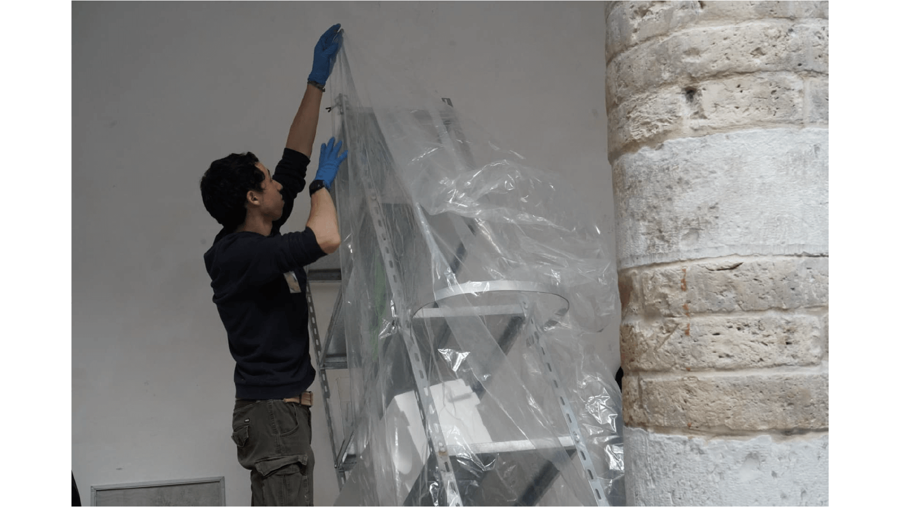
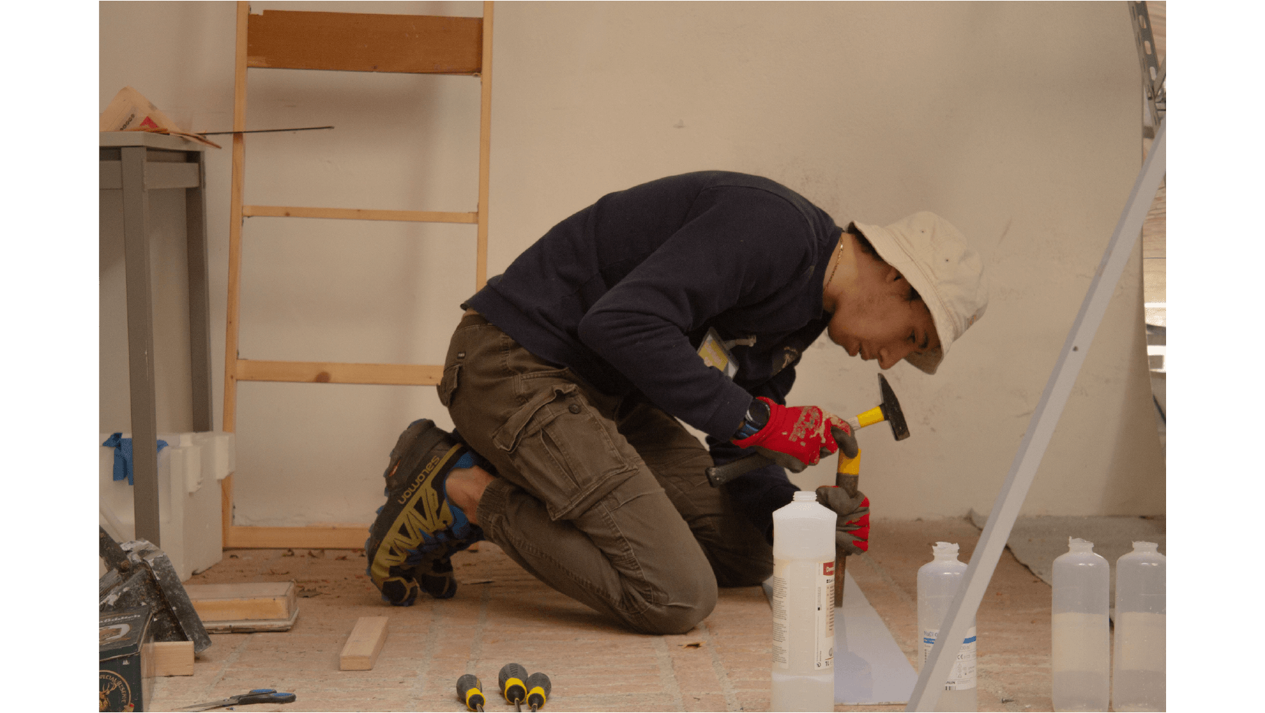
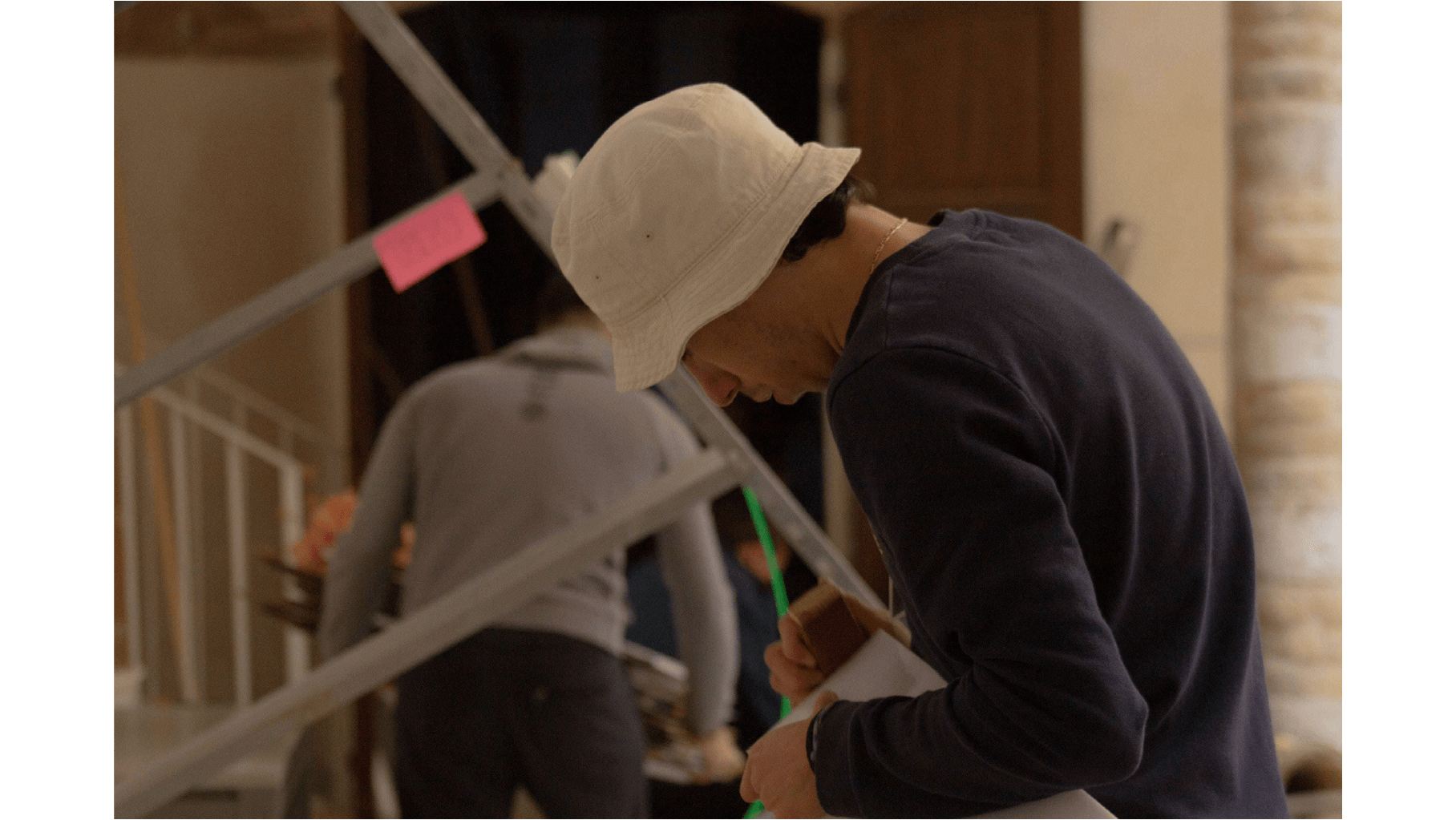
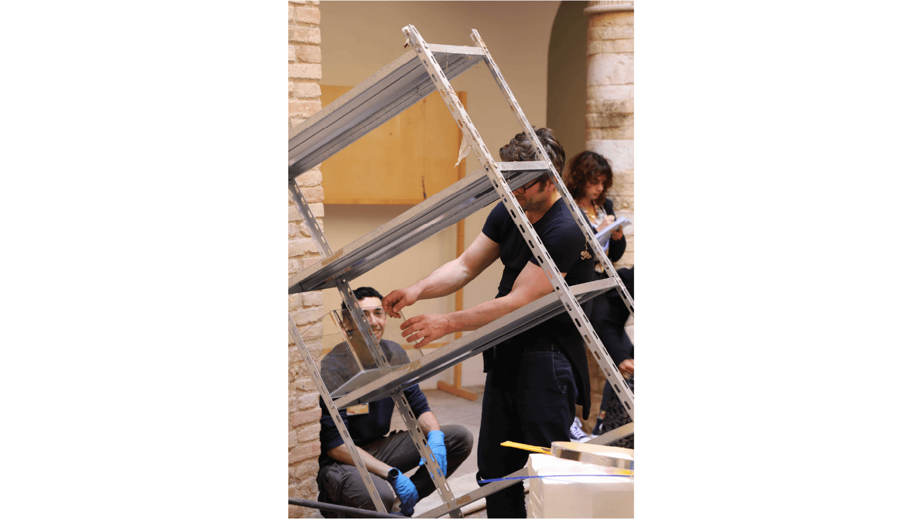
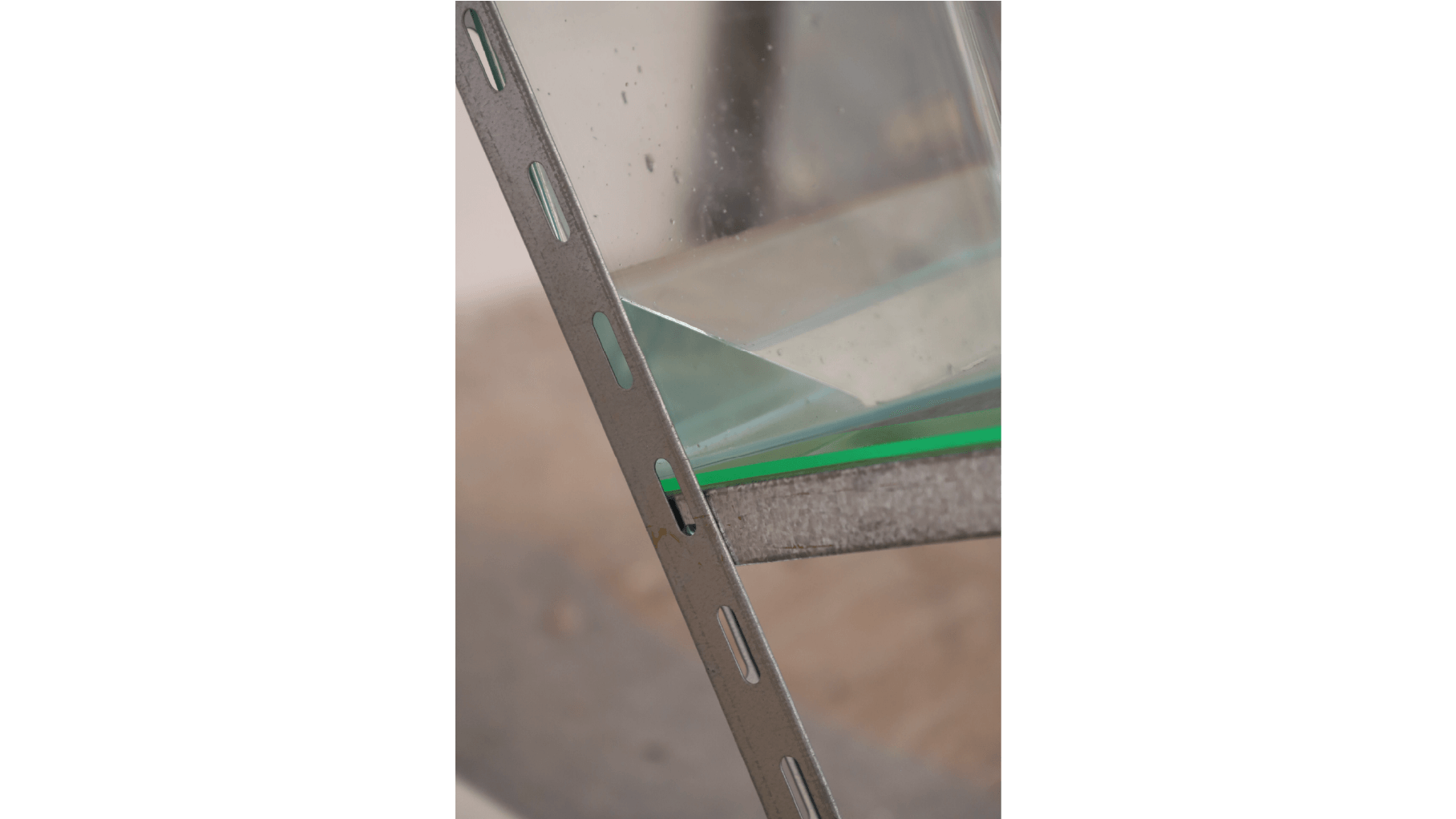
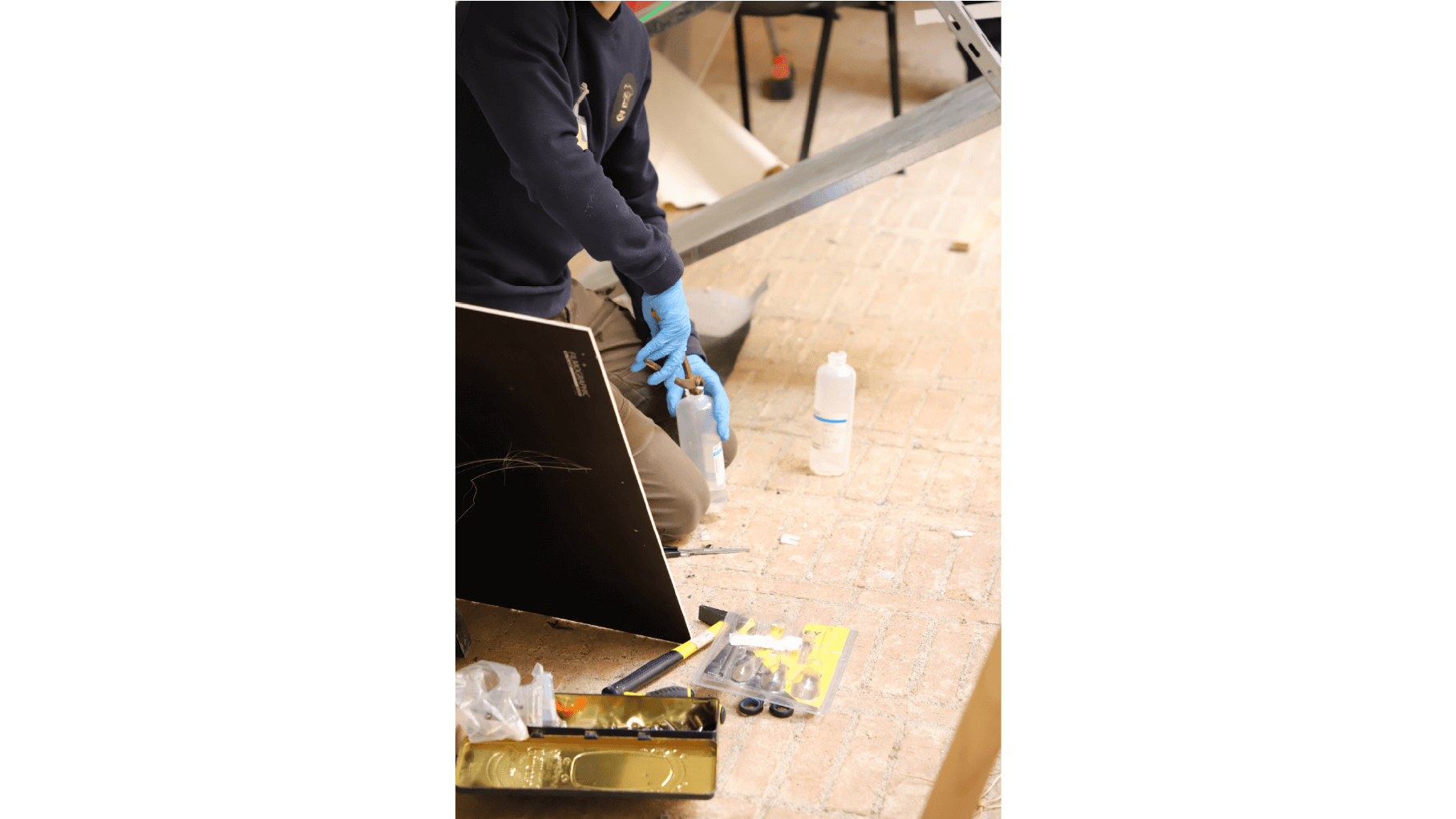
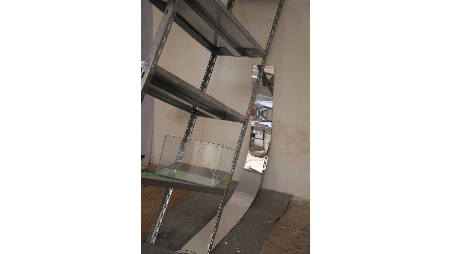
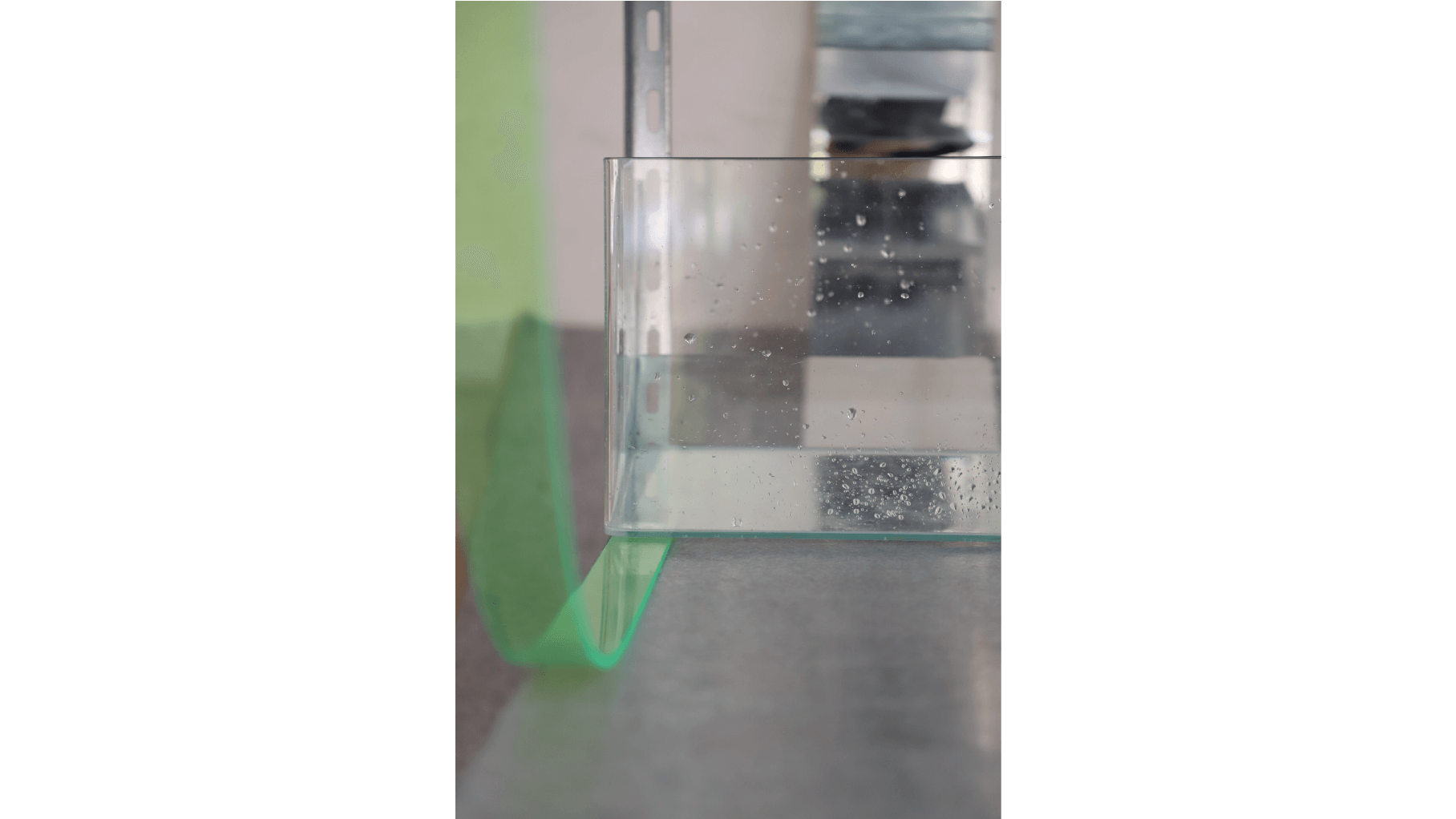
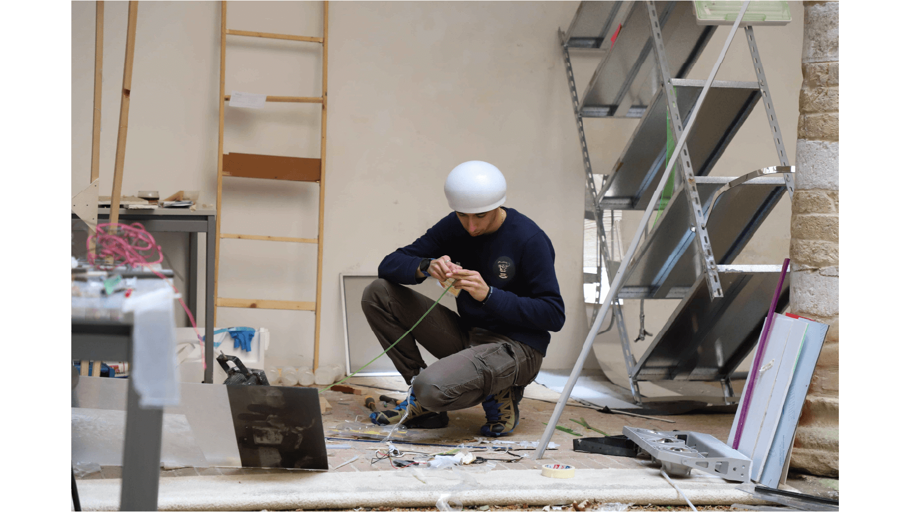
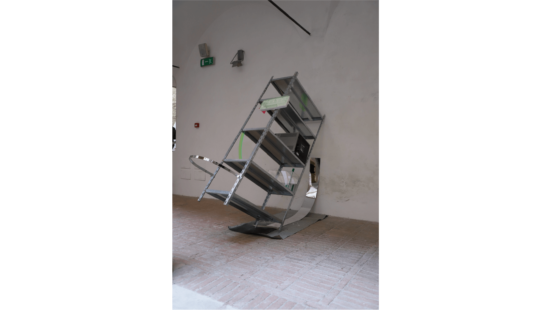
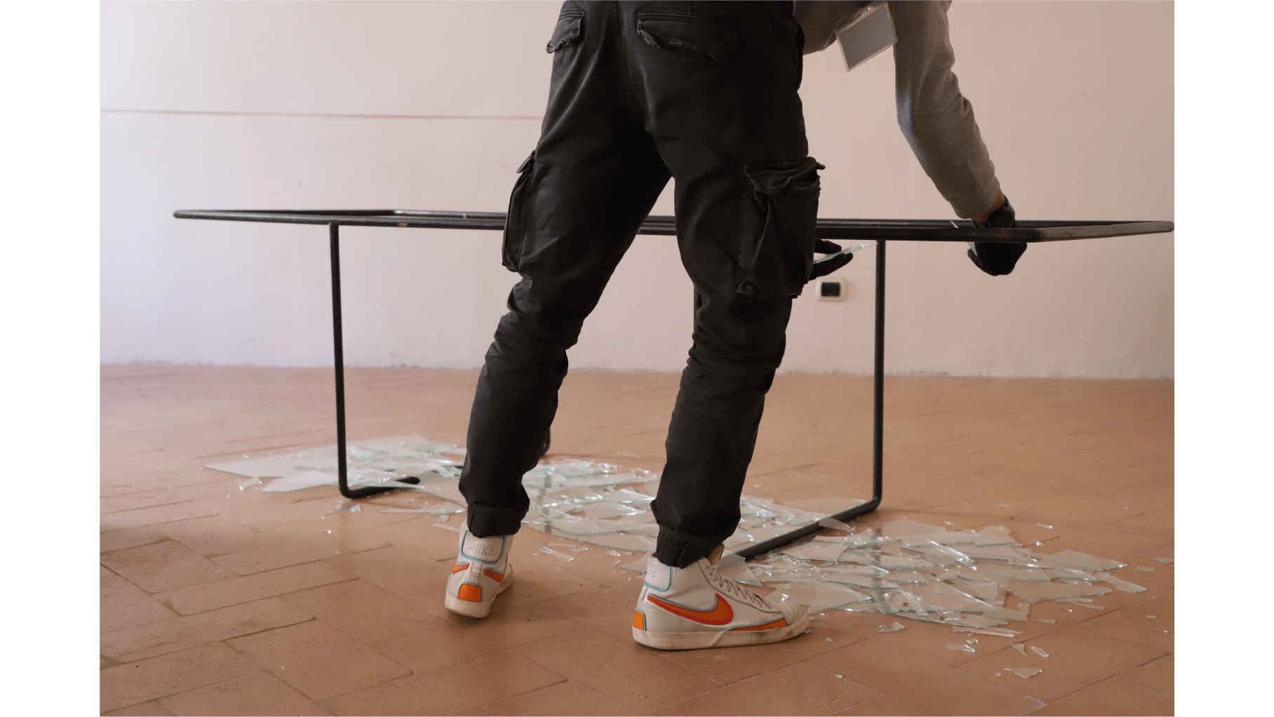
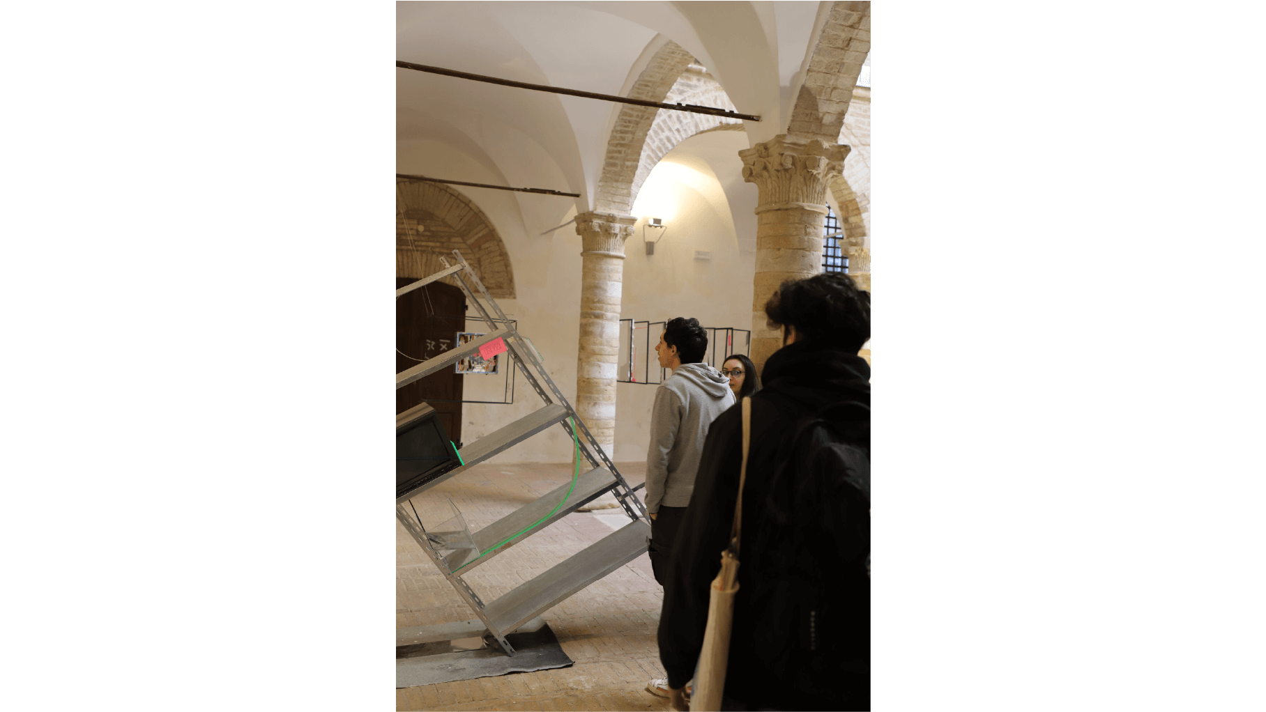
PROJECT Object Design CONTEXT ABA_U DESCRIPTION Setzung and Zersetzung: the ability to reconfigure space in infinite ways. From this idea comes “UND” (German for "is"), a work that is not simply an arrangement of objects, but a complex organism in which every element is part of a living system. Metal, plexiglass, glass, water — each material carries a distinct identity and plays a role that becomes evident only when it enters into dialogue with the others. There is no hierarchy among the parts: every element is essential, and at the same time dependent on the others, to bring the work to life in its entirety. “UND” does not merely occupy space; it redefines it, reshaping the perception of everything around it. The relationship between the parts creates an unstable, dynamic balance — a constant play of forces where even the smallest shift can transform the entire arrangement. In this instability lies the true strength of the work: it compels us to rethink our position, to move in search of a new perspective, to question what we consider “center” and “periphery.” When we reconfigure ourselves within the space of the work, we become part of its creative process: our gaze, our movement, our presence alter the way it is perceived. In this way, the connections between the elements are never static but constantly evolving, generating new configurations again and again. Perhaps, in the future, we will find ourselves alone in the vastness of space. Yet even then, the ability to move, to rebuild relationships, and to redefine our surroundings will remain the one true tool for discovering — and rediscovering — the best side of things. OBJECT Und: metal shelving with television, mirrored green plexiglass inserts, and aquarium; Car Wash: movable curtain with plexiglass components; Tabula Rasa: iron structure shaped like a table with shattered glass on the floor.
1 (OF) 12
07
KOKOROZASHI
2024
PROJECT Book Design CONTEXT ABA_U DESCRIPTION Kokorozashi is a Japanese expression meaning “direction of the heart,” encompassing ideas such as determination, sincerity, and willpower. From this term, I developed a photographic-editorial project composed of 97 unpublished images of portions of the sky, partly pure and partly digitally manipulated. I chose the sky as my subject for its universality and its ability to evoke different perceptions, memories, and emotional states. Photographing it means capturing a fragment of time that inevitably becomes the past, only to return in the future under a new light, transforming into memory and visual testimony. The project takes shape in a counter-bound book using the Japanese quartino technique: the images are not immediately visible but hidden within the folds of the pages. On the outside, only technical details remain — file name, size, color space — making consultation a physical act of discovery.
1 (OF) 12
06
UNLESS WORD
2024
PROJECT Book Design CONTEXT ABA_U DESCRIPTION Issue 0 was conceived as an experimental edition exploring the concept of creation, bringing together books and texts on art, history, and design. Its goal is to encourage reflection on what it means to “create” today, offering a space that acts as a virtual workshop for designers and creatives. The structure is intentionally minimal and “raw,” designed to be enriched and personalized by its users. In this way, the volume becomes almost like a personal diary, where each reader can develop and record their own formula for creation, turning the issue into a living, ever-evolving object.
1 (OF) 12
05
FAUSTO 24
2023
PROJECT Art Direction CONTEXT Personal Project DESCRIPTION An A3-format calendar featuring a series of illustrations dedicated to Fausto, the main character of the project. Each month depicts a different moment of his everyday life, turning ordinary situations into a sequence of small visual narratives. Edition One thus represents a first exploration of his universe, where the simplicity of the line and the repetition of recurring elements accompany the passing of time.
1 (OF) 12
04
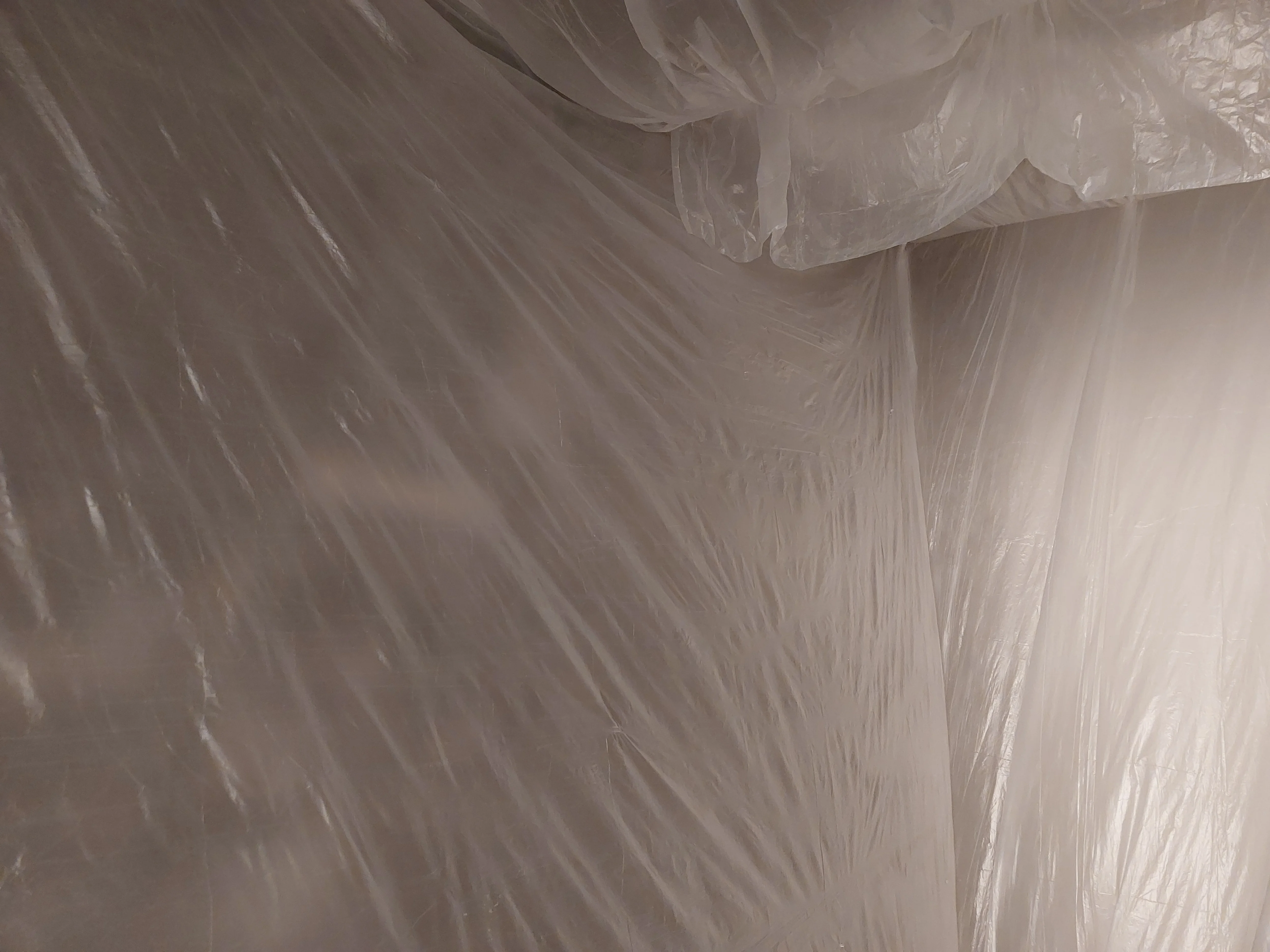
EXTRASTATECRAFTING
2023
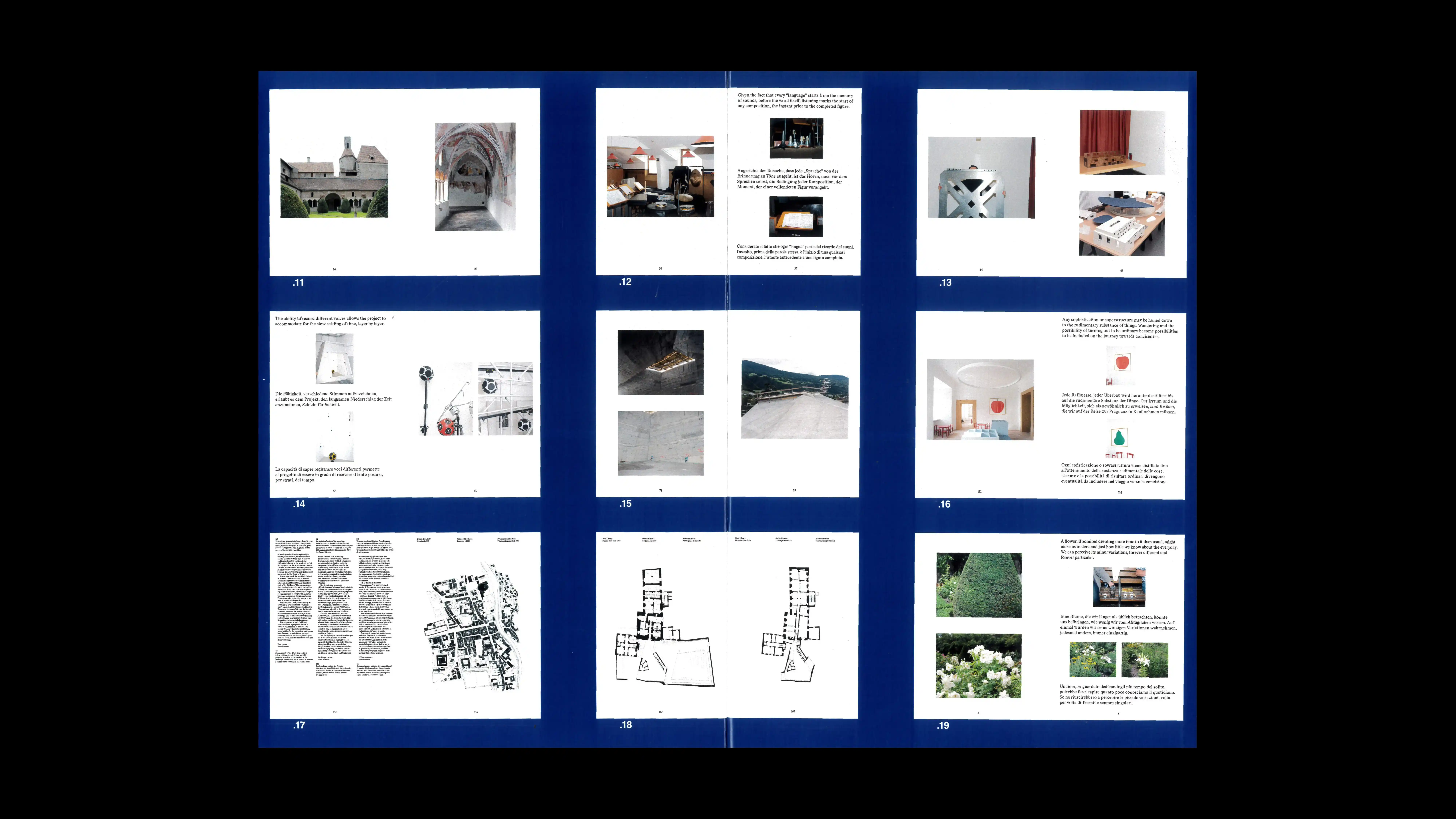
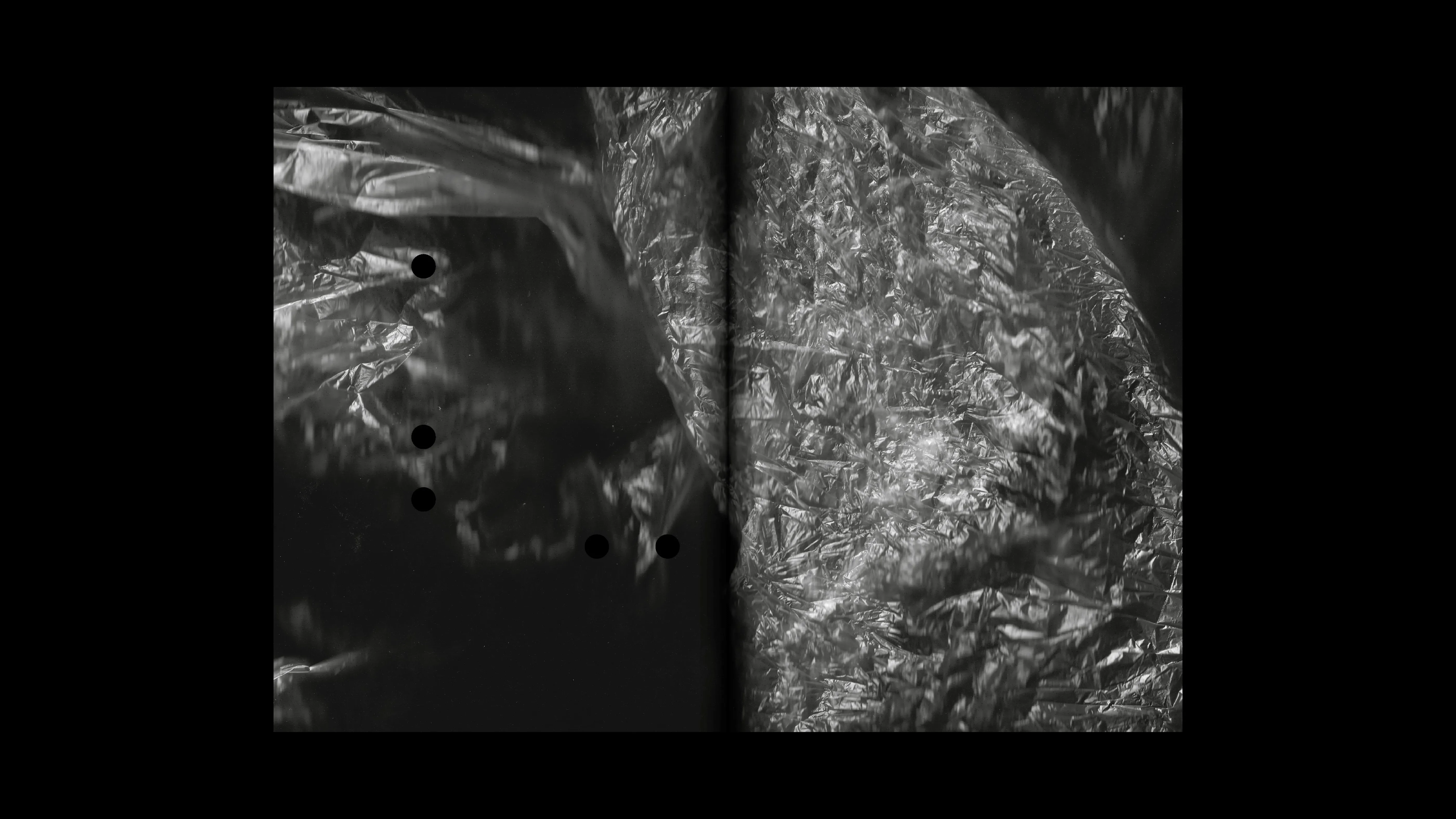
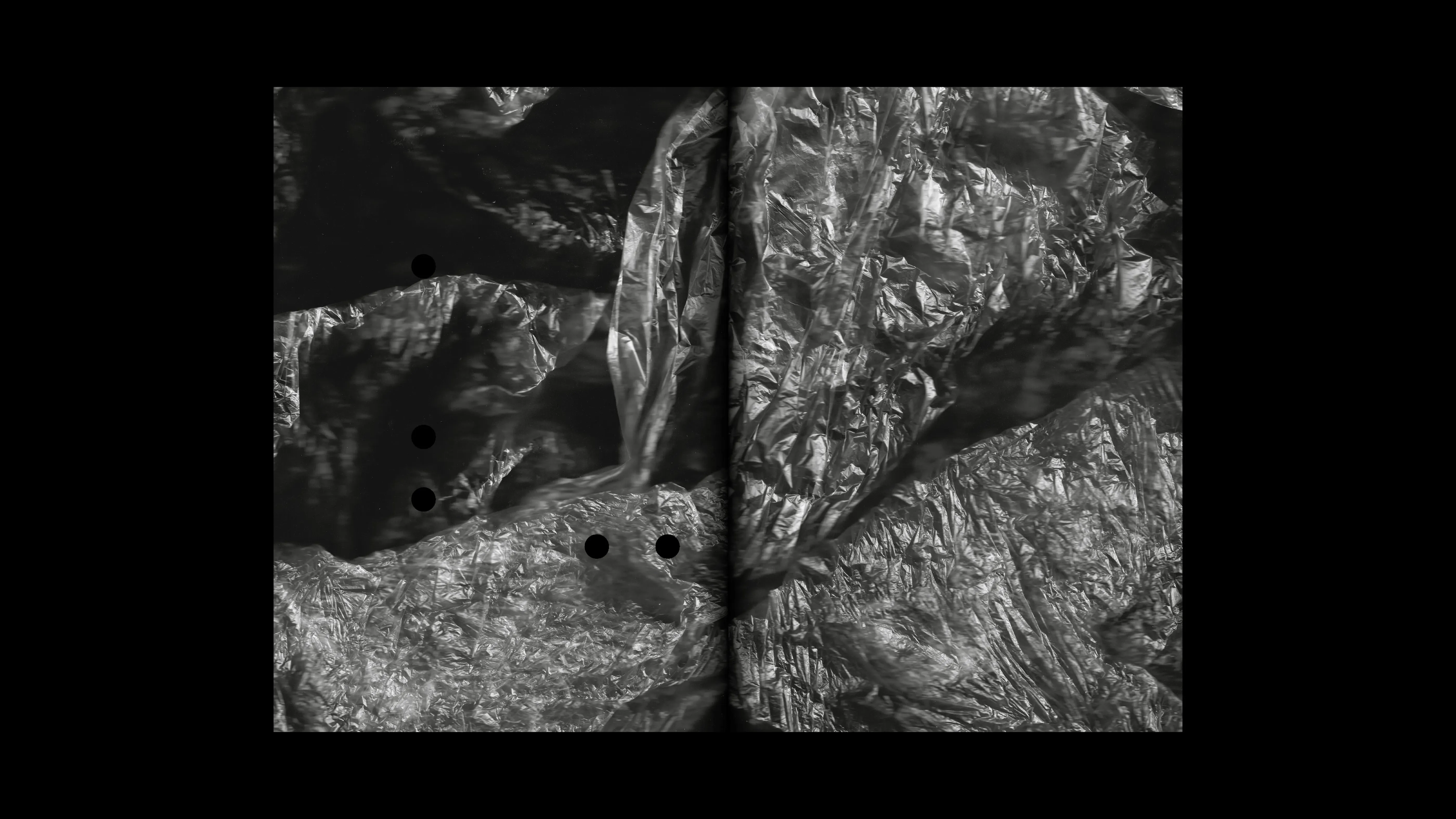
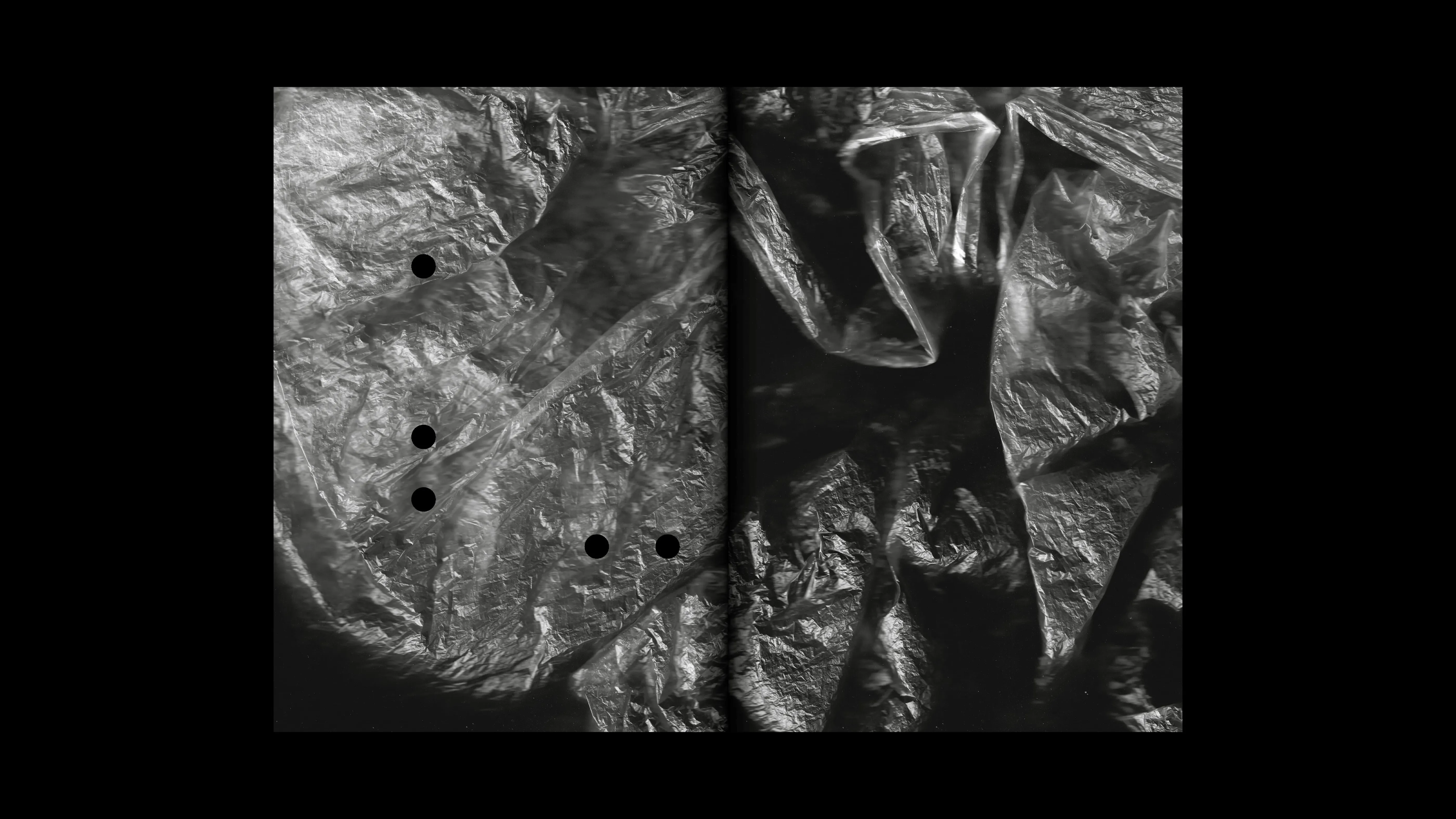
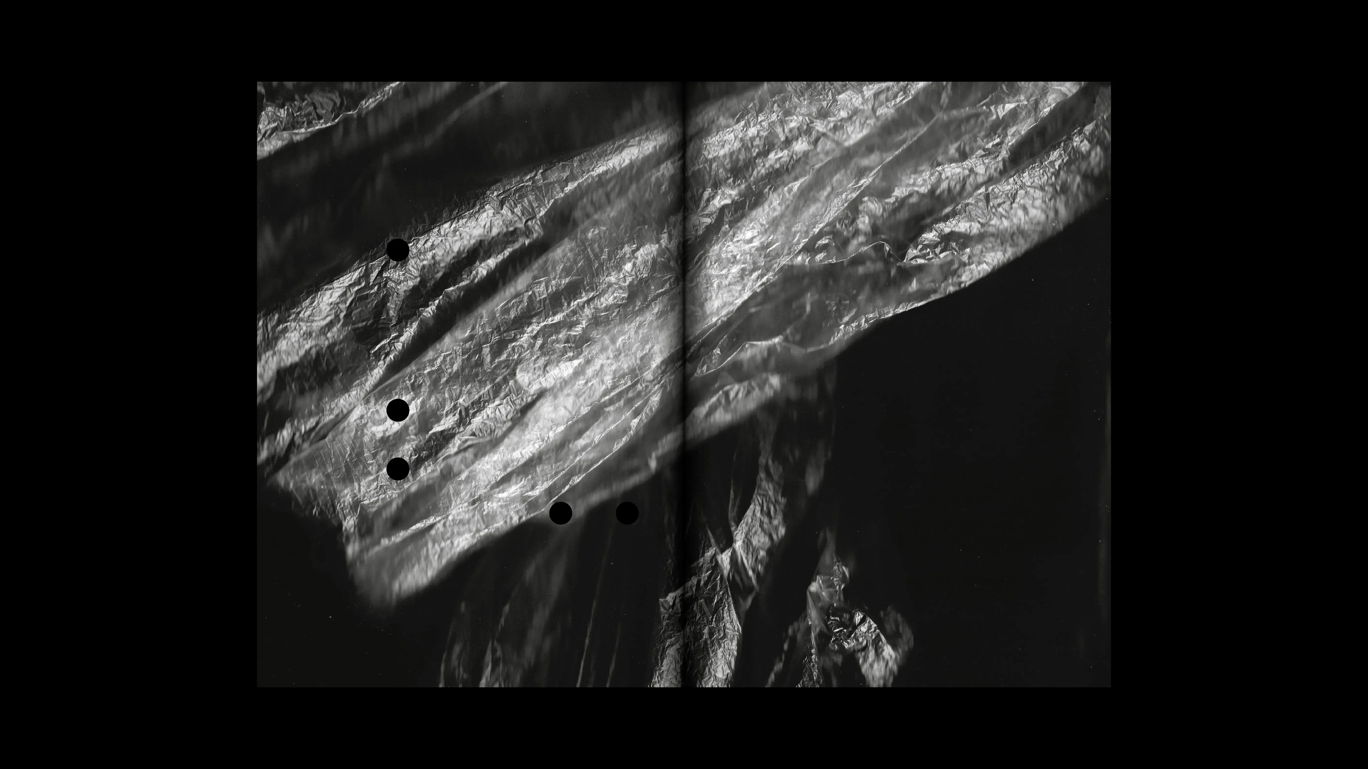
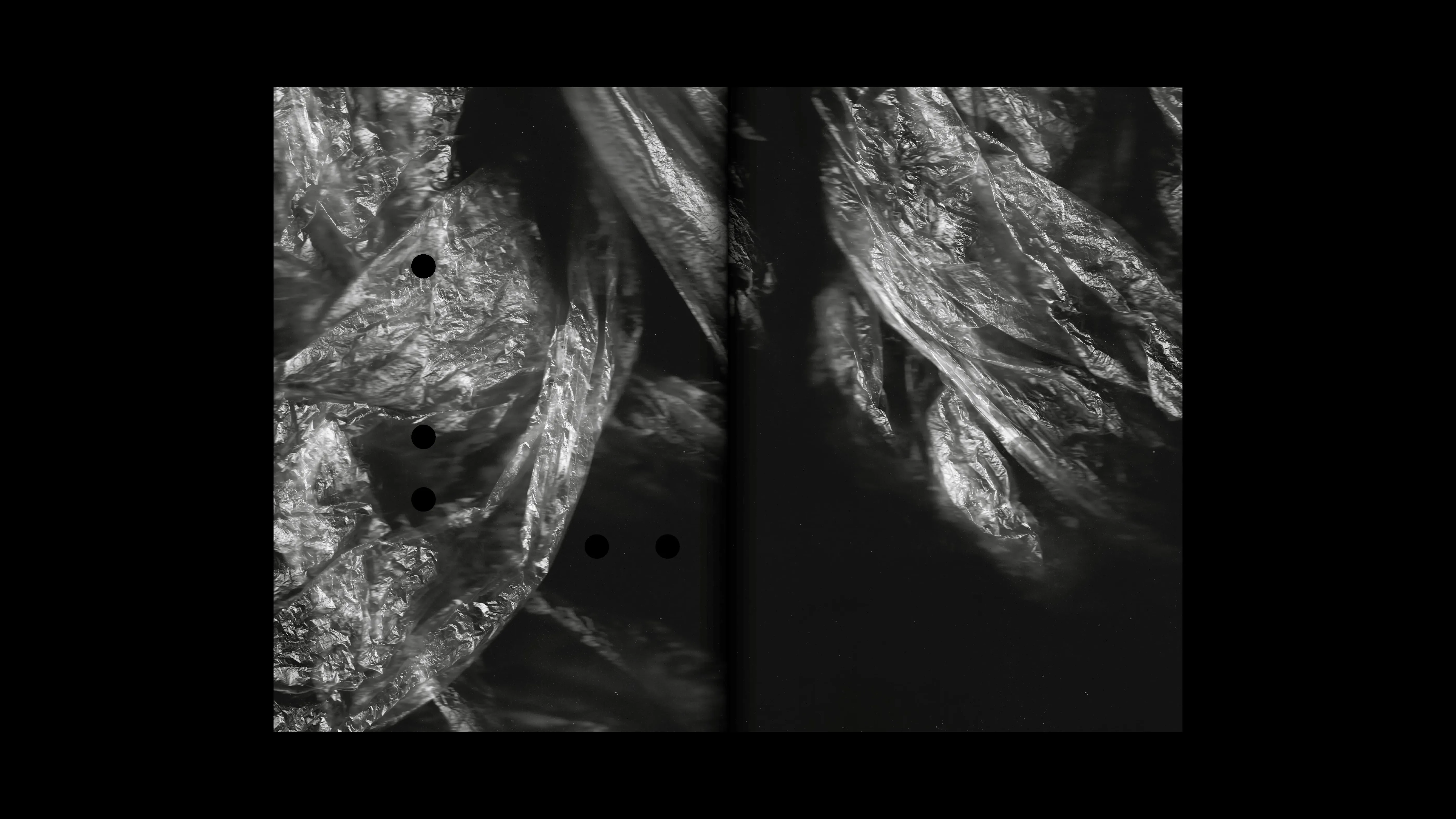
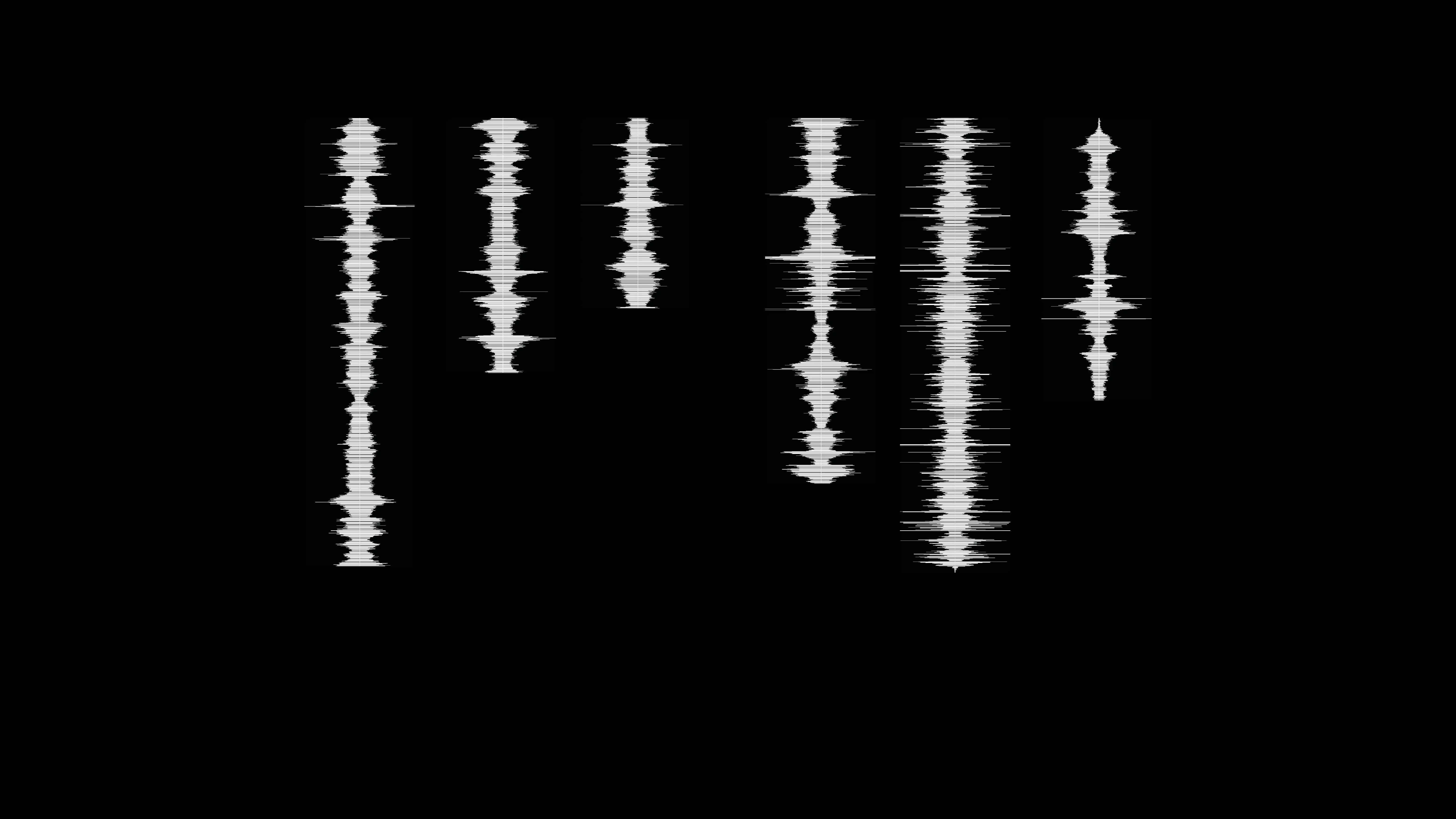
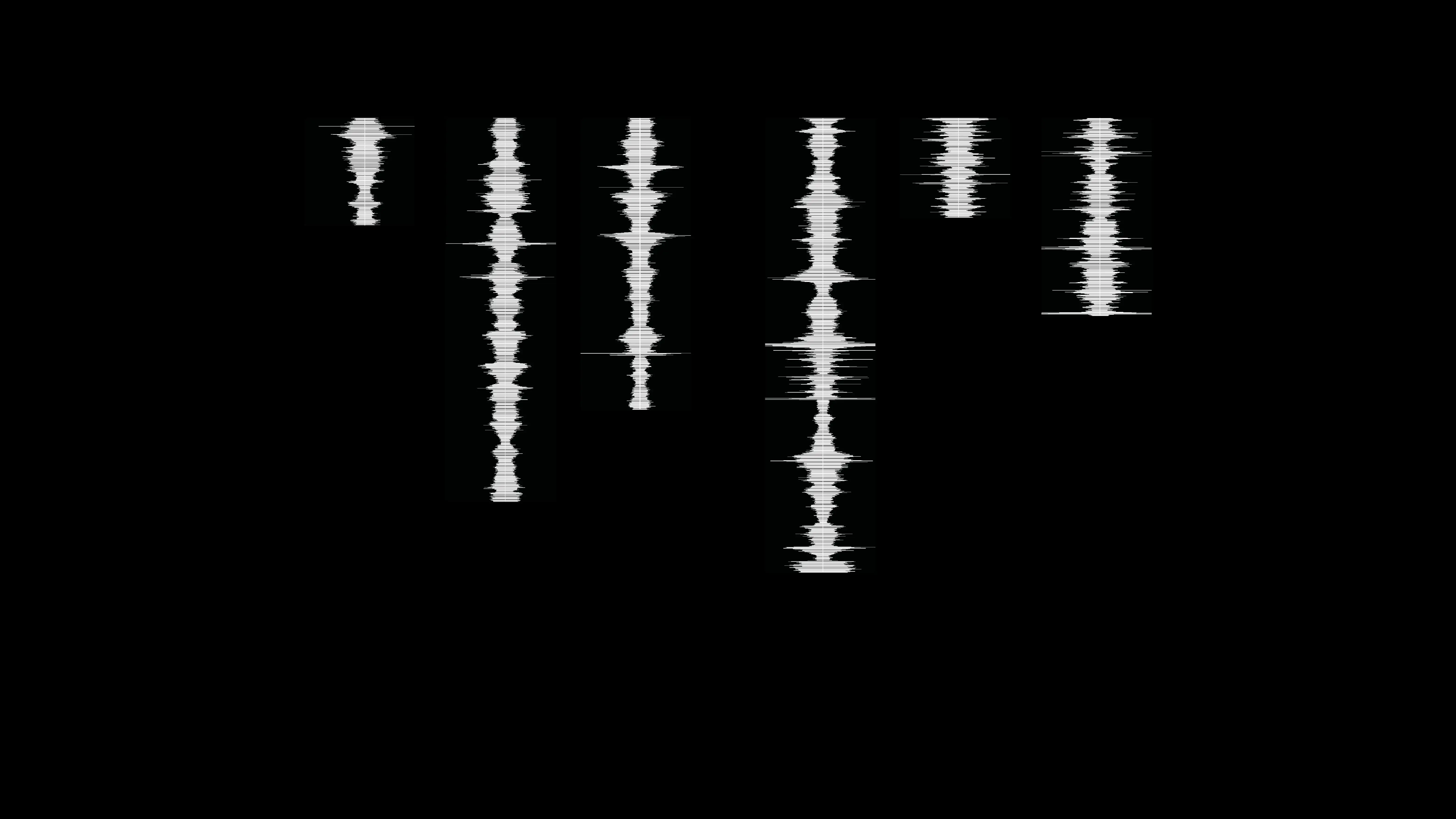
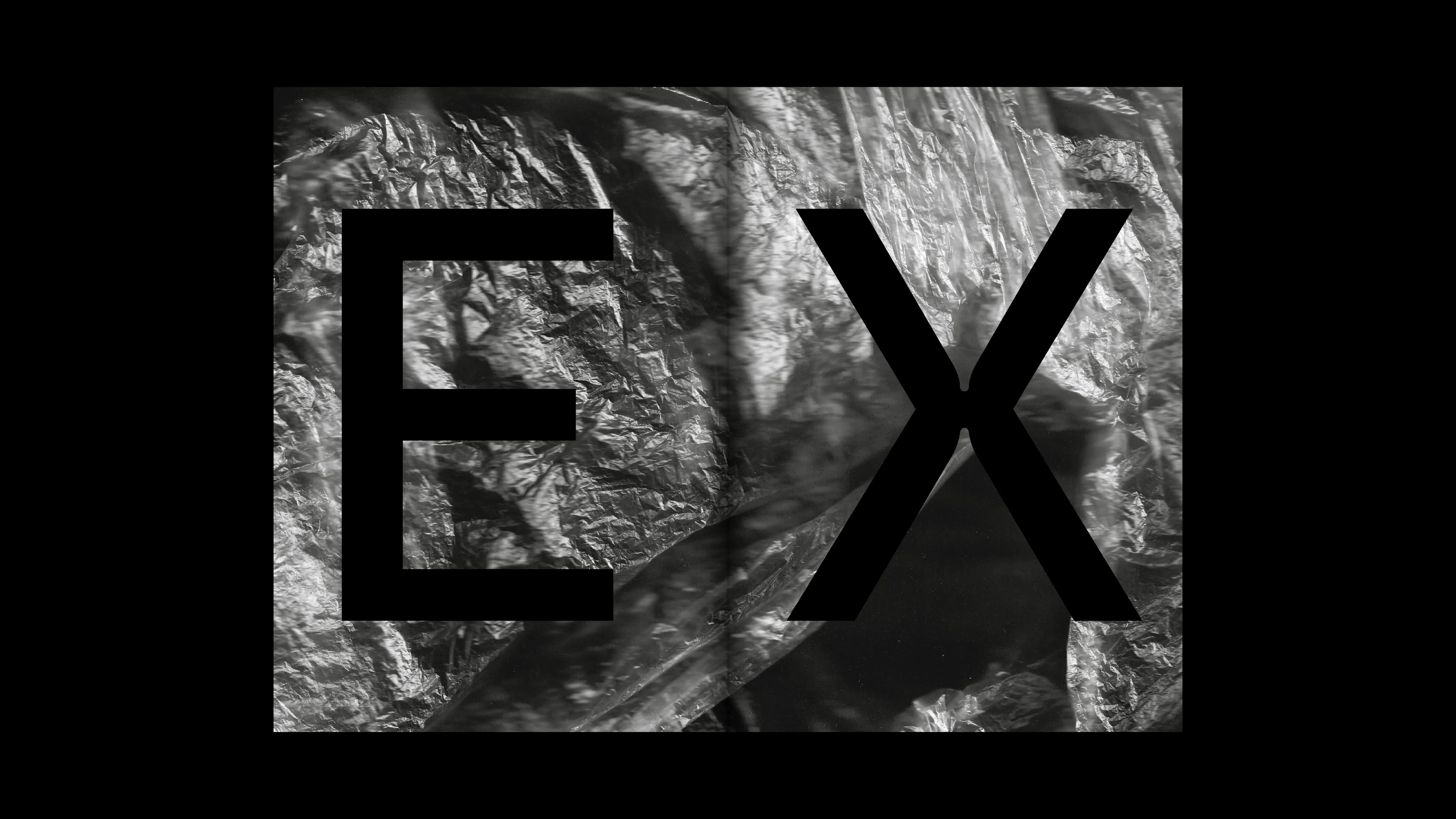
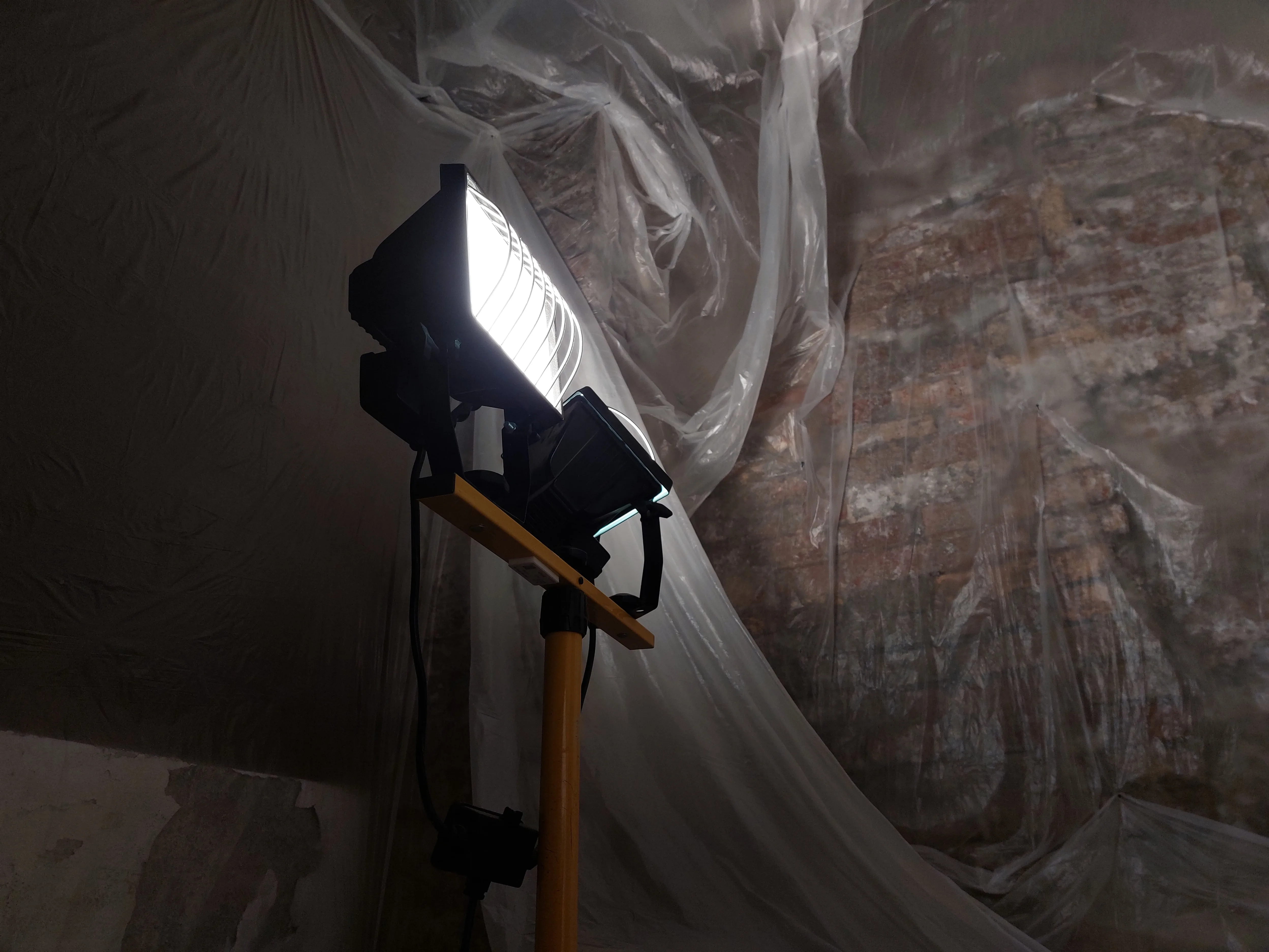
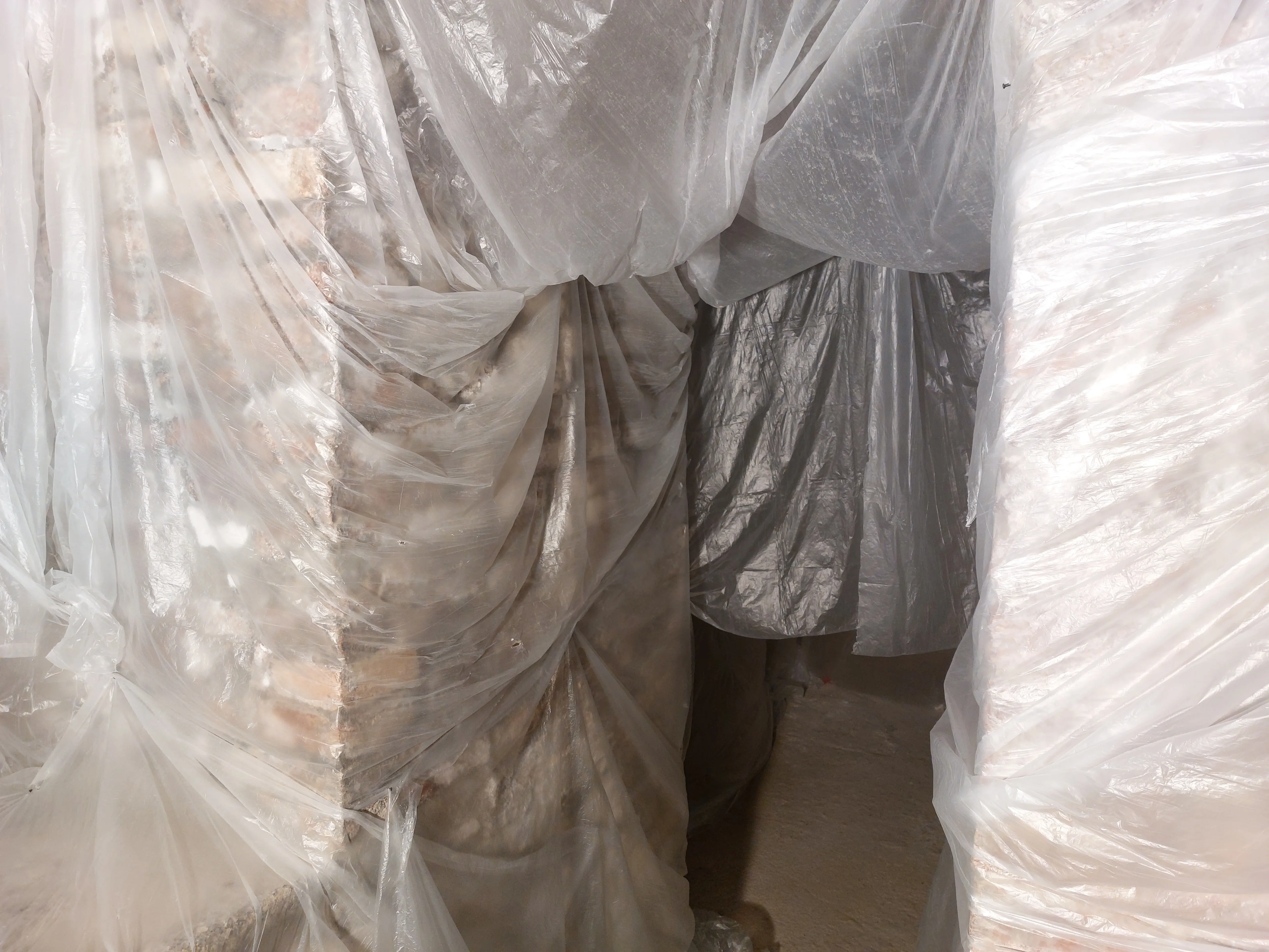
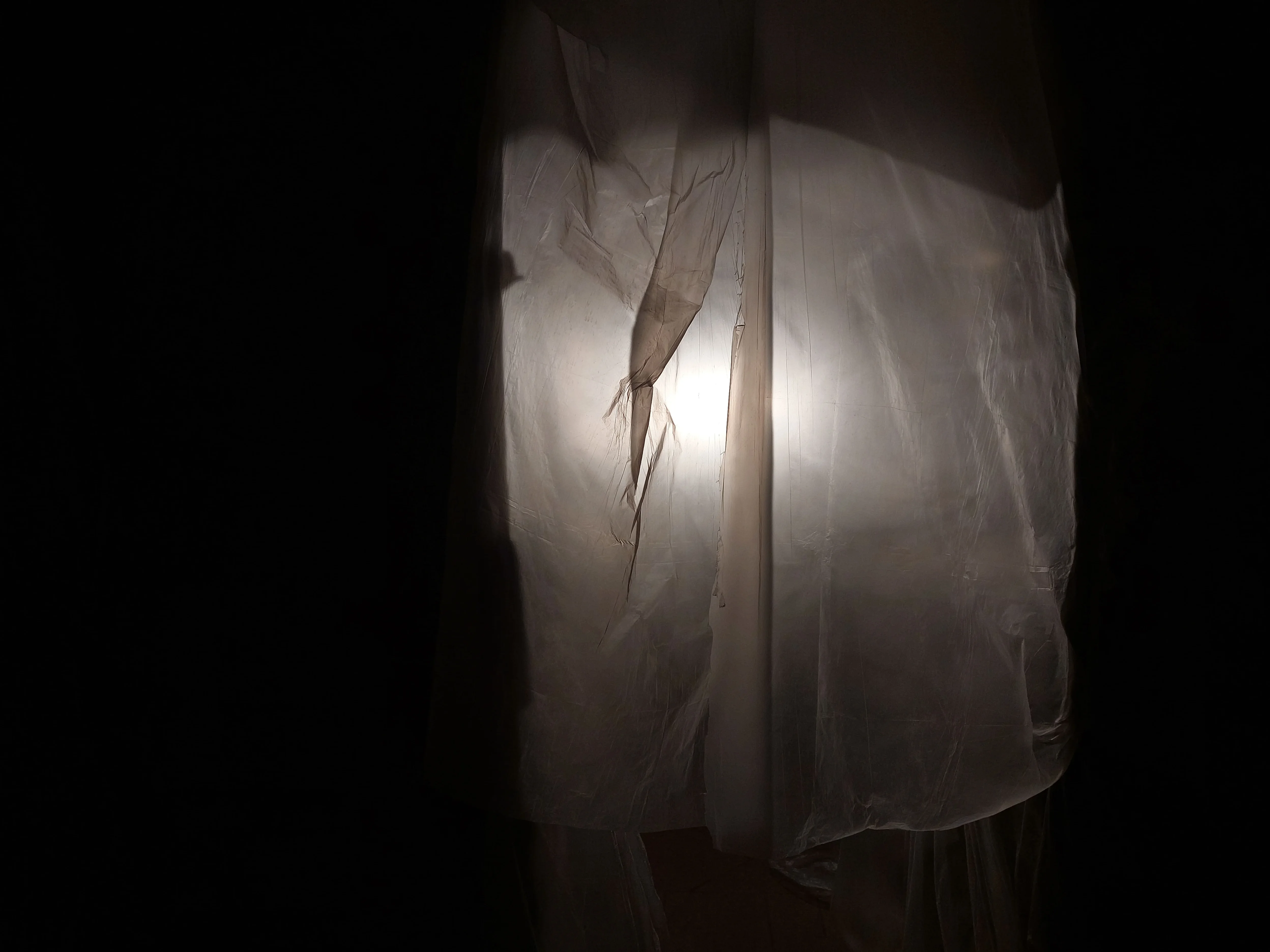
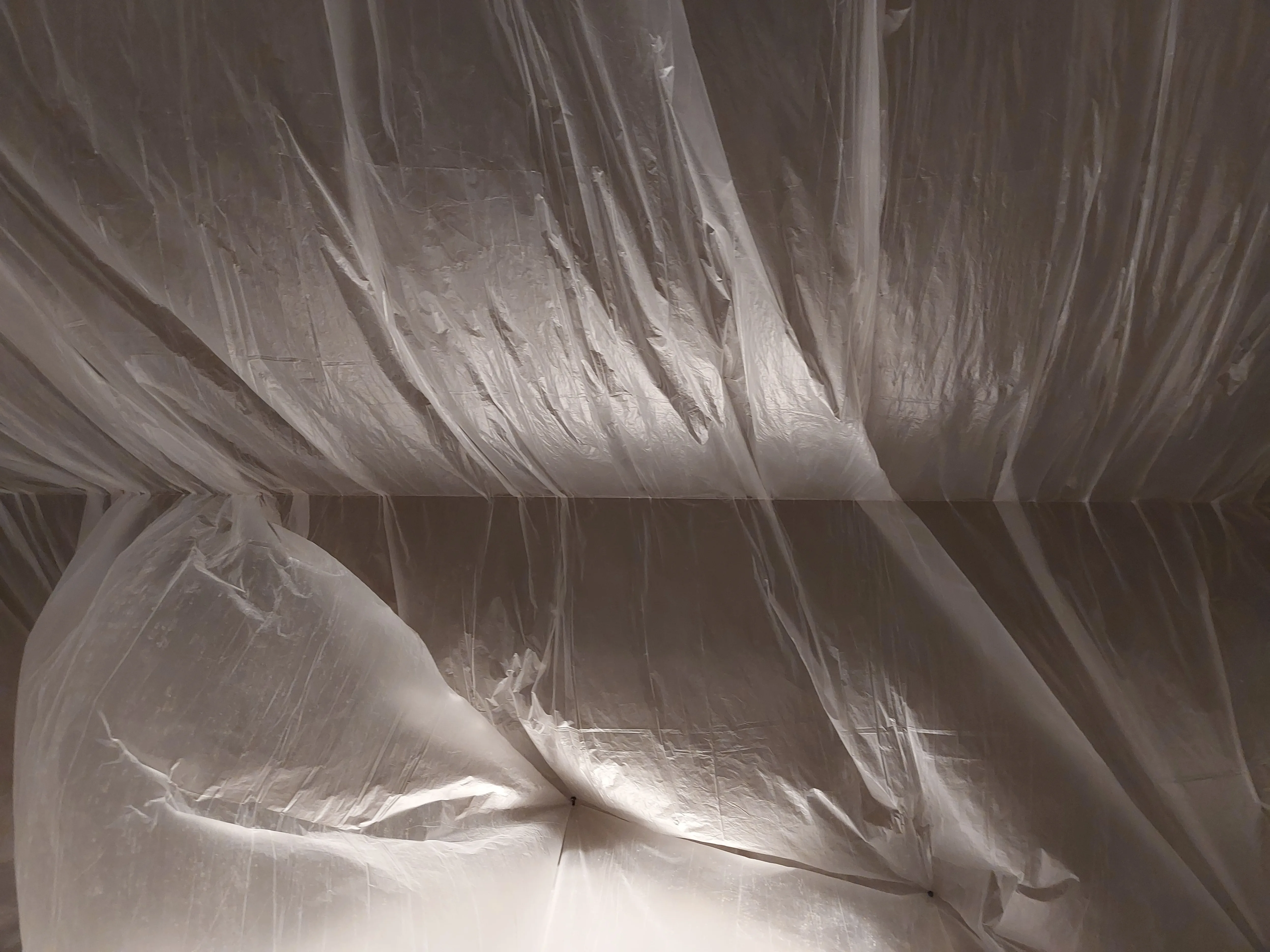
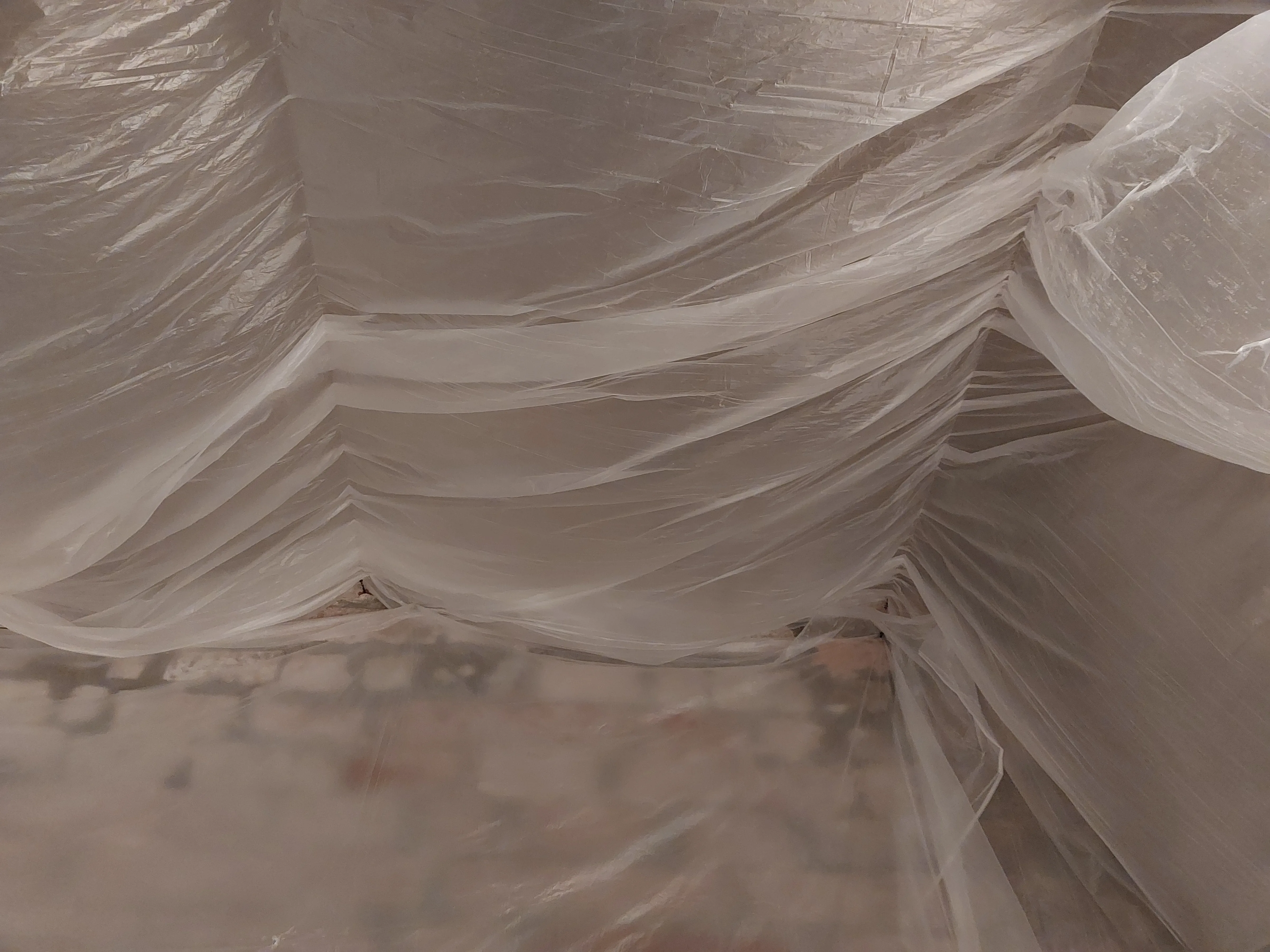
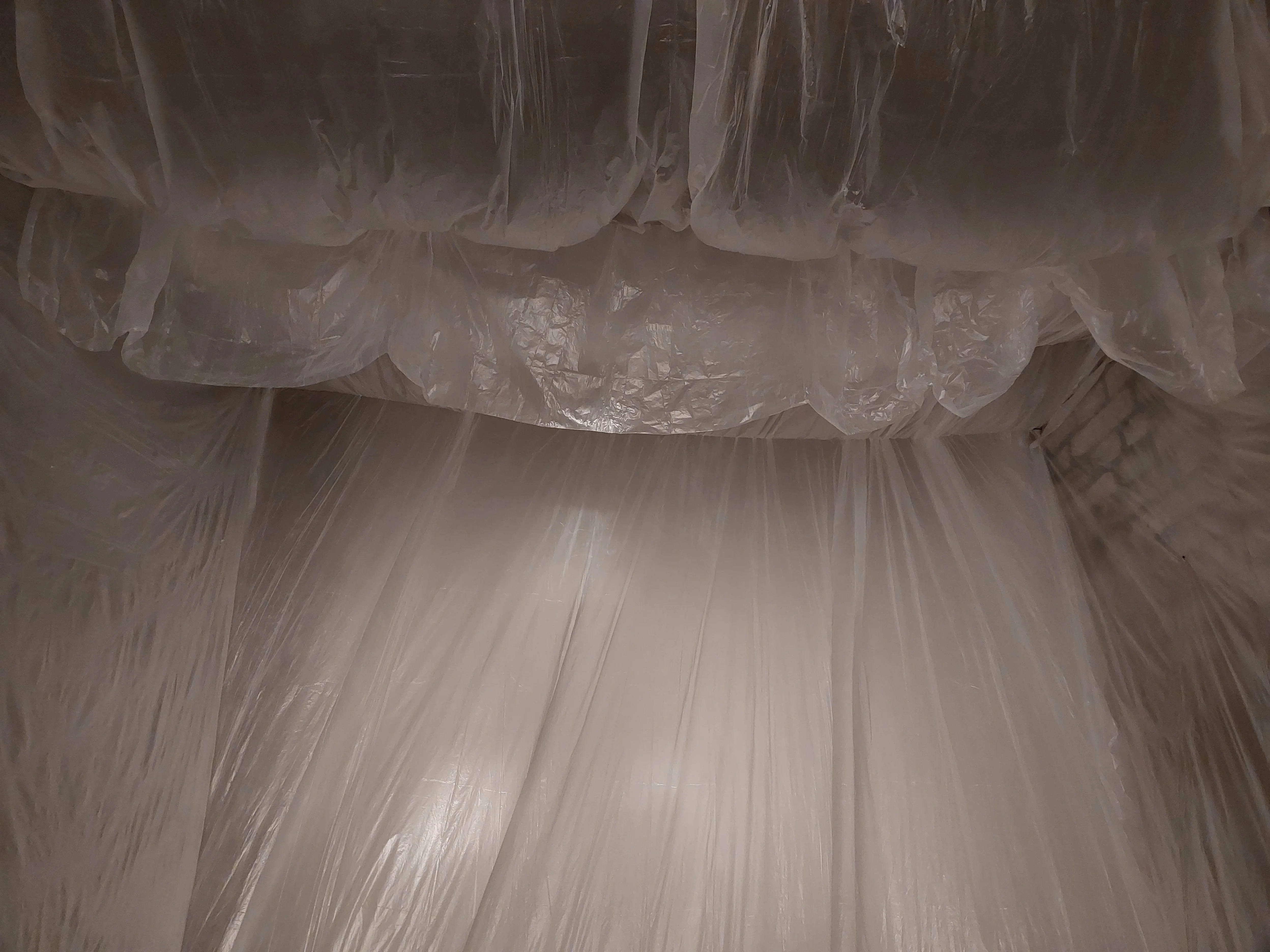
PROJECT Site Specific Installation and Book Design CONTEXT ABA_U DESCRIPTION The work explores the growing disconnect between humans and the earth through an installation centered on the use of a light, semi-transparent protective plastic. A common material, often associated with protection or packaging, is here reinterpreted as a symbol of suffocation and separation from the natural world. Its transparency allows a glimpse of what lies beyond without truly experiencing it, generating a sense of suspension. Within the installation, the plastic behaves like an artificial organism: it moves with the air, warms with the light, vibrates, and reacts to the presence of people, creating a closed ecosystem in which every interaction alters and enriches the experience. Complementing the installation is a book that serves as both an extension and an archive of the work. It collects photographs of the plastics used, captured under different lighting and movement conditions to highlight textures and imperfections, accompanied by technical sheets detailing materials and spatial placement. One section is dedicated to sound wave graphs, recorded during audience interaction, offering a visual translation of an otherwise ephemeral experience. In this way, image, sound, and matter merge into a single narrative.
1 (OF) 12
03
SENZATITOLO
2023
PROJECT Book Design CONTEXT ABA_U DESCRIPTION I designed a type catalog conceived to showcase a selection of fonts by narrating both their design process and their possible applications. The volume features around eight typefaces, each accompanied by a detailed technical sheet and an integrated specimen section, illustrating their potential in real-world contexts. Each font is also presented with an A5 technical sheet dedicated to the object designed in relation to the typeface, along with an A5 spread displaying the complete set of glyphs. The project was created with a dual purpose: to serve as a cohesive collection of typographic specimens and as the annual catalog of the type foundry developed within the lettering course over the academic year. The layout and content structure were carefully designed to ensure a clear, comprehensive, and visually engaging presentation, highlighting each typeface from both a technical and aesthetic perspective.
1 (OF) 12
02
SPECIMEN 01
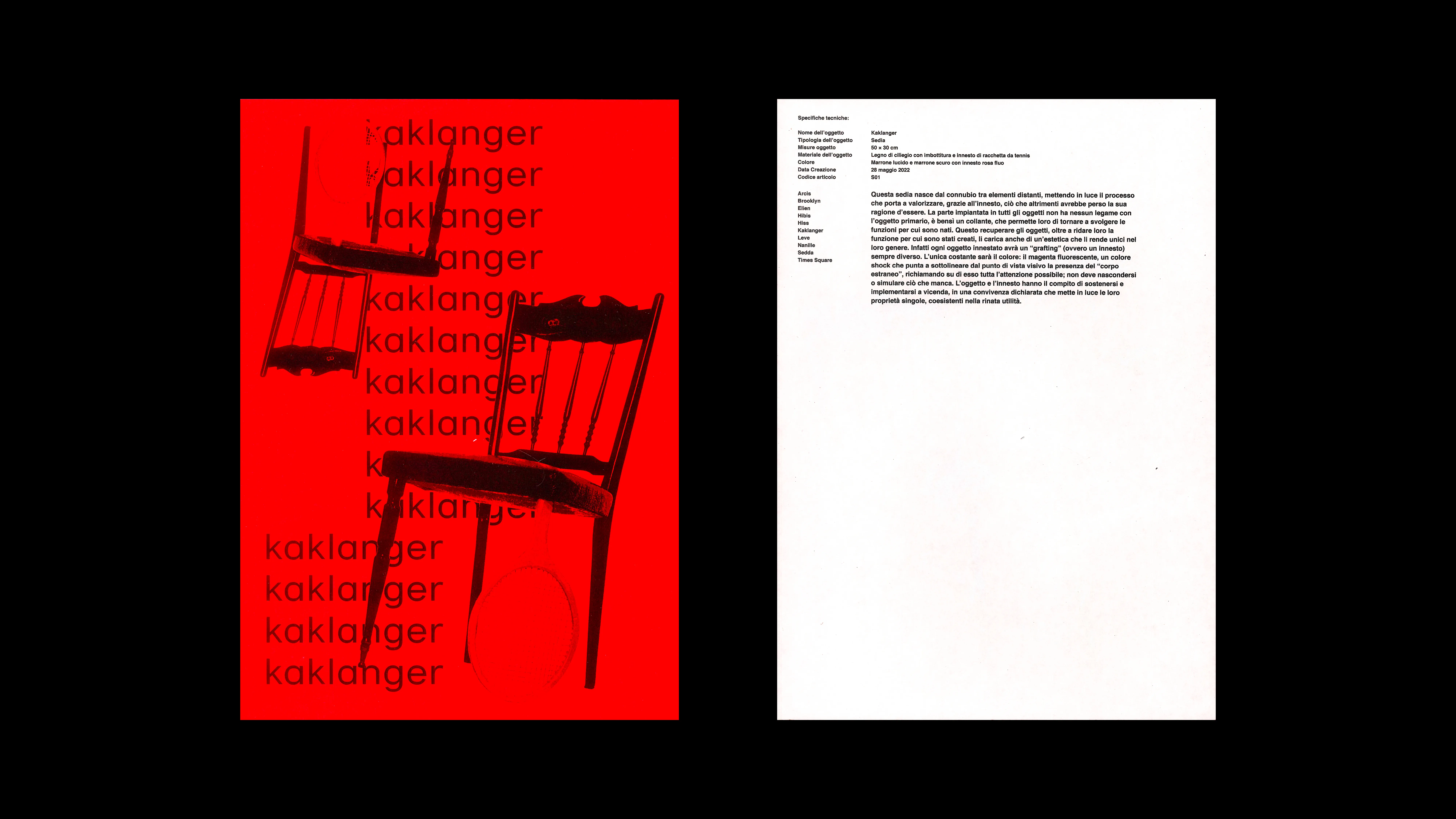
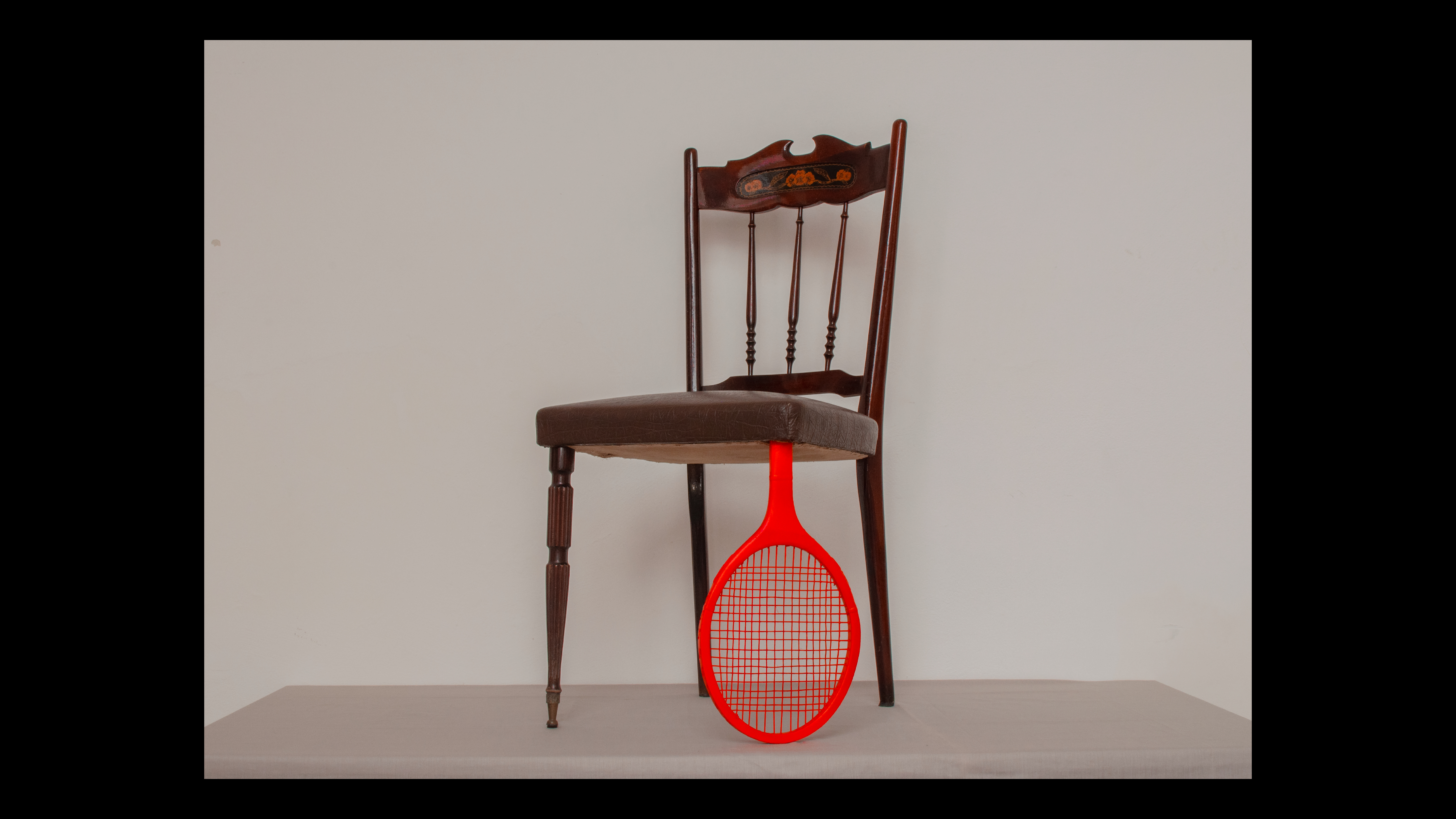
2022
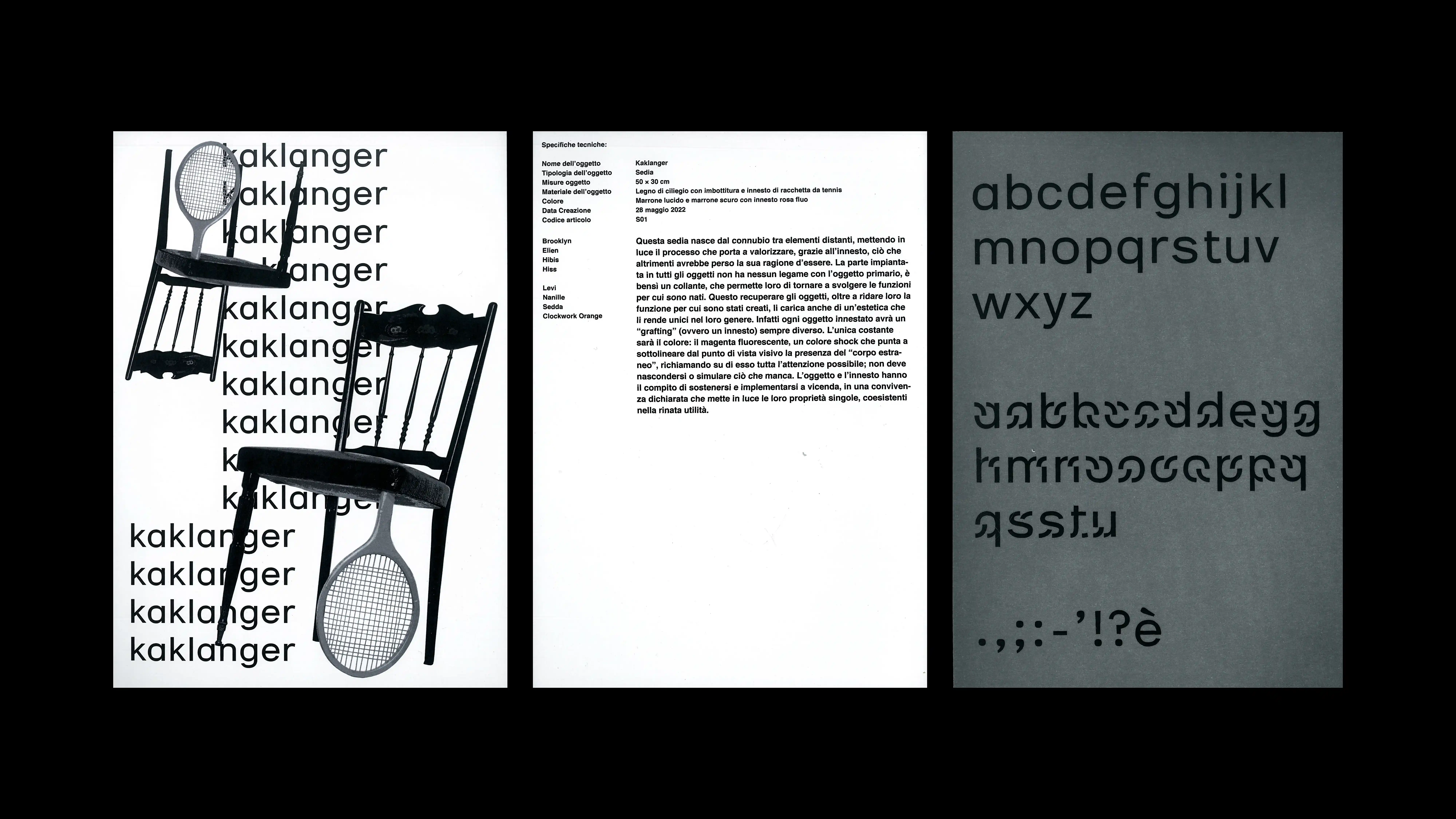
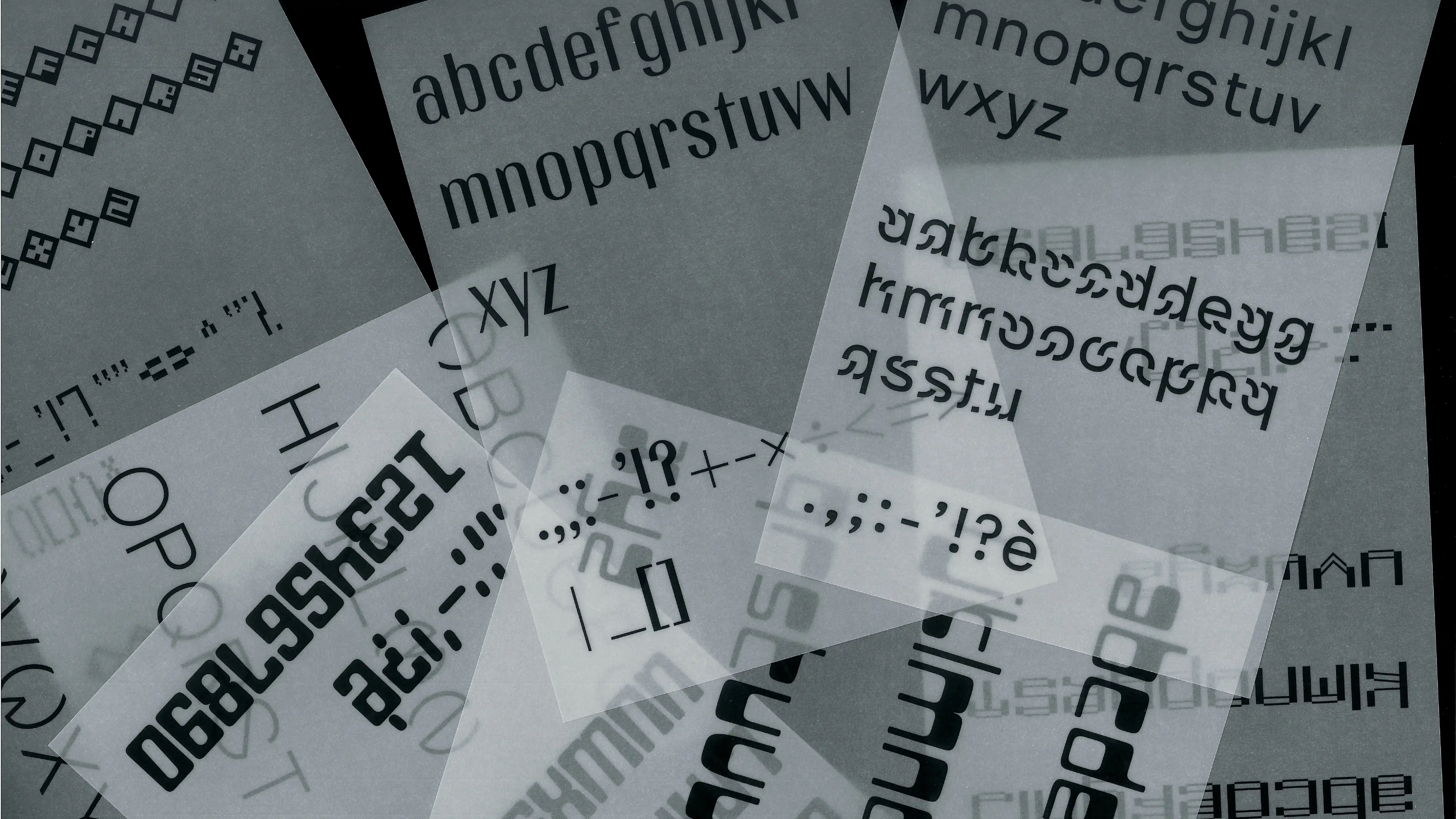
PROJECT Book & Poster Design, Object Design and Web Development CONTEXT ABA_U DESCRIPTION The Grafting typeface is accompanied by an A4 presentation specimen, designed to systematically showcase the potential of the typeface. The specimen includes all stylistic variations and possible combinations, offering a comprehensive view of the typographic project. In addition to the specimen, I designed a fluorescent paper insert dedicated to the chair, the design object inspired by the grafting concept of the typeface. The insert presents the chair and its functionality, highlighting the modular and transformable logic that underlies the entire project. I also designed a poster, conceived as an independent visual support to communicate the qualities of the typeface and the concept of modularity in a clear and impactful way. Finally, I designed a dynamic web interface that translates the principles of transformation and modularity of the Grafting typeface into an interactive digital environment, capable of changing during navigation and offering a lively, engaging user experience.
1 (OF) 12
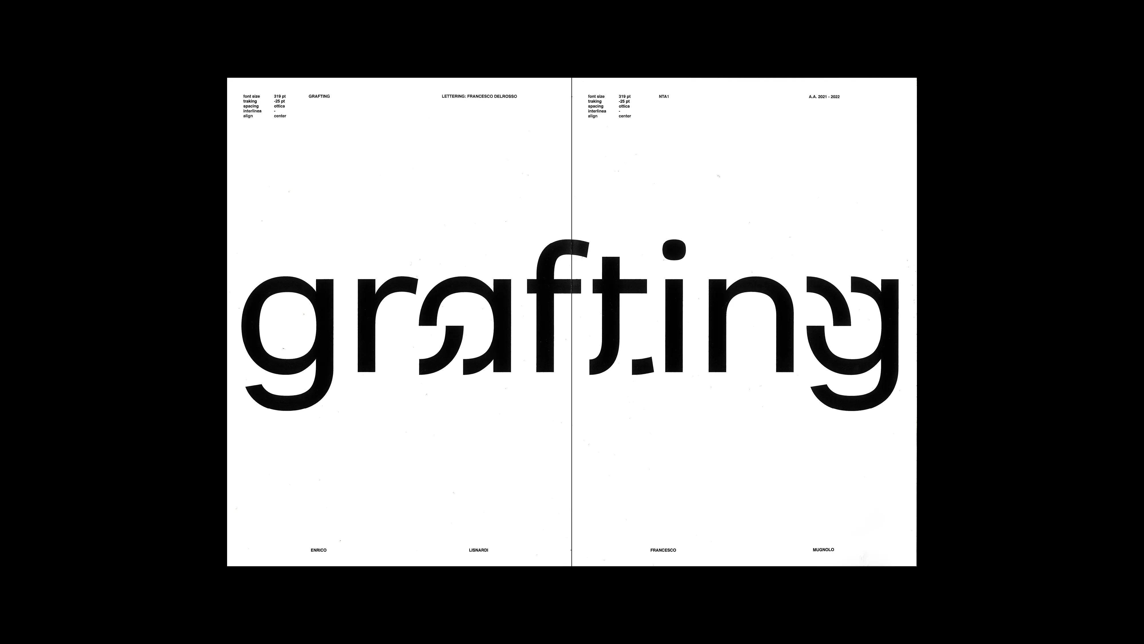
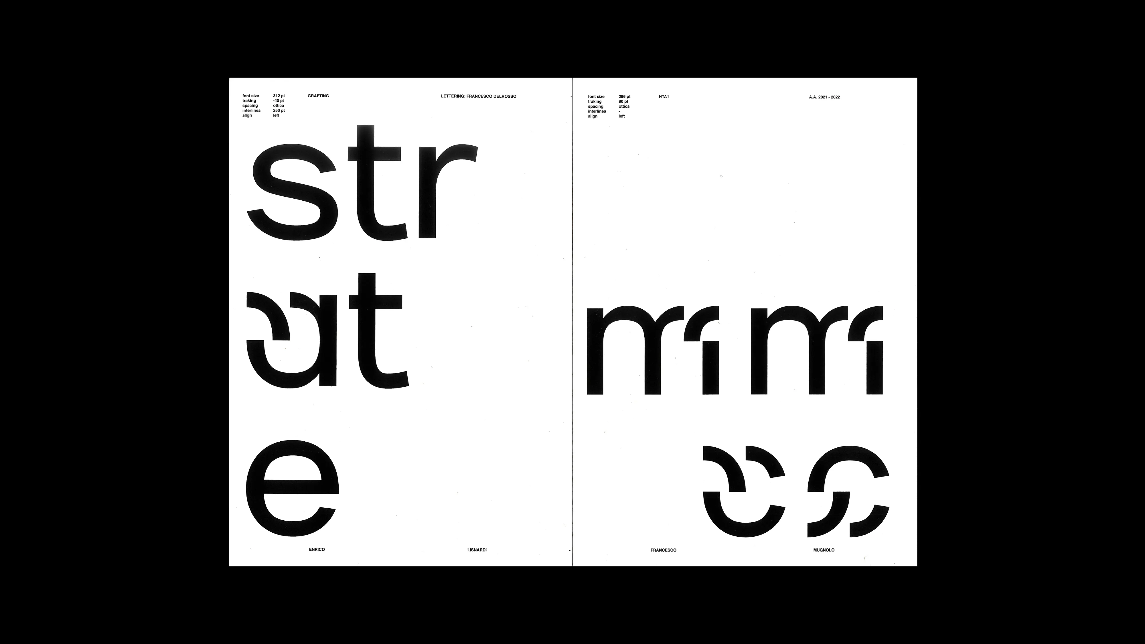
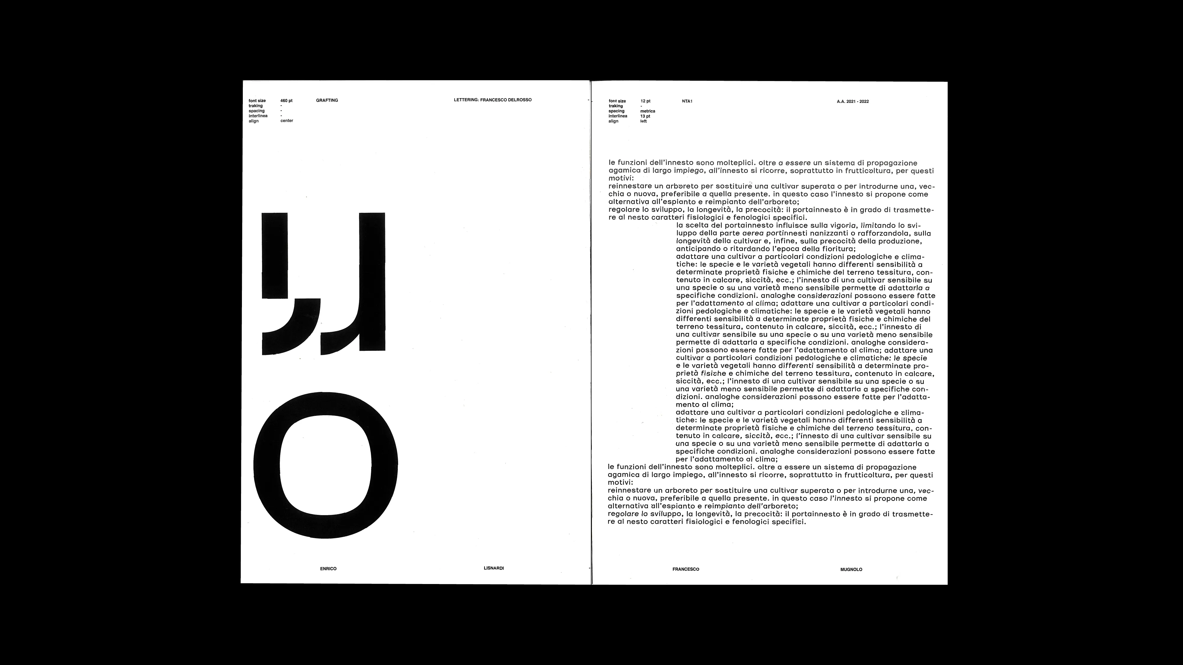
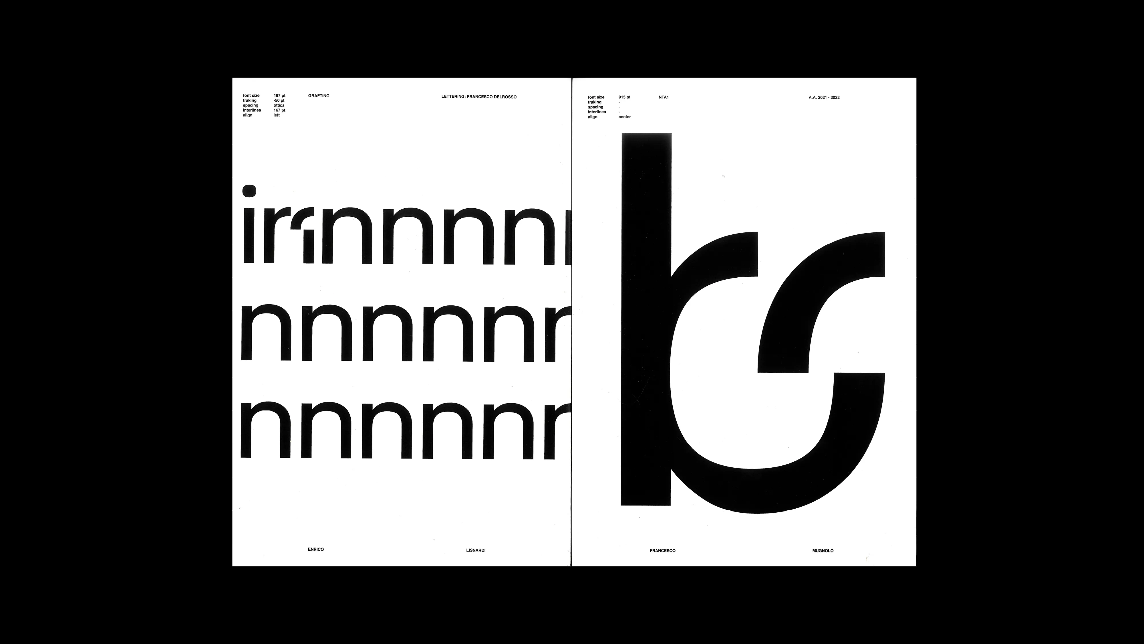
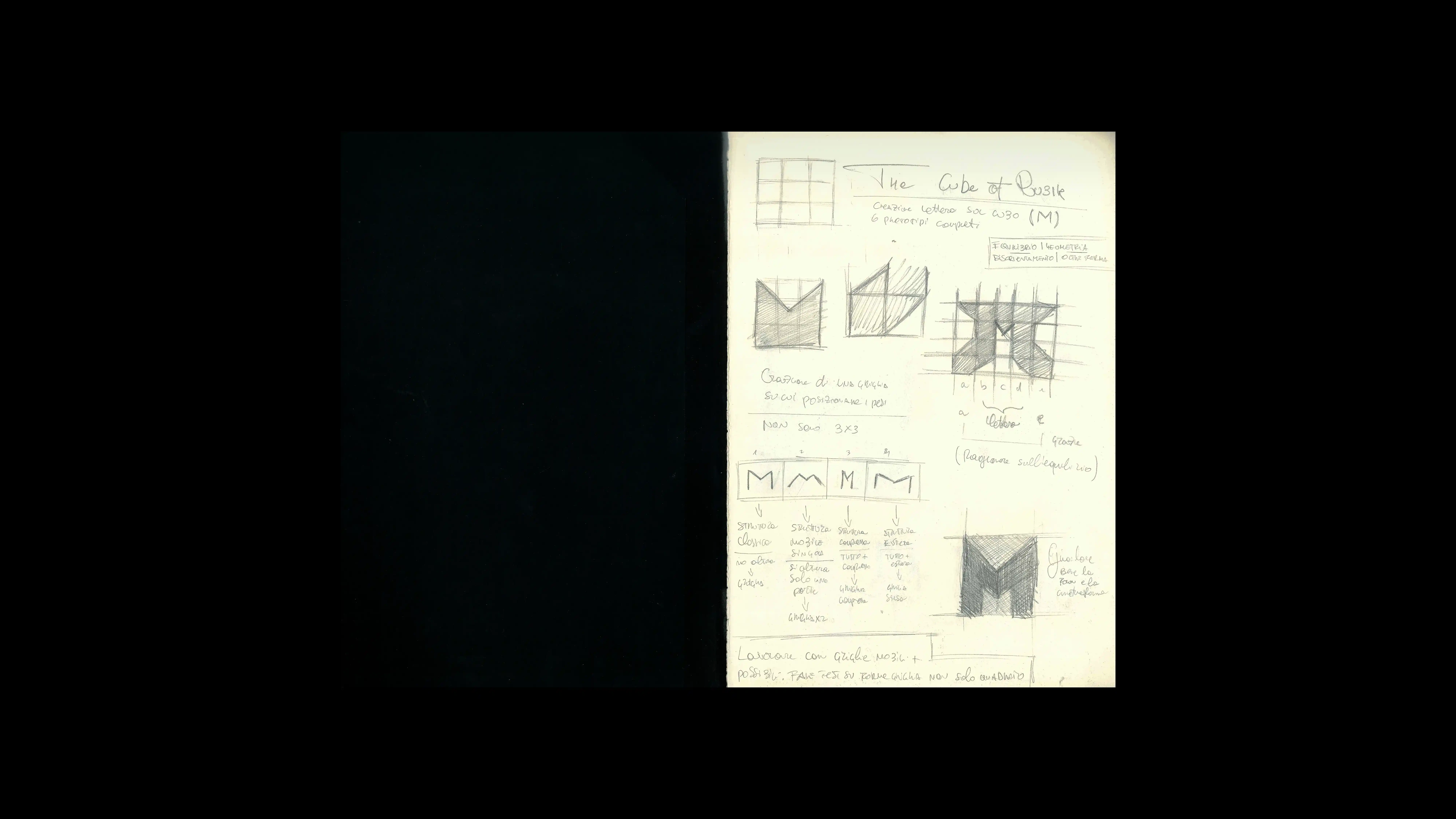
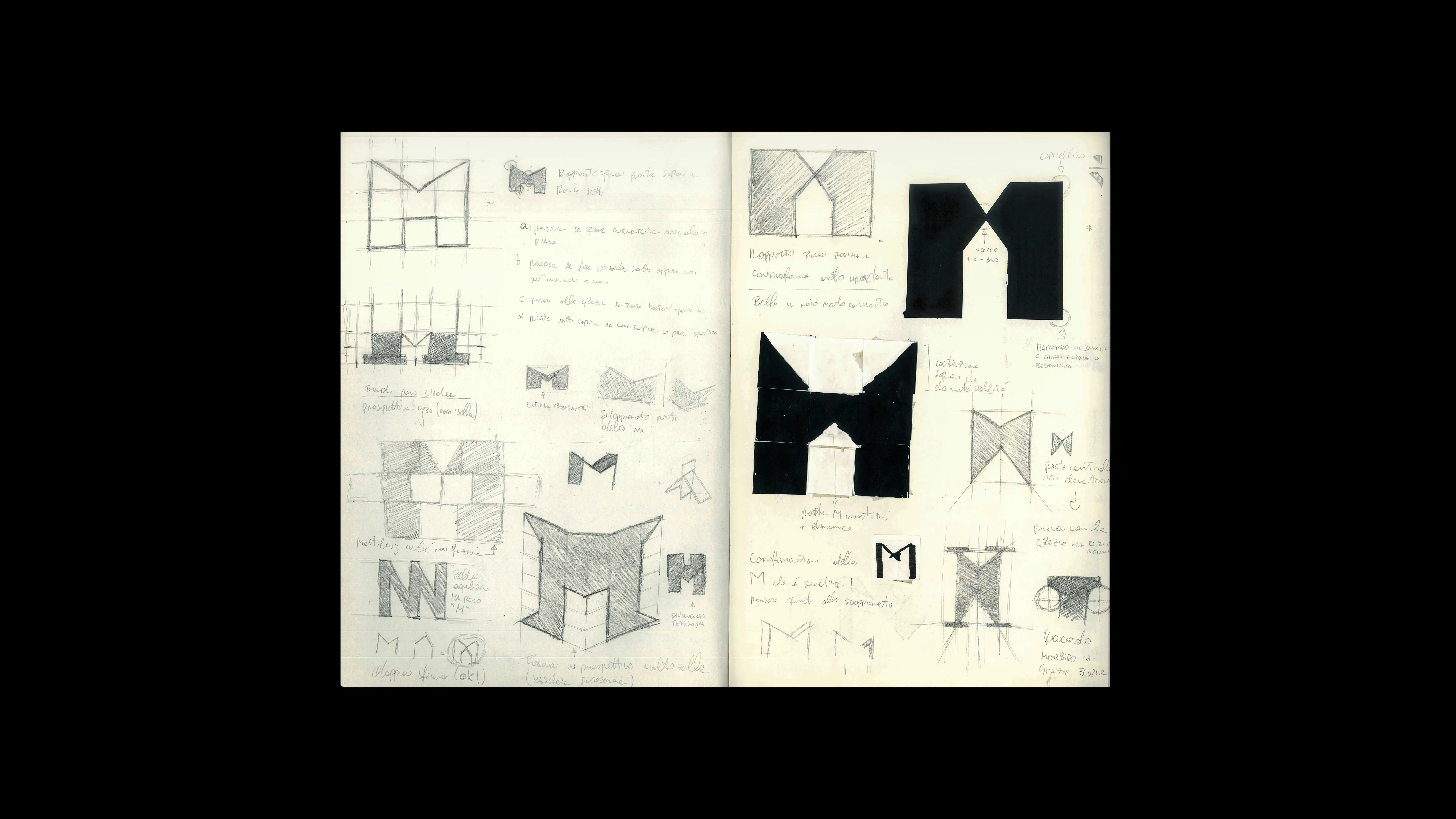
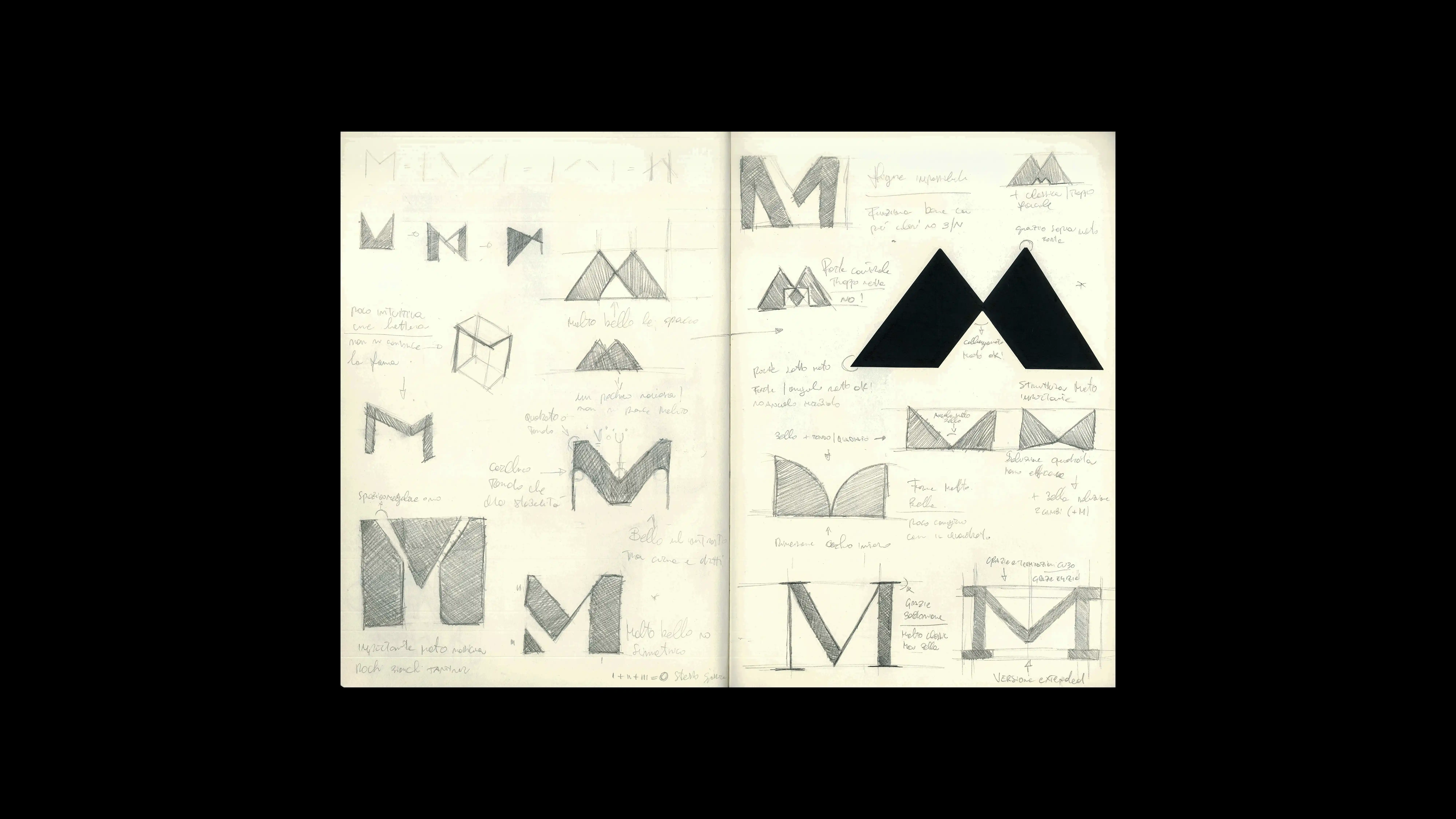
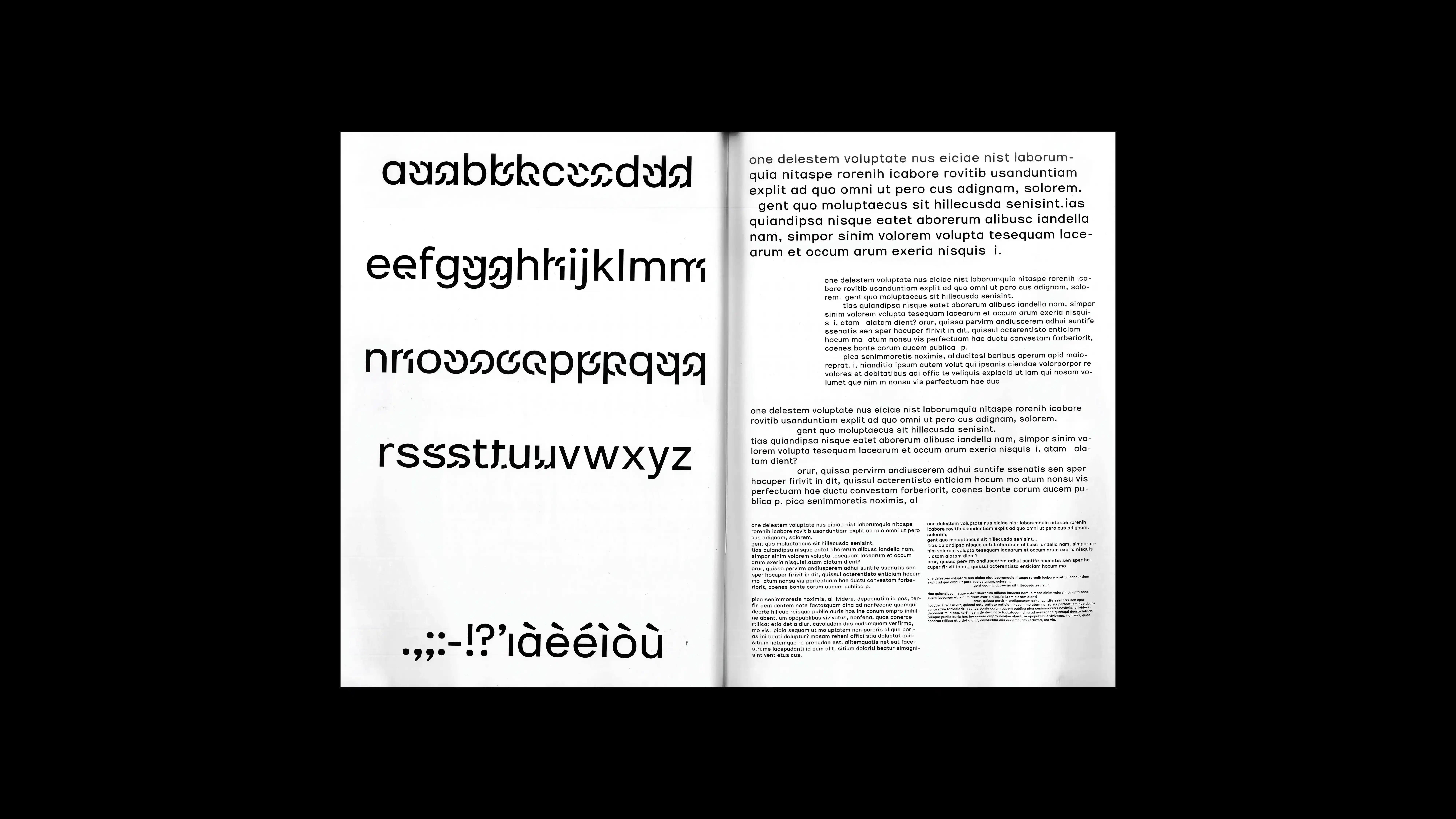
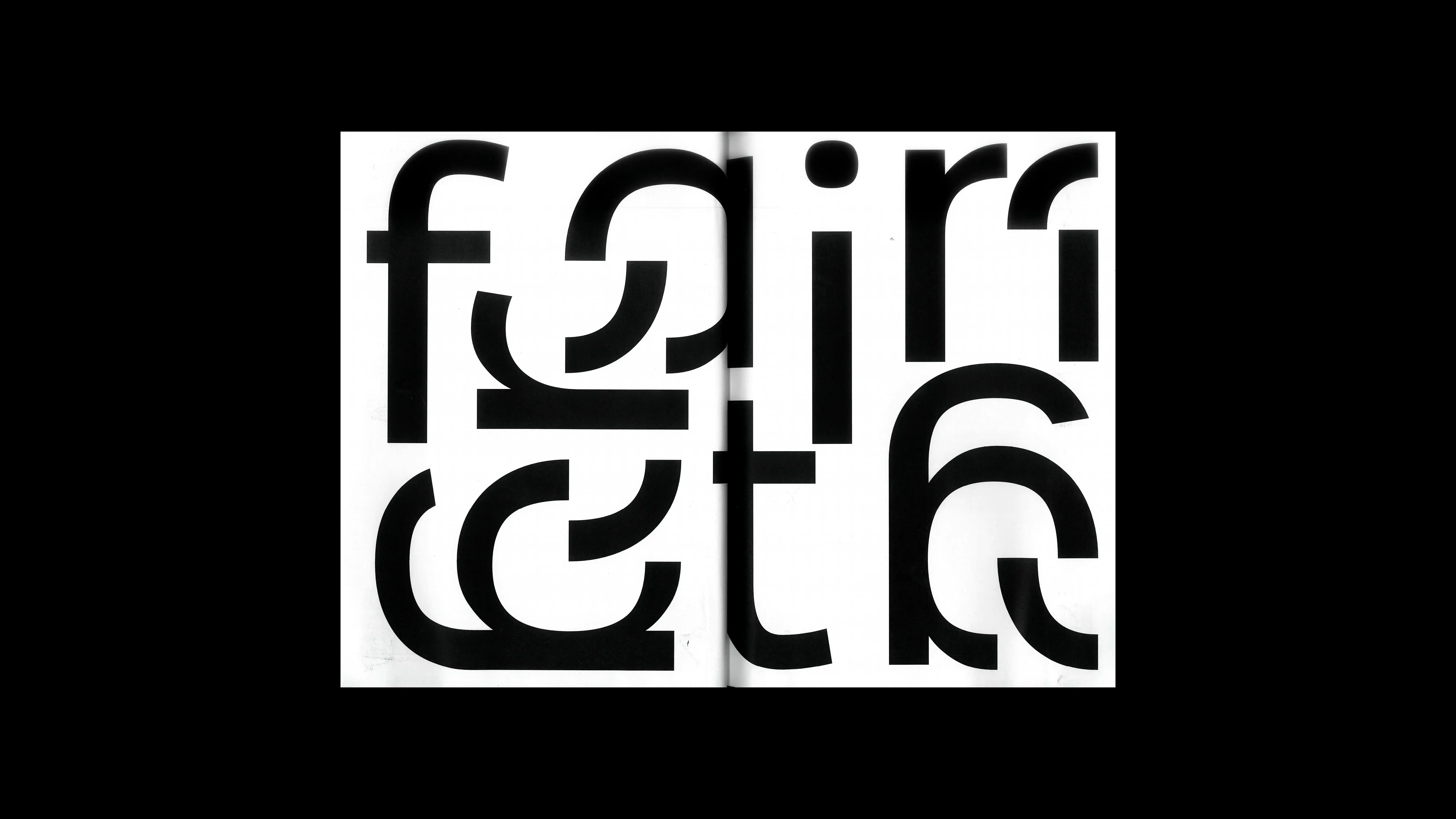
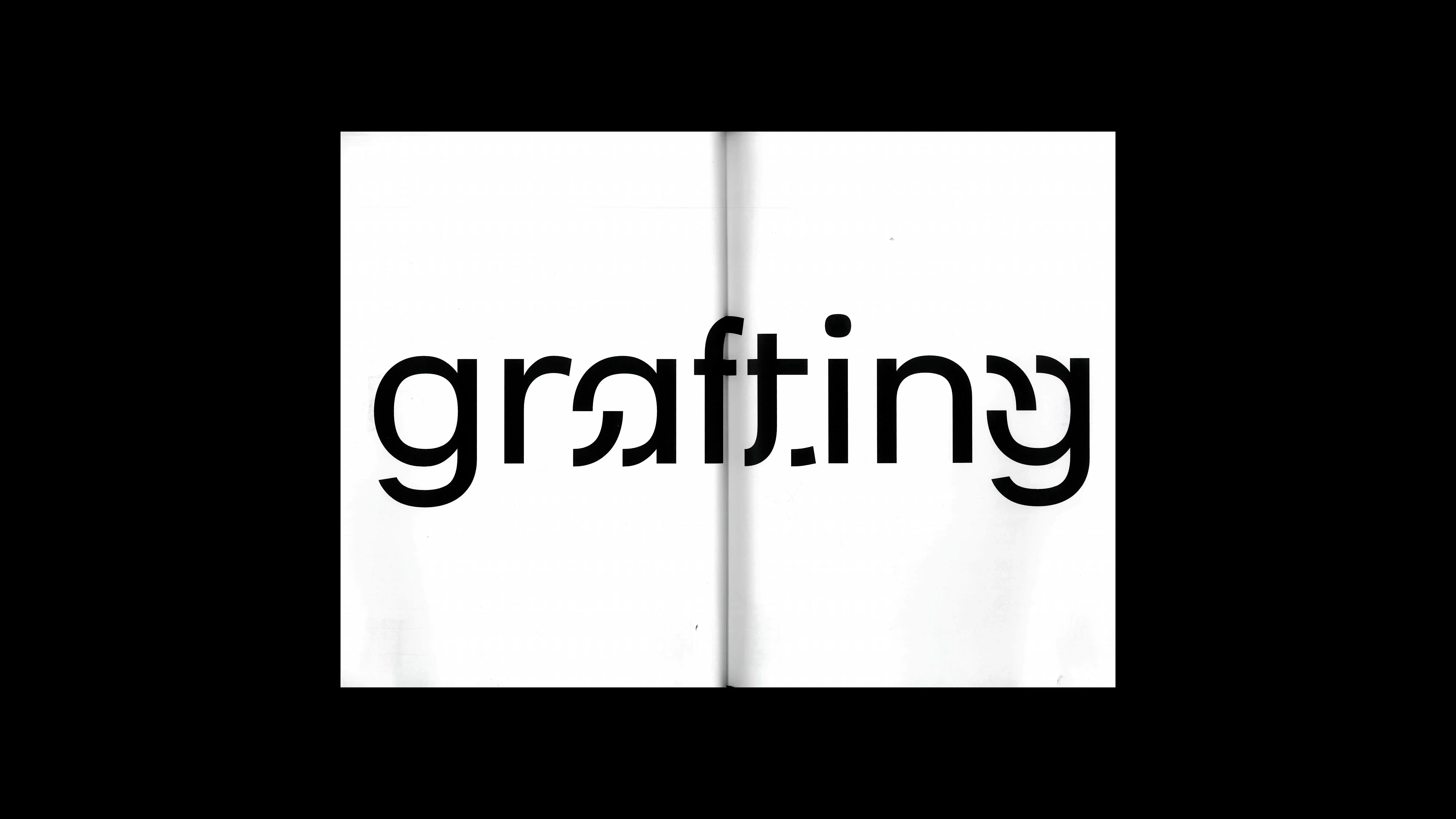
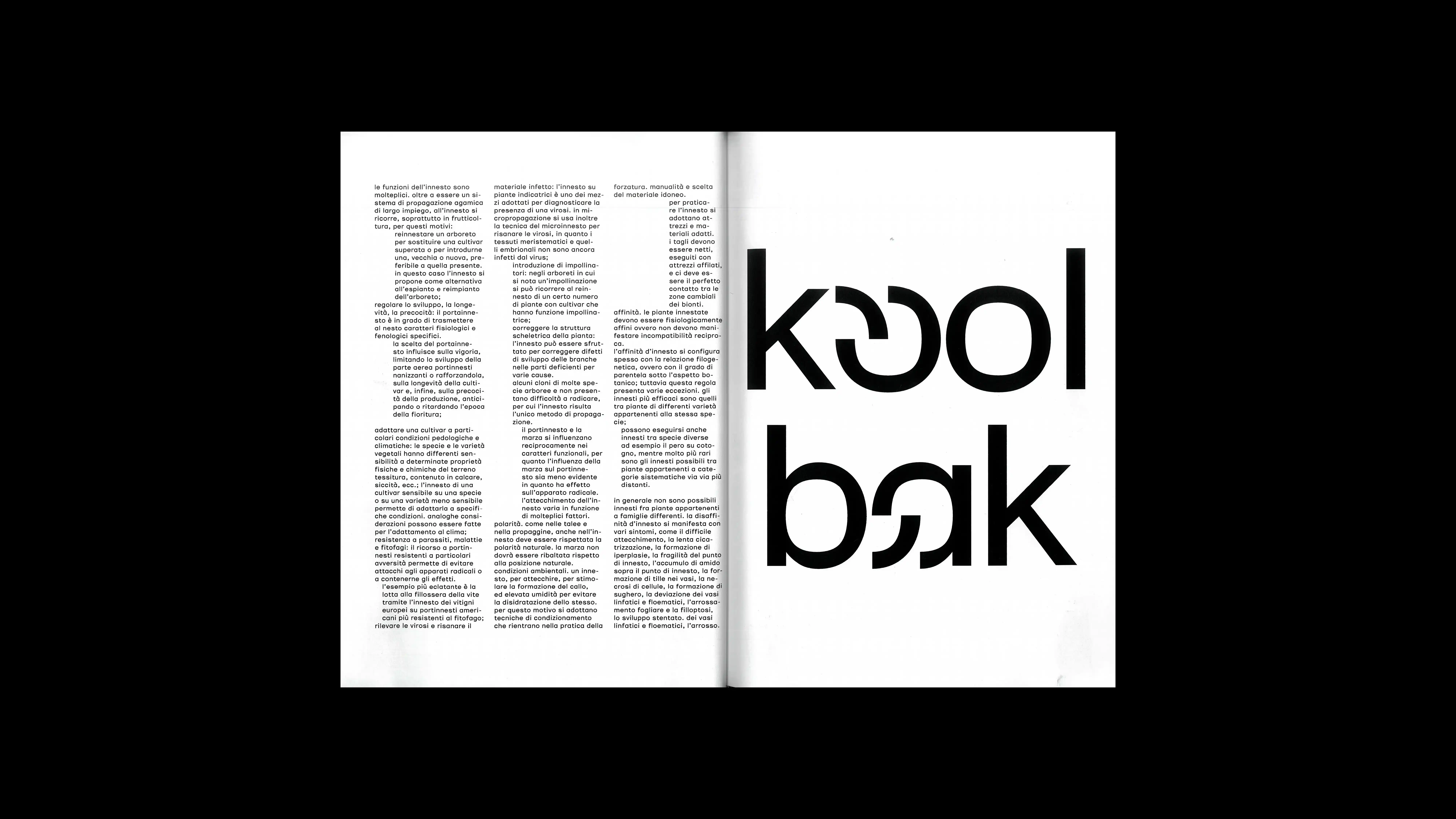
01
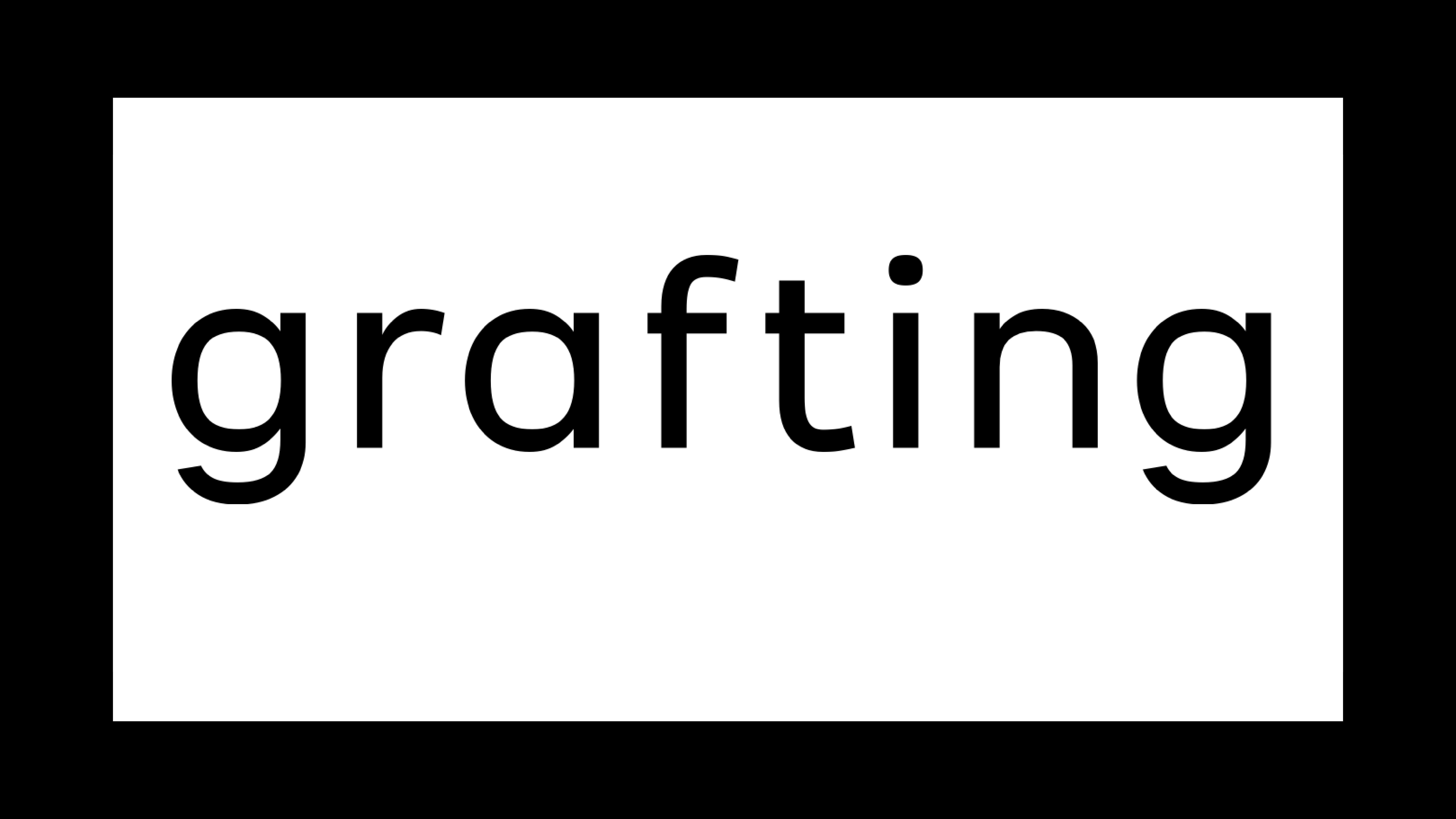
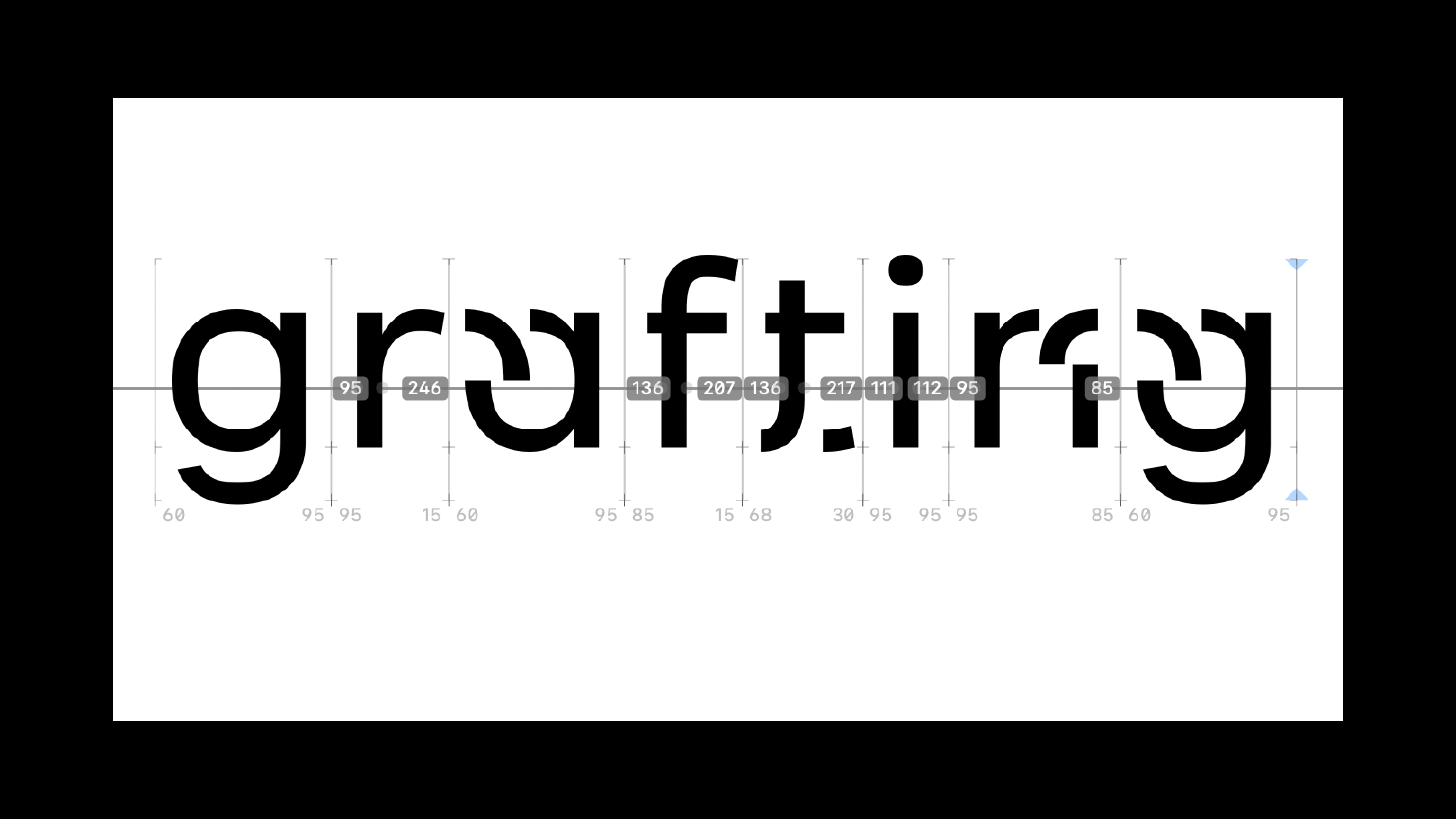
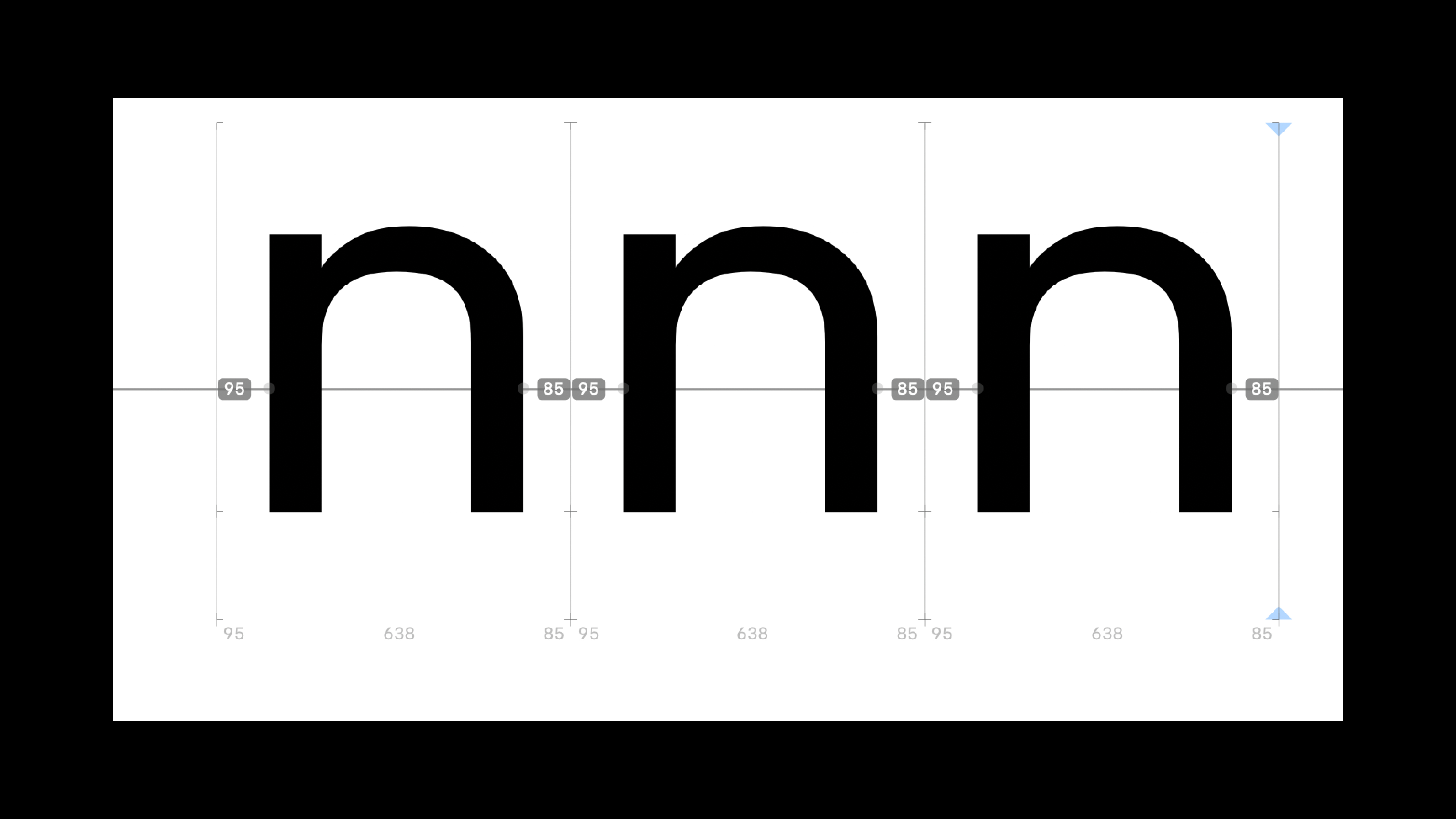
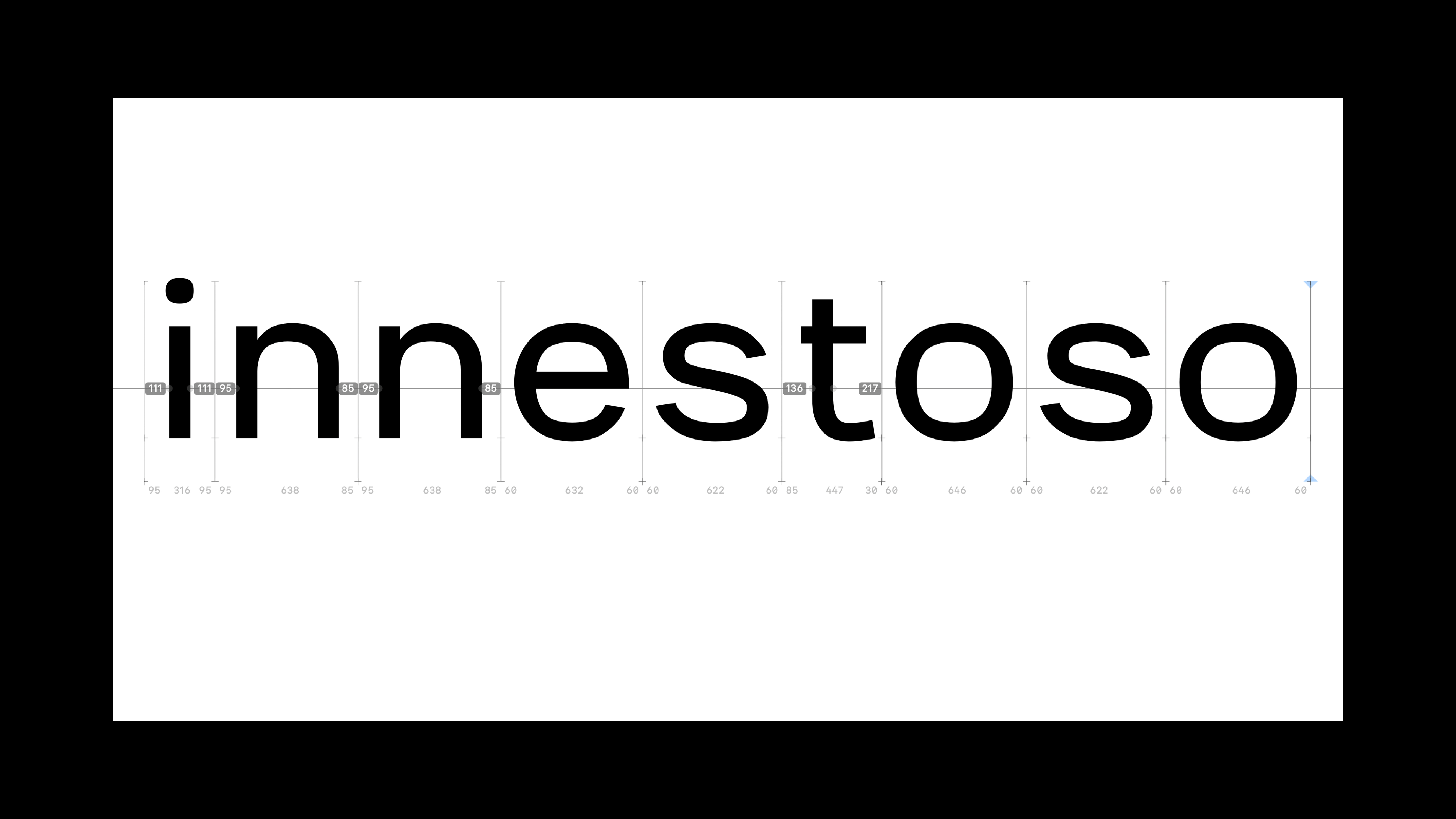
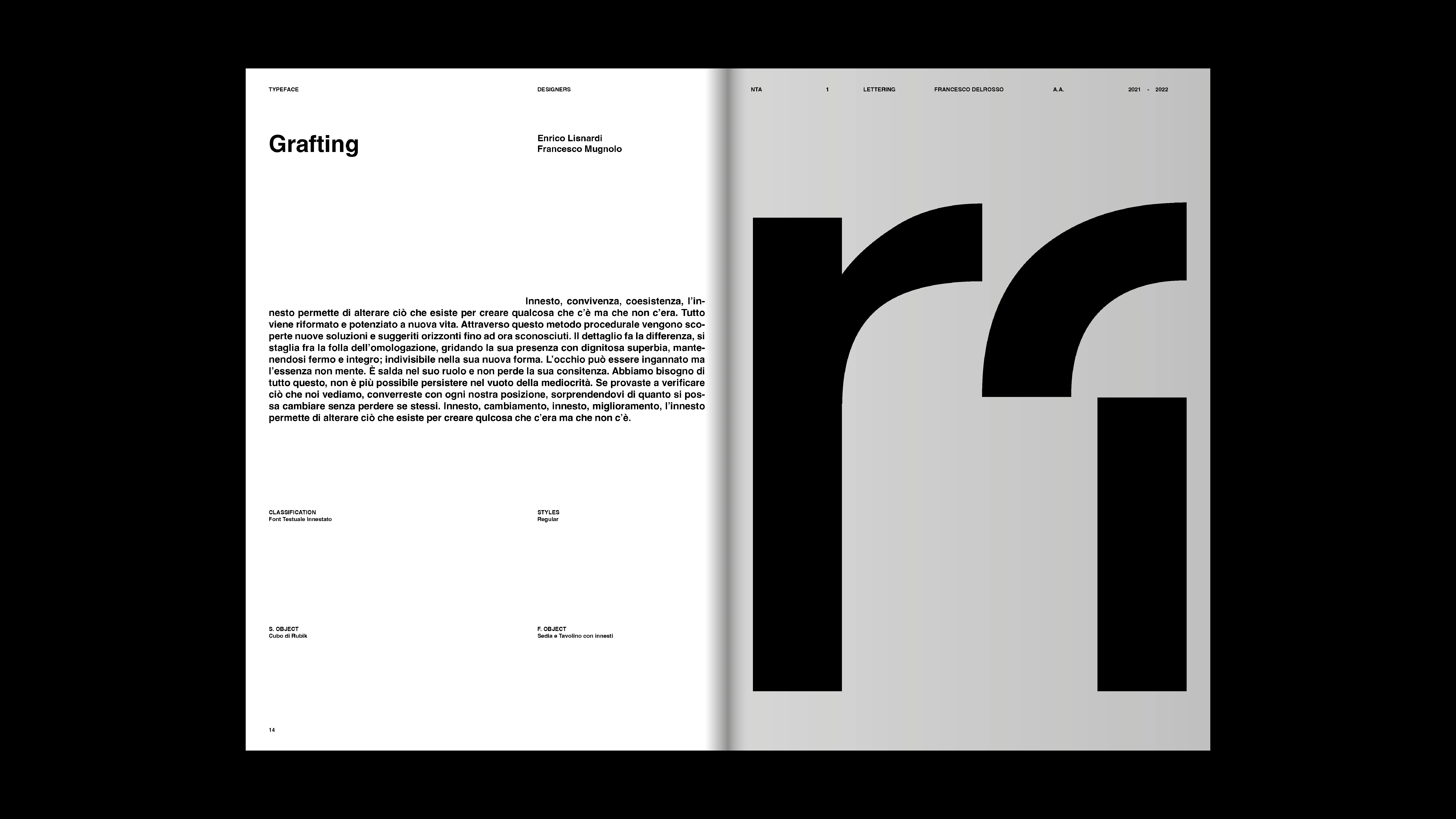
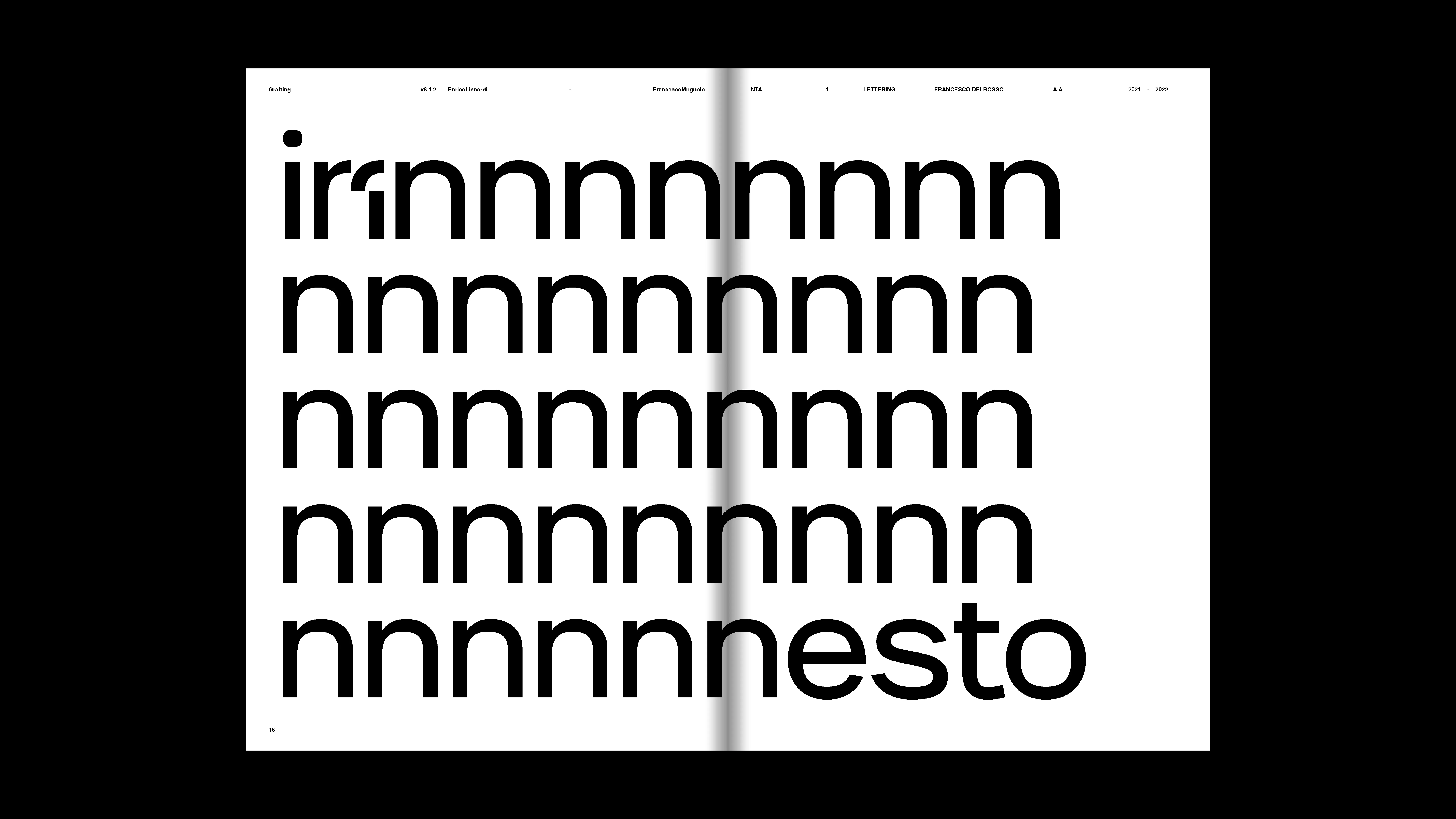
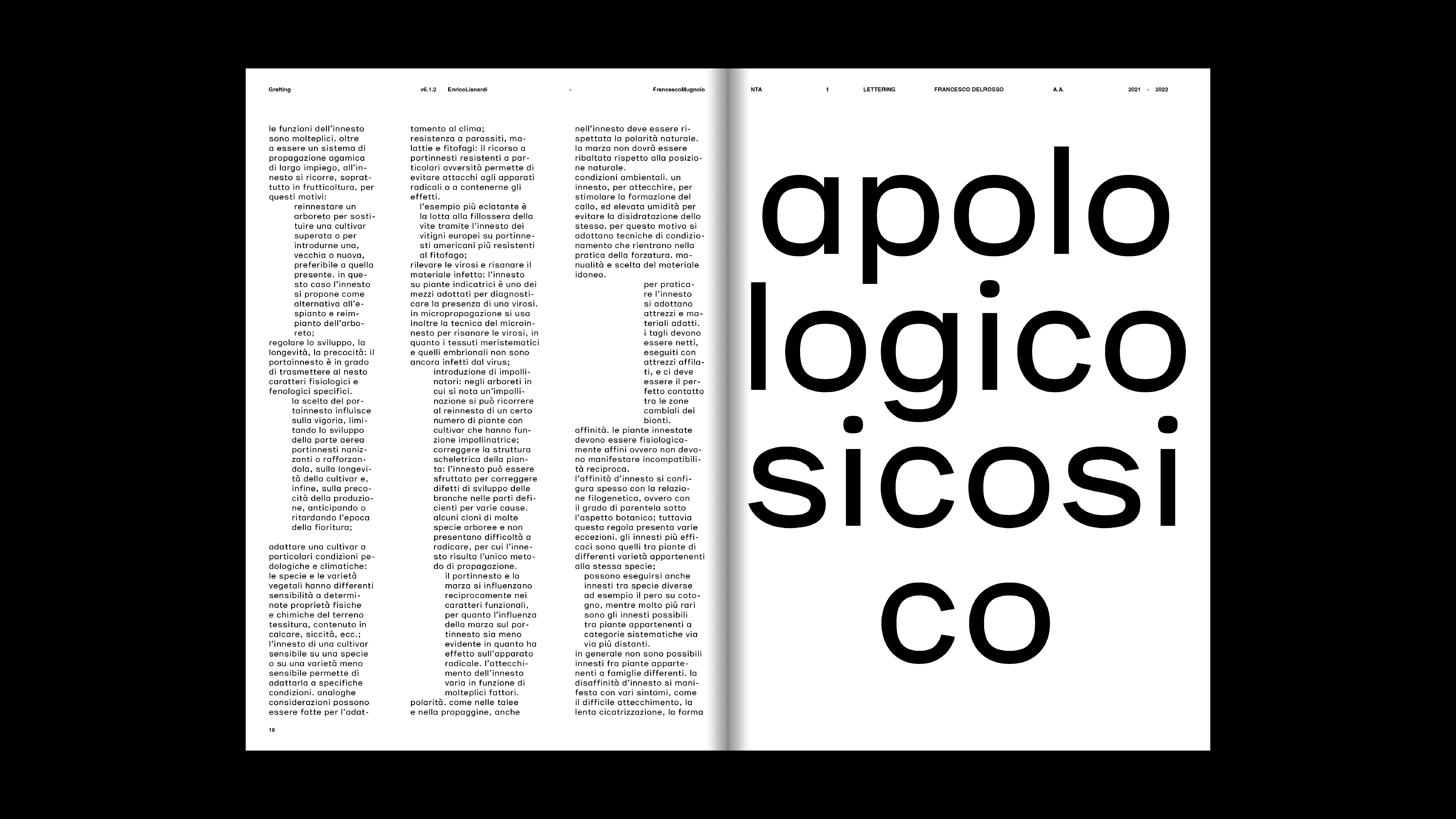
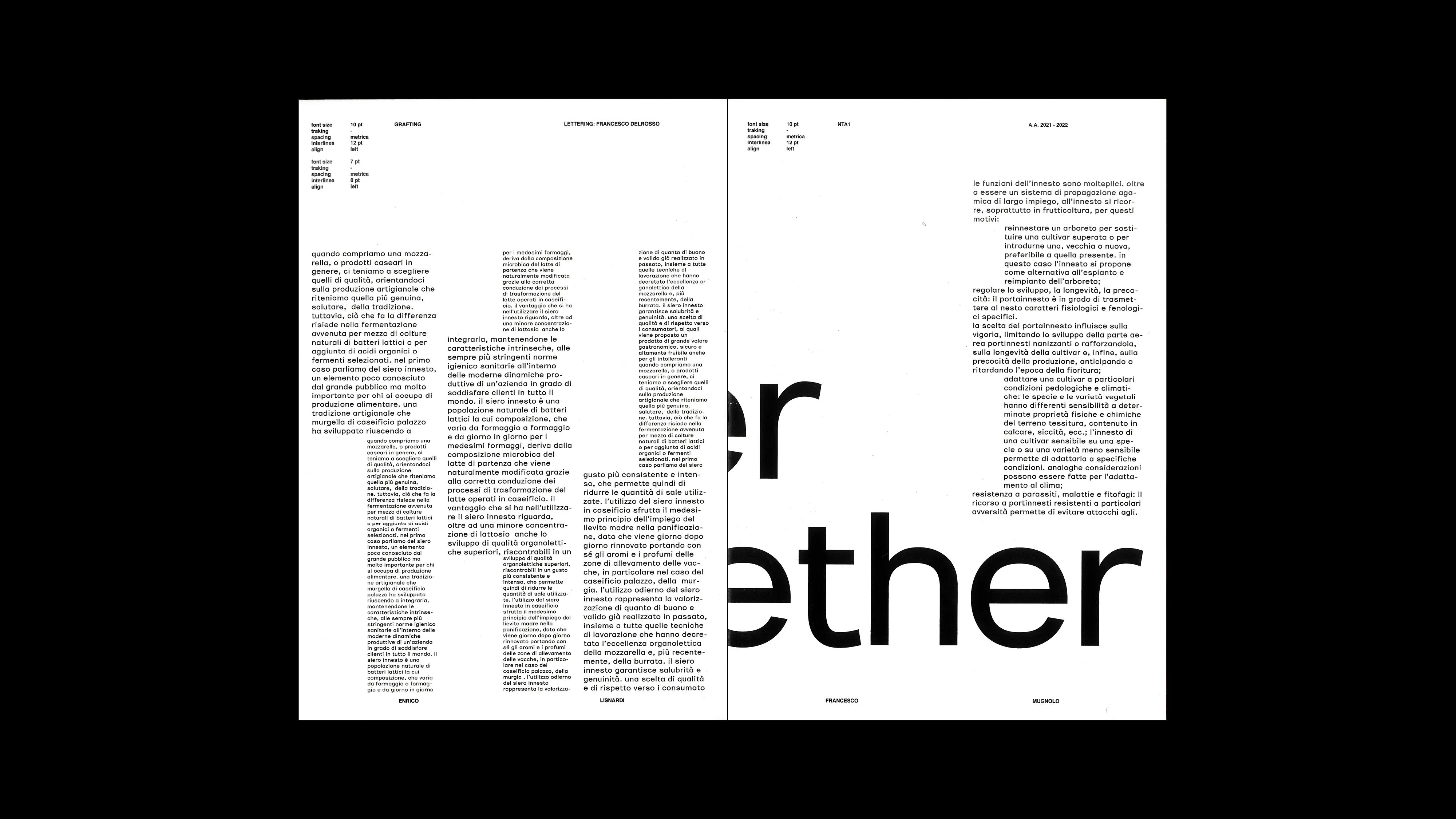
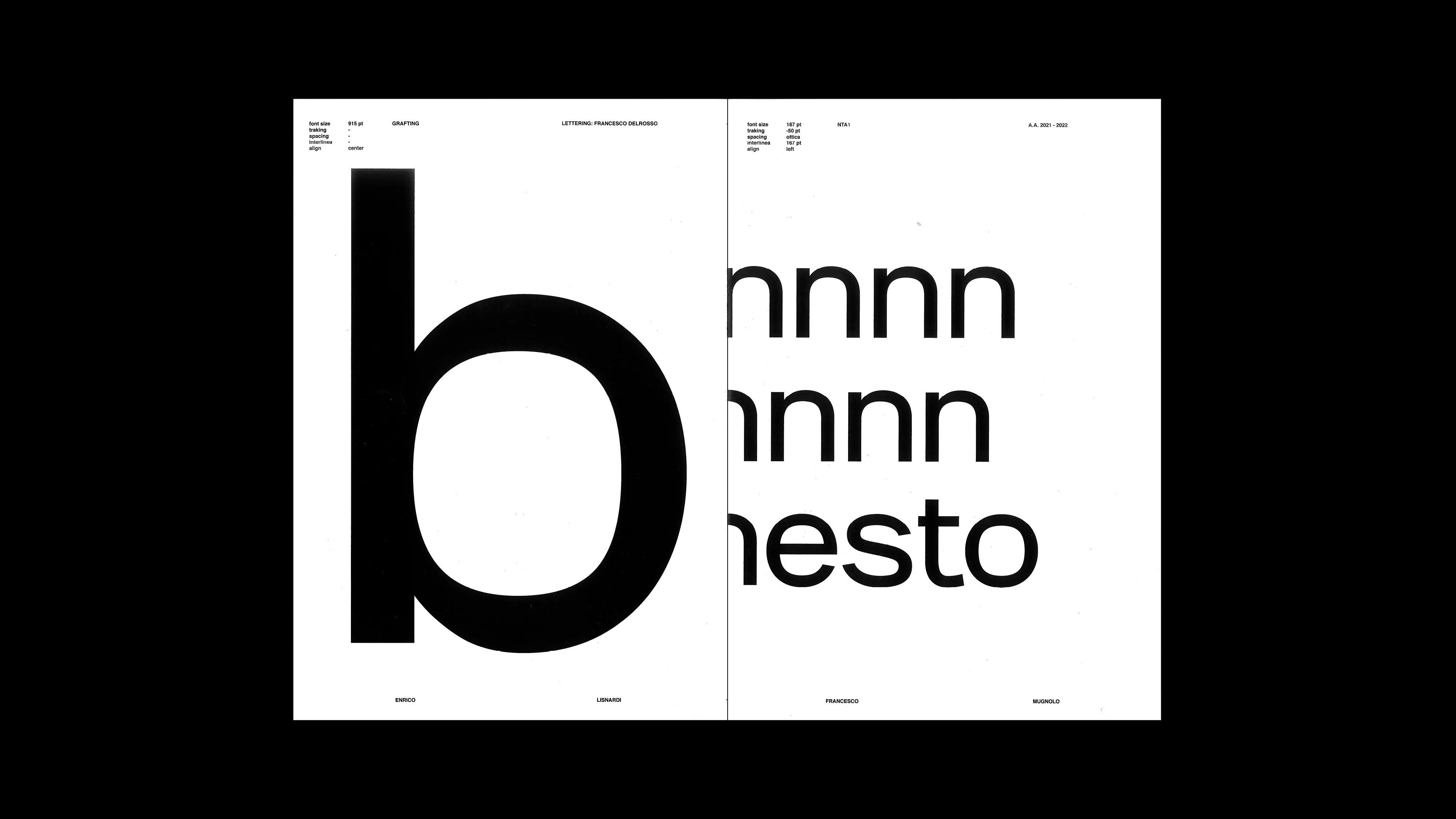
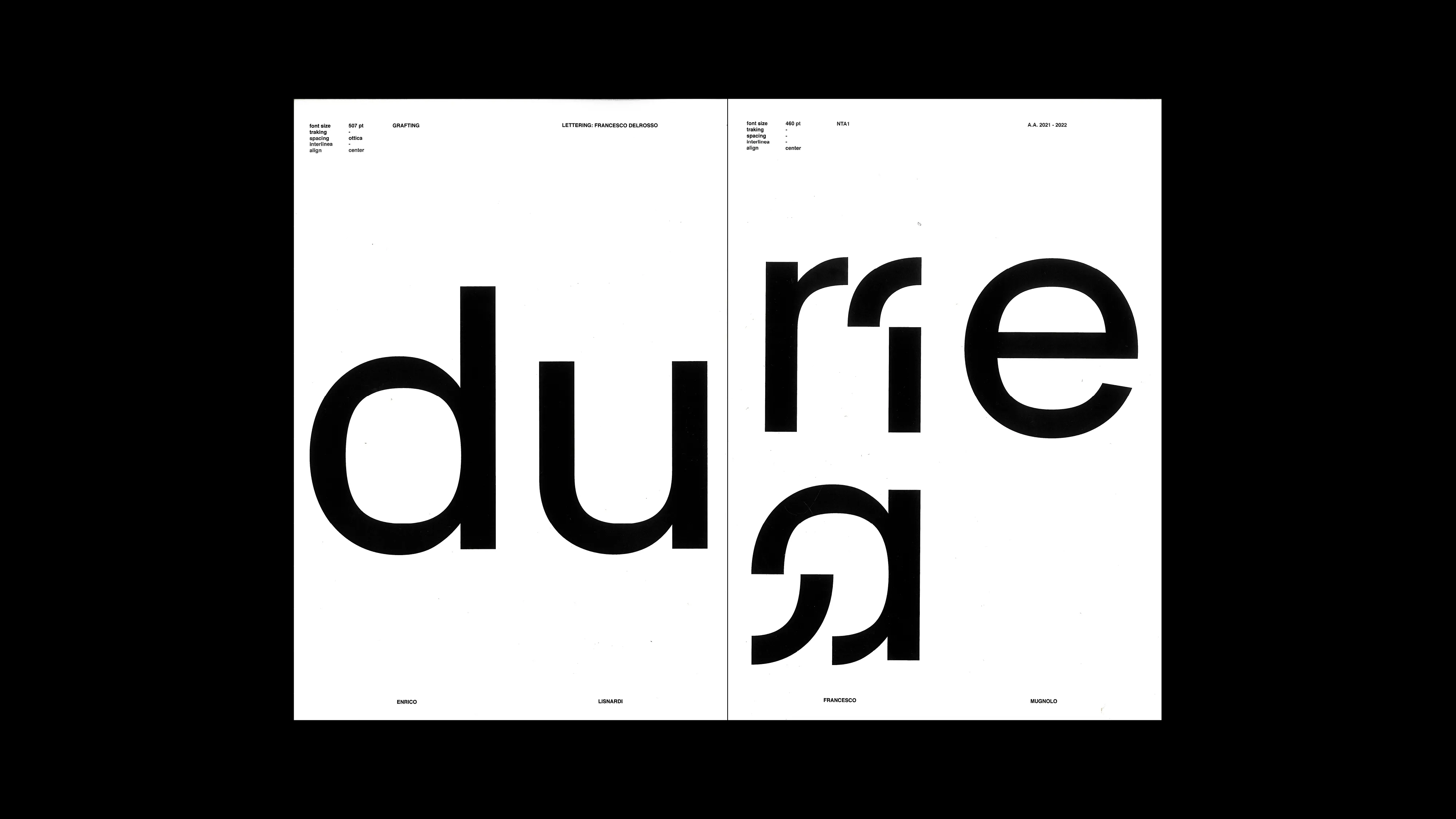
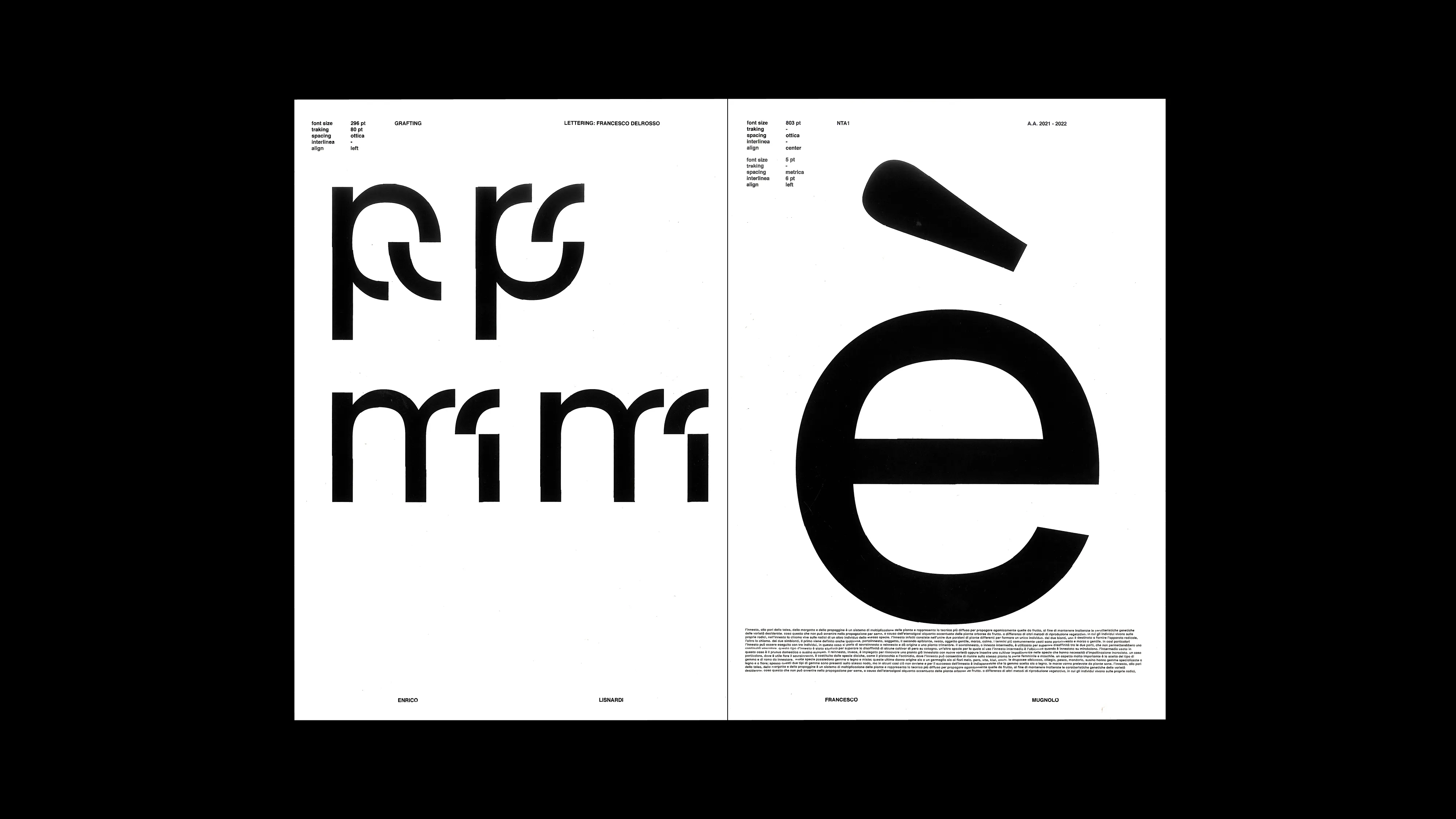
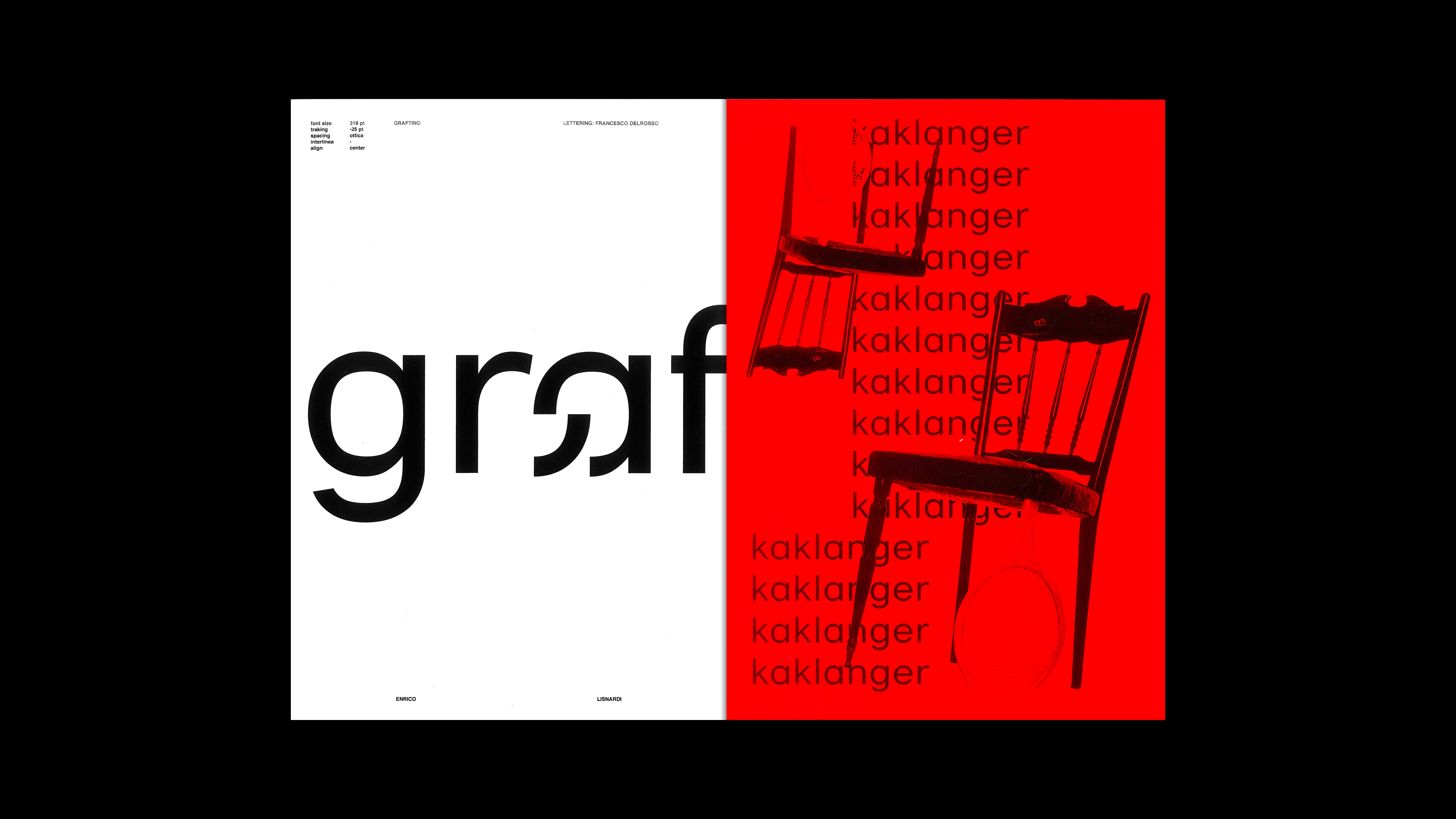
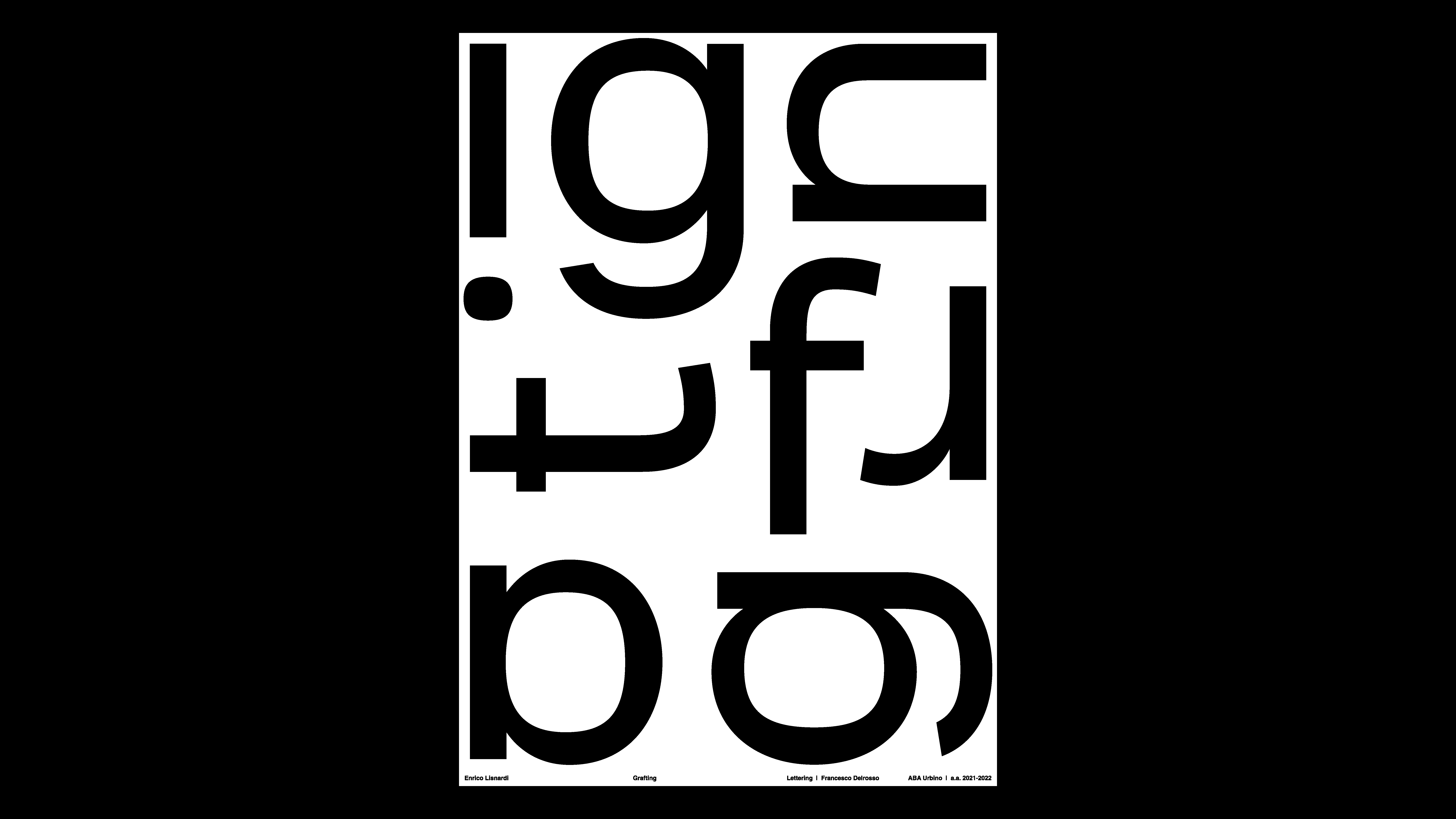
GRAFTING
2022
PROJECT Typeface Design CONTEXT ABA_U DESCRIPTION The project stems from a reflection on the form and versatility of the Rubik’s Cube, an object capable of infinite transformation through the movement and reconfiguration of its faces. From this logic, I developed a typeface built on modular units that can change while still remaining part of a coherent system. As with the cube, each letter functions as a “face” that, combined with the others, creates a complete structure. I explored what happens when part of a letter is rotated or shifted: the result recalls a cube where all the faces are identical except for one, generating both a visual and conceptual contrast. From this exploration emerges the concept of the graft, an element that simultaneously binds and unbinds the form of a letter, creating new graphic relationships. Not all letters incorporate it: its presence depends on their shape and context, just as the cube’s faces change depending on the moves. Building on this principle, I developed several stylistic sets that can be freely applied, opening up endless possibilities for combination and transformation.
1 (OF) 12